The Metallica font is more than just a typeface-it’s an emblem of the heavy metal spirit. From the striking album art of “Master of Puppets” to the iconic logo font style that adorns concert posters, this font encapsulates the raw energy and rebellious essence of metal branding.
As a graphic designer with a penchant for rock and roll typography, I can’t overstate the influence of Metallica’s typeface design on the visual aesthetics of the music industry.
Diving into this article, you’ll discover the origins of Metallica’s lettering and how it has shaped music branding.
We will explore practical ways to incorporate this gothic rock font into your graphic design projects, whether you’re creating a digital art piece or customizing your next poster design.
By the end, you’ll have a toolkit full of resources and insights to harness the power of the Metallica font in your own creative journey. Stay tuned as we peel back the layers of this iconic typographic wonder.
The creation of the Metallica Logo
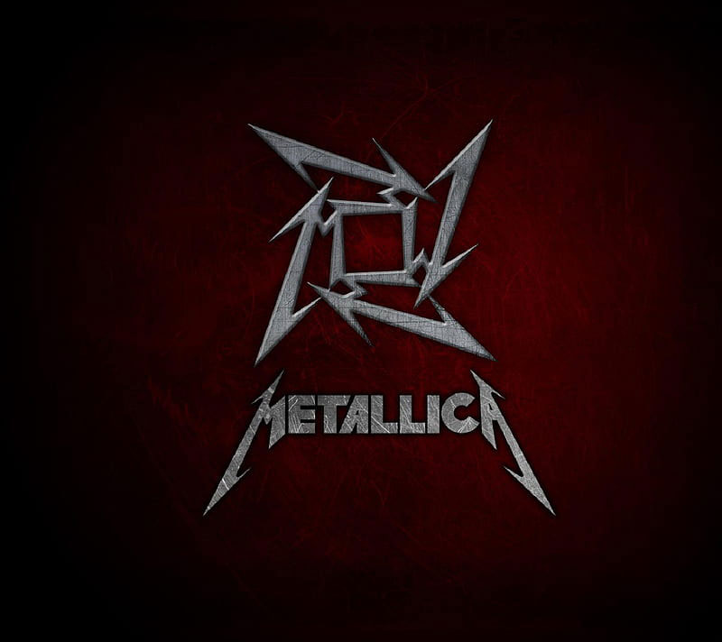
Even if you are not a Metallica fan, you have seen its mettle and impressive logo. Design experts evaluate it as one of the most memorable and easy-to-identify logos to ever be created. The reason, they claim, is that the logo is simple.
The story of how this logo came to be is just as simple as the logo itself. The person in charge of designing all logos of the band is its creator and main guitarist James Hetfield. He tried his luck several times during the 1980s, but the iconic print appeared only in 1996, on the ‘Death Magnetic’ album cover. It was also Hetfield who created Metallica’s scary guy and ninja star logos.
The meaning of the Metallica logo
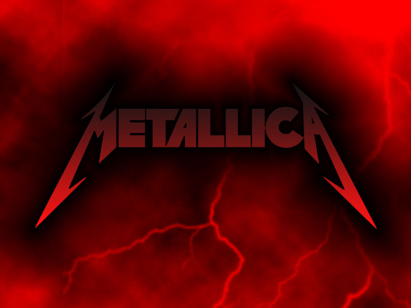
The iconic heavy metal band released even four logos so far, but the first version remained the most memorable. Therefore, they applied some modifications in 2008 and continued using it as their leading logotype. The original color palette was monochrome, but it changed occasionally to red and black. In that way, it depicted the energy and the style of the band.
On some occasions, the Metallica logo also featured blue electric flashlights. The intention here was to associate music with nature and to bring the band closer to its audience.
The shape of the Metallica logo
The 1980s Metallica logo, as famous as it is, consists only of the band’s name. And yet, we are talking about hand-drawn, elongated typeface where the first and the last letter make an impression. There is just no way we could forget their sharp, spiky angles and long lines.
Therefore, the Metallica logo is respected also outside the music industry and used for all sorts of branding, such as T-shirts or coffee mugs. It is simply everywhere!
The colors on the Metallica logo
Since they are a heavy metal band, Metallica opted for black and silver as the best colors for their logo. The shades, on the other hand, are maroon and they stand for the prevailing subtle tones of Metallica’s compositions.
The history of the Metallica logo

Metallica’s branding developed over the years as much as the band itself. Unfortunately, the artists took some disputed and controversial decisions over the decades. These moves also affected the brand’s consistency.
1983–1996
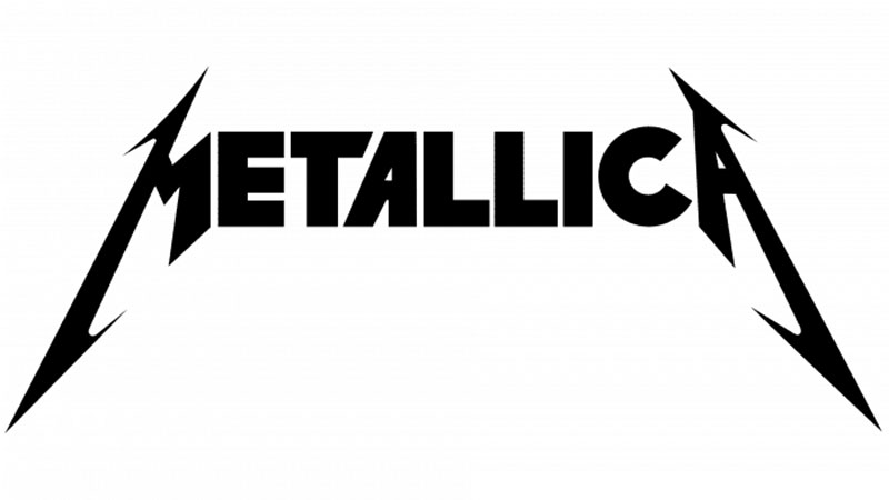
This Metallica logo was used by the Bend for almost a decade, all the way from Kill ‘Em All in 1983 to Metallica in 1991. James Hetfield also ensured that a 3D version of it is used on Master of Puppets, Ride the Lightning, and the Metallica album. The band changed its logo in 2008 and 2016 but is still using the original one as a secondary choice.
In the meantime, all nameplate letters were capitalized and their font changed to traditional Extra Bold sans serif. The only exception is the letter A where the left bar is inclined, and the letter T whose right part is cut diagonally. As a result, the entire logo is harmonized with the iconic flashlights on the first and last letter of the logo.
The Black Album – 1991
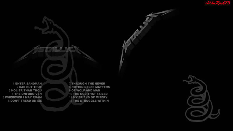
The cover of Metallica’s 1991 Black Album was, as expected, completely black. The logo on it, however, was less black and slightly visible, and it was located in the upper corner. It was at that point that the band changed both the color and the positioning of its most popular logo.
The Metallica logo between 1996 and 2003
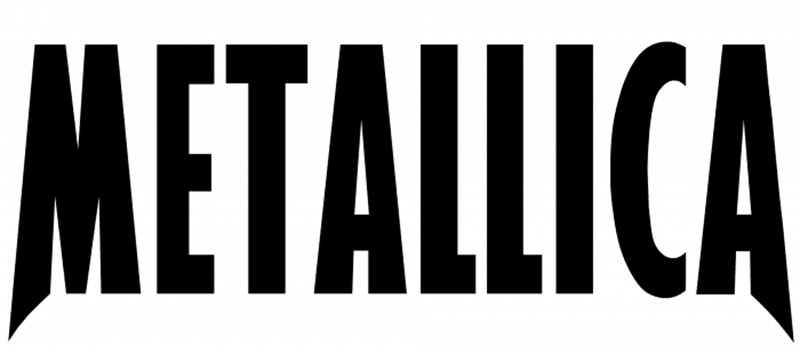
Another redesign of the logo followed in 1996. The band intended to create a more modern and minimalist logo. They removed the flashlights and simplified the inscription. At the same time, they switched to a more condensed sans-serif typeface.
This time, designers elongated the tails of the M and the A as they were in the original version, as those stand for the sharp and unique identity of the brand. They opted for a stylish design that represents their progressive music style. And still, the design didn’t contradict their roots and the traditions they preserve.
The Metallica logo between 2003 and 2008
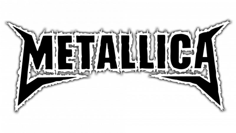
This logo, on the other hand, accompanied the band during the promotion of their St. Anger album. It was never their main logo – Metallica chose to leave it out of the album cover and only used it alongside their 2003 logo. The first time they gave it a priority was on their The Videos Release in 2006.
The St. Anger logo is not Metallica’s luckiest choice, as its details were not that elaborated. The name is bordered by an irregular line with shadows and the letters are distinctive on every image. The only thing that works, nevertheless, is the simplified framing.
The Metallica logo since 2008 onwards
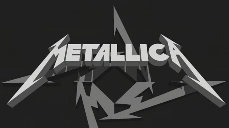
Today’s Metallica logo comes in capital letters only. The ‘M’ and the ‘A’ have elongated sides. The flashlight symbolism is still there, which means most Metallica fans can still identify this logo as soon as they see it.
Being this sharp and remarkable, the Metallica logo doesn’t only stand for this band, but all representatives of heavy metal and rock music. It is indisputably the most successful example of how visual identity can help anyone, anywhere.
The Death Magnetic symbol
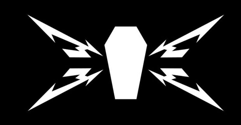
Another logo facelift accompanied Metallica’s album Death Magnetic. This time, the task was assigned to the famous San Francisco agency Turner Duckworth. This agency is also the signatory to other ultra-successful logos, such as the ones of Amazon and Coca-Cola. They didn’t change Metallica’s logo but rather created a very similar and stylish emblem based on it.
The fonts used on the Metallica logo
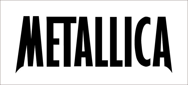
In its essence, the Metallica logo was created with classic sans serif fonts. These fonts were then tweaked and customized in unusual ways, especially when the letters ‘M’ and ‘A’ are concerned. What designers tried to there with the spikes and the lightning was to express the wild emotions Metallica’s songs inspire. The other letters are pretty much average, except for the two different T-s written in the Pastor of Muppets font.
This font is known nowadays as the Metallica font. You can’t use it on larger text passages, but you can still get it for your music logos. If you are a perfectionist, don’t expect too much from this font: there is still a lot to do there for this font to turn into a decent sans serif.
The New Metallica Logo
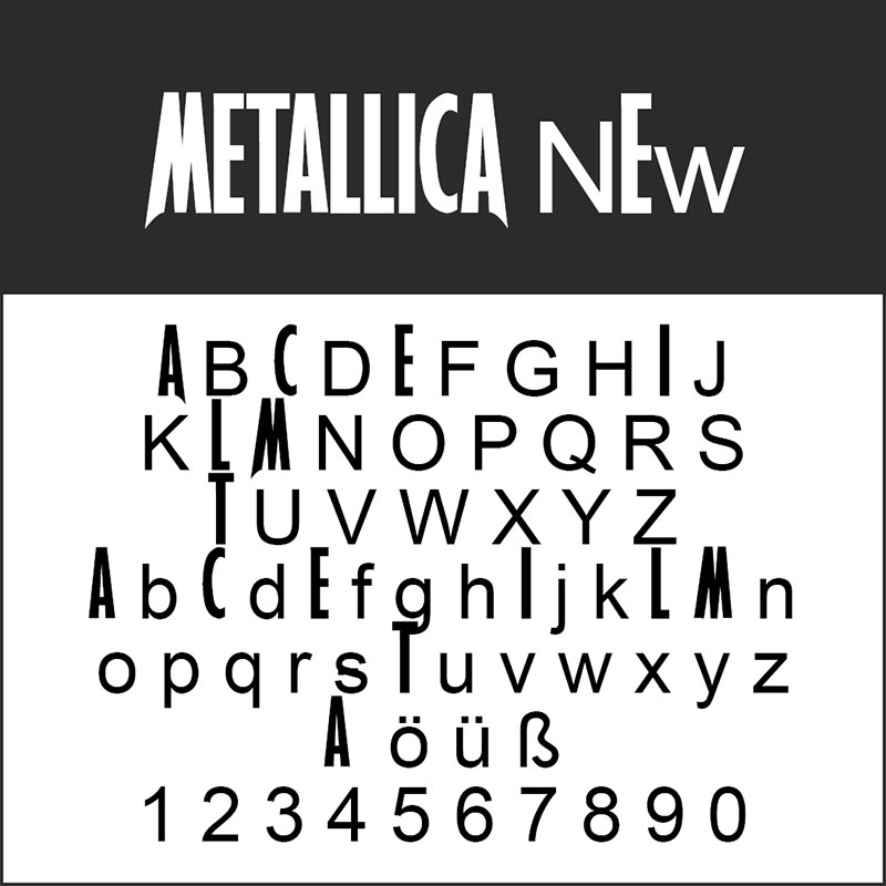
As expected, many designers worked on improving the Metallica logo typeface over the years. The most prominent result is Metallica New which pretty much works for nothing else than the Metallica logo. You can download it at the following link:
Despite a large number of prominent heavy metal bands in the world, Metallica still stands no competition. It has been the inspiration of millions of fans and prospective musicians worldwide.
Experts claim that Metallica’s logo played a great role in its success – it is simple, and yet recognizable everywhere in the world. It is also one of the few band logos that withstood the pressure of time and weren’t affected by the rebranding ideas the group had over the years.
FAQ On The Metallica Font
What font is used in the Metallica logo?
The Metallica font seen in their logo isn’t a standard typeface-it’s a custom design. The unique sharp edges and boldness capture the spirit of their heavy metal vibe. Known for its use in album art and concert posters, this iconic logo font style has a significant visual impact.
Can I download the Metallica font for free?
While there are several fan-made fonts inspired by the Metallica logo, the official typeface isn’t openly available.
However, a quick search for “Metallica font download” might lead you to some creative imitations. Always check the font licensing if you intend to use it commercially.
Where can I use the Metallica font?
The Metallica font fits perfectly in graphic design projects, especially those requiring bold and edgy aesthetics.
Think poster designs, album covers, and even music merchandise. Its unique design can also be used for personal projects that require a touch of rock and roll flair.
How do I install the Metallica font in Photoshop?
To use the Metallica font in Photoshop, first download a compatible version. Then, drag the font file into your system’s Fonts folder.
Photoshop usually picks it up automatically. Restart the application, and you’re ready to add some heavy metal typography to your designs!
Is the Metallica font copyrighted?
Yes, the original Metallica typeface used by the band is under copyright. Trademark laws protect it, especially in commercial uses.
If you plan to use similar fonts for anything beyond personal projects, ensure you understand the font licensing requirements to avoid legal issues.
Can I create my own version of the Metallica font?
Absolutely! Tools like Font Maker can help you design a typeface inspired by the Metallica lettering. Emulate the bold, sharp style, but ensure it’s unique to avoid copyright infringement. This could be an exciting project for anyone interested in DIY font creation.
What software is best for replicating the Metallica font?
For creating fonts akin to the Metallica font, software like Adobe Illustrator and Font Creator are reliable choices. These tools offer the flexibility needed to capture the intricate details of iconic rock fonts. SVG files are recommended for scalability and precision.
Are there other famous band fonts similar to Metallica’s?
Yes, numerous rock band fonts share the bold, dramatic flair of the Metallica font. Bands like AC/DC and Iron Maiden also use impactful typefaces in their branding. These famous logos are great references if you’re exploring music industry fonts for inspiration.
How can I use the Metallica font for commercial projects?
If you’re considering using the Metallica font for commercial purposes, always check the font licensing and possibly seek legal advice.
Many fan-made fonts allow personal but not commercial use. For official usage, obtaining permission is crucial to respecting trademark rights.
What does the Metallica font symbolize?
The Metallica font is more than just typography; it’s a symbol of rebellion, energy, and the raw power of heavy metal aesthetics.
It’s a staple in music branding and resonates deeply with the band’s identity and their fans worldwide. This font encapsulates an era of bold artistic expression.
Conclusion
Unleashing the power of the Metallica font can dramatically amplify your designs, injecting them with the raw energy and rebellious spirit synonymous with heavy metal. This iconic typeface is more than just letters; it’s a visual representation of Metallica’s groundbreaking impact on rock music and branding. From album covers to concert posters, the distinct typographic style of Metallica has carved its niche.
Incorporating this unique font into your projects can elevate your graphic design to new heights. Whether you’re dabbling in digital art, creating a poster design, or working on music merchandise, the Metallica font offers endless creative possibilities. However, remember to navigate the waters of font licensing and trademark considerations diligently.
By understanding its nuances and historical significance, you’re now equipped to harness the essence of this legendary typeface. Let your next design roar with the same intensity and authenticity that Metallica has brought to the world. Unleash your creativity and rock on!
If you enjoyed reading this article on Metallica font, you should check out this one about fonts similar to Avenir.
We also wrote about a few related subjects like what font does Medium use on its website, the Roblox font and what font does Roblox use, the best 72 free fonts for logos to create modern and creative designs, fonts similar to Futura, fonts similar to Impact, fonts similar to Calibri, fonts similar to Gotham, and fonts similar to Montserrat.

Renowned for his expertise in logo design and visual branding, Bogdan has developed a multitude of logos for various clients.
His skills extend to creating posters, vector illustrations, business cards, and brochures. Additionally, Bogdan's UI kits were featured on marketplaces like Visual Hierarchy and UI8.
He also wrote in the past years on sites like Design Your Way, WebDesignerDepot, WPDean, Designmodo, Speckyboy, Slider Revolution, and more.
- Minecraft Font Generator - 8 October 2026
- How photo recovery software works and when to use it - 7 October 2026
- Top Source Sans Pro Font Pairing for Clean UIs - 6 October 2026

Bogdan Sandu is a seasoned designer who has been designing websites since 2008. Renowned for his expertise in logo design and visual branding, Bogdan has developed a multitude of logos for various clients. His skills extend to creating posters, vector illustrations, business cards, and brochures. Additionally, Bogdan's UI kits were featured on marketplaces like Visual Hierarchy and UI8. He also wrote in the past years on sites like Design Your Way, WebDesignerDepot, WPDean, Designmodo, Speckyboy, Slider Revolution, and more.
You Might Also Like