


A mood board is the fastest way to turn a vague creative concept into something a client can actually react to.
Knowing how to make a mood board in Canva means you can build a polished, shareable visual concept board in under an hour, without any graphic design background.
Canva has 260 million monthly active users as of 2025 (DemandSage). Most of them are not professional designers. That accessibility is exactly why Canva has become the go-to tool for brand identity work, interior design boards, fashion mood boards, and client presentations.
This guide covers everything: canvas setup, image layout, color palette building, typography display, texture layers, alignment, export formats, and how Canva compares to tools like Milanote and Adobe Express.
What Is a Mood Board in Canva?

A mood board in Canva is a visual collection of images, colors, typography, and textures assembled on a Canva canvas to communicate a design direction or creative concept before any final decisions are locked in.
It is not a finished design. It is not a brand style guide. A mood board sits before both of those and answers one question: what should this project feel like?
Inside Canva, mood boards live as regular design projects. There is no separate “mood board mode.” You open a canvas, add your visual elements, and that canvas becomes your board.
The design collaboration software market was valued at $3.92 billion in 2024 and is expected to reach $11.72 billion by 2032 (SNS Insider). Teams are putting serious money into early-stage visual alignment tools, and mood boards sit at the center of that workflow.
What makes a Canva mood board different from a general design project?
Purpose is the difference. A general Canva design targets a specific output like a flyer, a social post, or a presentation. A mood board targets a feeling.
A mood board typically includes 4 types of elements working together:
- Reference images and photography that set the visual tone
- A color palette of 3 to 6 swatches representing the project’s color direction
- Font samples showing the typographic style
- Textures, patterns, or graphic elements that add tactile context
Who uses Canva mood boards?
Canva has 260 million monthly active users as of 2025 (DemandSage). Most are not professional designers. That accessibility is exactly why mood boards inside Canva have become common across industries beyond traditional graphic design.
Common use cases by field:
| Field | Mood Board Purpose | Typical Audience |
|---|---|---|
| Brand identity | Define visual and emotional direction before logo or guidelines | Founders, brand managers |
| Interior design | Show clients material, color, and furniture direction | Designers, homeowners |
| Fashion | Align on garment palette, texture, and styling concept | Stylists, designers |
| Content planning | Set a consistent aesthetic for social media or editorial work | Creators, marketers |
| Client presentations | Present design direction options for client approval | Agencies, freelancers |
—
What Are the Canva Features Used to Build a Mood Board?

Canva does not have a single dedicated mood board tool. Instead, mood boards are built by combining 5 core features inside the standard design editor.
Knowing these before you start saves time. A lot of first-timers spend 20 minutes hunting for things that were in plain sight.
The core feature set
Elements panel: the main source for photos, graphics, frames, grids, stickers, and shapes used to build the board’s visual layers.
Uploads tab: where external images, client photos, and brand assets are brought into the canvas. Canva accepts JPEG, PNG, SVG, and bitmap formats.
Color picker: pulls exact HEX values from any image on the canvas, used to build accurate color swatches. Displays values in RGB and HEX, with CMYK accessible via export settings for print projects.
Text tool: adds font samples directly to the canvas. Canva’s library includes 1,000+ fonts, covering serif, sans-serif, script, and display styles.
Frames and grids: structure how images sit on the canvas. Frames crop images into shapes. Grids organize multiple images into clean, even layouts without manual alignment.
Canva Free vs. Canva Pro Features for Mood Boards
85% of Fortune 500 companies use Canva (Cropink, 2025). Most of them are on paid plans. But for a basic mood board, the free plan covers a lot.
| Feature | Free Plan | Pro Plan |
|---|---|---|
| Templates | Limited selection | Full library access |
| Stock images | Pexels and Pixabay only | 100M+ premium images |
| Background remover | Not available | Included |
| Brand Kit | Not available | Saves colors, fonts, logos |
| Upload limit | 5GB storage | 1TB storage |
Well, the thing is, for a one-off client mood board, the free plan works fine. If you’re doing this regularly for multiple brands, Pro pays for itself quickly.
—
How Do You Set Up a Canva Mood Board Canvas?

Canvas setup takes 3 minutes if you know what you’re choosing. Most people skip past this step and then regret it when the board doesn’t export cleanly.
Canva generates an average of 38.5 million designs per day (Backlinko, 2024). A significant share of those start with the wrong canvas size for their intended output. Getting this right first avoids resizing everything later.
Choosing the right canvas dimensions
There is no single correct size for a mood board. The right size depends on where the board goes after it’s finished.
3 common dimension setups:
- 1920 x 1080 px for screen presentations or client calls where the board will fill a monitor
- 1080 x 1080 px for social sharing on Instagram or LinkedIn where a square crop is expected
- A3 (3508 x 4961 px at 300 DPI) for print output or inclusion in a printed brand document
For print purposes, DPI matters. A screen mood board at 72 DPI looks fine on a monitor and blurry in print. Set custom dimensions to 300 DPI if the board goes anywhere physical.
Template vs. blank canvas: which to use
Start with a template when you need a client-ready result quickly or when the board structure is more important than the creative exploration.
Start with a blank canvas when you have a strong visual concept already and templates will pull you toward someone else’s layout decisions.
To find mood board templates: open Canva, select “Create a design,” search “mood board” in the template search bar. Canva returns hundreds of options filtered by style and color. Pick one, then replace every element with your own content.
Naming and organizing the project
This sounds obvious. It is not obvious when you have 40 untitled designs in your Canva dashboard two weeks later.
Name the project immediately after creating it. Use a format like: ClientNameMoodBoardV1. If you’re on Canva Teams, move the file into the relevant team folder before adding any content. Finding it later takes zero effort that way.
—
How Do You Add and Arrange Images on a Canva Mood Board?

Images carry the most visual weight on any mood board. A board with weak image choices communicates the wrong direction no matter how good the color palette is.
Took me a while to figure out that image sourcing and image layout are two separate skills. Getting both right is what makes a board actually useful to a client.
How to Use Frames and Grids for Image Layout
Frames and grids are the fastest way to create a structured image layout without manual alignment.
Grids divide the canvas into equal cells. Drop images into each cell and they resize automatically to fit. Good for boards that need a clean, editorial feel.
Frames crop images into a specific shape: rectangle, circle, arch, or custom. The image stays inside the frame boundary regardless of how you resize it.
Practical layout approaches for mood boards:
- 2×3 or 3×3 grid for a structured, organized look
- Mixed frame sizes (1 large hero image + 4 smaller supporting images) for a more editorial feel
- Freeform placement with overlapping frames for a collage aesthetic
Alignment and balance across the image layout directly affect how readable the board feels at a glance. Canva’s built-in alignment guides snap elements into position as you drag them.
How to Upload External Images to Canva
The Uploads tab accepts files up to 25MB per image on the free plan. Pro users get higher limits.
Supported formats: JPEG, PNG, SVG, and GIF. For mood boards, JPEG and PNG are the practical choices. SVG works well for logo references or flat graphic elements where you need clean edges at any size, since vector graphics scale without quality loss.
Click “Uploads” in the left panel, then “Upload files.” Drag directly from your desktop or select from your file browser. Uploaded images stay in your Canva library and are reusable across any project.
Canva Pro’s background remover is worth using on product images or isolated objects. A chair photo from a manufacturer’s website comes with a studio background that clutters the board. Remove it and the element integrates cleanly with the rest of the layout.
—
How Do You Build a Color Palette on a Canva Mood Board?

Color is what clients and collaborators respond to first. Get the palette right and the rest of the board falls into place. Get it wrong and no amount of good imagery fixes the disconnect.
Understanding color theory helps here, but it is not required. Canva’s color picker does the technical extraction. Your job is selecting which colors actually represent the concept.
Building color swatches manually on the canvas
The simplest approach: add a rectangle shape for each color, fill it with the chosen color, and label it with the HEX code below.
A standard mood board palette includes:
- 3 to 5 primary swatches (the dominant colors in the concept)
- 1 to 2 accent colors (used sparingly in the final design)
Show HEX codes as text labels directly below each swatch. This makes the palette immediately actionable for any designer working from the board later. If the project involves Pantone matching for print or physical production, note the Pantone equivalent alongside the HEX value.
Using Canva’s color picker to extract palette colors from images
This is the fastest way to build a palette that actually feels cohesive with the imagery on the board.
Select any element on the canvas. Click its color swatch in the top toolbar. In the color panel that opens, the eyedropper icon lets you click anywhere on the canvas to sample that exact color. Canva returns the RGB value and HEX code instantly.
The practical workflow: place all your reference images first, then use the eyedropper to pull 4 to 6 colors directly from those images. The palette will naturally harmonize with the visuals because it came from them.
For projects where the palette needs to follow specific color relationships, analogous colors create calm, harmonious boards. Complementary color schemes work for high-contrast, energetic concepts. Monochrome colors suit minimal, sophisticated brand directions.
Using Canva Pro Brand Kit for color management
Brand Kit is the feature that makes Canva Pro worth paying for if you work with multiple clients or recurring projects.
It saves brand colors, fonts, and logos in one place. Once a mood board palette is approved, those colors get saved into the Brand Kit. Every subsequent Canva design for that client starts with the correct palette loaded and ready, no manual re-entry required.
Brand Kit is under “Brand Hub” in the left sidebar. Add colors by pasting the HEX code or using the color picker. Saved palettes appear as a clickable row at the top of the color panel in any design project.
—
How Do You Add Typography to a Canva Mood Board?

Typography on a mood board is not about writing text. It is about showing a font direction. The goal is to put a heading font and a body font on the canvas so that anyone reviewing the board can see immediately what the typographic voice of the project will be.
Displaying font pairings on the canvas
A typical typographic section on a mood board shows 2 elements:
- A heading font set at large size (60pt or higher) with the font name labeled below it
- A body font set at reading size (14-16pt) with a short sample sentence showing how it reads in paragraph form
Include the font name, weight (Regular, Bold, Light), and size as a text label under each sample. This turns the mood board into a working reference, not just an aesthetic exercise.
Font choice carries more meaning than most clients realize. A serif font on a mood board communicates tradition, authority, and editorial quality. A geometric sans-serif font reads as modern and minimal. Font psychology is doing real work here even when it looks purely decorative.
Using Canva’s font library for mood board typography
Canva’s free plan includes 1,000+ fonts. Pro adds several hundred more, including access to many popular Google Fonts and a handful of premium typefaces.
Finding the right font: open the Text tool, click the font name field at the top of the editor, and type a descriptive word. Search terms like “elegant,” “modern,” “handwritten,” or “bold condensed” actually return relevant results in Canva’s font browser.
For mood boards, pairing fonts effectively matters. A common and reliable pairing structure: one display font for headings and one neutral sans-serif for body. This creates contrast without conflict. The typographic hierarchy becomes immediately clear to anyone reviewing the board.
If you plan to use the font in the final design, confirm it is available under a license that fits your project. Font licensing becomes relevant the moment a design leaves Canva and goes into a printed or commercial product.
—
How Do You Add Textures, Patterns, and Graphics to a Canva Mood Board?

Textures and graphics are the layer most people skip. They are also the layer that makes a mood board feel genuinely considered rather than just a grid of reference photos.
Over 52% of visual collaboration platforms now integrate AI-powered content suggestions (Market Growth Reports, 2024). In Canva, this shows up in the Elements panel through smart search and AI-generated visual suggestions that pull contextually relevant textures based on your search terms.
Searching for textures in the Elements panel
Open the Elements panel on the left sidebar. In the search bar, type texture keywords that match the concept.
Keywords that return useful results in Canva’s Elements library:
- Linen, cotton, fabric for soft, tactile mood boards in fashion or interiors
- Marble, stone, concrete for architectural or luxury brand concepts
- Grain, noise, film grain for vintage or editorial aesthetics
- Watercolor, brush stroke for organic, artisanal, or wellness brand directions
Add textures at reduced opacity (20-40%) behind images or over color swatches. This creates depth without overwhelming the other elements on the board. The contrast between a flat color and a textured surface does a lot of visual work.
Using illustrated graphics and icons
Graphics work as context signals. A line illustration of a leaf on a wellness brand mood board communicates “organic” faster than any headline text could.
Canva’s Elements library includes flat icons, line drawings, illustrated shapes, and abstract graphic elements. Search the category name plus “illustration” or “minimal” to narrow results toward mood board-appropriate styles.
Avoid using too many different graphic styles on the same board. Mixing a hand-drawn icon with a geometric flat icon with a photographic element creates visual noise. Pick one graphic style and stay consistent. Unity across the board is what makes the concept feel intentional rather than assembled.
Canva’s Content Credentials feature (available in Pro) tags AI-generated elements with origin data. If you’re presenting the board to a client who asks about image provenance, this feature provides a clear record of which elements came from AI generation vs. stock photography vs. original uploads.
How Do You Organize and Align Elements on a Canva Mood Board?

Layout organization is where most self-built mood boards fall apart. The images are good, the colors work, but the board looks chaotic because nothing is properly positioned relative to anything else.
Gestalt principles explain why this matters: elements that are spatially close and visually aligned read as intentional groups. Elements scattered randomly read as noise. Canva’s layout tools apply these principles without requiring you to know the theory behind them.
Using Canva’s alignment and spacing tools
Tidy Up is the fastest tool in Canva’s layout arsenal. Select multiple elements, click Position in the top toolbar, then click Tidy Up. Canva distributes them with equal horizontal and vertical spacing in a single click.
The Position panel also contains:
- Align left, center, right (relative to the canvas or to other selected elements)
- Align top, middle, bottom
- Space evenly horizontally or vertically as separate controls
For pixel-precise placement, enable rulers and guide lines via File > View settings > Show rulers and guides. Drag guides from the ruler edges to define margins and columns. Elements snap to these guides as you drag them.
Grouping and locking elements
A mood board typically has repeating units: image + color swatch + font label. Group each unit once it’s positioned correctly.
Select the elements in a unit, then press Ctrl+G (Windows) or Command+G (Mac). The group moves, resizes, and repositions as a single object. This prevents color swatches from drifting away from their reference images as you rearrange the board.
Lock background elements once they’re placed. Right-click any element and select Lock. A locked element cannot be accidentally moved or selected. This is worth doing early, especially if you’re working on a complex board with 20+ elements.
Layer order and visual hierarchy
Visual hierarchy on a mood board is set by layer order, size contrast, and proximity. The most important visual reference should be the largest element and sit on top of all other layers.
To adjust layer order: right-click any element and choose Forward, Backward, To Front, or To Back.
Canva does not have a visible layers panel (unlike Photoshop or Figma). Layer management works entirely through right-click controls and the Position toolbar. This is a real limitation for complex boards with many overlapping elements. Work around it by grouping related elements early so each group behaves as a single layer unit.
—
How Do You Share or Export a Canva Mood Board?
The board is finished. Now it has to reach the client, the team, or the printer without losing quality or context.
Canva users create an average of 38.5 million designs per day (Backlinko, 2024). A significant portion of those are shared directly via Canva link rather than downloaded, because the link preserves interactive access and requires no file transfer.
Export format options
The right format depends entirely on where the board goes next.
| Format | Best For | Quality Note |
|---|---|---|
| PNG | Digital sharing, screen viewing | Lossless, best clarity for screen |
| JPG | Email attachments, social media | Compressed, smaller file size |
| PDF Standard | Client review, email delivery | Multi-page, good for presentations |
| PDF Print | Physical print output | High resolution, CMYK-ready |
For print output, use PDF Print and confirm the canvas was set at 300 DPI at setup. A PDF exported from a 72 DPI canvas will print poorly regardless of the format chosen.
Sharing via Canva link
Click Share in the top right corner. Canva generates a link with 2 permission levels:
- View only: the recipient sees the board but cannot edit it. Use this for client review.
- Can edit: the recipient can modify the canvas directly. Use this for internal team collaboration.
The link works in any browser, no Canva account required for view-only access. This is the fastest way to share a mood board with a client who has never opened Canva in their life.
Presenting directly in Canva
Present mode turns any Canva design into a full-screen presentation. Click the arrow next to Share and select Present.
This works well for live client sessions or internal design reviews where the board needs to fill a screen without switching to a separate presentation tool. The board stays editable between sessions, so real-time feedback can be incorporated immediately after the call ends.
Canva Teams users can share directly to a team workspace folder, where all members retain persistent access without managing individual share links. This is how agencies like Huge and design-forward teams at companies using Canva for Teams maintain organized design archives across multiple client projects.
—
What Are the Best Canva Mood Board Templates?
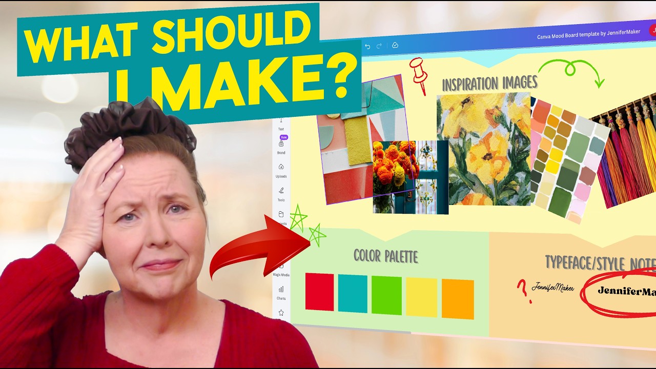
Canva’s template library returns hundreds of results when you search “mood board.” Most are usable. The ones worth picking are the ones built around a clear structure: a defined area for images, a color palette section, and a typography block.
Templates save time on layout decisions. They do not save time on content. Every placeholder image, color swatch, and font sample still needs to be replaced with your actual project content.
Brand mood board templates
Brand templates are the most structurally complete in Canva’s library. A well-built brand mood board template includes placeholder areas for:
- Logo or wordmark reference
- Primary and secondary color swatches with HEX labels
- Font pairing samples (heading + body)
- 3 to 5 brand reference images
Search “brand mood board” in Canva’s template library. The Neutral Minimalist and Clean Brand Identity templates appear consistently in the top results and follow this structure reliably.
Interior design mood board templates
Interior design boards typically need more image space and fewer font samples. The structure shifts toward material swatches, room references, and product shots rather than typography.
Common layout pattern: 1 large hero room image, 4 to 6 product or material reference images, 1 color palette row, and a brief text block for the concept name or design rationale.
Search “interior design mood board” or “home decor mood board” in Canva. The Cream and Black Interior Design Moodboard template is frequently used by interior designers for client presentations because it presents a clean grid with enough image space to show material context clearly.
Fashion and wedding mood board templates
Fashion boards lean heavily on imagery, texture overlaps, and editorial-style layouts. Wedding boards prioritize softness: pastel palettes, script fonts, and florals alongside venue and styling references.
Search “fashion editorial mood board” for editorial-style layouts. For weddings, “wedding inspiration board” returns templates with built-in areas for floral palettes, dress references, and venue imagery. These templates are structured for non-designers and require minimal customization beyond image replacement and color adjustment.
—
How Does a Canva Mood Board Compare to Other Mood Board Tools?

Canva has 260 million monthly active users (DemandSage, 2025). That number reflects how dominant it is as a general design tool, not necessarily as a purpose-built mood board platform. The distinction matters when you’re choosing a tool for a specific workflow.
Canva vs. Milanote
These two tools solve different problems. Milanote is built for open-ended, research-heavy creative organization. Canva is built for producing polished, shareable design output.
| Factor | Canva | Milanote |
|---|---|---|
| Canvas type | Fixed-size canvas | Infinite free-form canvas |
| Template library | Hundreds of mood board templates | Limited templates |
| Web clipping | Not available natively | Built-in web clipper |
| Export quality | High-res PDF, PNG, JPG | PDF export, lower resolution |
| Best for | Polished client-ready output | Research and creative exploration |
The practical workflow many agencies use: Milanote for inspiration gathering and internal brainstorming, Canva for assembling and presenting the final board to clients.
Canva vs. Adobe Express
Adobe Express sits closer to Canva in terms of output focus, but with stronger PDF handling and access to Pantone color libraries through Adobe’s ecosystem.
Canva advantage: larger free template library, easier onboarding, wider user base, more beginner-friendly interface.
Adobe Express advantage: better Creative Cloud integration, 18,000+ licensed Adobe Fonts, stronger PDF import and editing when mood boards become part of a larger brand document package.
For teams already inside Adobe’s ecosystem (InDesign, Illustrator, Photoshop), Express integrates without friction. For everyone else, Canva’s template depth and accessibility wins.
Canva vs. Pinterest
Pinterest is not a mood board tool. It is a visual discovery engine. The confusion is common and costs time.
Pinterest collects and organizes inspiration images. It has no layout tools, no color picker, no typography controls, and no export options for a structured board. What it has is a discovery algorithm with access to billions of images, which makes it an excellent starting point for building a Canva mood board.
The workflow that actually works: use Pinterest to find and save reference images, then bring those images into Canva via the Uploads tab to build the structured board. These are complementary tools, not competing ones. Storytelling through a mood board requires layout control that Pinterest simply does not provide.
When Canva is the right choice for mood boards
Canva fits best when the mood board is the deliverable, not just a thinking tool. Specifically:
- Client presentations where the board needs to look polished and professional
- Brand guidelines development where the mood board feeds directly into a brand kit
- Social-shareable mood boards (Instagram, Pinterest, LinkedIn) where export format and dimensions matter
- Non-designers who need templates to get started quickly without learning layout from scratch
Canva is not the right choice when the creative process is still open and exploratory, or when the board needs to function as a living research document that multiple team members annotate with notes and linked references. For those scenarios, Milanote or Miro serve better.
FAQ on How To Make A Mood Board In Canva
Can you make a mood board in Canva for free?
Yes. Canva’s free plan includes blank canvases, a limited template library, Pexels and Pixabay stock images, and basic design tools. You can build a complete digital mood board without paying anything. Background remover and Brand Kit require a Pro subscription.
What size should a Canva mood board be?
It depends on the output. Use 1920×1080 px for screen presentations, 1080×1080 px for social sharing, and A3 at 300 DPI for print. Set dimensions before adding content to avoid resizing everything later.
How do you add a color palette to a Canva mood board?
Add rectangle shapes, fill each with your chosen color, and label them with HEX codes below. Use Canva’s color picker eyedropper to sample exact colors directly from images already on the canvas. Aim for 3 to 5 primary swatches.
How do you add your own images to a Canva mood board?
Open the Uploads tab in the left sidebar and drag files from your desktop or click “Upload files.” Canva accepts JPEG, PNG, SVG, and GIF formats. Uploaded images stay in your library and are reusable across all projects.
What is the difference between a mood board and a vision board in Canva?
A mood board communicates a design direction for a project, covering color, typography, and visual tone. A vision board is personal, focused on goals and aspirations. Both use the same Canva tools, but the intent and audience are different.
How do you share a Canva mood board with a client?
Click Share in the top right corner and generate a view-only link. The client opens it in any browser with no Canva account needed. For live review sessions, use Present mode to display the board full-screen directly inside Canva.
What Canva features are only available on Pro for mood boards?
Three features make a noticeable difference: background remover for cleaning up product or object images, Brand Kit for saving and reusing color palettes and fonts across projects, and access to 100 million+ premium stock photos.
How do you add typography to a Canva mood board?
Use the Text tool to place font samples directly on the canvas. Show a heading font at large size and a body font at reading size, with the font name and weight labeled below each. This turns the board into a working typographic reference.
How do you organize elements on a Canva mood board?
Select multiple elements and click Position, then Tidy Up to distribute spacing evenly in one click. Group related elements like image, color swatch, and font label together with Ctrl+G. Lock background layers to prevent accidental movement.
What is the best Canva mood board template for branding?
Look for templates that include dedicated areas for a color palette, font pairing samples, and brand reference images. Search “brand mood board” in Canva’s template library. The Neutral Minimalist and Clean Brand Identity templates follow this structure reliably.
Conclusion
This conclusion is for an article presenting how to make a mood board in Canva, from setting up your canvas dimensions to exporting a client-ready design.
The process is more structured than most people expect. Canvas size, image layout, color swatch placement, font pairing, texture layers, and alignment all work together to produce a board that communicates a clear visual direction.
Canva handles the full workflow without requiring professional design skills.
Whether you are building a brand identity board, an interior design concept, or a fashion mood board, the same core steps apply. Get the structure right, and the creative content fills in naturally.
Start with a blank canvas or a template. Replace every placeholder with your actual project content. Share the link.

Renowned for his expertise in logo design and visual branding, Bogdan has developed a multitude of logos for various clients.
His skills extend to creating posters, vector illustrations, business cards, and brochures. Additionally, Bogdan's UI kits were featured on marketplaces like Visual Hierarchy and UI8.
He also wrote in the past years on sites like Design Your Way, WebDesignerDepot, WPDean, Designmodo, Speckyboy, Slider Revolution, and more.
- The Cursor Logo History, Colors, Font, And Meaning - 24 September 2026
- Top 7 Web Design Subscription Services That Replace Full-Time Hires - 24 September 2026
- Canva vs PowerPoint: Which Is Better for Presentations? - 22 September 2026

Bogdan Sandu is a seasoned designer who has been designing websites since 2008. Renowned for his expertise in logo design and visual branding, Bogdan has developed a multitude of logos for various clients. His skills extend to creating posters, vector illustrations, business cards, and brochures. Additionally, Bogdan's UI kits were featured on marketplaces like Visual Hierarchy and UI8. He also wrote in the past years on sites like Design Your Way, WebDesignerDepot, WPDean, Designmodo, Speckyboy, Slider Revolution, and more.
You Might Also Like


