Most apps get deleted within 72 hours of installation because users can’t figure out how to use them.
Mobile app design determines whether users stick around or abandon your product immediately. The interface, navigation, and visual hierarchy either guide users to their goals or leave them confused.
This guide covers how to design a mobile app from initial wireframes to final prototypes. You’ll learn platform-specific requirements for iOS and Android, essential design tools like Figma and Sketch, and proven patterns that improve usability.
By the end, you’ll understand the complete design process: creating wireframes, building interactive prototypes, testing with real users, and optimizing for different screen sizes.
What is Mobile App Design?
Mobile app design is the process of creating the visual interface, user experience, and interaction patterns for applications on mobile devices.
The design covers everything from screen layouts to touch gestures, navigation systems to visual hierarchy.
iOS and Android platforms each have distinct requirements. Apple’s Human Interface Guidelines and Google’s Material Design define how apps should look and behave.
Good mobile app design balances aesthetics with functionality. Users expect intuitive interfaces that respond instantly to touch inputs.
Core Elements of Mobile App Design
| Design Element | Primary Function | User Impact | Implementation Focus |
|---|---|---|---|
| Navigation Architecture | Provides intuitive pathways for users to access app features and content sections efficiently | Reduces cognitive load and enables task completion with minimal interaction steps | Tab bars, hamburger menus, bottom navigation with clear hierarchy |
| Visual Hierarchy | Organizes interface elements to guide user attention toward priority actions and information | Improves content scanability and directs users to primary conversion points | Typography scale, color contrast, spacing, size differentiation |
| Touch Target Optimization | Ensures interactive elements meet minimum size requirements for accurate finger-based input | Decreases interaction errors and increases user confidence during app usage | 44×44 pixel minimum (iOS) or 48×48 density-independent pixels (Android) |
| Responsive Layout System | Adapts interface components across different screen sizes and device orientations dynamically | Maintains consistent user experience across smartphones, tablets, and foldable devices | Flexible grids, constraint-based layouts, breakpoint definitions |
| Feedback Mechanisms | Communicates system status and confirms user actions through visual, haptic, or auditory signals | Builds user trust by providing immediate confirmation of completed actions | Loading indicators, success animations, error messages, haptic vibrations |
| Performance Optimization | Minimizes load times and ensures smooth interactions through efficient resource management | Prevents user frustration and app abandonment caused by slow response times | Image compression, lazy loading, caching strategies, 60fps animations |
| Accessibility Standards | Implements inclusive design patterns that accommodate users with visual, motor, or cognitive disabilities | Expands user base and ensures legal compliance with accessibility regulations | Screen reader support, color contrast ratios, adjustable font sizes, voice control |
Mobile app design breaks down into specific components. Each element serves a function in the overall user experience.
User Interface Components
Buttons, input fields, cards, and navigation bars form the building blocks.
These components follow platform-specific standards. iOS uses different button styles than Android.
Interaction Design
Interaction design defines how users navigate through the app.
Touch targets need minimum sizes (44×44 points on iOS, 48x48dp on Android). Gestures like swipe, pinch, and long-press trigger specific actions.
Visual Hierarchy
Visual hierarchy guides users through content by controlling emphasis.
Size, contrast, and spacing determine what users see first.
Primary actions get prominent placement. Secondary options recede into the background.
Navigation Patterns
Apps use tab bars, navigation bars, or drawer menus.
Bottom navigation works best for 3-5 primary sections. Hamburger menus hide less-used features.
What Makes a Mobile App Design Successful

A successful design lets users complete tasks without confusion.
Usability comes first. If users can’t figure out basic functions within seconds, the design fails.
Usability Principles
Clear labeling eliminates guesswork. Icons need accompanying text labels when meaning isn’t obvious.
Consistent patterns reduce cognitive load. The back button should always work the same way.
Visual Consistency
Every screen should feel like part of the same app.
Use the same color palette, typography, and spacing throughout. Instagram’s interface maintains strict visual consistency across hundreds of screens.
Performance Considerations
Animations should complete in 300-400ms. Anything slower feels sluggish.
Images need optimization. A JPEG photo at 80% quality looks identical to 100% but loads faster.
Lazy loading defers off-screen content. Users see the interface instantly while the app loads remaining assets.
User Feedback Integration
Test with actual users before launch.
Watch where they tap, where they get stuck, where they give up. These pain points reveal design flaws that seemed fine on paper.
What Tools Do Mobile App Designers Use
Figma dominates collaborative design work. Teams can edit files simultaneously and maintain design systems.
Sketch remains popular for Mac users doing solo work. The plugin ecosystem extends functionality.
Principle creates high-fidelity animations. Designers prototype micro-interactions that show exactly how elements should move.
Each tool has specific strengths:
- Figma excels at team collaboration and design systems
- Sketch offers speed and a mature plugin library
- Adobe XD provides seamless Creative Cloud integration
- Principle specializes in animation prototyping
The choice depends on team size, budget, and workflow preferences.
How Do You Create a Mobile App Wireframe
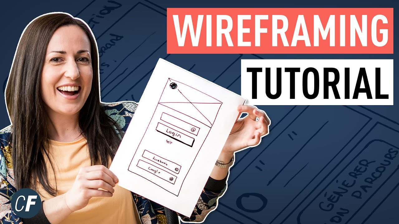
Wireframes map out structure before visual design starts.
Before you sketch a single screen, draft the user flow – the path someone takes from opening the app to completing their goal.
Define User Flows
Map each step a user takes.
Login flows need email verification screens. Checkout flows require payment input screens. Chart every screen transition.
Sketch Layout Structures
Draw rectangles for content areas.
Navigation sits at the bottom or top. Main content fills the middle. Actions appear as buttons in logical positions.
Create Low-Fidelity Wireframes

Use gray boxes and placeholder text.
Balsamiq produces rough sketches quickly. The deliberately unfinished look prevents stakeholders from critiquing colors instead of structure.
Low-fidelity wireframes test information architecture without the distraction of visual design.
Test Information Architecture
Show wireframes to potential users.
Can they predict what happens when they tap elements? Do they understand the navigation structure? Confusion at this stage is cheap to fix.
Refine Based on User Testing
Adjust layouts based on feedback.
Move frequently-used features higher on the screen. Combine screens that felt redundant. Split screens that tried to do too much.
How Do You Design for iOS Platforms

iOS follows Apple’s Human Interface Guidelines strictly.
The San Francisco font is standard across the system. Touch targets require 44×44 points minimum.
Navigation bars sit at the top with large titles. Tab bars anchor the bottom with 3-5 items maximum.
Typography Standards
San Francisco comes in two variants: SF Pro for iOS and SF Compact for watchOS.
Dynamic Type adjusts text size based on user preferences. Design for the full range from extra small to accessibility sizes.
Leading and tracking values are built into the system fonts.
Icon Requirements
SF Symbols provides over 4,000 icons that match San Francisco’s weight and size.
Custom icons need multiple weights (ultralight through black). Export at @1x, @2x, and @3x resolutions.
App icons measure 1024×1024 pixels with no transparency. iOS applies corner radius automatically.
Navigation Patterns
Large titles collapse when scrolling. This saves screen space while maintaining context.
Modal sheets slide up from the bottom. Side-by-side navigation splits iPad screens into master-detail views.
Component Behavior
Buttons use subtle gradients and shadows. Toggle switches have the familiar green/gray appearance.
List rows show chevrons for navigation, checkmarks for selection. Swipe actions reveal delete and edit options.
How Do You Design for Android Platforms

Material Design defines Android’s visual language through elevation, motion, and bold color.
Components cast shadows based on their elevation. Higher elements appear above lower ones in the z-axis.
Elevation System
Surfaces exist at different heights measured in density-independent pixels (dp).
App bars sit at 4dp. Floating action buttons elevate to 6dp. Dialogs and pickers float at 24dp.
Shadows grow softer and larger as elevation increases.
Motion Patterns
Standard easing curves create natural movement. Duration scales with distance traveled.
Small components animate in 100ms. Large transitions take 300-375ms.
Component Standards
Floating action buttons trigger primary actions. They float above content at the bottom-right corner.
Bottom sheets slide up to reveal options. Snackbars provide brief feedback without interrupting workflow.
Cards group related information with 8dp corner radius.
Responsive Layouts
Material uses 4dp grid systems for spacing. Components snap to these increments.
Breakpoints trigger layout changes: 600dp for tablets, 840dp for large tablets. Content reflows into multi-column layouts on bigger screens.
What is User Interface Prototyping

User interface prototyping creates interactive models before development starts.
Prototypes test workflows, gather feedback, and communicate design intent to developers.
Low-Fidelity Prototypes
Grayscale wireframes with basic interactions. Screens link together with simple taps.
Fast to build, disposable when wrong. Perfect for testing information architecture.
High-Fidelity Prototypes
Full color theory application, real content, actual typefaces.
Animations show transitions between states. InVision and Marvel turn static designs into clickable prototypes.
Interactive Prototypes
Working code prototypes using React Native or Flutter. Users test on actual devices.
Performance feels real. Gestures work exactly as they will in production.
Clickable Prototypes
Hotspots trigger screen transitions. Forms accept input but don’t process data.
Stakeholders click through user flows. Developers see expected behavior before writing production code.
How Do You Test Mobile App Designs
Testing reveals problems users experience but can’t articulate.
Observe behavior, not opinions. What people say they want differs from what they actually use.
Usability Testing
Five users find 85% of usability problems.
Watch users complete specific tasks: create an account, make a purchase, find saved items. Note where they hesitate, tap wrong elements, or abandon the flow.
Record completion rates and time spent per task.
A/B Testing
Split traffic between two design versions.
Version A uses a bottom sheet for filters. Version B uses a full-screen modal. Measure conversion rates, engagement time, and feature adoption.
Statistical significance requires adequate sample sizes. Run tests for at least one full week to account for daily patterns.
Accessibility Testing
Color contrast ratios must meet WCAG 2.1 standards (4.5:1 for normal text).
Test with VoiceOver on iOS and TalkBack on Android. Screen readers should announce every interactive element clearly.
Touch targets hit 44×44 points minimum. Larger is better for users with motor impairments.
What Are Mobile App Design Patterns
Design patterns solve common problems with proven solutions.
Users recognize familiar patterns instantly, reducing learning curves.
Bottom Navigation
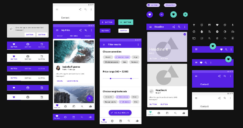
Three to five items anchor the screen bottom. Active sections show filled icons; inactive ones show outlines.
Instagram, Twitter, and Spotify use bottom navigation. Works best when sections have equal importance.
Hamburger Menu
Three horizontal lines reveal a slide-out drawer.
Usage declined after studies showed hidden navigation reduces engagement. Reserve for secondary features, not primary navigation.
Card Layouts
Content groups into rectangular containers with images, text, and actions.
Pinterest and Medium pioneered card-based feeds. Cards work well for mixed content types in a single stream.
Swipe Gestures
Tinder popularized swipe-right-to-like, swipe-left-to-reject.
Gmail uses swipe for archive and delete. Gestures save screen space but need visual hints for discoverability.
How Do You Design App Icons

App icons are the first brand touchpoint users see.
Simple shapes work better than complex illustrations at small sizes. Test visibility at 60×60 pixels or smaller.
iOS Icon Requirements
Submit 1024×1024 pixels in PNG format. No transparency allowed.
iOS adds rounded corners, shadow, and border automatically. Design for a square canvas even though final icons appear rounded.
Icons need versions for home screen, Spotlight search, and Settings.
Android Icon Requirements
Adaptive icons separate into foreground and background layers.
Devices apply different masks: circles, squircles, rounded squares. Keep important elements within the safe zone (72dp diameter).
Background layer extends beyond the mask for parallax effects.
Color and Contrast
High contrast improves visibility against varied backgrounds.
Avoid using too many colors. Dropbox uses one color. Slack uses four but maintains clear focal points.
Shape Psychology
Rounded shapes feel friendly and approachable. Angular shapes convey precision and professionalism.
Psychology of shapes affects brand perception before users read a single word.
What is Responsive Mobile Design

Responsive mobile design adapts interfaces to different screen sizes and orientations.
iPhones range from 4.7 to 6.7 inches. Android screens span 4 to 7+ inches with varying aspect ratios.
Screen Densities
iOS uses @1x, @2x, @3x asset scales.
Android categorizes devices: ldpi, mdpi, hdpi, xhdpi, xxhdpi, xxxhdpi. Export vector graphics or multiple bitmap resolutions.
High-DPI screens display more pixels per inch for sharper visuals.
Breakpoints for Tablets
Single-column layouts work on phones. Tablets support two or three columns.
iPad apps use split views for master-detail navigation. Android tablets follow similar patterns at 600dp width.
Landscape Layouts
Landscape mode offers more horizontal space but less vertical room.
Navigation moves to the side. Content spreads across multiple columns. Videos and images gain prominence.
Safe Areas
iPhone notches and Android punch-hole cameras cut into screen space.
Design within safe areas (iOS provides UILayoutGuide). Critical buttons sit above bottom gesture indicators.
How Do You Create a Mobile App Style Guide
Style guides maintain consistency across screens and team members.
Document every design decision: colors, typography, spacing, components.
Color Palette
Define primary, secondary, and accent colors with hex codes.
Airbnb uses Rausch (FF5A5F) as their primary brand color. Spotify uses Spotify Green (1DB954).
Include saturation and hue variations for hover states, disabled states, and backgrounds.
Typography Scale
List font sizes, weights, and line heights for every text style.
H1: 32pt, bold, 38pt line height. Body: 16pt, regular, 24pt line height. Caption: 12pt, regular, 16pt line height.
Sans-serif fonts dominate mobile interfaces for readability.
Spacing System
Use 4pt or 8pt grid systems for consistent spacing.
Components maintain 8pt padding internally. Screens use 16pt margins. Related elements sit 4pt apart; unrelated elements need 16pt separation.
Component Library
Document button styles, input fields, cards, and navigation bars.
Include states: default, hover, active, disabled, error. Figma component libraries sync across files automatically.
Animation Guidelines
Define standard durations and easing curves.
Micro-interactions complete in 100-200ms. Screen transitions take 300-400ms. Long operations show progress indicators after 400ms.
What Are Mobile App Accessibility Requirements

WCAG 2.1 Level AA compliance is the baseline standard.
Accessible apps reach more users and perform better in app store rankings.
Text Contrast Requirements
Normal text (under 18pt) needs 4.5:1 contrast ratio against backgrounds.
Large text (18pt+) requires 3:1 minimum. Use online contrast checkers to verify ratios.
RGB values determine contrast calculations. Insufficient contrast fails accessibility audits.
Touch Target Sizing
44×44 points (iOS) or 48x48dp (Android) minimum for all interactive elements.
Larger targets reduce errors. Financial apps often use 56dp targets for critical actions like “Transfer Money.”
Screen Reader Support
Every interactive element needs descriptive labels.
“Submit” button gets labeled “Submit registration form.” Decorative images get empty alt text so screen readers skip them.
VoiceOver and TalkBack read content in logical order from top to bottom.
Alternative Text
Images conveying information need descriptive alt text.
Chart images describe the data: “Bar graph showing 23% revenue increase in Q2.” Decorative images use null alt attributes.
Keyboard Navigation
External keyboards navigate through all interactive elements with Tab key.
Current focal point shows visible focus indicator. Enter key activates buttons; Space toggles checkboxes.
How Do You Design Mobile App Onboarding
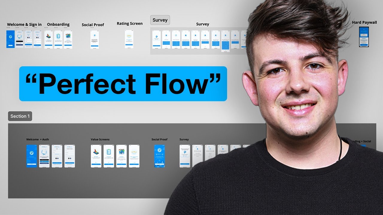
Onboarding app design introduces core features without overwhelming new users.
Long onboarding sequences see 80%+ skip rates. Show value immediately.
Core Features
Focus on 3-5 key features maximum.
Duolingo explains personalized lessons, streak tracking, and gamification in three screens. Users start lessons within 30 seconds.
Skip Option
Allow skipping onboarding entirely.
Returning users or those familiar with similar apps resent forced tutorials. Power users explore features independently.
Progressive Disclosure
Reveal features when users need them, not during initial onboarding.
Slack introduces advanced features after basic messaging works. Contextual tooltips appear when users hover over new buttons.
Contextual Help
Inline hints appear next to relevant features.
First-time composers see “Tap here to add photos” with an arrow. After one use, the hint disappears permanently.
What is the Mobile-First Design Approach
Mobile-first design starts with smartphone constraints before expanding to tablets and desktops.
Designing for small screens forces ruthless prioritization. Everything non-essential gets cut.
Forced Prioritization
Limited screen space reveals what truly matters.
Desktop sites list 20 navigation items. Mobile apps show 5. The exercise clarifies core user needs.
Performance Optimization
Mobile-first design assumes slower networks and less powerful processors.
Images load lazily. Code bundles split into smaller chunks. JPEG compression increases without visible quality loss.
Better Mobile Experience
Apps designed mobile-first feel native and responsive.
Desktop-first designs shrink poorly. Tiny tap targets frustrate users. Mobile-first scales up gracefully.
Easier Scaling
Adding features for larger screens is simpler than removing them for smaller ones.
Tablet layouts add second columns. Desktop views show three columns. Core mobile layout remains intact.
How Mobile App Design Relates to User Experience Design
Mobile app design creates the visual interface. User experience design encompasses the entire journey from discovery to retention.
UX includes research, information architecture, and post-launch optimization. Visual design is one component.
Overlapping Responsibilities
Both disciplines handle interaction design and usability testing.
UX designers create user flows. UI designers transform flows into specific screens with buttons, typography, and color palettes.
Research Foundation
UX designers conduct user interviews and analyze behavioral data.
Findings inform design decisions. If users abandon checkout at payment, designers simplify form fields and add trust signals.
Holistic Perspective
UX considers onboarding emails, push notifications, customer support, and app store presentation.
UI focuses on in-app screens and interactions. Together they create cohesive product experiences.
How Mobile App Design Differs from Web Design
| Aspect | Mobile App Design | Web Design | Key Consideration |
|---|---|---|---|
| Screen Real Estate | Mobile apps operate within 375px to 428px width on average. Designers prioritize single-column layouts with vertical scrolling patterns to maximize limited screen space. | Web designs adapt across 320px to 2560px+ widths. Designers implement multi-column layouts with horizontal navigation to leverage expansive desktop displays. | Mobile apps require content prioritization due to 89% smaller viewport compared to desktop displays. |
| Navigation Patterns | Apps use bottom tab bars, hamburger menus, and gesture-based navigation (swipe, pinch, long-press). Navigation elements occupy 44px to 56px tap target areas per iOS and Android guidelines. | Websites employ top horizontal navigation bars, sidebar menus, and mouse-hover interactions. Click targets range from 24px to 40px with precise pointer control. | Thumb-reach zones influence mobile app navigation placement, while web design benefits from precise cursor control across larger surfaces. |
| Performance Requirements | Native apps load in 1 to 3 seconds with offline functionality. Apps store data locally using SQLite or Core Data, reducing server dependency by 60% to 80%. | Websites target 2.5 second load times (per Google standards) with continuous internet connectivity. Progressive Web Apps bridge this gap with service workers and caching strategies. | Apps provide persistent offline access through local storage, while websites depend on active network connections for full functionality. |
| Device Integration | Apps access device hardware including camera, GPS, accelerometer, biometric sensors, and push notifications. Integration enables features like augmented reality and contactless payments. | Websites access limited device features through browser APIs (camera, location, microphone). Security restrictions prevent direct hardware control to protect user privacy. | Native app capabilities extend beyond browser limitations, offering 12x more device feature access than web applications. |
Screen size drives the primary differences.
Mobile apps are built for 6-inch touchscreens. Websites target 13+ inch displays with mouse and keyboard input.
Input Methods
Touch requires larger targets (44pt minimum). Mouse cursors hit 1-pixel targets accurately.
Hover states work on desktop. Mobile needs tap-and-hold or long-press alternatives.
Keyboards enable shortcuts and tab navigation. Touch relies on visible buttons.
Native Capabilities
Apps access cameras, GPS, push notifications, and biometric authentication directly.
Websites request permissions through browser APIs. Native apps integrate deeper with operating systems.
Flutter and React Native bridge this gap but can’t match fully native performance.
Offline Functionality
Mobile apps cache data for offline use.
Reddit’s app loads previously viewed posts without connectivity. Websites require internet connections unless using service workers.
Installation Process
Apps require App Store or Google Play downloads.
Websites load instantly through URLs. No installation barrier means easier user acquisition but less engagement.
What Are Standard Mobile App Screen Sizes
| Screen Category | Standard Resolution (pixels) | Device Context | Design Consideration |
|---|---|---|---|
| iOS Base | 375 x 667 | iPhone 6 to 8 (baseline template) | Smallest modern iOS artboard reference |
| Android Base | 360 x 640 | Mid-range smartphones (standard baseline) | Most common Android starting point |
| Mid-Range Mobile | 360 x 800 | Budget to mid-tier devices | High market share globally |
| Premium Mobile | 390 x 844 | Newer flagship smartphones | Growing adoption in premium segment |
| Modern Standard | 393 x 873 | Contemporary smartphone models | Increasingly popular resolution |
| Large Mobile | 412 x 915 | Larger smartphones and phablets | Extended vertical space considerations |
| High-End iPhone | 414 x 896 | Premium iOS devices | Requires @2x and @3x asset scaling |
| Full HD Mobile | 1080 x 1920 | High-resolution flagship devices | Sharp images, higher pixel density |
iOS devices follow Apple’s published specifications.
iPhone 15 Pro displays 1179 x 2556 pixels. iPhone 15 uses 1170 x 2532 pixels. iPad Air shows 1640 x 2360 pixels.
Android Fragmentation
Android manufacturers produce thousands of screen combinations.
Design for 360dp width as the baseline. This covers most phones from Samsung, Google Pixel, OnePlus, and Xiaomi.
Tablets start at 600dp width. Large tablets exceed 840dp.
Aspect Ratios
Modern phones range from 19:9 to 21:9 aspect ratios.
Tall screens show more vertical content. Bottom navigation remains reachable. Top navigation sits farther from thumbs.
Foldable devices add complexity with multiple states.
Design Tokens
Use density-independent pixels (dp) on Android, points (pt) on iOS.
These units adjust automatically for different screen densities. Designs scale consistently across devices.
What File Formats Do Mobile Apps Use
Image format choice affects file size and quality.
PNG supports transparency but creates larger files. JPEG compresses photos efficiently but loses transparency.
PNG Format
Lossless compression preserves every pixel perfectly.
UI elements with transparency require PNG. Icons, logos, and buttons with alpha channels use PNG exclusively.
File sizes grow quickly with dimensions.
JPEG Format
Lossy compression reduces file size dramatically.
Photos compress to 80% quality with no visible degradation. Background images and user-uploaded photos default to JPEG.
No transparency support limits UI applications.
SVG Format
Vector graphics scale infinitely without quality loss.
Icons and simple illustrations work perfectly as SVG. File sizes stay tiny even at large dimensions.
Android supports SVG natively. iOS requires conversion to PDF vectors or PNG rasterization.
WebP Format
Modern format offering better compression than JPEG and PNG.
Google developed WebP for web performance. Mobile apps gain the same benefits: smaller downloads, faster loading.
iOS 14+ and Android 4.0+ support WebP fully.
How Do You Design Dark Mode for Mobile Apps

Dark mode reduces eye strain in low-light environments and saves battery on OLED screens.
True black (#000000) burns into OLED displays. Use near-black (#121212) instead.
Background Colors
Primary backgrounds sit at #121212. Elevated surfaces lighten slightly to #1E1E1E or #2C2C2C.
Layer surfaces through subtle gradients rather than stark boundaries.
Text Colors
Pure white (#FFFFFF) creates too much contrast against dark backgrounds.
Primary text uses #E0E0E0. Secondary text drops to #A0A0A0. Disabled text sits at #6C6C6C.
These saturation adjustments maintain readability without harsh glare.
Color Adjustments
Bright accent colors overpower dark interfaces.
Reduce saturation by 20-30%. Spotify’s green shifts from #1DB954 to #1ED760 in dark mode.
Test colors in actual dark rooms, not bright offices.
System Integration
iOS switches automatically based on system settings.
Android requires manual dark theme implementation. Apps respond to configuration changes and update UI accordingly.
What Are Mobile App Animation Best Practices
Animation duration determines perceived responsiveness.
Animations under 100ms feel instant. Over 600ms feels sluggish.
Duration Standards
Small UI changes complete in 100-200ms: button presses, checkbox toggles, switch flips.
Screen transitions take 300-400ms: navigation pushes, modal presentations, tab switches.
Complex animations extend to 400-600ms: onboarding app design sequences, loading states, celebration effects.
Easing Curves
Linear timing feels robotic. Natural movement accelerates and decelerates.
Ease-out curves start fast and slow down. Perfect for items entering the screen.
Ease-in curves start slow and speed up. Used when items exit the screen.
Ease-in-out curves accelerate then decelerate. Standard for screen transitions.
Performance Optimization
Animate transform and opacity properties only.
Changing width, height, or position triggers layout recalculation. Transform uses GPU acceleration for smooth 60fps rendering.
Purpose-Driven Animation
Every animation needs a reason beyond decoration.
Loading animations show progress. Transitions maintain spatial context. Micro-interactions provide feedback.
Gratuitous animation distracts from content and slows task completion.
How Do You Design for Different Mobile Form Factors
Standard smartphones (6-6.7 inches) dominate the market.
Compact phones under 6 inches suit one-handed use. Tablets exceed 7 inches and enable multi-column layouts.
Compact Phones
iPhone SE and Google Pixel 5a serve users preferring smaller devices.
Bottom navigation stays within thumb reach. Primary actions sit in the lower third of the screen.
Reduce information density. Show fewer items per screen compared to larger phones.
Standard Smartphones
Most designs target this range as the baseline.
Single-column layouts work universally. Bottom sheets and modals utilize vertical space efficiently.
Tablets
iPad and Android tablets support productivity workflows.
Split views show master-detail layouts side by side. Business app design and medical app design benefit from extra screen space.
Multi-column content grids (2-3 columns) replace single-column phone layouts.
Foldable Devices
Samsung Galaxy Fold and Motorola Razr present unique challenges.
Apps need responsive breakpoints for folded (cover screen) and unfolded (tablet-sized) states.
Content reflows when users fold or unfold mid-task. Save scroll position and form data during transitions.
FAQ on How To Design A Mobile App
What software do you need to design a mobile app?
Figma, Sketch, or Adobe XD handle interface design and prototyping for mobile app development. Figma also creates clickable prototypes for user testing and aligns design with technology and tools to create apps.
Most designers use Figma for collaboration and design systems. Free versions work fine for solo projects or small teams and follow mobile applications best practices for design workflows.
How long does it take to design a mobile app?
Simple apps with 5-10 screens take 2-4 weeks. Complex apps with custom interactions need 2-3 months.
Business app design and finance app design require additional time for compliance and security considerations.
Do you need coding skills to design mobile apps?
No coding required for user interface design. Designers create mockups and prototypes in visual tools.
Understanding basic iOS and Android development helps communicate with engineers. Knowledge of constraints and technical limitations improves design feasibility.
What’s the difference between UI and UX design?
UI design creates the visual interface: buttons, typography, colors, layouts.
UX design covers the entire user journey including research, information architecture, and usability testing. UI is one component of UX.
How much does it cost to design a mobile app?
Freelance designers charge $50-$150 per hour. Simple app designs cost $5,000-$15,000.
Complex apps with custom animations and multiple user types run $20,000-$50,000. Agency rates typically exceed freelance prices by 50-100%.
Should you design for iOS or Android first?
Design for the platform your target audience uses most. iPhone users dominate in North America and Western Europe.
Android holds 70% global market share. Travel app design and music app design often prioritize iOS for higher-spending users.
What screen size should you design for?
iPhone designs use 375×812 points (iPhone 15 base model). Android designs target 360dp width.
These dimensions cover the majority of devices. Responsive layouts adapt content for tablets and larger phones automatically.
How do you test mobile app designs?
Create interactive prototypes in Figma or InVision. Watch 5-7 users complete specific tasks while you observe.
Note where users hesitate, tap incorrectly, or abandon flows. A/B testing compares design variations with real usage data after launch.
What makes a good mobile app icon?
Simple shapes with high contrast work best at small sizes. Test visibility at 60×60 pixels.
Avoid fine details, gradients, and text. Dropbox, Spotify, and Instagram use one or two colors maximum for instant recognition.
How do you make apps accessible?
Text needs 4.5:1 contrast ratio against backgrounds. Touch targets measure 44×44 points minimum.
Test with VoiceOver (iOS) and TalkBack (Android) screen readers. Every interactive element requires descriptive labels for visually impaired users.
Conclusion
Learning how to design a mobile app requires mastering platform-specific guidelines, design tools, and user testing methods.
Start with wireframes to map user flows before investing time in visual design. Test prototypes with real users to catch usability problems early.
Platform differences matter. iOS follows Human Interface Guidelines while Android uses Material Design principles. Design for touch targets, screen densities, and safe areas specific to each system.
Tools like Figma and Sketch handle interface design efficiently. InVision and Principle create interactive prototypes that communicate design intent to developers.
Accessibility isn’t optional. Color contrast ratios, touch target sizing, and screen reader support determine whether millions of users can access your app.
The design process never truly ends. User feedback, analytics data, and A/B testing reveal opportunities for continuous improvement after launch.

Renowned for his expertise in logo design and visual branding, Bogdan has developed a multitude of logos for various clients.
His skills extend to creating posters, vector illustrations, business cards, and brochures. Additionally, Bogdan's UI kits were featured on marketplaces like Visual Hierarchy and UI8.
He also wrote in the past years on sites like Design Your Way, WebDesignerDepot, WPDean, Designmodo, Speckyboy, Slider Revolution, and more.
- The Miro Logo History, Colors, Font, And Meaning - 6 September 2026
- How to Design a High-Converting SaaS Website - 6 September 2026
- CM to MM converter - 5 September 2026

Bogdan Sandu is a seasoned designer who has been designing websites since 2008. Renowned for his expertise in logo design and visual branding, Bogdan has developed a multitude of logos for various clients. His skills extend to creating posters, vector illustrations, business cards, and brochures. Additionally, Bogdan's UI kits were featured on marketplaces like Visual Hierarchy and UI8. He also wrote in the past years on sites like Design Your Way, WebDesignerDepot, WPDean, Designmodo, Speckyboy, Slider Revolution, and more.
You Might Also Like