The Spezia logo is one of those football crests that carries more weight than most people outside Italy realize. Founded in 1906 in the Ligurian port city of La Spezia, Spezia Calcio has gone through a remarkable number of identity shifts. The club’s crest has been redesigned multiple times across its 119-year history, with the most recent version arriving in 2025 through a fan-driven collaboration with Tub Design.
The current badge sits inside a shield inspired by the club’s 1944 wartime emblem. It features the intertwined letters S and C (for Spezia Calcio), enclosed in a circle. Black and white dominate the design. The founding year, 1906, is displayed prominently. It’s a stripped-back, modern interpretation that still feels rooted in the club’s past.
Spezia Calcio, nicknamed “Gli Aquilotti” (The Little Eagles), has bounced between Italy’s lower divisions for most of its existence. The club reached Serie A for the first time in 2020. That journey from regional obscurity to top-flight football is reflected in the crest’s evolution, which has moved from simple monograms to more polished, identity-driven branding over the decades.
What Is the Spezia Calcio Logo?
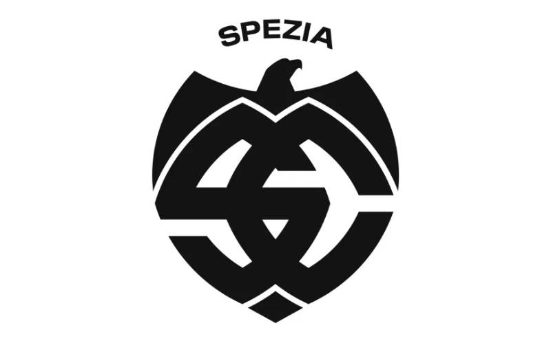
The Spezia Calcio logo is a black-and-white shield-shaped emblem featuring the intertwined initials S and C inside a circle, set within a design modeled after the club’s historic 1944 crest. Created by Tub Design under Emanuele Martera, it was introduced for the 2025/2026 season and represents the club’s deep connection to its Ligurian roots.
Here’s a breakdown of the main attributes:
- Design Type: Combination mark. The crest combines letterforms (S and C) with a shield shape, making it both a monogram and an emblematic badge.
- Primary Elements: Intertwined S and C letters, circular frame, pointed shield outline, the word “Spezia” in capitals, and the year 1906.
- Official Introduction Date: July 1, 2025 (replacing the controversial 2023 version).
- Designer/Agency: Tub Design, led by Emanuele Martera. The design was selected through a fan vote, with 62% of supporters choosing this version.
- Trademark Status: Registered trademark of Spezia Calcio. The club actively protects its visual identity from unauthorized use.
- Color Palette: Black (#000000) and White (#FFFFFF) as primary colors, with Gold (#AA9665) used as an accent in certain applications.
- Usage Context: Official kits, merchandise, the club’s website and social channels, Stadio Alberto Picco signage, press materials, and all digital platforms.
How Has the Spezia Calcio Logo Evolved Over Time?
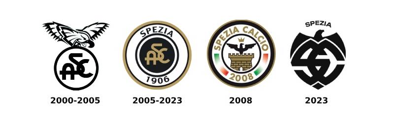
Spezia Calcio’s crest has gone through at least three major versions since the club’s founding in 1906. Early designs relied on simple letter monograms, while later versions introduced the eagle, the shield, and the black-and-white color palette that fans now associate with the club.
The timeline below covers the key eras.
Early Spezia Crests (1906-1970s)
The club’s earliest badges were basic by today’s standards. Spezia’s initial kits were light blue and white, borrowed from Crystal Palace. But the playing colors changed to white shirts with black shorts by 1911, and the branding followed.
Through the first half of the 20th century, Spezia used crests that featured monograms of the club’s initials. These were typically the letters A, S, and C (for Associazione Calcio Spezia), intertwined on a simple background.
The 1944 wartime crest is particularly significant. That year, the club (playing as the 42nd Corps of Firefighters of La Spezia) won the Northern Italy Championship. The shield used during this period became a lasting reference point. Decades later, it would directly inspire the 2025 redesign.
There wasn’t much consistency in the early decades. Logos changed with ownership shifts and name changes. The club went through several identities, including A.C. Spezia-Arsenal in 1954 and Football Club Spezia 1906 shortly after.
The Centennial Roundel (2005-2023)
Years Active: 2005-2023
For the club’s 100th anniversary in 2006, Spezia introduced a circular badge. This version featured concentric rings, alternating between gold, black, and white. The word “Spezia” sat at the top, the founding year “1906” at the bottom, and the monogram of A, S, and C was placed at the center in a black circle.
This was the logo that carried the club through its most successful period. Spezia climbed from Serie D all the way to Serie A between 2008 and 2020. The roundel became associated with the club’s rise.
The gold accent gave the badge a warmth that set it apart from many Italian football crests. It worked well on merchandise and kits, and fans grew attached to it.
When the club went bankrupt in 2008, a temporary round logo with an eagle was briefly used before the classic roundel was restored.
The Controversial Eagle Redesign (2023-2025)
Years Active: 2023-2025
In July 2023, after relegation from Serie A, Spezia unveiled a completely new visual identity. The redesign featured a geometric, minimalist design with three main components: the word “Spezia” at the top, a stylized eagle, and intersecting S and C letters. The letters were built from four geometric shapes meant to represent a ship’s prow, and they formed an anchor shape at the bottom.
The reaction was immediate. And not good.
Many fans and observers felt the intersecting letters, combined with the eagle above them, resembled fascist or Nazi-era symbols. A petition on change.org gathered over a thousand signatures within three days. Even La Spezia’s mayor publicly stated his discomfort with the design. The Curva Ferrovia, the club’s most passionate supporter group, hung banners against it.
The 2023 logo was designed to represent the sea, the city, and the club’s traditions. But the execution missed badly with the fanbase. The backlash forced the club to start a new redesign process within a year.
The Fan-Chosen Shield (2025-Present)
Years Active: 2025-present
The current version went through a three-phase creation process. First, an online survey collected thousands of fan suggestions. Then, randomly selected focus groups reviewed drafts from Tub Design. Finally, a public vote on the club website decided the winner.
The winning design, chosen by 62% of voters, brings back the shield from 1944. The S and C letters are redrawn using typography pulled from the club’s traditional emblem. They sit inside a circle, with no additional graphic elements needed.
It went live on July 1, 2025. Black and white only. No gold, no eagle, no extra decoration.
The slogan for the launch was “The future is in our roots.” And honestly, after the 2023 disaster, that’s exactly what the supporters wanted to hear.
What Do the Design Elements of the Spezia Calcio Logo Mean?
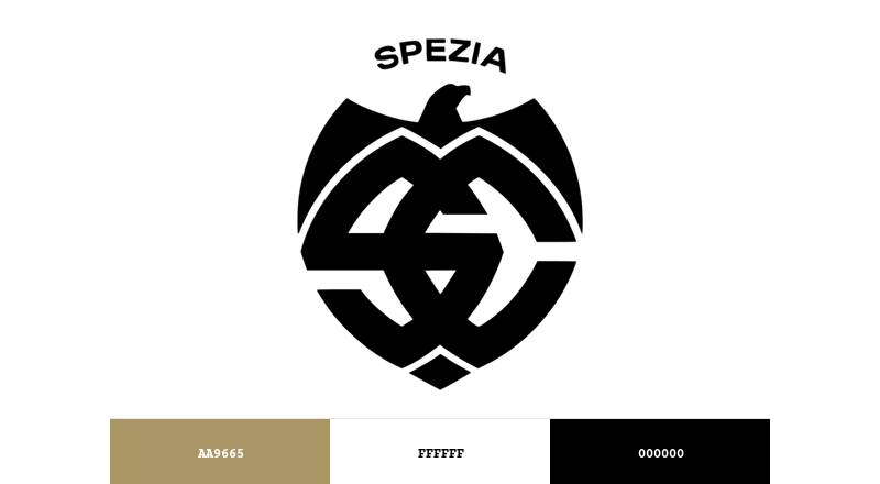
Every piece of the current Spezia crest ties back to the club’s identity and the city of La Spezia. The shield recalls wartime glory. The intertwined letters reference over a century of tradition. The black-and-white palette connects to kits that haven’t changed since 1911.
Let’s look at each element.
Why Did Spezia Calcio Choose These Specific Colors?
Black and white have been the club’s colors since 1911, when Alberto Picco and others decided to honor Pro Vercelli’s all-white kit as a symbol of a small club beating bigger teams.
Understanding color theory helps explain why this combination works so well for branding. The contrast between black and white creates instant readability at any size.
Black stands for strength and determination. White represents clean sportsmanship. Together, they form a monochrome color scheme that’s bold and easy to recognize from a distance.
The official color codes:
- Black: Hex #000000, RGB (0, 0, 0), CMYK (0, 0, 0, 100), Pantone Black 6 C
- White: Hex #FFFFFF, RGB (255, 255, 255), CMYK (0, 0, 0, 0), Pantone 7436 C
- Gold (accent): Hex #AA9665, RGB (170, 150, 101), CMYK (0, 12, 41, 33), Pantone 7503 C
The gold accent appears in some brand applications but not in the 2025 logo itself, which is strictly black and white.
What Typography Style Is Used in the Spezia Calcio Logo?
The current logo uses a custom-drawn version of the letters S and C, pulled directly from the club’s historical monogram. These aren’t based on any commercially available font. They were redrawn by Tub Design to match the traditional letterforms while adjusting thickness, curvature, and symmetry for modern use.
The word “Spezia” at the top of the shield is set in bold capitals. The typeface feels strong without being aggressive. It reads clearly at small sizes on a jersey badge and at large sizes on stadium signage.
Overall, the typographic elements lean toward a sans-serif sensibility. Clean lines, no decorative flourishes. It’s built for function first.
What Are the Hidden Meanings in the Spezia Calcio Logo?
The shield shape directly references the 1944 crest, which was used during the club’s wartime championship win. That’s not accidental. It connects to the most celebrated moment in Spezia’s history.
The intertwined S and C letters are a constant throughout the club’s visual history. They appear in nearly every version of the badge. Keeping them signals continuity.
There’s no eagle in the 2025 version. That’s a deliberate move after the 2023 controversy. But the eagle remains part of the club’s identity through the “Aquilotti” nickname, which shows up in supporter culture and marketing even without appearing on the badge.
How Does the Spezia Calcio Logo Compare to Competitor Logos?
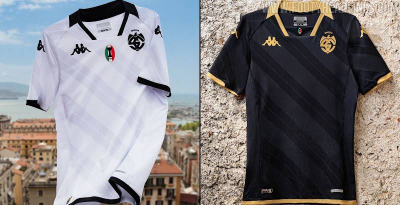
Italian football is full of crests that lean on heraldic traditions, city symbols, and rich color palettes. Spezia’s approach is noticeably different. Where clubs like Fiorentina use floral motifs and purple hues, or Genoa leans into the red and blue griffin, Spezia keeps things stripped down.
The black-and-white palette puts Spezia in the same visual neighborhood as Juventus. But where Juventus went completely abstract with its “J” rebrand, Spezia holds onto the traditional shield shape.
Against Ligurian neighbors Sampdoria and Genoa, Spezia’s badge reads as the most modern. Sampdoria’s sailor-headed crest and Genoa’s ornate griffin are far more detailed. Spezia’s monogram-in-a-shield approach is cleaner and arguably more flexible across digital platforms.
Compared to other Serie B clubs, the 2025 Spezia badge stands out for its restraint. Most Italian second-tier clubs still use detailed, color-heavy crests. Spezia’s white space and limited color scheme make it immediately distinctive in a crowded visual landscape.
What Are the Technical Specifications of the Spezia Calcio Logo?
Official Color Codes:
- Primary Color (Black): Hex #000000 | RGB (0, 0, 0) | CMYK (0, 0, 0, 100) | Pantone Black 6 C
- Primary Color (White): Hex #FFFFFF | RGB (255, 255, 255) | CMYK (0, 0, 0, 0) | Pantone 7436 C
- Accent Color (Gold): Hex #AA9665 | RGB (170, 150, 101) | CMYK (0, 12, 41, 33) | Pantone 7503 C
Dimensions and Format:
- The 2025 logo was created in vector graphics format (SVG) to allow scaling across all sizes without quality loss.
- The shield has a vertical orientation with a pointed base, roughly conforming to a traditional heraldic shield proportion.
- Clear space requirements mandate that the logo is not placed too close to other graphic elements. The minimum clear space typically equals the height of the “S” in the word “Spezia.”
- The logo is designed to work at small sizes on kit badges (approximately 6-8 cm height) and at large sizes for stadium applications.
A single black-and-white color version was chosen intentionally. There’s no alternate colorway. This keeps the brand consistent across print and web formats without confusion.
What Cultural Impact Has the Spezia Calcio Logo Had?
The Spezia logo story is actually a case study in what happens when clubs ignore their fanbase during a rebrand. The 2023 redesign, with its unintended associations to fascist imagery, became national news in Italy. It showed how sensitive football crest design can be, especially for a club whose wartime president died in a concentration camp.
The 2025 recovery process was equally significant. Spezia became one of the few Italian clubs to hand the final logo decision directly to supporters through a public vote. That’s still rare in football.
For the people of La Spezia, the badge means something beyond football. It represents a small city’s identity on a national stage. The return to the 1944 shield shape wasn’t just a design choice. It was a statement about memory, community ownership, and getting things right after getting them wrong.
How Does the Spezia Calcio Logo Fit Into the Overall Brand Identity?
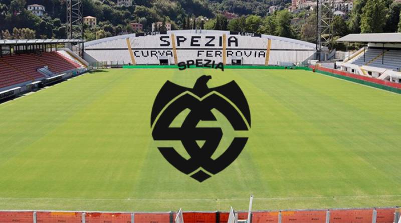
The logo sits at the center of everything Spezia Calcio does visually. It ties together the club’s kits, the Stadio Alberto Picco’s signage, the official website, and all social media channels. The brand guidelines dictate how the badge appears across these different touchpoints.
Spezia’s broader brand identity rests on three things: the city’s maritime heritage, the “Aquilotti” eagle tradition, and the black-and-white color scheme that goes back over a century. The 2025 logo brings these together without trying to do too much.
The relationship between the logo and the club’s merchandise line is straightforward. The monochrome design prints well on apparel, scarves, and accessories. It also translates cleanly to digital contexts where a brand style guide needs to stay consistent across platforms.
How Should the Spezia Calcio Logo Be Used?
Do’s:
- Use the official vector file provided by the club for any licensed applications.
- Maintain required clear space around the logo at all times.
- Keep the logo in its original black-and-white color scheme.
- Follow the club’s guidelines for minimum size requirements to keep the design legible.
Don’ts:
- Don’t alter the proportions, stretch, or rotate the logo.
- Don’t add colors, effects, shadows, or gradients to the badge.
- Don’t place the logo on busy backgrounds that reduce readability.
- Don’t recreate or approximate the logo from memory. Always use the official file.
Official logo assets can be accessed through Spezia Calcio’s website at speziacalcio.com. Any commercial use requires licensing approval from the club. The crest is a registered trademark, and unauthorized reproduction for commercial purposes will be subject to legal action.
For fan-made content and personal use, the club generally allows the logo to appear in non-commercial supporter materials. But if you’re producing anything for sale, you need permission. That’s standard across Italian football clubs and most professional sports organizations worldwide.
FAQ on The Spezia Logo
What does the Spezia Calcio logo look like?
The current Spezia logo features intertwined S and C letters inside a circle, set within a pointed shield. It uses a strict black and white color scheme. The word “Spezia” appears at the top in bold capitals, with the founding year 1906 displayed below.
When was the Spezia badge last redesigned?
The newest version launched on July 1, 2025. Tub Design created it under Emanuele Martera’s direction.
Fans voted directly on the final design, with 62% choosing this club emblem over three other options. It replaced the controversial 2023 crest.
Why did Spezia change its logo in 2025?
The 2023 redesign drew backlash because many supporters felt the eagle and intersecting letters resembled fascist-era symbols. Protests broke out fast.
The club launched a full logo redesign process involving fan surveys and focus groups. The new shield references the historic 1944 crest instead.
What do the colors in the Spezia crest mean?
Black represents strength and competitive drive. White stands for sportsmanship and simplicity. These have been the official team colors since 1911.
The color psychology behind the pairing creates a bold, high-contrast identity that works across kits, merchandise, and digital platforms.
What is the eagle’s connection to the Spezia logo?
Spezia’s nickname is “Gli Aquilotti,” meaning The Little Eagles. The eagle appeared on several past crests, including the 2023 version.
The 2025 badge dropped the eagle graphic entirely. But the bird remains central to supporter culture and the club’s broader visual identity.
Who designed the current Spezia Calcio emblem?
Emanuele Martera and his team at Tub Design handled the creative work. They collaborated closely with the Aquilotti fanbase through multiple rounds of feedback.
The process included an online survey, randomly selected focus groups, and a final public vote on speziacalcio.com.
What font is used in the Spezia logo?
The lettering is custom-drawn. It’s not based on any standard serif font or commercial typeface.
Tub Design retraced the traditional S and C monogram from Spezia Calcio’s historical badges, adjusting the curves and weight for modern applications.
Can I download the Spezia logo for personal use?
The official crest is available on the Spezia Calcio website. Fan-made content and non-commercial use is generally accepted.
For anything commercial, you need licensing approval. The badge is a registered trademark, so unauthorized use for profit isn’t allowed.
How does the Spezia badge compare to other Italian football crests?
Most Serie B clubs use detailed, color-heavy designs. Spezia’s monochrome approach is far more restrained.
It sits closer to AC Milan’s clean aesthetic than to the ornate crests used by clubs like Bologna or Torino. That simplicity makes it flexible across digital and print formats.
What is the history behind the Spezia shield shape?
The shield traces back to the crest used in 1944, when Spezia won the Northern Italy Championship during World War II. Players were registered as firefighters to avoid military conscription.
That wartime badge became a symbol of resilience for the La Spezia community, which is why the 2025 redesign brought it back.
Conclusion
The Spezia logo tells a story that goes well beyond football branding. It’s a badge shaped by fan protest, wartime history, and a port city’s pride.
Few Italian football clubs have gone through three crests in under five years. That says something about how much a club emblem matters to the people who wear it.
The 2025 shield, with its intertwined S and C monogram and strict black-and-white palette, finally landed where supporters wanted it. Rooted in the principles of good logo design, grounded in Spezia Calcio’s 1906 heritage, and built through genuine community input.
For a Serie B club from Liguria, that’s a big deal. Your mileage may vary on whether the design itself is remarkable. But the process behind it? That part is worth paying attention to.

Renowned for his expertise in logo design and visual branding, Bogdan has developed a multitude of logos for various clients.
His skills extend to creating posters, vector illustrations, business cards, and brochures. Additionally, Bogdan's UI kits were featured on marketplaces like Visual Hierarchy and UI8.
He also wrote in the past years on sites like Design Your Way, WebDesignerDepot, WPDean, Designmodo, Speckyboy, Slider Revolution, and more.
- Jujutsu Kaisen Font Generator - 12 October 2026
- The Windsurf Logo History, Colors, Font, And Meaning - 10 October 2026
- How to Remove Background From Product Photos (No Photoshop) - 10 October 2026

Bogdan Sandu is a seasoned designer who has been designing websites since 2008. Renowned for his expertise in logo design and visual branding, Bogdan has developed a multitude of logos for various clients. His skills extend to creating posters, vector illustrations, business cards, and brochures. Additionally, Bogdan's UI kits were featured on marketplaces like Visual Hierarchy and UI8. He also wrote in the past years on sites like Design Your Way, WebDesignerDepot, WPDean, Designmodo, Speckyboy, Slider Revolution, and more.
You Might Also Like