


The AC Milan logo is one of the most recognized football club badges in Europe. It carries over 120 years of history inside a single oval shield. The crest ties together the city of Milan, the club’s founding story, and a color identity that millions of fans associate with success on the pitch.
Within the broader history of sports branding, the AC Milan badge holds a unique position. It blends municipal heraldry (the red cross of Milan) with club-specific elements, something that puts it alongside crests like those of FC Porto and Athletic Bilbao in terms of design heritage.
The current version of the logo was refined in 2003, though its roots trace directly back to the club’s founding in 1899. AC Milan has gone through roughly 10 notable logo changes during that span.
What Is the AC Milan Logo?
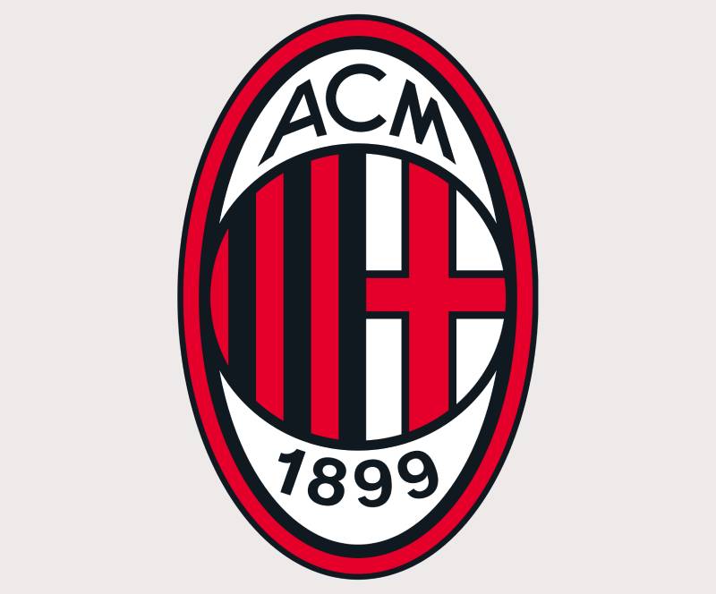
The AC Milan logo is an oval-shaped emblem featuring a red and black striped shield with the red Cross of St. George on a white field, the letters “ACM,” and the founding year 1899. It was last significantly updated in 2003 and reflects both Milanese civic identity and the club’s Rossoneri nickname.
Here are the key attributes that define the current badge:
- Design Type: Emblem (combination of shield, typography, and heraldic symbols)
- Primary Elements: Oval border, red and black vertical stripes, Cross of St. George, “ACM 1899” lettering, and a crown element at top
- Official Introduction Date: 2003 (current refined version)
- Designer/Agency: Not publicly attributed to a single designer. The iterations were handled internally with input from club ownership over the decades
- Trademark Status: Registered trademark owned by AC Milan S.p.A., protected under Italian and EU trademark law
- Color Palette: Red (#FB090B), Black (#000000), White (#FFFFFF), and Gold (#D4A843) accents
- Usage Context: Match kits, official merchandise, San Siro stadium branding, digital platforms, Casa Milan headquarters, and all licensed products
How Has the AC Milan Logo Evolved Over Time?

The AC Milan badge has gone through around 10 versions since 1899. Early designs were simple and heraldic. The mid-century versions introduced the oval shape and striped shield that fans recognize today. The most recent changes have been refinements, not overhauls.
Original AC Milan Logo (1899–1916)
Years Active: 1899–1916
The first badge was straightforward. It used a circular format with the English name “Milan Football and Cricket Club” wrapped around the edge, because the club was founded by English expatriates, including Herbert Kilpin.
The red cross on white, pulled straight from the coat of arms of Milan, sat at the center. Red and black were already present but not in the striped format people know now.
There was no “ACM” text yet. No oval. Just a round badge with strong ties to the city’s heraldic tradition and English sporting culture. It looked more like a municipal seal than a football crest, which actually makes sense given the era.
Inter-War AC Milan Logo (1916–1945)
Years Active: 1916–1945
This period brought the first real shift. The name was Italianized from “Milan Football and Cricket Club” to “Milan Associazione Calcio” under political pressure during the fascist era.
The circular shape stayed but the internal design started to change. The red and black vertical stripes became more prominent inside the badge. The St. George cross remained, sitting on the upper portion of the crest.
This version established the dual-panel layout that would carry forward. City symbol on top, club stripes below. It was the blueprint, basically.
Post-War AC Milan Logo (1945–1960s)
Years Active: 1945–1960s
After WWII, the badge shed the last traces of wartime-era naming. The oval shape started to appear in this period, replacing the circular format.
The red and black stripes became bolder and more defined. Gold trim appeared around the border for the first time on some versions, adding a touch that hinted at the club’s growing stature in Italian and European football.
This was the era when Milan won its first European Cup (1963), and the logo needed to match that level of ambition. Well, “needed” is strong. But it did get sharper.
Modern Era AC Milan Logo (1960s–1986)
Years Active: 1960s–1986
The oval became the definitive shape during this stretch. The “ACM” initials were placed prominently, and the “1899” founding year was included consistently for the first time.
The color palette locked in. Red, black, white, and gold accents. No more experimentation with layout. The proportions were set, and the general composition that exists today was mostly in place by the late 1970s.
Designers working in football branding often point to this version as the one that got the structure right, even if the execution was still a bit rough around the edges compared to what came later.
Berlusconi Era AC Milan Logo (1986–2003)
Years Active: 1986–2003
Silvio Berlusconi’s purchase of the club in 1986 brought corporate sensibility to the badge. The design was cleaned up. Lines got crisper. The gold border was refined. The lettering was standardized.
This was the version that accompanied the Arrigo Sacchi and Fabio Capello dynasties, the back-to-back Champions League wins, the Maldini and Baresi era. It became the most globally recognized version of the crest simply because of the team’s dominance during this period.
The changes from the previous version were subtle but mattered. Better proportions, cleaner lines, and a slightly modernized feel without losing any heritage.
Current AC Milan Logo (2003–Present)
Years Active: 2003–present
The 2003 update is what you see today. It kept everything from the Berlusconi-era version but added further polish. The oval is slightly more streamlined. The colors are more defined for digital use. The gold accents are cleaner.
The key change here wasn’t about reinvention. It was about making the badge work across modern contexts, from 16-pixel favicons to stadium jumbotrons. The core identity stayed intact.
RedBird Capital’s acquisition in 2022 hasn’t resulted in a logo change (yet), though the club has modernized its broader visual identity and marketing materials under new ownership.
What Do the Design Elements of the AC Milan Logo Mean?

Every element on the AC Milan crest carries specific meaning. The red cross connects to Milan’s civic identity. The red and black stripes represent the club itself. And the oval frame ties it all into a unified emblem that has worked for over a century.
What Does the Red Cross on the AC Milan Logo Represent?
The red cross on a white background is the Cross of St. George. It has been the symbol of Milan (the city) since at least the 11th century, tied to the Crusades and the Ambrosian tradition.
AC Milan uses it as a direct link between club and city. It’s not a religious symbol in this context. It’s civic identity, pure and simple.
You’ll find the same cross on the city’s coat of arms, on Inter Milan’s badge, and across municipal buildings. For the Rossoneri, it sits at the top of the crest, above the stripes.
Why Did AC Milan Choose These Specific Colors?
The red and black go back to the club’s founding. Herbert Kilpin, one of the founders, reportedly described the colors as representing “the fire of the team and the fear of their opponents.” Whether that’s entirely accurate or a bit of myth-making, it stuck.
Here’s the technical breakdown based on color theory:
- Red (#FB090B): Pantone 485 C. Connected to passion, energy, and intensity. Color psychology links red to urgency and power, which fits the club’s aggressive playing identity.
- Black (#000000): Pantone Black C. Represents authority, strength, and sophistication. It’s the grounding force against the intensity of the red.
- White (#FFFFFF): Used for the St. George cross background and as a secondary accent. Provides contrast and readability.
- Gold (#D4A843): Pantone 7405 C. The border and accent color. Signals prestige, tradition, and the club’s extensive trophy cabinet.
Red paired with black creates a strong tonal contrast that reads well at any size. That’s not an accident. It’s one of the reasons the badge holds up across print and digital contexts equally.
What Typography Style Is Used in the AC Milan Logo?
The “ACM” and “1899” on the badge use a custom serif typeface. It’s not based on any commercially available font.
The letterforms are compact and slightly condensed, designed to fit within the oval without crowding. The serifs give it a classical feel that matches the heraldic tone of the rest of the crest.
Over the years, the typography has been tightened and standardized. Earlier versions had more hand-drawn qualities. The current version is precise and consistent, optimized for reproduction at various sizes.
What Are the Hidden Meanings in the AC Milan Logo?
The oval shape isn’t random. It mimics classical Italian shields and heraldic crests, connecting the club to broader Italian visual traditions.
The vertical stripes (red and black) inside the lower section mirror what players wear on the pitch. That jersey-to-badge connection is intentional and shows up in very few clubs this directly.
The crown element at the top of some versions references the club’s self-image as football royalty. Took me a while to notice it actually, because it’s subtle on most reproductions.
How Does the AC Milan Logo Compare to Competitor Logos?

AC Milan’s badge sits in a group of classic European football emblems that lean heavily on heraldry and city-of-origin symbols. It’s less minimal than Juventus, which went fully modern in 2017. And it’s more structured than the Napoli crest, which keeps things simpler.
Compared to city rival Inter Milan, the two badges share the Cross of St. George but differ in everything else. Inter uses a circular format with the letters “FCIM” in a more compact arrangement. Milan’s oval and striped shield create a wider, more layered composition.
Against other Serie A clubs like AS Roma (figurative, featuring the she-wolf) and Lazio (eagle-based), Milan’s badge is more geometrically structured. It relies on shapes and patterns rather than illustrations.
Across European football, the AC Milan emblem shares design DNA with clubs like Porto and Benfica, where heritage and city identity remain front and center. It’s the opposite approach to what Borussia Dortmund does with its stripped-down circular mark.
What Are the Technical Specifications of the AC Milan Logo?
Official Color Codes
- Primary Red: Hex #FB090B | RGB (251, 9, 11) | CMYK (0, 96, 96, 2) | Pantone 485 C
- Black: Hex #000000 | RGB (0, 0, 0) | CMYK (0, 0, 0, 100) | Pantone Black C
- White: Hex #FFFFFF | RGB (255, 255, 255) | CMYK (0, 0, 0, 0)
- Gold Accent: Hex #D4A843 | RGB (212, 168, 67) | CMYK (0, 21, 68, 17) | Pantone 7405 C
Dimensions and Proportions
The logo uses an approximate aspect ratio of 3:4 (width to height). The oval shape means clear space requirements are measured from the outermost edge of the border.
AC Milan’s brand guidelines specify a minimum reproduction size to keep the internal details (cross, stripes, lettering) legible. On digital platforms, this generally means no smaller than 32 pixels in height.
The badge works best as a vector graphic for scalability. At very small sizes, simplified versions exist that drop the internal detail and keep just the oval, stripes, and cross. The DPI requirements for print reproduction typically call for 300 DPI minimum to maintain the fine details of the gold border and lettering.
What Cultural Impact Has the AC Milan Logo Had?

The AC Milan badge has become one of the most tattooed football crests in the world. It appears on streetwear, in music videos, and across fashion collaborations that the club has pursued over the years.
Milan’s position as a fashion capital gives the badge extra weight outside of football. It shows up in contexts where most club logos wouldn’t. The red-and-black stripes are recognized even by people who don’t follow Serie A.
The badge played a role in globalizing Italian football during the 1990s. When Milan dominated the Champions League, that oval crest was everywhere, on VHS covers, magazine spreads, and early football websites. It helped define what a “prestige football brand” looked like.
How Does the AC Milan Logo Fit Into the Overall Brand Identity?
The logo sits at the center of a broader visual system. Milan’s brand style guide connects the badge to kit design, stadium graphics, digital presence, and commercial partnerships.
Puma, the current kit manufacturer, integrates the crest into jersey designs each season. The home kit always features the red-and-black stripes that mirror the badge itself, creating a direct visual loop between the logo and the product.
Casa Milan, the club headquarters, uses the badge as an architectural anchor point in its interior design. The colors, the oval motif, and the cross all appear throughout the building. That kind of environmental branding turns the logo into something you experience spatially, not just visually.
Under RedBird Capital, the club has pushed harder into digital-first branding. Social media templates, app design, and video content all orbit around the badge as the fixed reference point. The broader identity changes around it, but the crest stays put.
How Should the AC Milan Logo Be Used?
Official usage rules are strict. The badge cannot be recolored, distorted, or placed on backgrounds that reduce legibility. The gold border must always remain visible, and the internal elements (cross, stripes, text) cannot be removed individually.
For licensed merchandise and commercial use, AC Milan requires written permission. Unauthorized reproduction of the badge carries trademark consequences under both Italian law and EU intellectual property regulations.
Official logo files are available through AC Milan’s corporate brand portal, accessible to approved partners and licensees. Fan use (non-commercial) is generally tolerated but technically not authorized without permission.
If you’re working with the badge in any professional capacity, always pull the vector files from official sources. Screenshots and web rips never match the correct color values, and you’ll end up with a red that’s just slightly off. Your mileage may vary on how much that matters, but it does matter.
FAQ on The AC Milan Logo
What does the AC Milan logo look like?
The AC Milan badge is an oval-shaped emblem. It features red and black vertical stripes on the lower half and the Cross of St. George on white in the upper section.
The letters “ACM” and “1899” sit inside the crest. A gold border wraps the whole thing.
Why does the AC Milan crest have a red cross?
That’s the Cross of St. George, which has been Milan’s civic symbol since the medieval period. It connects the Rossoneri directly to the city’s coat of arms.
Inter Milan uses it too, by the way. It’s a city thing, not a club-exclusive thing.
When was the current AC Milan logo introduced?
The current version dates back to 2003. It wasn’t a full redesign. More of a cleanup, sharper lines, better color definition for digital use.
The core structure has stayed the same since the 1960s.
What do the red and black stripes on the Milan badge mean?
Herbert Kilpin, one of the club’s founders, linked red to the fire of the team and black to the fear opponents should feel. That story gets repeated a lot.
Whether it’s fully accurate or partly legend, those Serie A club colors have stuck since 1899.
Has AC Milan ever completely changed its logo?
Not completely. The badge has gone through roughly 10 versions. But every single one kept the red and black stripes and the St. George cross.
The shape shifted from circular to oval around the 1950s. That’s the biggest structural change.
Who designed the AC Milan logo?
There’s no single credited designer. The early versions were based on Milanese heraldry. Later refinements happened internally under various ownership groups, including during the Silvio Berlusconi era.
It was evolution by committee, basically.
What font is used in the AC Milan badge?
The “ACM” and “1899” text uses a custom serif typeface that isn’t commercially available. The letterforms are compact and slightly condensed to fit inside the oval.
Earlier versions had a more hand-drawn quality to them.
What are the official colors of the AC Milan logo?
Red (#FB090B), black (#000000), white (#FFFFFF), and gold (#D4A843). Those are the hex values used across digital platforms and official club merchandise.
The red is closer to a pure, intense red. Not burgundy, not crimson.
Can I use the AC Milan logo for my own project?
Not without permission. The badge is a registered trademark owned by AC Milan S.p.A. Commercial use requires written authorization.
Fan use in non-commercial contexts is generally tolerated but technically not licensed.
How does the AC Milan logo compare to other Italian football crests?
It’s more geometric than most. Fiorentina uses a fleur-de-lis. Torino features a bull. Genoa has a griffin.
Milan sticks with shapes, stripes, and heraldic symbols. No figurative imagery at all, which makes it stand out across Serie A.
Conclusion
The AC Milan logo has survived ownership changes, political pressure, and over a century of football history without losing what makes it work. That’s rare for any brand, let alone a sports club.
Its strength comes from simplicity. The Rossoneri crest combines Milanese heraldry with the club’s red and black identity in a way that feels locked in. No gimmicks.
Whether you see it on a Puma kit, across Casa Milan’s facade, or as a tiny favicon on your phone, the badge reads the same. That kind of consistency across the UEFA Champions League stage and everyday merchandise is what separates lasting football emblems from forgettable ones.
Few Italian football club badges have managed that balance this well.

Renowned for his expertise in logo design and visual branding, Bogdan has developed a multitude of logos for various clients.
His skills extend to creating posters, vector illustrations, business cards, and brochures. Additionally, Bogdan's UI kits were featured on marketplaces like Visual Hierarchy and UI8.
He also wrote in the past years on sites like Design Your Way, WebDesignerDepot, WPDean, Designmodo, Speckyboy, Slider Revolution, and more.
- The Cursor Logo History, Colors, Font, And Meaning - 24 September 2026
- Top 7 Web Design Subscription Services That Replace Full-Time Hires - 24 September 2026
- Canva vs PowerPoint: Which Is Better for Presentations? - 22 September 2026

Bogdan Sandu is a seasoned designer who has been designing websites since 2008. Renowned for his expertise in logo design and visual branding, Bogdan has developed a multitude of logos for various clients. His skills extend to creating posters, vector illustrations, business cards, and brochures. Additionally, Bogdan's UI kits were featured on marketplaces like Visual Hierarchy and UI8. He also wrote in the past years on sites like Design Your Way, WebDesignerDepot, WPDean, Designmodo, Speckyboy, Slider Revolution, and more.
You Might Also Like


