The Benfica logo is one of the most recognizable football emblems in Europe. It belongs to Sport Lisboa e Benfica, a club founded in 1904 in Lisbon, Portugal. The crest combines elements from two predecessor clubs, Grupo Sport Lisboa and Grupo Sport Benfica, whose merger in 1908 shaped the badge we see today.
Within Portuguese football branding, this emblem sits alongside crests from FC Porto and Sporting Lisbon as part of the country’s “Big Three.” But the Benfica badge has something the others don’t. That eagle perched on top? It’s been there since 1904. The current version of the crest was last refined around 1999, with three championship stars added above the eagle in 2008. The emblem has gone through roughly eight major redesigns across its 120-plus year history.
What Is the Benfica Logo?
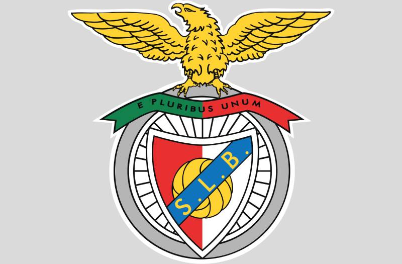
The Benfica logo is an emblem-style crest featuring a spread-winged eagle perched atop a vertically divided red-and-white shield. The shield sits inside a circular badge (representing a bicycle wheel from one of the founding clubs). It carries the initials “S.L.B.” on a diagonal ribbon, a football at the center, and the Latin motto “E Pluribus Unum” below. The current version was refined in 1999.
Design Type: Emblem (combination mark with pictorial and typographic elements enclosed in a badge shape)
Primary Elements: Eagle with outstretched wings, vertically split shield in red and white, a football in the center, diagonal ribbon with “S.L.B.” initials, circular wheel-shaped border, and ribbon bearing the motto “E Pluribus Unum”
Official Introduction Date: The merged club badge first appeared in 1908. The current modern iteration dates to 1999, with championship stars added in 2008.
Designer/Agency: The original emblem was created internally through the merger of the two founding clubs’ crests. No specific designer or agency has been publicly credited for the 1999 revision.
Trademark Status: The emblem is a registered trademark of Sport Lisboa e Benfica. The club has filed multiple trademark applications through Portugal’s INPI (Instituto Nacional da Propriedade Industrial) and internationally, including with the USPTO for related brand marks.
Color Palette: Red (#E83030), White (#FFFFFF), Black (#000000), Green (#12814B), Blue (#1074BC), Yellow (#FFD432), Gray (#B5B5B5)
Usage Context: Official match kits and jerseys, stadium signage at Estadio da Luz, digital platforms and website, merchandise (scarves, apparel, accessories), broadcast graphics, and international marketing materials
How Has the Benfica Logo Evolved Over Time?

The Benfica crest has gone through about eight major redesigns since 1904. Each version kept the eagle as the central figure but shifted colors, proportions, and details to match the club’s growing status.
The biggest structural change came in 1908 when two club badges merged into one. After that, the revisions were mostly about refining the color scheme and adjusting how the eagle and shield related to each other.
Original Sport Lisboa Logo (1904-1908)
Years Active: 1904-1908
The very first badge belonged to Sport Lisboa, Benfica’s main predecessor. It featured a shield split into two halves, white and blue, with a round football in the center.
A diagonal stripe crossed the shield with the initials “S.L.” in black. Above it all sat an eagle with spread wings, perched on a ribbon carrying the Latin phrase “E Pluribus Unum,” meaning “Out of many, one.”
This was straightforward heraldic design for the era. Nothing flashy. The eagle was chosen because it represents strength and ambition in Portuguese culture, and frankly, it looked good on a crest.
There was no specific designer credited. This was a club badge made by people who cared more about football than graphic design, and honestly, it showed. But the bones were there.
Grupo Sport Benfica Badge (1906-1908)
Years Active: 1906-1908
Meanwhile, the other founding club, Grupo Sport Benfica, had its own badge. This one was completely different. It was a circular design shaped like a bicycle wheel, which makes sense because cycling was actually the primary sport at Grupo Sport Benfica.
Inside the wheel, at the hub where the spokes met, sat a small shield with an oval ball and a ribbon bearing the letters “G.S.B.”
The wheel element would survive the merger and become a permanent part of the Benfica emblem, which is kind of wild when you think about it. A cycling reference on one of Europe’s biggest football badges.
First Merged Benfica Logo (1908-1930)
Years Active: 1908-1930
When Sport Lisboa and Grupo Sport Benfica merged in 1908, someone had to figure out how to combine two very different badges. The solution? Put one inside the other.
The Sport Lisboa shield (with the eagle on top) was placed inside the Grupo Sport Benfica bicycle wheel. The diagonal ribbon now read “S.L.B.” to reflect the new name. The eagle still stood on its motto ribbon with wings spread wide.
The color scheme was light pink and white for the shield halves, with a monochrome football in the center. The overall effect was busy but meaningful. Every piece had a reason.
In 1911, a small update aligned the colors with Portugal’s new flag after the monarchy was abolished. The eagle shifted slightly from sitting on the banner to sitting at the top of the crest.
Colorful Redesign (1930-1961)
Years Active: 1930-1961
This is where things got interesting. The 1930 version was the first really colorful iteration of the badge.
The eagle was redrawn in gold and black, and for the first time, it looked upward proudly instead of bending its head. That’s a small detail that changed the whole feel of the crest.
The shield became more triangular. Left half: red. Right half: white. The football turned yellow. The diagonal inscription ribbon became light blue, and the motto ribbon picked up green and red from the Portuguese flag.
The gray ring (the old bicycle wheel) was also enlarged. This version set the template that, at least in my experience looking at football crests, gave the Benfica badge its real personality for the first time.
Muted Palette Version (1961-1999)
Years Active: 1961-1999
The designers went in the opposite direction here. They made the ball yellow, repainted the diagonal stripe blue, and used a white wheel. The overall palette was much paler.
The eagle remained mostly the same as the 1930 version, just with an adjusted color scheme. Proportions shifted slightly across the elements.
This was the era when Benfica won its two European Cups (1961 and 1962) under coach Bela Guttmann. So this version of the logo carries a lot of weight for older fans, even though it was probably the least visually striking iteration.
Modern Benfica Logo (1999-Present)
Years Active: 1999-present
The current badge refocused attention on the eagle. The circular wheel got smaller, which made the bird appear much larger and more prominent. Instead of sitting on the motto ribbon, the eagle now perches directly on the wheel.
The shield got a white outline replacing the previous gold one. Colors became more vivid. Lines became cleaner. The whole thing was built to work across digital platforms and broadcast graphics, not just stitched onto a jersey.
In 2008, three yellow stars were added above the eagle to mark 30 Primeira Liga championships (one star per ten titles). These stars appear primarily on match kits rather than the official standalone crest.
What Do the Design Elements of the Benfica Logo Mean?
Every piece of this emblem traces back to either one of the founding clubs or Portuguese national identity. The eagle represents strength and victory. The shield split in red and white reflects the club’s traditional colors. The bicycle wheel comes from Grupo Sport Benfica’s cycling heritage. And the motto ties it all together with a message of unity.
Why Did Benfica Choose These Specific Colors?

The color palette on this badge is surprisingly complex for a football crest.
Red (#E83030, Pantone PMS 3556 C): The primary club color. It stands for passion and nobility in Portuguese tradition. According to color psychology, red also triggers feelings of energy and excitement, which is exactly what you want from a football badge.
White (#FFFFFF): Paired with red as the club’s core identity colors. It represents peace and purity. Together, the red and white create that instantly recognizable contrast on the shield.
Green (#12814B, Pantone PMS 7731 C) and Blue (#1074BC, Pantone PMS 285 C): These come directly from the Portuguese national flag. They were added in the 1930 redesign and have stayed ever since, grounding the badge in national identity.
Yellow/Gold (#FFD432, Pantone PMS 810 C): Used for the football, the eagle’s details, and the championship stars. Gold adds a sense of achievement and prestige. Looking at other gold-accented logos across sports, it’s a common choice for communicating success.
Gray (#B5B5B5, Pantone PMS Cool Gray 4 C): The wheel outline. It provides a neutral frame for the more vivid elements inside.
If you look at the full palette in terms of color theory, it’s actually pretty bold. You’ve got warm reds and yellows sitting next to cool blues and greens. It shouldn’t work, but it does because the balance between the elements keeps the eye moving without getting confused.
What Typography Style Is Used in the Benfica Logo?

The lettering on the Benfica badge is a custom-designed sans-serif typeface. It’s clean, modest, and deliberately understated.
The “S.L.B.” initials on the diagonal ribbon are sized larger for readability, but they’re not the focal point. This is an emblem that puts its visual weight on the graphics, not the text.
The Latin motto “E Pluribus Unum” sits on the lower ribbon in a similar clean style. Both pieces of text use traditional shapes and cuts that prioritize legibility over flair. Nothing decorative. Nothing trendy.
It’s a smart choice. Since the badge packs so many graphic elements into one space, adding a complex font would create visual noise. The simple typography lets everything else breathe.
What Are the Hidden Meanings in the Benfica Logo?
The bicycle wheel is probably the most overlooked element. Most people see a decorative circle. It’s actually a direct reference to cycling at Grupo Sport Benfica. That connection to the club’s multi-sport origins gets lost on casual fans.
“E Pluribus Unum” predates the club itself as a phrase. It’s the same motto used by the United States. In Benfica’s context, it means “out of many, one,” referring to the merger of the two founding clubs. Some fans also read it as a message about their community: millions of supporters, one identity.
The eagle facing upward (since the 1930 redesign) was a deliberate change from the earlier downward-facing version. It signals ambition and forward-looking confidence. Took me a while to notice that shift when comparing the older versions.
How Does the Benfica Logo Compare to Competitor Logos?
Among Portugal’s Big Three, Benfica has the most ornate badge. FC Porto’s logo uses a similar shield-and-ball format but with a simpler circular frame and a crown on top. Sporting Lisbon’s crest leans toward green and goes with a lion instead of an eagle.
Benfica’s eagle puts it in an interesting category alongside clubs like Lazio and Eintracht Frankfurt, both of which feature eagles prominently. But Benfica’s version is more heraldic and layered than either of those.
Where most modern football clubs have been simplifying their crests (think Juventus going to a plain “J”), Benfica has kept almost all of its traditional detail. That’s a deliberate choice. And if you compare the approach to how tech companies handle their logos, it’s basically the opposite philosophy. Football heritage badges resist minimalist design trends because the detail IS the point.
The red-dominant palette also puts Benfica alongside clubs like Liverpool, Bayern Munich, and AC Milan in a visual shorthand for passion and aggression. Red works. It just does.
What Are the Technical Specifications of the Benfica Logo?
Official Color Codes
Red (Primary) Hex: #E83030 | RGB: (232, 48, 48) | CMYK: (3, 95, 95, 0) | Pantone: PMS 3556 C
White Hex: #FFFFFF | RGB: (255, 255, 255) | CMYK: (0, 0, 0, 0)
Black Hex: #000000 | RGB: (0, 0, 0) | CMYK: (70, 50, 50, 100) | Pantone: PMS Black 6 C
Green Hex: #12814B | RGB: (18, 129, 75) | CMYK: (87, 25, 90, 12) | Pantone: PMS 7731 C
Blue Hex: #1074BC | RGB: (16, 116, 188) | CMYK: (86, 51, 0, 0) | Pantone: PMS 285 C
Yellow/Gold Hex: #FFD432 | RGB: (255, 212, 50) | CMYK: (1, 15, 89, 0) | Pantone: PMS 810 C
Gray Hex: #B5B5B5 | RGB: (181, 181, 181) | CMYK: (30, 24, 24, 0) | Pantone: PMS Cool Gray 4 C
Dimensions and Proportions
The badge uses a roughly circular aspect ratio due to the wheel shape, with the eagle extending above the top edge. The eagle typically adds about 40% extra height above the circular base.
For print applications, the club requires high-resolution files at 300 DPI minimum. Digital use follows standard vector graphic formats (SVG, EPS) to maintain sharpness at any scale. The emblem needs clear space around it, especially when placed on busy backgrounds, to keep it readable at smaller sizes.
Since the crest packs a lot of detail, minimum size thresholds matter more than they would for a simpler mark. Below a certain pixel count, the “S.L.B.” text and smaller details start to blur.
What Cultural Impact Has the Benfica Logo Had?
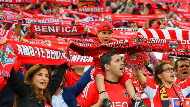
Benfica holds a Guinness World Record for the most paid members of any sports club. That’s over 230,000 people who carry a card with this crest on it. The badge shows up on scarves, banners, tattoos, murals across Lisbon, and in Portuguese communities worldwide.
The emblem is deeply tied to Portuguese national identity. The flag colors woven into the design aren’t decoration. They’re a statement. For the millions of Benfiquistas around the globe, this logo functions as a cultural marker, not just a sports brand.
On social media, images of the crest go viral during Champions League nights and derby matches against Sporting CP and Porto. It’s become a shorthand for Portuguese football itself, especially outside of Portugal where casual fans might not know the league but recognize the eagle.
How Does the Benfica Logo Fit Into the Overall Brand Identity?
The crest is the anchor of everything Benfica does commercially and culturally. It appears on the jerseys made by Adidas, across the Estadio da Luz, on Benfica TV broadcasts, throughout the official online store, and on everything from wine bottles to children’s backpacks.
The club’s brand guidelines dictate exactly how the emblem can be used, what colors surround it, and what modifications are off-limits. This consistency is what keeps a 120-year-old badge looking coherent across modern platforms.
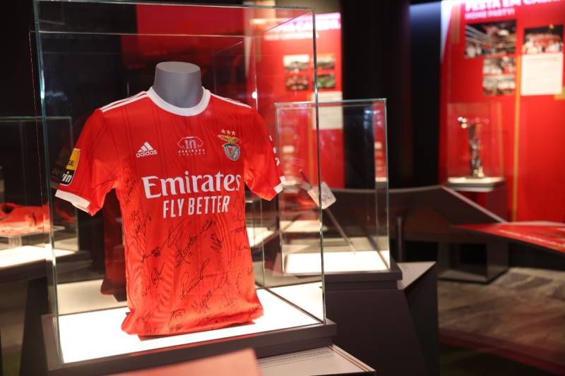
The Benfica Museum at the Estadio da Luz traces the crest’s evolution as a central part of the visitor experience. Old versions of the badge sit alongside trophies and match memorabilia, treating the logo as a historical artifact in its own right.
There’s a storytelling element here too. Each detail in the badge (the wheel, the eagle, the motto) connects to a specific chapter in the club’s history. Fans who understand those connections feel a deeper attachment to the brand. That’s not accidental. It’s by design.
How Should the Benfica Logo Be Used?
Official usage rules: The club controls how the badge appears on all licensed products. Colors must match the official codes listed above. The eagle, shield, and wheel cannot be separated or used individually without authorization. Distortion, recoloring, or partial reproduction of the emblem is not permitted.
Where to access official assets: The club’s official website (slbenfica.pt) provides branding materials for authorized partners. Media outlets working with the club receive press kits with approved logo files.
Licensing: Any commercial use of the Benfica crest requires a licensing agreement with the club. This covers merchandise, co-branded products, advertising, and digital content. Unauthorized reproduction is a trademark violation.
Trademark protection: The emblem is protected under Portuguese intellectual property law through INPI and internationally through various trademark filings. The club has pursued trademark registrations in multiple jurisdictions to protect against unauthorized use. Using the crest without permission, even on fan-made merchandise, can result in legal action.
If you’re a designer working with this badge, always request official vector files from the club. Don’t trace it from screenshots or low-resolution downloads. The detail in this emblem is tricky to reproduce accurately, and getting the color values wrong (even slightly) is noticeable to anyone familiar with the original.
FAQ on The Benfica Logo
What does the Benfica logo represent?
The Benfica emblem represents the 1908 merger of Sport Lisboa and Grupo Sport Benfica. The eagle stands for strength and ambition. The split red-and-white shield reflects the club’s traditional colors, while the circular wheel honors the cycling roots of one founding club.
When was the current Benfica logo introduced?
The current version of the Benfica crest was refined in 1999. It made the eagle larger and more prominent by reducing the wheel’s diameter. Three championship stars were added above the eagle in 2008, marking 30 Primeira Liga titles won by the Lisbon club.
What do the colors in the Benfica badge mean?
Red represents passion and nobility. White stands for peace. The green and blue come directly from the Portuguese flag, added during the 1930 redesign. Yellow and gold signal achievement. Gray frames the outer wheel. Together they form the club’s official color identity.
Why is there an eagle on the Benfica logo?
The eagle has been part of the badge since 1904 when Sport Lisboa first adopted it. In Portuguese culture, eagles represent power and victory. Benfica’s mascot is a real golden eagle named “Vitoria” that flies around the Estadio da Luz before home matches.
What is the Latin motto on the Benfica emblem?
“E Pluribus Unum” means “out of many, one.” It originally referenced the merger of two clubs into Sport Lisboa e Benfica. Fans also interpret it as millions of Benfiquistas united under one identity. The motto has appeared on the ribbon since the first merged badge in 1908.
What font is used in the Benfica logo?
The badge uses a custom-designed clean sans-serif typeface for the “S.L.B.” initials and the motto. It’s deliberately simple. The emblem prioritizes graphic elements over lettering, so the text stays modest and readable without competing for attention.
How many times has the Benfica logo changed?
The Benfica logo history includes roughly eight major redesigns since 1904. The most significant shift came in 1908 with the club merger. Other big changes happened in 1930 (color overhaul), 1961 (muted palette), and 1999 (modern refinement with a larger eagle).
What does the wheel shape in the Benfica crest mean?
The circular border represents a bicycle wheel from Grupo Sport Benfica, one of the two founding clubs. Cycling was their main sport before the 1908 merger. Most fans don’t realize this detail. It’s one of those design elements hiding in plain sight on the football club badge.
Where can I download the official Benfica logo?
Official Benfica logo files are available through the club’s website at slbenfica.pt for authorized partners. The emblem is trademark-protected, so commercial use requires a licensing agreement. For personal or editorial use, media press kits include approved vector files in SVG and EPS formats.
How does the Benfica logo compare to other Portuguese club badges?
It’s the most detailed of Portugal’s Big Three crests. Porto’s badge is simpler with a crown. Sporting’s crest uses a lion. Benfica’s layered design with the eagle, shield, and wheel makes it stand out among European football club emblems.
Conclusion
The Benfica logo carries over a century of Portuguese football identity in a single badge. From the 1904 Sport Lisboa shield to the modern crest refined in 1999, every redesign kept the eagle, the wheel, and the club’s red and white core intact.
That kind of consistency is rare in European club branding.
The Benfica emblem works because it respects its own history. The cycling wheel stays. The Latin motto stays. The eagle still faces upward. These aren’t arbitrary choices.
For Benfiquistas worldwide, this badge is more than a visual mark on a jersey or a stadium wall. It’s a connection to Lisbon, to the Primeira Liga, and to a club that has shaped Portuguese sports culture since Cosme Damiao helped found it.

Renowned for his expertise in logo design and visual branding, Bogdan has developed a multitude of logos for various clients.
His skills extend to creating posters, vector illustrations, business cards, and brochures. Additionally, Bogdan's UI kits were featured on marketplaces like Visual Hierarchy and UI8.
He also wrote in the past years on sites like Design Your Way, WebDesignerDepot, WPDean, Designmodo, Speckyboy, Slider Revolution, and more.
- How to Install Fonts on Mac (Step-by-Step Guide) - 20 September 2026
- From Mockup to Code: How AI-Augmented Development Speeds Up the Design Handoff - 19 September 2026
- The Beehiiv Logo History, Colors, Font, And Meaning - 18 September 2026

Bogdan Sandu is a seasoned designer who has been designing websites since 2008. Renowned for his expertise in logo design and visual branding, Bogdan has developed a multitude of logos for various clients. His skills extend to creating posters, vector illustrations, business cards, and brochures. Additionally, Bogdan's UI kits were featured on marketplaces like Visual Hierarchy and UI8. He also wrote in the past years on sites like Design Your Way, WebDesignerDepot, WPDean, Designmodo, Speckyboy, Slider Revolution, and more.
You Might Also Like