The Gil Vicente logo is one of the most culturally rooted football club badges in Portuguese football. It belongs to Gil Vicente Futebol Clube, a professional club based in Barcelos, Portugal, founded on May 3, 1924. The emblem centers around the Galo de Barcelos (Barcelos Rooster), a figure pulled directly from local folklore that represents justice, faith, and good fortune.
Within the broader history of football branding, the Gil Vicente crest stands apart from most Primeira Liga badges because of how tightly it connects to a specific regional legend. It’s not just a club symbol. It’s a piece of Barcelos identity stamped onto a shield.
The current version of the badge was restored in 2021 after a member vote, returning to the classic form used from roughly 1938 to 2005. Before that, a 2005 redesign had simplified some elements for a more modern look. So the club has gone through at least three to four significant visual iterations over its century-long existence.
What Is the Gil Vicente Logo?

The Gil Vicente logo is a shield-shaped emblem featuring the iconic Barcelos Rooster at its center, rendered in red, white, and navy blue. It was first introduced in the late 1930s and has been redesigned multiple times since. The crest symbolizes the club’s ties to Barcelos folklore and Portuguese football heritage.
Key Attributes
- Design Type: Emblem (combination mark with shield, symbol, and text)
- Primary Elements: Barcelos Rooster (Galo de Barcelos), shield shape, club name lettering, founding year “1924”
- Official Introduction: Late 1930s (earliest known formal crest). Current restored version adopted in 2021
- Designer/Agency: Not publicly credited to a specific designer or agency. The 2021 restoration was decided through a member vote
- Trademark Status: Registered and protected by Gil Vicente Futebol Clube. The logo is copyrighted
- Color Palette: Red (#d52929), Navy Blue (#083363), Dark Red (#521c19), White (#ffffff), Gold (#9ea85e), Silver (#d9d9d9)
- Usage Context: Match kits, official merchandise, Estadio Cidade de Barcelos signage, digital platforms, social media, fan memorabilia, and promotional materials
How Has the Gil Vicente Logo Evolved Over Time?

The Gil Vicente badge has gone through several redesigns since the club’s founding in 1924. Early versions were basic and functional. Major shifts happened in the late 1930s, again around 2005, and most recently in 2021 when the club voted to restore the classic crest.
Original Gil Vicente Logo (1924 – Late 1930s)
Years Active: 1924 to approximately 1938.
The earliest Gil Vicente badges were simple and rough around the edges, as you’d expect from a small club in the 1920s. Basic shapes, straightforward imagery. Nothing fancy.
Design priorities back then had more to do with identification than branding. Most Portuguese clubs from that era worked with whatever local resources they had.
Colors were likely red and white from the start, matching the team’s kit colors. But the execution was minimal.
There was no strong graphic identity at this stage. The club was still finding its footing, only registering with the Braga Football Association in 1931.
Classic Crest Era (Late 1930s – 2005)
Years Active: Roughly 1938 to 2005.
This is when the Gil Vicente badge became something recognizable. The Barcelos Rooster made its way into the crest, and the shield shape was established.
The rooster wasn’t a random pick. Barcelos is famous across Portugal (and globally) for the Galo de Barcelos figurine, a ceramic rooster tied to a medieval legend about a falsely accused pilgrim. Putting that symbol on the badge connected the club to the city’s most well-known cultural export.
Red, white, and blue became the standard color palette. The shield got more defined over the decades, and lettering was refined.
This version lasted nearly seven decades with minor tweaks. It became the badge that generations of supporters grew up with.
Modernized Redesign (2005 – 2021)
Years Active: 2005 to 2021.
In 2005, the club went through a redesign that stripped back some traditional details. The goal was to make the badge more adaptable for digital platforms and merchandise.
Think cleaner lines, simplified shapes. The rooster stayed, but the overall feel shifted toward something sleeker.
This kind of simplification was common across European football during that period. Lots of clubs were doing it. But for Gil Vicente, a club where tradition runs deep, not everyone loved the change.
The 2005 version served its purpose for print and web design applications. It worked well at small sizes and on screens. But it lacked some of the character that made the older crest special.
Restored Classic Crest (2021 – Present)
Years Active: 2021 to present.
In 2021, the club put it to a vote. Members chose to bring back the classic crest, the one used from the late 1930s to 2005.
The restored version includes bold red, white, and blue tones. The rooster is prominent again, rendered in a more traditional style. The shield is fuller.
It was a clear statement: tradition matters more than trends. And honestly, it was the right call for a club celebrating its centenary in 2024.
A special 100th anniversary version was also used during the 2023-2024 season on the home kit, marking a century of football in Barcelos.
What Do the Design Elements of the Gil Vicente Logo Mean?
Every part of the Gil Vicente crest connects back to either the club’s history or the culture of Barcelos. The rooster is the most obvious piece, but the shield shape, the colors, and even the lettering all carry weight.
The badge is built on shape psychology. Shields suggest protection, tradition, authority. The rooster adds a layer of local meaning that most football crests don’t have.
Why Did Gil Vicente Choose These Specific Colors?
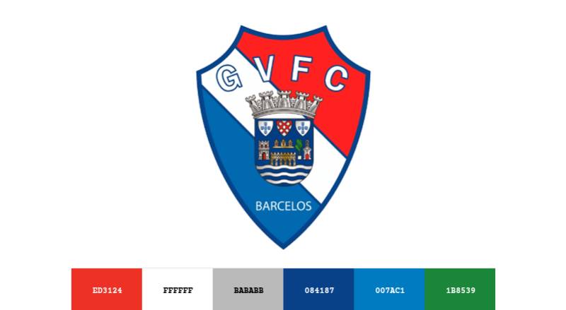
Red is the dominant color. It represents the passion and energy of the supporters. In terms of color psychology, red signals intensity, courage, and action. Perfect fit for a football club.
Navy Blue (#083363) provides depth and seriousness. It grounds the design and adds a sense of stability that pure red alone wouldn’t achieve.
White (#ffffff) stands for purity and integrity, balancing the warmth of the red with something clean and open.
Dark Red (#521c19) appears as an accent, adding richness to the overall palette without competing with the primary red.
Gold (#9ea85e) and Silver (#d9d9d9) show up in specific crest details, giving the badge a touch of prestige. You’ll see these mostly in embroidered or high-resolution versions of the emblem.
The red and white pairing also matches the traditional home kit, so the badge sits naturally on the jersey. That kind of unity between kit and crest matters more than people think.
What Typography Style Is Used in the Gil Vicente Logo?
The font used in the Gil Vicente emblem is bold and slightly condensed. It’s not a widely available commercial typeface. It was selected to look strong but also somewhat classic.
Readability was clearly a priority. The club name needs to work on everything from a jersey badge viewed from stadium seats to a tiny social media avatar.
The lettering has stayed relatively consistent across redesigns, even when other elements changed. That’s a smart move because typography consistency builds recognition over time.
The text sits within the shield, integrated into the overall composition rather than floating outside it. This keeps the badge compact and self-contained.
What Are the Hidden Meanings in the Gil Vicente Logo?
The Barcelos Rooster is the big one. It’s tied to a medieval legend where a roasted rooster supposedly stood up and crowed to prove a pilgrim’s innocence. The story symbolizes justice, faith, and truth. For a football club, that’s a powerful narrative to carry on your chest.
The shield shape is common in football, but for Gil Vicente it also references heraldic tradition in Portugal. Barcelos has deep medieval roots, and the shield echoes that history.
The inclusion of “1924” is more than a date. It’s a reminder that this club has survived a full century, through relegations, financial struggles, and administrative disputes. Still here.
How Does the Gil Vicente Logo Compare to Competitor Logos?
Portuguese football crests tend to lean heavily on heraldic tradition. Look at Benfica with its eagle, Sporting Lisbon with its lion, or FC Porto with its dragon. Big animals, bold shields.
Gil Vicente fits right into that tradition but stands out because of the rooster. No other Primeira Liga club uses a rooster. It’s distinctive in a way that bigger clubs sometimes struggle to achieve with more generic symbols.
Compared to other mid-table Portuguese clubs like Boavista or Rio Ave, the Gil Vicente badge has a stronger cultural hook. The Barcelos Rooster is internationally recognized as a Portuguese folk symbol, and Gil Vicente basically owns it in football.
The color scheme also differs from many Liga Portugal competitors. While red and white is shared with Benfica, the navy blue accent and the overall composition give the Gil Vicente crest its own identity.
What Are the Technical Specifications of the Gil Vicente Logo?
Official Color Codes
- Red: Hex #d52929 | RGB (213, 41, 41) | CMYK (11, 97, 98, 2) | Pantone 1795 CP
- Navy Blue: Hex #083363 | RGB (8, 51, 99) | CMYK (100, 86, 34, 24) | Pantone 2995 C
- Dark Red: Hex #521c19 | RGB (82, 28, 25) | CMYK (40, 85, 79, 61) | Pantone 490 C
- Gold: Hex #9ea85e | RGB (158, 168, 94) | CMYK (42, 23, 78, 2) | Pantone 10323 C
- Silver: Hex #d9d9d9 | RGB (217, 217, 217) | CMYK (14, 10, 11, 0) | Pantone Cool Gray 1 XGC
- White: Hex #ffffff | RGB (255, 255, 255) | CMYK (0, 0, 0, 0)
Dimensions and Proportions
The badge uses a vertical shield orientation, taller than it is wide. The approximate aspect ratio is around 3:4 (width to height), though this varies slightly depending on the version.
For print design applications, the logo should maintain a minimum clear space equal to the height of the lettering around all edges. This keeps the badge from looking cramped when placed near other graphics.
The logo is available in vector graphics formats (SVG, AI, EPS) for professional use, and in pixel-based formats (PNG) for digital use. High-resolution PNG files go up to 4096 x 5505 pixels.
For screen display, DPI matters. The badge should be rendered at a minimum of 72 DPI for web use and 300 DPI for print materials to keep the rooster detail sharp.
What Cultural Impact Has the Gil Vicente Logo Had?

The Gil Vicente crest has become inseparable from the identity of Barcelos as a football city. For a town known worldwide for its rooster figurines, having that same symbol on a Primeira Liga club’s badge creates a unique overlap between sports and folk culture.
Supporters don’t just see a logo. They see their city’s story. That connection explains why, when the club modernized the badge in 2005, fans pushed to bring back the classic version.
The 2021 restoration and the 2024 centenary celebration both reinforced how much the badge means to the community. It shows up on banners, scarves, local business signage, and throughout the Estadio Cidade de Barcelos.
Gil Vicente’s nickname, “Os Galos” (The Roosters), comes directly from the emblem. The badge literally shaped how people refer to the club.
How Does the Gil Vicente Logo Fit Into the Overall Brand Identity?
The Gil Vicente badge is the anchor of the club’s entire visual system. Kit design, merchandise, stadium branding, social media presence. Everything flows from that crest.
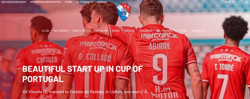
The red and white home kit mirrors the badge’s primary colors. Away kits typically flip to white or blue with red accents, but the rooster badge stays consistent across all versions.
For the 2025-26 season, the kit is produced by Joma. The deep red base connects to the badge’s dominant red, while blue and white details echo the secondary colors in the crest. That kind of consistency between badge and kit is what makes brand guidelines work in practice.
The emblem also connects the club to a network of related entities: Barcelos as a city, the Portuguese Football Federation, Liga Portugal, and the broader tradition of European football badge design. Each relationship reinforces the club’s position within Portuguese football culture.
How Should the Gil Vicente Logo Be Used?
If you need the Gil Vicente badge for editorial or informational purposes, keep a few things in mind.
Do: Use the official version from the club’s website or authorized brand asset platforms. Maintain the original proportions. Keep clear space around the badge. Use it on backgrounds where all elements remain visible.
Don’t: Stretch, rotate, or alter the colors. Don’t place it on busy backgrounds where the rooster detail gets lost. Don’t remove any elements from the crest or use unauthorized redrawn versions.
The logo is copyrighted by Gil Vicente Futebol Clube. Using it commercially requires permission from the club. For editorial or educational use, proper attribution is expected.
Official logo files can be found through the club’s website at gilvicentefc.pt. Vector and PNG versions are also available on brand asset directories, though always verify you’re using the most current version, especially after the 2021 restoration.
For merchandise and licensed products, the club works with official partners. Unauthorized reproduction on commercial goods is a trademark violation, same as with any other professional football club.
FAQ on The Gil Vicente Logo
What does the Gil Vicente logo look like?
The Gil Vicente FC badge is a shield-shaped emblem featuring the Barcelos Rooster at its center. Red, white, and navy blue make up the complementary color scheme. The club name and founding year 1924 sit within the shield.
What does the rooster mean on the Gil Vicente crest?
The Galo de Barcelos comes from a medieval Portuguese legend about a falsely accused pilgrim. A roasted rooster supposedly crowed to prove his innocence.
For Gil Vicente Futebol Clube, it represents justice, faith, and local identity in Barcelos.
When was the Gil Vicente emblem first created?
The earliest formal crest appeared in the late 1930s, roughly a decade after the club’s founding on May 3, 1924. Before that, the team used basic imagery without a structured badge design.
Has the Gil Vicente logo changed over the years?
Yes. The club has gone through at least three major redesigns. A simplified version launched in 2005. Then in 2021, members voted to restore the classic crest used from the late 1930s to 2005.
What are the official colors of the Gil Vicente FC badge?
The official team colors are red (#d52929), navy blue (#083363), and white (#ffffff). Dark red, gold, and silver appear as accent colors within certain versions of the Portuguese football club crest.
Why did Gil Vicente restore its old logo in 2021?
Club members voted to bring back the traditional badge. The 2005 modernized version had lost some of the character that fans connected with.
Ahead of the 2024 centenary, returning to the classic design felt right for the Primeira Liga club.
Where can I download the Gil Vicente logo?
The club’s official website at gilvicentefc.pt is the best source. Brand asset directories also host PNG and vector files. Always verify you’re using the post-2021 restored version for accuracy.
What makes the Gil Vicente badge different from other Liga Portugal logos?
The Barcelos Rooster. No other club in Portuguese football uses this symbol. While teams like Belenenses or Portimonense have their own regional ties, Gil Vicente’s folklore connection is unique.
Can I use the Gil Vicente logo for my project?
The emblem is copyrighted by Gil Vicente Futebol Clube. Editorial and educational use requires proper attribution. Commercial use needs direct permission from the club. Unauthorized reproduction on merchandise is a trademark violation.
Did Gil Vicente have a special centenary logo?
Yes. A 100th anniversary version appeared on the home kit during the 2023-2024 season. It celebrated the club’s founding in Barcelos while keeping the core visual identity intact. The standard crest returned afterward.
Conclusion
The Gil Vicente logo is more than a football badge. It’s a piece of Barcelos folklore stitched into the fabric of Portuguese football.
From its rough beginnings in the 1920s to the member-voted restoration in 2021, the crest has always reflected what the club values. Tradition, community, identity.
The Galo de Barcelos at the center of the shield gives Gil Vicente FC something most Primeira Liga clubs can’t claim. A symbol that belongs to an entire city’s cultural history.
Whether you’re studying logo design principles or just curious about European football branding, this emblem is worth a closer look. It tells a real story.

Renowned for his expertise in logo design and visual branding, Bogdan has developed a multitude of logos for various clients.
His skills extend to creating posters, vector illustrations, business cards, and brochures. Additionally, Bogdan's UI kits were featured on marketplaces like Visual Hierarchy and UI8.
He also wrote in the past years on sites like Design Your Way, WebDesignerDepot, WPDean, Designmodo, Speckyboy, Slider Revolution, and more.
- The Windsurf Logo History, Colors, Font, And Meaning - 10 October 2026
- How to Remove Background From Product Photos (No Photoshop) - 10 October 2026
- How Designers can Build a Stronger Online Creative Identity - 9 October 2026

Bogdan Sandu is a seasoned designer who has been designing websites since 2008. Renowned for his expertise in logo design and visual branding, Bogdan has developed a multitude of logos for various clients. His skills extend to creating posters, vector illustrations, business cards, and brochures. Additionally, Bogdan's UI kits were featured on marketplaces like Visual Hierarchy and UI8. He also wrote in the past years on sites like Design Your Way, WebDesignerDepot, WPDean, Designmodo, Speckyboy, Slider Revolution, and more.
You Might Also Like