The Boavista logo is one of the most recognizable crests in Portuguese football. It belongs to Boavista Futebol Clube, a club founded on 1 August 1903 in Porto by British entrepreneurs Harry and Dick Lowe alongside Portuguese textile workers. The crest sits at the center of over 120 years of sporting history, competition, and community pride.
Within the wider world of football branding, the Boavista badge stands apart. Most Portuguese club crests lean into reds, greens, or blues. Boavista went with a black and white checkered pattern, a choice that traces back to 1933 and a trip to France by club president Artur Oliveira Valenca. That single design decision defined the club’s identity for nearly a century. The current version of the crest, introduced around 2007 for kit use, keeps those same core elements while cleaning up the graphic details for modern reproduction. Across its history, the club has gone through roughly four to five major logo versions.
What Is the Boavista Logo?
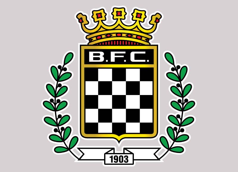
The Boavista logo is a shield-shaped emblem featuring alternating black and white checkered squares, the initials “B.F.C.” in bold yellow lettering, and a gold crown with red gems at the top. Introduced in its earliest checkered form in 1933, the crest represents the club’s identity, tradition, and connection to Porto.
Design Type: The Boavista crest is a combination mark. It merges a logo symbol (the checkered shield) with typographic elements (the B.F.C. initials). That makes it more than a simple wordmark or a pure icon.
Primary Elements: The checkered pattern of alternating black and white squares dominates the lower half of the shield. Above it sit the “B.F.C.” initials in uppercase yellow type. A decorative gold crown with red gemstones tops the shield, and branches or floral elements frame the sides. A ribbon at the bottom sometimes displays the club’s founding year.
Official Introduction Date: The checkered identity was adopted in 1933 when the club shifted from a multi-sport emblem (which included a tennis racket and hockey stick) to the now-famous black and white pattern. The current refined version has been in use on kits since approximately 2009.
Designer/Agency: The original checkered concept was inspired by club president Artur Oliveira Valenca after he saw a French team wearing chequered kits. No formal design agency has been publicly credited for the modern iterations.
Trademark Status: The Boavista FC crest is a registered trademark of Boavista Futebol Clube, Futebol SAD. It is protected under Portuguese intellectual property law and used exclusively by the club for official branding and merchandise.
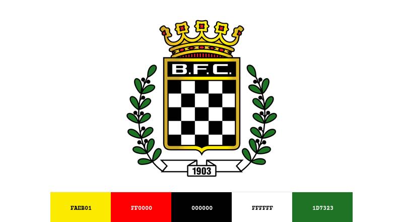
Color Palette: The official logo colors include Black (#000000), White (#FFFFFF), Gold (#FAEB01), Red (#FF0000), and Green (#1D7323). The gold and red appear primarily in the crown, while the green is used in the surrounding decorative elements.
Usage Context: The crest appears on match kits, official merchandise, the club’s website and app, marketing materials, stadium signage at the Estadio do Bessa, and digital platforms. It also features on fan memorabilia and partnership materials.
How Has the Boavista Logo Evolved Over Time?
The Boavista badge has moved through several stages since the club’s founding in 1903. Early versions featured multi-sport iconography. The 1933 redesign brought in the checkered pattern. Updates in the 1960s, 1990s, and 2000s refined the crest into its current form.
Original Boavista Logo (1903-1933)
Years Active: 1903 to 1933
The first Boavista emblems reflected the club’s multi-sport nature. You’d find a tennis racket, a hockey stick, and other sporting equipment in the badge. The overall look was busy, packed with references to every section the club operated.
There were no checkered patterns. No crown. The color palette at this stage was simpler and did not include the black and white scheme fans know today.
This version existed in a time when football wasn’t yet the club’s dominant sport. It served more as a general athletic club symbol than a football-specific crest. By the early 1920s, at least one version showed a more streamlined approach, but the big shift hadn’t happened yet.
The Checkered Era Begins (1933-2006)
Years Active: 1933 to approximately 2006
This is where everything changed. Club president Artur Oliveira Valenca traveled to France, noticed a local team in chequered black and white kits, and brought the idea home to Porto. In 1933, the checkered shirt and a matching crest became official.
The shield shape was introduced. Black and white squares filled the lower section. The “B.F.C.” initials appeared above the checkered area, typically in a gold or yellow tone. A crown sat at the top of the shield.
This version lasted decades with minor tweaks. Adjustments in the 1960s sharpened the crest as the club grew more popular in Portuguese football. The contrast between the black and white squares became a defining feature, something no other major Portuguese club had.
The cultural significance here is hard to overstate. The checkered pattern earned the club the nickname “Os Axadrezados” (The Chequered Ones). It tied the visual identity directly to the playing kit, which is something a lot of football clubs never manage to do this cleanly.
Modern Boavista Logo (2007-Present)
Years Active: 2007 to present (kit version since 2009)
The modern crest keeps the checkered shield, the B.F.C. initials, and the crown. But the graphic quality jumped. Lines got cleaner. The crown gained more detail, with vibrant gold tones and defined red gems.
Green elements in the surrounding foliage became more visible. The overall proportions were tightened for better reproduction at small sizes, which matters a lot for web design and digital platforms.
The key changes from the previous version include sharper line work, more defined hue separation in the crown and decorative elements, and better scalability. It was a modernization, not a redesign. No core element was removed.
A special 120th anniversary version appeared briefly in 2023-2024, used on the third kit. But the standard crest remains the primary version.
What Do the Design Elements of the Boavista Logo Mean?
Every part of the Boavista crest carries specific meaning. The checkered squares represent strength and unity. The crown signals prestige and ambition. The B.F.C. initials ground the emblem in the club’s official name, connecting it back to the English founders who kept “Football Club” in the title.
The shield shape itself suggests protection and tradition, a common choice in European football heraldry. But the checkered fill is what makes it unique among Portuguese crests.
Why Did Boavista Choose These Specific Colors?
Black (#000000) represents power, resilience, and authority. In the context of football branding, it gives the crest a bold, serious tone. According to color psychology, black signals sophistication and formality.
White (#FFFFFF) stands for purity, fairness, and sportsmanship. Together with black, it creates one of the highest-contrast combinations possible. That’s not an accident. It makes the checkered pattern instantly readable from across a stadium.
Actually, I should mention. The black and white pairing predates any formal color theory application. It came from a French team Valenca saw. But the result aligns perfectly with what we know about monochrome colors and their visual impact.
Gold (#FAEB01) appears in the crown and the B.F.C. lettering. It communicates prestige, achievement, and excellence. For a club that won the Primeira Liga in 2001, the gold feels earned.
Red (#FF0000) shows up in the crown’s gemstones. Red adds energy and passion, two things that define Boavista’s supporters.
Green (#1D7323) features in the foliage around the shield. It links to growth and the club’s deep roots in its Porto neighborhood.
What Typography Style Is Used in the Boavista Logo?
The “B.F.C.” initials use a bold, uppercase serif font. The letters have strong, blocky proportions that work well at both large and small sizes.
Periods separate each letter, a classic convention in Portuguese and European club branding. The typeface appears to be custom or at least heavily modified. It’s not something you’d find in a standard font library.
The yellow/gold coloring of the letters against the dark shield background creates strong visual hierarchy. Your eye hits the initials almost before you process the checkered pattern. Took me a while to notice that, but once you see it, the typographic hierarchy is clearly intentional.
What Are the Hidden Meanings in the Boavista Logo?
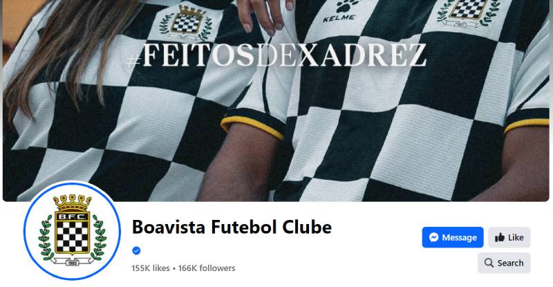
The checkered pattern mirrors a chessboard. Fans and writers have picked up on this for years, and the club itself leans into it. Their hashtag is #FeitosDeXadrez, which translates roughly to “Made of Chess.” It implies strategy, planning, and calculated moves.
The crown is not just decorative. In Portuguese heraldry, it references civic pride and the club’s deep ties to the city of Porto.
The branches framing the shield suggest growth and longevity. For a club founded in 1903, that framing choice works on a literal level. Whether the original designers planned all of this? Probably not all of it. But the psychology of shapes in design tells us that viewers read these meanings regardless of intent.
How Does the Boavista Logo Compare to Competitor Logos?
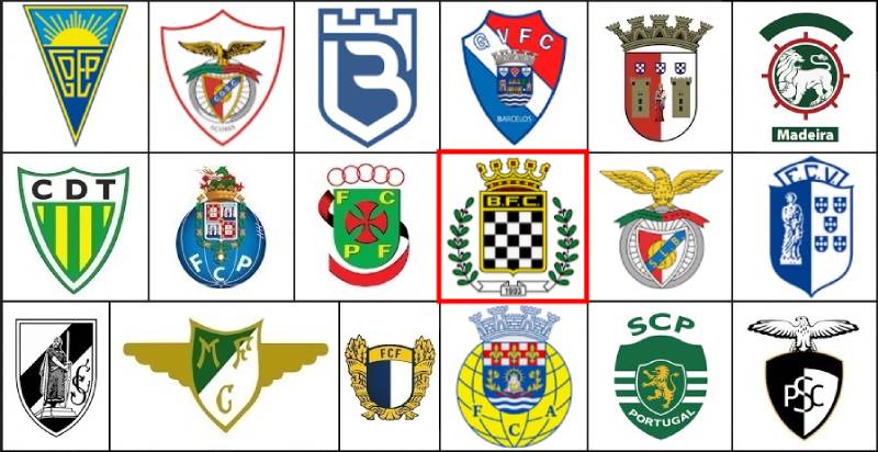
In Portuguese football, most crests follow a similar template: shield, club initials, symbolic animal or icon, and heavy use of red, green, or blue. Boavista breaks from this pattern. Its black and white checkered scheme stands alone among Primeira Liga clubs.
Look at the Benfica logo with its eagle, red tones, and bicycle wheel references. Or the FC Porto logo with its blue and white dragon-themed crest. Sporting Lisbon’s logo uses green and its lion heavily.
Boavista has no animal mascot in its crest. It relies on pattern and color contrast instead. That’s a fundamentally different design approach, and it makes the badge easier to spot on a page full of Portuguese club emblems.
The checkered pattern also creates an interesting comparison with clubs outside Portugal. Italy’s Inter Milan uses blue and black stripes. Croatia’s national team uses a red and white checkerboard on their kits. But in the Portuguese context, nobody else does this.
Portuguese clubs with simpler crests, like Gil Vicente or Rio Ave, tend to use more traditional shield-plus-symbol formats. Boavista’s approach is bolder and more pattern-driven, which gives it strong recognition even at small sizes.
What Are the Technical Specifications of the Boavista Logo?
Official Color Codes
Black
Hex: #000000 | RGB: (0, 0, 0) | CMYK: (70, 50, 50, 100) | Pantone: PMS Process Black C
White
Hex: #FFFFFF | RGB: (255, 255, 255) | CMYK: (0, 0, 0, 0)
Gold
Hex: #FAEB01 | RGB: (250, 235, 1) | CMYK: (5, 1, 98, 0) | Pantone: PMS Yellow U
Red
Hex: #FF0000 | RGB: (255, 0, 0) | CMYK: (0, 99, 100, 0) | Pantone: PMS 2028 C
Green
Hex: #1D7323 | RGB: (29, 115, 35) | CMYK: (85, 31, 100, 20) | Pantone: PMS 2273 XGC
Dimensions and Proportions
The shield follows an approximate 5:6 width-to-height ratio when including the crown. Without the crown, it’s closer to a standard 4:5 shield proportion.
Minimum size for legible reproduction is roughly 25mm in width for print design work. Below that, the checkered squares start to blur together, especially at lower DPI settings.
Clear space around the logo should be at least equal to the height of the “B” in “B.F.C.” on all sides. This keeps the crest readable against busy backgrounds. The official club guidelines for merchandise and kit printing follow these spacing rules.
The logo is available in vector graphics formats (SVG, EPS, AI) for scalable use, and in raster formats like PNG and JPEG for digital platforms.
What Cultural Impact Has the Boavista Logo Had?
The Boavista crest is bigger than football in Porto. It represents one of the city’s oldest institutions and a club that, against all odds, won the Portuguese championship in 2001, breaking the dominance of the “Big Three” (Benfica, FC Porto, and Sporting CP).
That title win cemented the checkered badge in Portuguese football history. Fans across the country, even those who don’t support Boavista, recognize the crest instantly.
The “Axadrezados” nickname built a whole subculture. Checkered merchandise, scarves, and banners fill the Estadio do Bessa on match days. The pattern transcended football and became a marker of neighborhood identity in the Boavista district of Porto.
Even the club’s Cape Verdean namesake, Boavista FC of Praia, adopted an almost identical crest during Portuguese colonial rule. That cross-continental influence speaks to how strong the visual identity became.
How Does the Boavista Logo Fit Into the Overall Brand Identity?

The Boavista crest is the anchor of the entire club brand. Everything flows from it. The kit design, the stadium branding, the digital presence, the merchandise, all of it connects back to the checkered shield. A strong set of brand guidelines keeps the visual system consistent across platforms.
The black and white checkered pattern extends beyond the logo into the team’s jerseys, which are themselves checkered. That kind of logo-to-kit consistency is rare. Most clubs have logos that look nothing like their playing shirts. Boavista’s crest and kit are the same design idea.
The club’s hashtag #FeitosDeXadrez builds on the chess connection from the logo. Their digital content, social media templates, and marketing materials all use the checkered pattern as a background texture or accent element. It creates a unified look that’s easy to scale across different channels.
How Should the Boavista Logo Be Used?
Do:
Use the full-color version of the crest on white or light backgrounds. On darker backgrounds, the logo works well because the white squares and gold lettering provide enough contrast. Always maintain the minimum clear space around the badge. Keep proportions locked when resizing.
Don’t:
Never stretch or distort the crest. Don’t rearrange the elements or separate the crown from the shield. Avoid placing the logo over busy photographic backgrounds where the checkered pattern could get lost. Don’t alter the official colors unless you’re using an approved monochrome version.
Where to Access Official Logos: The club’s official website (boavistafc.pt) provides brand assets for partners and media. Third-party vector databases like Brandfetch also host downloadable versions in SVG format.
Licensing: The Boavista FC crest is fully trademarked. Any commercial use requires written permission from the club. Fan-made merchandise using the crest without licensing is a common issue in Portuguese football, and Boavista’s legal team actively protects the mark.
Trademark Protection: The logo is registered under Portuguese intellectual property law. Unauthorized reproduction for commercial sale, especially on merchandise and apparel, can lead to legal action. Fan art and editorial use typically fall under fair use, but anything sold for profit needs approval.
FAQ on The Boavista Logo
What does the Boavista logo look like?
The Boavista FC badge features a shield with alternating black and white checkered squares, gold “B.F.C.” initials, and a crown topped with red gems. Decorative branches frame the sides. It’s one of the most distinct football club emblems in Portugal.
When was the Boavista checkered crest first introduced?
The checkered pattern arrived in 1933. Club president Artur Oliveira Valenca saw a French team wearing chequered kits and brought the idea back to Porto.
Before that, the Boavista club badge included multi-sport symbols like tennis rackets and hockey sticks.
What do the colors in the Boavista FC emblem mean?
Black represents resilience and authority. White stands for fairness. The gold in the crown and lettering signals prestige, while red adds energy. Green in the foliage connects to the club’s roots in Porto’s Boavista neighborhood.
Has the Boavista logo changed over the years?
Yes. The club has gone through roughly four to five versions since 1903.
The biggest shift came in 1933 with the checkered design. Later updates in the 1960s, 1990s, and around 2007 refined the Boavista crest design without changing core elements.
Why is the Boavista badge called the “chessboard” crest?
The alternating black and white squares mirror a chessboard pattern. Fans call the team “Os Axadrezados” (The Chequered Ones). The club itself uses #FeitosDeXadrez, meaning “Made of Chess,” as its official hashtag across digital platforms.
What is the crown on the Boavista logo?
The gold crown sits at the top of the shield. It features red gemstones and detailed ornamentation.
In Portuguese heraldry, crowns represent civic pride. For Boavista, it highlights the club’s connection to Porto and its Primeira Liga ambitions.
What font is used in the Boavista FC crest?
The “B.F.C.” initials use a bold, uppercase serif typeface with periods separating each letter. It appears to be custom or heavily modified. The yellow lettering creates strong readability against the dark shield background.
What are the official Boavista logo color codes?
Black is #000000. White is #FFFFFF. Gold is #FAEB01. Red is #FF0000. Green is #1D7323.
These five colors make up the full Boavista visual identity across kits, merchandise, and all club branding materials.
How does the Boavista emblem compare to other Portuguese football logos?
Most Primeira Liga crests use animals, red, blue, or green heavily. Boavista skips the mascot entirely and relies on its checkered pattern instead. That approach makes it instantly recognizable among Portuguese club crests, even at small sizes.
Can I use the Boavista logo for my own project?
Not commercially. The Boavista FC crest is a registered trademark. Any use on merchandise or products needs written permission from the club.
Editorial and fan art typically fall under fair use, but anything sold for profit requires official licensing from Boavista Futebol Clube.
Conclusion
The Boavista logo is more than a football club badge. It’s a piece of Porto’s sporting heritage, built on a checkered identity that no other Primeira Liga team shares.
From its 1903 origins to the championship-winning 2001 season, every version of the crest reflects the club’s growth. The black and white squares, the gold crown, the B.F.C. initials. Each element carries weight.
Whether you’re studying football club branding in Portugal or just curious about what makes the Axadrezados different, this emblem tells the whole story. Simple pattern, deep roots, lasting recognition.

Renowned for his expertise in logo design and visual branding, Bogdan has developed a multitude of logos for various clients.
His skills extend to creating posters, vector illustrations, business cards, and brochures. Additionally, Bogdan's UI kits were featured on marketplaces like Visual Hierarchy and UI8.
He also wrote in the past years on sites like Design Your Way, WebDesignerDepot, WPDean, Designmodo, Speckyboy, Slider Revolution, and more.
- The Windsurf Logo History, Colors, Font, And Meaning - 10 October 2026
- How to Remove Background From Product Photos (No Photoshop) - 10 October 2026
- How Designers can Build a Stronger Online Creative Identity - 9 October 2026

Bogdan Sandu is a seasoned designer who has been designing websites since 2008. Renowned for his expertise in logo design and visual branding, Bogdan has developed a multitude of logos for various clients. His skills extend to creating posters, vector illustrations, business cards, and brochures. Additionally, Bogdan's UI kits were featured on marketplaces like Visual Hierarchy and UI8. He also wrote in the past years on sites like Design Your Way, WebDesignerDepot, WPDean, Designmodo, Speckyboy, Slider Revolution, and more.
You Might Also Like