

The Belenenses logo is one of the most historically rich emblems in Portuguese football. It belongs to Clube de Futebol Os Belenenses, a club founded in 1919 in the Belem district of Lisbon. The crest carries deep ties to Portugal’s maritime past, featuring a shield format with the Cross of Christ at its center.
Within the wider context of European football branding, the Belenenses emblem stands out for how closely it connects club identity to national heritage. Most football crests pull from local or regional symbols. This one pulls from the country’s entire Age of Discovery. The current version of the logo has been active since the mid-1990s, though the core design dates back over a century. The club has gone through roughly five logo iterations since 1919.
What Is the Belenenses Logo?
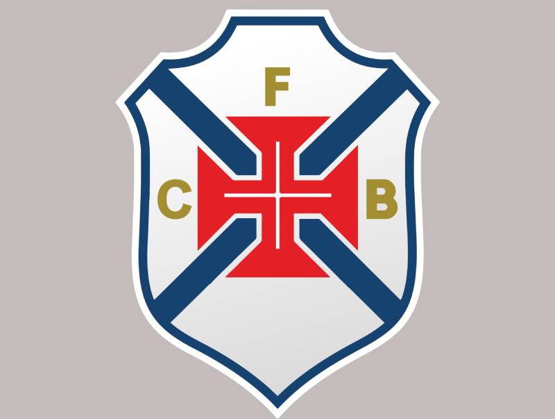
The Belenenses logo is an emblem-style crest featuring a shield with the Cross of Christ set inside a red square, flanked by blue diagonal bands on a white background. First introduced in 1919, the badge includes the initials “CFB” in yellow and uses blue, white, red, and gold as its primary colors.
Design Type: Emblem (shield-based crest). The Belenenses badge follows a classic heraldic format, which is common across older European football clubs but rare in how directly it references national religious and maritime symbols.
Primary Elements: The shield shape forms the outer boundary. Inside, a red square holds a white Cross of Christ. Blue diagonal bands create an “X” pattern across the white field. The letters “C,” “F,” and “B” sit above the central cross in a stylized yellow font. Five small stars and circular elements round out the composition.
Official Introduction Date: 1919, coinciding with the club’s founding year.
Designer/Agency: The original designer is not publicly documented. The crest was likely created by the club’s founding members.
Trademark Status: The Belenenses logo is trademarked and legally protected. After a split with Belenenses SAD (now B-SAD) in the late 2010s, the original CF Os Belenenses retained legal rights to the name and crest. B-SAD was forced to adopt a new logo entirely.
Color Palette: Blue (#365C8D), White (#FFFFFF), Red (used in the central cross square), and Yellow/Gold (used for the “CFB” lettering).
Usage Context: The logo appears on matchday kits, club merchandise, official documents, the Estadio do Restelo, digital platforms, and all promotional materials associated with CF Os Belenenses.
How Has the Belenenses Logo Evolved Over Time?

The Belenenses crest has been updated five times since 1919, but the core identity has barely shifted. The Cross of Christ has sat at the center of every version.
Each redesign refined the shield outline, adjusted lettering, or tweaked the color tones. But the fundamental layout stayed put for over a century.
Original Belenenses Logo (1919-1925)
Years Active: 1919-1925
The first badge was rough and hand-drawn, as you would expect from a newly founded club with almost no money. Belenenses nearly folded within their first six months due to financial problems.
The design already featured the shield shape and the Cross of Christ. Blue and white were present from day one. The overall look was rounder, less angular than later versions.
There was no predecessor, so this was the starting point. It was simple, almost crude by today’s standards. But it set the template that every future version would follow.
For a club born in a riverside neighborhood of Lisbon, the cross connected them immediately to Portugal’s identity as a seafaring nation. That choice was intentional, and it stuck.
Second Belenenses Logo (1925-1928)
Years Active: 1925-1928
This version cleaned up the edges. The shield became more defined, the proportions a bit more consistent.
The “CFB” initials were more prominent. Color application was slightly more standardized, though printing methods of the era limited how precise things could get.
Belenenses were winning Campeonato de Portugal titles during this period. The club was becoming a serious force, and the logo needed to look the part.
Third Belenenses Logo (1928-1945)
Years Active: 1928-1945
The shield took on a more angular, structured look. Lines got sharper. The Cross of Christ became bolder and more visually prominent.
This was the era when Belenenses established themselves as part of Portugal’s “Big Four.” They won their first Taca de Portugal in 1942 and their only Primeira Liga title in 1946 (just after this version transitioned).
The crest reflected a club that was confident, growing, and competing at the highest level. The design tightened up to match that ambition.
Fourth Belenenses Logo (1945-1994)
Years Active: 1945-1994
This was the longest-running version. Nearly fifty years. The shield was more streamlined, the blue became more consistent in shade, and the overall look was cleaner.
The “CFB” letters got a color update, and the frame around the crest was refined. But honestly, the changes were subtle. If you put the 1928 and 1945 versions side by side, you would see the family resemblance immediately.
During this half-century, Belenenses experienced their first relegation (1982), won their last Taca de Portugal (1989), and became a club defined more by tradition than by trophies. The logo carried that weight well.
Current Belenenses Logo (1994-Present)
Years Active: 1994 to present
The current version is the most polished iteration. Color values were standardized for modern reproduction. The shield outline is crisp. The Cross of Christ is rendered with greater precision.
Digital reproduction was a factor here. The logo needed to work on screens, not just on fabric and print. The blue became the now-official #365C8D shade.
This version also became the center of a legal battle. When Belenenses SAD split from the original club, the courts ruled that only CF Os Belenenses could use this crest. That legal protection gave the badge even more significance as a symbol of the club’s authentic identity.
What Do the Design Elements of the Belenenses Logo Mean?
Every piece of the Belenenses crest ties back to either Lisbon’s history or Portugal’s national identity. The shield represents protection and strength. The Cross of Christ connects the club to the Age of Discovery.
The blue and white recall the sea and sky around Belem, a district that was literally the departure point for Portuguese explorers. Nothing in this badge is decorative filler.
Why Did Belenenses Choose These Specific Colors?
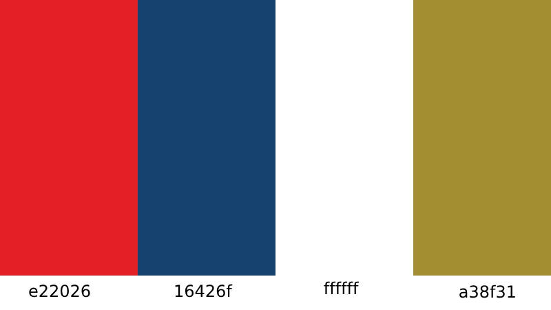
Blue (#365C8D) is the dominant color. It references the Atlantic Ocean and the Tagus River, both of which define Belem’s geography. In terms of color psychology, blue signals trust, depth, and stability. For a football club, that is a solid foundation.
White (#FFFFFF) sits alongside the blue as a secondary color. It represents peace and purity. The combination of blue and white is common in Lisbon-based institutions, tying Belenenses to the city’s broader visual culture.
Red appears in the central square behind the Cross of Christ. It adds a focal point to the design and connects to the historical use of red in the Order of Christ’s symbolism. The contrast between the red square and the surrounding blue-white field makes the cross impossible to miss.
Yellow/Gold is used for the “CFB” initials. It brings warmth and helps the lettering stand out against the blue background. Gold traditionally carries associations with achievement and prestige.
What Typography Style Is Used in the Belenenses Logo?
The “CFB” lettering uses a custom stylized typeface that leans traditional. It is not a widely available commercial font.
The letterforms are decorative but still legible at small sizes, which matters for badge reproduction on kits and merchandise. The style feels consistent with early 20th-century Portuguese design conventions.
Over the years, the lettering has been subtly adjusted. Earlier versions were rougher. The current iteration is cleaner, with more consistent stroke widths and better spacing between the three characters.
What Are the Hidden Meanings in the Belenenses Logo?
The Cross of Christ is the biggest “hidden in plain sight” element. It is not just a religious symbol. It was the emblem carried on the sails of Portuguese ships during the Age of Discovery.
Belem itself was where many of those ships departed. So the cross on the crest is both geographical and historical at the same time.
The “X” pattern formed by the blue diagonal bands inside the shield resembles the saltire cross, which adds another layer of heraldic meaning. Whether the original designers intended all of this is hard to say. But the connections are there.
How Does the Belenenses Logo Compare to Competitor Logos?
Among Portuguese football crests, the Belenenses badge sits in a unique position. It draws from national symbolism more directly than most rivals. Benfica uses an eagle and a shield. Sporting Lisbon features a lion. FC Porto leans on a crown and dragon.
Belenenses went a different route entirely. No animal mascot. No crown. Just the Cross of Christ and a clean shield. That makes it instantly distinguishable in a league full of animal-based and royalty-themed crests.
The overall look is quieter than rivals like Benfica or Porto, which use more complex compositions with more colors. Belenenses keeps it tight. Four colors, a shield, a cross, and three letters. In terms of principles that guide strong logo creation, the crest scores well on simplicity and memorability.
Compared to other Lisbon clubs, Belenenses also stands out through its connection to a specific neighborhood. The badge is not just about football. It is about Belem itself.
What Are the Technical Specifications of the Belenenses Logo?
Official Color Codes
Primary Color: Blue
Secondary Color: White
- Hex: #FFFFFF
- RGB: (255, 255, 255)
- CMYK: (0, 0, 0, 0)
Accent Color: Red
- Used in the central Cross of Christ square
- Exact hex values vary slightly across sources, but the red is a traditional, warm tone consistent with the Order of Christ’s historical usage
Accent Color: Yellow/Gold
- Applied to the “CFB” initials
- A goldenrod-adjacent shade that reads as gold on darker backgrounds
Dimensions and Proportions
The shield follows a roughly pentagonal shape, wider at the top and tapering to a point at the bottom. The aspect ratio is approximately 5:6 (width to height).
For web use, the logo is typically distributed in vector formats (SVG, EPS, AI) to keep it sharp at any size. Bitmap versions in PNG are also available for smaller applications. The club maintains clear space rules around the emblem, though official brand guidelines are not publicly distributed in the way that larger corporate entities publish theirs.
What Cultural Impact Has the Belenenses Logo Had?

The Belenenses crest is more than a football badge in the Belem neighborhood. It is a cultural marker. Locals identify with it beyond the sport, because the cross and shield carry meaning tied to the district’s identity as Portugal’s gateway to the world.
When Real Madrid invited Belenenses to inaugurate their new stadium in 1947, it was the crest that traveled with the team. That moment placed the badge on an international stage at a time when few Portuguese clubs had that kind of visibility.
The legal battle over the logo during the Belenenses SAD split gave the emblem even more cultural weight. Fans rallied around the original crest as a symbol of the “real” club. Attendance at the original CF Os Belenenses matches jumped to around 5,000 while B-SAD (stripped of the logo) drew only a few hundred. The badge became a line in the sand.
How Does the Belenenses Logo Fit Into the Overall Brand Identity?
The Belenenses crest is the anchor of the entire brand system. Kit designs, stadium signage, official communications, and merchandise all flow from the shield’s blue, white, red, and gold palette.
The club’s nickname, “Azuis do Restelo” (The Blues from Restelo), ties directly to the primary blue in the logo. Another nickname, “A Cruz de Cristo” (The Cross of Christ), references the crest’s central element. The logo and the club’s spoken identity are basically the same thing.
Belenenses operates across multiple sports, including handball, basketball, futsal, athletics, and rugby. The crest unifies all of these under one visual identity. That is a lot of weight for one badge to carry, but the simplicity of the design handles it well. It works on a football shirt, a basketball jersey, and a letterhead without needing modification.
How Should the Belenenses Logo Be Used?
Official usage guidelines are maintained internally by CF Os Belenenses. The club does not publish a public brand guidelines document, but standard rules apply. The logo should not be stretched, recolored, or placed on backgrounds that reduce its legibility.
Where to access official logos: Vector and raster versions of the crest are available through sports logo databases and the club’s official channels. For any commercial or editorial use, permissions should be obtained directly from the club.
Licensing: The Belenenses logo is a registered trademark. Unauthorized use on merchandise, media, or digital platforms is prohibited. The legal precedent set during the B-SAD dispute makes this particularly clear. Courts ruled definitively that only CF Os Belenenses has the right to use the badge.
Trademark protection: The crest is protected under Portuguese trademark law. The club has actively enforced these rights, especially following the institutional split with Belenenses SAD.
FAQ on The Belenenses Logo
What does the Belenenses logo look like?
The CF Os Belenenses crest is a shield-shaped emblem. It features a red square at the center holding a white Cross of Christ, with blue diagonal bands on a white field.
The initials “CFB” appear in yellow above the cross. Five stars and circular details complete the badge design.
When was the Belenenses logo first created?
The original club emblem dates to 1919, the same year the club was founded in the Belem district of Lisbon. It was a simple hand-drawn design.
That first version already included the shield shape and the Cross of Christ. The founding members built the crest around Portugal’s maritime identity from day one.
What does the cross on the Belenenses badge mean?
The cross is the Cruz de Cristo, or Cross of the Order of Christ. Portuguese explorers carried this symbol on their ships during the Age of Discovery.
Belem was the departure point for many of those voyages. So the cross ties the club directly to the neighborhood’s historical role in Portuguese exploration.
What are the official Belenenses logo colors?
The primary club colors are blue (#365C8D) and white (#FFFFFF). Red fills the square behind the cross, and yellow or gold is used for the “CFB” lettering.
Blue represents the sea and sky around Lisbon. White stands for peace. These color palette choices reflect the club’s connection to Portugal’s coastal heritage.
How many times has the Belenenses logo changed?
The crest has gone through roughly five versions since 1919. Changes happened in 1925, 1928, 1945, and 1994.
Each update was minor. The Belenenses badge design stayed remarkably consistent for over a century, with the cross and shield always at its core.
What is the difference between the Belenenses and B-SAD logos?
After a legal split in the late 2010s, courts ruled that only the original CF Os Belenenses could use the historic crest. Belenenses SAD was forced to rebrand as B-SAD with a completely new logo.
The original badge became a symbol of the club’s authentic identity during that dispute.
What type of logo design is the Belenenses crest?
It is an emblem, specifically a heraldic shield-based crest. This format is common among older European football clubs.
Unlike wordmarks or abstract marks, emblems pack multiple visual elements into one contained shape. The Belenenses version uses a shield, cross, lettering, and stars together. Understanding the psychology behind shape choices helps explain why the shield format communicates strength and tradition.
Is the Belenenses logo trademarked?
Yes. The logo is a registered trademark under Portuguese law. The club actively enforces its rights, especially after the B-SAD split.
Unauthorized reproduction on merchandise, digital platforms, or media is not allowed. The legal case against Belenenses SAD set a clear precedent for that protection.
Can I download the Belenenses logo for personal use?
Several sports logo databases offer the Belenenses crest in pixel-based PNG and vector formats like SVG and EPS. These work for reference or educational purposes.
For anything commercial, you need permission from the club. The trademark protections are real and enforceable.
How does the Belenenses logo compare to other Portuguese football crests?
Most Primeira Liga clubs use animal mascots or royal symbols. Boavista has a checkered design. Gil Vicente features a rooster.
Belenenses skipped the animal route entirely. The Cross of Christ gives it a distinctly national, historical feel that no other Portuguese football club emblem replicates. That is what makes the Belenenses visual identity stand apart.
Conclusion
The Belenenses logo has survived over a century with its core identity intact. That is rare for any football club emblem, let alone one from a team that has faced relegation, financial trouble, and an institutional split.
The Cross of Christ at its center does the heavy lifting. It connects the club to Belem’s role in Portuguese exploration, to the Estadio do Restelo, and to a community that sees this crest as more than a sports badge.
Five redesigns, one legal battle, and the shield still holds. The blue and white hue choices, the heraldic structure, the restrained use of color. All of it works together.
For a club nicknamed “Os Azuis do Restelo,” the badge tells the whole story without saying a word.

Renowned for his expertise in logo design and visual branding, Bogdan has developed a multitude of logos for various clients.
His skills extend to creating posters, vector illustrations, business cards, and brochures. Additionally, Bogdan's UI kits were featured on marketplaces like Visual Hierarchy and UI8.
He also wrote in the past years on sites like Design Your Way, WebDesignerDepot, WPDean, Designmodo, Speckyboy, Slider Revolution, and more.
- The Windsurf Logo History, Colors, Font, And Meaning - 10 October 2026
- How to Remove Background From Product Photos (No Photoshop) - 10 October 2026
- How Designers can Build a Stronger Online Creative Identity - 9 October 2026

Bogdan Sandu is a seasoned designer who has been designing websites since 2008. Renowned for his expertise in logo design and visual branding, Bogdan has developed a multitude of logos for various clients. His skills extend to creating posters, vector illustrations, business cards, and brochures. Additionally, Bogdan's UI kits were featured on marketplaces like Visual Hierarchy and UI8. He also wrote in the past years on sites like Design Your Way, WebDesignerDepot, WPDean, Designmodo, Speckyboy, Slider Revolution, and more.
You Might Also Like


