The Sporting Lisbon logo is one of the most recognizable club badges in European football. Built around a rampant lion and a green-and-white color scheme, it carries over a century of Portuguese sporting tradition. The club, officially known as Sporting Clube de Portugal, was founded on July 1, 1906, in Lisbon. Since 1907, the crest has gone through six distinct versions, each keeping the lion and the green palette intact while adapting to shifting design trends.
Few football emblems have stayed this consistent for this long. The Sporting CP badge sits alongside crests from rivals like Benfica and FC Porto as part of Portugal’s “Big Three,” but its visual identity tells a different story. Where other clubs have gone through dramatic overhauls, Sporting has treated its crest more like a family heirloom. Adjusted, polished, modernized. Never abandoned.
The current version has been in use since 2001. It replaced a beloved 1945 design that many fans still consider the “true” badge. Both versions circulate today across merchandise, digital platforms, and matchday kits at Estadio Jose Alvalade.
What Is the Sporting Lisbon Logo?
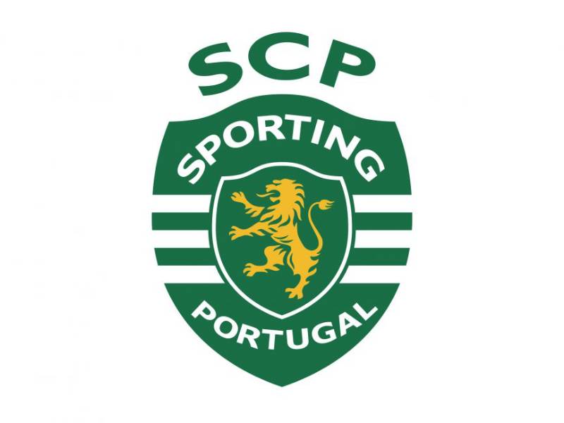
The Sporting Lisbon logo is a combination mark featuring a golden rampant lion set on a green shield, framed inside a larger striped shield bearing the words “Sporting Portugal.” Officially introduced in 2001, it was designed as part of the club’s broader rebranding effort to modernize its identity and clarify its name internationally. The lion symbolizes strength, courage, and the club’s fighting spirit.
Here’s a breakdown of the badge’s core attributes:
- Design Type: Combination mark (emblem with wordmark). The crest merges heraldic shield elements with typographic components, placing it in the same category as classic European football badges.
- Primary Elements: A golden rampant lion centered on a green inner shield with a white border. This sits inside a larger shield featuring alternating green and white horizontal stripes. The “SCP” monogram crowns the top. Below the lion, the words “Sporting” and “Portugal” are written in white.
- Official Introduction Date: 2001. The redesign coincided with the club’s push toward professional modernization and economic sustainability.
- Designer/Agency: The 2001 rebrand was developed internally through marketing strategy studies commissioned by the club. The original 1907 badge was produced by Casa Anjos, a Lisbon-based firm. The 1913 version was designed by Hugo Morais Sarmento, a goalkeeper who ordered the badges from Germany.
- Trademark Status: The Sporting CP emblem is a registered trademark of Sporting Clube de Portugal. The club has actively promoted awareness campaigns around the correct use of its name and logo, pushing back against the informal “Sporting Lisbon” label used abroad.
- Color Palette: Green (#008057), Gold (#F3C242), and White (#FFFFFF). These three colors define the club’s complete visual system.
- Usage Context: The logo appears on home and away kits, official merchandise, digital platforms, stadium signage, broadcast graphics, and all formal club communications. It’s also used across Sporting’s non-football departments, including futsal, handball, and athletics.
How Has the Sporting Lisbon Logo Evolved Over Time?

Sporting CP has used six official badges since 1907. Each redesign kept the rampant lion and green color while gradually shifting from circular emblems to shield-based crests. The biggest visual leap came in 2001, when the lion turned golden and the striped outer shield was introduced.
Original Sporting CP Badge (1907-1913)
- Years Active: 1907-1913
- Design Description: A circular green emblem with a silver-gray rampant lion at the center. The club’s initials “SCP” appeared in bold sans-serif lettering, semi-encircling the lion figure.
- Color Scheme: Green background, silver/gray lion, white lettering
- Designer: Produced by Casa Anjos, a firm based in Lisbon
- Context: The lion came from the coat of arms of Fernando de Castelo Branco, a Portuguese politician. Jose Alvalade, one of the club’s founders, asked for permission to use it. Castelo Branco agreed, with one condition: the blue from his original arms had to be replaced. Green was chosen because it represented hope.
- Cultural Significance: This first badge established the visual DNA that every future version would build on. Clean, simple, and built around a single powerful symbol.
The Shield Badge (1913-1930)
- Years Active: 1913-1930
- Design Description: The circular format gave way to a green shield shape with smooth curved edges. A white rampant lion sat at the center. The shield was enclosed in a black circular frame, with “Sporting Club de Portugal” written in white capitals around it.
- Color Scheme: Green shield, white lion, black circular border, white text
- Designer: Hugo Morais Sarmento, a goalkeeper who joined Sporting in 1910 after returning from Germany. He designed the model and ordered the production of new enamel badges from German manufacturers.
- Key Changes from Previous: Shift from circular to shield shape. The lion changed from silver to white. Full club name appeared for the first time. The overall look moved toward a more heraldic, European football crest style.
- Context: The idea for the redesign actually came from Sarmento’s blue jacket, which had Germanic lapel emblems pinned to it. That sparked the concept of ordering proper club badges from abroad. They arrived on April 1, 1913.
- Cultural Significance: This version aligned Sporting with the broader European tradition of shield-based heraldic designs in football. It gave the badge a more formal, institutional feel.
The Simplified Medallion (1930-1945)
- Years Active: 1930-1945
- Design Description: The black circular frame was removed entirely. What remained was a smooth green medallion with a white outline. The white lion stood prominently in the center, with “S.C.P.” letters arranged around it.
- Color Scheme: Green medallion, white outline, white lion, white lettering
- Key Changes from Previous: Gone was the heavy black border and the full club name. The design became quieter, more refined. The focus shifted entirely to the lion and the monogram.
- Cultural Significance: This was the badge Sporting wore during the rise of organized Portuguese football. The Primeira Liga launched in 1934, and this crest represented the club through that transition into professional competition.
The Iconic Crest (1945-2001)
- Years Active: 1945-2001
- Design Description: The lion was enlarged and given more visual weight on the green medallion. All lettering was removed from the green background itself. The “SCP” monogram was placed above the crest for the first time, acting like a crown. The badge gained a thicker white outline.
- Color Scheme: Green shield, white lion, white outline, green “SCP” monogram above
- Key Changes from Previous: The monogram moved outside the shield. The lion became the undisputed focal point. The indented top of the shield added a heraldic touch. Cleaner lines gave it a more professional appearance.
- Context: This badge covered Sporting’s most storied era. The legendary “Five Violins” squad, seven league titles in eight years, the 1964 European Cup Winners’ Cup triumph. It became so iconic that many fans never wanted it changed.
- Cultural Significance: For older supporters, this IS the Sporting badge. It still appears on retro merchandise, throwback kits, and is widely used by fan groups. It represents the golden age.
The Modern Badge (2001-Present)
- Years Active: 2001-present
- Design Description: A golden (yellow) rampant lion sits on a green inner shield with a white border. This shield nests inside a larger outer shield featuring green and white horizontal stripes. “Sporting” and “Portugal” appear in white text on the striped section. The green “SCP” monogram sits on top.
- Color Scheme: Green (#008057), Gold (#F3C242), White (#FFFFFF)
- Key Changes from Previous: The lion changed from white to golden/yellow for the first time in club history. The striped outer shield was entirely new, referencing the club’s famous shirt pattern. The words “Sporting” and “Portugal” were written in full, replacing the monogram-only approach.
- Context: The 2001 redesign came during Sporting’s push to become a modern, commercially sustainable football club. The full name was included partly to fight back against the “Sporting Lisbon” label used internationally, which the club considers incorrect.
- Cultural Significance: It divided opinion among supporters. Some loved the updated look. Others felt it lost the simplicity of the 1945 design. Either way, it’s now been in use for over two decades and has become the standard.
What Do the Design Elements of the Sporting Lisbon Logo Mean?
Every piece of the Sporting CP badge carries specific meaning rooted in the club’s origins and values. The rampant lion is the central symbol, borrowed from a nobleman’s coat of arms in 1907. The shield format follows European heraldic traditions. And the striped pattern on the outer shield directly mirrors the green-and-white jersey the club has worn since 1908.
The motto “Esforco, Dedicacao, Devocao e Gloria” (Effort, Dedication, Devotion, and Glory) doesn’t appear on the badge itself, but it runs through every design choice. The lion faces right in a fighting stance, front paws raised. It’s not decorative. It’s aggressive and forward-looking.
Why Did Sporting Choose These Specific Colors?

Green was chosen in 1906 because it symbolized hope. The original lion came from a blue coat of arms, but Castelo Branco required the color be changed. The club’s founders picked green as a deliberate statement about the future they wanted to build.
Here are the official color codes:
- Green – Hex: #008057 | RGB: (0, 128, 87) | CMYK: (88, 26, 80, 12) | Pantone: PMS 3415 C. Green represents growth, renewal, and the endless potential the founders envisioned for the club. In color psychology, green is tied to balance and perseverance, which fits a club that has never been relegated from Portugal’s top flight.
- Gold – Hex: #F3C242 | RGB: (243, 194, 66) | CMYK: (4, 24, 87, 0) | Pantone: PMS 123 C. Gold was introduced with the 2001 redesign, replacing the white lion. It represents excellence, achievement, and the club’s trophy-winning history. The psychological impact of gold in branding communicates prestige and tradition.
- White – Hex: #FFFFFF | RGB: (255, 255, 255) | CMYK: (0, 0, 0, 0). White stands for peace, unity, and sportsmanship. It appears throughout the badge as outlines, stripes, and text. Combined with green, it creates the club’s signature striped identity.
These three colors work together as a cohesive palette that’s instantly recognizable across broadcast, print, and digital formats.
What Typography Style Is Used in the Sporting Lisbon Logo?
The badge uses a custom sans-serif typeface for both the “SCP” monogram and the “Sporting Portugal” wordmark. The letters are bold, with smooth angles and clean cuts that give them a modern but solid feel.
The “SCP” monogram at the top uses a slightly different weight than the text below, creating a sense of typographic hierarchy. The kerning on “Sporting Portugal” is tight, keeping the text compact within the shield’s horizontal stripes.
Earlier versions of the badge used more traditional serif-style lettering, especially the 1913 crest with its all-caps club name. The shift to sans-serif came as part of the 2001 modernization, matching the cleaner lines of the updated shield.
What Are the Hidden Meanings in the Sporting Lisbon Logo?
The three horizontal stripes on the outer shield aren’t random. They directly reference the club’s famous green-and-white striped jersey, first introduced in 1908 as the “Stromp Kit.” So the badge literally wears the shirt.
The lion’s pose, known in heraldry as “rampant,” shows the animal standing on its hind legs with claws extended. It’s a position that communicates readiness and aggression. Not a resting lion. A fighting one.
Including “Portugal” instead of “Lisbon” in the 2001 redesign was a deliberate branding move. The club wanted to emphasize its national identity, not just its city. This was partly a response to years of being mislabeled as “Sporting Lisbon” by foreign media.
How Does the Sporting Lisbon Logo Compare to Competitor Logos?
Among Portugal’s Big Three, each badge tells a very different visual story. Sporting’s green-and-gold shield sits between two other strong identities. The comparison reveals a lot about how these clubs see themselves.
Benfica’s crest uses a red eagle perched above a shield, with “SLB” initials and a football icon. It’s bolder, more vertical, and relies heavily on red to communicate passion and power. The eagle is a completely different kind of animal symbol compared to Sporting’s lion.
FC Porto’s badge features a blue-and-white color scheme with a dragon incorporated into a circular design. The dragon is more stylized and graphic compared to Sporting’s heraldic lion. Porto’s badge feels busier, with more text elements and a crown on top.
Sporting’s current crest lands somewhere in the middle. It’s more structured than Benfica’s, with its nested shield-within-a-shield layout. But it’s cleaner than Porto’s, with fewer individual elements competing for attention. The use of gold gives it a warmth that neither rival badge has.
If you look at other European clubs with lion-based crests, like Aston Villa, Chelsea, or even Olympique Lyonnais, Sporting’s version is among the most traditional. It stays close to actual heraldic conventions rather than going abstract or stylized.
What Are the Technical Specifications of the Sporting Lisbon Logo?
Official Color Codes
- Primary Color: Green – Hex: #008057 | RGB: (0, 128, 87) | CMYK: (88, 26, 80, 12) | Pantone: PMS 3415 C
- Secondary Color: Gold – Hex: #F3C242 | RGB: (243, 194, 66) | CMYK: (4, 24, 87, 0) | Pantone: PMS 123 C
- Accent Color: White – Hex: #FFFFFF | RGB: (255, 255, 255) | CMYK: (0, 0, 0, 0)
Dimensions and Proportions
The badge uses a vertical shield format, meaning it’s taller than it is wide. The aspect ratio roughly follows a 3:4 proportion when accounting for the “SCP” monogram at the top.
The inner lion shield sits centered within the outer striped shield, creating a layered depth effect. Clear space around the logo should generally equal or exceed the height of the “SCP” monogram to keep it legible at smaller sizes.
For print applications, the badge should be reproduced at a minimum size that keeps the “Sporting Portugal” text readable. At very small sizes (like vector favicon or app icon use), simplified versions may apply.
For screen use, the badge works across both light and dark backgrounds due to the white outlines providing enough contrast. The DPI for print should be set at 300 or higher to preserve the fine details of the lion illustration and the thin type.
What Cultural Impact Has the Sporting Lisbon Logo Had?

The Sporting CP badge is more than a sports crest in Portugal. It’s a cultural marker. Over 150,000 registered members wear it, tattoo it, fly it from their windows. The lion has become shorthand for an entire set of values: resilience, ambition, and a stubborn refusal to ever give up.
At Estadio Jose Alvalade, the badge is everywhere. It’s woven into the stadium seats. Printed on scarves. Projected onto screens. For matchday, the badge becomes the visual anchor of the entire experience.
The crest has appeared on kits made by several major manufacturers over the years, including Nike and currently other partners. Each new kit release generates intense discussion among fans about how the badge sits on the chest, how the colors interact with that season’s design.
And then there’s the broader Lisbon identity angle. The city is defined in part by the rivalry between Sporting and Benfica. Both badges are sprayed on walls, stuck on car bumpers, hung in barbershop windows. You can’t walk through certain neighborhoods without seeing one or the other. They’re as much a part of the urban landscape as the tram lines.
How Does the Sporting Lisbon Logo Fit Into the Overall Brand Identity?

The logo is the anchor of Sporting’s entire brand system. Everything else, from the kit designs to the stadium architecture to the digital presence, flows out from it. The green-gold-white palette shows up across every touchpoint. The club’s brand guidelines dictate exactly how the badge should appear on jerseys, signage, broadcast graphics, and partner materials.
The “SCP” monogram at the top of the badge doubles as a standalone mark for secondary applications. You’ll see it on training gear, social media avatars, and app icons where the full crest would be too detailed to read.
Sporting’s brand reaches beyond football. The club fields teams in futsal, handball, athletics, swimming, and several other sports. The badge unifies all of these under a single visual identity. It’s the thread that connects a futsal player in Lisbon to a track athlete representing the same institution.
The brand style guide maintains consistency across all departments, partner integrations, and licensed products. This kind of centralized visual control is what separates professional sports brands from amateur ones.
How Should the Sporting Lisbon Logo Be Used?

Official usage guidelines:
- The badge should always be reproduced from official artwork files. Never recreate it manually or trace it from screenshots.
- Minimum clear space must be maintained around the crest. No text, graphics, or other visual elements should crowd into the badge area.
- The official color codes (Green #008057, Gold #F3C242, White #FFFFFF) must be used exactly. No color substitutions, gradients, or effects should be applied unless specifically approved.
- The badge should not be stretched, skewed, rotated, or distorted in any way. Aspect ratios must remain locked.
- On dark backgrounds, the white outline provides sufficient separation. On very light or white backgrounds, care should be taken so the white elements remain visible.
Where to access official logos:
Official badge files can be sourced through Sporting CP’s communications department or authorized licensing partners. The club’s official website (sporting.pt) features the badge in its current form across all pages.
Licensing information:
Any commercial use of the Sporting CP badge requires written permission from the club. Licensed merchandise partners receive approved artwork and usage specifications as part of their agreements.
Trademark protection:
The Sporting CP emblem, including the lion, the shield design, and the “SCP” monogram, is fully trademarked. Unauthorized reproduction or modification for commercial purposes is a violation of the club’s intellectual property rights. The club has been especially vocal about protecting its brand against informal names and unauthorized logo alterations used by third-party sellers.
FAQ on The Sporting Lisbon Logo
What does the Sporting Lisbon logo look like?
The Sporting CP badge features a golden rampant lion on a green shield, nested inside a larger shield with green and white horizontal stripes. The “SCP” monogram sits on top, with “Sporting Portugal” written below the lion.
What does the lion on the Sporting Lisbon logo represent?
The lion comes from the coat of arms of Fernando de Castelo Branco, a Portuguese politician. Jose Alvalade asked to use it when the club was founded in 1906.
It represents strength, courage, and the club’s fighting spirit. That’s why fans are nicknamed “Leoes.”
When was the current Sporting CP logo introduced?
The current version launched in 2001. It replaced the beloved 1945 crest as part of a broader rebranding effort tied to the club’s professional modernization and its push for international name recognition.
What are the official colors of the Sporting Lisbon logo?
Green (#008057), gold (#F3C242), and white (#FFFFFF). Green was chosen in 1906 as a symbol of hope.
Gold replaced the previously white lion in 2001. The green and white stripes on the outer shield mirror the club’s famous jersey pattern.
How many times has the Sporting Lisbon logo changed?
Six versions total since 1907. The badge was redesigned in 1913, 1930, 1945, and 2001. Each version kept the rampant lion and green hue intact while adjusting the overall structure and detail.
Who designed the original Sporting CP badge?
Casa Anjos, a Lisbon-based firm, produced the first badge in 1907. It was a green circle with a silver lion and “SCP” lettering.
The 1913 redesign came from Hugo Morais Sarmento, a goalkeeper who ordered new enamel badges from Germany after being inspired by Germanic lapel emblems.
What is the difference between the 1945 and 2001 Sporting Lisbon logos?
The 1945 crest had a white lion on a simple green shield. Clean and minimal.
The 2001 version added a golden lion, an outer striped shield, and the full “Sporting Portugal” text. It introduced a layered, more complex approach to the club’s badge design.
Why does the logo say “Sporting Portugal” instead of “Sporting Lisbon”?
The club’s official name is Sporting Clube de Portugal. “Sporting Lisbon” is an informal label used by foreign media that the club actively rejects.
The 2001 redesign included “Portugal” specifically to clarify the name internationally and protect the brand.
Can I download or use the Sporting Lisbon logo for personal projects?
The Sporting CP emblem is a registered trademark. Any commercial use requires written permission from the club. Personal, non-commercial use like fan art is generally tolerated but not officially licensed.
Official files come through the club’s communications department.
How does the Sporting Lisbon logo compare to other Portuguese football club logos?
Benfica uses a red eagle. FC Porto features a blue-and-white dragon. Sporting’s green-and-gold lion sits between them in terms of visual complexity.
All three Primeira Liga giants use animal symbols and shield formats, but Sporting’s crest stays closest to traditional heraldic design elements.
Conclusion
The Sporting Lisbon logo has survived six redesigns across 118 years without ever losing its core identity. That kind of visual consistency is rare in European football branding. The rampant lion, the green shield, the SCP monogram, all still there from the very beginning.
What makes this crest work is how it balances tradition with modern needs. The 2001 update gave it commercial flexibility without gutting what fans connected to.
From the streets of Alvalade to Champions League broadcasts, the badge carries the weight of Sporting Clube de Portugal’s legacy. It’s a piece of visual storytelling that keeps earning its place on the chest.

Renowned for his expertise in logo design and visual branding, Bogdan has developed a multitude of logos for various clients.
His skills extend to creating posters, vector illustrations, business cards, and brochures. Additionally, Bogdan's UI kits were featured on marketplaces like Visual Hierarchy and UI8.
He also wrote in the past years on sites like Design Your Way, WebDesignerDepot, WPDean, Designmodo, Speckyboy, Slider Revolution, and more.
- The Cursor Logo History, Colors, Font, And Meaning - 24 September 2026
- Top 7 Web Design Subscription Services That Replace Full-Time Hires - 24 September 2026
- Canva vs PowerPoint: Which Is Better for Presentations? - 22 September 2026

Bogdan Sandu is a seasoned designer who has been designing websites since 2008. Renowned for his expertise in logo design and visual branding, Bogdan has developed a multitude of logos for various clients. His skills extend to creating posters, vector illustrations, business cards, and brochures. Additionally, Bogdan's UI kits were featured on marketplaces like Visual Hierarchy and UI8. He also wrote in the past years on sites like Design Your Way, WebDesignerDepot, WPDean, Designmodo, Speckyboy, Slider Revolution, and more.
You Might Also Like