The Sampdoria logo is one of the most recognizable badges in Italian football. It belongs to Unione Calcio Sampdoria, a club formed in 1946 through the merger of two Genoa-based teams, Sampierdarenese and Andrea Doria. The crest centers on a black silhouette of a sailor called Baciccia, set against a white shield with diagonal blue, white, red, and black stripes.
Few football emblems carry this much local identity. The Baciccia figure ties directly to Genoa’s centuries-old maritime culture, and the four-color stripe pattern reflects the two predecessor clubs that gave birth to Sampdoria. The current version of the badge has been in use since 1997, though its core design dates back to 1984.
The club has gone through roughly 12 distinct logo versions since its founding. Each iteration adjusted the composition, but the connection to Genoa’s port heritage stayed consistent across every redesign.
What Is the Sampdoria Logo?

The Sampdoria logo is an emblem-style crest featuring a black sailor silhouette known as Baciccia, placed on a white shield with diagonal stripes in blue, red, white, and black. Officially refined in 1997, the badge represents Genoa’s seafaring tradition and the 1946 merger of Sampierdarenese and Andrea Doria.
- Design Type: Emblem (combination of shield, figure, and wordmark)
- Primary Elements: Baciccia sailor silhouette, diagonal striped pattern, white shield shape, “U.C. Sampdoria” text in red
- Official Introduction Date: Current version since 1997 (Baciccia shield concept from 1984)
- Designer/Agency: In-house club design. The original Baciccia figure was first revealed in September 1980 through Italy’s Topolino (Mickey Mouse) comic magazine, published by Panini
- Trademark Status: Registered trademark of Unione Calcio Sampdoria S.p.A.
- Color Palette: Blue (#1B5497), Red (#C21718), White (#FFFFFF), Black (#000000)
- Usage Context: Match kits, club merchandise, stadium signage, digital platforms, official communications, and broadcast graphics
How Has the Sampdoria Logo Evolved Over Time?
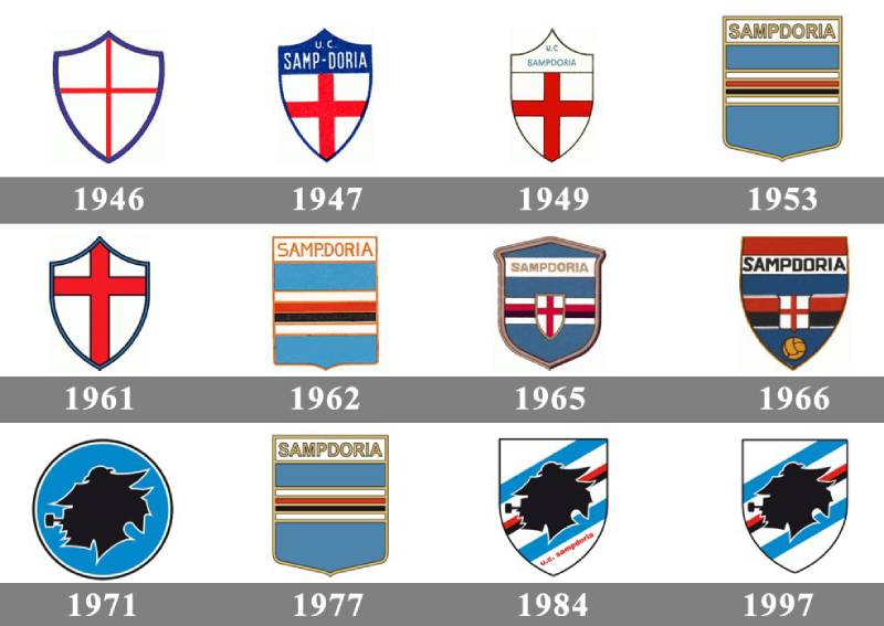
The Sampdoria badge has gone through roughly 12 versions since 1946. Early designs focused on the St. George’s Cross, a red cross on white that represents the city of Genoa.
The biggest shift happened in the early 1980s when the Baciccia sailor figure was introduced. That single change defined the club’s visual identity for good.
Original Sampdoria Logo (1946-1947)
- Years Active: 1946-1947
- Design Description: A white shield with a thin red St. George’s Cross and a blue outline. Rounded corners on the outer edges, pointed in the middle
- Color Scheme: White, red, blue
- Designer: Club founders (not specifically credited)
- Context: Created at the moment of the merger between Sampierdarenese and Andrea Doria. The St. George’s Cross honored Genoa’s patron saint
- Cultural Significance: Represented the fresh start of a new club while staying rooted in the city’s medieval maritime republic heritage
Refined Crest (1947-1949)
- Years Active: 1947-1949
- Design Description: The shield got bolder contours. A blue top section was added as background for white sans-serif lettering. The Red Cross was redrawn with thicker lines
- Color Scheme: White, red, blue
- Key Changes from Previous: Stronger line weights, addition of club name text, wider upper portion of the shield
- Cultural Significance: The club was establishing itself in Serie A and needed a more confident visual presence
Sky-Blue Square Crest (1953-1961)
- Years Active: 1953-1961 (also reused 1962-1965 and 1977-1980)
- Design Description: A square-shaped light blue crest with horizontal stripes in white, red, and black across the center. Gold outline and gold sans-serif lettering at the top
- Color Scheme: Sky blue, white, red, black, gold
- Key Changes from Previous: Complete departure from the St. George’s Cross. First time all four club colors appeared together in horizontal bands
- Cultural Significance: This was the first logo to clearly show the combined identity of both predecessor clubs through the stripe pattern. The blue came from Andrea Doria, while the red, black, and white represented Sampierdarenese
Square and Shield Combination (1965-1971)
- Years Active: 1965-1971
- Design Description: A square blue crest with a gold outline, featuring horizontal stripes in white, red, and black. A small white shield with the St. George’s Cross sat in the center of the stripes. Bold gold sans-serif lettering on a white banner across the top
- Color Scheme: Blue, gold, white, red, black
- Key Changes from Previous: Merged the St. George’s Cross element with the striped pattern for the first time
- Context: This period coincided with the club’s longer stretches in Serie A during the 1960s
Baciccia Era Badge (1984-1997)
- Years Active: 1984-1997
- Design Description: The Baciccia sailor profile in solid black, outlined in white, placed on a white shield with diagonal stripes in blue, red, and black. “U.C. Sampdoria” written diagonally in red beneath the bottom blue stripe
- Color Scheme: Blue, white, red, black
- Designer: The Baciccia figure was first unveiled in September 1980 in the pages of Topolino magazine. It appeared on match shirts from 1980-81 onward
- Key Changes from Previous: Introduction of the sailor silhouette. Shift from horizontal to diagonal stripes. Addition of an actual character figure to the badge
- Cultural Significance: This is the version that saw Sampdoria’s golden age. The club won four Coppa Italia titles, the 1990 Cup Winners’ Cup, and the 1991 Scudetto during this period. Players like Vialli and Mancini wore this crest
Current Sampdoria Logo (1997-Present)
- Years Active: 1997-present
- Design Description: Same composition as the 1984 version but with enlarged, cleaner, bolder contours throughout. The Baciccia silhouette, diagonal stripes, and “U.C. Sampdoria” wordmark all remained
- Color Scheme: Blue (#1B5497), Red (#C21718), White (#FFFFFF), Black (#000000)
- Key Changes from Previous: Refinement rather than redesign. Larger proportions, sharper edges, better legibility at smaller sizes
- Cultural Significance: This version has now been in use for over 25 years, making it the longest-serving iteration of the club’s badge
What Do the Design Elements of the Sampdoria Logo Mean?
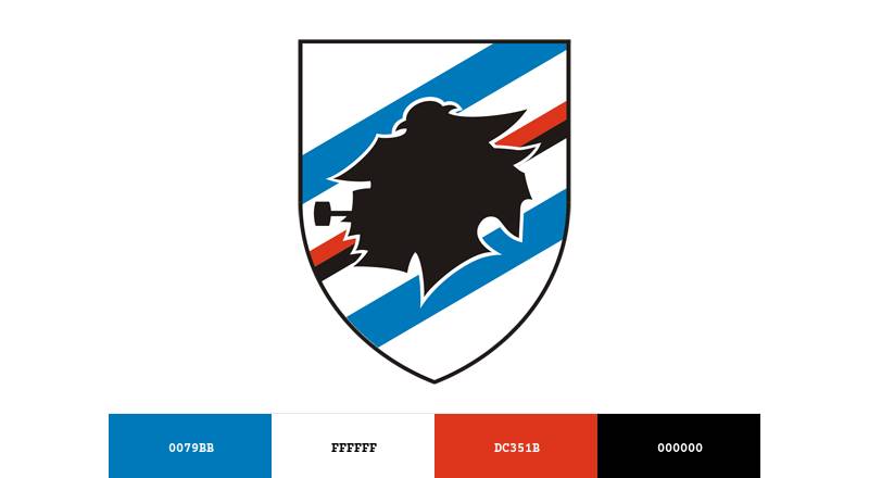
Every part of the Sampdoria crest carries a specific reference to the club’s origins or to Genoa itself.
The sailor. The diagonal stripes. The four colors. None of these are decorative choices. They’re all tied to history.
What Does the Baciccia Sailor Represent?
Baciccia is a Genoese dialect nickname. It comes from “Gio-Batta,” short for Giovanni Battista (John the Baptist), the patron saint of both sailors and the city of Genoa.
The silhouette shows a traditional fisherman wearing a typical hat, shown in profile. It connects UC Sampdoria to Genoa’s identity as a major Mediterranean port city.
The figure was not on the club’s original badge. It first appeared in 1980 and became a permanent fixture on match kits from that season forward. It’s now inseparable from the club’s identity.
Why Did Sampdoria Choose These Specific Colors?
The four colors in the Sampdoria logo each trace back to the two clubs that merged in 1946.
Blue (Hex: #1B5497, Pantone 4152 C) came from Andrea Doria. It represents loyalty and trust. Blue is the dominant color on Sampdoria’s home kit, which is why the team is nicknamed “blucerchiati” (blue-circled).
Red (Hex: #C21718, Pantone 3517 CP) came from Sampierdarenese. It adds energy and passion to the badge. Red also references the St. George’s Cross, a symbol of Genoa since the medieval era.
White (Hex: #FFFFFF) serves as the shield background and provides contrast between the colored elements. It also ties to the white field of the St. George’s Cross.
Black (Hex: #000000) belonged to Sampierdarenese’s original identity. In the current logo, it’s used for the Baciccia silhouette and one of the diagonal stripes.
Understanding how these color palette choices work together shows why the badge feels so grounded in local tradition rather than abstract branding.
What Typography Style Is Used in the Sampdoria Logo?
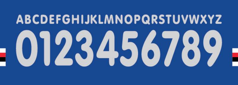
The wordmark “U.C. Sampdoria” is set in a bold, condensed sans-serif typeface. It’s written diagonally in red, following the angle of the stripes beneath the Baciccia figure.
The letters are uppercase and slightly compressed. This keeps the text readable even at small reproduction sizes on merchandise and broadcast graphics.
The diagonal placement is unusual for a football crest. Most clubs set their name horizontally. But the angled text matches the stripe direction, which creates a sense of movement across the badge.
What Are the Hidden Meanings in the Sampdoria Logo?
The Baciccia was originally depicted with a pipe, a detail that’s been dropped from more recent versions. UEFA reportedly ruled that the pipe-smoking sailor couldn’t appear on kits during European competition, which pushed the club toward the cleaner silhouette.
The diagonal stripes aren’t random either. They mirror the bands that run across the front of Sampdoria’s home shirt, creating a direct link between the badge and the kit design. Few clubs have that kind of integration.
There’s also the shield shape itself. It uses a traditional heraldic form that connects to Genoa’s history as one of Italy’s four great maritime republics.
How Does the Sampdoria Logo Compare to Competitor Logos?
Italian football badges tend to lean heavily on heraldic shields, city symbols, and traditional crest formats. Sampdoria fits this pattern but stands apart because of the Baciccia figure.
Their local rivals Genoa CFC use a griffin, another mythological creature tied to the city. But Sampdoria went with something more human. A regular sailor. That choice feels more personal, more grounded.
Compare the badge to Juventus, which modernized into a minimal “J” mark in 2017. Or AC Milan, whose cross-and-stripes emblem stays firmly traditional. Sampdoria sits somewhere in between. It’s detailed and figurative, but not overly complex.
Among other Serie A clubs, the AS Roma badge uses the she-wolf of Roman mythology, Napoli features a stylized “N,” and Fiorentina displays a fleur-de-lis. Sampdoria’s sailor holds its own against all of them in terms of character and storytelling capacity.
The diagonal stripe element is also pretty uncommon. Most football crests use horizontal or vertical divisions. That diagonal angle gives Sampdoria’s badge a dynamic quality that’s hard to find elsewhere in the league.
What Are the Technical Specifications of the Sampdoria Logo?
Official Color Codes
- Blue – Hex: #1B5497 | RGB: (27, 84, 151) | CMYK: (96, 74, 11, 1) | Pantone: 4152 C
- Red – Hex: #C21718 | RGB: (194, 23, 24) | CMYK: (16, 100, 100, 7) | Pantone: 3517 CP
- White – Hex: #FFFFFF | RGB: (255, 255, 255) | CMYK: (0, 0, 0, 0) | Pantone: P 1-1 C
- Black – Hex: #000000 | RGB: (0, 0, 0) | CMYK: (0, 0, 0, 100) | Pantone: Black 6 C
Dimensions and Proportions
The logo uses a traditional shield shape with a slightly tapered bottom. The aspect ratio is roughly vertical, taller than it is wide. The Baciccia figure sits in the upper-center portion of the shield, with diagonal stripes running from upper-left to lower-right beneath.
For digital use, the badge is most commonly distributed in vector graphics formats (SVG, EPS, AI) to maintain sharpness at any size. Pixel-based versions in PNG format are available for web and social media applications, typically at 512×512 or 1024×1024 pixels.
Minimum reproduction size guidelines require the full badge to remain legible, with the “U.C. Sampdoria” text still readable. At very small sizes (like favicons or app icons), the club sometimes uses just the Baciccia silhouette as a standalone mark.
What Cultural Impact Has the Sampdoria Logo Had?

The Baciccia has become a symbol that goes beyond football in Genoa. You see it on street art, on bar signs near the port, on tattoos. It represents a certain version of the city’s identity, the working-class, seafaring side.
During the club’s golden era in the late 1980s and early 1990s, the badge gained international recognition. Vialli and Mancini wearing that crest in the 1992 European Cup final at Wembley put it in front of millions of viewers worldwide.
Shirt collectors consider Sampdoria kits from this period among the most desirable in all of European football. The combination of the Baciccia badge, the distinctive four-color horizontal bands, and the kit designs from Ennerre and later Asics created something that still looks fresh decades later. At least in my experience, few Italian club badges trigger the same instant nostalgia.
The logo also played an unexpected role in Italian pop culture when it was first revealed through the pages of a Disney comic in 1980. That’s a pretty unusual origin story for a football badge, and it gives the Baciccia an oddly charming provenance.
How Does the Sampdoria Logo Fit Into the Overall Brand Identity?
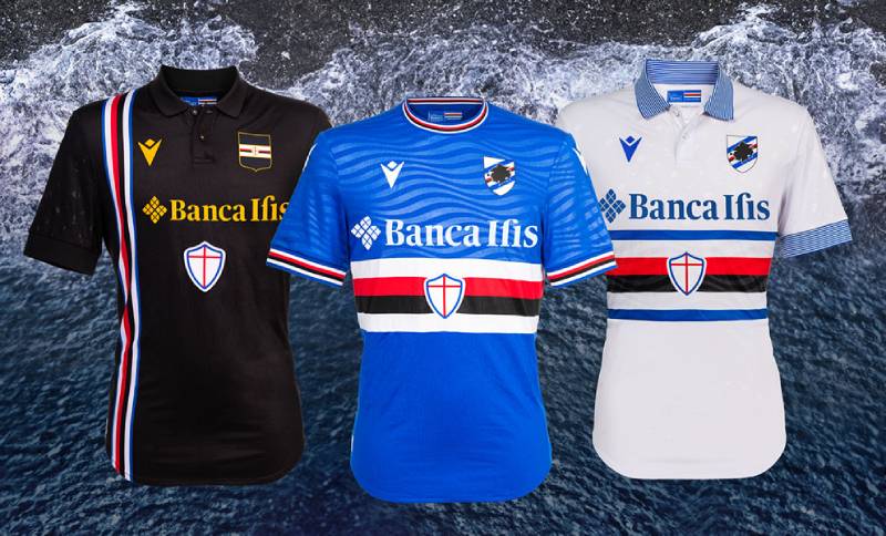
The Sampdoria badge doesn’t just sit on the shirt. It drives the entire visual system of the club. The four colors in the logo are the same four colors on the home kit, the away kit, the training gear, the stadium branding, everything.
That diagonal stripe from the crest repeats across the front of the home shirt. So the jersey and the badge share the same DNA. This kind of consistency between logo design and kit design is something most clubs don’t achieve this cleanly.
The Baciccia works as a standalone element too. On social media, the club often uses just the sailor profile as an avatar or icon. It’s recognizable enough to function without the shield or the text, which says a lot about how strong the mark is on its own.
For brand guidelines, the club maintains strict rules about color usage, minimum sizes, and clear space around the badge. Merchandise partners need to follow these standards when printing the logo on products.
How Should the Sampdoria Logo Be Used?
The club’s official brand standards cover everything from color accuracy to placement rules. Here’s what you need to know if you’re working with the badge:
- Always use official color values. The blue is #1B5497, not a generic blue. Get it right or don’t use it. For print work, stick to the Pantone references
- Don’t stretch, rotate, or crop the badge. The proportions are fixed. Changing the aspect ratio makes it look wrong immediately
- Maintain clear space. Don’t crowd other logos or text against the crest edges. Leave breathing room
- Use vector files for reproduction. PNG files work fine for screens, but anything going to print should start from an SVG or EPS source
- The Baciccia silhouette can be used independently in limited contexts (social media icons, small applications), but always with club approval
For official logos and assets, the club’s website at sampdoria.it is the primary source. Any commercial use of the Sampdoria badge requires licensing from the club.
The Sampdoria logo is a registered trademark. Unauthorized reproduction for commercial purposes (merchandise, apparel, printed goods) is protected under Italian and EU trademark law. Fan art and editorial use generally fall under different rules, but if you’re producing anything for sale, you need permission first.
FAQ on The Sampdoria Logo
What does the Sampdoria logo look like?
The UC Sampdoria badge is a white shield with diagonal stripes in blue, red, white, and black. A black silhouette of a sailor called Baciccia sits at the center. The text “U.C. Sampdoria” runs diagonally in red beneath the figure.
Who is the sailor on the Sampdoria crest?
The sailor is known as Baciccia. That’s Genoese dialect for Giovanni Battista (John the Baptist), the patron saint of Genoa.
The figure honors the city’s long maritime heritage and its identity as a major Mediterranean port.
When was the Sampdoria logo first created?
The first badge appeared in 1946 when Sampierdarenese and Andrea Doria merged. It featured a simple St. George’s Cross.
The current version with the Baciccia sailor dates to 1984, with a refinement in 1997 that’s still used today.
What do the colors in the Sampdoria emblem mean?
Blue represents Andrea Doria. Red, black, and white came from Sampierdarenese. Together, these four colors reflect the 1946 merger that created the blucerchiati.
The same colors appear on the club’s home kit in horizontal bands across the chest.
What are the official Sampdoria logo color codes?
Blue is #1B5497. Red is #C21718. White is #FFFFFF. Black is #000000.
These hex values match the club’s official color palette used across kits, merchandise, and digital platforms for Serie A branding.
How many times has the Sampdoria badge changed?
The club has used roughly 12 distinct logo versions since 1946. Early designs focused on the St. George’s Cross and horizontal stripe patterns.
The biggest change came in 1980 when the Baciccia sailor was introduced to the club’s visual identity.
Why does Sampdoria have a sailor in their logo?
Genoa is one of Italy’s oldest port cities. The sailor figure connects UC Sampdoria to that seafaring culture directly.
John the Baptist, the saint behind the Baciccia name, is patron of both sailors and the city itself. It just fits.
What font does the Sampdoria logo use?
The wordmark uses a bold, condensed sans-serif typeface. The letters are uppercase and set at a diagonal angle, matching the direction of the stripes on the shield.
This keeps the text readable across jersey prints and small-scale merchandise.
Can I download the Sampdoria logo for personal use?
The badge is available in PNG and SVG formats through various sports logo databases. For anything commercial, you need licensing from the club.
The Sampdoria logo is a registered trademark under Italian and EU law. Fan art is a different story.
How does the Sampdoria logo compare to other Italian football badges?
Most Serie A crests use heraldic shields with city symbols. Sampdoria stands out because of the Baciccia figure, something human rather than mythological.
The diagonal stripe pattern is also uncommon. Clubs like Lazio, Torino, and Bologna all use more conventional crest layouts.
Conclusion
The Sampdoria logo does what the best football crests do. It tells you exactly where the club comes from and what it stands for, without needing a single word of explanation.
The Baciccia sailor, the four-color stripe pattern, the heraldic shield. Every piece traces back to Genoa’s port culture and the 1946 merger that created the blucerchiati.
Twelve logo iterations over nearly eight decades, and the core identity never drifted. That kind of consistency is rare in Serie A club branding.
Whether printed on a Coppa Italia winner’s jersey or scaled down to a social media icon, the UC Sampdoria emblem holds up. It’s a badge built on real history, not trends.

Renowned for his expertise in logo design and visual branding, Bogdan has developed a multitude of logos for various clients.
His skills extend to creating posters, vector illustrations, business cards, and brochures. Additionally, Bogdan's UI kits were featured on marketplaces like Visual Hierarchy and UI8.
He also wrote in the past years on sites like Design Your Way, WebDesignerDepot, WPDean, Designmodo, Speckyboy, Slider Revolution, and more.
- The Cursor Logo History, Colors, Font, And Meaning - 24 September 2026
- Top 7 Web Design Subscription Services That Replace Full-Time Hires - 24 September 2026
- Canva vs PowerPoint: Which Is Better for Presentations? - 22 September 2026

Bogdan Sandu is a seasoned designer who has been designing websites since 2008. Renowned for his expertise in logo design and visual branding, Bogdan has developed a multitude of logos for various clients. His skills extend to creating posters, vector illustrations, business cards, and brochures. Additionally, Bogdan's UI kits were featured on marketplaces like Visual Hierarchy and UI8. He also wrote in the past years on sites like Design Your Way, WebDesignerDepot, WPDean, Designmodo, Speckyboy, Slider Revolution, and more.
You Might Also Like