The Sassuolo logo is one of those football crests that tells you exactly where it comes from. Unione Sportiva Sassuolo Calcio, founded in 1920 in the Emilia-Romagna region of Italy, wears a badge pulled straight from the city’s own coat of arms. Black and green. A shield split into four sections. A football sitting between thick stripes at the bottom.
It is not flashy. It does not try to be. And that is sort of the point.
The club spent decades grinding through amateur leagues before reaching Serie A in 2013. The crest went on a similar journey, going through at least a few changes since the early 2000s before settling into the version fans recognize today. The current design, used since around 2010, keeps the city’s heraldic elements front and center, with the three mountains and flowers from Sassuolo’s municipal emblem sitting right there on the badge.
For a club that does not come from a provincial capital, that local identity matters. The logo is the proof.
What Is the Sassuolo Logo?
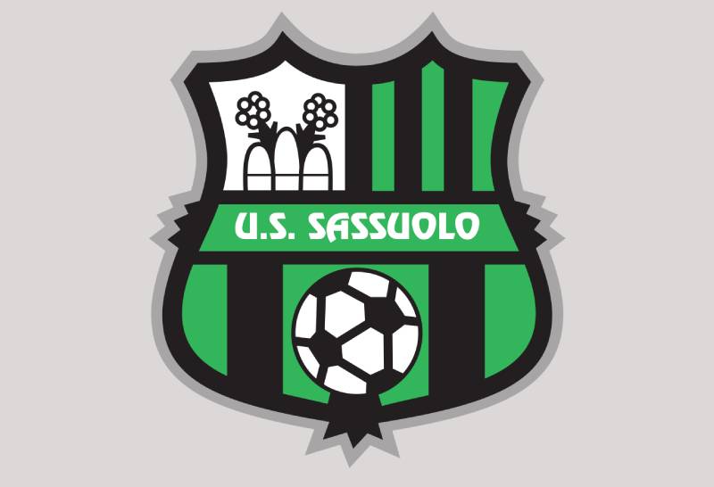
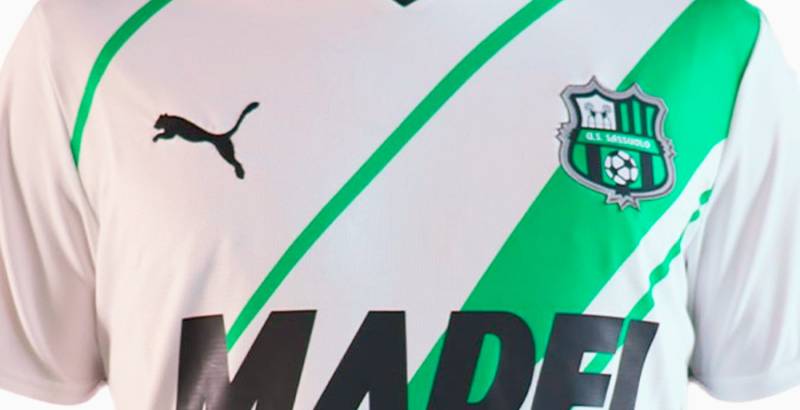
The Sassuolo logo is a shield-shaped emblem divided into four quadrants, featuring the city of Sassuolo’s coat of arms, black and green vertical stripes, a football, and the inscription “U.S. Sassuolo” in white across the center. It has been in use since approximately 2010.
Here is what defines it:
- Design Type: Combination mark. It blends heraldic imagery, text, and sporting symbols into a single crest. Think of it as part municipal badge, part football identity.
- Primary Elements: A bowed shield split into four fields. The top left quadrant has three vertical bars with two flowers behind them, borrowed directly from Sassuolo’s city coat of arms. The top right and bottom sections carry alternating black and green stripes of different sizes. A football sits between the two large black stripes at the bottom. The text “U.S. Sassuolo” runs across a white banner in the center.
- Official Introduction Date: The current version dates to approximately 2010, with earlier versions of the quartered shield in use since at least 2001.
- Designer/Agency: No publicly credited designer or agency. The badge was developed internally by the club, drawing on the municipal coat of arms of the city of Sassuolo for its heraldic elements.
- Trademark Status: Registered as part of U.S. Sassuolo Calcio S.r.l.’s official brand identity. Protected under Italian intellectual property law and FIGC regulations.
- Color Palette: Green (#00A752), Black (#000000), White (#FFFFFF), and Grey (#C7C7C7). The green is a specific shade that gives the Neroverdi their name.
- Usage Context: Match kits, official merchandise, Mapei Stadium signage, digital platforms, social media, press materials, and Serie A broadcasting graphics.
How Has the Sassuolo Logo Evolved Over Time?

The Sassuolo crest has gone through a handful of changes since the club’s founding in 1920. Early versions were basic. The more structured shield layout appeared around 2001.
A refinement came in 2010 that sharpened the design into what fans see today.
Not a dramatic overhaul. More like a slow cleanup over a century.
Early Sassuolo Crest (1920s – 2000)
- Years Active: 1920s through approximately 2000
- Design Description: Simpler badges typical of lower-division Italian clubs. Black and green remained the core colors throughout, but the heraldic elements were not as formally structured. During this long stretch, the club bounced between amateur leagues, Serie D, and Serie C2, and the badge reflected that modest profile.
- Color Scheme: Black and green, consistent with the Neroverdi identity
- Designer: Unknown, likely created internally
- Context: Sassuolo spent most of these decades as a regional amateur club. The crest did not need to function at a national branding level.
- Cultural Significance: It established the black and green color identity that would carry the club through every future iteration. The Neroverdi nickname took root during this period.
Quartered Shield Badge (2001 – 2010)
- Years Active: Approximately 2001 to 2010
- Design Description: The quartered shield format appeared, dividing the badge into four sections. The city’s coat of arms (three vertical bars with flowers) was placed in one quadrant, while the other sections carried the black and green stripe pattern. A football was added to the lower section. “U.S. Sassuolo” was written in white across the middle.
- Color Scheme: Green, black, and white
- Designer: Not publicly credited
- Context: This version arrived as the club was climbing through the lower professional divisions. By 2008, Sassuolo had earned promotion to Serie B for the first time, and the crest now needed to hold up on a bigger stage.
- Key Changes from Previous: Introduction of the formal quartered layout. Direct use of the city’s heraldic symbols. More structured typography for the club name.
- Cultural Significance: The first version that really tied the club’s identity to the city of Sassuolo in a visible, deliberate way. Fans started seeing the badge as something worth being proud of, not just a functional stamp.
Current Sassuolo Badge (2010 – Present)
- Years Active: 2010 to present
- Design Description: A refined version of the quartered shield. The proportions were cleaned up. The stripes became more defined. The football in the lower section gained more visual weight. The “U.S. Sassuolo” text was adjusted with slightly modified letterforms, particularly noticeable on the “U” and “O” characters. The overall shape of the shield became slightly more curved.
- Color Scheme: Green (#00A752), Black (#000000), White (#FFFFFF), Grey (#C7C7C7)
- Designer: Not publicly credited
- Context: This is the badge that went to Serie A. It appeared on kits during the club’s historic 2012-13 Serie B title win and first-ever top-flight season in 2013-14. It was also the crest worn during Sassuolo’s best Serie A finish (6th place, 2015-16) and their first European campaign.
- Key Changes from Previous: Tighter line work, refined proportions, adjusted text styling. Not a radical redesign but a noticeable polish.
- Cultural Significance: This version is the one most people think of. It represents the club’s rise from obscurity to Serie A regularity. It is the badge Domenico Berardi wore when he scored his first top-flight hat-trick against Sampdoria in 2013.
What Do the Design Elements of the Sassuolo Logo Mean?

Every piece of the Sassuolo crest points to something specific. The shield is not decorative filler. It is a direct reference to the city’s heraldry, with the football elements layered on top to mark it as a sporting badge.
The three vertical bars and flowers in the top left quadrant are the most recognizable piece of Sassuolo’s municipal coat of arms.
If you know Italian civic crests, you spot it immediately.
Why Did Sassuolo Choose These Specific Colors?
Green and black have been with Sassuolo since the beginning. The combination gave the club its Neroverdi nickname, which translates to “black and greens” in Italian. These are not colors the club picked from a trend board. They are tied to the town itself.
Here is the breakdown:
- Green (#00A752) – Pantone 2257 XGC. The green is meant to represent growth and the natural surroundings of the Emilia-Romagna countryside. From a color psychology standpoint, green signals renewal and energy. It connects the club to the Italian landscape around Reggio Emilia and Modena. Very few Italian top-flight clubs use green as a primary color, which makes Sassuolo stand out.
- Black (#000000) – Pantone Black 6 C. Black brings weight and seriousness. It grounds the green. Together, they create a contrast that reads well on kits, on screen, and on merchandise. The combination is uncommon enough among green logos in football that Sassuolo owns the pairing in Italian football.
- White (#FFFFFF) – Used for the “U.S. Sassuolo” text and accent details. It separates the elements within the crest and keeps the text readable against the dark background sections.
- Grey (#C7C7C7) – Pantone Cool Gray 3 XGC. A supporting accent used in certain digital and print applications. Not always visible on the primary badge but part of the broader color palette.
What Typography Style Is Used in the Sassuolo Logo?
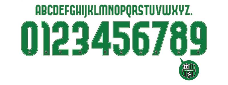
The lettering on the Sassuolo crest is a custom-modified sans-serif style. It is not a standard off-the-shelf font. The proportions are intentionally tweaked.
Look at the “U” and the “O” in “U.S. Sassuolo” closely. The top and bottom halves of those letters are not evenly weighted. That is on purpose.
It gives the text a slightly compressed, condensed feel that works within the narrow banner space on the shield. The white color against the green and black sections of the crest keeps it legible even at smaller sizes, which matters for things like broadcast graphics and jersey prints.
What Are the Hidden Meanings in the Sassuolo Logo?
The three vertical bars in the top left quadrant are not just decorative lines. They come from the city of Sassuolo’s coat of arms and represent the town’s three hills or mountains.
The two flowers behind those bars are another civic element tied to the region’s identity.
Most people outside Italy miss this. They see stripes and flowers and assume it is just decoration. But for anyone from the Province of Modena, that quadrant is a direct callout to home. The football in the lower section grounds the whole thing as a sporting crest rather than a purely civic one.
How Does the Sassuolo Logo Compare to Competitor Logos?
Italian football is packed with shield-shaped crests. Juventus went minimal with their 2017 rebrand. AC Milan keeps the classic red and black oval.
Napoli uses a simple “N” on a sky blue circle. And then there is Sassuolo, sticking with a traditional quartered heraldic shield.
The Sassuolo crest is closer in spirit to clubs like Fiorentina or Genoa, where civic pride drives the badge design. It has not followed the flat, stripped-down trend that hit many European football clubs in the 2010s. Some observers have noted the shield shape resembles FC Barcelona’s crest layout, though the content inside is entirely different.
Among Serie A badges, Sassuolo’s green and black combination is unique. No other top-flight Italian club uses that exact pairing. Clubs like Atalanta use blue and black. Udinese goes with black and white. Lazio is sky blue and white. The Neroverdi own their lane.
What Are the Technical Specifications of the Sassuolo Logo?
Official Color Codes:
- Primary Color: Green – Hex: #00A752, RGB: (0, 167, 82), CMYK: (82, 6, 95, 1), Pantone: 2257 XGC
- Secondary Color: Black – Hex: #000000, RGB: (0, 0, 0), CMYK: (0, 0, 0, 100), Pantone: Black 6 C
- Accent Color: White – Hex: #FFFFFF, RGB: (255, 255, 255), CMYK: (0, 0, 0, 0), Pantone: P 1-1 C
- Supporting Color: Grey – Hex: #C7C7C7, RGB: (199, 199, 199), CMYK: (22, 17, 17, 0), Pantone: Cool Gray 3 XGC
Dimensions and Proportions:
- Aspect Ratio: Approximately 1:1.09 (width to height). The shield is slightly taller than it is wide, with a curved bottom edge that adds visual depth.
- Minimum Size Requirements: For print applications, the badge should not drop below roughly 15mm in width to keep the internal details (especially the heraldic elements in the top left quadrant) readable. Digital use follows similar logic, with a minimum of about 40 pixels wide.
- Clear Space: Standard practice for football club crests applies. The badge needs breathing room equal to approximately the height of the “U.S.” text on all sides.
- File Formats: Available in vector graphics formats (SVG, EPS, AI) for scalable use, plus raster formats (PNG, JPEG) for web and social media.
What Cultural Impact Has the Sassuolo Logo Had?
Sassuolo is a town of roughly 40,000 people. It is not Milan. It is not Turin. It is not Rome.
So when that badge showed up in Serie A broadcasts starting in 2013, it mattered. For the people of Sassuolo and the Province of Modena, seeing their city’s coat of arms on national television every weekend was a big deal.
The crest became a symbol of what a small-town club can do. Eighth-place finishes. A Europa League campaign. Beating Juventus in pre-season tournaments. All of it happened under that green and black shield.
The logo also carries the Mapei brand story. The building materials company’s sponsorship transformed the club, and the badge became associated with a particular model of Italian football ownership where a corporate backer lifts a tiny club to the top tier.
How Does the Sassuolo Logo Fit Into the Overall Brand Identity?
The crest sits at the center of everything Sassuolo does as a brand. It shows up on the jerseys. On the Mapei Stadium signage. On digital channels. On youth academy kits. On women’s team materials.
The Neroverdi identity starts with those two colors and that quartered shield.
Sassuolo’s broader brand guidelines keep the green and black pairing consistent across all touchpoints. Kit manufacturers (the club has worked with brands like Kappa) build their jersey templates around the badge’s proportions. The club’s social media presence, ticketing systems, and press materials all pull from the same visual system anchored by the crest.
Compared to clubs like AS Roma or Torino, which have large historical archives of branding materials, Sassuolo’s brand identity is younger and leaner. But that simplicity is an advantage. There is less baggage. The badge does not carry the weight of decades of corporate redesigns. It just looks like what it is: a small Italian city’s football club.
How Should the Sassuolo Logo Be Used?
- Official Usage Guidelines: The badge must always appear with its full color scheme on light backgrounds. On dark backgrounds, the green and white elements maintain their values while the black sections blend, which is why clear space around the crest matters. The crest should never be stretched, rotated, or recolored outside the approved palette. The “U.S. Sassuolo” text should remain intact and not be separated from the shield.
- Where to Access Official Logos: The club’s official website (sassuolocalcio.it) is the primary source for authorized brand assets. Third-party logo databases offer SVG and PNG downloads, but these may not always reflect the most current version. For commercial or media use, contact the club directly.
- Licensing Information: Use of the Sassuolo badge for commercial purposes requires written permission from U.S. Sassuolo Calcio S.r.l. Fan-created content for non-commercial purposes (blogs, fan art, social media posts) is generally tolerated, but the club reserves the right to enforce its trademarks. Kit manufacturers and sponsors receive specific usage licenses as part of their partnership agreements.
- Trademark Protection: The badge is a registered trademark under Italian law. FIGC regulations also protect club crests within the football ecosystem. Unauthorized use on merchandise, counterfeit kits, or competing commercial products can result in legal action. The Lega Serie A also controls how the crest appears in broadcast and digital match coverage.
FAQ on The Sassuolo Logo
What does the Sassuolo logo look like?
The Sassuolo logo is a shield divided into four quadrants. It features the city’s coat of arms with three vertical bars and flowers, black and green stripes, a football, and the text “U.S. Sassuolo” in white across the center.
When was the current Sassuolo badge introduced?
The current version of the US Sassuolo Calcio badge has been in use since approximately 2010. An earlier quartered shield design appeared around 2001.
The 2010 update refined proportions and cleaned up the line work without changing the overall layout.
What do the colors in the Sassuolo crest mean?
Green represents growth and the Emilia-Romagna countryside. Black adds strength. Together they form the Neroverdi identity, which translates to “black and greens.” White is used for text and accent details inside the shield.
Why does the Sassuolo emblem include flowers and vertical bars?
Those elements come directly from the city of Sassuolo’s municipal coat of arms. The three bars represent the town’s hills.
The two flowers are a traditional civic symbol from the Province of Modena. Not decoration. Local heritage.
Who designed the Sassuolo football club logo?
No designer or agency has been publicly credited. The badge was developed internally by the club, drawing heavily on the heraldic symbols of its home city. Most lower-division Italian clubs handled their logo design this way during that era.
What are the official Sassuolo logo color codes?
Green is #00A752 in hex. Black is #000000. White is #FFFFFF. Grey is #C7C7C7.
The green carries a saturation level that makes it pop against the black sections of the Serie A team crest.
Has Sassuolo ever completely changed its logo?
Not dramatically. The club shifted from simpler amateur-era badges to the quartered shield format around 2001. The 2010 refinement polished things further. But no radical rebrand like Hellas Verona or other Italian clubs have attempted.
Can I download the Sassuolo logo for personal use?
PNG and SVG versions are available through the club’s official site and third-party logo databases. Fan use for non-commercial purposes like blogs or social media is generally tolerated.
Commercial use requires written permission from the club.
How does the Sassuolo badge compare to other Serie A logos?
It is more traditional than most. Clubs like Bologna and Cagliari also use heraldic shields, but Sassuolo’s green and black combination is unique in Italian top-flight football. Nobody else owns that pairing.
What font is used in the Sassuolo logo?
The club uses a custom-modified condensed typeface. It is not a standard commercial font. The letters have uneven proportions between their top and bottom halves, most visible on the “U” and “O” characters in the badge.
Conclusion
The Sassuolo logo is a football crest built on local identity rather than corporate trends. Every element inside that quartered shield, from the city’s heraldic bars to the Neroverdi color scheme, ties back to a specific place and a specific story.
It carried a small-town club from the amateur ranks of Emilia-Romagna all the way to Serie A and European competition.
Not bad for a badge that nobody famous designed. The club’s design elements work because they are honest. No gimmicks. Just a clean connection between a football team and the city it represents.
That kind of authenticity is harder to fake than most people think.

Renowned for his expertise in logo design and visual branding, Bogdan has developed a multitude of logos for various clients.
His skills extend to creating posters, vector illustrations, business cards, and brochures. Additionally, Bogdan's UI kits were featured on marketplaces like Visual Hierarchy and UI8.
He also wrote in the past years on sites like Design Your Way, WebDesignerDepot, WPDean, Designmodo, Speckyboy, Slider Revolution, and more.
- Jujutsu Kaisen Font Generator - 12 October 2026
- The Windsurf Logo History, Colors, Font, And Meaning - 10 October 2026
- How to Remove Background From Product Photos (No Photoshop) - 10 October 2026

Bogdan Sandu is a seasoned designer who has been designing websites since 2008. Renowned for his expertise in logo design and visual branding, Bogdan has developed a multitude of logos for various clients. His skills extend to creating posters, vector illustrations, business cards, and brochures. Additionally, Bogdan's UI kits were featured on marketplaces like Visual Hierarchy and UI8. He also wrote in the past years on sites like Design Your Way, WebDesignerDepot, WPDean, Designmodo, Speckyboy, Slider Revolution, and more.
You Might Also Like