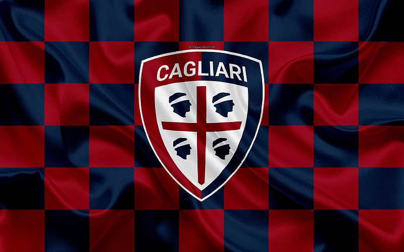
The Cagliari logo is one of the most culturally loaded badges in Italian football. It carries the weight of Sardinian identity, centuries of Mediterranean conflict, and over a hundred years of club history, all packed into a single crest.
Cagliari Calcio, founded in 1920, plays in Serie A and calls the island of Sardinia home. The club’s badge has gone through multiple redesigns since the 1950s, but one thing stays constant: the Four Moors. That symbol, pulled directly from the flag of Sardinia, ties the club to something much bigger than football. It connects the team to medieval history, regional pride, and a sense of belonging that most logos in European sport simply cannot match.
Few football crests carry this kind of historical depth. The Cagliari badge does not just represent a team. It represents a people.
What Is the Cagliari Calcio Logo?
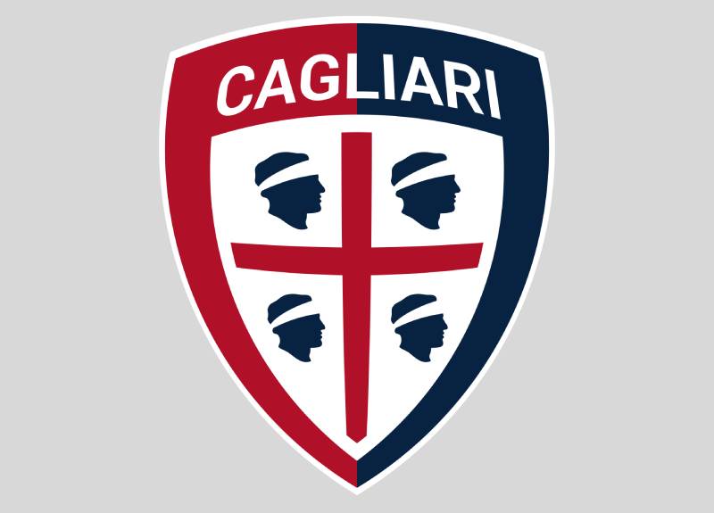
The Cagliari Calcio logo is a shield-shaped emblem split vertically into navy blue and red halves, featuring the Sardinian flag (Four Moors with a red Cross of St. George) at its center. Introduced on June 21, 2015, the current version uses a clean sans-serif typeface and drops the ornate gold framing of earlier badges.
- Design Type: Combination mark (shield emblem with wordmark)
- Primary Elements: Shield crest divided into navy blue and red halves, the Sardinian coat of arms (Four Moors and St. George’s Cross), the “CAGLIARI” wordmark in white, and the founding year “1920”
- Official Introduction Date: June 21, 2015 (current version)
- Designer/Agency: Redesigned under the direction of club president Tommaso Giulini. The specific design agency has not been publicly credited.
- Trademark Status: Registered trademark of Cagliari Calcio S.p.A.
- Color Palette: Navy Blue (#002350), Red (#AD002A), White (#FFFFFF)
- Usage Context: Match kits, official merchandise, digital platforms, stadium branding, press materials, and the club’s official website cagliaricalcio.com
How Has the Cagliari Calcio Logo Evolved Over Time?

The Cagliari crest has been redesigned at least seven times since the club’s founding in 1920. Early versions were simple shield designs. Later ones added oval frames, gold accents, and refined lettering.
The Four Moors, taken from the flag of Sardinia, remained the one constant across every version. But colors shifted, shapes changed, and typography was swapped out multiple times.
Early Cagliari Badge (1935-1971)
- Years Active: Approximately 1935 to 1971
- Design Description: A simple shield divided into two fields. Red on the left, very dark blue on the right. The Four Moors from the Sardinian flag appeared on the dark blue side. Gold lettering reading “U.S. Cagliari” sat at the top on a white strip.
- Color Scheme: Dark blue, red, gold, white, black
- Context: This badge was used during the club’s early decades, covering the period when Cagliari was working its way through Italy’s lower divisions. The club was known as “Unione Sportiva Cagliari” during this time.
- Cultural Significance: It was the first badge to visually connect the club to Sardinia’s regional identity through the Four Moors. That decision shaped every logo that came after it.
Round Crest Era (1971-1993)
- Years Active: 1971 to 1993
- Design Description: The emblem shifted to a circular form with a wide border split into blue and red halves. The Four Moors grew larger at the center, drawn in black with yellow wraps. A red cross separated the four profiles. “Unione Sportiva” appeared on the blue portion, “Cagliari” on the red.
- Color Scheme: Lighter blue, red, black, yellow, white
- Designer: Not publicly credited
- Context: This badge arrived just after Cagliari’s legendary 1970 Scudetto win, led by Gigi Riva. The club needed a more confident, modern identity to match its newfound status.
- Key Changes from Previous: Shield shape replaced by a circle. Moor heads became larger and more detailed. The font shifted to all-uppercase white sans-serif capitals.
- Cultural Significance: This was the badge fans associated with Cagliari’s golden era and the club’s run to the 1993-94 UEFA Cup semi-finals.
Oval Redesign (1995-2010)
- Years Active: 1995 to 2010
- Design Description: The crest moved inside an oval, vertically divided into dark blue on the left and red on the right. White lettering reading “Cagliari Calcio” appeared above a triangular inner crest. The founding year “1920” was added below the crest for the first time.
- Color Scheme: Dark blue, red, white
- Context: This update coincided with the club’s official name change to Cagliari Calcio. The “1920” datemark gave the badge a stronger sense of heritage.
- Key Changes from Previous: Circular shape replaced by an oval. The triangular crest became a secondary element inside the larger shape. White sans-serif capitals replaced the previous lettering style.
Gold-Framed Badge (2010-2015)
- Years Active: 2010 to 2015
- Design Description: The oval shape stayed, but the colors got brighter. White lettering turned to gold. An ornate, leafy gold frame wrapped around the entire medallion. The wordmark switched to a bold serif font.
- Color Scheme: Dark blue, red, gold, white
- Context: The gold accents were meant to add a feeling of prestige and tradition. A 2011 tweak darkened the shades and simplified the frame to a smooth, thick golden outline.
- Key Changes from Previous: Gold replaced white for the lettering and frame. Serif typography replaced sans-serif. Decorative elements were added around the oval.
- Cultural Significance: This version gave the badge a more polished, premium look. But it also felt a bit heavy. Some fans thought the ornate frame was too busy for a football crest.
Current Cagliari Badge (2015-Present)
- Years Active: 2015 to present
- Design Description: An “Old French” shield shape, split vertically into red and blue halves. The Sardinian flag (Four Moors with red cross on white) sits inside a smaller white shield at the center. “CAGLIARI” is written above the inner shield in white. The “1920” founding year appears at the bottom.
- Color Scheme: Navy Blue (#002350), Red (#AD002A), White (#FFFFFF)
- Context: Introduced on June 21, 2015, under club president Tommaso Giulini. The club was in Serie B at the time and wanted a fresh start.
- Key Changes from Previous: Dropped the oval shape entirely. Removed all gold elements. Switched back to a clean sans-serif typeface. The Sardinian flag now sits more prominently within the design.
- Cultural Significance: This version caused controversy. Previous logos showed the Four Moors facing west (away from mainland Italy), which many Sardinians saw as a statement of independence. The 2015 redesign flipped the Moors to face east, matching the official regional flag but upsetting some traditionalists.
What Do the Design Elements of the Cagliari Calcio Logo Mean?
Every piece of the Cagliari badge carries meaning. The Four Moors tie the club to Sardinia’s medieval past. The shield shape signals strength and protection.
The red and blue split is not just about looking good on a kit. These are the city’s official colors, rooted in local tradition going back centuries.
Why Did Cagliari Calcio Choose These Specific Colors?
The club’s color palette is built on three colors, each with specific meaning:
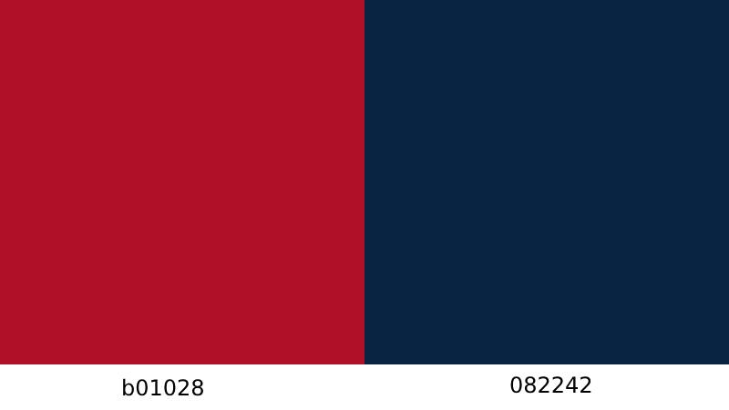
- Navy Blue (#002350) – RGB: (0, 35, 80), CMYK: (100, 90, 38, 39). Blue represents loyalty and pride. It is one of the official colors of the city of Cagliari and reflects the Mediterranean Sea surrounding Sardinia. According to color psychology, blue communicates trust, stability, and calm, which fits the club’s identity as Sardinia’s flagship team.
- Red (#AD002A) – RGB: (173, 0, 42), CMYK: (21, 100, 88, 15). Red represents passion and strength. It is the other half of Cagliari’s official club colors and mirrors the red cross of St. George on the Sardinian flag. Red gives the badge its energy and intensity.
- White (#FFFFFF) – RGB: (255, 255, 255), CMYK: (0, 0, 0, 0). White serves as the background for the inner crest and the lettering. It adds clarity and makes the other colors pop. On the Sardinian flag, white is the base field behind the red cross and Four Moors.
These three colors have appeared on every version of the Cagliari badge since the 1950s. Only the shades have changed over time, getting darker or brighter depending on the era.
What Typography Style Is Used in the Cagliari Logo?

The current badge uses a custom sans-serif typeface for the “CAGLIARI” wordmark. All capitals, clean lines, no decorative extras.
This is a big shift from the 2010-2015 version, which used a bold serif font with gold coloring. That older style aimed for sophistication but sacrificed readability, especially at smaller sizes.
The sans-serif choice works better across digital platforms, merchandise, and broadcast graphics. At small pixel sizes, you can still read it clearly. That matters more now than it did ten years ago.
What Are the Hidden Meanings in the Cagliari Logo?
The most talked-about detail in the 2015 redesign is the direction the Four Moors face. In older Cagliari badges, the Moors looked west, turning their backs to mainland Italy.
Many Sardinians read that as a deliberate symbol of autonomy and distinctness from the rest of the country. The 2015 logo flipped the heads to face east, aligning with the official 1999 regional law about the Sardinian flag.
Some fans still see the change as a loss of identity. Others view it as the club simply following the updated regional standard. Either way, it is the single most debated design choice in the badge’s history.
The shield shape itself references heraldic tradition. Specifically, it is an “Old French” escutcheon, a style common in medieval coats of arms. That is not accidental. It connects the football badge to the same visual language as the Sardinian coat of arms.
How Does the Cagliari Logo Compare to Competitor Logos?

Italian football crests tend to be heavy on heraldry and regional identity. Cagliari fits that pattern but stands apart because of the Four Moors.
No other Serie A club has a symbol that contentious or historically layered baked into its badge.
Compare it to Juventus, which went fully minimal in 2017 with a simple “J” monogram. Or Napoli, which keeps things relatively simple with a stylized “N” on a round badge. Cagliari’s crest feels like it belongs to a different century, and that is the point.
AS Roma uses the she-wolf from the Romulus and Remus myth. Fiorentina features the fleur-de-lis of Florence. AC Milan incorporates the city’s red cross. These clubs all pull from local history, but Cagliari’s use of the Four Moors carries a political and cultural weight that goes beyond simple civic pride.
Among Italian clubs, Cagliari’s badge is closest in spirit to teams like Genoa and Bologna, which also lean heavily on traditional shield shapes and local heraldry. But none of those crests have sparked the kind of controversy the Cagliari logo did in 2015.
What Are the Technical Specifications of the Cagliari Logo?
Official Color Codes
- Primary Color: Navy Blue – Hex: #002350, RGB: (0, 35, 80), CMYK: (100, 90, 38, 39), Pantone: PMS 289 XGC
- Secondary Color: Red – Hex: #AD002A, RGB: (173, 0, 42), CMYK: (21, 100, 88, 15), Pantone: PMS 7621 XGC
- Accent Color: White – Hex: #FFFFFF, RGB: (255, 255, 255), CMYK: (0, 0, 0, 0)
Dimensions and Proportions
- Aspect Ratio: The shield is slightly taller than it is wide, roughly following a 5:6 width-to-height ratio
- Minimum Size: For print, the logo should not be reproduced smaller than 15mm in width to keep the Four Moors detail visible. On screens, a minimum of 40 pixels wide is recommended.
- Clear Space: The club requires a minimum clear space around the logo equal to the height of the “C” in the CAGLIARI wordmark
- File Formats: Official versions are available in vector formats (SVG, AI, EPS) for scalable use, and raster formats (PNG, JPEG) for web and digital use
What Cultural Impact Has the Cagliari Logo Had?
The Cagliari badge has become one of the most recognizable symbols of Sardinian identity in sport. For many islanders, it represents more than football.
It is one of the few places where the Four Moors appear regularly on national and international television. Every time Cagliari plays a Serie A match, the Sardinian flag gets screen time across Italy and beyond.
The 2015 redesign controversy put the badge in national news for weeks. People who had never watched a Cagliari match suddenly had opinions about which direction the Moors should face. That kind of cultural reach is rare for a mid-table club.
The badge also plays a role in Sardinia’s tourism branding. Cagliari merchandise with the crest is popular with visitors to the island, functioning almost like a regional souvenir.
How Does the Cagliari Logo Fit Into the Overall Brand Identity?
The logo sits at the center of everything Cagliari Calcio does visually. The navy blue and red palette extends across the club’s kits, stadium signage, website, social media presence, and licensed merchandise.
The shield shape connects back to Italian football’s broader tradition of heraldic crests, placing Cagliari within a familiar visual system for Serie A fans. But the Four Moors immediately set the club apart from every other team in the league.
The club’s brand guidelines keep the logo usage consistent. The sans-serif wordmark from the current badge is used in official communications, press kits, and digital content. The color palette rarely deviates from the core trio of navy, red, and white.
Cagliari’s brand identity leans heavily on regional pride. The storytelling around the club is deeply connected to Sardinia, and the badge makes that connection visible at a glance.
How Should the Cagliari Logo Be Used?
Official Usage Guidelines
- Do: Use the official color versions (full color, single color white, single color black) as provided by the club
- Do: Maintain minimum clear space around the logo at all times
- Do: Use vector files for print and large-format applications
- Don’t: Alter the colors, stretch or distort the proportions, or remove any elements from the badge
- Don’t: Place the logo on busy backgrounds that reduce readability
- Don’t: Add drop shadows, gradients, or other effects to the official mark
Where to Access Official Logos
The club’s official website, cagliaricalcio.com, is the primary source for approved brand assets. Media partners and licensed manufacturers receive logo files directly from the club’s communications department.
Licensing and Trademark Protection
The Cagliari Calcio logo is a registered trademark. Any commercial use requires written permission from the club. Unauthorized reproduction on merchandise, digital content, or promotional materials can result in legal action.
Fan-created content typically gets a pass as long as it is not sold commercially. But the club actively monitors unauthorized merchandise, especially around match days and during the transfer window when interest in the brand peaks.
FAQ on The Cagliari Logo
What does the Cagliari Calcio logo look like?
It is a shield split into navy blue and red halves. The Sardinian coat of arms sits at the center, showing the Four Moors separated by a red cross. “CAGLIARI” appears in white above the inner crest, with “1920” below it.
What do the Four Moors on the Cagliari badge represent?
The Quattro Mori come from the flag of Sardinia. They represent Moorish princes defeated by the Aragonese during medieval conflicts in the Mediterranean.
It is a symbol of regional pride that predates the football club by centuries.
When was the current Cagliari logo introduced?
The current version launched on June 21, 2015. Club president Tommaso Giulini oversaw the redesign during a period of transition for Cagliari Calcio, which was playing in Serie B at the time.
What are the official colors of the Cagliari crest?
Navy blue (#002350), red (#AD002A), and white (#FFFFFF). These are the same colors the club has used since the 1950s.
The shades shifted across different logo versions, but the red and blue combination never changed.
Why did the 2015 Cagliari logo redesign cause controversy?
Older badges showed the Moors facing west, away from mainland Italy. The 2015 club crest redesign flipped them east, matching the official regional flag. Many Sardinian fans saw this as losing a symbol of island autonomy.
How many times has the Cagliari Calcio logo changed?
At least seven major versions exist since the 1930s. The club went from simple shields to circular crests, then oval medallions, gold-framed badges, and finally the current shield design.
Core elements like the Four Moors stayed through every update.
What font is used in the Cagliari logo?
The current badge uses a custom sans-serif typeface for the “CAGLIARI” wordmark. All uppercase, clean, no decorative extras. Previous versions between 2010 and 2015 used a bold serif typeface with gold coloring.
Where can I download the official Cagliari Calcio logo?
The club’s official website, cagliaricalcio.com, is the best source. Vector files in SVG and AI formats are available for media partners. PNG versions work fine for most digital uses.
What is the connection between the Cagliari logo and the Sardinian flag?
The badge directly incorporates the Sardinian flag as its central element. The red Cross of St. George and Four Moors have appeared on every Cagliari Calcio badge since the club first adopted a visual identity in the mid-20th century.
Can I use the Cagliari logo for my own project?
Not commercially. The Cagliari Calcio logo is a registered trademark. Any commercial use needs written permission from the club.
Fan content is generally tolerated as long as you are not selling anything with the badge on it.
Conclusion
The Cagliari logo is more than a football club emblem. It is a piece of Sardinian heritage printed on every kit, scarf, and matchday program the Rossoblu produce.
From its earliest shield designs in the 1930s to the current crest introduced in 2015, the badge has always kept the Quattro Mori front and center. That consistency matters.
Colors shifted. Shapes changed. Typography went from serif to sans-serif and back again. But the connection to Sardinia’s flag never broke.
Whether you are studying Italian football branding, researching Serie A team logos, or just curious about what those four heads mean, the Cagliari Calcio badge rewards a closer look. Few crests in European football carry this much history inside a single design.

Renowned for his expertise in logo design and visual branding, Bogdan has developed a multitude of logos for various clients.
His skills extend to creating posters, vector illustrations, business cards, and brochures. Additionally, Bogdan's UI kits were featured on marketplaces like Visual Hierarchy and UI8.
He also wrote in the past years on sites like Design Your Way, WebDesignerDepot, WPDean, Designmodo, Speckyboy, Slider Revolution, and more.
- The Cursor Logo History, Colors, Font, And Meaning - 24 September 2026
- Top 7 Web Design Subscription Services That Replace Full-Time Hires - 24 September 2026
- Canva vs PowerPoint: Which Is Better for Presentations? - 22 September 2026

Bogdan Sandu is a seasoned designer who has been designing websites since 2008. Renowned for his expertise in logo design and visual branding, Bogdan has developed a multitude of logos for various clients. His skills extend to creating posters, vector illustrations, business cards, and brochures. Additionally, Bogdan's UI kits were featured on marketplaces like Visual Hierarchy and UI8. He also wrote in the past years on sites like Design Your Way, WebDesignerDepot, WPDean, Designmodo, Speckyboy, Slider Revolution, and more.
You Might Also Like