


The Bologna logo is the official crest of Bologna Football Club 1909, one of the oldest professional football clubs in Italy. It features an oval shape divided into sections that display red and blue vertical stripes, St. George’s Cross, and the letters “BFC” above the founding year “1909.”
Founded on October 3, 1909 by Emilio Arnstein and a group of Swiss and Austrian university students, the club built its identity around the heraldic symbols of the city of Bologna. The crest has gone through several redesigns since 1946, but its structure and core elements have stayed mostly the same for decades.
This makes it one of those rare badges in Serie A where you can actually trace a direct visual line from the mid-20th century to today. The current version, introduced in 2018, refined the previous design rather than starting from scratch. That’s a choice not every club makes, and it says something about how Bologna views its own history.
What Is the Bologna FC Logo?
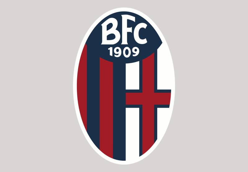
The Bologna FC logo is an oval emblem featuring red and blue vertical stripes, St. George’s Cross on a white field, and the initials “BFC” with the year “1909.” The current version was introduced in 2018, building on the 1993 design with darker, more modern tones.
Here’s a breakdown of the main attributes:
- Design Type: Combination mark (emblem with typographic elements and graphic symbols within an oval badge shape)
- Primary Elements: Red and blue vertical stripes, St. George’s Cross (red cross on white), “BFC” lettering, “1909” date mark, oval crest outline
- Official Introduction Date: Current version launched in 2018, based on the 1993 crest structure
- Designer/Agency: The specific designer behind the 2018 update has not been publicly credited. The redesign was handled internally through the club’s branding team
- Trademark Status: Registered trademark of BFC 1909 Lux SPV S.A., the holding company that owns the club
- Color Palette: Navy blue (#1A2F48), red/burgundy (#A21C26), white (#FFFFFF), and light silver (#ECECEC)
- Usage Context: Match day kits, official merchandise, digital platforms, stadium signage, marketing materials, and broadcast graphics across Serie A coverage
How Has the Bologna FC Logo Evolved Over Time?

The Bologna crest has been redesigned at least five times since the club’s founding in 1909.
Early versions were simple. Later iterations introduced the oval shape, striped patterns, and heraldic symbols that became permanent. The biggest shifts happened in 1946, 1980, 1993, and 2018.
Original Bologna FC Logo (1909-1946)
- Years Active: 1909-1946
- Design Description: The earliest badges were basic marks. During the club’s first decades, formal logo design wasn’t standardized across Italian football. Bologna used simple lettering and early interpretations of the city’s heraldic cross
- Color Scheme: Red, blue, and white, drawn from the city of Bologna’s official colors
- Designer: Unknown, likely created informally by founding members
- Context: The club was founded by Emilio Arnstein at the Ronzani brewery. During this period, Bologna won seven Serie A titles and built their reputation as one of Italy’s top clubs
- Cultural Significance: These early marks established the red-and-blue identity that gave the club its nickname “Rossoblu” (Red and Blue)
Post-War Bologna Logo (1946-1980)
- Years Active: 1946-1980
- Design Description: An oval crest appeared, featuring the “BFC” letters and the red-and-blue striped pattern. The cross of St. George was placed on the right side of the badge. A gold or yellow border framed the oval
- Color Scheme: Brighter shades of red and blue, white for the cross section, gold border
- Designer: Not publicly credited
- Context: Post-World War II, the club reorganized as Bologna Football Club. The crest formalized the link to the city’s coat of arms and the club’s football identity
- Key Changes from Previous: First structured oval badge. The “BFC” inscription appeared for the first time, and the striped pattern became a fixed element
- Cultural Significance: This version carried Bologna through its final league title in 1963-64 and two Coppa Italia wins in the 1970s
Modernized Bologna Logo (1980-1993)
- Years Active: 1980-1993
- Design Description: The oval shape was retained, and a shield backdrop was added behind the badge. The cross and stripes remained, but the overall look was cleaned up with sharper lines and a more defined yellow border
- Color Scheme: Red, blue, white, with a bright yellow border
- Designer: Not publicly credited
- Context: This was a tough period for Bologna. The club was relegated multiple times and even dropped to Serie C1. The logo stayed consistent through those difficult seasons
- Key Changes from Previous: Added shield element behind the oval, refined border styling
- Cultural Significance: Despite on-field struggles, this badge kept the club’s visual identity intact during its lowest sporting moments
Restructured Bologna Logo (1993-2018)
- Years Active: 1993-2018
- Design Description: A vertically stretched oval crest, split into two sections. The left side featured vertical blue and red stripes. The right side showed a red cross outlined in blue on a white background. “BFC” was set in white across the top on a solid blue field, with “1909” directly below in bold white
- Color Scheme: Medium blue, bright red, white, yellow/gold border
- Designer: Not publicly credited
- Context: The club was renamed Bologna Football Club 1909. This logo coincided with the club’s return to Serie A in 1996 and their UEFA Intertoto Cup win in 1998. A special centenary version was used in 2009
- Key Changes from Previous: Removed the shield backdrop. The “1909” founding year was added for the first time. The lettering switched to a handwritten-style typeface
- Cultural Significance: This version lasted 25 years and became the most recognized Bologna crest globally. It carried the club through multiple ownership changes and a return to European competition
Current Bologna Logo (2018-Present)
- Years Active: 2018-present
- Design Description: The same oval structure and layout as the 1993 version, but with refined contours and a dramatically different color palette. The bright red shifted to burgundy, and the blue became so dark it almost looks black. The border changed from yellow to a more subdued white
- Color Scheme: Navy blue (#1A2F48), burgundy red (#A21C26), white (#FFFFFF)
- Designer: Handled by the club’s internal branding team under Joey Saputo’s ownership
- Context: Introduced as part of a broader visual refresh. The darker tones were meant to give the badge a bolder, more aggressive look. It arrived during a period of stability under Canadian ownership
- Key Changes from Previous: Darker color palette, refined contours, white border replacing the gold/yellow one
- Cultural Significance: This version has represented Bologna during their strongest recent run, including Champions League qualification in the 2023-24 season under Thiago Motta
What Do the Design Elements of the Bologna FC Logo Mean?

Every piece of the Bologna crest ties back to the city itself.
The red and blue stripes are the city’s official colors. The cross is St. George’s Cross, pulled straight from Bologna’s coat of arms. And the “BFC 1909” text grounds the badge in the club’s founding identity.
None of this is decorative. It’s all functional, connecting the football club to its home city at a structural level.
Why Did Bologna FC Choose These Specific Colors?
Bologna’s colors come from the city of Bologna’s municipal heraldry. Red and blue have been the city’s colors for centuries.
The club literally borrowed them, which is why the team is called “Rossoblu.”
Here are the official colors in the current logo:
- Navy Blue: Hex #1A2F48, RGB (26, 47, 72), CMYK (93, 78, 46, 44). The darker navy replaced the brighter blue in 2018 to convey strength and seriousness. Blue is commonly linked to trust, loyalty, and authority
- Burgundy Red: Hex #A21C26, RGB (162, 28, 38), CMYK (24, 100, 93, 19). Red signals passion and intensity. The shift to burgundy in 2018 gave the badge a more mature, aggressive tone compared to the previous brighter red
- White: Hex #FFFFFF. Used in St. George’s Cross and the lettering. White provides the contrast that makes the other elements readable and clean
- Light Silver: Hex #ECECEC. Used as a subtle accent in certain digital applications, mainly for border and background separation
The combined effect of these darker tones makes the current badge feel heavier and more serious than its predecessors. Your mileage may vary on whether that’s an improvement, but it’s clearly a deliberate color psychology choice.
What Typography Style Is Used in the Bologna FC Logo?

The “BFC” lettering in the logo uses a custom handwritten-style typeface. It’s not based on any commercially available font.
The letters are set in white, all uppercase, with a slightly decorative flair that separates them from a standard sans-serif or serif typeface.
The “1909” below uses a cleaner, bolder weight. This creates a subtle typographic hierarchy where the initials draw the eye first and the date anchors the bottom.
Readability isn’t a problem at larger sizes, but at smaller scales (think mobile screens or tiny print), the decorative lettering can get a bit tricky. That’s a trade-off with custom lettering versus something more standardized.
What Are the Hidden Meanings in the Bologna FC Logo?
The most obvious “hidden” element is St. George’s Cross. Most people outside Italy wouldn’t associate it with Bologna, but it’s been on the city’s coat of arms for centuries.
The vertical split of the crest into stripes and cross is basically the club saying: “We’re this city’s team.”
The oval shape itself is worth noting. It’s not a shield, not a circle. It’s a stretched oval, which gives the badge a taller, more formal look compared to the round crests you see elsewhere in Italian football.
There’s no widely reported “Easter egg” from the designer. The symbolism is straightforward, and honestly, that’s what makes it work.
How Does the Bologna FC Logo Compare to Competitor Logos?
Most Serie A crests use shields or circles. Bologna’s stretched oval stands apart in that lineup.
Compared to rivals, the badge is less ornate than Juventus’s emblem (which went full minimalist in 2017) and busier than something like the AC Milan crest.
Among direct regional competitors, it shares color DNA with Genoa’s badge (both use red and blue), but the structural approach is different. Genoa leans into a circular griffon design, while Bologna sticks with its stripe-and-cross formula.
The Fiorentina logo uses a completely different approach with its fleur-de-lis. Napoli’s badge is simpler, built around the letter “N.” And Roma’s crest pulls from classical Roman mythology with the she-wolf.
Bologna’s design sits somewhere in the middle of that spectrum. Not minimalist, not overly complex. Just… traditional, in the best sense.
What Are the Technical Specifications of the Bologna FC Logo?
Official Color Codes
- Primary Color (Navy Blue): Hex #1A2F48, RGB (26, 47, 72), CMYK (93, 78, 46, 44)
- Secondary Color (Burgundy Red): Hex #A21C26, RGB (162, 28, 38), CMYK (24, 100, 93, 19)
- Tertiary Color (White): Hex #FFFFFF, RGB (255, 255, 255), CMYK (0, 0, 0, 0)
- Accent Color (Light Silver): Hex #ECECEC, RGB (236, 236, 236), CMYK (6, 4, 4, 0)
Dimensions and Proportions
- Aspect Ratio: The logo follows roughly a 2:3 width-to-height ratio in its oval shape, making it taller than it is wide
- Minimum Size: For print applications, the crest should not be reproduced smaller than 15mm in width to maintain legibility of the “BFC” and “1909” text
- Clear Space: The club’s brand guidelines require a buffer zone around the logo equal to the height of the “BFC” text on all sides
- File Formats: Official assets are distributed in vector formats (SVG, EPS, AI) for scalability, plus rasterized versions in PNG and JPEG for digital use
What Cultural Impact Has the Bologna FC Logo Had?
The Bologna crest is deeply connected to the city’s identity. It doesn’t just represent a football club. For many residents of Bologna, this badge is one of the most visible symbols of civic pride, right alongside the Two Towers and the city’s famous porticoes.
The “Rossoblu” colors have become shorthand for the city itself in sporting contexts.
When Bologna qualified for the Champions League in 2024, the badge suddenly had international exposure it hadn’t seen in decades. Merchandise sales jumped. Social media accounts gained hundreds of thousands of followers. The logo was everywhere.
And because the 2018 redesign kept things recognizable rather than pulling a Juventus-style rebrand, long-time fans didn’t feel alienated by the new look. That continuity matters when your badge is also your city’s badge, in a way.
How Does the Bologna FC Logo Fit Into the Overall Brand Identity?

The logo sits at the center of everything Bologna FC does visually. The navy and burgundy brand style guide extends to the matchday kits, the Stadio Renato Dall’Ara signage, the club’s website, social media templates, and all licensed merchandise.
The crest’s heraldic roots connect it to the broader identity of the city of Bologna.
The “BFC 1909” text ties the club to its founding history, which matters when you’re trying to communicate legacy and tradition. Under Joey Saputo’s ownership, the club has worked to make the brand feel both historic and modern at the same time.
That’s actually a tricky balance to get right. Too modern and you lose the old guard. Too traditional and younger fans don’t connect with it. Bologna’s current approach leans traditional but with enough polish that it doesn’t feel dated.
How Should the Bologna FC Logo Be Used?
- Official Usage Guidelines: The logo must always appear in its complete form. Don’t crop, rotate, distort, or separate individual elements from the crest. The color palette should match the official hex values listed above
- Background Rules: Use the full-color version on light backgrounds. On dark backgrounds, a version with a white or light border may be used to keep the badge legible
- Where to Access Official Logos: Official vector and raster files can be requested through Bologna FC’s media department or accessed through the club’s official press resources at bolognafc.it
- Licensing Information: The Bologna FC logo is a registered trademark. Any commercial use requires written permission from BFC 1909 Lux SPV S.A. Unauthorized reproduction on merchandise, digital products, or marketing materials is not allowed
- Trademark Protection: The crest, including the “BFC” initials and the oval design, is protected under Italian and EU trademark law. The club actively enforces its intellectual property rights against counterfeit goods and unauthorized usage
- Fan and Editorial Use: Non-commercial editorial use (like news coverage or blog posts) is generally fine, but always check current club policies. For fan-created content, the club tends to be supportive as long as it’s not sold or misrepresented as official
FAQ on The Bologna Logo
What does the Bologna FC logo look like?
The Bologna FC 1909 crest is an oval emblem with red and blue vertical stripes on the left side. St. George’s Cross sits on the right. The letters “BFC” and the founding year “1909” appear at the top in white.
Why are red and blue the colors on the Bologna logo?
Red and blue come directly from the city of Bologna’s municipal coat of arms. These have been the city’s official colors for centuries.
The club adopted them at founding in 1909, which is why fans call the team “Rossoblu.”
When was the current Bologna logo introduced?
The current version launched in 2018. It kept the same oval structure from the 1993 design but shifted the color palette to darker tones. Bright red became burgundy. Blue went almost black.
What does the cross on the Bologna badge mean?
That’s St. George’s Cross, a red cross on a white field. It appears on the city of Bologna’s flag and coat of arms.
The club included it to tie the football identity directly to the city’s heraldic tradition.
Who designed the Bologna FC logo?
No individual designer has been publicly credited for the current crest. The 2018 redesign was handled internally under the club’s ownership group led by Joey Saputo. Previous versions also lack documented attribution.
Has the Bologna logo changed over the years?
Yes. The badge has gone through at least five major versions since 1909. Key redesigns happened in 1946, 1980, 1993, and 2018.
The core elements, the stripes, cross, and “BFC” initials, have stayed consistent through most of those changes.
What font is used in the Bologna logo?
The “BFC” lettering uses a custom handwritten-style typeface. It’s not a commercially available font. The “1909” below it uses a cleaner, bolder weight to create separation between the two text elements.
What are the official color codes for the Bologna logo?
Navy blue is #1A2F48. Burgundy red is #A21C26. White is #FFFFFF. Light silver is #ECECEC.
The 2018 redesign made these significantly darker than the previous version’s brighter shades used in the Serie A badge from 1993.
Can I use the Bologna logo for my project?
The crest is a registered trademark of BFC 1909 Lux SPV S.A. Commercial use requires written permission. Non-commercial editorial use is generally acceptable, but check the club’s current policies at bolognafc.it first.
How does the Bologna crest compare to other Italian football logos?
Bologna’s oval shape is unusual in Serie A, where most clubs use shields or circles. It’s less minimal than Juventus, less ornate than Roma, and shares red-blue DNA with Genoa but uses a completely different layout.
Conclusion
The Bologna logo is one of those football crests that actually means something beyond the pitch. Every stripe, every color, every line connects back to the city’s heraldic roots and over a century of club history.
The 2018 redesign proved you can refresh a badge without gutting its identity. Darker tones, cleaner contours, same soul.
For a club competing in Serie A with seven league titles and growing international recognition, the crest does exactly what it needs to do. It represents Bologna the city and Bologna the team in a single oval mark.
Few emblems in Italian football manage that connection so cleanly.

Renowned for his expertise in logo design and visual branding, Bogdan has developed a multitude of logos for various clients.
His skills extend to creating posters, vector illustrations, business cards, and brochures. Additionally, Bogdan's UI kits were featured on marketplaces like Visual Hierarchy and UI8.
He also wrote in the past years on sites like Design Your Way, WebDesignerDepot, WPDean, Designmodo, Speckyboy, Slider Revolution, and more.
- How to Install Fonts on Mac (Step-by-Step Guide) - 20 September 2026
- From Mockup to Code: How AI-Augmented Development Speeds Up the Design Handoff - 19 September 2026
- The Beehiiv Logo History, Colors, Font, And Meaning - 18 September 2026

Bogdan Sandu is a seasoned designer who has been designing websites since 2008. Renowned for his expertise in logo design and visual branding, Bogdan has developed a multitude of logos for various clients. His skills extend to creating posters, vector illustrations, business cards, and brochures. Additionally, Bogdan's UI kits were featured on marketplaces like Visual Hierarchy and UI8. He also wrote in the past years on sites like Design Your Way, WebDesignerDepot, WPDean, Designmodo, Speckyboy, Slider Revolution, and more.
You Might Also Like


