The Crotone logo is one of those badges that tells you everything about a football club before you even read the name. FC Crotone, based in the Calabrian city of Crotone, carries a crest built on maritime imagery, bold red and blue stripes, and a deep connection to its ancient Greek roots. Founded on September 20, 1910, the club has gone through multiple name changes, two bankruptcies, and several badge redesigns. But the current emblem, introduced in 2012, pulls together over a century of history into a single shield.
Understanding what a logo actually represents helps put the Crotone badge into perspective. It’s not just a graphic slapped on a jersey. It’s a compressed story of a city, a community, and a football tradition rooted in Magna Graecia.
What Is the Crotone Logo?
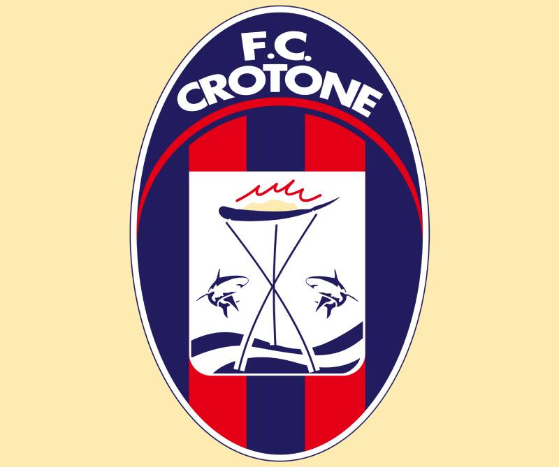
The Crotone logo is a shield-shaped emblem featuring two sharks flanking a boat on stylized waves, with alternating red and blue vertical stripes. The current version was introduced in 2012 and carries the club name “F.C. CROTONE” in white uppercase lettering on a banner across the top. The design pulls directly from the Crotone city coat of arms, representing maritime strength and coastal identity.
Here’s what defines the badge at a technical level:
- Design Type: Combination mark (emblem with wordmark)
- Primary Elements: Shield shape, two sharks, a boat, red waves, vertical red and blue stripes, white banner with club name
- Official Introduction Date: 2012 (current version)
- Designer/Agency: Not publicly credited to a specific designer or agency
- Trademark Status: Registered under Football Club Crotone S.r.l.
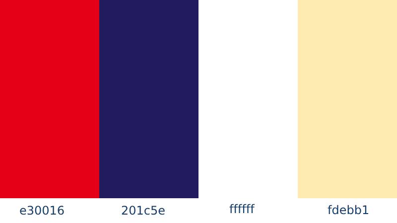
- Color Palette: Dark blue, red, white, and cream/light yellow accents
- Usage Context: Match kits, official merchandise, stadium branding, digital platforms, press materials, and all club communications
The sharks (“squali” in Italian) are the club’s nickname. So the badge literally wears its identity. That’s something you don’t see with every football crest, and it works well here.
How Has the Crotone Logo Evolved Over Time?
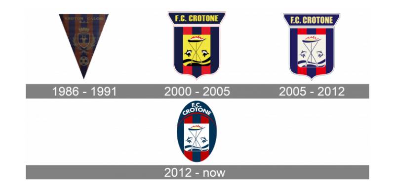
The Crotone badge has gone through at least six major versions since the club’s founding. Each redesign reflected a shift in the club’s status, ambitions, or organizational structure.
The overall arc went from a straight copy of the city’s heraldic emblem to a more polished, modern football crest. It took decades, and some versions lasted longer than others.
City Coat of Arms Era (1910-1986)
- Years Active: 1910-1986
- Design Description: A direct reproduction of the Crotone city coat of arms, featuring the boat and dolphins (later interpreted as sharks) on a traditional heraldic shield
- Color Scheme: Based on the city’s official colors
- Designer: Not applicable (heraldic adoption)
- Context: The club existed under several names during this period, including Societa Sportiva Crotona, Milone, and Unione Sportiva Crotone. The badge stayed tied to the municipal identity
- Key Changes from Previous: This was the starting point
- Cultural Significance: Showed the club as an extension of the city itself, with no separate football identity
For 76 years, the club just used the city’s own crest. No separate football branding at all. That’s actually pretty common for smaller Italian clubs from that era, but it meant there was zero distinction between civic and sporting identity.
Three-Pointed Pennant Badge (1986-2000)
- Years Active: 1986-2000
- Design Description: A triangular pennant shape with the city emblem positioned above a football. Blue and reddish stripes formed the background
- Color Scheme: Blue, reddish-red, and traditional city emblem colors
- Designer: Unknown
- Context: Introduced when the club was renamed Associazione Kroton Calcio, signaling a fresh start after financial troubles. This was the first time Crotone had its own distinct football badge
- Key Changes from Previous: Moved away from the raw city coat of arms to a pennant shape, added a football element
- Cultural Significance: Marked the first real separation between civic and club identity. The “Kroton” naming referenced the ancient Greek city directly
The pennant shape was a step forward. But honestly, the design felt a bit generic for the time. Lots of Italian lower-division clubs were doing similar things in the late ’80s.
Square Shield Badge (2000-2005)
- Years Active: 2000-2005
- Design Description: A square-shaped crest with a pointed bottom and rounded corners. Bold yellow banner across the top with “CROTONE FC” written in a heavy sans-serif typeface. Yellow central background section with the city’s coat of arms imagery
- Color Scheme: Bright yellow, dark blue, red, white
- Designer: Not publicly credited
- Context: The club had just been promoted to Serie B for the first time in its history under Raffaele Vrenna’s ownership, and the new badge reflected higher ambitions
- Key Changes from Previous: Complete shape overhaul from pennant to square shield. Introduction of bold yellow as a primary accent color. Much larger, more confident lettering
- Cultural Significance: Represented the club’s arrival on the national stage. The yellow added energy and confidence to the visual identity
This is where the badge started looking like something you’d actually recognize. The square shield gave it a more modern football feel, and the yellow really popped.
Refined Shield Badge (2005-2012)
- Years Active: 2005-2012
- Design Description: Same overall shape as the 2000 version, but with the bright yellow toned down to a very pale, almost white shade. The lettering on the banner got taller and bolder
- Color Scheme: Pale yellow/cream, dark blue, red, white
- Designer: Not publicly credited
- Context: A refinement rather than a full redesign. The club was competing in Serie B and needed a slightly more polished look
- Key Changes from Previous: Yellow elements shifted to pale cream. Letters became larger and more prominent
- Cultural Significance: Showed growing design awareness without abandoning the core identity established in 2000
Subtle changes, but they mattered. The move away from bright yellow to cream gave the badge a more mature look. The bigger letters helped with readability on TV broadcasts and merchandise.
Current Oval Badge (2012-Present)
- Years Active: 2012-present
- Design Description: An oval shield shape replacing the previous squared design. White replaces all former yellow/cream elements. The club name “F.C. CROTONE” sits in white text on a banner at the top. Two sharks flank a boat on waves in the center, with vertical red and blue stripes as the background
- Color Scheme: Dark blue, red, white
- Designer: Not publicly credited
- Context: Introduced a few years before the club’s historic first promotion to Serie A in 2016. This badge appeared on the shirts during both Serie A campaigns
- Key Changes from Previous: Oval shape instead of squared shield. Yellow completely removed in favor of white. Cleaner overall lines and more refined detailing
- Cultural Significance: This is the badge that went to Serie A. For Crotone supporters, it represents the club’s greatest achievements on the pitch
The current design feels right. The oval is cleaner, the white gives it a sharper look, and the whole thing reads well at small sizes. It’s the badge that was on the shirts when Davide Nicola pulled off that miracle survival in 2016-17.
What Do the Design Elements of the Crotone Logo Mean?
Every piece of the Crotone badge connects to the city’s history and geography. The two sharks represent the club’s nickname “Gli Squali” and reference Crotone’s position on the Ionian Sea coast.
The boat at the center recalls the city’s fishing and maritime traditions going back centuries.
The red and blue stripes come from the city’s own coat of arms and were adopted as the club’s playing colors early in its history. The psychology behind the shapes in this badge leans heavily on protection (the shield) and aggression (the sharks), which fits a club that’s had to fight for survival both on and off the field.
Why Did Crotone Choose These Specific Colors?
The color palette isn’t random. Dark blue and red were borrowed from the Crotone city crest, which in turn draws from the city’s ancient Greek heritage and the Calabria regional flag.
The dark blue connects to the club’s Greek origins. Ancient Kroton was a major colony of Magna Graecia, and the deep blue references the Ionian Sea that borders the city.
Red ties to Calabria’s regional identity. It adds energy to the badge and provides strong contrast against the blue.
White, introduced more prominently in the 2012 redesign, replaced earlier yellow elements and gives the badge a cleaner, more modern feel.
If you look at color theory principles, the dark blue and red combination is a high-contrast pairing that reads well on both light and dark backgrounds. It’s no accident that the same combination works for many brands that use red or organizations that lean on blue.
From a color psychology standpoint, dark blue signals trust and stability, while red brings passion and intensity. That’s a fitting mix for a club that’s built loyalty through decades of lower-league grind before reaching the top flight.
What Typography Style Is Used in the Crotone Logo?
The club name uses a bold, condensed sans-serif typeface in all uppercase letters. “F.C. CROTONE” sits on a banner spanning the top of the badge.
The letters are tightly spaced, which adds a sense of solidity. They’ve gotten progressively larger and bolder through each redesign since 2000.
White text against the dark badge provides strong readability. At small sizes (kit badges, for example) the lettering still holds up well. It’s a practical choice over something decorative.
What Are the Hidden Meanings in the Crotone Logo?
The sharks are sometimes described as dolphins in older descriptions, but they specifically represent “Gli Squali,” the club’s official nickname. The distinction matters to fans.
The boat isn’t just decorative. Crotone has been a fishing port for centuries. Placing it at the badge’s center makes the city’s livelihood the focal point of the design.
The waves below the boat add a sense of motion. There’s also a connection to the club motto “Noi siamo la Magna Grecia” (We are Greater Greece), which ties the maritime imagery back to the ancient Greek sailors who founded the original settlement of Kroton.
How Does the Crotone Logo Compare to Competitor Logos?
Among Italian football crests, Crotone’s badge sits in a specific niche. It’s more illustrative than the stripped-back minimalism that clubs like Juventus with their modern rebrand have pushed. But it’s also more refined than some of the busier lower-division crests you see across Serie C.
Compared to other southern Italian clubs, there are some clear differences. The Napoli badge relies on a simple “N” lettermark, which is a totally different approach. Cagliari’s crest uses the Four Moors of Sardinia for regional specificity, but it does the same thing Crotone does: it ties the club to its geography.
Clubs like Genoa and Bologna use more traditional heraldic styling. Fiorentina’s badge centers on the fleur-de-lis. Lazio uses an eagle. Crotone’s sharks are rarer as a mascot choice, and that actually works in the club’s favor for standing out.
The red and blue stripe combination is shared with several Italian clubs, but the maritime imagery makes Crotone’s version distinct. You won’t confuse it with another badge once you’ve seen it.
What Are the Technical Specifications of the Crotone Logo?
Official Color Codes
- Dark Blue (Primary) – Hex: #0E0EBB, RGB: (14, 14, 187), CMYK: (93, 93, 0, 27)
- Red (Primary) – Hex: #CC0E0E, RGB: (204, 14, 14), CMYK: (0, 93, 93, 20)
- White (Secondary) – Hex: #FFFFFF, RGB: (255, 255, 255), CMYK: (0, 0, 0, 0)
- Cream/Light Yellow (Accent, pre-2012) – Hex: #FACE18, RGB: (250, 206, 24), CMYK: (0, 18, 90, 2)
For print work, matching Pantone spot colors to the dark blue and red is important to maintain accuracy across different materials.
Dimensions and Proportions
The current oval badge has a roughly 2:3 width-to-height ratio. The banner with the club name takes up about one-fifth of the total badge height. Clear space around the logo should equal at least half the height of the “F.C. CROTONE” text banner.
For digital use, the badge is commonly distributed as vector files (SVG, EPS, AI formats) to allow scaling without quality loss. Bitmap versions in PNG format are available at various resolutions, and JPEG files are used for web contexts where file size matters. For print, a minimum of 300 DPI is standard.
What Cultural Impact Has the Crotone Logo Had?
For a club from a small Calabrian city, the Crotone badge has become a symbol that goes well beyond football. It represents southern Italian identity, perseverance through repeated financial collapses, and the pride of Magna Graecia.
During the 2016-17 Serie A survival campaign, the badge was everywhere. National media ran it alongside coverage of one of Italian football’s greatest escape stories.
The sharks in the crest have become a rallying symbol for the club’s supporters. “Gli Squali” isn’t just a nickname. It’s a way of talking about where you’re from and what you’ve been through. Fans use it on banners, scarves, and tattoos.
The badge also shows up in discussions about regional pride. The motto “Salutate la Magna Grecia” connects the football club to a much older cultural identity. Through the storytelling power of design, a single emblem carries more than a hundred years of history.
How Does the Crotone Logo Fit Into the Overall Brand Identity?
The badge sits at the center of everything FC Crotone does visually. Kit designs, stadium graphics, social media, merchandise, and press materials all build outward from the logo’s colors and imagery.
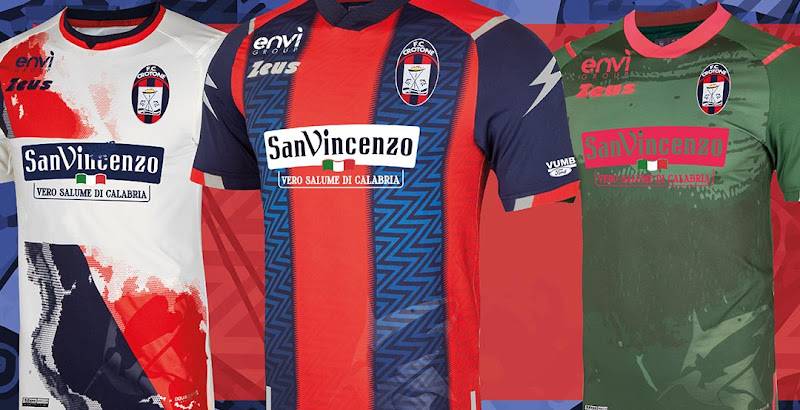
The dark blue and red stripes from the badge carry directly into the club’s traditional home kit, which uses vertical stripes in the same colors. That kind of unity between badge and kit makes the whole identity feel connected.
Good visual hierarchy starts with the logo at the top. Everything else, from emphasis on match day graphics to how the club handles balance in promotional layouts, traces back to the crest’s core elements.
The Stadio Ezio Scida uses the badge prominently across its signage, including on the stadium facade, pitch-side boards, and press room backdrops. The shark imagery extends to fan culture too, with supporter groups building their own visual language around the club’s symmetrical shield format.
How Should the Crotone Logo Be Used?
The FC Crotone badge is a registered trademark. You can’t just slap it on products or use it in commercial materials without permission from Football Club Crotone S.r.l.
Following proper brand guidelines matters. Here’s the practical breakdown:
- Do: Use the official files provided by the club for media and editorial purposes. Maintain the correct color values. Keep clear space around the badge. Respect minimum size requirements so the details remain readable.
- Don’t: Stretch or distort the proportions. Change the colors. Add drop shadows or effects not specified in the brand style guide. Place the badge on backgrounds that clash with its color scheme. Recreate or modify the shark illustrations.
- Where to access official logos: Contact the club directly through their official website at fccrotone.it. Licensed media outlets receive assets through standard football press channels.
- Licensing: Any commercial use of the badge requires written approval from the club. This includes merchandise, promotional materials, and digital products.
- Trademark protection: The logo is protected under Italian intellectual property law. Unauthorized use, particularly on counterfeit merchandise, is subject to legal action.
For anyone working with the badge in a design context, understanding core logo design principles helps you present it properly. The badge carries over a century of history. Treating it with care isn’t just a legal requirement. It’s the right thing to do.
FAQ on The Crotone Logo
What does the Crotone logo look like?
The FC Crotone badge is an oval shield with vertical red and blue stripes. Two sharks flank a boat on stylized waves at the center. A white banner across the top reads “F.C. CROTONE” in bold uppercase letters.
The whole thing draws from the city’s coat of arms.
When was the current Crotone calcio badge introduced?
The current version arrived in 2012. It replaced the squared shield that had been used since 2000, switching to an oval shape and dropping yellow in favor of white.
This is the badge Crotone wore during both Serie A promotions in 2016 and 2020.
What do the sharks in the Crotone emblem represent?
The sharks reference the club’s nickname “Gli Squali.” They also tie into Crotone’s identity as a coastal city on the Ionian Sea.
Some older descriptions call them dolphins, but the club officially identifies them as sharks. The distinction matters to the Crotone supporters.
What colors are used in the Crotone football club logo?
Dark blue, red, and white. These come from the Crotone city crest and reflect both the club’s Greek heritage and Calabria’s regional identity.
The combination creates a complementary color pairing that works well across printed materials and digital screens alike.
How many times has the Crotone logo changed?
At least six major versions exist. The club used the city coat of arms until 1986, then moved to a triangular pennant, a squared shield in 2000, a refined version in 2005, and the current oval from 2012.
Each shift matched a change in the club’s organizational structure or competitive level.
What font is used in the Crotone badge?
A bold, condensed sans-serif typeface in all caps. The letters are tightly spaced with strong tracking that keeps everything readable even at small sizes on match kits and merchandise.
Can I download the Crotone logo for personal use?
PNG and SVG versions of the badge are available through various logo databases online. But any commercial use requires written permission from Football Club Crotone S.r.l.
For web projects or editorial content, always check the club’s licensing terms first.
Why does the Crotone logo feature a boat?
The boat at the center reflects Crotone’s long history as a fishing port and maritime city. It comes directly from the municipal coat of arms, which has used this imagery for centuries.
It places the city’s livelihood right at the heart of the club’s visual identity.
How does the Crotone crest compare to other Italian football badges?
It’s more illustrative than minimalist rebrands like Juventus. Clubs such as Sampdoria and Torino use similarly detailed heraldic crests, but Crotone’s shark imagery makes it stand out.
Few Italian clubs feature marine animals this prominently.
What is the meaning behind the red and blue stripes on the Crotone shield?
The stripes were borrowed from the players’ uniforms, which in turn took their colors from the Crotone city crest. The dark blue links to Greek origins and the Ionian Sea. Red ties to Calabria’s regional flag.
Together they form the club’s core design elements and have appeared in every badge version since 1986.
Conclusion
The Crotone logo does what the best football badges do. It compresses a city’s identity, history, and pride into a single mark that fans carry with them everywhere.
From its origins as a copy of the municipal coat of arms to the current oval shield with its sharks, boat, and red and blue stripes, every version of the FC Crotone emblem has reflected where the club stood at that moment.
The Pitagorici badge is proof that a club doesn’t need a massive budget or a famous designer to build something lasting. It just needs a real connection to its roots.
That connection, from ancient Kroton to Calabria’s Stadio Ezio Scida, is what makes this crest work.

Renowned for his expertise in logo design and visual branding, Bogdan has developed a multitude of logos for various clients.
His skills extend to creating posters, vector illustrations, business cards, and brochures. Additionally, Bogdan's UI kits were featured on marketplaces like Visual Hierarchy and UI8.
He also wrote in the past years on sites like Design Your Way, WebDesignerDepot, WPDean, Designmodo, Speckyboy, Slider Revolution, and more.
- Jujutsu Kaisen Font Generator - 12 October 2026
- The Windsurf Logo History, Colors, Font, And Meaning - 10 October 2026
- How to Remove Background From Product Photos (No Photoshop) - 10 October 2026

Bogdan Sandu is a seasoned designer who has been designing websites since 2008. Renowned for his expertise in logo design and visual branding, Bogdan has developed a multitude of logos for various clients. His skills extend to creating posters, vector illustrations, business cards, and brochures. Additionally, Bogdan's UI kits were featured on marketplaces like Visual Hierarchy and UI8. He also wrote in the past years on sites like Design Your Way, WebDesignerDepot, WPDean, Designmodo, Speckyboy, Slider Revolution, and more.
You Might Also Like