The Udinese logo is one of the longest-running visual identities in Italian football. It belongs to Udinese Calcio, a Serie A club founded on November 30, 1896, in the city of Udine, located in the Friuli-Venezia Giulia region of northeastern Italy. The club is actually the second oldest in the country, behind only Genoa.
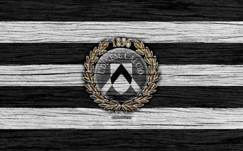
The crest has gone through at least six distinct versions since the 1950s. What you see today is a circular gray emblem framed by golden laurel branches, with a white shield and black chevron at its center. The founding year “1896” sits at the top. It’s a look that balances civic pride with football tradition, and it has been in use (with minor tweaks) since the 1995-96 season.
Within the broader history of Italian football branding, the Udinese badge sits in a category of crests heavily influenced by municipal heraldry. That black chevron? It comes straight from the coat of arms of the city of Udine. Not every club can say their logo literally maps back to civic symbolism that predates the sport itself.
What Is the Udinese Logo?

The Udinese logo is a combination mark featuring a white shield with a bold black chevron, set inside a gray circle bearing the arched inscription “UDINESE CALCIO,” all surrounded by a golden laurel wreath with the founding year 1896 at the top. The current version was first introduced in 1995 and refined in 2010.
Here’s a breakdown of the key attributes:
- Design Type: Combination mark (emblem style). It combines a shield, a circular frame, text, and decorative laurel elements into one badge.
- Primary Elements: A white shield containing a black upward-pointing chevron (borrowed from the Udine city coat of arms), surrounded by a gray ring with “UDINESE CALCIO” in uppercase serif lettering, and enclosed by gold laurel branches.
- Official Introduction Date: The current design debuted in the 1995-96 Serie A season. A refined version with updated gray tones and laurel details was released in 2010.
- Designer/Agency: The specific designer or agency has not been publicly credited. Like many Italian football club badges from the 1990s, it was likely developed in-house or by a local design firm.
- Trademark Status: The Udinese Calcio logo is registered as trademarked intellectual property. Use requires permission from the club, regardless of the context.
- Color Palette: Black (#000000), White (#FFFFFF), Gold (#8B7D37), and Gray (#7F7F7F). These four colors define the official badge.
- Usage Context: The badge appears on match kits, fan merchandise, official correspondence, the club’s website, social media accounts, stadium signage at the Bluenergy Stadium (formerly Dacia Arena), and broadcast graphics during Serie A matches.
How Has the Udinese Logo Evolved Over Time?

The Udinese badge has been redesigned roughly six times since the mid-20th century. Early versions used striped shields and monograms. Later designs introduced a zebra mascot, then a city coat of arms element, before settling into the laurel-framed emblem used today.
It’s actually kind of fascinating how much the identity shifted in a span of about 30 years.
Early Shields and the ACU Monogram (1950s-1970s)
Years Active: Roughly 1950s through the late 1970s
The earliest official emblems featured a shield filled with black and white vertical stripes, paired with “AC Udinese” text and later the “ACU” monogram (standing for Associazione Calcistica Udinese).
These crests were never actually printed on the match shirts, which makes it tricky to pin down exact dates. But the visual language was clear: bold sans-serif type, narrow letterforms, and the club’s signature black-and-white stripes filling the shield background.
There was no color beyond black and white. No laurels, no circular framing. Just stripped-back identity work that matched the design standards of mid-century Italian football.
For context, this was a time when most clubs didn’t obsess over brand consistency. The badge was a badge, nothing more. It did the job.
The Zebra Badge (1977-Early 1980s)
Years Active: Late 1970s to approximately 1980
In 1977, the club introduced a circular badge with a zebra illustration set inside a green frame. This was the first emblem to appear on the actual match shirts, starting in 1979.
The zebra references the club’s nickname, “Le Zebrette” (the Little Zebras), which comes from their black-and-white striped kits. At the time, the zebra was facing left. Decades later, Macron reintroduced this retro badge on the 2023-24 home kit, but with the zebra facing right as a nod to “looking forward.”
This version had personality. A lot of it. It’s the kind of badge fans still feel nostalgic about, and honestly, I get it. There’s a charm to mascot-based crests that geometric designs can’t quite replicate.
The Zanussi-Era Shield (Early 1980s-1986)
Years Active: Early 1980s to around 1986
Under President Lamberto Mazza, the logo changed completely. Out went the zebra. In came a white shield with a prominent black chevron pointing upward, directly referencing the coat of arms of Udine.
Below the chevron sat the “Z” logo of Zanussi, the appliance company that owned the club at the time. The lowercase inscription “udinese calcio” appeared above in a bold serif typeface with rounded terminals and chunky square serifs.
Fun detail: during the 1981-82 season, the shirts didn’t even display the full badge. Just a large “Z” on the chest. Corporate branding at its most direct.
After Giampaolo Pozzo acquired the club and Zanussi departed, the “Z” was removed. What remained was just the shield and chevron, stripped clean of corporate influence.
The First Circular Emblem (1992-1995)
Years Active: 1992 to 1995
Between 1992 and 1995, Udinese introduced a circular badge for the first time. The city’s coat of arms sat in the center, surrounded by a gray circle.
This was a transitional design. Not the strongest version the club has ever had, and it didn’t last long. But it set the template for the circular layout that the current logo would eventually build on.
The gray tones gave it a slightly muted look. If you compare it to what came right after, you can see the club was working toward something bigger.
The Laurel Wreath Badge (1995-2010)
Years Active: 1995 to 2010
This is where the modern identity really took shape. The 1995 redesign brought back the circular format but added a gold laurel wreath around the outside, with “1896” placed at the top and the “UDINESE CALCIO” text arched along the inner ring.
The color palette shifted to a cleaner black and white scheme with gold accents. The circle was initially gray, then changed to black during this period.
This badge saw the club through some of its best years. The 1997-98 UEFA Cup semifinal run, the 2004-05 Champions League qualification, the Antonio Di Natale era. A lot of good memories sit under this version of the crest.
The Current Udinese Logo (2010-Present)
Years Active: 2010 to present
The 2010 update was more of a refinement than a full redesign. The outer circle returned to gray. The golden laurel branches were given more detail. The white shield and black chevron remained the centerpiece.
The overall composition stayed the same, but the execution got tighter. Better proportions, cleaner lines, and a slightly more polished feel.
It’s the version currently used across all club materials, from Serie A broadcasts to merchandise.
What Do the Design Elements of the Udinese Logo Mean?

Every part of the Udinese badge carries meaning rooted in the city of Udine and the club’s football heritage. The black chevron on white is a direct reference to civic heraldry. The laurel wreath signals achievement. The circular format represents completeness and unity.
Let’s break these down.
Why Did Udinese Choose These Specific Colors?
The black and white pairing comes from the municipal coat of arms of Udine. It’s been part of the club since day one, literally. In one of the earliest known photos from around 1896, players wore all-black shirts with a white star on the chest.
According to color theory, black communicates authority and strength while white suggests clarity and openness. Together, they create a high-contrast pairing that works well across different media.
The gold (#8B7D37, Pantone 7755 CP) appears in the laurel wreath and adds a sense of prestige. It’s not a flashy gold. More like a muted, olive-toned metallic that feels earned rather than decorative.
The gray (#7F7F7F, Pantone 8401 C) fills the circular background ring. It acts as a neutral buffer between the bold black-and-white shield and the gold laurel elements.
What Typography Style Is Used in the Udinese Logo?
The current badge uses an uppercase serif font for the “UDINESE CALCIO” text that arches along the inside of the circular frame. The letterforms are elegant, with moderate stroke contrast and classical proportions.
Earlier versions told a different story. The 1970s ACU monogram used a bold, condensed sans-serif. The 1980s Zanussi-era version featured a lowercase serif with rounded edges and square slab terminals. Each era’s typography reflected its own design trends.
The current type choice leans traditional. It feels appropriate for a club founded in the 19th century, and the letter spacing along the curved path stays readable even at smaller sizes.
What Are the Hidden Meanings in the Udinese Logo?
The black chevron isn’t just a geometric shape. It’s pulled from Udine’s city heraldry, where it represents the mountain (some interpret it as a stylized castle or fortification) that has appeared on the city’s coat of arms for centuries.
The laurel wreath is a classical Greco-Roman symbol of victory. In the context of a football badge, it reads as a claim to sporting achievement and staying power. Not every Serie A club uses laurels. When one does, it usually means something about how they see themselves.
The year “1896” at the top isn’t just a date. It’s a statement of seniority. Udinese is one of the oldest football institutions in Italy, and the badge makes sure you know that before anything else.
How Does the Udinese Logo Compare to Competitor Logos?
Italian football crests are some of the most design-rich in Europe. The Udinese badge holds its own, though it sits in a different category than the more famous emblems.
Take the Juventus logo, for example. After their 2017 rebrand, Juve went fully modern with a minimalist “J” mark. Clean lines, no shield, no laurels. Completely different approach.
The Napoli logo is also stripped back, built around a bold “N” on a circular blue background. Simple, direct, and instantly recognizable.
Meanwhile, clubs like AS Roma and AC Milan lean into more detailed crests with historical and civic references, which is closer to what Udinese does.
Where Udinese stands out is in that combination of the chevron, laurels, and muted color scheme. Most Serie A badges use vibrant reds, blues, or golds. The Udinese badge leans monochrome, which gives it a distinct look on the pitch and on merchandise.
Compared to fellow northeastern clubs like Hellas Verona, the Udinese logo feels more reserved and structured. Verona’s badge uses a ladder motif and deeper blues, creating a warmer visual feel.
The Atalanta logo, meanwhile, features a large “A” monogram in a more contemporary circular layout, which leans geometric. Udinese keeps things more heraldic.
What Are the Technical Specifications of the Udinese Logo?
Official Color Codes
- Black – Hex: #000000, RGB: (0, 0, 0), CMYK: (0, 0, 0, 100), Pantone: Black 6 C
- White – Hex: #FFFFFF, RGB: (255, 255, 255), CMYK: (0, 0, 0, 0), Pantone: P 1-1 C
- Gold – Hex: #8B7D37, RGB: (139, 125, 55), CMYK: (44, 41, 94, 15), Pantone: 7755 CP
- Gray – Hex: #7F7F7F, RGB: (127, 127, 127), CMYK: (52, 43, 43, 8), Pantone: 8401 C
Dimensions and Proportions
The badge is a vertically oriented circular emblem. With the laurel wreath included, the overall aspect ratio sits close to 1:1. The shield and chevron inside the circle are slightly taller than they are wide.
Official brand guidelines from Udinese Calcio include logo usage rules, color specifications, spacing requirements, and prohibited modifications. Clear space around the badge should be maintained to preserve readability, especially on busy backgrounds or sponsor-heavy kit layouts.
The logo is available in vector formats (SVG, EPS) for scalable reproduction and in rasterized formats (PNG) for digital use. For print applications, exporting at 300 DPI is standard. For web use, SVG is preferred because it stays sharp at any screen resolution without the file size bloat of a bitmap image.
What Cultural Impact Has the Udinese Logo Had?
The Udinese badge carries weight far beyond the football pitch in the Friuli-Venezia Giulia region. For locals, it represents regional identity. Udine sits near the Slovenian border, and the club has long served as a symbol of Friulian culture and pride.
When Udinese reached the Champions League in 2005, the badge appeared on broadcasts across Europe. That kind of exposure matters for a smaller-market club. It put the chevron and laurels in front of audiences who had never thought about Udine as a city, let alone as a football destination.
The 2021 125th anniversary kit by Macron featured historical crests from throughout the club’s timeline, printed in a tonal stripe down the front. It was a celebration of the badge’s evolution, and fans responded strongly. Those anniversary shirts became collector’s items fast.
Within Italian football culture, the Udinese crest is recognized for its understated quality. It doesn’t shout for attention. But among people who pay attention to design principles in sports branding, it’s respected for its consistency and connection to local heritage.
How Does the Udinese Logo Fit Into the Overall Brand Identity?
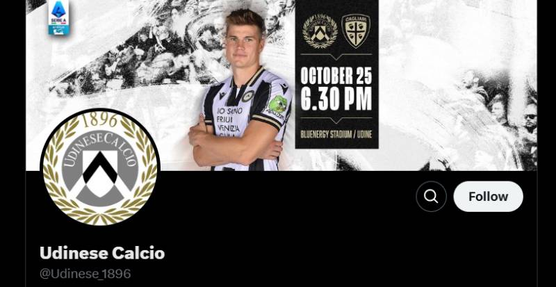
The badge is the anchor of everything visual at Udinese Calcio. From the match-day experience at the Bluenergy Stadium to the club’s social media presence, the chevron-and-laurel mark ties it all together.
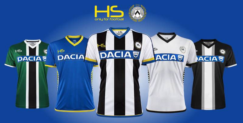
Kit manufacturer Macron places the badge in silicone on the chest of every jersey. The gold and gray tones of the crest influence accent colors used in away and third kits. Even the green details that appeared on the 2023-24 home shirt were a callback to the green-framed zebra badge of the 1970s.
The club maintains accounts on Twitter, Facebook, Instagram, YouTube, TikTok, Twitch, Spotify, and LinkedIn. Across all of these, the badge works as the profile icon. Its circular format makes it ideal for the rounded avatar frames that most platforms use. That’s the kind of thing you might not think about, but it matters. A crest that doesn’t translate well to a 40×40 pixel circle is a crest that fails at modern branding.
The Pozzo family, who have owned the club since the late 1980s (and also owned Watford FC in England), have kept the visual identity stable. That kind of ownership continuity shows in the brand. No drastic rebrands, no unnecessary trend-chasing. Just steady refinement over decades.
The relationship between the badge, the kits, the stadium, and the digital presence forms a connected identity system. Everything references back to the same black, white, gold, and gray palette. The same chevron. The same laurels. It’s a brand system that works because it doesn’t try to do too much.
How Should the Udinese Logo Be Used?
If you need to use the Udinese badge for any purpose, here’s what you should know.
The logo is trademarked intellectual property owned by Udinese Calcio S.p.A. You need explicit permission from the club to use it commercially. This applies whether you download it from official sources or third-party logo databases.
Do’s:
- Use the official color codes provided in the brand guidelines
- Maintain clear space around the badge so it stays legible
- Use the vector (SVG or EPS) version for scalable reproduction
- Keep the badge intact. Don’t separate the shield from the laurels or remove the text
Don’ts:
- Don’t alter the colors, stretch the proportions, or add effects like drop shadows or bevels
- Don’t use the badge on backgrounds that reduce its visibility or clash with the gray-and-gold palette
- Don’t recreate or redraw the badge from scratch. Always use the official files
- Don’t place other logos or text so close that they visually merge with the emblem
Official logo assets can typically be accessed through the club’s website in the press or media section. Partner portals and authorized kit manufacturers like Macron also have access to approved versions.
For editorial and non-commercial uses like presentations or research, the badge is generally usable under fair-use conventions. But if money is involved, get permission first. Italian trademark law allows owners to pursue enforcement against unauthorized commercial use across the entire national territory, and EU-wide trademark protections may apply as well.
FAQ on The Udinese Logo
What does the Udinese Calcio logo look like?
The current badge features a white shield with a black chevron inside a gray circle. Golden laurel branches frame the outside. The arched text “UDINESE CALCIO” runs along the inner ring, with the founding year 1896 placed at the top.
When was the current Udinese logo introduced?
The emblem debuted during the 1995-96 Serie A season. A refined version arrived in 2010 with updated gray tones and more detailed laurel work.
Both versions share the same core layout. The 2010 update was subtle, not a full overhaul.
What do the colors in the Udinese badge mean?
Black and white come directly from the Udine city coat of arms. These have been the club’s colors since the 1890s.
Gold appears in the laurel wreath, signaling prestige. Gray fills the circular background as a neutral tone that holds the composition together.
Why is there a chevron on the Udinese crest?
The black chevron is borrowed from Udine’s municipal heraldry. It represents a mountain or fortification and has appeared on the city’s official shield for centuries. The club adopted it in the early 1980s under President Lamberto Mazza.
How many times has the Udinese logo changed?
At least six distinct versions exist. Early designs used striped shields with the ACU monogram. Then came a zebra mascot badge in 1977.
The 1980s brought the Zanussi-era shield. A transitional circular design followed in 1992 before the current laurel-framed emblem arrived in 1995.
What is the Zebrette badge?
The Zebrette (Little Zebras) badge showed a zebra inside a green circle. It appeared on Udinese kits starting in 1979. Macron brought back this retro crest on the 2023-24 home shirt with the zebra facing right instead of left.
What font does the Udinese logo use?
The current version uses an uppercase serif font for the “UDINESE CALCIO” inscription. The letterforms are classical with moderate stroke contrast.
Earlier versions varied. The 1970s used condensed sans-serif type. The 1980s featured a lowercase slab serif with rounded terminals.
What are the official Udinese color codes?
Black is #000000. White is #FFFFFF. Gold is #8B7D37. Gray is #7F7F7F.
These four values define the entire Udinese Calcio visual identity across kits, merchandise, and digital platforms at the Bluenergy Stadium and beyond.
Can I use the Udinese logo for my project?
The badge is trademarked by Udinese Calcio S.p.A. Commercial use requires direct permission from the club. Editorial or non-commercial use may fall under fair-use conventions, but anything involving money needs formal authorization first.
How does the Udinese logo compare to other Serie A crests?
It leans more heraldic than most. Fiorentina uses a fleur-de-lis. Lazio builds around an eagle. Bologna features a circular crest with cross details.
Udinese stands apart with its muted black, white, and gold scheme tied to civic symbolism from the Friuli-Venezia Giulia region.
Conclusion
The Udinese logo tells the story of a club that has spent over 125 years building its identity in Italian football. From the ACU monogram to the Zebrette zebra badge to the current chevron-and-laurel emblem, each version reflects a specific chapter in the history of Udinese Calcio and the city it represents.
What makes this crest work is restraint. The black and white palette, the gold accents, the shield borrowed from Udine’s coat of arms. Nothing here feels random or trend-driven.
For a club competing in Serie A alongside some of the most recognized brands in European football, that kind of design discipline matters. It keeps the badge relevant across jerseys, digital platforms, and fan merchandise without losing its connection to the Friuli-Venezia Giulia region.

Renowned for his expertise in logo design and visual branding, Bogdan has developed a multitude of logos for various clients.
His skills extend to creating posters, vector illustrations, business cards, and brochures. Additionally, Bogdan's UI kits were featured on marketplaces like Visual Hierarchy and UI8.
He also wrote in the past years on sites like Design Your Way, WebDesignerDepot, WPDean, Designmodo, Speckyboy, Slider Revolution, and more.
- The Cursor Logo History, Colors, Font, And Meaning - 24 September 2026
- Top 7 Web Design Subscription Services That Replace Full-Time Hires - 24 September 2026
- Canva vs PowerPoint: Which Is Better for Presentations? - 22 September 2026

Bogdan Sandu is a seasoned designer who has been designing websites since 2008. Renowned for his expertise in logo design and visual branding, Bogdan has developed a multitude of logos for various clients. His skills extend to creating posters, vector illustrations, business cards, and brochures. Additionally, Bogdan's UI kits were featured on marketplaces like Visual Hierarchy and UI8. He also wrote in the past years on sites like Design Your Way, WebDesignerDepot, WPDean, Designmodo, Speckyboy, Slider Revolution, and more.
You Might Also Like