


The Hellas Verona logo is one of the most recognizable club badges in Italian football. Built around two mastiff dogs facing opposite directions and a four-rung ladder, the crest ties directly to the Scaliger dynasty that once ruled the city of Verona. The current version was introduced on July 1, 2020, replacing a badge that had been in use since 1995. Founded in 1903 by students at the Liceo Scipione Maffei, Hellas Verona FC has gone through roughly eight distinct logo versions across its 120-plus year history. Each one reflects the club’s deep connection to the city, its medieval roots, and the Gialloblu (yellow-blue) identity that fans still rally behind today.
What Is the Hellas Verona Logo?

The Hellas Verona logo is a combination mark featuring two yellow mastiff dogs in a back-to-back position with a four-rung ladder between them, topped by the wordmark “HELLAS VERONA FC” in bold uppercase lettering. Officially introduced on July 1, 2020, the current design is a simplified flat version of the 1995 badge.
- Design Type: Combination mark (mascot-based symbol with wordmark)
- Primary Elements: Two mastiff dogs (Mastino della Scala), a four-rung ladder representing the Scaliger lordship, and the club name in uppercase sans-serif text
- Official Introduction Date: July 1, 2020
- Designer/Agency: The club’s in-house team handled the 2020 restyling. The 120th-anniversary variant (2023) was created in collaboration with Verona-based Studio Fantastico
- Trademark Status: Registered trademark of Hellas Verona Football Club. Commercial use requires explicit permission from the club
- Color Palette: Blue (#005395), Yellow (#FFE74A), with secondary tones of Dark Yellow (#F6C245) and Gold (#C49E46)
- Usage Context: Football kits, club merchandise, stadium signage, official documents, digital platforms, social media profiles, and promotional materials
How Has the Hellas Verona Logo Evolved Over Time?

The Hellas Verona badge has gone through eight major versions since 1903. Early designs used striped oval shapes and heraldic symbols. The mastiff dogs first appeared in the late 1950s and became the permanent centerpiece by 1995.
The 2020 redesign stripped the crest down to just two colors and a flat layout, ditching the oval frame entirely.
Original Hellas Verona Logo (1903-1945)
Years Active: 1903-1945
Design Description: A vertical oval badge with alternating blue and yellow stripes. A white plaque sat in the middle with arched sides, holding the team’s name in black text. A small blue shield with a yellow cross appeared at the bottom.
Color Scheme: Blue, yellow, white, and black.
Context: This was the club’s founding emblem, created when a group of students at the Liceo Scipione Maffei established the team. The name “Hellas” (Greek for Greece) came at the suggestion of a classics professor.
Cultural Significance: It established the blue-and-yellow color pairing that would define the club for over a century. Simple and heraldic, it matched the visual language of early 20th-century Italian football.
Second Hellas Verona Logo (1945-1965)
Years Active: 1945-1965
Design Description: A multi-section emblem containing several Veronese symbols. It featured a blue field with a yellow cross, a red section with a white ladder, a bronze knight figure, and a striped lower portion. A white ribbon near the bottom carried the team’s name.
Color Scheme: Blue, yellow, red, white, and bronze.
Key Changes from Previous: Moved from the simple striped oval to a compartmentalized crest packed with local heraldic references.
Context: Post-war Italy saw clubs leaning harder into regional identity. This badge brought in multiple Verona symbols at once. It’s actually the most visually complex version in the club’s entire history.
Diamond-Shaped Logo (1970-1975)
Years Active: Approximately 1970-1975
Design Description: A wide rhombus (diamond shape) with a blue core and yellow frame. Inside sat two dog heads side by side, fully yellow except for a small blue ladder symbol between them.
Color Scheme: Blue and yellow.
Key Changes from Previous: First appearance of the paired mastiff dog motif. The design dropped all the multi-section heraldry in favor of a single, bold image.
Cultural Significance: This is where the mastiff symbol was born. Borrowed from the coat of arms of the Scala family (the medieval lords of Verona), these dogs would become the club’s permanent identity marker. It was a turning point, honestly.
Scudetto-Era Logo (1984-1991)
Years Active: 1984-1991
Design Description: A rhomboid shape with two corners cut. The mastiff motif continued but with cleaner lines and better definition. The ladder symbol remained between the two dog heads.
Color Scheme: Blue and yellow, with hints of white.
Context: This badge was in use during the club’s greatest achievement. The 1984-85 Serie A title, won under coach Osvaldo Bagnoli with players like Preben Elkjaer and Hans-Peter Briegel, cemented this version in the collective memory of Verona supporters.
Cultural Significance: For many fans, this is THE logo. It’s tied to the only Scudetto in club history. That emotional weight is impossible to separate from the design itself.
Transitional Logo (1991-1995)
Years Active: 1991-1995
Design Description: A modified version of the 1984 badge with slight adjustments to the shape and proportions of the mastiff illustration. The overall form stayed close to the previous era’s look.
Color Scheme: Blue and yellow.
Key Changes from Previous: Minor refinements rather than a full overhaul. Think of it as a cleanup pass, not a redesign.
Oval Badge Era (1995-1999)
Years Active: 1995-1999
Design Description: A return to the vertical oval shape, but now with brighter blue and yellow tones. The wordmark changed to “Hellas Verona” in a bolder, uppercase sans-serif typeface with slightly arched letters following the concave shape of a white banner. A blue and yellow crest with a cross sat below the banner. Above it, a two-headed mastiff creature was drawn in thin outlines.
Color Scheme: Brighter blue, brighter yellow, white, and black.
Key Changes from Previous: Brought back the 1950s oval concept but modernized it. The mastiff illustration became more stylized and integrated into a full crest design.
Cultural Significance: This version set the template for the next 25 years of Hellas Verona branding. The basic structure, with minor updates, survived until 2020.
Refined Oval Badge (1999-2020)
Years Active: 1999-2020
Design Description: A strengthened and cleaned-up version of the 1995 oval. The contours were sharper, and the Italian flag (green, white, red) was added between the heads of the mastiff figure. The wordmark inscription switched to black text, giving the badge a more powerful look.
Color Scheme: Blue, yellow, white, black, green, and red.
Key Changes from Previous: Addition of the Italian tricolor flag. Cleaner outlines. Black text instead of colored text on the banner.
Context: This was the longest-serving modern version. It covered roughly two decades of club history, including multiple promotions and relegations between Serie A and Serie B.
Current Logo (2020-Present)
Years Active: 2020-present
Design Description: A flat, simplified design. Only the yellow mastiff symbol (two dogs back-to-back with the four-rung ladder) was kept from the previous badge. It sits on a clean background without any oval frame. Above the dogs, “HELLAS VERONA FC” appears in bold yellow uppercase letters.
Color Scheme: Yellow and blue only. No more white banner, no Italian flag, no black text.
Designer: Club in-house design team. Released under the motto “Ritorno al Futuro” (Back to the Future), referencing the 1980s classic and the Scudetto-era badge that inspired it.
Key Changes from Previous: Removed the oval frame, Italian flag, and multi-color approach. Went to a strict two-color flat design for better digital use and monochrome reproduction.
Context: Launched just before the 2020-21 season. The club stated it wanted a simpler, more modern brand ahead of major anniversaries, including the 120th birthday in 2023 and the 40th anniversary of the 1985 Scudetto in 2025.
What Do the Design Elements of the Hellas Verona Logo Mean?

Every element in the Hellas Verona badge connects to the city’s medieval heritage and the club’s identity. The two mastiff dogs are the most significant feature, borrowed directly from the Scala family’s coat of arms.
The ladder between them is the Scaliger symbol. And the colors? They go back to the club’s earliest days in 1903.
Why Did Hellas Verona Choose These Specific Colors?
Yellow and blue have been the Hellas Verona club colors since the beginning. The nickname “Gialloblu” literally translates to “yellow-blue” in Italian.
Yellow (#FFE74A) carries associations with energy and optimism. From a color psychology perspective, it’s attention-grabbing and works well for visibility on matchday kits and merchandise.
Blue (#005395) suggests trust, stability, and loyalty. It grounds the brighter yellow and gives the badge a sense of seriousness. The combination creates strong contrast, which makes the crest easy to spot from the stands or on a screen.
Secondary tones include Dark Yellow (#F6C245, Pantone P 10-7 C) and Gold (#C49E46, Pantone 7407 C). These show up in various applications, though the primary crest sticks to the two main shades.
What Typography Style Is Used in the Hellas Verona Logo?
The current wordmark uses a bold, uppercase sans-serif font identified as Nexa ExtraBold, designed by Svetoslav Simov and published by Fontfabric.
The letters have slightly distorted proportions, which prevents the text from looking generic. It’s readable at small sizes but has enough personality to feel custom.
Earlier versions used arched typography that followed the curve of the oval badge. The 2020 redesign straightened everything out for cleaner digital reproduction.
What Are the Hidden Meanings in the Hellas Verona Logo?
The four-rung ladder between the two mastiff heads is the Scaliger coat of arms in miniature. It represents the Della Scala lordship that ruled Verona from the 13th to 14th century. Mastino I della Scala and Mastino II della Scala specifically lend their names to the dog imagery.
The dogs themselves symbolize guardianship and strength. If you look closely, the two-faced positioning (back to back) suggests watchfulness in all directions. It’s not just decoration. That said, some fans see the shape as a single two-headed creature rather than two separate dogs. Both readings work.
How Does the Hellas Verona Logo Compare to Competitor Logos?

Among Serie A clubs, the Hellas Verona badge stands out because of the mastiff motif. Most Italian football crests use shields, circles, or ovals with initials or simple icons.
Look at the Juventus emblem, which went minimal with a stylized “J.” Or the Napoli crest, built around a simple “N” in a circle.
Hellas Verona’s approach is different. The animal imagery puts it closer to clubs like AS Roma (the she-wolf) or Torino (the bull). But the medieval heraldic angle, with the Scaliger references, is pretty unique in the league.
The 2020 flat redesign also positioned Hellas Verona alongside a wider trend in football. Clubs across Europe have been stripping down their badges for digital use. AC Milan did something similar. So did several Bundesliga sides. Where Hellas Verona differs is in keeping the entire mastiff illustration front and center instead of reducing the mark to a letter or abstract shape.
What Are the Technical Specifications of the Hellas Verona Logo?
Official Color Codes
- Blue – Hex: #005395, RGB: (0, 83, 149), CMYK: (99, 74, 13, 2), Pantone: 2945 C
- Yellow – Hex: #FFE74A, RGB: (255, 231, 74), CMYK: (2, 4, 82, 0), Pantone: P 1-7 C
- Dark Yellow – Hex: #F6C245, RGB: (246, 194, 69), CMYK: (3, 24, 85, 0), Pantone: P 10-7 C
- Gold – Hex: #C49E46, RGB: (196, 158, 70), CMYK: (24, 36, 87, 2), Pantone: 7407 C
- White – Hex: #FFFFFF, RGB: (255, 255, 255), CMYK: (0, 0, 0, 0)
- Black – Hex: #221F20, RGB: (34, 31, 32), CMYK: (71, 67, 64, 74), Pantone: 426 XGC
Dimensions and Proportions
The 2020 design was specifically built for flexibility. The two-color-only approach means the badge works in full color, single color, or monochrome without losing clarity.
The logo is distributed in vector format (SVG and EPS) for scalability. This means it holds up at any size, from a small favicon on a website to a massive banner at Stadio Bentegodi.
Clear space around the logo must be maintained in all applications. The club requires that no other graphic elements crowd the mastiff symbol or wordmark. Minimum size requirements exist to keep the ladder detail visible at smaller scales.
What Cultural Impact Has the Hellas Verona Logo Had?

The Hellas Verona badge carries weight that goes beyond football results. In Verona, the mastiff symbol is instantly associated with the club and, by extension, with local pride.
The 1985 Scudetto, won by a club most people considered a small-town outsider, turned the logo into a symbol of underdog achievement across Italian sport.
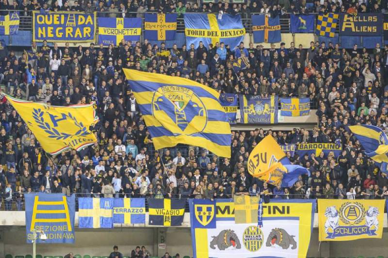
The Curva Sud ultras adopted the mastiff imagery for their own banners and flags. It became shorthand for the supporter culture that grew around the club through the 1980s and 1990s. Matchday scarves, stickers, graffiti around the city. The badge is everywhere in Verona if you look for it.
When the club celebrated its 120th anniversary in 2023, they worked with Studio Fantastico to create a special commemorative logo that referenced the founding-era lettering style. That level of care around the visual identity shows how much the badge means to the community.
How Does the Hellas Verona Logo Fit Into the Overall Brand Identity?
The logo sits at the center of everything Hellas Verona does visually. It connects the club’s matchday kits (produced by Macron) to the stadium experience at the Bentegodi, to the digital channels, to the retail merchandise.
The Gialloblu color palette runs through every touchpoint. Yellow and blue show up on the home kit, the away kit uses variations, and the training gear keeps the same tones. That consistency matters.
The mastiff symbol doubles as a standalone icon. You can slap it on a hat, a phone case, a stadium seat cover, and people know exactly what it represents. That kind of flexibility was a big reason behind the 2020 simplification. The old oval badge had too many details to shrink cleanly.
Compared to how tech companies build logos for apps and social profiles, the Hellas Verona approach follows the same logic. Keep it clean. Keep it recognizable at thumbnail size. The badge does that job well.
How Should the Hellas Verona Logo Be Used?
The Hellas Verona logo is a registered trademark. You cannot use it for commercial purposes without written permission from the club.
Official usage guidelines include:
- Always maintain the required clear space around the badge
- Do not alter the proportions, colors, or arrangement of elements
- Do not place the logo on backgrounds that reduce its readability
- Use the official color codes (listed above) in all reproductions
- For monochrome applications, use the approved single-color versions only
Official logo files in vector and raster formats can be requested through the club’s media office or accessed through approved licensing channels. Fan use for non-commercial purposes (personal blogs, fan pages) is generally tolerated but not formally permitted.
For any commercial use on merchandise, publications, or advertising, direct licensing from Hellas Verona FC is required. This applies to both physical products and digital applications.
FAQ on The Hellas Verona Logo
What does the Hellas Verona logo represent?
The Hellas Verona logo represents the club’s connection to Verona’s medieval history. The two mastiff dogs come from the Scala family coat of arms. The four-rung ladder between them is the Scaliger dynasty’s symbol.
Yellow and blue, the Gialloblu colors, tie the badge to the club’s founding identity from 1903.
When was the current Hellas Verona badge introduced?
The current version launched on July 1, 2020. It replaced the oval crest that had been in use since 1995.
The club called the redesign “Ritorno al Futuro,” referencing its Scudetto-era roots while pushing toward a cleaner, flat design for digital platforms.
Why are there two dogs on the Hellas Verona crest?
The two mastiffs reference Mastino I and Mastino II della Scala, medieval lords of Verona. “Mastino” literally means mastiff in Italian.
These dogs first appeared on the club badge around the 1970s. They became permanent fixtures after the 1995 redesign of the Serie A club’s emblem.
What are the official colors of the Hellas Verona FC logo?
Blue (#005395) and yellow (#FFE74A) are the primary colors. Secondary tones include dark yellow (#F6C245) and gold (#C49E46).
The 2020 redesign stripped everything down to just these two main shades. Previous versions also included white, black, and the Italian tricolor.
What font is used in the Hellas Verona logo?
The wordmark uses Nexa ExtraBold, a sans-serif typeface designed by Svetoslav Simov and published by Fontfabric. The letters are uppercase with slightly distorted proportions.
It reads well at small sizes. That was the whole point, given the push toward mobile and social media applications.
How many times has the Hellas Verona logo changed?
The club has used roughly eight distinct logo versions since 1903. Major shifts happened in 1945, the early 1970s, 1984, 1995, 1999, and 2020.
The mastiff motif arrived in the 1970s. Everything before that used striped ovals and heraldic crests typical of early Italian football club badges.
What does the ladder symbol mean in the Hellas Verona emblem?
The four-rung ladder represents the Della Scala lordship that ruled Verona from the 13th to 14th century. “Scala” translates to “ladder” or “staircase” in Italian.
It sits between the two mastiff heads. Subtle, but it’s been part of the Verona football identity for decades.
Can I use the Hellas Verona logo for my project?
Not commercially. The badge is a registered trademark of Hellas Verona Football Club. Any commercial reproduction requires written permission from the club.
Fan use on personal blogs or non-commercial pages is generally tolerated. But don’t assume that means it’s officially allowed.
Why did Hellas Verona redesign their logo in 2020?
The club wanted a simpler mark ahead of major anniversaries. The 120th birthday (2023) and the 40th anniversary of the 1985 Scudetto (2025) were both on the calendar.
Flat design also made the crest easier to reproduce across digital channels. The old oval had too many small details for clean scaling.
How does the Hellas Verona logo compare to other Italian football badges?
Most Serie A crests use shields or circles with initials. Hellas Verona’s mastiff imagery makes it stand out. It’s closer to Fiorentina’s fleur-de-lis or Lazio’s eagle in terms of using a strong visual symbol rather than just letters and shapes.
The two-color flat approach puts it ahead of several rivals when it comes to digital readability.
Conclusion
The Hellas Verona logo tells a story that goes back to 1903 and a group of students who named their club after the Greek word for Greece. Eight badge versions later, the mastiff symbol and Scaliger ladder still anchor the whole thing.
The 2020 flat redesign proved the club could modernize without losing what makes the Gialloblu crest distinct among Serie A football badges.
Yellow and blue. Two dogs. One ladder. That’s all it takes to represent over a century of Verona football, a surprise 1985 championship, and a fanbase that treats this emblem like a piece of the city itself.
Few design elements in Italian calcio carry this much local history in such a simple package.

Renowned for his expertise in logo design and visual branding, Bogdan has developed a multitude of logos for various clients.
His skills extend to creating posters, vector illustrations, business cards, and brochures. Additionally, Bogdan's UI kits were featured on marketplaces like Visual Hierarchy and UI8.
He also wrote in the past years on sites like Design Your Way, WebDesignerDepot, WPDean, Designmodo, Speckyboy, Slider Revolution, and more.
- Jujutsu Kaisen Font Generator - 12 October 2026
- The Windsurf Logo History, Colors, Font, And Meaning - 10 October 2026
- How to Remove Background From Product Photos (No Photoshop) - 10 October 2026

Bogdan Sandu is a seasoned designer who has been designing websites since 2008. Renowned for his expertise in logo design and visual branding, Bogdan has developed a multitude of logos for various clients. His skills extend to creating posters, vector illustrations, business cards, and brochures. Additionally, Bogdan's UI kits were featured on marketplaces like Visual Hierarchy and UI8. He also wrote in the past years on sites like Design Your Way, WebDesignerDepot, WPDean, Designmodo, Speckyboy, Slider Revolution, and more.
You Might Also Like


