A cover letter should use a clean, readable font set between 10 and 12 points. The most widely recommended options are Calibri, Arial, Times New Roman, Garamond, and Georgia – all of which are ATS-compatible and render consistently across devices and email clients.
Font choice affects how quickly a hiring manager reads your letter. It also affects whether an applicant tracking system (ATS) can parse your text at all.
—
What Type of Font Works Best for a Cover Letter?
Cover letter fonts fall into two categories: serif fonts and sans-serif fonts. Understanding the difference matters because each carries a different tone – and hiring managers do notice.
Serif fonts (Times New Roman, Garamond, Georgia, Cambria) have small decorative strokes at the ends of letters. They read as formal, traditional, and authoritative.
Sans-serif fonts (Arial, Calibri, Helvetica, Verdana) have no decorative strokes. They feel clean, modern, and direct. Research from the Nielsen Norman Group links sans-serif typefaces to clarity and contemporary settings.
A 2026 study by the Journal of Applied Psychology found 67% of hiring managers associate serif fonts with trustworthiness, while 72% link sans-serif fonts with innovation. Neither is wrong. The right call depends on the industry.
Serif vs. Sans-Serif: Which Should You Pick?
| Category | Best For | Examples |
| Serif | Law, Finance, Academia, Government | Times New Roman, Garamond, Georgia |
| Sans-serif | Tech, Startups, Marketing, Design | Calibri, Arial, Helvetica |
| Either | Healthcare, Education, HR, Nonprofit | Cambria, Georgia, Verdana |
The serif vs. sans-serif debate has no universal winner. What matters most is that the font you pick is readable, widely supported, and right for the role.
—
The Best Fonts for a Cover Letter
Calibri
Calibri is a geometric sans-serif font designed by Lucas de Groot. Microsoft adopted it as the default Office font in 2007, which means it renders without substitution errors on virtually every device an HR manager might use.
Its slightly rounded letterforms give it a friendly but professional feel. Good pick for tech, consulting, and corporate roles.
Font size: 11pt is ideal. ATS compatibility: Excellent.
Arial
Arial is a neo-grotesque sans-serif typeface released by Monotype in 1982. It’s the default font in Google Docs and one of the most widely installed fonts across all operating systems and email clients.
Some hiring managers see it as generic. That’s fair. But “generic” also means “safe” – it will never distract from what you’re saying.
Best for any industry. Especially reliable for online applications where font substitution is a real risk.
Times New Roman
Times New Roman is a transitional serif typeface, originally commissioned by The Times newspaper in 1931 and designed by Stanley Morison and Victor Lardent. It remains one of the most recognized professional fonts in the world.
Works best in conservative industries: law, finance, academia, government. A SEEK resume font analysis confirmed it as one of the top recommended choices for formal professional documents.
One thing to know: on screen, its narrow letterforms can feel a bit dense at small sizes. Stick to 11–12pt.
Garamond
Garamond is an old-style serif typeface with origins in 16th-century France. Modern versions (Adobe Garamond, EB Garamond) are refined interpretations of the original cuts by Claude Garamond.
It reads elegantly at smaller sizes and gives formal documents a polished, classic feel. Strong choice for legal, publishing, and executive-level applications.
Worth noting: Garamond runs slightly smaller visually than other fonts at the same point size. If you use it at 11pt, check that body text still feels readable.
If Garamond appeals to you, also look at Cormorant Garamond pairings or explore fonts similar to Garamond as free alternatives.
Georgia
Georgia is a transitional serif typeface designed by Matthew Carter and released by Microsoft in 1993. It was built specifically for screen readability, which makes it a strong pick for digital-first applications.
Compared to Times New Roman, Georgia has a larger x-height – meaning its lowercase letters are taller relative to capitals. This improves on-screen legibility at smaller sizes.
Good for: online submissions, email cover letters, any role where your document will primarily be read on screen.
Helvetica

Helvetica is a neo-grotesque sans-serif typeface designed by Max Miedinger in 1957 at the Haas type foundry in Switzerland. It became a standard in corporate and brand design globally.
Its neutrality is the point. Helvetica doesn’t project personality – it projects professionalism. This works well for business, advertising, and design roles.
One practical issue: Helvetica is not a standard system font on Windows. If you use it in Microsoft Word and the hiring manager doesn’t have it installed, substitution happens. Save as PDF to avoid this. Explore Helvetica font pairings or check out fonts similar to Helvetica that are more universally available.
Cambria
Cambria is a transitional serif typeface designed by Jelle Bosma and released by Microsoft in 2007. It was optimized for on-screen reading at small sizes, which gives it an advantage over older serif fonts in digital contexts.
Works well in management, HR, and leadership roles. Also a good default when you want the formality of a serif font without the rigidity of Times New Roman.
—
What Is the Right Font Size for a Cover Letter?
Body text should be set between 10 and 12 points. That’s the range ATS systems parse most reliably, and the range that keeps text readable for a hiring manager skimming through a stack of applications.
A few specific guidelines:
- Use 12pt if your letter is short and you have space to fill
- Use 11pt as the standard for most cover letters
- Use 10pt only if your content is running onto a second page
- Never go below 10pt – hiring managers will notice and it reads as sloppy
Different fonts appear visually different at the same point size. Verdana at 10pt looks noticeably larger than Garamond at 10pt because Verdana has a bigger x-height. Always print a test page or view it at 100% zoom before sending.
—
How Does Font Choice Affect ATS Compatibility?
Applicant tracking systems scan your cover letter for keywords and relevant content. Most modern ATS platforms handle standard fonts without issues – but decorative, script, or unusual typefaces can cause parsing errors where your text becomes unreadable to the system.
ATS-safe fonts: Calibri, Arial, Times New Roman, Georgia, Garamond, Cambria, Verdana, Helvetica.
Fonts to avoid entirely:
- Comic Sans – unprofessional, widely flagged by recruiters
- Courier New – reads as outdated; looks like a typewriter document
- Papyrus – decorative, inappropriate for business documents
- Brush Script or any cursive/handwriting font – ATS systems frequently misread these
- Impact – far too heavy; designed for headlines, not body text
According to Enhancv’s 2025 study of 25 recruiters across industries, 92% confirmed their ATS doesn’t automatically reject applications for font choices alone. But poor fonts still affect human readability – and that’s where applications actually get cut.
Understanding typography basics helps here. Cover letters are, at their core, a typographic document. Things like leading, tracking, and overall typographic hierarchy contribute to how readable and professional a document feels – even when the hiring manager can’t articulate why.
—
Should Your Cover Letter and Resume Use the Same Font?
Yes. Consistency across your cover letter and resume signals attention to detail. A hiring manager who opens two documents from the same applicant expects them to look like they belong together.
You don’t need to use two different fonts within the cover letter itself. One font in regular weight for body text, with bold used only for your name or key headings, is enough. Introducing a second typeface usually creates visual noise rather than structure.
One exception: If you want to distinguish your name from body text, you can increase the size of your name (14–16pt) using the same font, rather than switching to a different typeface. This creates visual hierarchy without inconsistency.
Thinking about how to pair fonts effectively is useful for multi-document application packages – but for most cover letters, a single well-chosen typeface is the cleaner approach.
—
Font Recommendations by Industry
| Industry | Recommended Font | Why It Works |
| Law / Finance | Times New Roman, Garamond | Formal, authoritative, traditional |
| Tech / Startups | Calibri, Arial | Clean, modern, widely supported |
| Creative / Design | Helvetica, Georgia | Polished, design-aware without being flashy |
| Healthcare / Education | Cambria, Georgia, Verdana | Readable, approachable, professional |
| Government / Academia | Times New Roman, Cambria | Conservative, credible, expected |
These are starting points, not hard rules. If the company you’re applying to has a distinctive brand that leans modern, using Calibri over Times New Roman signals awareness of tone.
—
Cover Letter Font Spacing and Line Length
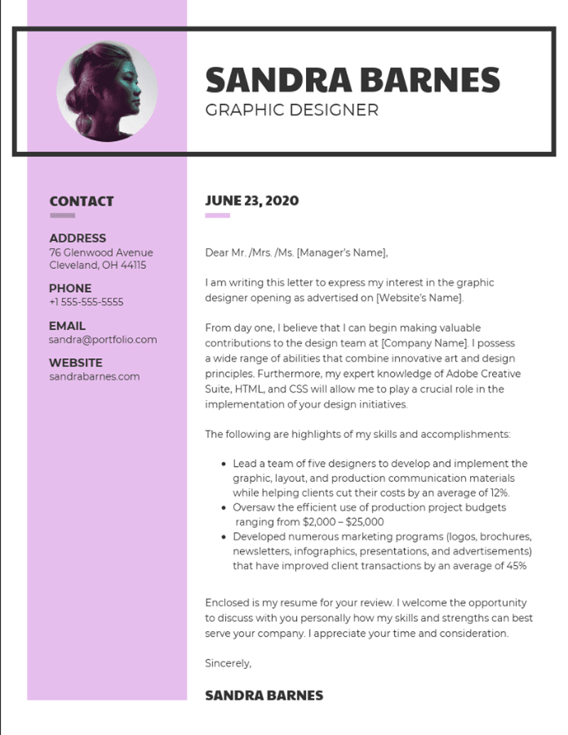
Font choice is only part of the picture. Spacing matters just as much for readability.
Use single spacing within paragraphs. Leave a blank line between paragraphs. Set margins to 1 to 1.5 inches on all sides.
Line spacing between 1.15 and 1.4 is easier to read than true single spacing (1.0), especially on screen. Most word processors default to something in this range already.
The goal is white space that lets the text breathe. A dense, wall-of-text cover letter reads as a chore regardless of how strong the content is. The font spacing choices you make directly affect how quickly a recruiter can extract information from your letter.
—
How to Choose the Right Cover Letter Font
If you’re unsure where to start, Calibri at 11pt is the safest default in 2026. It’s modern, ATS-friendly, and expected in most corporate and tech environments.
Want something with more formality? Use Garamond or Georgia. Both read well at smaller sizes and hold up in print.
The decision framework is straightforward:
- Traditional industry: serif font, 11–12pt
- Modern or tech industry: sans-serif font, 10.5–11pt
- Submitting digitally: Georgia or Calibri for screen clarity
- Printing the letter: Garamond or Times New Roman hold up well in print
- Unsure: Calibri or Arial, 11pt, save as PDF
Whatever you choose, save the final document as a PDF. This preserves your font, spacing, and layout regardless of what software or operating system the recruiter uses to open it.
Cover letters sit alongside resumes as the most common professional documents job seekers produce. Getting the font right is one of the simpler parts of the process – but it’s the first thing a hiring manager sees before reading a single word.
FAQ on What Font Should a Cover Letter Be
What is the best font for a cover letter?
Calibri, Arial, and Garamond are the top choices. They’re clean, ATS-friendly, and widely supported across devices.
For traditional industries, use a serif font like Times New Roman. For modern roles, a sans-serif like Calibri works better.
What font size should a cover letter use?
Stick to 10–12pt for body text. 11pt is the most reliable default for most cover letters.
Never go below 10pt. If your letter spills onto a second page, tighten the content rather than shrinking the font.
Should a cover letter use a serif or sans-serif font?
It depends on the industry. Serif fonts suit law, finance, and academia. Sans-serif fonts fit tech, startups, and marketing roles better.
When in doubt, sans-serif is the safer choice for digital submissions.
Is Times New Roman a good font for a cover letter?
Yes, in the right context. Times New Roman is a classic transitional serif typeface that reads as formal and credible.
It’s best for conservative industries. For modern roles, it can feel dated compared to Calibri or Georgia.
Is Calibri acceptable for a cover letter?
Absolutely. Calibri has been the default font in Microsoft Office since 2007 and is universally supported.
It’s clean, modern, and passes through applicant tracking systems without parsing issues. A reliable choice for most applications.
What fonts should you avoid on a cover letter?
Avoid Comic Sans, Courier New, Papyrus, Impact, and any script or handwriting typeface. These look unprofessional and can confuse ATS parsing.
Font psychology matters here. Decorative fonts signal poor judgment before a recruiter reads a single word.
Should the cover letter font match the resume font?
Yes. Consistent typography across both documents signals attention to detail.
Use the same typeface and size in both. Mismatched fonts across a job application package look careless to experienced hiring managers.
Does font choice affect ATS scanning?
Decorative or script fonts can cause ATS parsing errors, making your text invisible to automated systems.
Standard fonts like Arial, Calibri, Georgia, and Garamond parse cleanly. Always save as PDF to preserve formatting and font rendering across devices.
Can you use Google Fonts in a cover letter?
Technically yes, but it adds risk. If the font isn’t embedded properly in your PDF, substitution errors can shift your font spacing and layout.
Stick to system fonts or widely available options from the web safe fonts list for safer results.
Does font choice really matter to hiring managers?
Yes. Research from Indeed confirms that presentation quality is one of the first signals recruiters use to assess candidate effort.
A poor font won’t get you hired, but it can get you skipped. Readability and professionalism register before a single sentence is read.
Conclusion
Knowing what font should a cover letter be comes down to one priority: readability over personality. Calibri, Georgia, and Garamond consistently deliver clean, professional results across both digital submissions and print.
ATS compatibility, font size, and line spacing are just as important as the typeface itself. A well-formatted cover letter with proper typographic hierarchy tells a hiring manager you take the application seriously.
Pick one font, keep it consistent with your resume, and save everything as a PDF. That’s it.

Renowned for his expertise in logo design and visual branding, Bogdan has developed a multitude of logos for various clients.
His skills extend to creating posters, vector illustrations, business cards, and brochures. Additionally, Bogdan's UI kits were featured on marketplaces like Visual Hierarchy and UI8.
He also wrote in the past years on sites like Design Your Way, WebDesignerDepot, WPDean, Designmodo, Speckyboy, Slider Revolution, and more.
- The Cursor Logo History, Colors, Font, And Meaning - 24 September 2026
- Canva vs PowerPoint: Which Is Better for Presentations? - 22 September 2026
- How to Install Fonts on Mac (Step-by-Step Guide) - 20 September 2026

Bogdan Sandu is a seasoned designer who has been designing websites since 2008. Renowned for his expertise in logo design and visual branding, Bogdan has developed a multitude of logos for various clients. His skills extend to creating posters, vector illustrations, business cards, and brochures. Additionally, Bogdan's UI kits were featured on marketplaces like Visual Hierarchy and UI8. He also wrote in the past years on sites like Design Your Way, WebDesignerDepot, WPDean, Designmodo, Speckyboy, Slider Revolution, and more.
You Might Also Like