Grab any two crayons a kid loves most, and yellow and green are usually in the pile. So what color do yellow and green make when you actually blend them?
The short answer is yellow-green, a tertiary color you might know as chartreuse or lime.
Here is the catch. The result shifts depending on whether you mix paint or light, and the ratio of yellow to green changes everything.
This guide breaks down the whole picture:
- Why yellow-green counts as a tertiary color
- How paint mixing differs from mixing light
- Exact hex, RGB, and CMYK values
- Shades, complements, and real-world uses
By the end, you will know exactly what this mix produces and how to control it.
What Color Do Yellow and Green Make?

Yellow and green make yellow-green, a tertiary color also called chartreuse or lime.
It sits between primary yellow and secondary green on the wheel, carrying the standard web hex code #9ACD32. The exact shade shifts a little between paint and screen.
Green already contains yellow, so adding more yellow just pulls the mix back toward the warm end. You get a fresh, leafy tone instead of a brand-new color family.
The human eye is unusually good at reading this zone. Biology Insights notes the average person can distinguish up to 10 million colors, and our sharpest sensitivity lands right in the hue band where yellow-green lives.
Think of new spring foliage or an unripe lime. That is yellow-green doing its thing in nature.
Why Is Yellow-Green Considered a Tertiary Color?
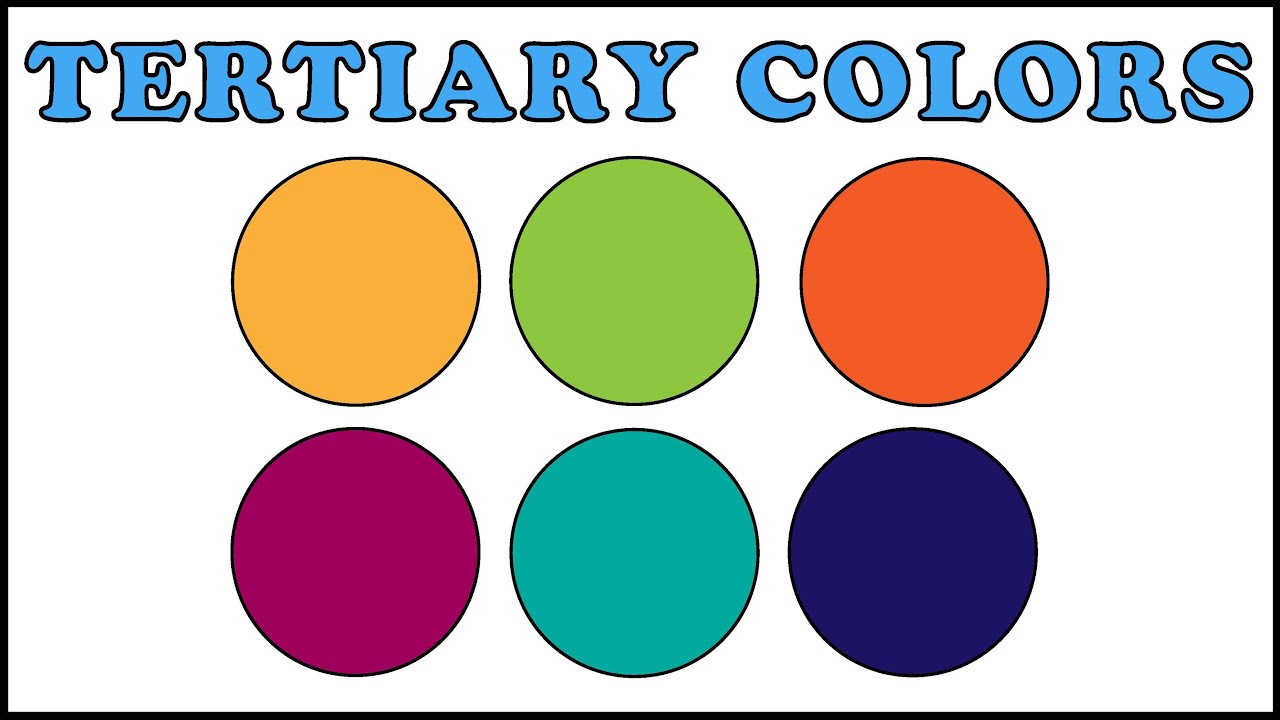
Yellow-green is a tertiary color because it mixes one primary (yellow) with the adjacent secondary (green). On a 12-part color wheel, tertiary colors always fall between a primary and its neighboring secondary, and yellow-green is one of six.
The naming rule: the primary comes first. That is why it reads “yellow-green,” not “green-yellow.”
The 12-part wheel most designers use traces back to Johannes Itten at the Bauhaus, built on Isaac Newton’s original circular spectrum from 1666.
The six tertiary colors that sit between primaries and secondaries:
| Tertiary Color | Primary + Secondary |
|---|---|
| Yellow-green | Yellow + green |
| Blue-green | Blue + green |
| Blue-violet | Blue + violet |
| Red-violet | Red + violet |
| Red-orange | Red + orange |
| Yellow-orange | Yellow + orange |
Miss this ordering and you break the whole logic of color theory. Every tertiary name signals exactly which two colors built it.
What Color Do Yellow and Green Paint Make When Mixed?

Yellow and green paint make a muted, natural yellow-green closer to leaf or moss than neon. Pigments work by subtraction, absorbing wavelengths and reflecting what is left, so real paint mixes land duller than their digital cousins.
The specific pigments matter more than most people expect.
- Lemon yellow + phthalo green: a cool, bright yellow-green with real punch
- Cadmium yellow + sap green: warmer, earthier, closer to olive territory
- Hansa yellow + viridian: pulls slightly blue, so it reads less “true”
The designyourway mixing guide recommends roughly 65% yellow to 35% green as a starting ratio for a clean chartreuse, then adjusting from there.
Here is the tricky part. Cadmium yellow is warm and orange-shifted, so leaning on it pushes your mix away from a true yellow-green. Reach for a lemon or hansa yellow instead when you want that crisp result.
What Happens When You Mix Yellow and Green Light?

Mixing yellow and green light produces a brighter, more saturated yellow-green than paint ever will. Light works by addition, stacking wavelengths so the result grows more luminous, which is why screen chartreuse looks like it glows.
Screens build the effect in a sneaky way. In RGB displays, yellow itself is already made from red and green subpixels, so nudging that toward green lands you in vivid chartreuse fast.
This is also why the color reads so bright to us. Gigahertz-Optik notes the eye’s daylight sensitivity peaks near 555 nm, and yellow-green light sits almost exactly on that peak.
The practical payoff shows up in stagecraft, LED signage, and monitor calibration, where a small green shift buys a big jump in perceived brightness.
How Subtractive and Additive Mixing Produce Different Yellow-Greens
Same name, two different outputs. Paint and light both land on “yellow-green,” but they do not look alike side by side.
| System | Method | Result |
|---|---|---|
| Paint (subtractive) | Absorbs wavelengths | Earthy, lower saturation |
| Light (additive) | Adds wavelengths | Vivid, high saturation |
The gap explains a lot of designer frustration. A yellow-green that dazzles on screen can dry flat and grayish once it hits a printed page.
Does the Ratio of Yellow to Green Change the Result?
Yes. The ratio decides everything about the final shade, sliding it from bright lime toward deep olive.
Small proportion changes create genuinely different named colors:
- More yellow (roughly 70/30): shifts toward lime and chartreuse, brighter and zestier
- Equal parts (50/50): lands on true yellow-green, the #9ACD32 zone
- More green (30/70): deepens into moss green and olive tones
Add white and you get airy tints. Add black and the mix drops into olive drab and forest-edge shades.
An 80/20 mix and a 60/40 mix are not the same color, even though both are “yellow and green.” That sensitivity is exactly why muddy mixes happen. One heavy squeeze of green and your chartreuse is gone.
What Are the Color Values of Yellow-Green?
Standard yellow-green carries the hex code #9ACD32, which breaks down to RGB (154, 205, 50). Encycolorpedia lists its hue at 80 degrees with 61% saturation and 50% lightness, plus an approximate light wavelength near 562 nm.
The full technical breakdown for designers and print work:
| Model | Value |
|---|---|
| HEX | #9ACD32 |
| RGB | 154, 205, 50 |
| CMYK | 25, 0, 76, 20 |
| HSL | 80°, 61%, 50% |
| Wavelength | ~562 nm |
Print has a real limitation here. The CMYK gamut cannot fully reproduce the punch of screen yellow-green, so a swatch that sings on a monitor often lands quieter on paper.
Need to move between formats quickly? A HEX to RGB converter handles the math in one step.
What Shades and Variations of Yellow-Green Exist?

Yellow-green spans a wide family, from electric chartreuse to muddy olive. Each variation comes from shifting the yellow-to-green balance, then adding white, black, or gray.
Five core members of the family:
| Shade | Hex | Character |
|---|---|---|
| Chartreuse | #7FFF00 | Vivid, leans green, near-neon |
| Lime | #BFFF00 | Bright, energetic, leans yellow |
| Olive | #808000 | Dark, desaturated, earthy |
| Moss | #8A9A5B | Soft, grayed, natural |
| Apple green | #8DB600 | Fresh, medium, balanced |
Chartreuse versus lime: chartreuse sits at 90 degrees on the wheel and leans greener, while lime pushes toward yellow. Wikipedia’s color history notes chartreuse was named after the French liqueur, with its first documented use as a color name appearing in an 1884 British newspaper.
The web version got locked in when the chartreuse value entered the X11 color set in 1987. Lime green and olive green round out the everyday end of the range.
Emotionally these shades pull in different directions. Bright ones read fresh and energetic. Deeper ones read grounded, and the muddiest can even tip toward sickly, which is worth knowing before you build a brand around one.
Safety design leans hard on the bright end. Fluorescent yellow-green is one of only three background colors approved under the ANSI/ISEA 107-2020 standard for high-visibility gear, chosen because it stands out across the widest range of daytime backgrounds.
What Is the Complementary Color of Yellow-Green?

The complementary color of yellow-green is red-violet, the hue sitting directly opposite it on the 12-part color wheel.
This pairing creates maximum contrast. Designers reach for it when they want each color to look more intense, or when they need to mix believable shadows in a painting.
Red-violet lands in the magenta and purple range, so the two colors sit on opposite temperature ends. One warm, one cool.
The relationships on the wheel:
| Scheme | Yellow-Green Pairs With |
|---|---|
| Complementary | Red-violet (direct opposite) |
| Split-complementary | Red-purple and blue-purple |
| Analogous | Yellow and green (its neighbors) |
A direct complement can feel loud, almost like traffic-light tension. That is where a split-complementary color scheme helps, swapping the single opposite for the two hues flanking it.
Where each pairing earns its keep:
- Painting: a touch of red-violet neutralizes yellow-green for natural shadow tones
- Branding: the high contrast makes a logo mark pop off the background
- Interiors: yellow-green walls with red-violet accents balance warm against cool
ColorKit recommends the 60-30-10 rule for these palettes, roughly 60% base, 30% second color, 10% accent, so the contrast stays punchy without overwhelming the eye.
A full-strength complementary color scheme works best when one color stays vivid and the other pulls back into a tint or shade. Running both at max saturation usually clashes.
Where Does Yellow-Green Appear in the Real World?
Yellow-green shows up across nature, branding, and safety gear. New foliage and unripe fruit carry it naturally, brands use it to signal freshness, and fluorescent versions dominate high-visibility clothing because the eye catches them fast.
Nature leans on this color constantly:
- Spring leaves before they deepen into full green
- Unripe limes, apples, and pears
- Moss, lichen, and young grass
- The chartreuse plumage of warblers
Branding uses it to say fresh, energetic, or natural. A few marks built on the yellow-green end:
| Brand | Use of Yellow-Green |
|---|---|
| Mountain Dew | Core brand yellow-green, hex #94C93D |
| Subway | Yellow-into-green wordmark for freshness |
| Android | Originally a lime-green robot mascot |
Mountain Dew’s palette, logged by SchemeColor, pairs that #94C93D yellow-green with a deeper fun green and a jolt of red, exactly the kind of high-contrast pairing the complement section covered.
Safety is where the science pays off. Fluorescent yellow-green sits near the eye’s peak daylight sensitivity, so it reads as brighter than almost any other color in daylight.
That visibility is not decorative. The construction industry recorded 1,069 fatal injuries in 2022, per BLS data cited by National Safety Gear, and struck-by incidents remain a leading cause, which is why hi-vis yellow-green is standard on roadways and job sites.
The color psychology cuts both ways. Bright yellow-green reads energetic and alive, but pushed too far it can tip toward sickly or unsettling, so it is a bolder logo choice than a safe corporate blue.
Designers matching it to print often check the closest Pantone reference first, since screen yellow-green and printed yellow-green rarely line up on their own.
FAQ on What Color Do Yellow and Green Make
What color do yellow and green make?
Yellow and green make yellow-green, a tertiary color also called chartreuse or lime. It sits between yellow and green on the color wheel, carrying the standard web hex code #9ACD32.
What color do yellow and green make in paint?
Mixed as paint, they make a muted, natural yellow-green closer to leaf or moss. Pigments absorb wavelengths and reflect the rest, so paint mixes always look duller than the same color on a screen.
What color do yellow and green light make?
Yellow and green light make a bright, high-saturation yellow-green. Light adds wavelengths instead of subtracting them, so the screen version glows far more vividly than any paint mix ever could.
Is yellow-green a primary, secondary, or tertiary color?
Yellow-green is a tertiary color. It forms when you mix one primary (yellow) with the adjacent secondary (green), which is why the primary name always comes first in “yellow-green.”
What is the hex code for yellow-green?
Standard yellow-green is #9ACD32, or RGB (154, 205, 50). Its HSL reads 80 degrees, 61% saturation, 50% lightness, and the CMYK print values land near 25, 0, 76, 20.
How do you make chartreuse?
Make chartreuse by mixing roughly 65% yellow with 35% green, leaning on a cool lemon yellow. Web chartreuse carries hex #7FFF00 and sits exactly halfway between yellow and green.
What is the difference between chartreuse and lime?
Chartreuse leans greener and sits at 90 degrees on the wheel, while lime pushes toward yellow. Both are bright, but chartreuse reads slightly deeper and lime feels zestier and lighter.
Does adding more green change the result?
Yes. More green deepens the mix toward olive and moss tones, while more yellow brightens it into lime and chartreuse. The ratio controls the entire slide from vivid to earthy.
What is the complementary color of yellow-green?
The complement of yellow-green is red-violet, sitting directly opposite on the color wheel. This pairing creates high contrast, useful for logos and for mixing natural shadows in painting.
Why is yellow-green so easy to see?
The human eye peaks in daylight sensitivity near 555 nm, right where yellow-green lives. That is why fluorescent yellow-green dominates high-visibility safety gear and appears to almost glow.
Conclusion
So what color do yellow and green make? Yellow-green, the tertiary hue that swings from bright chartreuse all the way to earthy olive.
The mix is never just one shade. Paint gives you a muted, leafy tone through subtractive mixing, while light on a screen builds a vivid, saturated version.
The ratio does the heavy lifting. Push toward yellow for lime, lean into green for moss, and the hex value slides right along with it.
Keep a few anchors in mind:
- Standard yellow-green is #9ACD32
- Its complement is red-violet
- Chartreuse sits halfway between yellow and green
Now you can mix it, name it, and match its values across paint, screen, and print with confidence.

Renowned for his expertise in logo design and visual branding, Bogdan has developed a multitude of logos for various clients.
His skills extend to creating posters, vector illustrations, business cards, and brochures. Additionally, Bogdan's UI kits were featured on marketplaces like Visual Hierarchy and UI8.
He also wrote in the past years on sites like Design Your Way, WebDesignerDepot, WPDean, Designmodo, Speckyboy, Slider Revolution, and more.
- The Windsurf Logo History, Colors, Font, And Meaning - 10 October 2026
- How to Remove Background From Product Photos (No Photoshop) - 10 October 2026
- How Designers can Build a Stronger Online Creative Identity - 9 October 2026

Bogdan Sandu is a seasoned designer who has been designing websites since 2008. Renowned for his expertise in logo design and visual branding, Bogdan has developed a multitude of logos for various clients. His skills extend to creating posters, vector illustrations, business cards, and brochures. Additionally, Bogdan's UI kits were featured on marketplaces like Visual Hierarchy and UI8. He also wrote in the past years on sites like Design Your Way, WebDesignerDepot, WPDean, Designmodo, Speckyboy, Slider Revolution, and more.
You Might Also Like