Grab two tubes of paint, swirl blue and orange together, and you will not get anything close to either one. You get brown.
The answer to what color do blue and orange make is brown, but that plain word hides a lot. The shade shifts from warm reddish-brown to muddy gray depending on your pigments and ratio.
Light changes the rules completely. Mix blue and orange as light instead of paint, and the result swings toward pale white or gray.
This guide breaks down the why behind the brown, covering:
- How complementary colors neutralize each other
- Paint versus light mixing results
- RGB, hex, and CMYK values
- Controlling the ratio to avoid mud
I’ll verify the color facts and values before writing. Let me search.
What Color Do Blue and Orange Make?

Blue and orange make brown. Mix them as paint or pigment and you land on some version of brown almost every time.
Orange already holds red and yellow inside it. Add blue and you now have all three primary colors in one puddle, which always pulls toward a shade of brown.
The one exception is light. Blue light and orange light behave the opposite way and drift toward a pale off-white or gray.
The brown itself is not fixed. It runs from a warm reddish brown to a muddy gray-brown depending on your ratio and which blue you reach for. Everything below comes straight from the rules of color theory.
Why Do Blue and Orange Make Brown?

Orange is a secondary color built from two primaries. When red and yellow combine into orange, and you then stir in blue, all three primary colors sit in the mix at once.
Any full combination of red, yellow, and blue produces brown or a neutral dark tone. That is the whole trick.
The complementary angle: blue and orange sit directly across from each other on the color wheel. Mixing two opposites cancels their brightness and drags both toward a muddy neutral.
Compare that to mixing colors that share a primary. Blue and green both carry blue, so they blend into a clean teal instead of mud. Blue and orange share nothing, so the result loses its hue purity and reads as brown.
What Color Do Blue and Orange Paint Make?
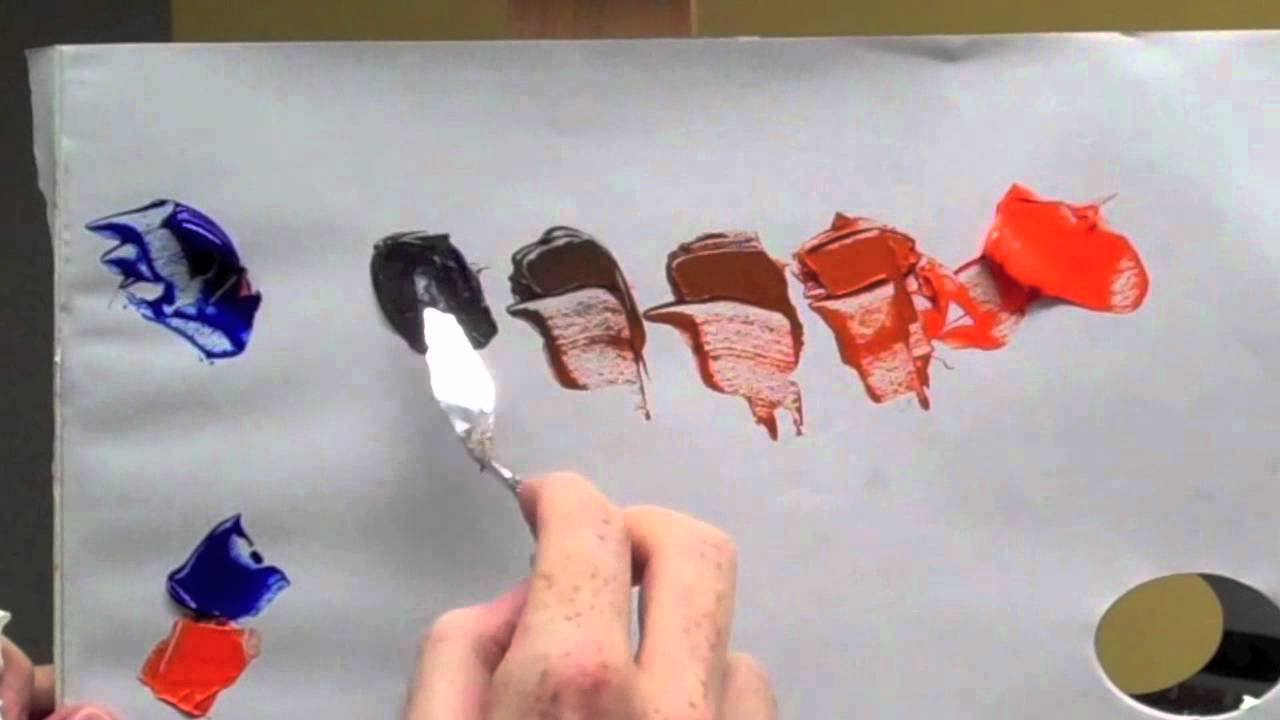
Paint mixing is subtractive. Pigments absorb wavelengths instead of adding them, so combined blue and orange soak up most of the light and bounce back a dull brown.
Real pigments make this obvious:
- Ultramarine + cadmium orange: a deep, earthy brown close to burnt sienna
- Cerulean + orange: grayer, cooler, more washed out
- Indigo + muted peach: a reserved taupe-gray with a faint lavender lean
Acrylic, oil, and watercolor all land on brown in hue. They differ in how muddy the result reads, and watercolor is the least forgiving of the three.
This is also why a hand-mixed brown often looks dirty next to a store-bought tube. Two colors fighting each other will never be as clean as a single dedicated pigment.
How the Type of Blue Changes the Brown
The blue you pick steers the final temperature.
| Blue Used | Result Leans Toward |
|---|---|
| Ultramarine (warm) | Reddish, earthy brown |
| Phthalo (cool) | Gray-brown, olive edge |
| Cerulean (cool) | Muted, dusty brown |
The orange matters too. A red-orange warms the brown further, while a yellow-orange keeps it lighter and more golden.
What Color Do Blue and Orange Light Make?

Light flips the whole outcome. Screens, stage lights, and LEDs use additive mixing, where wavelengths stack up instead of canceling out.
Blue light plus orange light produces a pale, near-white or light gray. No brown anywhere.
Why the split happens: pigment mixing removes light, so combined colors get darker and duller. Light mixing adds it, so combined colors get brighter and wash toward white.
Brown does not even exist as a pure wavelength. It only shows up when our brains read a dim orange against brighter surroundings, which is why you almost never see a brown neon sign.
What Are the RGB, Hex, and CMYK Values for Mixing Blue and Orange?
Standard blue is (0, 0, 255), hex #0000FF. Standard orange is (255, 165, 0), hex #FFA500.
Average those channels and you get roughly (128, 82, 128), a muted purple-gray. That is the quirk designers hit constantly.
| Value | Blue | Orange |
|---|---|---|
| RGB | 0, 0, 255 | 255, 165, 0 |
| Hex | #0000FF | #FFA500 |
Digitally averaging two RGB values is not the same as physically mixing paint. On screen you get a mauve-gray. On canvas you get brown.
In print, CMYK behaves more like paint and leans toward a desaturated brown, useful for shadows and background tones. If you need the exact code from a mix, running the numbers through a tool that converts RGB into hex saves the guesswork.
How Does the Blue-to-Orange Ratio Change the Result?
The proportion decides where on the brown scale you land.
More orange than blue: warm tan, terracotta, or rust.
More blue than orange: cool gray-brown, taupe, or near-charcoal.
Roughly equal parts: a balanced mid-brown, and pure colors at equal strength can push almost to black.
Adjusting from there is simple. Add white and the mix lifts into beige, mushroom, or a soft tan. Add more of either parent color and the lean intensifies, dropping the saturation as it goes.
Why Are Blue and Orange Complementary Colors?
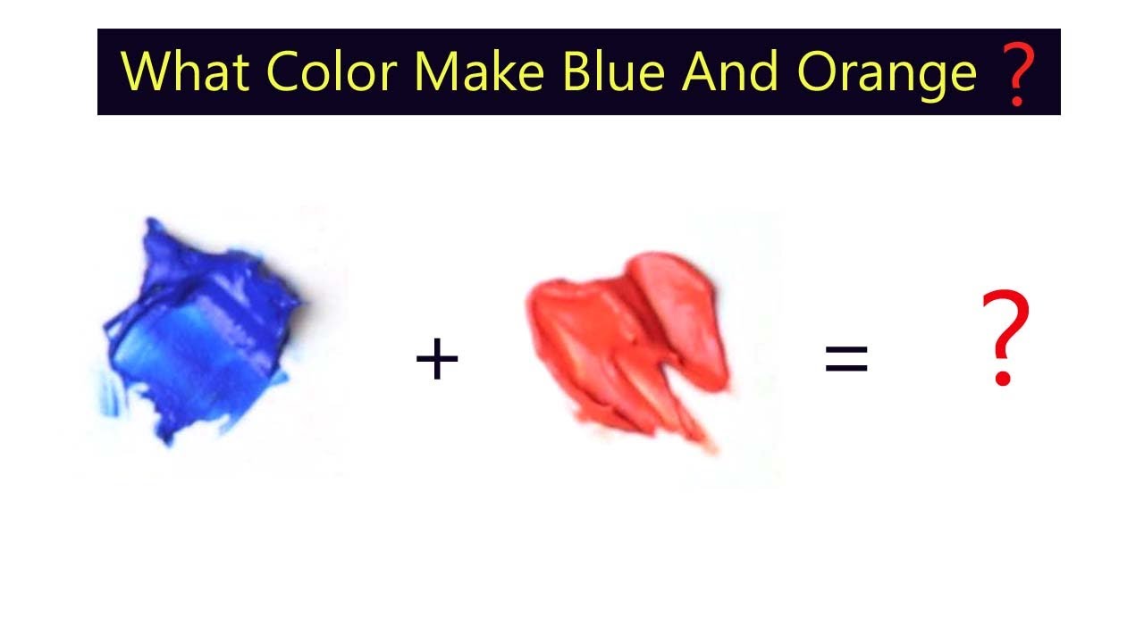
Complementary colors sit directly opposite each other on the color wheel. Blue and orange are a textbook pair.
Here is the part that trips people up. Mixing complements and pairing complements do two completely different things.
| Action | Result | Where You See It |
|---|---|---|
| Mixed together | Neutral brown | Paint, shadows, earth tones |
| Placed side by side | Maximum contrast | Movie posters, sports branding |
Blended, they neutralize into the brown covered above. Set next to each other, they pop, which is why cinematic color grading loves warm orange skin against cool blue backgrounds.
This mixing behavior is not unique to one pair. Red and green also make brown, and so does any pair pulled from a complementary color scheme, because every opposite pair contains all three primaries.
How Do You Keep Blue and Orange From Making Mud?
Muddy brown happens when the two colors fight to a dead stop at a perfect 50/50. The fix is control, not luck.
Lean the mix one direction instead of balancing it. A brown that favors orange or favors blue stays alive. An exact split kills it.
| Problem | Fix |
|---|---|
| Flat, dead brown | Add a touch of yellow or white |
| Too gray | Push more orange back in |
| Too dark | Lift with white, not more color |
Work in small increments. Add blue to orange a little at a time. Dumping equal blobs together is the fastest way to sludge.
Use clean, single-pigment paints. Blues and oranges built from several pigments gray out the blend before you even start.
When a truly clean brown is the goal, skip the premixed orange entirely. Building from red, yellow, and a small amount of blue gives far more control over the final warmth, whether you are chasing a rich chocolate tone or something softer.
Keep a reference color palette as you go. Note the ratios that worked, or you will never reproduce that perfect brown again.
Glazing is the quiet trick most painters skip. Layer a transparent orange over dried blue instead of stirring them together, and you get depth without the graying that physical mixing causes.
FAQ on What Color Do Blue and Orange Make
What color do blue and orange make when mixed?
Blue and orange make brown. Orange already holds red and yellow, so adding blue brings all three primary colors together. Any full primary combination lands on a neutral brown, though the exact tone shifts with your ratio.
Why do blue and orange turn into brown instead of a bright color?
They sit opposite each other on the color wheel as complementary colors. Mixing opposites cancels their brightness and pulls both toward a muddy neutral. That neutralizing effect is why the result reads brown, not vibrant.
Do blue and orange light make brown too?
No. Light uses additive mixing, so blue and orange light combine into a pale, near-white or gray. Brown only appears with paint and pigment, which absorb wavelengths instead of adding them together.
What shade of brown do blue and orange create?
Anywhere from warm reddish-brown to cool gray-brown. Ultramarine with cadmium orange gives a deep earthy tone. Cooler blues like phthalo or cerulean push the mix toward taupe, olive-brown, or near-charcoal.
How do I make a warmer brown from blue and orange?
Add more orange to the mix. A stronger orange lean produces warm browns like tan, rust, and terracotta. A touch of red or yellow-orange warms it further into golden, earthy territory.
How do I make a cooler brown?
Increase the blue. More blue than orange shifts the result toward gray-brown, taupe, or a shadowy charcoal. Cool blues such as cerulean and phthalo intensify that muted, reserved effect in the final tone.
Why does my blue and orange mix look muddy?
A perfect 50/50 split kills the color. Mixing paints built from multiple pigments also grays it out. Lean one direction, use clean single-pigment colors, and add a little white or yellow to revive it.
What are the RGB and hex values for blue and orange?
Standard blue is (0, 0, 255), hex #0000FF. Standard orange is (255, 165, 0), hex #FFA500. Averaging those RGB channels on screen gives a muted purple-gray, not the brown you get with physical paint.
Are blue and orange complementary colors?
Yes. Blue and orange sit directly across from each other on the color wheel, making them a classic complementary pair. Mixed together they neutralize into brown. Placed side by side, they create maximum visual contrast.
What other color pairs make brown like blue and orange?
Any complementary pair works. Red and green make brown, and so does yellow and purple. Each pair contains all three primary colors, which is the reason every complementary mix neutralizes into a brown tone.
Conclusion
So what color do blue and orange make? In paint, they neutralize into brown, since orange carries red and yellow and blue completes the trio of primary colors.
The tone is never locked. Ratio and pigment choice slide it from earthy reddish-brown to a cool, dusty taupe.
Light plays by opposite rules. Blend blue and orange as light and additive mixing hands you a pale, near-white instead of any brown.
Their spot as complementary colors on the color wheel explains both behaviors. Opposites cancel when mixed and clash beautifully when set side by side.
Lean your mix one way, keep pigments clean, and adjust with white or black. That is how you turn a muddy accident into a brown you actually planned.

Renowned for his expertise in logo design and visual branding, Bogdan has developed a multitude of logos for various clients.
His skills extend to creating posters, vector illustrations, business cards, and brochures. Additionally, Bogdan's UI kits were featured on marketplaces like Visual Hierarchy and UI8.
He also wrote in the past years on sites like Design Your Way, WebDesignerDepot, WPDean, Designmodo, Speckyboy, Slider Revolution, and more.
- The Windsurf Logo History, Colors, Font, And Meaning - 10 October 2026
- How to Remove Background From Product Photos (No Photoshop) - 10 October 2026
- How Designers can Build a Stronger Online Creative Identity - 9 October 2026

Bogdan Sandu is a seasoned designer who has been designing websites since 2008. Renowned for his expertise in logo design and visual branding, Bogdan has developed a multitude of logos for various clients. His skills extend to creating posters, vector illustrations, business cards, and brochures. Additionally, Bogdan's UI kits were featured on marketplaces like Visual Hierarchy and UI8. He also wrote in the past years on sites like Design Your Way, WebDesignerDepot, WPDean, Designmodo, Speckyboy, Slider Revolution, and more.
You Might Also Like