


Mix pink and blue, and you get purple. Simple answer, but the shade you land on is anything but predictable.
So what color do pink and blue make once you factor in ratio, pigment, and whether you’re working with paint or light? The result swings from soft lavender to deep periwinkle.
Pink carries red, and red plus blue builds purple on the color wheel. Change the mix and the purple changes with it.
This guide covers the science, the exact hex and RGB codes, paint versus screen behavior, and how RGB and CMYK shift the result.
By the end, you’ll know how to hit any purple you want, plus which colors pair with it.
What Color Do Pink and Blue Make

Pink and blue make purple. The exact result runs from soft lavender to deep periwinkle, shifting with the ratio and the medium you mix in.
Pink is a tint of red. Red plus blue produces purple, so pink plus blue lands on a lighter, softer purple than a straight red-blue mix.
Quick example: hot pink (#FF69B4) blended with pure blue (#0000FF) averages out near #8035DA, a blue-leaning violet.
Physical paint and screen light don’t behave the same way, which is why the same two colors can read as pastel lilac in one place and electric violet in another.
Why Do Pink and Blue Make Purple

Pink and blue make purple because pink holds red pigment, and red combined with blue sits directly between them on the color wheel as purple. The white inside pink lightens the mix, pushing it toward pastel purples like lilac.
Isaac Newton mapped this relationship in the first color wheel back in 1666. Red and blue sit apart in the warm and cool zones, and their meeting point is violet.
The same logic drives the classic red-and-blue combination. Pink just runs a diluted version of that reaction.
Key point: the more white a pink carries, the lighter and chalkier the purple becomes.
Basic color theory treats pink as red plus white, so every pink-and-blue mix is really a red-white-blue mix in disguise.
The Role of Red Inside Pink
Pink equals red plus white. The red is the part that actually reacts with blue to build purple.
More red saturation in the pink means a deeper, richer purple. More white means a paler one.
Bubblegum pink and salmon pink don’t produce the same purple. A warm salmon leans mauve, a cool bubblegum leans violet.
Push the pink toward hot pink for a bolder result. Warm it with red first (see how pink and red combine) and the purple turns dusky.
What Shade of Purple Do Pink and Blue Make
Pink and blue make purple shades across at least 6 named results: lavender, periwinkle, mauve, orchid, lilac, and violet. Ratio decides which one appears, with more blue cooling the mix and more pink warming it.
More pink: warmer purples like mauve, magenta-leaning violet, and dusty rose-purple.
More blue: cooler purples like periwinkle, indigo-leaning violet, and blue-purple.
Equal parts: a balanced medium purple close to orchid or true violet.
Light pink and light blue: pastel results like lavender and soft lilac.
Ratio Chart for Pink and Blue Mixing
Mixing proportions change the outcome fast. These are approximate results for standard artist pigments.
| Pink : Blue | Result | Character |
|---|---|---|
| 1 : 1 | Medium orchid purple | Balanced, true purple |
| 2 : 1 | Mauve / magenta-purple | Warm, reddish |
| 1 : 2 | Periwinkle / blue-violet | Cool, muted |
| 3 : 1 + white | Lavender | Pale, pastel |
Brand and opacity shift these results. A transparent pink over an opaque blue reads different from the reverse.
What Do Pink and Blue Make in Paint
In paint, pink and blue make a muted purple. Pigments work by subtraction, absorbing wavelengths, so combined pigments darken toward a deeper, grayer purple than the same colors mixed as light.
Subtractive mixing is why paint purples look softer. Each added pigment removes more reflected light.
A real studio combo: quinacridone magenta plus ultramarine blue gives a clean, vivid purple. Swap in a cooler pink and the purple grays down.
Add white and the mix stays pastel. Add more blue and it deepens toward plum.
Watch the saturation as you go, since two highly saturated parents can overpower each other in a hurry.
Acrylic and Oil Paint Results

Oils: blend longer, stay vivid, and dry close to the wet color.
Acrylics: dry a shade darker than they look wet, so mix slightly lighter than your target.
Watercolor: gives the palest, most translucent purples of the three.
Winsor and Newton and Golden both sell pre-mixed purples, but a hand-mixed pink-blue purple gives more control over temperature.
What Do Pink and Blue Make in Light
In light, pink and blue make a bright violet or magenta-violet. Light mixes by addition, so wavelengths stack and the result gets brighter, not darker, the opposite of paint.
On an RGB screen, pink light and blue light combine into a glowing electric violet.
Stage and LED rigs use this directly. Wash a surface with pink and blue lamps, and the overlap zone lights up violet.
Paint darkens. Light brightens. Same two colors, opposite direction.
What Are the Hex and RGB Codes for Pink and Blue Mixes
Averaging the hex and RGB values of a pink and a blue gives the digital purple between them. Hot pink (255, 105, 180) averaged with blue (0, 0, 255) yields roughly (128, 53, 218), or hex #8035DA.
| Pink input | Blue input | Averaged result |
|---|---|---|
| #FF69B4 hot pink | #0000FF blue | #8035DA violet |
| #FFC0CB light pink | #ADD8E6 light blue | #D6CCD9 lavender |
| #FF1493 deep pink | #4169E1 royal blue | #A03FBA orchid |
Method: add the two red values and halve, then repeat for green and blue.
Free tools handle the math instantly. Run values through an RGB-to-hex converter, or reverse it with a hex-to-RGB converter.
Light pink and light blue produce the palest outputs. Each parent already sits near white, so the average settles into soft lilac.
What Is the Difference Between Mixing Pink and Blue in RGB vs CMYK

RGB and CMYK produce different purples from the same pink and blue. RGB is additive and brightens toward electric violet on screens, while CMYK is subtractive and mutes toward a deeper printed purple on paper.
| Model | Used for | Pink-blue result |
|---|---|---|
| RGB | Screens, light | Bright electric violet |
| CMYK | Print, ink | Deeper muted purple |
Why the shift: screens emit light that adds up, ink absorbs light and subtracts it.
In CMYK, magenta stands in for pink, so a print purple is really magenta plus a cyan-leaning blue.
A design that glows violet on a monitor can print noticeably darker. Convert early with an RGB-to-CMYK converter and check a proof before a full run.
For brand work, lock the purple to a Pantone reference so it holds steady across screen and print.
What Colors Pair Well With the Purple From Pink and Blue
The purple from pink and blue pairs best with 3 groups: complementary yellows and golds, analogous blues and magentas, and neutral gray, white, and cream. Yellow gives the sharpest contrast, and neutrals let the purple carry a palette on its own.
| Pairing type | Colors | Best use |
|---|---|---|
| Complementary | Yellow, gold | High-contrast accents |
| Analogous | Blue, magenta, violet | Smooth gradients |
| Neutral | Gray, white, cream | Balanced backdrops |
Complementary: yellow sits opposite purple on the wheel, so a complementary pairing with gold makes the purple pop.
Analogous: stay in the same neighborhood with analogous colors like blue, magenta, and violet for a calm, blended look.
Neutral: ground it with gray, white, or cream when the purple should lead.
Cadbury built its whole identity on a deep purple against clean white, one of the most recognizable brand color pairings in confectionery.
Need a full scheme fast? A set of ready-made purple palettes saves the guesswork for web and print work.
How to Adjust Pink and Blue to Get a Specific Purple
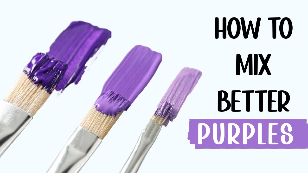
Adjust the purple by changing 4 things: add white for pastel lavender, add black for deep plum, go pink-heavy for warm mauve, or go blue-heavy for cool periwinkle. A touch of red intensifies it, and gray mutes it.
| Target purple | Adjustment |
|---|---|
| Pastel lavender | Add white |
| Deep plum | Add black |
| Warm mauve | More pink |
| Cool periwinkle | More blue |
Intensify: a small amount of red deepens and saturates the purple without darkening it much.
Mute: a touch of gray pulls the intensity back for a dusty finish like dusty rose-purple.
Push toward royal purple with more blue and a hint of black. Pull toward light purple with white and more pink.
For a near-black result, keep adding blue and black until it reads as dark purple.
Test on a scrap swatch first. Wet color and dry color rarely match, especially in acrylics.
Fine-tune the hue before you commit to a large surface, and preview combinations with a color palette generator so you mix with a target in hand.
FAQ on What Color Do Pink And Blue Make
What color do pink and blue make?
Pink and blue make purple. Depending on ratio and medium, the result runs from soft lavender to deep periwinkle. Pink holds red, and red plus blue produces purple, just lighter and softer.
Do pink and blue really make purple?
Yes. Pink is a tint of red, and red combined with blue lands on purple. The white inside pink dilutes the mix, so the purple comes out paler and more pastel than a straight red-blue blend.
What shade of purple do pink and blue make?
The shade depends on the ratio. More pink gives warm mauve or magenta-purple, more blue gives cool periwinkle or blue-violet, and equal parts land near orchid or true violet.
What do pink and blue make in paint?
In paint, pink and blue make a muted purple. Pigments mix by subtraction, absorbing light, so the combined color darkens toward a deeper, grayer purple than the same two colors mixed as light.
What do pink and blue make in light?
In light, they make a bright violet. Light mixes by addition, so wavelengths stack and brighten. On an RGB screen, pink and blue light glow as electric violet, the opposite of paint.
What color do light pink and light blue make?
Light pink and light blue make pastel lavender or soft lilac. Both parents sit near white, so the average comes out pale and chalky, a favorite for nursery, wedding, and spring palettes.
What color do hot pink and blue make?
Hot pink and blue make a bold blue-violet. Averaged in RGB, hot pink (#FF69B4) and pure blue (#0000FF) land near hex #8035DA, a saturated, vivid purple with a cool lean.
Why do pink and blue make purple?
Pink and blue make purple because pink carries red pigment. Red and blue sit apart on the color wheel, and their meeting point is violet. The white in pink lightens the final result.
What color do pink and navy blue make?
Pink and navy blue make a deep, muted purple close to plum or eggplant. Navy’s darkness pulls the mix toward a shadowy, dusky purple instead of a bright lavender.
What is the hex code for pink and blue mixed?
Average the two RGB values. Hot pink (255, 105, 180) plus blue (0, 0, 255) halved gives (128, 53, 218), or hex #8035DA. Light pink and light blue average to about #D6CCD9.
Conclusion
Now you know what color do pink and blue make: purple, in every version from pale lavender to moody eggplant.
The medium decides the outcome. Pigments mix by subtraction and gray down, while additive light on a screen brightens into electric violet.
Ratio handles the fine-tuning. Lean pink for warm mauve, lean blue for cool periwinkle, add white for pastel, add black for deep plum.
Designers should watch the RGB and CMYK gap, since a screen purple prints darker than it glows.
Keep the hex math simple: average the values, test a swatch, then commit. Once the mix behaves, any purple you picture is within reach.

Renowned for his expertise in logo design and visual branding, Bogdan has developed a multitude of logos for various clients.
His skills extend to creating posters, vector illustrations, business cards, and brochures. Additionally, Bogdan's UI kits were featured on marketplaces like Visual Hierarchy and UI8.
He also wrote in the past years on sites like Design Your Way, WebDesignerDepot, WPDean, Designmodo, Speckyboy, Slider Revolution, and more.
- The Windsurf Logo History, Colors, Font, And Meaning - 10 October 2026
- How to Remove Background From Product Photos (No Photoshop) - 10 October 2026
- How Designers can Build a Stronger Online Creative Identity - 9 October 2026

Bogdan Sandu is a seasoned designer who has been designing websites since 2008. Renowned for his expertise in logo design and visual branding, Bogdan has developed a multitude of logos for various clients. His skills extend to creating posters, vector illustrations, business cards, and brochures. Additionally, Bogdan's UI kits were featured on marketplaces like Visual Hierarchy and UI8. He also wrote in the past years on sites like Design Your Way, WebDesignerDepot, WPDean, Designmodo, Speckyboy, Slider Revolution, and more.
You Might Also Like


