Grab a blue crayon, a yellow one, and drag them across each other. You already know where this goes.
So what color do blue and yellow make? Green. But that one-word answer hides a lot, because the result flips depending on whether you are mixing paint or mixing light.
On paper, blue and yellow pigment give you green through subtractive mixing. On a screen, blue and yellow light behave nothing alike.
Here is what this article covers:
- Why the two colors produce green in the first place
- How ratios shift the shade from lime to teal
- Which pigments give clean greens versus muddy ones
- How RGB, CMYK, and RYB each handle the mix
By the end, you will know exactly how to control your green, not just guess at it.
What Color Do Blue and Yellow Make?

Blue and yellow make green when you mix them as paint or pigment. Green sits directly between the two on the standard color wheel, which is why blending them lands you there. The exact result shifts with your mixing system and the specific tubes you use.
Most of us learned this in a grade-school art class using the RYB model (red, yellow, blue). In that setup, blue and yellow are two of the three primaries, and green is the secondary color they build together.
Green also happens to be the most common secondary. Both parent colors are widely liked, so the mix shows up everywhere from house paint to logos.
Here is the quick map of where the three primary pairings land on the color wheel:
| Mix | Result | Wheel Position |
|---|---|---|
| Blue + Yellow | Green | Between blue and yellow |
| Red + Yellow | Orange | Between red and yellow |
| Red + Blue | Purple | Between red and blue |
Why Do Blue and Yellow Make Green?
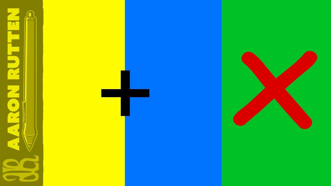
Blue and yellow make green because of subtractive color mixing. Each pigment absorbs some light wavelengths and reflects others. Green is the one band both pigments reflect, so green is what reaches your eye.
Break it down by what each pigment does:
- Blue pigment: reflects blue and green wavelengths, absorbs red and yellow
- Yellow pigment: reflects green and yellow wavelengths, absorbs blue and violet
- The overlap: only green survives both, so green is the reflected result
Adgenix color-theory guides describe this as subtracting light from the paper by adding color to it. The colors you actually see are the ones not being absorbed.
This is the same principle behind every physical surface you look at, from packaging to a painted wall.
How Is the Result Different When You Mix Blue and Yellow Light?
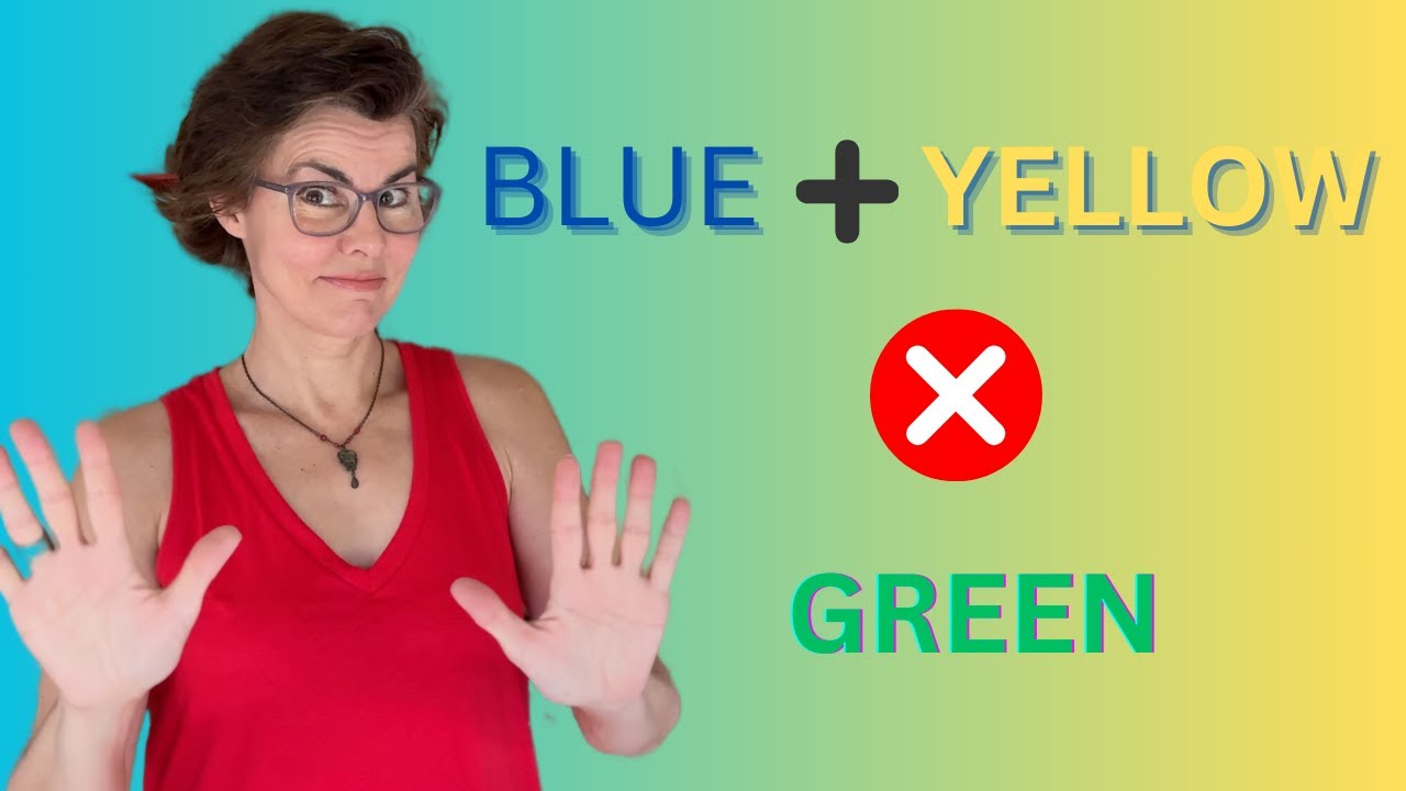
Blue and yellow light do not make green. Mixing them as light produces white or a pale gray. Screens work with additive color, where wavelengths stack instead of cancel, so the rule you learned with paint flips completely.
The reason is that yellow light is itself red plus green light in the additive system. Add blue on top of that and you have all three primaries firing, which reads as white.
Southwestern Oklahoma State University color guides note the RGB model starts from black, and adding red, green, and blue light at full strength yields additive white.
Blue and Yellow on Screens vs on Paper
Same two colors, two outcomes, depending entirely on the medium.
| Medium | System | Blue + Yellow Result |
|---|---|---|
| Paint, print, ink | Subtractive (RYB / CMYK) | Green |
| Phone, TV, monitor | Additive (RGB) | White or gray |
What Shade of Green Do Blue and Yellow Make?

Blue and yellow make a green that ranges from bright lime to deep teal, set by your ratio and your specific pigments. More yellow pushes the mix warm and light. More blue pushes it cool and dark.
Ratio does most of the work here:
- Heavy yellow gives lime green and chartreuse
- Roughly equal parts give a balanced mid green
- Heavy blue leans toward teal and blue-green
The base hue of each parent matters too. A greenish blue with a lemon yellow reads far cleaner than a violet-leaning blue paired with a golden yellow, which drifts toward olive.
So there is no single “green.” There is a whole range living between your two starting colors.
Which Blue and Yellow Pigments Make the Cleanest Green?
The brightest green comes from a cool blue plus a cool yellow. Phthalo Blue with Lemon or Hansa Yellow gives the most vivid result. Warm-warm mixes go muddy because hidden red content quietly neutralizes the green.
Pigment choice controls how much punch survives the mix, which is really a question of saturation.
| Blue | Yellow | Green Result |
|---|---|---|
| Phthalo Blue (cool) | Lemon Yellow (cool) | Bright, clean green |
| Ultramarine (warm) | Cadmium Yellow (warm) | Dull, earthy green |
| Cerulean Blue | Yellow Ochre | Soft, muted green |
Prussian Blue is another strong mixer if you want deep, slightly cool greens without reaching for phthalo. Tube pigments from most acrylic and watercolor lines behave the same way here.
How Do Color Models Represent the Blue and Yellow Mix?
Different systems handle the blue-yellow green in different ways. In RYB it is a straight primary mix. In print it is built from Cyan and Yellow, not blue. On screens, green is its own channel and never gets mixed from the other two.
This is where a lot of confusion starts, and it is worth knowing before any real color theory work.
| Model | Used For | How Green Appears |
|---|---|---|
| RYB | Paint, art class | Blue + Yellow = Green |
| CMYK | Cyan + Yellow ink | |
| RGB | Digital screens | Green is a primary channel |
The RGB gamut runs wider than print, so bright electric greens on a monitor can shift and dull once they hit paper. Designyourway color-theory notes that vivid greens are one of the classic colors that drift during an RGB to CMYK conversion.
Sample hex codes for blue-yellow greens: #008000, #4CAF50, #7CB342, #00A86B.
For color that must match across print runs anywhere, brands lean on Pantone numbers instead of guessing at ink percentages.
How Do You Change the Green With White, Black, or Gray?

Once you have your green, three additions reshape it. White lightens it into a tint. Black or a touch of red deepens it into a shade. Gray mutes it into a tone.
Each move does a specific job:
- Add white: lifts the mix toward mint and sage pastels
- Add black: drops it into forest and hunter green territory
- Add a little red: neutralizes the green for natural, complex tones
- Add gray: pulls it toward moss and olive drab
One warning from experience: black shifts green fast, and too much turns it flat and grayish before you notice. Add it in tiny amounts and mix as you go.
Red works as the quieter option because it sits opposite green on the wheel. A dab knocks down the intensity without killing the color the way heavy black can.
Where Is the Blue and Yellow Green Mix Used?

The green that blue and yellow create shows up across painting, branding, print, and the natural world. Artists reach for it to build realistic foliage. Designers use it to signal growth, health, and sustainability. Printers rebuild it from cyan and yellow plates.
Green is a small slice of the branding pie but a meaningful one. Straits Research puts green at 5.5% of top brand color choices, behind blue, black, red, and yellow, yet it dominates specific industries.
| Green Shade | Industry | Example Brand |
|---|---|---|
| Bright green | Music, tech | Spotify |
| Deep forest | Grocery, wellness | Whole Foods |
| Earthy green | Outdoor, eco | Patagonia |
In Painting and Mixing Palettes
Landscape painters lean on the blue-yellow green constantly. Realistic foliage almost never comes straight from a tube, so mixing your own gives control over warm sunlit leaves versus cool shadowed ones.
- Warm, yellow-heavy greens for grass in direct light
- Cool, blue-heavy greens for distant trees and shade
- Muted, grayed greens for natural depth
Mixing beats a single “sap green” tube every time. Your greens read as intentional rather than flat.
In Graphic and Web Design
Growth and trust signals: green carries nature, health, finance, and eco-messaging at a glance, which is why color psychology ranks it as a versatile brand choice.
SliderRevolution data shows 47% of financial apps launched in 2024 used green gradients, up from 23% in 2022. Robinhood, Chime, and Acorns pushed that shift.
Green also earns its keep on buttons. Unbounce found green calls-to-action convert 21% better than red in environmental and wellness categories.
The blue-green pairing (leaning toward what you get when green and blue combine) bridges trust and growth, a favorite in healthcare and fintech web design.
In Print Production
Green never prints as “blue plus yellow” on paper. Presses build it from Cyan and Yellow ink, since CMYK is the standard for physical output.
Screen vs press: a bright green approved on a monitor can dull noticeably once it hits the smaller print gamut.
Smart teams handle this in two ways:
- Set the file to CMYK from the start in print design work
- Run a proof before the full press run
In Nature and Consumer Perception
Green is nature’s default, and human brains respond to it instinctively as a signal of food, water, and safety.
That instinct translates straight into buying behavior. Nielsen 2024 data shows 66% of consumers prefer buying from sustainable brands, and green is the color most tied to that promise.
The demand is trending up, too. Adobe found 36% of consumers expect earthy, organic tones like sage green to lead branding in 2025.
One honest caveat: green only works when it matches a real brand truth. Slap it on an unsustainable product and it reads as greenwashing fast.
FAQ on What Color Do Blue And Yellow Make
What color do blue and yellow make?
Blue and yellow make green when mixed as paint or pigment. Green sits between them on the color wheel, so blending the two primaries in the RYB model lands you right in the middle at green.
Do blue and yellow always make green?
As paint or ink, yes. As light, no. Blue and yellow light mix additively and produce white or pale gray, since screens stack wavelengths instead of absorbing them like pigment does.
Why do blue and yellow make green?
Subtractive mixing. Blue pigment reflects blue and green while absorbing red. Yellow reflects green and yellow while absorbing blue. Green is the only band both reflect, so green reaches your eye.
What shade of green do blue and yellow make?
Anything from lime to teal. More yellow gives a warm, light green like chartreuse. More blue gives a cool, dark green leaning toward blue-green. Equal parts land on a balanced mid green.
Which blue and yellow make the brightest green?
A cool blue plus a cool yellow. Phthalo Blue with Lemon Yellow gives the cleanest, most vivid green. Warm blues and warm yellows carry hidden red that dulls the mix.
Why does my green turn out muddy?
Warm-warm mixing. Ultramarine (a warm blue) with Cadmium Yellow (a warm yellow) hides red content that neutralizes the green. Switch to cooler pigments for a cleaner, brighter result.
How do you make green darker?
Add a small amount of black for forest or hunter green, or a touch of red to deepen it naturally. Black shifts green fast, so add tiny amounts and mix as you go.
How do you make green lighter?
Add white. This tints the mix toward mint and sage pastels. For muted, natural greens like moss or olive, add gray instead, which tones the color down without brightening it.
Do blue and yellow make green on screens?
No. In RGB, green is its own primary channel and never gets built from blue and yellow. Red and green light actually combine to make yellow in the additive system.
How is green printed if not from blue and yellow?
Presses use Cyan and Yellow ink under the CMYK model, not blue. Bright screen greens sit outside the print gamut, so they often shift and dull during an RGB to CMYK conversion.
Conclusion
So what color do blue and yellow make? Green, every time you mix them as pigment. That answer holds whether you are working in watercolor, acrylic, or house paint.
The interesting part is the control you now have. Ratio, pigment temperature, and a touch of white, black, or gray decide whether you land on chartreuse, olive, or deep teal.
Cool pigments keep the green vivid. Warm ones pull it toward earthy, muted tones.
Remember the medium too. Pigment mixing gives green through subtraction, while light and the RGB model play by opposite rules.
Print rebuilds the same green from cyan and yellow, not blue.
Once these principles click, green stops being a guess. You mix it on purpose.

Renowned for his expertise in logo design and visual branding, Bogdan has developed a multitude of logos for various clients.
His skills extend to creating posters, vector illustrations, business cards, and brochures. Additionally, Bogdan's UI kits were featured on marketplaces like Visual Hierarchy and UI8.
He also wrote in the past years on sites like Design Your Way, WebDesignerDepot, WPDean, Designmodo, Speckyboy, Slider Revolution, and more.
- How to Install Fonts on Mac (Step-by-Step Guide) - 20 September 2026
- From Mockup to Code: How AI-Augmented Development Speeds Up the Design Handoff - 19 September 2026
- The Beehiiv Logo History, Colors, Font, And Meaning - 18 September 2026

Bogdan Sandu is a seasoned designer who has been designing websites since 2008. Renowned for his expertise in logo design and visual branding, Bogdan has developed a multitude of logos for various clients. His skills extend to creating posters, vector illustrations, business cards, and brochures. Additionally, Bogdan's UI kits were featured on marketplaces like Visual Hierarchy and UI8. He also wrote in the past years on sites like Design Your Way, WebDesignerDepot, WPDean, Designmodo, Speckyboy, Slider Revolution, and more.
You Might Also Like