Grab two tubes of paint, swirl them together, and the answer surprises most people the first time.
So what color do brown and blue make? In pigment they make a deep, muted blue-gray that leans toward a dark slate or grayed navy, because brown acts like a dark orange and orange is the opposite of blue.
That single fact opens a bigger story. The result shifts with your ratio, your specific browns and blues, and whether you’re working in paint or in light on a screen.
This guide walks through all of it:
- Why the mix turns muted instead of vivid
- How ratios swing it from taupe to steely navy
- What burnt umber and ultramarine really produce
- Hex codes, RGB behavior, and where the pairing gets used
What Color Do Brown and Blue Make
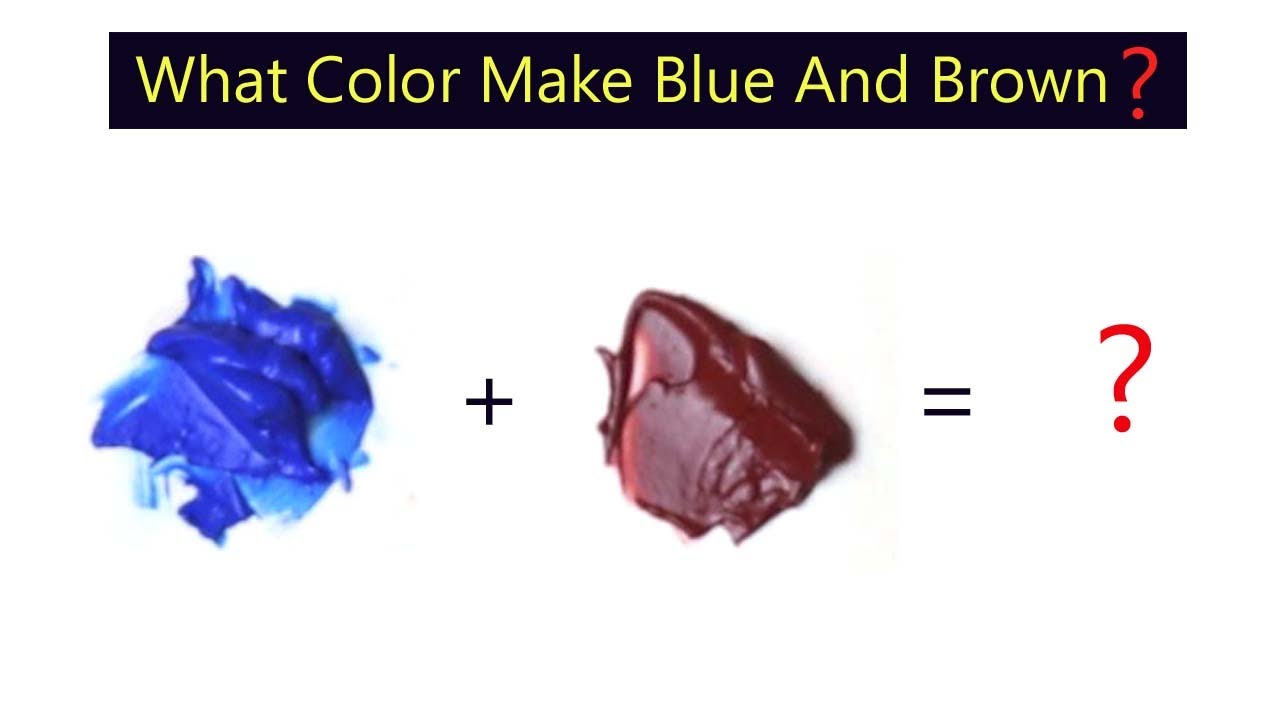
Brown and blue make a deep, muted blue-gray that leans toward a dark, desaturated navy or slate. Brown carries orange undertones, and orange sits opposite blue, so the two partly cancel each other and pull the mix down into a grayed neutral.
The result is rarely a bright new shade. It reads more like a dulled-down blue that has lost its punch.
Push the balance one way and you land near a cool slate gray. Push it the other way and it drifts toward a dark, earthy taupe.
One thing worth flagging early: paint and screens behave differently. Mixing brown and blue pigment darkens the result, while mixing brown and blue light does the opposite, and both cases are covered below.
Why Do Brown and Blue Create a Muted Result
Brown and blue turn muddy because brown is basically a dark orange, and orange is the direct opposite of blue. When two opposites meet in pigment, they neutralize, cutting the intensity and dragging the mix toward gray.
Brown breaks down into red plus yellow with a bit of black. That red-yellow base gives it a warm, orange-leaning core.
Blue is cool. Drop a warm color into a cool one and the saturation takes a hit, which is exactly why the blend looks flat instead of vivid.
This graying effect is a core idea in color theory, and it’s the same reason painters reach for opposite colors when they want to knock the life out of a shade on purpose.
The Complementary Relationship Between Orange and Blue
Blue’s true complement is orange. Since brown is orange with the brightness turned down, brown behaves like a muted stand-in for orange whenever it meets blue.
Complementary pairs sit across from each other on the color wheel. Mix them and they subtract wavelengths, which is what shifts the tone toward a neutral.
Painters exploit this constantly. The blue-orange pairing is one of the most reliable ways to build a natural gray, and it shows up any time you want two opposite colors working against each other rather than clashing on the page.
How Does the Ratio of Brown to Blue Change the Color

The ratio decides everything. More blue gives you a steely, grayed navy; more brown gives you a warm, dark taupe; equal parts land on a neutral slate or charcoal that leans cool.
Small tweaks shift the result more than people expect. A drop of blue into a pile of brown just cools the brown into a shadow tone, while a drop of brown into blue quietly kills the blue’s glare.
| Mix Ratio | Result | Where It Fits |
|---|---|---|
| Mostly blue | Grayed navy / steel blue | Cool shadows, denim tones |
| Even split | Neutral slate / charcoal | Natural grays, chromatic black base |
| Mostly brown | Dark taupe / cool earth | Soil, bark, muted backgrounds |
| Tiny bit of blue | Cool shadow brown | Depth in realistic painting |
Landscape painters lean on that last row all the time. A hint of blue turns a plain brown into a believable shadow instead of a muddy blob.
What Happens When You Mix Brown and Blue Paint


Brown and blue paint make a rich, dark near-black. Pigment mixing is subtractive, so combined paints absorb more light and drop in value, which is why the blend darkens instead of brightening.
The exact outcome shifts with your pigments. Watercolor stays transparent and cooler, acrylic dries a touch darker, and oil holds its depth longest.
A few reliable combinations painters actually use:
- Ultramarine + burnt umber: the classic adjustable black, warm or cool on demand
- Ultramarine + burnt sienna: a warmer gray with more life in the mid-tones
- Prussian blue + burnt umber: an even deeper, moodier dark
Payne’s grey, a staple tube color, is built on this exact blue-brown logic. Gamblin’s chromatic black takes a similar route using a colored base instead of a black pigment, which keeps shadows lively rather than dead.
The Burnt Umber and Ultramarine Mix
Burnt umber plus ultramarine makes a deep, tunable black that most painters prefer over a tube black. Add more umber and it warms; add more ultramarine and it cools.
The reason it works is simple geometry. Burnt umber sits near dark orange, ultramarine sits near blue, so the two land on near-opposite ends of the wheel and neutralize into a strong dark.
It stays useful because it never goes fully flat. You can shift the temperature mid-painting, something a jar of premixed black can’t do, and brands like Geneva even sell the combination pre-blended for people who use it constantly.
What Color Do Brown and Blue Make in Light (RGB)
In light, brown and blue make a dull grayish mauve or muted purple, not a dark black. Light mixing is additive, so channels add together and the result brightens rather than deepens the way paint does.
Brown on a screen is a low-brightness orange: high red, medium green, low blue. Adding blue light lifts that weak blue channel.
Raise the blue and the warm orange base gets pushed toward a soft purple-gray. This is why a screen-based color model hands designers a different answer than a paint palette does.
Anyone who has designed a blue-and-orange combination for the web has bumped into this gap. What looks like one color on canvas can look like another entirely once it’s made of pixels.
What Hex Code Do You Get From Brown and Blue

Averaging brown (#8B4513) and blue (#0000FF) lands near #45238A, a muted indigo-purple. Hex mixing is channel math, not pigment behavior, so the output depends entirely on which blend mode you run the numbers through.
Blend mode changes the story completely:
- Normal / average: a middling purple-gray around #45238A
- Multiply: a much darker, near-black result
- Screen: a lighter, washed lavender
Tools like Adobe Color and Coolors reproduce these outputs instantly. The key thing to remember: the hex value is arithmetic on red, green, and blue channels, so it won’t match what happens when wet paint meets wet paint.
Using CSS color-mix() for Brown and Blue
The color-mix() function blends two colors right in the browser, no preprocessor needed. The syntax color-mix(in srgb, brown, blue) returns a blended value, and adjustable percentages control the balance.
The color space you pick matters more than the colors sometimes. Mixing in srgb gives the muddy, grayed result everyone knows, while oklch keeps the blend cleaner and more saturated.
Support is broad. The function runs in Chrome 111+, Safari 16.2+, and Firefox 113+, covering roughly 95% of global traffic as of 2025 (DevToolbox).
OKLCH itself was designed by Bjorn Ottosson in 2020, and design systems like Tailwind v4 and Material You have since moved to OKLCH-based palettes for exactly this reason: fewer muddy midpoints.
How Do Different Shades of Brown and Blue Affect the Outcome
The specific brown and blue you start with steer the final hue. Warm browns keep the mix earthy, cool browns push it gray, light blues stay soft, and dark blues drive it toward near-black.
Undertone is the real driver here. A chocolate brown and a greige taupe behave nothing alike once blue enters the picture.
| Brown | Blue | Result |
|---|---|---|
| Chocolate (warm) | Sky blue | Soft dusty blue-gray |
| Taupe (cool) | Navy | Near-black cool neutral |
| Chestnut (warm) | Cobalt | Deep muted slate |
| Greige (cool) | Powder blue | Pale, quiet gray-blue |
This is where color harmony gets practical. Matching two cool parents keeps things clean, while pairing a warm brown with a cool blue is what tends to muddy the water fastest.
How Do You Avoid a Muddy Brown-Blue Mix

To keep a brown-blue mix from going muddy, commit to a warm or cool lean instead of a dead-center blend, add color slowly, lift the value with a little white, and hold a limited palette so both undertones stay predictable.
Muddiness happens when the two colors fully neutralize each other and flatten out. The fix is control, not luck.
Four habits that keep the mix clean:
- Add gradually: drop the second color in a little at a time and test on scrap before committing
- Pick a direction: aim for a cool slate or a warm taupe, not a perfect middle that reads as sludge
- Lift with white: a touch of white raises brightness without dumping all the saturation
- Stay limited: fewer pigments means fewer competing undertones, which keeps a tight working palette honest
Painters follow the slow-add rule almost religiously. The usual advice is to add burnt umber into ultramarine one tiny bit at a time, since a heavy hand tips the whole mix into flat gray before you notice.
On screen, the equivalent move is choosing your color space. Blending in oklch instead of srgb keeps the midpoint from graying out, which is the digital version of not overmixing.
Where Is the Brown-Blue Color Combination Used
The brown-blue pairing shows up across interior design, fashion, painting, and branding. Rooms use it for grounded calm, painters use it for realistic shadows and chromatic blacks, and brands use its muted neutrals for an understated, trustworthy feel.
Designers call it an unexpected pairing that works because both are organic colors we see in nature. Designer Stephanie Larsen notes that these organic tones tend to have a calming effect, which is part of why the combination reads as restful rather than heavy.
| Field | How It’s Used | Real Example |
|---|---|---|
| Interiors | Navy walls with warm brown wood | Farrow & Ball Oval Room Blue with chocolate walls |
| Fashion | Low-contrast classic pairing | Navy suit, brown leather shoes |
| Painting | Shadow tones, chromatic black | Ultramarine plus burnt umber |
| Branding | Muted neutral identity | Slate-and-tan logo systems |
Chocolate brown ranked as one of the biggest color trends of 2025, and pairing it with a blackened blue like Oval Room Blue gives rooms depth without going cold. Cabinet maker Dura Supreme leans on the same idea, matching navy cabinetry with warm brown stains like “Morel” and “Toast.”
The pairing carries into branding for the same reason it works on a wall. A muted blue-gray built from these two colors signals steadiness, which is why it anchors so many understated earth-toned brand palettes and quiet visual identity systems.
Fashion treats it as a safe, grown-up default. Navy and brown sit close in temperature once brown warms the mix, so the two rarely fight, and that low-drama contrast is exactly what makes the combination feel timeless.
FAQ on What Color Do Brown And Blue Make
What color do brown and blue make together?
They make a deep, muted blue-gray that leans toward dark slate or grayed navy. Brown carries orange undertones, and orange sits opposite blue, so the two partly cancel and pull the mix toward a neutral.
Do brown and blue make black?
Close, but not a pure black. Burnt umber plus ultramarine makes a rich chromatic black that you can warm or cool by adjusting the ratio. Most painters prefer this over a flat tube black.
Why does mixing brown and blue look muddy?
Muddiness comes from neutralization. Brown behaves like a dark orange, orange is blue’s complement, and complementary colors subtract each other’s chroma. The saturation drops, leaving a grayed, flat result instead of a vivid one.
What color do brown and blue make in light or RGB?
In light the result brightens instead of darkening. Brown is a dim orange on screen, so adding blue light lifts the blue channel and pushes the mix toward a dull grayish mauve or muted purple.
What happens if you add more blue than brown?
More blue gives you a steely, grayed navy or a cool slate. The brown knocks the glare off the blue without erasing it, which is why painters use a little brown to build believable cool shadows.
What happens if you add more brown than blue?
The mix warms into a dark, earthy taupe or a cool greenish-brown. A small amount of blue simply cools the brown into a shadow tone, useful for soil, bark, and grounded backgrounds.
What hex code do brown and blue make?
Averaging brown (#8B4513) and blue (#0000FF) lands near #45238A, a muted indigo-purple. The exact value depends on blend mode: multiply darkens toward near-black, while screen lightens it into a washed lavender.
Which browns and blues work best for a natural black?
Transparent pairs work best. Ultramarine with burnt umber is the classic, and Prussian blue with burnt umber goes deeper. Swap in burnt sienna for a warmer gray with more life in the mid-tones.
How do I mix brown and blue without going muddy?
Add color gradually and test on scrap first. Pick a direction (cool slate or warm taupe) rather than a dead-center blend, lift the value with a touch of white, and keep a limited palette.
Where is the brown and blue combination used?
It appears in interiors, fashion, painting, and branding. Navy-and-chocolate rooms feel grounded, painters use it for shadows and chromatic blacks, and brands lean on its muted neutrals for a calm, trustworthy look.
Conclusion
So what color do brown and blue make? In pigment, a dark, desaturated blue-gray that reads as slate or grayed navy, since brown works like a dim orange fighting against blue.
The outcome is never fixed. Ratio, undertone, and medium all steer it, from a warm chestnut-leaning taupe to a near-black chromatic neutral.
On canvas, subtractive mixing darkens the blend, and burnt umber with ultramarine stays the reliable go-to. On screen, additive light nudges the same pair toward a soft mauve instead.
Keep a few things in your pocket:
- Add pigment slowly to dodge a flat mix
- Lean warm or cool on purpose
- Check your color space before trusting a digital result
Master those, and this quiet pairing becomes one of your most useful.

Renowned for his expertise in logo design and visual branding, Bogdan has developed a multitude of logos for various clients.
His skills extend to creating posters, vector illustrations, business cards, and brochures. Additionally, Bogdan's UI kits were featured on marketplaces like Visual Hierarchy and UI8.
He also wrote in the past years on sites like Design Your Way, WebDesignerDepot, WPDean, Designmodo, Speckyboy, Slider Revolution, and more.
- The Windsurf Logo History, Colors, Font, And Meaning - 10 October 2026
- How to Remove Background From Product Photos (No Photoshop) - 10 October 2026
- How Designers can Build a Stronger Online Creative Identity - 9 October 2026

Bogdan Sandu is a seasoned designer who has been designing websites since 2008. Renowned for his expertise in logo design and visual branding, Bogdan has developed a multitude of logos for various clients. His skills extend to creating posters, vector illustrations, business cards, and brochures. Additionally, Bogdan's UI kits were featured on marketplaces like Visual Hierarchy and UI8. He also wrote in the past years on sites like Design Your Way, WebDesignerDepot, WPDean, Designmodo, Speckyboy, Slider Revolution, and more.
You Might Also Like