

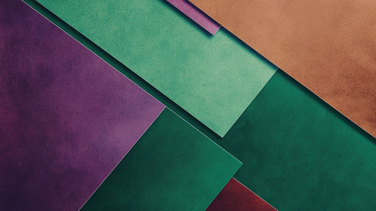
Grab green and purple paint, swirl them together, and you get something nobody expects. Not a bold new shade. Just brown.
The real answer to what color do green and purple make depends entirely on how you mix them. Paint pulls one direction, light pulls the complete opposite.
Mix them as pigment and you land on a muddy, olive-leaning brown. Mix them as light on a screen and you get a pale pink instead.
This guide breaks down every version of the result:
- Paint and pigment mixing, plus the exact shade you get
- Green and purple in light versus ink
- Why these two sit as near-complements on the wheel
- Ratios that shift the mix, and where the result actually gets used
By the end, you will know exactly what to expect before you ever pick up a brush.
What Color Do Green and Purple Make?
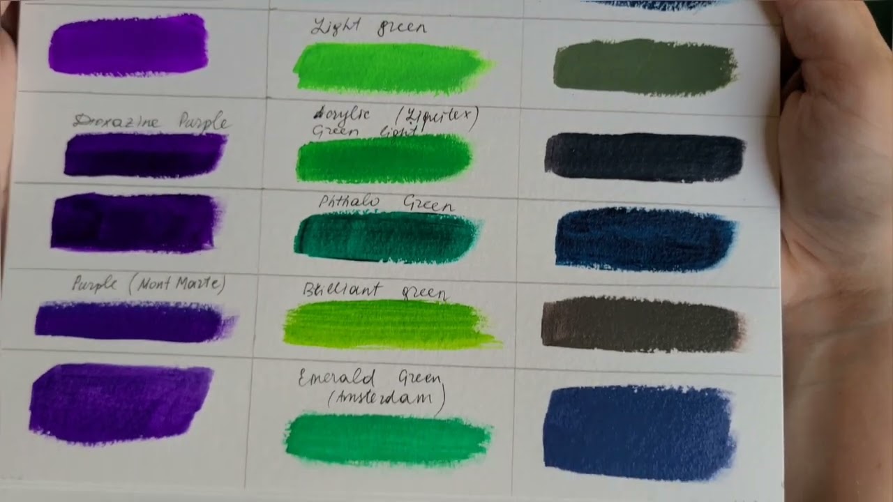
Green and purple mixed as paint make a muddy brown, usually leaning grayish or olive. The exact shade shifts with your ratio and the type of mixing. In light, the same pair behaves the opposite way and lands on a pale, washed pink instead.
Most people asking this mean paint or pencils. That answer is brown. Not a clean brown either, more of a dull, earthy neutral you would never squeeze out of a tube on purpose.
The reason comes down to how colors actually interact. Both green and purple are secondary colors, so blending them drags in all three primaries at once.
| Mixing Type | Result | Rough Hex |
|---|---|---|
| Paint / pigment | Muddy olive-brown | #4A4A3A |
| Light (RGB) | Pale pink-white | #F0C0E0 |
| Ink (CMYK) | Dark cool neutral | #3B3A45 |
Same two colors. Three different answers. That trips people up more than anything.
Why Does Mixing Green and Purple Create Brown?

Mixing green and purple creates brown because their pigments absorb almost every wavelength of light between them. Green already carries blue and yellow. Purple carries red and blue. Combine them and you get red, yellow, and blue sitting together, which is the classic recipe for mud.
Subtractive mixing: paint works by absorbing light, not adding it. Every pigment you stir in removes more of the spectrum, so two rich colors together reflect very little back.
The primary overlap: any time all three primaries land in one puddle, the result neutralizes toward brown or gray. That is exactly what happens here.
This is the RYB model, the red-yellow-blue system artists learned in school. It does not match physics perfectly, but it predicts the brown outcome well enough for real mixing.
What Shade of Brown Do You Actually Get?
The brown is never fixed. It slides based on which parent dominates.
- More green: drifts toward a dull olive or khaki
- More purple: shifts to a grayish plum or muddy mauve
- Equal parts: flat neutral brown-gray, pretty lifeless
Warm versus cool versions of each parent matter too. A cool blue-green plus a red-heavy purple reads warmer than you would expect.
What Color Do Green and Purple Light Make?
Screens flip the whole thing. Green and purple light combine into a pale pinkish white, not brown, because light adds wavelengths instead of removing them.
This is additive mixing. Your phone, your monitor, stage lighting, all of it builds color by stacking beams of red, green, and blue light on top of each other.
| Source | R | G | B |
|---|---|---|---|
| Green light | 0 | 255 | 0 |
| Purple light | 160 | 32 | 240 |
| Combined | 160 | 255 (full) | 240 |
Green pushes the green channel to full while purple lifts red and blue. Stack them and every channel runs high, which the eye reads as a washed-out lavender-pink verging on white.
Try it in any design tool set to screen blend mode. The pale result surprises people every single time.
How Do Green and Purple Mix in CMYK Printing?

In CMYK printing, green and purple overlap into a dark, cool, muddy neutral. It behaves like paint (subtractive) but runs on cyan, magenta, and yellow instead of the artist primaries.
Green in print: built mostly from cyan plus yellow.
Purple in print: built mostly from cyan plus magenta.
Overlap those and cyan doubles up while magenta and yellow fill in the rest. The four-ink process pushes toward a heavy, near-black brown with a cool cast.
Print designers avoid this overlap on purpose. It lays down too much ink, dries slow, and shifts unpredictably between paper stocks. Tools like Pantone spot color libraries exist partly to dodge this kind of muddy conversion.
Are Green and Purple Complementary Colors?

No, green and purple are not true complementary colors. On the RYB wheel, purple’s real complement is yellow, and green’s is red. Green and purple sit closer together as near-complements, which still lets them dull each other into brown.
That near-complement relationship is the whole reason the mix goes muddy. Colors that partly oppose each other cancel out saturation when combined.
People confuse this with a few neighboring ideas:
- Analogous: colors sitting next to each other, like blue and green
- Complementary: direct opposites that create maximum contrast when paired
Want to see the exact spacing? Plotting both on a standard color wheel makes the near-complement gap obvious.
What Ratios Change the Result of Green and Purple?
Ratio is your steering wheel here. Small shifts move the mix across a surprising range of neutrals.
| Mix | Result |
|---|---|
| 50 / 50 | Flat brown-gray |
| Green-heavy | Olive, khaki |
| Purple-heavy | Grayish plum |
| Plus white | Dusty sage or greige |
Adding white lifts the whole thing into soft, dusty territory. Great for muted palettes.
One thing that gets missed: pigment grade matters. Student-grade acrylics carry fillers, so they mix chalkier and flatter than artist-grade tubes with denser pigment load.
How Do You Use a Green and Purple Mix in Real Work?

That muddy result sounds useless. It isn’t. Painters reach for these self-mixed neutrals constantly.
- Shadow tones: green-purple grays read far more natural than black in landscapes and skin
- Earthy palettes: the olive and plum range works for interiors and moody branding
- Depth without deadening: mixing a neutral beats dumping black, which flattens everything
Most working painters mix their own browns rather than buying tube brown, because a custom neutral carries undertones that tie back into the rest of the piece.
If you build digital palettes, a tint and shade tool lets you spin one muddy base into a full range of usable neutrals in seconds.
FAQ on What Color Do Green And Purple Make
What color do green and purple make in paint?
Green and purple paint make a muddy brown, often leaning olive or grayish. Both colors carry all three primaries between them, so mixing neutralizes the result into a dull, earthy tone rather than anything bright.
Do green and purple make brown every time?
Mostly, yes. Pigment mixing lands on brown or brown-gray in almost every case. The undertone shifts with your ratio and paint quality, but a vibrant result is not possible from these two secondary colors.
What color do green and purple light make?
On screens, green and purple light combine into a pale pinkish white. Light adds wavelengths instead of absorbing them, so stacking these two beams pushes every channel high toward a washed-out lavender.
Are green and purple complementary colors?
No. On the RYB wheel, purple pairs with yellow and green pairs with red. Green and purple sit as near-complements, close enough to dull each other but not true opposites.
What shade of brown do green and purple make?
It depends on the mix. More green drifts toward olive or khaki. More purple shifts to grayish plum or mauve. Equal parts gives a flat, neutral brown-gray with little life.
Why does green and purple make mud?
Green holds blue and yellow. Purple holds red and blue. Combined, all three primaries appear together, and subtractive mixing absorbs nearly every wavelength, leaving a dull neutral behind.
What do green and purple make in CMYK printing?
In print, they overlap into a dark, cool, muddy neutral. Green uses cyan plus yellow, purple uses cyan plus magenta, so the shared cyan builds a heavy near-black brown.
Can you make a nice color from green and purple?
Yes, if you want neutrals. The muted olive and plum grays work beautifully for shadow tones and earthy palettes. Adding white lifts the mix into soft, dusty sage territory.
Does the type of green or purple change the result?
Absolutely. A warm, red-leaning purple with a cool blue-green mixes differently than yellow-greens with violet. Undertones steer the final brown warmer or cooler, even at the same ratio.
Should I use green and purple instead of black to darken?
Often, yes. Mixing your own neutral from green and purple keeps undertones connected to the rest of a piece. Black flattens color, while these self-mixed browns stay alive and natural.
Conclusion
So what color do green and purple make? A muddy brown when you mix pigment, sliding toward olive or grayish plum based on your ratio.
Switch to light and the answer flips completely. Green and purple beams stack into a pale, washed pink instead of any brown.
Ink brings its own version, overlapping into a dark, cool neutral through the cyan-heavy CMYK process.
The takeaway is simple. These two are near-complements, so they dull each other rather than building something vivid.
That dullness is a feature, not a flaw. Self-mixed neutrals give you natural shadow tones and earthy palettes that black could never match.
Next time you reach for both, you already know the result before the brush hits the surface.

Renowned for his expertise in logo design and visual branding, Bogdan has developed a multitude of logos for various clients.
His skills extend to creating posters, vector illustrations, business cards, and brochures. Additionally, Bogdan's UI kits were featured on marketplaces like Visual Hierarchy and UI8.
He also wrote in the past years on sites like Design Your Way, WebDesignerDepot, WPDean, Designmodo, Speckyboy, Slider Revolution, and more.
- The Cursor Logo History, Colors, Font, And Meaning - 24 September 2026
- Top 7 Web Design Subscription Services That Replace Full-Time Hires - 24 September 2026
- Canva vs PowerPoint: Which Is Better for Presentations? - 22 September 2026

Bogdan Sandu is a seasoned designer who has been designing websites since 2008. Renowned for his expertise in logo design and visual branding, Bogdan has developed a multitude of logos for various clients. His skills extend to creating posters, vector illustrations, business cards, and brochures. Additionally, Bogdan's UI kits were featured on marketplaces like Visual Hierarchy and UI8. He also wrote in the past years on sites like Design Your Way, WebDesignerDepot, WPDean, Designmodo, Speckyboy, Slider Revolution, and more.
You Might Also Like


