Bodoni’s dramatic hairlines and vertical stress command attention, but pairing this elegant serif with the wrong companion destroys the sophistication it promises. Bodoni font pairing requires understanding how geometric sans serifs, humanist alternatives, and even other serifs can either amplify or undermine its neoclassical refinement.
Getting the combination right means balancing Bodoni’s high contrast aesthetic with typefaces that provide structural stability without competing for attention.
This guide examines 18 proven pairings that work across digital and print contexts. You’ll learn which sans-serif fonts complement Bodoni’s personality, when to break conventional pairing rules with serif-on-serif combinations, and how to implement these partnerships through specific weight selections and spacing adjustments.
Each pairing includes visual characteristics, best use cases, and practical implementation tips based on real-world applications in editorial design, brand identity systems, and web typography.
Bodoni Font Pairing
| Font Pairing | Classification | Visual Relationship | Optimal Use Context |
|---|---|---|---|
| Bodoni + Futura | Serif + Geometric Sans | High contrast between classical elegance and modern minimalism creates striking hierarchy | Luxury branding, fashion editorials, high-end product catalogs |
| Bodoni + Brandon Grotesque | Serif + Geometric Sans | Balanced sophistication with approachable geometric warmth and subtle rounded terminals | Premium lifestyle brands, boutique e-commerce, contemporary marketing |
| Bodoni + Helvetica | Serif + Neo-Grotesque Sans | Classic pairing balancing Bodoni’s dramatic contrast with Helvetica’s neutral readability | Corporate publications, museum exhibitions, editorial design systems |
| Bodoni + Montserrat | Serif + Geometric Sans | Digital-friendly alternative to Futura pairing with optimized screen rendering | Web design, mobile interfaces, digital magazines, online portfolios |
| Bodoni + Source Sans Pro | Serif + Humanist Sans | Open-source pairing combining classical formality with excellent legibility at small sizes | Technical documentation with sophisticated aesthetic, research publications |
| Bodoni + Proxima Nova | Serif + Humanist Sans | Professional versatility merging historical refinement with contemporary friendliness | Corporate identities, professional services, tech startups requiring elegance |
| Bodoni + Avenir | Serif + Geometric Humanist | Refined balance of geometric structure with organic proportions complements Bodoni’s formality | Art gallery materials, architectural presentations, upscale hospitality branding |
| Bodoni + PT Sans | Serif + Humanist Sans | Budget-conscious pairing maintaining sophistication with accessible web fonts | Non-profit organizations, educational institutions, cultural publications |
| Bodoni + Raleway | Serif + Elegant Sans | Thin weights and elegant proportions create cohesive luxury aesthetic with reduced contrast | Beauty brands, wedding invitations, premium wellness services |
| Bodoni + DIN | Serif + Industrial Sans | Unexpected contrast between Italian refinement and German engineering precision | Automotive branding, industrial design portfolios, modern architecture firms |
| Bodoni + Work Sans | Serif + Grotesque Sans | Screen-optimized grotesque provides practical readability against Bodoni’s display elegance | Digital products, SaaS platforms, contemporary web applications |
| Bodoni + Poppins | Serif + Geometric Sans | Internationalization-ready pairing with extensive language support and circular geometry | Global brands, multilingual websites, international marketing campaigns |
| Bodoni + Roboto | Serif + Neo-Grotesque Hybrid | Android-native pairing balancing classical typography with mechanical skeleton and friendly curves | Mobile applications, Material Design systems, tech company websites |
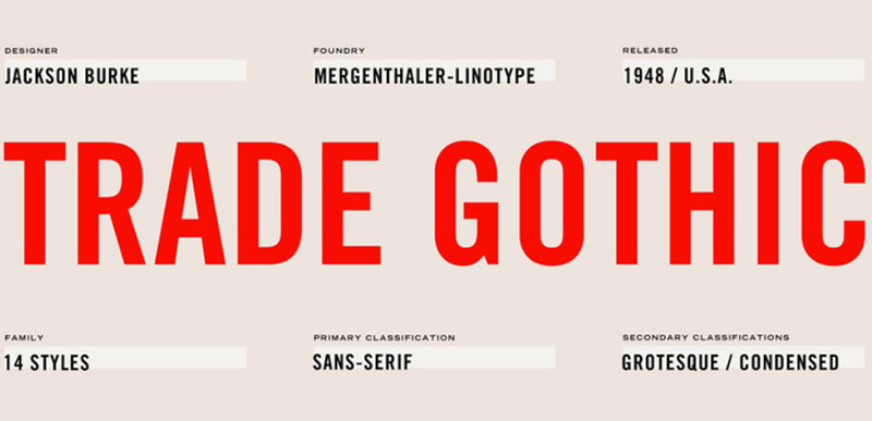
| Bodoni + Trade Gothic | Serif + Grotesque Sans | American advertising heritage combining Italian refinement with mid-century functionality | Magazine layouts, advertising campaigns, newspaper design systems |
| Bodoni + Sentinel | Serif + Slab Serif | Serif combination pairing neoclassical vertical stress with sturdy horizontal emphasis | News publications, long-form journalism, content-heavy editorial platforms |
| Bodoni + Playfair Display | Serif + Transitional Serif | Display serif pairing creates dramatic layering of high-contrast letterforms with historical resonance | Literary publications, historical content, heritage brand storytelling |
| Bodoni + Graphik | Serif + Neo-Grotesque Sans | Contemporary Swiss rationalism paired with Italian classicism for controlled brand systems | Financial services, legal firms, corporate annual reports |
| Bodoni + Neuzeit Grotesk | Serif + Geometric Grotesque | Bauhaus-era geometric sans provides modernist restraint against neoclassical ornamentation | Design studios, cultural institutions, avant-garde publications |
Futura

Futura’s geometric precision creates a striking visual dialogue with Bodoni’s dramatic vertical stress and thin hairlines. This pairing works because Futura’s circular forms and even stroke weight provide structural stability that balances Bodoni’s delicate refinement.
Visual Characteristics
Futura’s clean geometric construction contrasts beautifully with Bodoni’s organic ball terminals and sharp bracketing. The sans serif’s consistent stroke weight acts as a visual anchor against Bodoni’s extreme thick-thin contrast.
Both typefaces share a modernist sensibility but express it differently. Where Bodoni commands attention through elegance, Futura delivers through simplicity.
Best Use Cases
This combination excels in luxury brand identity and editorial layouts where sophistication matters. Use Bodoni for headlines and pull quotes, Futura for body text and navigation elements.
Print materials benefit most from this pairing. Fashion lookbooks, art exhibition catalogs, and high-end product packaging all leverage the combination’s refined aesthetic.
Pairing Rationale
The geometric-classical tension creates visual hierarchy without friction. Futura’s neutral personality doesn’t compete with Bodoni’s commanding presence.
Readability stays high because Futura handles extended text better than most geometric sans serifs. Its wide apertures and generous x-height compensate for Bodoni’s more demanding reading requirements.
Implementation Tips
Set Bodoni at 48pt+ for display work, Futura at 11-13pt for body text. Maintain a 3:1 size ratio minimum between headline and body copy.
Increase leading by 20% when using Bodoni for extended passages. Futura Book or Light pairs best with Bodoni Bold for maximum typographic hierarchy.
Add generous white space around both typefaces to maintain the clean, uncluttered aesthetic this pairing demands.
Brandon Grotesque
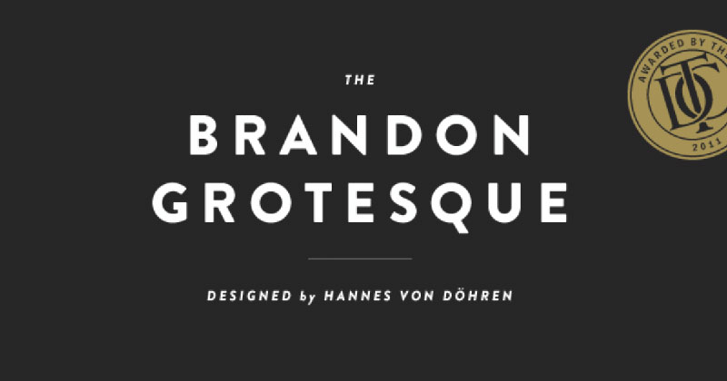
Brandon Grotesque brings geometric warmth to Bodoni’s formal elegance through slightly rounded terminals and humanist proportions. This pairing softens Bodoni’s severity while maintaining sophistication.
Visual Characteristics
The subtle personality in Brandon’s letterforms creates approachability without sacrificing professionalism. Its condensed proportions work well with Bodoni’s vertical emphasis and narrow character width.
Brandon’s uppercase forms echo Bodoni’s strong vertical stress. Both typefaces share architectural qualities but Brandon’s friendly details make extended reading less intimidating.
Best Use Cases
Perfect for modern brand guidelines that need personality with polish. Tech startups, design agencies, and creative studios use this pairing to project contemporary sophistication.
Digital interfaces benefit from Brandon’s screen-optimized letterforms. Use it for UI text, buttons, and form labels while reserving Bodoni for hero sections and feature callouts.
Pairing Rationale
The geometric foundation shared by both typefaces creates immediate visual coherence. Brandon’s warmer character prevents the overall design from feeling cold or unapproachable.
This combination signals both tradition and innovation. Bodoni represents classical refinement while Brandon suggests forward-thinking modernity.
Implementation Tips
Brandon Grotesque Medium pairs ideally with Bodoni’s standard weight. Avoid using Brandon Light with Bodoni as the weight contrast becomes too extreme.
Keep font spacing tighter than default for Brandon (tracking: -20) to match Bodoni’s natural rhythm. Set Brandon 2-3pt larger than typical body text to maintain visual weight parity.
Use Brandon for all interactive elements and microcopy. Its consistent x-height ensures UI consistency across different screen densities.
Helvetica
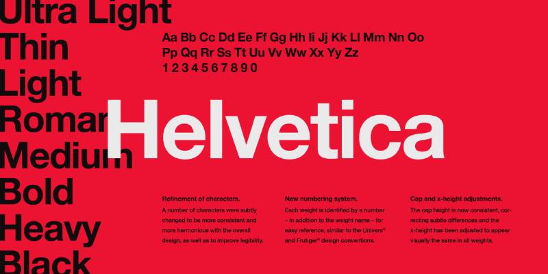
Helvetica’s neutral rationality provides the perfect counterpoint to Bodoni’s expressive personality. This is probably the safest pairing for designers who need reliability and timeless appeal.
Visual Characteristics
Helvetica’s tight apertures and squared curves create textural density that contrasts with Bodoni’s airy elegance. The sans-serif font‘s uniform stroke weight stabilizes Bodoni’s dramatic modulation.
Both typefaces avoid decorative flourishes. This shared restraint creates cohesion even as their fundamental construction differs radically.
Best Use Cases
Corporate communications and financial reports rely on this pairing for its professional credibility. Annual reports, white papers, and investor presentations use it to project authority.
Web design projects favor this combination because Helvetica (or Neue Helvetica) renders consistently across operating systems. Use Bodoni sparingly for landing page heroes and section headers.
Pairing Rationale
Helvetica lets Bodoni breathe. Its self-effacing nature creates emphasis through absence of personality rather than presence of character.
The pairing works because neither typeface demands constant attention. Readers move seamlessly between display and body text without visual friction.
Best Use Cases
This combination belongs in Swiss design contexts and anywhere objectivity matters. Medical publications, technical documentation, and institutional materials all benefit from the pairing’s neutrality.
Museums and cultural institutions use this for exhibition materials. Helvetica handles lengthy wall text while Bodoni provides visual punctuation for artwork titles and section dividers.
Implementation Tips
Use Helvetica 55 Roman for body text, never Helvetica Regular (which is actually Medium weight). The lighter optical weight better complements Bodoni’s delicate hairlines.
Maintain strict grid systems when working with this pairing. Both typefaces were designed with mathematical precision and demand structured layouts.
Set Helvetica with slightly increased tracking (+10 to +20) to prevent that signature tightness from making body text feel cramped.
Montserrat

Montserrat’s geometric simplicity and tall x-height make it an accessible alternative to commercial geometric sans serifs. This free Google Font pairs surprisingly well with Bodoni for projects with budget constraints.
Visual Characteristics
Montserrat’s slightly condensed proportions mirror Bodoni’s vertical emphasis. The sans serif’s clean geometry provides structural simplicity that doesn’t fight with Bodoni’s ornate details.
Both typefaces work at large sizes but Montserrat maintains legibility in smaller contexts where Bodoni struggles. The typography contrast comes from decoration, not construction.
Best Use Cases
Digital projects dominate here since both typefaces are easily accessible through Google Fonts. Web design agencies use this pairing for portfolio sites and creative agency landing pages.
Social media graphics and Instagram posts leverage this combination because Montserrat renders cleanly at thumbnail sizes. Bodoni adds drama to quote graphics while Montserrat handles attribution and supporting text.
Pairing Rationale
The free availability of both typefaces (Libre Bodoni on Google Fonts) removes font licensing barriers. Designers get sophistication without budget limitations.
Montserrat’s multiple weights (nine total) provide typographic flexibility. You can create complex hierarchies without introducing additional font families.
Implementation Tips
Use Montserrat Medium or Semibold for UI elements to maintain visual presence against Bodoni’s attention-grabbing headlines. The standard Regular weight often feels too light in comparison.
Keep Bodoni usage minimal in digital contexts. Its thin strokes disappear on low-quality displays, so reserve it for hero sections where users expect visual impact.
Increase line-height to 1.6 or higher when setting long passages in Montserrat. The typeface’s tall x-height makes lines feel cramped at standard leading values.
Source Sans Pro
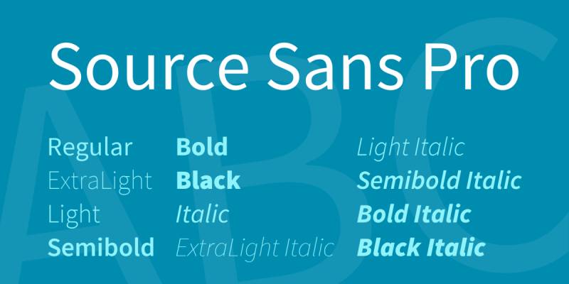
Adobe’s Source Sans Pro brings warmth and readability to the table through subtle humanist touches. This pairing works because Source Sans was literally designed for extended screen reading.
Visual Characteristics
Source Sans Pro’s slightly wider proportions create visual breathing room that complements Bodoni’s narrow construction. The humanist details add personality without competing for attention.
Both typefaces maintain clarity at small sizes but for different reasons. Bodoni relies on high contrast, Source Sans on generous apertures and simplified letterforms.
Best Use Cases
Long-form digital content needs this pairing. Articles, documentation, and educational platforms use Source Sans Pro for body text while Bodoni provides visual markers for sections and chapters.
The combination appears frequently in design systems for SaaS products. Source Sans handles interface copy, data tables, and form inputs while Bodoni distinguishes marketing pages and feature announcements.
Pairing Rationale
Source Sans Pro solves Bodoni’s biggest weakness. Where the serif font fatigues readers in extended passages, Source Sans Pro delivers effortless readability.
The open-source licensing for both typefaces makes this pairing practical for commercial projects. No font licensing fees or usage restrictions simplify implementation.
Implementation Tips
Source Sans Pro Regular pairs well with Bodoni Book or Poster depending on your contrast needs. Avoid mixing Source Sans Bold with Bodoni Bold as the combination becomes visually aggressive.
Set Source Sans with default or slightly increased letter-spacing. The typeface was designed with optimal kerning built in and rarely needs adjustment.
Use weight variations within Source Sans Pro to create hierarchy before introducing Bodoni. Reserve the serif for only the most important typographic moments.
Proxima Nova
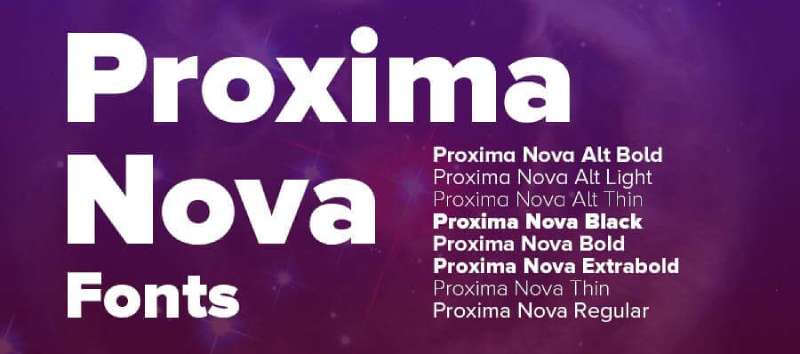
Proxima Nova’s balanced proportions and multiple weights make it one of the most versatile geometric sans serifs available. This pairing became ubiquitous in the 2010s for good reason.
Visual Characteristics
Proxima Nova walks the line between geometric and humanist, giving designers flexibility without sacrificing character. Its even stroke weight and open apertures provide exceptional legibility alongside Bodoni’s delicate forms.
The sans serif’s slightly condensed proportions echo Bodoni’s vertical stress. Both typefaces feel sophisticated but Proxima Nova adds contemporary accessibility.
Best Use Cases
Professional service firms love this pairing for its polished versatility. Law firms, consulting agencies, and financial advisors use it to project competence with personality.
Digital products benefit from Proxima Nova’s extensive weight range (eight weights plus italics). Create complete design systems using only these two typefaces without feeling limited.
Pairing Rationale
Proxima Nova handles the heavy lifting across UI, body text, and secondary headlines. This lets Bodoni remain special by appearing only in hero sections and key messaging.
The pairing signals modern luxury. Tech companies, premium apps, and upscale branding projects use it to look current without following obvious trends.
Implementation Tips
Proxima Nova Semibold creates the best visual balance with standard-weight Bodoni. The medium weights of both typefaces share similar optical density.
Maintain consistent rhythm by using a baseline grid that accommodates both typefaces. Set the grid interval to match Proxima Nova’s cap height for cleanest alignment.
Avoid using Proxima Nova’s italic variants with Bodoni. The mix of oblique and true italic creates visual confusion in typographic hierarchy.
Avenir
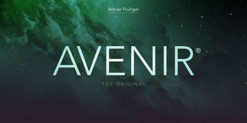
Avenir means “future” in French, and this geometric humanist sans serif delivers on that promise. Adrian Frutiger designed it to improve on Futura’s readability issues while maintaining geometric appeal.
Visual Characteristics
Avenir’s thicker vertical strokes and thinner horizontals create subtle contrast that harmonizes with Bodoni’s dramatic modulation. This shared emphasis on vertical stress unifies the pairing.
The typeface’s generous x-height and open counters ensure readability in contexts where Bodoni’s ornate details might overwhelm. Both typefaces feel refined but express it through different means.
Best Use Cases
Editorial design loves this combination for magazines and long-form publications. Fashion, architecture, and design magazines use it to maintain sophisticated tone across diverse content types.
Corporate identity systems frequently pair these typefaces for their professional warmth. Unlike Helvetica’s coldness, Avenir adds approachability while maintaining serious credibility.
Pairing Rationale
Both typefaces share European modernist roots. This common heritage creates instant visual coherence even though their construction differs fundamentally.
Avenir’s multiple weights (six in the standard family) provide typographic flexibility. Designers can create nuanced hierarchies without introducing additional type families.
Implementation Tips
Avenir Book works perfectly with Bodoni for body text applications. The typeface was specifically designed for extended reading in both print and digital contexts.
Use Avenir Heavy or Black for subheadings when Bodoni handles main headlines. The weight jump creates clear hierarchy while maintaining family consistency.
Keep font spacing at default settings for Avenir. Frutiger obsessively refined the typeface’s native spacing and it rarely needs adjustment.
PT Sans
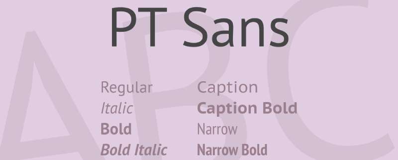
PT Sans brings Cyrillic expertise and open-source accessibility to geometric sans serif design. This Google Font pairs with Bodoni when projects need multilingual support without compromising aesthetics.
Visual Characteristics
PT Sans maintains consistent width across weights, making it predictable in responsive layouts. The slightly squared letterforms contrast nicely with Bodoni’s rounded ball terminals.
Both typefaces handle large size displays effectively but PT Sans was specifically optimized for low-resolution screens. This makes it practical where Bodoni is purely aspirational.
Best Use Cases
International projects and multilingual websites need this pairing’s extensive language support. PT Sans covers Latin, Cyrillic, and extended character sets that many premium typefaces ignore.
Government and institutional websites use this combination because both typefaces are freely available. Budget constraints don’t force compromise on visual quality.
Pairing Rationale
The free licensing removes cost barriers for large-scale implementations. Designers can use these typefaces across unlimited projects and platforms without tracking usage rights.
PT Sans’s sturdy construction provides reliability that balances Bodoni’s delicacy. The sans serif handles utilitarian tasks while the serif delivers moments of beauty.
Implementation Tips
PT Sans works best at Regular weight with Bodoni. The typeface’s standard weight has more presence than you’d expect from a “Regular” designation.
Increase tracking slightly (+10 to +15) when setting PT Sans in all-caps. The geometric construction can feel tight in uppercase settings.
Use PT Sans for all form inputs, error messages, and system text. Its clarity in challenging contexts lets Bodoni focus on expressive display purposes.
Raleway
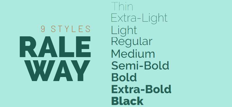
Raleway’s elegant thin weights and geometric precision make it a fashion-forward choice. This Google Font brings runway aesthetics to digital projects at no cost.
Visual Characteristics
Raleway’s ultra-thin weights mirror Bodoni’s delicate hairlines, creating visual echo rather than contrast. The shared emphasis on refinement unifies the pairing despite different construction methods.
Both typefaces demand careful handling at small sizes. Their thin strokes disappear on poor displays, limiting this pairing to contexts where visual quality is guaranteed.
Best Use Cases
Fashion and beauty brands embrace this combination for its runway elegance. E-commerce sites selling luxury goods use it to project aspirational sophistication.
Portfolio websites for photographers, stylists, and creative professionals favor this pairing. The thin weights create breathing room that lets visual work dominate.
Pairing Rationale
This pairing chooses beauty over utility. Both typefaces prioritize visual refinement, making the combination suitable only for design-forward audiences who value aesthetics.
Raleway’s multiple weights provide flexibility within the geometric framework. Designers can modulate tone from whisper-thin to confident bold without changing type families.
Implementation Tips
Never use Raleway Thin for body text. Reserve weights under Regular for large display purposes only, paired with Bodoni for maximum dramatic effect.
Increase line-height to 1.8 or higher when using thin weights. The delicate strokes need extra vertical space to remain legible and prevent visual crowding.
Use dark backgrounds with white or light text to maximize stroke visibility. Raleway’s and Bodoni’s thin weights gain presence on dark surfaces.
DIN
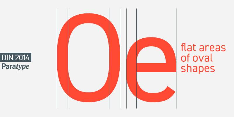
DIN’s industrial heritage and strict geometric construction provide architectural stability. This German standard brings technical precision to balance Bodoni’s decorative elegance.
Visual Characteristics
DIN’s condensed proportions and squared terminals create stark contrast with Bodoni’s organic curves. The geometric rigidity provides structure that contains Bodoni’s expressive energy.
Both typefaces were designed with specific technical requirements. DIN for road signage, Bodoni for high-end printing. This functional heritage gives both authority in their respective domains.
Best Use Cases
Architecture and engineering firms use this pairing to balance technical credibility with aesthetic sophistication. The combination signals both precision and taste.
Automotive and industrial brands leverage DIN’s heritage alongside Bodoni’s luxury associations. Product brochures, technical specifications, and brand materials all benefit from this contrast.
Pairing Rationale
The pairing creates tension between German engineering and Italian artistry. This cultural dialogue adds conceptual depth beyond pure visual appeal.
DIN handles data, specifications, and technical information while Bodoni manages brand voice and aspirational messaging. The division of labor creates clear functional hierarchy.
Implementation Tips
Use DIN Medium or Bold for body text, never Regular. The standard weight feels too light against Bodoni’s commanding presence.
Maintain strict baseline alignment when mixing these typefaces. Both were designed with mathematical precision and demand structured layouts.
Letterspace DIN by +15 to +25 for all-caps settings. The condensed proportions can feel cramped without breathing room.
Work Sans
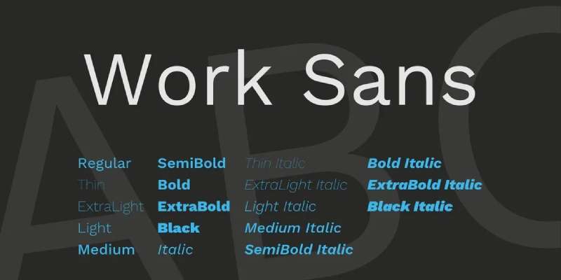
Work Sans was designed specifically for screen interfaces, making it one of the most practical sans serifs for pairing with Bodoni in digital contexts. The typeface handles small sizes and poor rendering conditions with grace.
Visual Characteristics
Work Sans’s slightly condensed proportions and squared details create sturdy functionality. The typeface’s open apertures and generous spacing ensure clarity alongside Bodoni’s more demanding forms.
Both typefaces maintain distinct personality without becoming distracting. Work Sans feels contemporary and approachable while Bodoni projects timeless refinement.
Best Use Cases
App interfaces and responsive websites need this pairing’s technical optimization. Work Sans handles UI text, navigation, and form elements while Bodoni distinguishes marketing and brand moments.
Tech startups and digital-first companies use this combination to balance innovation with credibility. The free licensing through Google Fonts makes implementation practical at any scale.
Pairing Rationale
Work Sans was literally designed for the contexts where Bodoni traditionally fails. This complementary weakness-strength relationship makes the pairing functionally smart, not just aesthetically pleasing.
The open-source nature removes licensing friction for commercial projects. Designers can implement freely without tracking usage or securing multiple licenses.
Implementation Tips
Work Sans Medium creates better visual balance with Bodoni than the Regular weight. The typeface’s weights run lighter than many sans serifs.
Use Work Sans for all interactive elements and microcopy below 14px. Reserve Bodoni for display purposes above 24px where its details remain visible.
Maintain consistent tracking across Work Sans weights. The typeface was designed with uniform spacing that shouldn’t require per-weight adjustment.
Poppins
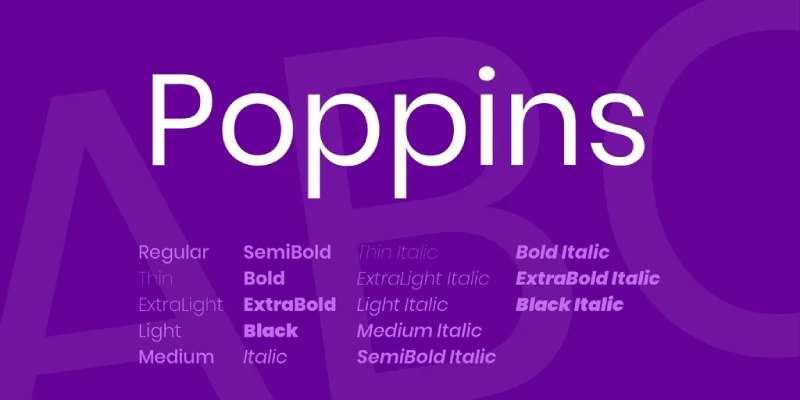
Poppins brings geometric charm with an international flavor through its Devanagari script origins. This Google Font offers extensive language support and cheerful personality.
Visual Characteristics
Poppins’s circular forms and even stroke weight create playful geometry that softens Bodoni’s severity. The monolinear construction provides visual simplicity that doesn’t compete for attention.
Both typefaces work at display sizes but Poppins was optimized for screen legibility. Its generous x-height and open counters ensure readability where Bodoni’s refinement might compromise function.
Best Use Cases
Consumer apps and friendly digital products use this pairing to project approachable sophistication. Fitness apps, lifestyle brands, and wellness platforms favor the combination’s warm professionalism.
Email newsletters and marketing materials benefit from Poppins’s readability. The typeface handles extended text while Bodoni punctuates key messages and calls-to-action.
Pairing Rationale
Poppins adds personality without sacrificing legibility. The typeface’s cheerful character prevents designs from feeling too formal or unapproachable.
The extensive weight range (nine weights from Thin to Black) provides typographic flexibility. Designers can create complete hierarchies without introducing additional type families.
Implementation Tips
Poppins Medium or Semibold pairs best with standard Bodoni weights. The geometric sans runs lighter than its weight names suggest.
Increase line-height to 1.6 or higher for extended reading in Poppins. The tall x-height makes lines feel cramped at default leading values.
Use Poppins for all body text and Bodoni sparingly for headlines only. The reverse arrangement creates readability problems in extended contexts.
Roboto

Google’s Roboto dominates Android and Material Design ecosystems, making it the most-used typeface in mobile interfaces. This pairing works because Roboto handles the utilitarian tasks while Bodoni provides brand distinction.
Visual Characteristics
Roboto’s dual nature (mechanical skeleton with friendly curves) creates approachability. The slightly squared curves contrast with Bodoni’s organic ball terminals and classical proportions.
Both typefaces maintain clarity across sizes but Roboto was specifically optimized for high-density screens. Its open apertures and generous spacing ensure function where Bodoni delivers form.
Best Use Cases
Android apps and Material Design projects default to this pairing when designers want personality beyond standard system fonts. Bodoni distinguishes onboarding, splash screens, and brand moments.
Cross-platform digital products use this combination because Roboto renders consistently across devices. The predictable behavior makes it safe for complex responsive layouts.
Pairing Rationale
Roboto’s ubiquity is its strength. Users recognize and trust the typeface, making Bodoni’s appearances feel intentional and special rather than random.
The free licensing and extensive font family (twelve weights plus italics) remove implementation barriers. Designers get flexibility without budget or licensing constraints.
Implementation Tips
Use Roboto Regular for body text, Medium for labels and buttons. The typeface’s standard weight has excellent readability across screen densities.
Never set Roboto and Bodoni at the same optical size. Maintain at least a 2:1 ratio between Bodoni headlines and Roboto body text.
Keep Roboto at default spacing settings. Google refined the typeface’s metrics specifically for Material Design and adjustments rarely improve results.
Trade Gothic
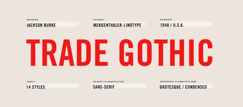
Trade Gothic’s pragmatic American Gothic construction brings blue-collar honesty to Bodoni’s European sophistication. This pairing creates interesting cultural and historical dialogue.
Visual Characteristics
Trade Gothic’s slightly condensed proportions and minimal contrast create utilitarian efficiency. The squared letterforms and tight spacing contrast sharply with Bodoni’s organic elegance.
Both typefaces represent design excellence from their respective eras. Trade Gothic served American commercial printing, Bodoni represented Italian neoclassical refinement.
Best Use Cases
Editorial design loves this combination for its textural variety. News publications, magazines, and journals use it to create visual interest without sacrificing readability.
Packaging design and product branding leverage the pairing’s approachable luxury. Craft beer, artisanal food products, and heritage brands all benefit from the historical contrast.
Pairing Rationale
The pairing juxtaposes high and low culture in productive tension. Bodoni represents aspirational luxury while Trade Gothic signals accessible authenticity.
Trade Gothic’s extensive family (multiple widths and weights) provides practical flexibility. Designers can create complex typographic systems while maintaining visual coherence.
Implementation Tips
Use Trade Gothic Bold Condensed for subheadings beneath Bodoni display headlines. The condensed width creates visual variety without disrupting vertical rhythm.
Letterspace Trade Gothic by +10 to +20 for all-caps settings. The tight native spacing can feel cramped in uppercase contexts.
Maintain strong contrast between Bodoni and Trade Gothic usage. Mixing them within the same text block creates confusion rather than hierarchy.
Sentinel

Sentinel brings contemporary slab serif sensibility to traditional typographic pairings. This typeface creates unusual harmony with Bodoni through shared vertical emphasis and geometric construction.
Visual Characteristics
Sentinel’s thick slab serifs provide visual weight that balances Bodoni’s delicate hairlines. The squared terminals contrast with Bodoni’s ball finials, creating textural variety within serif typography.
Both typefaces demand attention but for opposite reasons. Bodoni through elegance and refinement, Sentinel through sturdy presence and geometric confidence.
Best Use Cases
Editorial design and magazine layouts use this pairing to create serif-on-serif contrast. Long-form journalism, feature articles, and opinion pieces benefit from the dynamic tension.
Brand identity systems for cultural institutions pair these typefaces to signal both tradition and contemporary relevance. Museums, theaters, and arts organizations use it to bridge historical and modern contexts.
Pairing Rationale
This serif-plus-serif approach breaks conventional pairing rules productively. The combination proves that contrast comes from more than classification alone.
Sentinel handles extended reading where Bodoni tires readers. The slab serif maintains engagement through subtle personality and excellent legibility.
Implementation Tips
Use Sentinel Book for body text with Bodoni headlines. The lighter weight prevents Sentinel from overpowering Bodoni’s refined details.
Maintain generous leading (1.5x or higher) when setting Sentinel in extended passages. The slab serifs need vertical space to avoid creating dense text blocks.
Restrict Bodoni to display sizes only in this pairing. Using both typefaces at small sizes creates visual confusion and compromises readability.
Playfair Display

Playfair Display creates an unusual pairing scenario where two high-contrast serifs work together. This combination succeeds because Playfair’s transitional characteristics differ enough from Bodoni’s modern style.
Visual Characteristics
Playfair’s higher x-height and less extreme contrast create differentiation from Bodoni. The transitional serif features bracketed serifs and more organic construction compared to Bodoni’s geometric precision.
Both typefaces share elegance but express it differently. Playfair feels warm and classical, Bodoni sharp and modern.
Best Use Cases
Wedding stationery and formal invitations use this pairing to create layered sophistication. The serif-on-serif approach signals maximum formality and refinement.
Luxury brand materials and high-end editorial design pair these typefaces to double down on elegance. Fashion, jewelry, and premium lifestyle brands use the combination to project uncompromising sophistication.
Pairing Rationale
This pairing chooses emotion over convention. Both typefaces carry similar font psychology but their subtle differences create hierarchy without contrast.
Playfair’s availability through Google Fonts makes this sophisticated pairing accessible. Designers get display-quality typography without commercial font licensing costs.
Implementation Tips
Use Playfair for secondary headlines and pull quotes, never body text. Reserve Bodoni for primary headlines to maintain clear hierarchical distinction.
Increase size difference between Playfair and Bodoni applications by at least 8-10pt. The similar styles need significant scale contrast to remain distinguishable.
Never use regular weights of both typefaces together. Pair Playfair Bold with standard Bodoni, or Playfair Regular with Bodoni Poster to maintain contrast.
Graphik

Graphik’s contemporary geometric construction brings Swiss-inspired clarity to modern design systems. This typeface creates professional stability that lets Bodoni’s personality shine.
Visual Characteristics
Graphik’s slightly wide proportions and open counters contrast with Bodoni’s narrow vertical emphasis. The geometric precision matches Bodoni’s mathematical construction but through different stylistic means.
Both typefaces maintain clarity across sizes. Graphik through systematic spacing and clean forms, Bodoni through distinctive character shapes and high contrast.
Best Use Cases
Design agencies and creative studios use this pairing in their own branding. The combination signals both contemporary thinking and respect for typographic tradition.
Tech companies building premium products pair these typefaces to project quality without pretension. SaaS platforms, productivity tools, and professional software all benefit from the balanced sophistication.
Pairing Rationale
Graphik handles the entire typographic system while Bodoni provides accent moments. This division of labor creates practical design systems without sacrificing personality.
The extensive Graphik family (eight weights in multiple widths) provides exceptional flexibility. Designers can create nuanced hierarchies before introducing Bodoni for emphasis.
Implementation Tips
Use Graphik Regular or Medium for body text with Bodoni for display headlines. The geometric sans runs true to weight designations unlike many contemporary typefaces.
Maintain strict grid systems when working with this pairing. Both typefaces were designed with mathematical rigor and benefit from structured layouts.
Keep tracking at default for Graphik. Commercial Foundry obsessively refined the spacing and adjustments rarely improve readability.
Neuzeit Grotesk

Neuzeit Grotesk brings Weimar-era German modernism to contemporary typography. This lesser-known geometric sans creates sophisticated contrast with Bodoni through its distinctive character.
Visual Characteristics
Neuzeit’s tall x-height and slightly condensed proportions echo Bodoni’s vertical stress. The geometric construction feels more architectural than friendly, matching Bodoni’s formal personality.
Both typefaces represent modernist ideals from their respective traditions. Neuzeit from German functionalism, Bodoni from Italian neoclassicism.
Best Use Cases
Architecture firms and design studios focused on built environments pair these typefaces to signal modernist heritage. Project documentation, competition entries, and portfolio materials all benefit from the historical resonance.
Cultural institutions and art galleries use this combination to reference early 20th-century avant-garde movements. Exhibition catalogs, wall text, and promotional materials leverage the period connection.
Pairing Rationale
The pairing creates dialogue between German and Italian design traditions. This geographical and philosophical contrast adds conceptual depth to visual appeal.
Neuzeit’s distinctive personality prevents the pairing from feeling generic. The typeface offers familiarity of geometric sans serifs while maintaining individual character.
Implementation Tips
Use Neuzeit Book for body text rather than Regular. The typeface’s standard weight reads heavier than most geometric sans serifs.
Increase leading by 10-15% when setting Neuzeit in extended passages. The tall x-height makes lines feel tight at default spacing.
Avoid mixing Neuzeit’s italic with Bodoni. The oblique slant creates awkward contrast with Bodoni’s true italic letterforms.
FAQ on Bodoni Font Pairing
What sans serif fonts pair best with Bodoni?
Geometric sans serifs like Futura, Helvetica, and Avenir create the strongest pairings with Bodoni. Their clean construction and even stroke weight provide visual stability that balances Bodoni’s dramatic contrast. Proxima Nova and Brandon Grotesque offer modern alternatives with slightly humanist touches that soften Bodoni’s formality.
Can you pair two serif fonts with Bodoni?
Yes, but choose carefully. Playfair Display and Sentinel work because their construction differs enough from Bodoni’s modern classification. Use significant size contrast between the two serifs and reserve Bodoni for primary headlines only. This approach works best in luxury branding and formal invitations where maximum elegance matters.
What’s the ideal size ratio between Bodoni headlines and body text?
Maintain at least a 3:1 ratio between Bodoni display text and body copy. Set Bodoni at 48pt or larger for headlines, with body text at 11-14pt. Bodoni’s thin hairlines disappear at small sizes, so restricting it to display purposes ensures its details remain visible and impactful.
Which free fonts pair well with Bodoni?
Montserrat, Source Sans Pro, and Work Sans from Google Fonts create sophisticated pairings without licensing costs. Libre Bodoni offers a free alternative to commercial Bodoni variants. These combinations work particularly well for digital projects where budget constraints limit access to premium typeface libraries.
Does Bodoni work for web design?
Bodoni works in web contexts but requires careful implementation. Use it only for hero sections and large headlines above 24px where thin strokes remain visible. Pair with screen-optimized sans serifs like Roboto or Source Sans Pro for body text and UI elements to ensure readability across devices.
How do you create hierarchy with Bodoni pairings?
Use Bodoni exclusively for primary headlines and key messaging. Assign all body text, subheadings, and interface elements to your sans serif choice. Create additional hierarchy through weight variations within the sans serif family before introducing a third typeface. This restraint keeps Bodoni special and maintains clear visual hierarchy.
What spacing adjustments does Bodoni need?
Increase leading by 20% when setting Bodoni in extended passages to prevent hairlines from touching across lines. Maintain default kerning as Bodoni’s metrics are carefully crafted. Add generous white space around Bodoni elements to let its elegance breathe and prevent visual crowding with other design elements.
Which industries use Bodoni font pairings most?
Fashion brands, luxury goods, and editorial publications favor Bodoni pairings for their sophistication. Architecture firms and cultural institutions use it to signal refined taste. The typeface appears frequently in high-end packaging design, museum exhibitions, and premium brand identity systems where elegance drives perception.
What color combinations work with Bodoni typography?
Black Bodoni on white backgrounds maximizes contrast and preserves hairline visibility. Reverse treatments (white on dark) add drama but require heavier Bodoni weights to maintain legibility. Monochrome color schemes and limited color palettes let Bodoni’s form take center stage without competing visual elements.
How do you pair Bodoni for print versus digital?
Print allows full Bodoni usage across various sizes since high-resolution output preserves fine details. Digital contexts demand restraint with Bodoni limited to large display text above 24px. Use higher-contrast sans serifs for digital body text and reserve lighter sans serif weights for print applications.
Conclusion
Successful Bodoni font pairing comes down to understanding contrast principles and knowing when restraint serves the design better than complexity. Geometric sans serifs like Futura and Helvetica provide timeless stability, while contemporary options like Brandon Grotesque and Graphik add modern personality without overwhelming Bodoni’s classical elegance.
The best pairings respect Bodoni’s role as a display typeface rather than forcing it into contexts where its delicate hairlines compromise legibility.
Start with proven combinations from this guide, then adjust weight ratios and spacing to match your specific project needs. Test your choices across different screen densities and print conditions before finalizing typography decisions.
Remember that typographic hierarchy matters more than following rigid pairing rules. Use Bodoni sparingly for maximum impact, letting your sans serif choice handle the functional heavy lifting across body text and interface elements.
The right pairing elevates both typefaces while serving your audience’s reading experience above purely aesthetic considerations.

Renowned for his expertise in logo design and visual branding, Bogdan has developed a multitude of logos for various clients.
His skills extend to creating posters, vector illustrations, business cards, and brochures. Additionally, Bogdan's UI kits were featured on marketplaces like Visual Hierarchy and UI8.
He also wrote in the past years on sites like Design Your Way, WebDesignerDepot, WPDean, Designmodo, Speckyboy, Slider Revolution, and more.
- The Windsurf Logo History, Colors, Font, And Meaning - 10 October 2026
- How to Remove Background From Product Photos (No Photoshop) - 10 October 2026
- How Designers can Build a Stronger Online Creative Identity - 9 October 2026

Bogdan Sandu is a seasoned designer who has been designing websites since 2008. Renowned for his expertise in logo design and visual branding, Bogdan has developed a multitude of logos for various clients. His skills extend to creating posters, vector illustrations, business cards, and brochures. Additionally, Bogdan's UI kits were featured on marketplaces like Visual Hierarchy and UI8. He also wrote in the past years on sites like Design Your Way, WebDesignerDepot, WPDean, Designmodo, Speckyboy, Slider Revolution, and more.
You Might Also Like