YouTube uses Roboto as its primary UI font, a neo-grotesque sans-serif font designed by Christian Robertson and released by Google in 2011. Roboto handles video…
CNN uses CNN Sans, a custom humanist sans-serif font commissioned from Monotype and introduced across all platforms in April 2016. CNN Sans replaced a Gotham-style…
Discord uses gg sans, a custom-designed geometric sans-serif font built entirely in-house by Discord’s design team. Discord rolled out gg sans on December 1, 2022,…
Most readers decide whether to keep reading a newsletter within the first two seconds of opening it — and email typography is doing more of…
The font on your Android screen affects how long you read, how much you trust what you see, and whether your eyes give up after…
Medium uses Charter, a transitional serif font designed by Matthew Carter in 1987, as its primary body text typeface. Charter was created for Bitstream Inc.…
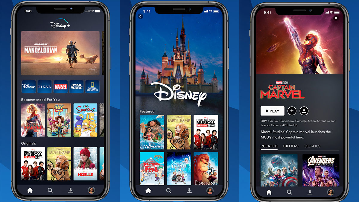
Disney’s wordmark is built on a proprietary custom script typeface derived from Walt Disney’s own stylized autograph. The closest publicly available version of that lettering…
The wrong font on a product label can cost you a sale before anyone reads a single word. Label typography determines whether your product reads…
Your thumbnail gets roughly half a second of attention before a viewer scrolls past. The font on it either stops them or doesn’t. Choosing the…
Your resume has roughly six seconds to make an impression. The font you pick decides whether those six seconds work for you or against you.…
The wrong font can kill a poster before anyone reads a single word. Choosing the best fonts for posters is not about personal taste. It’s…
The typeface you choose tells people something before they read a single word. Finding the best fonts for graphic design is not about picking what…
Your email signature is the last thing people read. The font you use there either reinforces your professionalism or quietly undermines it. Most people spend…
Overwatch uses Big Noodle Too as its primary in-game UI typeface, a condensed geometric sans-serif font designed by James Arboghast and published under Sentinel Type.…
Reddit uses IBM Plex Sans, a grotesque sans-serif font designed by Mike Abbink at IBM in collaboration with Bold Monday, an independent Dutch type foundry.…
The wrong typeface can make a well-designed brochure look cheap. The right one does the opposite. Choosing the best fonts for brochures comes down to…
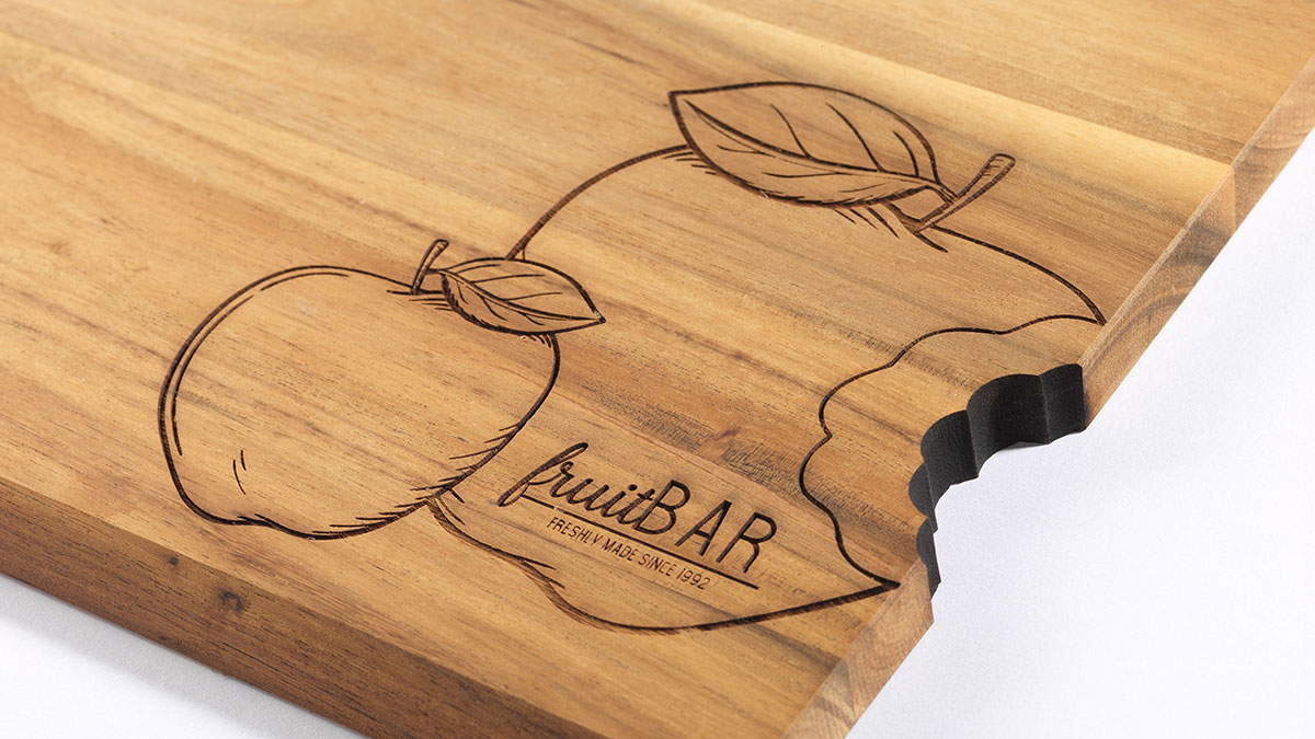
The wrong font can ruin an engraving job before the laser even fires. Choosing the best fonts for engraving is not a purely aesthetic decision.…
Minecraft uses Mojangles (also called Minecraft Seven) as its primary in-game font, a proprietary bitmap typeface created originally by Markus Persson (Notch) and later maintained…
Fortnite uses Burbank Big Condensed Black for its logo, a condensed sans-serif typeface designed by Tal Leming and published by House Industries in 2006. Epic…
The font you’re reading right now is either helping your brain or working against it. For people with ADHD, font choice directly affects reading speed,…
The wrong font at small sizes doesn’t just look bad. It makes text physically harder to read. Choosing the best fonts for small text comes…
Slack uses Lato as its primary UI font across the desktop and mobile app, a humanist sans-serif font designed by Warsaw-based type designer Łukasz Dziedzic…
Amazon uses Amazon Ember, a humanist sans-serif font commissioned exclusively for the brand and designed by London-based type foundry Dalton Maag. Amazon Ember was designed…
Your design looks perfect on screen. But getting that same quality onto cardstock? That’s where most people mess up. Learning how to print business cards…
HTML color names aren’t just a handy tool; they are essential for anyone involved in web design or front-end development. Whether you’re diving into CSS…
In the grand tapestry of NFL history, few things are as instantly recognizable as the Dallas Cowboys colors. With their legendary blend of navy blue, silver, and white,…
Aqua and orange: two colors that spark excitement and passion among Miami Dolphins fans. From the glorious days at Hard Rock Stadium to present-day NFL showdowns, the Miami Dolphins colors have…
The iconic Detroit Lions colors-Honolulu blue and silver-are more than shades; they are a signal of pride, history, and the heartbeat of a city. Each hue carries…
The unmistakable Kansas City Chiefs colors-a vibrant red and striking gold-aren’t just hues; they’re the heartbeat of a legacy that pulsates through every match at Arrowhead…
Imagine flipping through the pages of your favorite childhood memories and stumbling upon the unmistakable aesthetic of the Barbie logo. That enchanting, instantly recognizable style sparks…