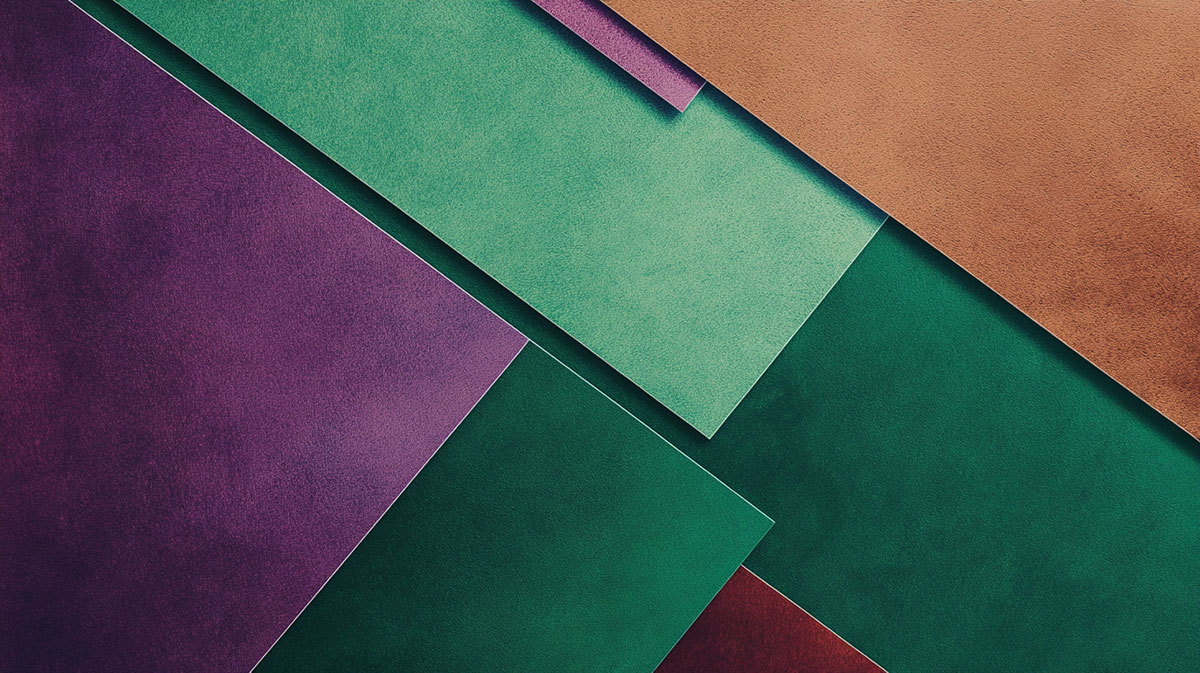
Mix orange and purple on a palette and you rarely get what you expected. You get mud.
So what color do orange and purple make? The short answer is brown, usually a warm reddish-brown that leans russet.
The reason sits in basic color theory. Orange carries red and yellow, purple carries red and blue, and once all three primaries land together they neutralize toward brown.
This guide breaks down exactly what happens, and why the result shifts depending on your medium.
By the end you will know:
- The exact shade different ratios produce
- How paint, light, and RGB values each change the outcome
- Hex and CMYK codes for the blend
- How to use the pair without turning everything muddy
What Color Do Orange and Purple Make

Orange and purple make brown, usually a warm reddish-brown that leans russet.
The blend counts as a tertiary color, since you are combining two secondary colors. The exact shade moves around based on your ratio and your medium.
Paint, light, and screen pixels each give a slightly different answer. That surprises people the first time they notice it.
Quick version by medium:
| Medium | Mixing type | Result |
|---|---|---|
| Paint / pigment | Subtractive | Muted reddish-brown |
| Light / stage | Additive | Pale pink to off-white |
| Screen (RGB average) | Digital | Muted salmon-brown |
Most of the time when someone asks this question, they mean paint. So brown is the short, honest answer.
Why Orange and Purple Make Brown
Orange and purple make brown because the two colors together pull all three primaries into the mix. Orange is red plus yellow. Purple is red plus blue.
Combine them and you get red, yellow, and blue sitting in the same puddle. All three primaries together always trend toward brown or gray.
The three primaries at play:
This is basic color theory. Anytime a mix contains a bit of everything, saturation drops and the color muddies toward neutral.
The Role of Red as the Shared Primary
Red is the tiebreaker. It appears in both orange and purple, so it never gets canceled out.
That double dose of red pushes the brown warm instead of gray. You land closer to maroon or russet than to a flat mud.
What Shade of Brown Do Orange and Purple Make

The shade depends entirely on your ratio. More orange gives a warm, earthy brown. More purple gives a cooler, dusky brown. Equal parts land near a neutral chestnut.
Adjusting hue balance is the whole game here.
| Ratio | Result | Reads as |
|---|---|---|
| More orange | Warm russet | Earthy, terracotta |
| Equal parts | Neutral chestnut | Balanced brown |
| More purple | Cool plum-brown | Dusky, grayed |
| Plus white | Dusty taupe | Soft, muted |
Add white and the whole thing lifts toward a dusty rose or soft taupe. Good to know if you want the muted version without buying a separate tube.
More Orange Than Purple
Warm and earthy. Weight the mix toward orange and the brown gets sunbaked.
You end up near burnt sienna or a soft terracotta. This is the range landscape painters reach for on skin tones and clay rooftops.
More Purple Than Orange
Tip it the other way and the brown cools right down.
- Grayer, dustier, less sunlight in it
- Drifts toward an eggplant-brown or soft mauve
- Useful for shadows and moody backgrounds
Key point: purple carries the blue, so a purple-heavy mix always feels cooler on the palette.
How Orange and Purple Mix in Paint
In paint, orange and purple mix subtractively, so the combined pigments absorb more light and darken toward brown. This is the predictable, real-world result most people expect.
Physical pigment behaves differently from light. Every layer you add takes brightness away rather than adding it.
Common pigment pairings:
- Cadmium orange plus dioxazine purple gives a deep, rich brown
- Watercolor stays more transparent and dusty
- Acrylic and oil hold heavier, denser browns
Honestly, this pair is a shortcut a lot of painters use to mix natural browns without touching black. Black tends to deaden a mix. Orange and purple keep it alive.
How Orange and Purple Combine in Light (RGB)

In light, orange and purple combine additively, so the wavelengths stack and the result brightens instead of darkening. Mixed beams trend toward a pale pink or near-white, nothing like the paint version.
Screens and stage lighting follow this rule. It trips people up constantly.
Starting values in RGB:
- Orange sits at 255, 165, 0
- Purple sits at 128, 0, 128
Average those channels and you get a muted salmon, roughly 192, 82, 64. Two orange and purple stage lights crossing on a wall lean warm and washed-out, not brown.
Orange and Purple Hex and CMYK Values
Standard orange is #FFA500 and standard purple is #800080. The midpoint blend lands near #BF5240, a warm reddish-brown. Averaging hex codes is not the same as physically mixing pigment, so treat these as digital approximations.
Designers need the codes to reproduce the blend exactly across screen and print.
| Color | Hex | RGB |
|---|---|---|
| Orange | #FFA500 | 255, 165, 0 |
| Purple | #800080 | 128, 0, 128 |
| Blend | #BF5240 | 192, 82, 64 |
For print, that blend converts to a CMYK build heavy on magenta and yellow with a touch of black. If color accuracy matters on a physical job, match it to a Pantone reference before you run it.
Watch out: the on-screen hex average will look brighter than the printed result. Proof it first.
Are Orange and Purple Complementary Colors
Orange and purple are not true complements. Orange’s real complement is blue, and purple’s is yellow. They sit as neighbors on the wheel, close but not opposite, which is exactly why the mix mutes instead of clashing.
The relationship still matters for how the blend behaves.
| Pair | Wheel position | Behavior when mixed |
|---|---|---|
| Orange + blue | True complements | Neutralize to gray-brown |
| Purple + yellow | True complements | Neutralize to gray-brown |
| Orange + purple | Split neighbors | Muted warm brown |
Because they only partially oppose each other on the color wheel, their partial overlap dulls the result without fully canceling it. If you want the sharp, high-contrast tension of a real complementary scheme, pair orange with blue instead and skip the blending altogether.
How to Keep Orange and Purple From Turning Muddy
Keep orange and purple from turning muddy by not blending them directly. Set them side by side for contrast, glaze one over the other in thin layers, and balance value before they ever touch. Direct mixing is what creates the brown.
Muddy brown is only a problem when you did not want it. If you are pairing the two colors in a design, you usually want them to stay separate and loud.
Four ways to protect the color:
- Place, do not mix: butt them against each other for high contrast
- Glaze in layers: thin transparent passes instead of one stirred puddle
- Match value first: line up lightness so neither one muddies the other
- Buffer with neutral: a strip of white or gray between them holds the edge
Dropping the saturation on one color before you combine them also helps. A softened orange next to a full purple reads cleaner than two colors screaming at each other.
| Goal | Method | Outcome |
|---|---|---|
| Loud contrast | Side by side | Both stay vivid |
| Depth | Layered glaze | Rich, not muddy |
| Soft blend | Lower saturation | Clean transition |
Nothing kills a bright orange faster than overworking it into purple on the palette. Mix once, then stop.
Where Orange and Purple Combinations Appear
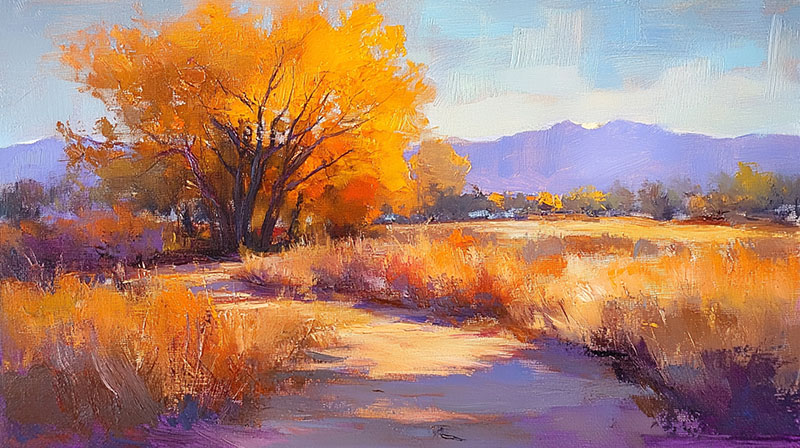
Orange and purple show up everywhere once you start looking. Sunsets run the two together, sports teams brand with them, and autumn and Halloween lean on the pair hard. Interiors and fashion use their muted brown offspring for warmth.
The combination reads bold and a little unexpected, which is exactly why brands reach for it.
| Context | How the pair is used |
|---|---|
| Sunsets | Natural orange-to-purple fade |
| Sports branding | High-energy team identity |
| Autumn / Halloween | Warm seasonal palettes |
| Interiors / fashion | Muted browns and taupes |
Sky gradients: a real sunset blends orange into purple as light scatters, and you can build the same effect with a gradient. Designers borrow it constantly. It never looks muddy in the sky because the colors sit next to each other, not stirred together.
Team identity: the Phoenix Suns built their whole look on purple and orange, and it is instantly recognizable on a court. Bold, warm, hard to confuse with anyone else.
Seasonal palettes are where the pair really earns its keep.
- Reach for a Halloween palette when you want spooky punch
- An autumn palette softens it toward burnt orange and plum
- A warm sunset palette gives you the gradient version
In homes and wardrobes, people rarely use the raw brights. They use the brown the two colors make. A dusty terracotta wall with a plum throw is orange and purple quietly doing their job.
FAQ on What Color Do Orange and Purple Make
What color do orange and purple make?
Orange and purple make brown, usually a warm reddish-brown that leans russet. The mix pulls red, yellow, and blue together, and all three primaries combined always neutralize toward brown.
Why does the mix turn brown instead of a bright color?
Because orange holds red and yellow while purple holds red and blue. Combine them and every primary is present, so saturation drops and the color settles into a muted brown.
What shade of brown do you get?
It depends on the ratio. More orange gives a warm russet or terracotta. More purple gives a cooler plum-brown. Equal parts land near a neutral chestnut.
Do orange and purple make brown in light too?
No. In light, mixing is additive, so orange and purple beams brighten toward pale pink or off-white. Brown only happens with paint and pigment, not with RGB light.
What is the hex code for the blend?
Averaging orange (#FFA500) and purple (#800080) gives roughly #BF5240, a warm reddish-brown. Digital averaging differs from real pigment mixing, so treat that hex as an approximation.
Are orange and purple complementary colors?
No. Orange’s true complement is blue, and purple’s is yellow. Orange and purple sit as neighbors on the wheel, which is why they mute rather than clash.
How do I mix brown without using black?
Blend orange and purple instead. This pair produces a natural, living brown, while black tends to deaden a mixture. Painters use cadmium orange and dioxazine purple for this.
Why did my mix turn muddy?
You probably overworked it. Stirring the two colors fully drives them straight to brown. Layer thin glazes or place them side by side to keep both vivid.
Can I make the brown lighter?
Add white. A touch lifts the reddish-brown toward a dusty rose or soft taupe. More white pushes it into a pale, muted mauve-gray range.
Where is the orange and purple pairing used?
Sunsets, sports branding like the Phoenix Suns, and autumn or Halloween palettes all use it. Interiors and fashion often rely on the muted brown the two colors create.
Conclusion
So what color do orange and purple make? A muted brown, warm and reddish, sitting somewhere between russet and chestnut.
The result traces back to the primaries. Both parents share red, and adding yellow and blue on top drags the whole mix toward a neutral tertiary tone.
Your medium changes the story. Pigment darkens into brown, while additive light drifts pale, and the on-screen hex average lands near a dusky salmon.
Ratio does the fine-tuning. Push orange for terracotta warmth, push purple for a cooler plum-brown, or add white for a soft taupe.
Use them side by side for bold contrast. Blend them thin when you actually want that rich, natural brown.

Renowned for his expertise in logo design and visual branding, Bogdan has developed a multitude of logos for various clients.
His skills extend to creating posters, vector illustrations, business cards, and brochures. Additionally, Bogdan's UI kits were featured on marketplaces like Visual Hierarchy and UI8.
He also wrote in the past years on sites like Design Your Way, WebDesignerDepot, WPDean, Designmodo, Speckyboy, Slider Revolution, and more.
- The Cursor Logo History, Colors, Font, And Meaning - 24 September 2026
- Top 7 Web Design Subscription Services That Replace Full-Time Hires - 24 September 2026
- Canva vs PowerPoint: Which Is Better for Presentations? - 22 September 2026

Bogdan Sandu is a seasoned designer who has been designing websites since 2008. Renowned for his expertise in logo design and visual branding, Bogdan has developed a multitude of logos for various clients. His skills extend to creating posters, vector illustrations, business cards, and brochures. Additionally, Bogdan's UI kits were featured on marketplaces like Visual Hierarchy and UI8. He also wrote in the past years on sites like Design Your Way, WebDesignerDepot, WPDean, Designmodo, Speckyboy, Slider Revolution, and more.
You Might Also Like