
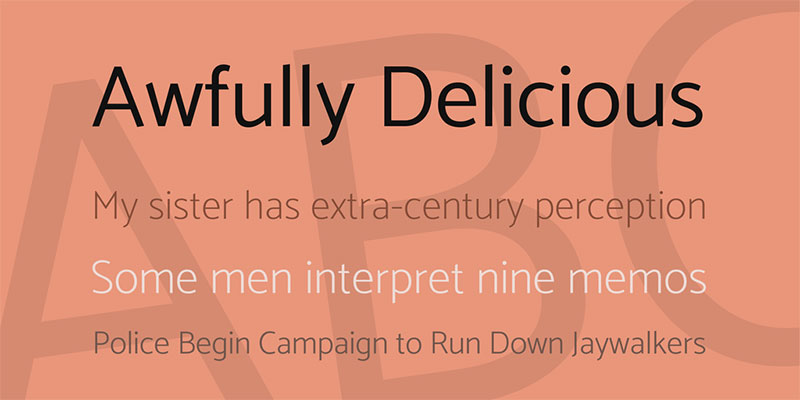
18 Montserrat Font Pairing Options To Use
Imagine unlocking the secret handshake of design – it’s called Montserrat font pairing, and it’s a game-changer. Your message doesn’t just whisper; it leaps off the screen and demands attention when Montserrat collides with its perfect partner.
Picture this: the clean, geometric lines of Montserrat holding hands with a class-act serif, or perhaps mingling with a sans-serif sibling for that modern-meets-minimalist vibe.
This isn’t just about aesthetics; it’s about crafting a visual symphony that guides your users, creating harmony out of chaos and elevating your brand’s voice to an opera of pixels and print.
By the curtain call of this article, you’ll morph from bystander to maestro, wielding typeface combinations like a magic wand.
In this typographic design article, we’ll take a direct dive into some show-stopping Montserrat font pairing examples. No filler, just the real deal—because your design toolkit deserves it.
Best Montserrat Font Pairing Options
| Montserrat Pairing | Serif or Sans-Serif | Style & Use-Case | Readability | Best Uses |
|---|---|---|---|---|
| Lora | Serif | Traditional, elegant; pairs well as body text with Montserrat headings | High | Body text, Books, Long reads |
| Merriweather | Serif | Highly readable; good for long-form content | Very High | Editorial, Websites |
| Work Sans | Sans-Serif | Modern and versatile; similar x-height to Montserrat | High | UI, Displays |
| Tinos | Serif | Classic, formal; good alternative to Times New Roman | High | Office Documents, Articles |
| Sacramento | Script | Casual, hand-written; for accent text | Medium | Invitations, Headings |
| Muli | Sans-Serif | Clean, minimalist; often used for paragraphs | High | Web design, Body text |
| Open Sans | Sans-Serif | Friendly and legible; complements Montserrat in readability | Very High | Web and Mobile Interfaces |
| Baloo Font | Display | Quirky, fun; best for catchy headers or callouts | Low | Display, Children’s content |
| Oswald | Sans-Serif | Modern, condensed; suitable for headings and capitals | Medium to High | Headlines, Posters |
| Georgia | Serif | Classic web font; pairs nicely with modern Montserrat | Very High | eBooks, Editorial Content |
| Cardo | Serif | Academic, old-style; suited for formal texts | High | Historical documents, Essays |
| Roboto | Sans-Serif | Neutral, modern; highly legible for body text | Very High | Android OS, Web Design |
| Fira Sans | Sans-Serif | Clean and open; designed for legibility | High | Digital text, User interfaces |
| Ubuntu | Sans-Serif | Geometric, friendly; for a contemporary feel | High | Tech-oriented content, Branding |
| Playfair Display | Serif | Stylish, with a high contrast design; for display use | Medium | Headings, Luxury products |
| Libre Baskerville | Serif | Optimized for body text; based on Baskerville | High | Digital publishing, eBooks |
| Maiola | Serif | Distinct, calligraphy-inspired; for a unique pairing | High | Decorative uses, Print |
Catamaran
Check out Catamaran—simple, yet it packs some cool, unique touches. Its clear-cut profile makes it super versatile, fitting snug into all sorts of designs.
Team it up with a slender type like Montserrat and you’ve got yourself a visual power couple, spot-on for modern web design and responsive typography.
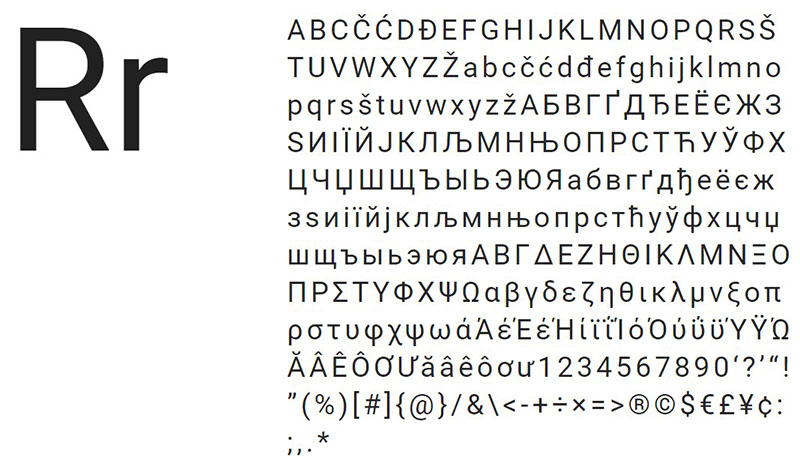
Lora
Lora’s a contemporary serif with calligraphy cred, nailing it as a headline honcho or a body text buddy. Its brushed curves?
They dial up the difference, steering clear of run-of-the-mill serifs. Fuse it with Montserrat, toss in some pink hues, and bam—a chic, feminine website ensemble emerges.
Merriweather
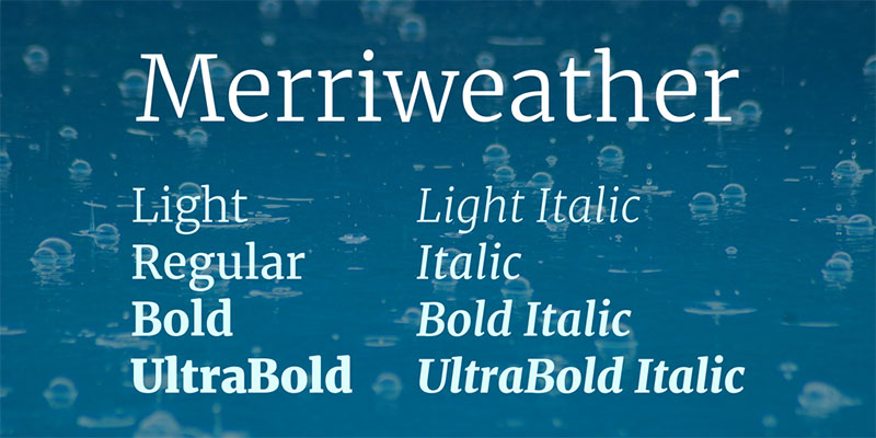
Merriweather mixes tradition and trend, striking that sweet balance.
It’s a no-fuss font that gels with Montserrat for on-screen readability and a semi-condensed style, perfect for smaller sizes. A classic pick for body text and upping your typography toolkit’s game on the digital landscape.
Work Sans
Every designer digs some groovy old-school vibes. Work Sans, drawing from vintage grotesque, is all about flexible sizing—that’s huge for screens tiny to large. Whether in print or on pixels, it’s practicality plus versatility equals top-notch Montserrat font pairings for bold statements.
Tinos
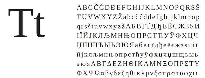
Designed by Steve Matteson, Tinos spins that refreshing font flavor—with a nod to Times New Roman. Supreme on-screen readability and stellar language support make it a solid sideman for Montserrat in diverse projects. Seriously, give this duo a whirl.
Sacramento
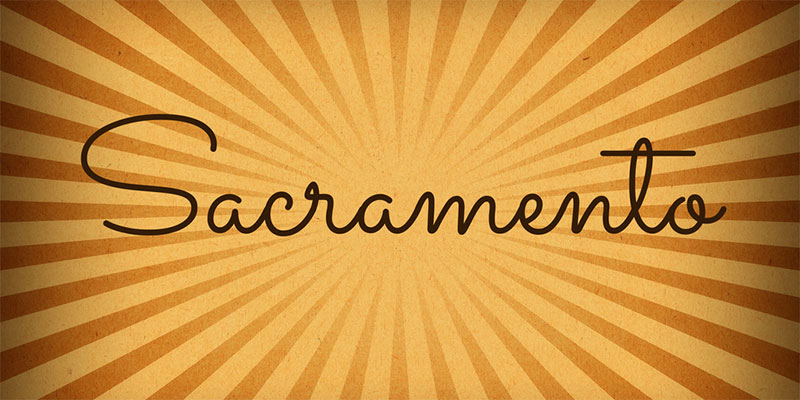
Ever daydream about ’60s brochure vibes? Sacramento’s your jam—part vintage, part classic, all charisma. This font is a head-turning headliner, adding a formal yet chill factor to whatever you’re crafting. A title heavy-hitter, no doubt.
Muli
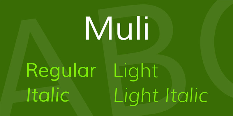
Minimalist, neat, and, oh boy, does Muli shine as a display font. It doubles down beautifully as body text, too. Free to use, flexible as can be—it’s the sans-serif choice for a no-cost path to typographic bliss alongside Montserrat.
Open Sans
Another Steve Matteson masterpiece, Open Sans tops Google fonts‘ popularity charts. Boasting an eye-pleasing neutrality and a friendly vibe, it crosses languages with grace. It’s like the friendly neighbor everyone loves—especially when hanging out next to Montserrat.
Baloo Font
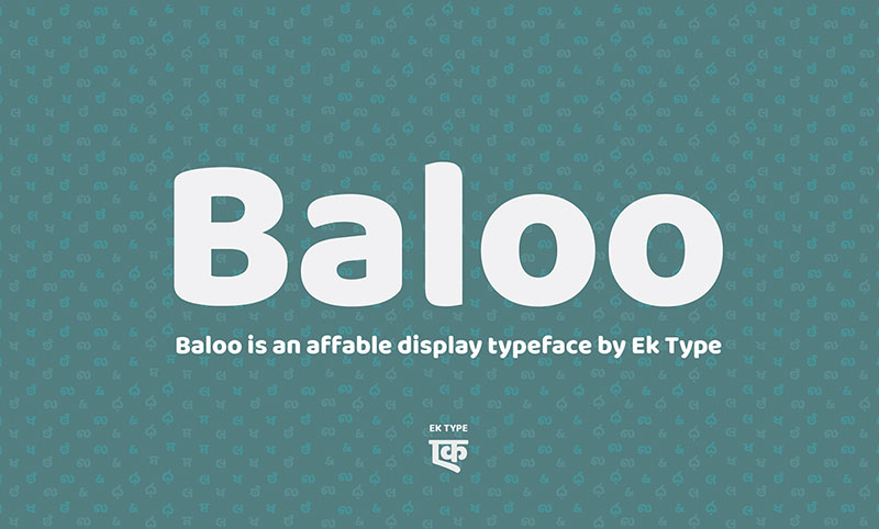
Baloo’s that easy-going pal with hidden depths—playful yet earnest. It delivers unassuming charm when it rubs elbows with the no-nonsense appeal of Montserrat. Proof that mixing light-hearted with serious can work like a charm across various platforms.
Oswald
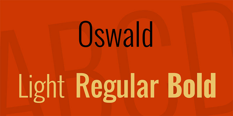
Meet Oswald, refashioning those old gothic styles into a brand-new avatar. Dialed in for digital screens and pixel perfection, it’s the kind of modernist that Montserrat would high-five. Together, they’d command any web user interface, ticking all boxes for style and functionality.
Georgia
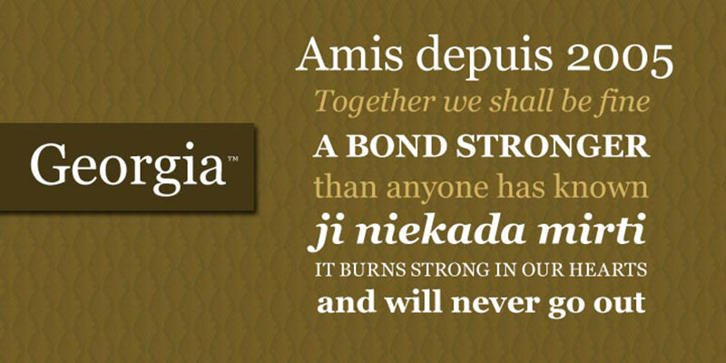
Georgia is the epitome of clean-cut professionalism. It prioritizes content clarity—or as I like to put it, it gets straight to the point. Married with Montserrat, Georgia brings a readable and refined edge that suits a plethora of projects to a T.
Cardo
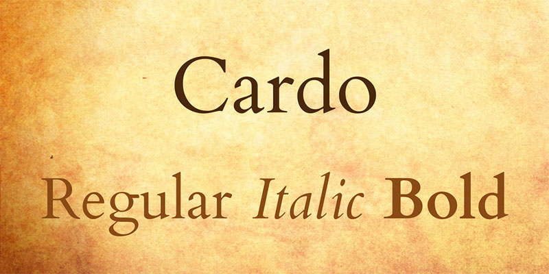
Cardo’s your old soul, echoing medieval scripts and scholarly charms. Its quality and language inclusivity make it a dang fine partner for Montserrat. Need that old-style, high-quality font flirting on your page? This pair’s done deal.
Roboto
Roboto’s a dual-character dynamo—formal meets fun meets function. It’s got a rhythm to its form that’s just naturally inviting. Teamed with Montserrat, it promises a seamless mix of efficiency and warmth.
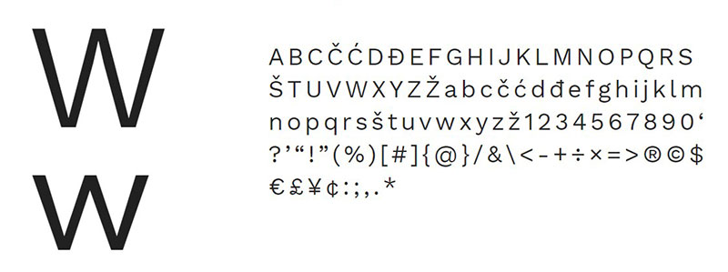
Fira Sans
Birthed for Mozilla Firefox, Fira Sans has spread its wings far and wide. An adaptable font through and through, it plays nicely with any screen size and holds three width styles up its sleeve for added flexibility.
Ubuntu

Ubuntu is custom-made for its namesake OS—a sharp, precision-engineered font. It won’t miss a beat when matched with Montserrat, strutting a compelling UX where users feel right at home.
Playfair Display
Playfair Display transports you to an era when print was blossoming. It carries that niche, vintage vibe but stays relevant, making it an excellent fit for grounding Montserrat’s contemporary crispness with a touch of the past.
Libre Baskerville
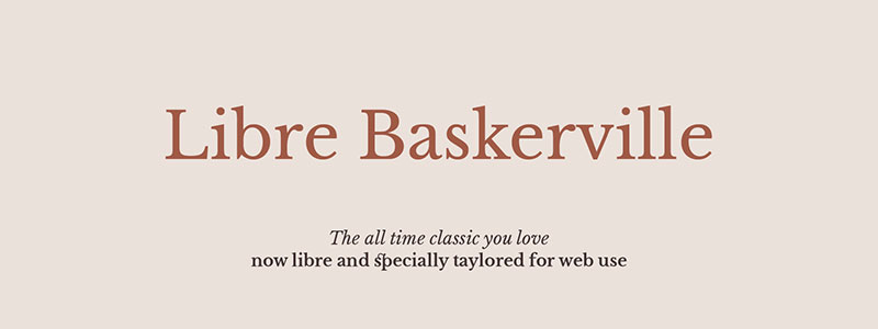
Here’s Libre Baskerville, all about serious performance. It’s one of those understated serifs that complements Montserrat’s modern flavor, ready for collaboration in sophisticated digital layouts.
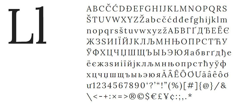
Maiola
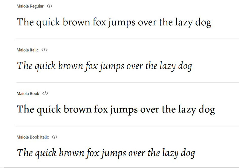
Finally, we’ve got Maiola, dressing up serif with a hint of calligraphy chic. It’s ready to work wonders alongside Montserrat, adding a handcrafted touch to your typographic tales.
FAQ about Montserrat font pairing
What Makes Montserrat a Good Font for Pairing?
It’s all about versatility. Montserrat, with its modern geometric design, fits like a glove with a myriad of other typefaces. It’s crisp, it’s clear, and it adapts. Pair it with a punchy serif for contrast or go all-in on minimalism with a simpler sans-serif counterpart.
How Can I Find the Best Font to Pair with Montserrat?
Dive into the world of typography design. Play matchmaker by balancing visuals and readability. There’s a bunch of font pairing tools out there; they’re your best pals. Check out user interface design examples for inspiration—see what’s ticking.
Are There Any Go-To Fonts That Work Well with Montserrat?
Sure thing. Think about a timeless serif like Georgia for body text, seamlessly complementing Montserrat’s modern vibe. On the sans-serif side of the street, fonts like Roboto or Lato can add a touch of subtlety—and they’re Google Fonts pals, so easily accessible, too.
Can Montserrat Be Used for Both Headings and Body Text?
Absolutely. You’re looking for that visual hierarchy in design, right? Montserrat shines in headings with its bold weights, making them pop. For body text, its lighter weights maintain legibility. The key is maintaining a comfy reading experience for the audience.
What Should I Consider When Pairing Fonts with Montserrat for Web Design?
Stick to the holy grail—readability and user experience. Choose a partner font that complements Montserrat’s geometric simplicity. Remember, screen legibility is key, so test your pairings on various devices. Oh, and make sure your web typeface harmony translates well across different browsers.
Can Montserrat Font Pairings Work for Print Design as Well?
They sure can. When you transfer from pixels to paper, keep visual flow in mind. Pair Montserrat with a font that ensures print legibility. This ain’t just a digital design font selection thing—Montserrat is versatile enough for your brochures, business cards, you name it.
How Do Montserrat Font Pairings Affect Brand Identity?
Font pairings are like the secret ingredients to your brand’s personality recipe. Montserrat resembles modern, approachable vibes. Choose a secondary font that reflects and reinforces your branding message. Typography’s not just seen—it’s felt, it tells your brand story.
Is It Crucial to Use a Sans-serif Font Like Montserrat for Digital Platforms?
While not an absolute must, it’s a best practice for sure. Sans-serif fonts, Montserrat included, cater to digital platforms with their clean lines and legibility. They’re also great for responsive typography, meaning they adapt well to different screen sizes, a massive win for UI/UX design.
What Are Some Common Mistakes in Montserrat Font Pairing?
Overcomplicating, that’s a major faux pas. Steer clear of pairing Montserrat with fonts that clash or compete. Keep your elements like weight, size, and spacing in check. Each font in your pairing should have a clear role—don’t let ’em fight for the spotlight.
Where Can I Look for Montserrat Font Pairing Inspiration?
Behold the vast kingdom of the internet. Scalp through design blogs, portfolios, and Typography handbooks. Adobe Fonts and Google Fonts showcase galleries where Montserrat stars in various roles. Keep your eyes peeled and your mind open!
Ending thoughts
So, we’ve had our fun, danced around with all these Montserrat font pairing examples.
Our journey’s taken us through mixing and matching, like a visual DJ spinning tracks—or in our case, fonts. We stepped into the world of Montserrat, mingling with serifs and sans-serifs, creating something that’s both easy on the eyes and spot-on for grabbing attention.
Bottom line? It’s crucial—nail the pairing, and you’ve got yourself a design that resonates, tells a story, lets every word you plaster on your canvas shout with its own unique voice. Remember, this isn’t just type we’re tossing around; it’s the personality of your project, the vibe your brand breathes.
- Bask in the glory of a match well made; that’s the takeaway.
- Watch your Montserrat-led designs elevate.
- Keep your typography toolkit loaded with these killer combos.
And remember, the power of that perfect partnership? It’s gonna make your designs sing.
If you enjoyed reading this article about Montserrat font pairing you should read these as well:
Bogdan Sandu, a seasoned designer with 15 years of diverse experience, has been designing websites since 2008.
Renowned for his expertise in logo design and visual branding, Bogdan has developed a multitude of logos for various clients.
His skills extend to creating posters, vector illustrations, business cards, and brochures. Additionally, Bogdan's UI kits were featured on marketplaces like Visual Hierarchy and UI8.
Latest posts by Bogdan Sandu (see all)
- Nature Color Palettes Inspired by the Outdoors - 25 April 2024
- The Epic Games Logo History, Colors, Font, And Meaning - 24 April 2024
- Spread Joy: Happy Color Palettes for Uplifting Designs - 24 April 2024