


The badge has gone through several redesigns since that founding year. Each version pulled from the red and yellow colors of the city’s coat of arms, building a visual identity tied directly to the region. The current crest, redesigned in 2020 by Antoine Rigot, blends classic and modern elements. It’s been used across kits, merchandise, and digital platforms. The club has had roughly four main logo iterations over its nearly 40-year history.
What Is the Le Mans FC Logo?
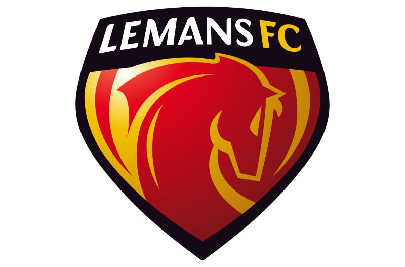
The Le Mans FC logo is a combination mark crest featuring a stylized shield in red and yellow, incorporating the club name, a football motif, and elements from the city of Le Mans’ coat of arms. It was redesigned in 2020 by Antoine Rigot as part of a broader rebranding effort.
Here’s a breakdown of the logo’s key attributes:
- Design Type: Combination mark (emblem with text and graphic elements)
- Primary Elements: City shield, stylized football, club name “Le Mans FC,” and vertical stripe patterning in red and yellow
- Official Introduction Date: The current version launched in 2020. The original badge dates back to the club’s 1985 founding.
- Designer: Antoine Rigot, a sports branding specialist
- Trademark Status: Registered as intellectual property of Le Mans Football Club (SASP)
- Color Palette: Red (#BE081A), Yellow (#F1C100), Black (#000000), and White (#FFFFFF)
- Usage Context: Football kits, official merchandise, the Stade Marie-Marvingt stadium branding, social media profiles, digital assets, and promotional materials
How Has the Le Mans FC Logo Evolved Over Time?

The Le Mans FC logo has changed at least four times since 1985, shifting from a basic geometric hexagon to a detailed, modern crest. Each redesign tracked the club’s growth, name changes, and position within French football’s league system.
Original MUC 72 Logo (1985-1995)
When Le Mans Union Club 72 formed from the USM-SOM merger, the first badge was straightforward. Almost spartan, really.
It featured a red and yellow hexagonal shape. That’s about it. The hexagon held the “MUC” initials and basic football imagery.
The red and yellow came straight from the Le Mans city coat of arms. The founders, led by president Roland Grandier, wanted the colors to root the new club in regional identity from day one.
There wasn’t much design sophistication here. The club was starting in Division 3 at Stade Leon-Bollee, and the badge reflected that scrappy, low-budget reality.
- Years Active: 1985-1995
- Design Description: Red and yellow hexagon with “MUC” lettering and simple football graphic
- Color Scheme: Red, yellow
- Designer: Unknown (likely produced in-house)
- Context: Created for the newly merged club entering Division 3
- Cultural Significance: Established the “Sang et Or” (Blood and Gold) identity that persists today
Updated MUC 72 Badge (1995-2010)
By the mid-1990s, the club needed something that could hold up next to Ligue 2 competitors. The hexagon stayed, but the number “72” got added. That number references the Sarthe department’s official code.
A football was placed more prominently inside the hexagonal frame. The vertical red and yellow stripes within the shape became more defined. It looked cleaner, more polished.
This was the badge the club wore during its best-ever period. Le Mans earned promotion to Ligue 1 in 2005 and stayed there until 2010, finishing ninth in the 2007-08 season under Rudi Garcia. That era remains the high-water mark.
- Years Active: 1995-2010
- Design Description: Refined hexagon with “72” added, clearer vertical striping, and a more prominent football element
- Color Scheme: Red, yellow, white, black accents
- Key Changes from Previous: Addition of “72,” sharper line work, improved balance in the composition
- Context: Coincided with the club’s rise through Division 2 and into Ligue 1
- Cultural Significance: Became the most recognized version among long-time supporters
Le Mans FC Transition Logo (2010-2020)
On December 2, 2009, the club dropped “Union Club 72” from its name and became Le Mans FC. A new badge followed.
This version moved away from the hexagonal frame. The design adopted a more rounded, shield-like shape. It kept the red and yellow but introduced a fresher layout.
The club also moved into the newly built MMArena (now Stade Marie-Marvingt) in January 2011. So the rebranding covered everything: name, stadium, and visual identity all at once.
But this era also brought pain. Financial problems led to the club’s liquidation in June 2013. Le Mans dropped to the amateur Division d’Honneur and had to rebuild from scratch. The logo, though, survived that collapse. It stayed through the remarkable climb back up, four promotions in five years, all the way to Ligue 2 by 2019.
- Years Active: 2010-2020
- Design Description: Shield-based crest, “Le Mans FC” lettering, integrated city emblem
- Color Scheme: Red, yellow, black, white
- Key Changes from Previous: Dropped the hexagonal frame, removed “72,” adopted shield format
- Context: Part of a full club rebrand including a new name and stadium
- Cultural Significance: Witnessed both the club’s darkest period and its gritty comeback
Current Le Mans FC Logo (2020-Present)
The 2020 redesign by Antoine Rigot was the biggest visual overhaul yet. Rigot, known for his work in sports branding, aimed to create something that respected the club’s past while looking right on a phone screen.
The current crest keeps the red and yellow. It integrates the city shield and a stylized football. But everything is tighter, more refined. The typography is sharper. The overall shape works well at small sizes, which matters a lot for social media and app icons.
In June 2025, the club also unveiled a special 40th-anniversary version of this logo, using elements from both the old MUC 72 hexagon and the current design to form the number “40.”
- Years Active: 2020-present
- Design Description: Modern crest with refined shield shape, city elements, stylized football, clean lettering
- Color Scheme: Red (#BE081A), Yellow (#F1C100), Black (#000000), White (#FFFFFF)
- Designer: Antoine Rigot
- Key Changes from Previous: More polished details, improved digital scalability, tighter line work
- Context: Part of a rebranding to refresh the club’s image after returning to professional football
- Cultural Significance: Represents the club’s ambitions as a modern, forward-looking team
What Do the Design Elements of the Le Mans FC Logo Mean?
Every piece of the Le Mans FC crest carries meaning. The city shield connects the club to Le Mans itself. The football motif signals the sport, obviously. And the red and yellow vertical stripes echo the traditional “Sang et Or” kits the team has worn since 1985.
The overall structure uses a focal point centered on the club name, drawing the eye to “Le Mans FC” before anything else.
Why Did Le Mans FC Choose These Specific Colors?

Red and yellow weren’t a random pick. They come directly from the coat of arms of the city of Le Mans.
When the club formed in 1985, the founders chose these colors to ground the team in local identity. Supporters call the team “Les Sang et Or,” which translates to “The Blood and Golds.” That nickname has stuck for four decades.
Here’s what each color brings to the badge:
- Red (#BE081A): Pantone PMS 3517 C. Represents energy, determination, and competitive spirit. Red is the dominant color on home kits and carries the heaviest psychological weight in the palette.
- Yellow (#F1C100): Pantone PMS 7406 C. Stands for optimism and brightness. It balances the intensity of the red, adding warmth without softening the overall look.
- Black (#000000): Pantone PMS Process Black C. Used for outlines, text, and structural elements. Gives the crest definition and authority.
- White (#FFFFFF): Background and spacing color. Keeps the design clean and readable at any size.
What Typography Style Is Used in the Le Mans FC Logo?
The current logo uses a custom sans-serif typeface. It’s bold, clean, and built for legibility across sizes.
Earlier versions of the badge used more standard lettering. The MUC 72 era had basic block letters. Nothing particularly designed about them.
Rigot’s 2020 redesign introduced a custom font that matches the crest’s angular geometry. The letterforms sit well inside the shield shape, and the spacing between characters feels deliberate, not default.
The 40th-anniversary logo revealed in 2025 kept this same type style for consistency.
What Are the Hidden Meanings in the Le Mans FC Logo?
Look, there’s no Da Vinci Code situation here. But there are a few intentional touches worth noting.
The vertical striping inside the crest mirrors the classic home kit design. Those stripes have been part of Le Mans kits since the 1985 merger. So the logo and the jersey visually echo each other.
The city shield references Le Mans’ medieval heritage. It’s a nod to the broader cultural identity of the Sarthe region, not just the football club. And the way the “72” appeared in earlier versions was a quiet geographic marker, tying the club to its departmental code.
The 2025 anniversary badge actually played on these references pretty cleverly, using the old hexagonal shape for the “4” and the newer rounded form for the “0” to literally merge past and present.
How Does the Le Mans FC Logo Compare to Competitor Logos?
Among French second-tier clubs, Le Mans FC’s badge stands apart mostly because of its color combination. Red and yellow together aren’t common in Ligue 2. Most competitors lean toward blue, white, red, or green palettes.
The Troyes badge, for instance, uses blue and white. Metz goes with maroon and white. Auxerre runs blue and white too.
Where Le Mans looks similar to some competitors is in the overall structure. Most Ligue 2 clubs use shield or circular crests with city elements. Lorient, Amiens, and Bastia all follow that pattern.
But the “Sang et Or” color pairing gives Le Mans a distinct visual contrast that few French clubs can match. It’s genuinely easy to pick out of a lineup, which is kind of the whole point of branding.
What Are the Technical Specifications of the Le Mans FC Logo?
Official Color Codes
- Primary Color (Red): Hex: #BE081A | RGB: (190, 8, 26) | CMYK: (17, 100, 100, 8) | Pantone: PMS 3517 C
- Secondary Color (Yellow): Hex: #F1C100 | RGB: (241, 193, 0) | CMYK: (6, 23, 100, 0) | Pantone: PMS 7406 C
- Accent Color (Black): Hex: #000000 | RGB: (0, 0, 0) | CMYK: (70, 50, 50, 100) | Pantone: PMS Process Black C
- Background Color (White): Hex: #FFFFFF | RGB: (255, 255, 255) | CMYK: (0, 0, 0, 0)
Dimensions and Proportions
The crest follows a roughly vertical rectangular aspect ratio, slightly taller than wide. Exact proportions aren’t publicly documented in a brand guidelines document that’s been shared externally.
For digital use, the logo is distributed as vector files (SVG format), which means it scales without losing quality. That’s standard practice for any club operating at the professional level.
Clear space rules likely follow typical sports branding conventions: maintain a buffer zone around the crest equal to roughly the height of the lettering, so nothing crowds the mark.
What Cultural Impact Has the Le Mans FC Logo Had?
The Le Mans FC badge carries weight mostly within its own community. It’s not a globally recognized mark like the Paris Saint-Germain logo or even a widely known Ligue 1 emblem. But in the Sarthe region, it’s significant.
When the club was liquidated in 2013, the logo became a rallying symbol. Supporters didn’t abandon it. They wore the badge through years of amateur-level football, waiting for the climb back.
The club’s 2019 return to Ligue 2 turned the crest into proof of something. That comeback, four promotions in five years, gave the logo a resilience narrative that goes beyond design.
And then in August 2025, tennis champion Novak Djokovic became a co-owner through the OutField consortium. Formula 1 drivers Felipe Massa and Kevin Magnussen joined that group too. That kind of international attention puts the badge in front of audiences who’d never have encountered it otherwise.
How Does the Le Mans FC Logo Fit Into the Overall Brand Identity?
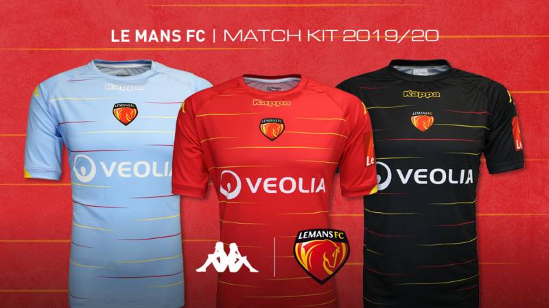
The logo sits at the center of everything Le Mans FC does visually. Kits, digital platforms, stadium signage at the Stade Marie-Marvingt, and all printed materials use the crest as the anchor point.
The red and yellow run through everything. Home jerseys have carried vertical “Sang et Or” stripes since 1985, and those stripes directly echo the logo’s internal patterning.
Kit manufacturers like Kappa (the current supplier) integrate the badge into jersey designs, warm-up gear, and fan merchandise. The consistency across all these applications reinforces brand recognition.
The club’s social media presence, website, and matchday programs all use the same color codes and crest placement. It’s a system that hangs together well, even for a club that spent years outside the professional game.
How Should the Le Mans FC Logo Be Used?
Like any professional football club’s mark, the Le Mans FC logo is a protected piece of intellectual property. You can’t just slap it on a t-shirt and sell it.
Official usage guidelines generally include:
- Do: Use the logo in its complete form with all elements intact. Maintain the correct color codes for both digital and print reproduction. Keep adequate clear space around the crest.
- Don’t: Stretch, rotate, or distort the logo. Change the colors without authorization. Place it on backgrounds that reduce legibility. Remove any part of the crest or modify the text.
Accessing official logo files: The club’s official website (lemansfc.fr) and authorized brand resource platforms provide download access. For commercial licensing inquiries, contacting the club’s administrative office at La Pincenardiere in Mulsanne is the standard route.
Trademark protection: The Le Mans FC logo is legally protected under French intellectual property law. Unauthorized commercial use can result in legal action from the club’s SASP (professional sports company entity).
For editorial and informational use, crediting the club and linking to official sources is considered best practice, though specific editorial guidelines may vary.
FAQ on The Le Mans Logo
What does the Le Mans logo represent?
The Le Mans FC logo represents the football club’s identity, heritage, and connection to the city of Le Mans in the Sarthe department. The crest includes the city’s shield, a stylized football, and the club’s “Sang et Or” colors drawn from the local coat of arms.
What colors are used in the Le Mans FC badge?
Red (#BE081A) and yellow (#F1C100) are the primary colors. Black and white serve as supporting tones.
These warm color pairings reflect the club’s “Blood and Gold” nickname, a tradition dating back to the 1985 founding of Le Mans Union Club 72.
Who designed the current Le Mans logo?
Antoine Rigot designed the current version, launched in 2020. He’s a sports branding specialist who focused on making the emblem work across both physical merchandise and digital platforms while keeping the club’s historical roots intact.
How many times has the Le Mans emblem been redesigned?
Roughly four major versions exist. The original MUC 72 hexagon came in 1985, followed by a refined version around 1995, a shield-based crest in 2010, and the current Antoine Rigot design from 2020.
What is the meaning behind the number 72 in the old Le Mans logo?
The “72” referenced the Sarthe department’s official administrative code. It was a geographic marker tying the club to its home region. When the club renamed itself Le Mans FC in 2010, the number was dropped from the badge.
What font style does the Le Mans FC logo use?
The current crest uses a custom typeface with bold, angular letterforms. It’s a clean sans-serif style built for readability at small sizes, which matters for app icons and social media profiles.
How does the Le Mans logo compare to other Ligue 2 club badges?
Most Ligue 2 clubs use shield or circular crests with blue, white, or red palettes. Le Mans stands out because of its red and yellow combination. Few French football teams share that color scheme, which gives the badge strong recognition.
What happened to the Le Mans logo during the club’s liquidation?
When Le Mans FC was liquidated in June 2013, the club kept its name and visual identity. The logo survived the drop to Division d’Honneur and stayed through four consecutive promotions back to professional football by 2019.
Does Le Mans FC have a special anniversary logo?
Yes. In June 2025, the club unveiled a 40th-anniversary badge. It merged the old MUC 72 hexagonal shape into the number “4” and the current crest’s rounded form into the “0.” Dates marking 1985 and the Ligue 2 return were included.
Where can I download the official Le Mans FC logo?
The club’s official website at lemansfc.fr provides authorized assets. Brand resource platforms also host the logo in SVG and PNG formats.
For any commercial use, you’ll need to contact Le Mans FC’s administrative office directly, since the mark is trademark-protected under French law.
The Le Mans FC Logo History, Colors, Font, And Meaning.
Conclusion
The Le Mans logo tells the story of a club that’s been knocked down and got back up. From the original MUC 72 hexagon to Antoine Rigot’s 2020 redesign, every version of this endurance racing city’s football crest has carried the same red and yellow identity rooted in the Sarthe region.
Four decades of logo design choices reflect real chapters. Ligue 1 highs, liquidation, amateur football, and a gritty return to Ligue 2.
With new ownership from figures like Novak Djokovic and a 40th-anniversary badge already on display, the “Sang et Or” crest is entering its most visible era yet. The badge earned that attention.

Renowned for his expertise in logo design and visual branding, Bogdan has developed a multitude of logos for various clients.
His skills extend to creating posters, vector illustrations, business cards, and brochures. Additionally, Bogdan's UI kits were featured on marketplaces like Visual Hierarchy and UI8.
He also wrote in the past years on sites like Design Your Way, WebDesignerDepot, WPDean, Designmodo, Speckyboy, Slider Revolution, and more.
- Jujutsu Kaisen Font Generator - 12 October 2026
- The Windsurf Logo History, Colors, Font, And Meaning - 10 October 2026
- How to Remove Background From Product Photos (No Photoshop) - 10 October 2026

Bogdan Sandu is a seasoned designer who has been designing websites since 2008. Renowned for his expertise in logo design and visual branding, Bogdan has developed a multitude of logos for various clients. His skills extend to creating posters, vector illustrations, business cards, and brochures. Additionally, Bogdan's UI kits were featured on marketplaces like Visual Hierarchy and UI8. He also wrote in the past years on sites like Design Your Way, WebDesignerDepot, WPDean, Designmodo, Speckyboy, Slider Revolution, and more.
You Might Also Like


