The Pepsi logo stands as one of the most recognizable brand symbols in the beverage industry. This circular emblem, known as the Pepsi Globe, has gone through numerous transformations since the company’s founding in 1893.
PepsiCo currently uses a modernized version introduced in 2023. The design features the iconic red, white, and blue color scheme that has defined the brand for decades.
What makes this logo particularly interesting is its ability to stay relevant while maintaining core visual elements. The brand has cycled through approximately 12 major logo iterations. Each redesign reflected changing design trends and marketing strategies of its era.
What Is the Pepsi Logo?
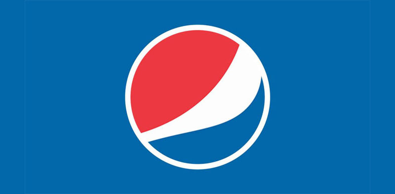
The Pepsi logo is a circular emblem featuring a red, white, and blue globe divided by a wavy white band. Introduced in its current form in 2023, this combination mark was redesigned by PepsiCo’s in-house team. The symbol represents energy, youthfulness, and American heritage.
Design Specifications
- Design Type: Combination mark (symbol plus wordmark)
- Primary Elements: Circular globe icon with tricolor scheme, custom wordmark
- Official Introduction Date: March 2023 (current version)
- Designer/Agency: PepsiCo in-house design team
- Trademark Status: Registered trademark of PepsiCo, Inc.
- Color Palette: Electric Blue (#005EEF), Pepsi Red (#EB0029), White (#FFFFFF), Black (#000000)
- Usage Context: Product packaging, digital platforms, advertising, merchandise, retail displays, corporate communications
How Has the Pepsi Logo Evolved Over Time?
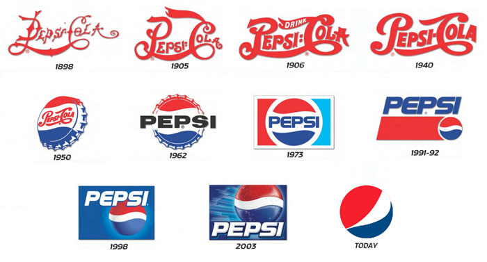
The Pepsi logo has undergone 12 major redesigns since 1898. Early versions featured ornate Victorian lettering.
The 1940s introduced the bottle cap design. The 1970s brought minimalist approaches.
The 2008 redesign sparked controversy with its tilted globe. The 2023 update returned to bolder, more confident styling.
Original Pepsi-Cola Logo (1898-1905)
- Years Active: 1898-1905
- Design Description: Red script lettering spelling “Pepsi-Cola” in an elaborate Victorian style
- Color Scheme: Red on white background
- Designer: Caleb Bradham (founder)
- Context: Created when the drink was renamed from “Brad’s Drink” to Pepsi-Cola
- Key Changes from Previous: First official logo design
- Cultural Significance: Established the brand’s initial visual identity during the patent medicine era
Refined Script Logo (1905-1940)
- Years Active: 1905-1940
- Design Description: More elaborate red script font with swirling flourishes
- Color Scheme: Deep red lettering
- Designer: Unknown
- Context: Reflected the ornamental design trends of the early 20th century
- Key Changes from Previous: Added decorative elements and refined letterforms
- Cultural Significance: Positioned Pepsi as a premium soda fountain drink
Bottle Cap Era Logo (1940-1950)
- Years Active: 1940-1950
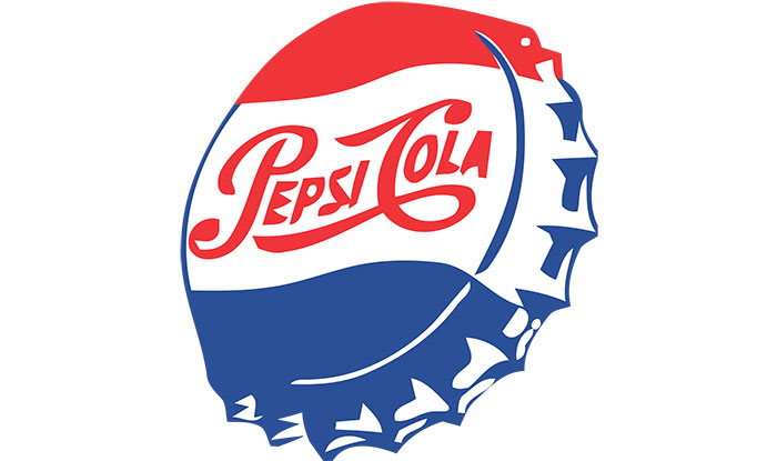
- Design Description: First appearance of the red, white, and blue color scheme in a bottle cap format
- Color Scheme: Red, white, and blue
- Designer: Unknown
- Context: Introduced during World War II to express patriotic sentiment
- Key Changes from Previous: Added blue color, created circular bottle cap shape
- Cultural Significance: Aligned the brand with American patriotism during wartime
Streamlined Globe Logo (1950-1962)
- Years Active: 1950-1962
- Design Description: Refined bottle cap design with cleaner lines and “Pepsi-Cola” script
- Color Scheme: Red, white, blue
- Designer: Unknown
- Context: Post-war optimism and mid-century modern design influence
- Key Changes from Previous: Simplified forms, more readable typography
- Cultural Significance: Reflected America’s post-war prosperity and confidence
Pepsi Generation Logo (1962-1973)
- Years Active: 1962-1973
- Design Description: Simplified globe with “Pepsi” in a sans-serif font, dropping “Cola” from the name
- Color Scheme: Red, white, blue
- Designer: Unknown
- Context: Launched alongside the “Pepsi Generation” marketing campaign targeting youth
- Key Changes from Previous: Dropped “Cola” from the logo, modernized typography
- Cultural Significance: Marked Pepsi’s shift toward youth culture marketing
Globe Refinement Logo (1973-1991)
- Years Active: 1973-1991
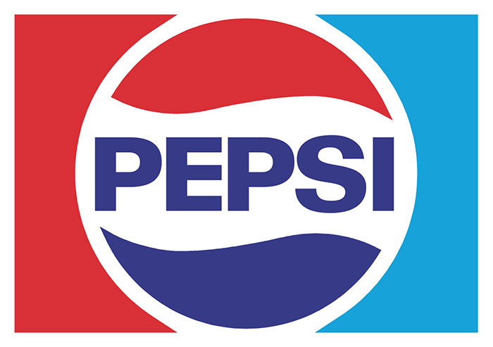
- Design Description: Boxed globe design with uppercase “PEPSI” lettering
- Color Scheme: Red, white, blue with bolder tones
- Designer: Landor Associates
- Context: Corporate identity standardization era
- Key Changes from Previous: Introduced rectangular framing, uppercase letters
- Cultural Significance: Represented corporate professionalism and brand consistency
Circular Globe Logo (1991-1998)
- Years Active: 1991-1998
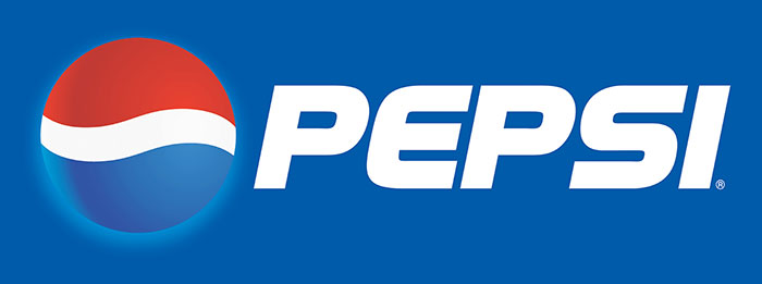
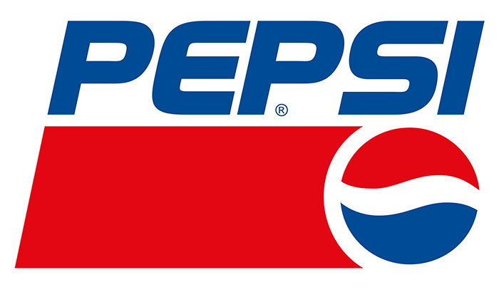
- Design Description: Three-dimensional globe effect with italicized “PEPSI” wordmark
- Color Scheme: Red, white, blue with dimensional shading
- Designer: Landor Associates
- Context: Digital age influence, 3D graphics becoming popular
- Key Changes from Previous: Added depth and dimension, italicized text
- Cultural Significance: Reflected the emerging digital aesthetic of the 1990s
Millennium Globe Logo (1998-2008)
- Years Active: 1998-2008
- Design Description: Glossy 3D globe with lowercase “pepsi” in a rounded font
- Color Scheme: Brighter red, white, blue with gradient effects
- Designer: Unknown
- Context: Y2K era design trends, web 2.0 influence
- Key Changes from Previous: Lowercase letters, increased glossiness, softer curves
- Cultural Significance: Embraced the optimistic, tech-forward spirit of the new millennium
Smile Globe Logo (2008-2023)
- Years Active: 2008-2023
- Design Description: Tilted globe with varying white stripe creating “smile” effects based on product line
- Color Scheme: Red, white, blue with flatter tones
- Designer: Arnell Group
- Context: Controversial $1 million redesign with extensive brand rationale document
- Key Changes from Previous: Tilted angle, variable white band width, removed wordmark from globe
- Cultural Significance: Became a case study in design industry debates about branding excess
Current Pepsi Logo (2023-Present)
- Years Active: 2023-Present
- Design Description: Bold globe with “PEPSI” wordmark integrated inside, stronger colors
- Color Scheme: Electric Blue (#005EEF), Pepsi Red (#EB0029), White, Black
- Designer: PepsiCo in-house team
- Context: 125th anniversary celebration, return to bolder branding
- Key Changes from Previous: Wordmark placed inside globe, bolder colors, removed tilt
- Cultural Significance: Represents brand confidence and heritage acknowledgment
What Do the Design Elements of the Pepsi Logo Mean?
The Pepsi Globe carries layers of meaning in its simple form. The circular shape represents unity and wholeness.
The tricolor scheme evokes American identity. The wavy white band suggests motion and refreshment.
Together, these elements communicate energy, patriotism, and the effervescence of the product itself.
Why Did Pepsi Choose These Specific Colors?
The red color in the Pepsi logo represents energy, excitement, and passion. It stimulates appetite and creates urgency.
The blue shade communicates trust, reliability, and refreshment. It also connects to water and coolness.
White provides contrast and purity. Combined, these colors reference the American flag, tapping into patriotic sentiment.
Official Color Specifications
- Electric Blue: Hex #005EEF, Pantone 2175 C
- Pepsi Red: Hex #EB0029, Pantone 185 C
- White: Hex #FFFFFF
- Black: Hex #000000 (for wordmark)
What Typography Style Is Used in the Pepsi Logo?
The current Pepsi wordmark uses a custom typeface based on bold sans-serif forms. The letters are uppercase with strong geometric construction.
This typography choice projects confidence and modernity. Earlier versions used script and italicized fonts.
The shift to bold sans-serif reflects current design trends favoring clarity and digital readability.
What Are the Hidden Meanings in the Pepsi Logo?
The Arnell Group’s 2008 redesign document claimed the white band referenced the golden ratio, Earth’s magnetic field, and Renaissance art. Most designers found these connections exaggerated.
A more genuine interpretation sees the wavy white stripe as a smile. The circular form suggests continuity and global reach.
The tilted angles in previous versions implied forward motion. Really, the logo works because of its simplicity, not hidden complexity.
How Does the Pepsi Logo Compare to Competitor Logos?
Pepsi and Coca-Cola represent opposing design philosophies. Coca-Cola maintains its Spencerian script since the 1880s. Pepsi constantly reinvents.
This difference reflects their market positions. Coca-Cola sells tradition. Pepsi sells newness.
Among other fast food and beverage logos, Pepsi’s globe format stands unique. Most competitors use wordmarks or mascots instead.
Competitive Logo Analysis
- Coca-Cola: Script wordmark, red and white only, unchanged core design, heritage-focused
- Dr Pepper: Elliptical badge, burgundy and cream, period between “Dr” and “Pepper” removed in 1950s
- Mountain Dew: Jagged text with green accent, action sports positioning, owned by PepsiCo
- Sprite: Green text with burst graphic, simplicity focus, also PepsiCo competitor
- 7UP: Green and red with bubble motif, “uncola” positioning
Pepsi’s abstract globe gives it flexibility that wordmark-only logos lack. The symbol works without text at small sizes. Few beverage competitors have achieved this level of icon recognition.
What Are the Technical Specifications of the Pepsi Logo?
Official Color Codes
- Electric Blue (Primary): Hex #005EEF, RGB (0, 94, 239), CMYK (100, 61, 0, 6), Pantone 2175 C
- Pepsi Red (Primary): Hex #EB0029, RGB (235, 0, 41), CMYK (0, 100, 83, 8), Pantone 185 C
- White: Hex #FFFFFF, RGB (255, 255, 255), CMYK (0, 0, 0, 0)
- Black: Hex #000000, RGB (0, 0, 0), CMYK (0, 0, 0, 100)
Dimensions and Proportions
- Aspect Ratio: 1:1 for globe icon alone
- Minimum Size: 0.5 inches (12.7mm) for print, 50 pixels for digital
- Clear Space: Minimum clearance equal to the height of the “P” in PEPSI on all sides
- File Formats: Available in vector formats (AI, EPS, SVG) and raster formats (JPEG, PNG)
- Resolution Requirements: Minimum 300 DPI for print applications
What Cultural Impact Has the Pepsi Logo Had?
The Pepsi logo influenced design trends beyond beverages. Its 2008 redesign document became infamous in design circles. Some called it brilliant. Others called it absurd.
The logo appeared in countless pop culture moments. Michael Jackson, Britney Spears, and Beyonce all featured it prominently.
The globe shape is parodied and referenced globally. It represents American commercial culture worldwide.
How Does the Pepsi Logo Fit Into the Overall Brand Identity?

The logo anchors a broader visual system. Brand guidelines specify how it interacts with photography, packaging, and advertising.
PepsiCo maintains sub-brand logos for Diet Pepsi, Pepsi Zero Sugar, and regional variants. Each adapts the core globe with modifications.
The 2023 refresh unified these variants under a more consistent system. Color theory and visual hierarchy principles guide how elements combine across touchpoints.
How Should the Pepsi Logo Be Used?
Official Usage Guidelines
- Do: Maintain minimum clear space around the logo
- Do: Use official color values only
- Do: Scale proportionally without distortion
- Do: Place on solid backgrounds that provide sufficient contrast
- Don’t: Alter colors or add effects
- Don’t: Rotate, stretch, or modify proportions
- Don’t: Place on busy backgrounds that reduce legibility
- Don’t: Recreate or approximate the logo
Accessing Official Assets
PepsiCo provides brand assets through its corporate website for authorized partners. Media contacts can request logo files for editorial use. Unauthorized commercial use constitutes trademark infringement.
Trademark Protection
The Pepsi Globe and wordmark are registered trademarks of PepsiCo, Inc. Protection covers the logo design, color combination, and brand name. Infringement cases are actively pursued in global markets.
FAQ on The Pepsi Logo
What Does the Pepsi Logo Represent?
The Pepsi Globe represents energy, youth, and American heritage. The circular shape suggests unity and global reach.
Red conveys excitement. Blue signals refreshment and trust. The wavy white band implies motion and the fizz of carbonated beverages.
When Was the Pepsi Logo First Created?
Caleb Bradham created the first Pepsi-Cola logo in 1898 in New Bern, North Carolina. It featured red Victorian script lettering.
The iconic red, white, and blue color palette appeared later in 1940. That bottle cap design set the template for future versions.
Who Designed the Current Pepsi Logo?
PepsiCo’s in-house design team created the 2023 logo. Previous versions involved outside agencies.
The controversial 2008 version came from Arnell Group. Landor Associates handled the 1991 and 1973 redesigns. The brand rarely credits individual designers publicly.
Why Is the Pepsi Logo Red, White, and Blue?
Pepsi adopted patriotic colors during World War II to align with American sentiment. The color psychology works perfectly for beverages.
Red stimulates appetite. Blue suggests coolness. This combination differentiates Pepsi from Coca-Cola’s red-only approach.
How Many Times Has the Pepsi Logo Changed?
The Pepsi brand identity has gone through approximately 12 major redesigns since 1898. Some decades saw multiple updates.
The 1990s and 2000s brought frequent changes. The 2023 version marks the most recent logo evolution in the company’s history.
What Is the Pepsi Globe?
The Pepsi Globe is the circular icon at the center of the brand’s visual identity. It first appeared in rudimentary form during the 1940s.
The globe uses three colors divided by a wavy white stripe. It functions as a standalone symbol without the wordmark.
What Font Does Pepsi Use in Its Logo?
Pepsi uses a custom font designed specifically for the brand. The current version features bold, geometric sans-serif letterforms.
Earlier logos used script and italicized styles. The shift to uppercase letters reflects modern logo design principles favoring clarity.
Is There a Hidden Meaning in the Pepsi Logo?
Arnell Group’s 2008 design document claimed connections to the golden ratio, magnetic fields, and feng shui. Most designers dismissed these claims.
The simpler truth? The white stripe resembles a smile. The circle suggests wholeness. Nothing more complicated than that.
How Much Did the 2008 Pepsi Logo Redesign Cost?
Reports indicate PepsiCo paid Arnell Group around $1 million for the 2008 redesign. The project included extensive brand strategy documentation.
The cost sparked industry debate about branding value. Some called it excessive. Others defended comprehensive brand development work.
What Changed Between the Old and New Pepsi Logo?
The 2023 update placed the wordmark inside the globe. Colors became bolder and more saturated. The tilted angle from 2008 was removed.
Black was added as an accent color. The overall effect feels more confident than previous soft drink logo iterations.
Conclusion
The Pepsi logo tells the story of a brand that refuses to stand still. Twelve redesigns across 125 years show a company constantly chasing relevance.
Each version reflected its era. Victorian script gave way to patriotic bottle caps. Three-dimensional effects yielded to flat design.
The 2023 refresh brought back boldness. PepsiCo embraced its heritage while pushing forward.
Whether you prefer the classic globe or the modern update, one thing remains clear. The Pepsi visual identity continues shaping how we think about packaging design and corporate branding worldwide.

Renowned for his expertise in logo design and visual branding, Bogdan has developed a multitude of logos for various clients.
His skills extend to creating posters, vector illustrations, business cards, and brochures. Additionally, Bogdan's UI kits were featured on marketplaces like Visual Hierarchy and UI8.
He also wrote in the past years on sites like Design Your Way, WebDesignerDepot, WPDean, Designmodo, Speckyboy, Slider Revolution, and more.
- The Arc Browser Logo History, Colors, Font, And Meaning - 14 September 2026
- From Information to Persuasion: A Practical Framework for Strategic Presentation Design - 14 September 2026
- Canva vs Photoshop: When Does Each Make Sense? - 12 September 2026

Bogdan Sandu is a seasoned designer who has been designing websites since 2008. Renowned for his expertise in logo design and visual branding, Bogdan has developed a multitude of logos for various clients. His skills extend to creating posters, vector illustrations, business cards, and brochures. Additionally, Bogdan's UI kits were featured on marketplaces like Visual Hierarchy and UI8. He also wrote in the past years on sites like Design Your Way, WebDesignerDepot, WPDean, Designmodo, Speckyboy, Slider Revolution, and more.
You Might Also Like