


The Glasgow Rangers logo is one of the most recognized football emblems in Scotland and across Europe. It carries over 150 years of club history in a compact circular design that hasn’t dramatically changed since the late 1960s.
Rangers Football Club, founded in 1872 in Glasgow, actually uses two official crests. The lion rampant corporate badge and the RFC scroll monogram that appears on matchday kits. Both have become deeply tied to the identity of the club, its supporters, and Scottish football culture as a whole.
The current corporate crest was last updated in 2020. The scroll crest on kits has featured five stars since 2003. Between the two badges, Rangers have gone through roughly 12 distinct versions since the club’s founding. That’s a lot of history packed into a circle.
What Is the Glasgow Rangers Logo?
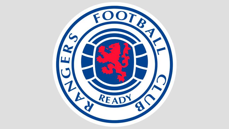
The Glasgow Rangers logo is a circular emblem featuring a red lion rampant set over a blue football, surrounded by the text “Rangers Football Club” and the club motto “Ready.” First introduced in its modern form in 1968, the crest draws on Scotland’s royal heraldry and reflects the club’s deep ties to Glasgow and Protestant tradition.
Key Attributes
- Design Type: Combination mark. The club uses both a circular emblem (corporate badge) and a monogram (scroll crest with intertwined RFC letters).
- Primary Elements: Red lion rampant, blue football with white panel lines, “Rangers Football Club” text, club motto “Ready,” and in the kit version, the overlapping RFC monogram with five stars.
- Official Introduction Date: The lion rampant circular badge was first adopted in 1959. It was significantly modernized in 1968 and updated again in the early 1990s and 2020.
- Designer/Agency: The 2020 brand update was handled by See Saw Creative, an Ayrshire-based graphic design studio. Earlier versions have no publicly credited designer.
- Trademark Status: The badge is a registered trademark held by The Rangers Football Club Ltd. Following the club’s 2012 liquidation and reformation, intellectual property rights were transferred to the new operating company.
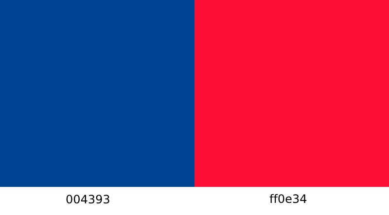
- Color Palette: Royal Blue (#0033A0), Red (#E51636), White (#FFFFFF), and Black for accents.
- Usage Context: The lion rampant crest appears on official documents, merchandise, social media, and marketing materials. The RFC scroll crest is used primarily on matchday kits and some supporter merchandise.
How Has the Glasgow Rangers Logo Evolved Over Time?

The Rangers badge has shifted through about 12 variations since 1872. Early designs focused on the RFC scroll monogram. The lion rampant arrived in 1959.
Most changes after 1968 were small. Color tweaks, slight adjustments to the lion’s posture, and the addition of five stars in 2003 to mark 50 league titles.
Original RFC Scroll Crest (1872-1959)
- Years Active: Approximately 1872 to 1959
- Design Description: Three intertwined letters “R,” “F,” and “C” forming a scroll monogram. Surrounded by a blue ribbon with the words “Rangers Football Club” and the motto “Ready” (shortened from “Aye Ready,” meaning “Always Ready” in Scots).
- Color Scheme: Blue monogram on a lighter background, with red swirls on the surrounding ribbon.
- Designer: Unknown. The earliest surviving depiction dates to the 1881-82 season.
- Context: This was the club’s first known emblem. Designed to represent the club’s full name through interlinked initials.
- Cultural Significance: The scroll crest established the visual identity that would carry through to every future Rangers badge. It’s still used on kits today in a modernized form.
Lion Rampant Corporate Badge (1959-1968)
- Years Active: 1959 to 1968
- Design Description: A shield with a dark blue background, topped by a gold football. Inside the shield sat a gold lion rampant with the word “Ready” underneath. A red circular border surrounded the shield with “The Rangers Football Club” in gold lettering.
- Color Scheme: Dark blue, gold, and red.
- Designer: Not publicly credited.
- Context: The club wanted a more formal corporate identity. The lion rampant, a symbol from the Royal Banner of Scotland, gave the badge a heraldic weight that the scroll monogram lacked.
- Key Changes from Previous: First time the lion rampant appeared. First circular badge format. The RFC monogram was dropped from official use during this period.
- Cultural Significance: Connected Rangers directly to Scottish national identity through the lion rampant symbol.
Modernized Lion Rampant Badge (1968-1991)
- Years Active: 1968 to 1991
- Design Description: A circular badge with a red lion rampant centered on a blue football. White panel lines on the ball. “Rangers Football Club” text around the outer ring with “Ready” at the bottom. Simultaneously, the RFC scroll crest returned to the club shirt for the first time.
- Color Scheme: Blue, red, white.
- Designer: Not publicly credited.
- Context: This was the redesign that became the foundation for every version that followed. The 1968 update also brought back the scroll monogram to appear on jerseys, creating the dual-badge system Rangers still uses.
- Key Changes from Previous: Removed the shield format. Dropped gold entirely. Made the lion rampant red instead of gold. Simplified the circular frame.
- Cultural Significance: The most important redesign in the club’s history. Set the template that has barely changed in over 50 years.
Updated Corporate Badge (1991-2020)
- Years Active: 1991 to 2020
- Design Description: A slightly refined version of the 1968 badge. The lion rampant’s shape was adjusted, and the font was changed to appear bolder. The football remained in the center with white panel markings.
- Color Scheme: Darker royal blue, red lion, white background elements.
- Designer: Not publicly credited for the 1991 update.
- Context: A minor refresh that cleaned up the lines without altering the overall structure. This version lasted nearly 30 years.
- Key Changes from Previous: Subtly thicker lettering. Slightly different lion posture. A marginally darker shade of blue.
Five Stars Scroll Crest (2003-Present on Kits)
- Years Active: 2003 to present (on kits)
- Design Description: The RFC scroll monogram with five white stars arched above it. The stars vary in size, with the largest at the top.
- Color Scheme: White monogram and stars on royal blue. Between 2005 and 2010, the stars turned red and the monogram turned blue on a white background before reverting.
- Context: Rangers won their 50th Scottish League title in 2003 under Alex McLeish. Each star represents ten league championships. After the club’s 2012 financial collapse and relegation, the stars were briefly less prominent but returned once Rangers climbed back to the top flight.
- Cultural Significance: The five stars are a direct marker of achievement. They tell the story of the club’s dominance in Scottish football at a glance.
Current Corporate Badge (2020-Present)
- Years Active: 2020 to present
- Design Description: An updated version of the lion rampant circular badge. Refined lion shape and slightly different typography. The overall layout remains the same as the 1968 foundation.
- Color Scheme: Royal blue, red, white.
- Designer: See Saw Creative (Ayrshire, Scotland). They handled the broader brand evolution project, including crest illustration and brand identity system.
- Context: A 150th anniversary badge was also unveiled for the 2020-21 season. The updated corporate badge aimed to refine the existing look rather than create something new.
- Key Changes from Previous: Subtle adjustments to the lion’s proportions and detail. Updated lettering style. The overall DNA of the 1968 design remains intact.
What Do the Design Elements of the Glasgow Rangers Logo Mean?
Every piece of the Rangers badge carries meaning tied to Scottish history, club identity, and regional pride. The lion rampant at the center is the most loaded symbol.
It connects Rangers to Scotland’s royal heraldry. The football underneath it is self-explanatory. And the circular frame keeps everything contained in a format that reads well at any size.
What Does the Lion Rampant Represent?
The lion rampant is taken from the Royal Banner of Scotland, one of the country’s most important heraldic symbols. It represents strength, courage, and Scottish national pride.
Rangers adopted it in 1959 to give the club’s badge more formal weight. It faces left and stands in a rearing posture, which is traditional for heraldic lions.
The red coloring separates it from the blue and white background, making it the clear focal point of the entire crest.
Why Did Rangers Choose These Specific Colors?
Royal Blue (#0033A0) is the dominant color. Rangers have played in blue shirts since 1872, switching from a lighter shade to royal blue in 1921. Blue represents loyalty and tradition. It’s also the color most associated with the club’s Protestant, Unionist cultural identity.
The Pantone reference for the official blue is 286C, though kit manufacturers have introduced slight variations over the years. Fans on forums have debated the exact shade for decades (your mileage may vary depending on which jersey you’re holding).
Red (#E51636) is used for the lion rampant and accent details. It adds contrast against the blue and white, and ties back to the traditional red turn-downs on the club’s black socks, part of the kit since 1904.
White (#FFFFFF) provides the background for text and creates separation between design elements. It’s used for the ball’s panel lines and the “Rangers Football Club” lettering in the outer ring.
Together, these three colors form a triadic color scheme that reads as distinctly Rangers from any distance.
What Typography Style Is Used in the Glasgow Rangers Logo?
The corporate badge uses a bold, uppercase serif font for the “Rangers Football Club” text that circles the outer ring. It’s formal. Thick strokes, short serifs, and tight spacing.
The kerning is deliberately tight to fit within the circular frame without looking cramped. Readability holds up well at smaller sizes, which matters for merchandise and digital use.
The 2020 update refined the letterforms slightly. They became a bit less elongated compared to the 1991 version.
What Are the Hidden Meanings in the Glasgow Rangers Logo?
The motto “Ready” (from the Scots phrase “Aye Ready,” meaning “Always Ready”) sits at the bottom of the corporate badge. It speaks to the club’s competitive mentality and its historical associations with military readiness and loyalty.
The circular frame itself carries meaning. It suggests unity and completeness. And the dual-badge system (corporate lion rampant plus the RFC scroll on kits) is unusual in football. Most clubs use one badge for everything.
Some fans see the intertwined RFC monogram as a nod to the club’s tight-knit community. The letters literally cannot be separated.
How Does the Glasgow Rangers Logo Compare to Competitor Logos?

Rangers’ main rival, Celtic, uses a four-leaf clover design with strong Irish and Catholic symbolism. The two badges are basically opposites in visual approach. Celtic’s is green and organic. Rangers’ is blue and heraldic.
That visual opposition is intentional, at least on a cultural level. The Old Firm derby is built on these differences.
Compared to other Scottish Premiership clubs like Aberdeen or Heart of Midlothian, Rangers’ badge stands out through its heraldic complexity and dual-crest system. Hibernian uses a harp-based design. Kilmarnock leans on a simpler shield format. Motherwell keeps things clean and modern.
Across European football, the lion rampant gives Rangers a look that’s closer to continental clubs with heraldic traditions. Think of badges from clubs in Spain or Germany that lean on regional coats of arms. It’s not a minimalist design, and that’s the point.
What Are the Technical Specifications of the Glasgow Rangers Logo?
Official Color Codes
- Royal Blue – Hex: #0033A0, RGB: (0, 51, 160), CMYK: (100, 91, 2, 1), Pantone: 286C
- Red – Hex: #E51636, RGB: (229, 22, 54), CMYK: (4, 100, 84, 1), Pantone: 1788C
- White – Hex: #FFFFFF, RGB: (255, 255, 255), CMYK: (0, 0, 0, 0)
- Black (accent) – Hex: #000000, RGB: (0, 0, 0), CMYK: (0, 0, 0, 100)
Dimensions and Proportions
The corporate badge follows a circular format with a 1:1 aspect ratio. The lion rampant sits within the center circle (the football), which takes up roughly 60% of the total badge diameter.
Clear space around the badge should be maintained at a minimum of 10% of the badge width on all sides. The club’s brand guidelines (managed following the 2020 See Saw Creative update) specify minimum reproduction sizes to keep the text legible, particularly for DPI requirements in print.
For digital use, vector graphics (SVG or EPS) are the preferred format to keep the crest sharp at any scale. Pixel-based formats like PNG are used for web and social media at recommended sizes.
What Cultural Impact Has the Glasgow Rangers Logo Had?
The Rangers crest is one of the most tattooed football badges in the world. That’s not an exaggeration. With over 600 supporters’ clubs across 35 countries, the badge shows up on skin, on walls, on car bumpers, and on pub signs from Belfast to Brisbane.
It carried particular weight during the club’s 2012 financial collapse and relegation to the fourth division. Fans displayed the badge as a statement of loyalty and survival. Almost 50,000 people attended a fourth-division match, which is a world record.
The badge is also tied to the Old Firm rivalry with Celtic, one of the biggest derbies in world football. It represents more than just a football club. For many supporters, it represents community, identity, and belonging.
How Does the Glasgow Rangers Logo Fit Into the Overall Brand Identity?

The badge is the anchor of the entire Rangers brand. Everything radiates outward from it. Kit designs, stadium signage at Ibrox, social media profiles, merchandise, and official communications all center on either the lion rampant crest or the RFC scroll monogram.
The dual-badge system is actually smart from a branding perspective. The corporate lion rampant handles formal and marketing duties. The scroll crest handles the emotional, matchday side of things. Two badges, one identity.
Kit manufacturer partnerships (Hummel, then Castore) have to work within the club’s established brand style guide when placing the crest on jerseys. The color palette stays consistent across all touchpoints, from the web to print to packaging.
How Should the Glasgow Rangers Logo Be Used?
Official Usage Guidelines
- Do: Use the official vector files provided by the club. Maintain the minimum clear space around the badge. Reproduce the badge in its correct colors (Royal Blue, Red, White). Use the monochrome version on single-color backgrounds where full color isn’t possible.
- Don’t: Stretch, rotate, or distort the badge. Change the official colors. Place the badge on busy backgrounds that reduce legibility. Add effects like drop shadows or gradients to the crest. Combine the badge with unauthorized text or graphics.
Where to Access Official Logos
Official badge assets are available through Rangers Football Club’s media and commercial departments. Licensed partners and media outlets can request files through the club’s official channels at rangers.co.uk.
Licensing and Trademark Protection
The Rangers badge, both the lion rampant and the scroll crest, is a registered trademark. Unauthorized commercial use will get you a legal notice, quickly. Fan-made items for personal use exist in a grey area, but anything sold for profit without a license is a trademark violation.
Following the 2012 ownership transition, trademark protections were carefully maintained to protect the club’s brand continuity. The Rangers International Football Club plc holds the commercial rights.
FAQ on The Glasgow Rangers Logo
What does the Glasgow Rangers logo look like?
The Rangers FC crest is a circular badge with a red lion rampant standing over a blue football. “Rangers Football Club” wraps around the outer ring in white text. The motto “Ready” sits at the bottom. Royal blue dominates the design.
When was the Rangers FC badge first created?
The earliest known version dates to around 1872, when the club formed in Glasgow. That original RFC scroll crest used intertwined letters.
The circular lion rampant crest arrived in 1959. The version most fans recognize today was shaped in 1968 and refined in 2020.
Why does the Rangers emblem have a lion on it?
The lion rampant comes from the Royal Banner of Scotland. It’s one of the country’s oldest heraldic symbols, representing strength and courage.
Rangers adopted it to connect the club’s identity to Scottish football tradition and national pride. It’s been red on every version since 1994.
What do the five stars on the Rangers kit badge mean?
Each star represents ten Scottish League titles. Rangers added them in 2003 after winning their 50th championship under Alex McLeish.
The stars appear on the RFC monogram used on kits, not the corporate lion rampant badge. They briefly changed from white to red between 2005 and 2010.
What are the official colors of the Rangers FC crest?
Royal blue, red, and white. The club has played in blue since 1872, switching to royal blue in 1921.
Red is used for the lion rampant. White handles the background and lettering. Black appears occasionally as an accent on merchandise and away kits.
Why does Rangers use two different badges?
The lion rampant crest is the corporate badge. It shows up on official documents, marketing, and merchandise.
The RFC scroll crest goes on matchday kits. This dual system has been in place since 1968 when the monogram returned to the club shirt at Ibrox Stadium.
Has the Glasgow Rangers logo changed much over the years?
Not dramatically. The 1968 redesign set the template. Everything since then has been small adjustments.
Color shifts, slight changes to the lion’s posture, updated typography elements. The 2020 update by See Saw Creative was the most recent refresh, and even that kept the core badge design intact.
What font is used in the Rangers Football Club logo?
The corporate badge uses a custom bold typeface with uppercase serifs. Short, thick strokes. Tight letter spacing to fit the circular frame.
It’s not a publicly available font. The 2020 brand update refined the letterforms to look slightly less elongated than the 1991 version.
Where can I download the official Rangers logo?
You can’t grab it from a free logo site and use it commercially. The badge is a registered trademark held by The Rangers Football Club Ltd.
Licensed media and partners get files through the club’s official channels at rangers.co.uk. Fan use for personal, non-commercial projects usually flies under the radar.
What is the meaning behind the Rangers motto “Ready”?
It’s shortened from “Aye Ready,” a Scots phrase meaning “Always Ready.” The motto has appeared on the club’s brand identity since the earliest badge designs.
It speaks to competitive spirit and loyalty. For many Rangers supporters, it’s more than words on a crest. It’s a statement of who they are.
Conclusion
The Glasgow Rangers logo has held its ground for over five decades without needing a major overhaul. That says something about the 1968 foundation.
From the RFC scroll crest on matchday jerseys to the lion rampant corporate badge on club merchandise, every element ties back to the club’s roots in Govan and its place in the Scottish Premiership.
The five stars, the royal blue and white palette, the “Ready” motto. None of it is decorative. It all carries weight.
Whether you’re a Gers supporter or just someone interested in how football clubs build their logo design, the Rangers emblem is a case study in staying consistent while the world around you changes. Few clubs that wear blue have managed that kind of staying power with their visual identity.

Renowned for his expertise in logo design and visual branding, Bogdan has developed a multitude of logos for various clients.
His skills extend to creating posters, vector illustrations, business cards, and brochures. Additionally, Bogdan's UI kits were featured on marketplaces like Visual Hierarchy and UI8.
He also wrote in the past years on sites like Design Your Way, WebDesignerDepot, WPDean, Designmodo, Speckyboy, Slider Revolution, and more.
- The Windsurf Logo History, Colors, Font, And Meaning - 10 October 2026
- How to Remove Background From Product Photos (No Photoshop) - 10 October 2026
- How Designers can Build a Stronger Online Creative Identity - 9 October 2026

Bogdan Sandu is a seasoned designer who has been designing websites since 2008. Renowned for his expertise in logo design and visual branding, Bogdan has developed a multitude of logos for various clients. His skills extend to creating posters, vector illustrations, business cards, and brochures. Additionally, Bogdan's UI kits were featured on marketplaces like Visual Hierarchy and UI8. He also wrote in the past years on sites like Design Your Way, WebDesignerDepot, WPDean, Designmodo, Speckyboy, Slider Revolution, and more.
You Might Also Like


