


The Aberdeen logo is the official crest of Aberdeen Football Club, a Scottish Premiership side founded in 1903 through the merger of three local clubs in Aberdeen, Scotland. It is one of the most recognizable badges in Scottish football.
The club went almost seven decades without a formal crest. The first official version arrived in 1972, designed by local graphic designer Donald Addison. Since then, the badge has gone through roughly three main iterations, with the current version dating back to the 1997-98 season. Two European stars were added in 2005.
Aberdeen FC, nicknamed “The Dons,” has never been relegated from the top flight of Scottish football. The logo represents more than just a club. It carries the weight of four league titles, seven Scottish Cups, and two European trophies.
What Is the Aberdeen Logo?
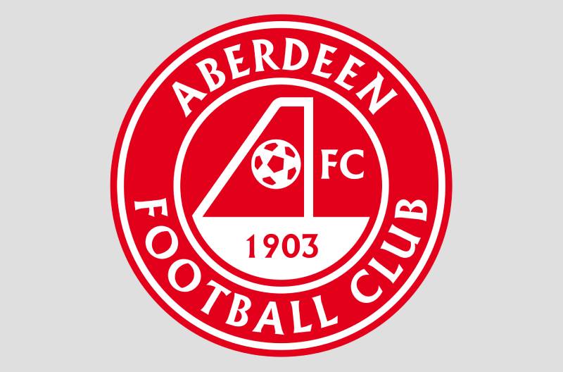
The Aberdeen logo is a circular emblem featuring a stylized capital letter “A” shaped like a football goal, with a crosshatched ball in the net. Designed originally by Donald Addison in 1972 and refined in 1997, it represents the club’s founding year of 1903, its identity as “The Dons,” and its European success.
Here is a breakdown of its core attributes:
- Design Type: Combination mark (emblem with integrated wordmark and symbolic icon)
- Primary Elements: A capital “A” resembling a football goal in side view, a crosshatched ball inside the net, the club name “Aberdeen Football Club” in a circular border, and the founding year “1903” beneath the goal
- Official Introduction Date: November 1972 (original). Current version launched for the 1997-98 season. Stars added in 2005-06
- Designer: Donald Addison (original 1972 crest), an Aberdonian graphic designer
- Trademark Status: Registered trademark of Aberdeen Football Club Ltd., operating from Pittodrie Stadium
- Color Palette: Red (#CF142B), White (#FFFFFF), Gold/Yellow accents, and Blue details within the crest’s heraldic elements
- Usage Context: Match kits, merchandise, official stationery, digital platforms, stadium signage, and all marketing materials
How Has the Aberdeen Logo Evolved Over Time?

The Aberdeen crest has moved through three distinct phases since 1972. Before that, the club had no official badge at all. Each update added layers of identity and context, from simple letterforms to a full heraldic emblem with European honors.
Pre-Logo Era (1903-1972)
- Years Active: 1903-1972
- Design Description: No official crest existed. Various cursive “AFC” monograms appeared sporadically on kits and match programs. In the 1950s, a laurel-wreathed AFC design appeared on programs but never on shirts
- Color Scheme: Black and gold (1904-1939), then red and white (1939 onward)
- Designer: Unknown, informal designs
- Context: The club simply didn’t prioritize a visual badge. Most Scottish clubs of that era operated the same way
- Cultural Significance: The absence of a formal crest reflected the local, regional nature of Scottish football at the time. Branding wasn’t a priority
The Original Addison Crest (1972-1986)
- Years Active: 1972-1986
- Design Description: A capital letter “A” drawn as the side view of a football goal. A crosshatched ball sits in the crossbar position, depicting a scored goal trapped in the net. The letters “FC” appear in smaller type beside the ball element
- Color Scheme: Red and white
- Designer: Donald Addison, a graphic designer based in Aberdeen
- Context: Commissioned when the club opened its first official shop on Nelson Street near Pittodrie in 1972. The logo was registered for use on all merchandise and stationery
- Key Changes from Previous: This was the first official crest, period. A complete departure from the informal AFC monograms
- Cultural Significance: It gave the club a proper identity just in time for the golden era under Alex Ferguson in the late 1970s and 1980s. First worn on shirts around 1978-79
The European-Era Crest (1986-1997)
- Years Active: Mid-1980s to 1997
- Design Description: The original Addison “A” goal design, now enclosed in a circular border. The words “Aberdeen Football Club” were added around the outside, and the founding year “1903” was placed beneath the goal element
- Color Scheme: Red, white, with gold and blue details in the border
- Designer: Club adaptation of Addison’s original
- Context: After winning the European Cup Winners’ Cup in 1983, the club realized that nobody outside Scotland recognized the bare “A” symbol as Aberdeen’s badge. The added text fixed that problem
- Key Changes from Previous: Circular border with club name, founding year added. The badge became more readable and identifiable internationally
- Cultural Significance: This version is tied directly to the club’s greatest period. Ferguson’s Aberdeen beat Real Madrid in Gothenburg, then won the European Super Cup against Hamburger SV. The badge needed to match that growing profile
The Current Crest (1997-Present)
- Years Active: 1997-present
- Design Description: A unified circular emblem retaining the “A” goal motif. Features a central shield with heraldic elements including two rampant lions in gold flanking the shield. The “BON ACCORD” motto sits on a blue scroll. “ABERDEEN” arches across the top in white capitals on red, with “FOOTBALL CLUB” at the bottom. A thick gold border frames the whole design
- Color Scheme: Red (#CF142B), White (#FFFFFF), Gold, and Blue accents
- Designer: Club design team (specific designer not publicly credited)
- Context: Launched at the start of the 1997-98 season. The club wanted a more professional, heraldic look that tied in with the city’s coat of arms and heritage
- Key Changes from Previous: Full heraldic redesign with lions, shield, motto, and more structured layout. In 2005-06, two red stars were added above the crest to mark the 1983 European Cup Winners’ Cup and European Super Cup victories
- Cultural Significance: This is the badge most modern fans grew up with. The addition of the European stars in 2005 gave it an extra layer of pride. The original 1972 design was brought back briefly for the 2014-15 and 2022-23 kits as a retro tribute
What Do the Design Elements of the Aberdeen Logo Mean?

Every piece of the Aberdeen crest carries specific meaning. The central “A” shaped like a football goal is the most distinctive element. It represents scoring, victory, the act of putting the ball in the net.
The crosshatched ball inside the goal isn’t just decoration. It shows the ball already caught in the netting, which signals a completed goal.
The heraldic lions, the shield, the “Bon Accord” motto. All of these connect the football club to Aberdeen the city. It’s a badge that says “we belong here.”
Why Did Aberdeen Choose These Specific Colors?
Aberdeen’s primary colors are red and white. The club originally played in black and gold from 1904 to 1939, which earned them the nickname “The Wasps.”
In March 1939, the club switched to red and white. The reason? These colors mirror the silver and red of the official City of Aberdeen coat of arms.
Here are the specific color details:
- Red – Hex: #CF142B. This is the dominant color of the badge and kits. Red represents passion, strength, and the connection to the city’s heraldic arms. The psychology behind this color ties directly to energy and competition, perfect for a football club
- White – Hex: #FFFFFF. Used for text, detailing, and contrast. White provides clarity and makes the red pop. It also represents the club’s clean, direct approach to identity
- Gold – Used in the border and heraldic lions. Gold nods to the club’s pre-1939 black and gold heritage and also adds a sense of prestige, fitting for a club with European silverware
- Blue – Used sparingly in the “Bon Accord” scroll and shield details. Blue connects to Scotland’s national color and adds depth to the heraldic composition
What Typography Style Is Used in the Aberdeen Logo?
The current crest uses a custom serif typeface for “ABERDEEN” and “FOOTBALL CLUB” around the circular border. The letters are all capitals, spaced evenly to follow the curve.
It’s a traditional, authoritative look. Nothing trendy or experimental. The letter spacing is generous enough to stay readable at smaller sizes.
The “BON ACCORD” motto on the scroll uses a slightly different, more condensed style. Over the years, the type has been refined but the basic approach hasn’t changed much since 1997.
What Are the Hidden Meanings in the Aberdeen Logo?
The “A” as a football goal is the big one. Most people see a letter. Look closer and you see the side profile of goalposts with a ball in the net. Donald Addison designed it that way on purpose.
“Bon Accord” is the city’s official motto. It means “good agreement” in French, supposedly dating back to a password used during a 14th-century battle. Including it ties the club to centuries of local history.
The two stars above the badge aren’t just decorative. Each one represents a European trophy from 1983. That’s a detail you won’t find on most Scottish club crests.
How Does the Aberdeen Logo Compare to Competitor Logos?

In Scottish football, Aberdeen’s badge sits between the old-school heraldic style of Celtic and the cleaner, more modern direction some clubs have taken. It’s traditional but not outdated.
Compared to Glasgow Rangers, Aberdeen’s crest is busier. Rangers use a more stripped-back circular badge. Aberdeen’s heraldic elements, lions, shield, motto, and stars give it more visual weight.
Heart of Midlothian takes a similar heraldic approach but leans harder into the maroon color identity. Hibernian uses a harp as a central icon, which gives their badge a different feel entirely.
Dundee United, Aberdeen’s “New Firm” rival from the 1980s, has a much simpler lion-based crest. And clubs like Kilmarnock and Motherwell go for cleaner, less ornate looks.
What sets Aberdeen apart is the “A” goal motif. No other Scottish club has that kind of built-in wordplay in their badge. It’s a clever design choice that’s lasted over 50 years.
What Are the Technical Specifications of the Aberdeen Logo?
Official Color Codes
- Primary Color: Red – Hex: #CF142B | RGB: (207, 20, 43) | CMYK: (0, 90, 79, 19)
- Secondary Color: White – Hex: #FFFFFF | RGB: (255, 255, 255) | CMYK: (0, 0, 0, 0)
- Accent Color: Gold – Used in heraldic lions and border details. Typically rendered as a warm yellow-gold in print applications
- Accent Color: Blue – Used in the “Bon Accord” scroll and minor shield details
Dimensions and Proportions
The badge is circular in overall shape. The aspect ratio is roughly 1:1 when you include the two European stars above, the total height extends slightly beyond a perfect circle.
For kit applications, the badge is typically reproduced at around 8-10cm in height on the chest area. Minimum reproduction size should maintain readability of the “Aberdeen Football Club” text and the “Bon Accord” motto.
Clear space around the logo follows standard practice: enough breathing room that no other graphic element crowds the badge. The club’s brand guidelines specify exact measurements for official partners and licensees.
For digital use, the logo works best as vector graphics (SVG, EPS, AI formats) to maintain sharpness at any size. Raster versions in PNG with transparent backgrounds are standard for web and social media applications.
What Cultural Impact Has the Aberdeen Logo Had?
The Aberdeen badge carries outsized cultural weight for a club from a city of about 230,000 people. It’s recognized across European football thanks to those 1983 triumphs.
When Aberdeen beat Real Madrid in Gothenburg, the crest became a symbol of what a smaller club could achieve. That’s still what it represents for many fans.
The retro 1972 badge has developed its own cult following. The club brought it back for the 2014-15 kits and again in 2022-23 for the 40th anniversary of the Gothenburg triumph. Those retro kits sell fast. Fans have a genuine emotional connection to that original Addison design.
In Aberdeen itself, the crest is everywhere. Pubs, car stickers, tattoos. It’s part of the city’s identity in a way that goes beyond just football. The “Bon Accord” motto ties it right into local heritage.
How Does the Aberdeen Logo Fit Into the Overall Brand Identity?

The badge is the anchor of everything Aberdeen FC does visually. The red and white color palette carries through from the crest to the kits, to the stadium, to the website, to all merchandise.
Pittodrie Stadium, the club’s home since 1899, reinforces the brand with red seating and signage throughout. The nickname “The Dons” appears alongside the badge on most official materials.
The club’s brand style guide keeps everything tight. The typographic choices, color usage, and badge placement rules create a consistent look across print and digital.
Aberdeen’s brand identity connects several things at once: the football club, the city, its granite architecture, its maritime history, and the motto “Bon Accord.” The crest ties all of these together in a single visual mark.
How Should the Aberdeen Logo Be Used?
Official usage guidelines include:
- The badge must always appear in its complete form. Don’t crop, stretch, rotate, or separate elements
- The two European stars should always be included in the current version (unless a specific retro application calls for the 1972 or pre-2005 design)
- Minimum clear space must be maintained around the crest on all materials
- The red should always be reproduced accurately. On-screen, use #CF142B. For print, match the specified color values
- The badge should not be placed on busy backgrounds that reduce readability
Where to access official logos: Aberdeen FC’s official website (afc.co.uk) and authorized brand asset platforms provide the approved files. Official commercial partners receive logo packs directly from the club’s marketing department.
Licensing information: The Aberdeen FC crest is a registered trademark. Any commercial use requires written permission from Aberdeen Football Club Ltd. Unauthorized reproduction on merchandise or marketing materials is a trademark violation.
Trademark protection: The club actively protects its brand. The crest, “The Dons” nickname, and associated visual elements are covered under UK trademark law. Fan-made products and third-party sellers need official licensing agreements to use the badge.
FAQ on The Aberdeen Logo
Who Designed the Original Aberdeen FC Logo?
Donald Addison, an Aberdonian graphic designer, created the first official Aberdeen crest in November 1972. The club commissioned him when they opened their first shop on Nelson Street near Pittodrie Stadium.
What Does the “A” in the Aberdeen Badge Represent?
The capital letter “A” is drawn as the side view of a football goal. A crosshatched ball sits in the crossbar area, showing a scored goal caught in the net. It’s clever visual emphasis through simple shapes.
What Are the Official Aberdeen FC Logo Colors?
Red (#CF142B) and white (#FFFFFF) are the primary colors. Gold and blue appear as accent colors in the heraldic elements. The club adopted red and white in 1939, matching the City of Aberdeen’s official arms.
When Was the Current Aberdeen Crest Introduced?
The current version launched for the 1997-98 season. Two gold stars were added above the badge in 2005 to honor the 1983 European Cup Winners’ Cup and European Super Cup victories.
What Does “Bon Accord” Mean on the Aberdeen Logo?
It’s the city’s official motto. “Bon Accord” translates from French as “good agreement.” Local history ties it to a password used during a 14th-century conflict. It links the storytelling in the design to Aberdeen’s deep heritage.
Why Does the Aberdeen Badge Have Two Stars?
Each star represents a European trophy won in 1983. Aberdeen beat Real Madrid to claim the Cup Winners’ Cup, then defeated Hamburger SV for the Super Cup. They remain the only Scottish club with two European honors.
Has Aberdeen FC Ever Changed Its Logo Completely?
The club had no official crest before 1972. Since then, three main versions have existed. The core “A” goal motif from Donald Addison’s original design has carried through every iteration of the Aberdeen brand identity.
Can I Use the Aberdeen FC Logo for Personal Projects?
The crest is a registered trademark of Aberdeen Football Club Ltd. Any commercial use needs written permission. Fan art and personal, non-commercial use typically falls into a gray area, but selling merchandise without a license is not allowed.
What File Format Is Best for the Aberdeen Logo?
For sharp reproduction at any size, pixel-based formats like PNG work for web use. But scalable formats (SVG, EPS, AI) are better for print and large displays where detail in the crest matters most.
Why Did Aberdeen FC Bring Back the 1972 Logo on Recent Kits?
The retro Addison crest appeared on 2014-15 kits and again in 2022-23 for the 40th anniversary of the Gothenburg win. Fans love it. The minimalist design of the original has a timeless quality that modern badges sometimes lack.
Conclusion
The Aberdeen logo has done something most football crests never manage. It stayed relevant for over 50 years while keeping Donald Addison’s original “A” goal concept at its core.
From the pre-crest era to the current heraldic emblem with its European stars, every update reflected real milestones. Not trend-chasing.
The red and white color scheme ties the club to the city. The “Bon Accord” motto roots it in local history. And those two stars above the badge? They remind everyone that Aberdeen once stood on top of European football.
Few Scottish Premiership badges carry that kind of weight.

Renowned for his expertise in logo design and visual branding, Bogdan has developed a multitude of logos for various clients.
His skills extend to creating posters, vector illustrations, business cards, and brochures. Additionally, Bogdan's UI kits were featured on marketplaces like Visual Hierarchy and UI8.
He also wrote in the past years on sites like Design Your Way, WebDesignerDepot, WPDean, Designmodo, Speckyboy, Slider Revolution, and more.
- Canva vs PowerPoint: Which Is Better for Presentations? - 22 September 2026
- How to Install Fonts on Mac (Step-by-Step Guide) - 20 September 2026
- From Mockup to Code: How AI-Augmented Development Speeds Up the Design Handoff - 19 September 2026

Bogdan Sandu is a seasoned designer who has been designing websites since 2008. Renowned for his expertise in logo design and visual branding, Bogdan has developed a multitude of logos for various clients. His skills extend to creating posters, vector illustrations, business cards, and brochures. Additionally, Bogdan's UI kits were featured on marketplaces like Visual Hierarchy and UI8. He also wrote in the past years on sites like Design Your Way, WebDesignerDepot, WPDean, Designmodo, Speckyboy, Slider Revolution, and more.
You Might Also Like


