


The Dundee United logo is one of the most recognizable club crests in Scottish football. Built around the lion rampant, tangerine and black colors, and a circular badge format, it represents over a century of football history rooted in the city of Dundee. The current version was introduced in 2022 as part of a brand regeneration led by local firm Creative Graffix. The club itself was founded in 1909 as Dundee Hibernian before changing its name in 1923. Across its history, the badge has gone through roughly 10 distinct versions, each one reflecting the era it belonged to.
Few Scottish clubs carry a visual identity quite as tied to a single color as Dundee United does with tangerine. That bright orange, paired with black, has become shorthand for Tannadice Park and everything the Tangerines stand for.
What Is the Dundee United Logo?

The Dundee United logo is a circular emblem featuring a black lion rampant centered on a diamond split into tangerine and black quadrants. It was officially redesigned in 2022 by Creative Graffix, a Dundee-based design firm. The crest includes the club name in a custom sans-serif font and represents bravery, heritage, and club identity.
Here’s a breakdown of the key attributes:
- Design Type: Combination mark (emblem with text and symbol)
- Primary Elements: Lion rampant, diamond shape, circular border, club name text, “Football Club” subtitle
- Official Introduction Date: June 2022 (current version)
- Designer/Agency: Creative Graffix, Dundee
- Trademark Status: Registered to Dundee United Football Club
- Color Palette: Tangerine (approx. #E85E15), Black (#000000), White (#FFFFFF)
- Usage Context: Match kits, merchandise, stadium signage, digital platforms, official documents, marketing materials
The diamond at the center is actually the thing most people miss at first glance. It’s split into four triangles, alternating between tangerine and black. The lion sits on white inside that diamond, which gives it room to breathe visually. Took me a while to appreciate how much that small detail matters for readability at smaller sizes.
How Has the Dundee United Logo Evolved Over Time?

The Dundee United crest has gone through about 10 different versions since the club’s founding in 1909. Early badges were simple shield designs or text-based initials. The lion rampant first appeared in 1956, and the circular format fans know today was introduced in 1993 before being updated in 2022.
Dundee Hibernian Badge (1909-1923)
When the club was founded as Dundee Hibernian in 1909, there was no official badge on the kit. The club wore green and white, a nod to its Irish heritage roots.
The first known badge appeared around 1922-1923. It was a loose redesign of the City of Dundee’s Coat of Arms. This was only worn on shirts for a few months before the club changed its name to Dundee United.
No formal design process existed back then. Most Scottish clubs at that time barely bothered with shirt badges at all.
Shield and Initials Era (1923-1956)
In their first season as Dundee United, the players wore a new shield badge with the club’s initials inside. And then… nothing. For over 30 years, there’s no evidence of any badge appearing on the jersey.
To be fair, very few Scottish clubs during the 1930s, 1940s, and 1950s used shirt badges either. It just wasn’t the standard yet.
The club colors during this stretch were white shirts and black shorts. No tangerine in sight.
The Lion Rampant Arrives (1956-1969)
The lion rampant crest made its first appearance on the front page of the match programme in 1956. This was the official club crest, but it didn’t actually appear on the players’ shirts right away.
In 1958, a new strip was introduced (all-white, two black bands), and a simpler “DUFC” shield badge was placed on the shirt instead. Possibly to keep costs down.
That DUFC shield lasted until 1969, when the whole color palette changed dramatically.
The Tangerine Revolution (1969-1983)
This is where things get interesting. In 1967, Dundee United played as Dallas Tornado in the United Soccer Association competition in the US. The burnt orange kit was a hit. Mrs. Barbara Kerr, wife of manager Jerry Kerr, loved it so much she suggested United adopt similar colors back home.
On August 4, 1969, the tangerine shirts with black trim debuted in a pre-season friendly against Everton. A new circular badge featuring a 1970s-style lion rampant came with it.
But here’s the tricky part. From 1973, the circular crest was swapped out for a diagonal “DUFC” motif on jerseys. The lion badge stuck around on match programmes though. In 1977, when United became the first Scottish club to sign with Adidas, a simpler horizontal “DUFC” badge appeared.
Return of the Lion Shield (1983-1993)
The original 1956 lion rampant design finally appeared on the jersey in 1983. This was a shield-based crest with the heraldic lion, and it became the badge fans of that era associate most strongly with the Jim McLean glory years.
This version appeared on programme covers and official club attire from 1987 to 1993. It carried the club through European Cup semi-finals and a UEFA Cup final appearance in 1987.
But it couldn’t last forever. A heraldry ruling in Scotland forced the club to abandon this particular lion rampant design.
The Circular Badge (1993-2009)
In 1993, the club introduced a fully new circular badge. This was their first proper “corporate identity” approach to the crest.
Fans weren’t exactly thrilled at first. But within a year, the club won the Scottish Cup for the first time, and suddenly the new badge became a bit of a lucky charm.
The circular design kept the lion rampant as the central figure, placed it inside the diamond shape on a tangerine and black background, and wrapped the club name around the outside. This is basically the template that still exists today.
Centenary Edition (2009-2010)
For the club’s 100th anniversary, a special version of the badge was created. It added “1909-2009 Centenary” text and featured green trim as a tribute to the club’s Dundee Hibernian origins.
This edition was used only for the 2009-10 season. It ended on a high note with a Scottish Cup victory in 2010. One season. One trophy. Good timing.
Post-Centenary Badge (2010-2022)
After the centenary year, the badge reverted to its standard 1993 format, minus the anniversary details. This version served the club through some turbulent years, including relegation to the Scottish Championship and eventual promotion back to the Premiership.
The 2022 Redesign (2022-Present)
In June 2022, the club rolled out a refreshed crest designed by Creative Graffix. The changes were subtle but significant.
The lion was redrawn with cleaner lines. The background diamond got a sharper black outline. The triangle colors on the background were switched to give the lion’s face more clarity. And the font was updated to a contemporary typeface with a sans-serif base and a touch of stylistic flair, rooted in old-century signage aesthetics.
Communications Director Joe Rice said the aim was to modernize the club’s look while keeping the history intact. Your mileage may vary on whether they pulled it off, but most fans seem to have accepted it pretty smoothly.
What Do the Design Elements of the Dundee United Logo Mean?

Every piece of the Dundee United crest carries meaning tied to the club’s Scottish roots and football identity. The lion rampant represents strength and courage. The diamond shape creates a strong focal point at the center of the circular badge. And the tangerine and black colors reflect the Tangerines’ identity since 1969.
The overall circular format signals tradition and continuity, which matters for a club that’s been around since 1909.
Why Did Dundee United Choose These Specific Colors?
Tangerine wasn’t always the club’s color. They played in green and white as Dundee Hibernian, then white and black for decades.
The switch to tangerine happened almost by accident. It came from the Dallas Tornado kit that United wore in the US in 1967 and 1969. Barbara Kerr’s suggestion to bring that look home changed the club’s entire visual identity.
Here are the logo colors based on color theory and brand use:
- Tangerine – Hex: approximately #E85E15, RGB: (232, 94, 21). Symbolizes energy, passion, and the club’s nickname “The Tangerines.” It’s a bold color that stands out against the greens and blues common in Scottish football.
- Black – Hex: #000000, RGB: (0, 0, 0). Adds weight and seriousness to the crest. Works as the structural backbone of the design, from the circular border to the lion’s outline.
- White – Hex: #FFFFFF, RGB: (255, 255, 255). Provides breathing room within the badge, especially behind the lion figure. Creates the contrast needed for the lion to read clearly at any size.
The psychology behind these colors is actually straightforward. Orange grabs attention and suggests warmth and enthusiasm. Black grounds it with authority. Together, they make a combination that’s hard to mistake for anyone else in Scottish football. Among clubs that use orange in their logos, Dundee United remains one of the most distinctive.
What Typography Style Is Used in the Dundee United Logo?
The 2022 crest uses a custom font with a sans-serif foundation. It has subtle decorative touches that reference old-century signage and vintage lettering styles.
“DUNDEE UNITED” appears along the top arc of the circle in uppercase black letters. “FOOTBALL CLUB” sits along the bottom arc in a slightly smaller size.
The typography is designed to be legible at multiple sizes, from large stadium banners down to small embroidered kit badges. The previous version had some readability issues at smaller scales, and the 2022 redesign specifically addressed that. The letter spacing was adjusted so the text doesn’t crowd itself around the curve.
What Are the Hidden Meanings in the Dundee United Logo?
The lion rampant is the most obvious symbol. It’s a heraldic figure used widely in Scottish tradition, connecting the club to national heritage. But the specific way it’s drawn in the Dundee United badge has been unique to the club since 1956.
The diamond shape inside the circle is less discussed, but it’s become a standalone brand element since 2022. Creative Graffix gave it a stronger black outline specifically so it could work as a secondary mark on its own.
The four triangles within the diamond, alternating tangerine and black, create a sense of balance and visual unity. In the 2022 update, the placement of these colored sections was switched to give the lion better definition against the background. A small move that made a real difference.
How Does the Dundee United Logo Compare to Competitor Logos?

Dundee United’s crest holds its own in a Scottish Premiership full of strong club identities. Compared to rivals like Celtic, Rangers, and Aberdeen, the Dundee United badge stands out primarily through color. Nobody else in the league uses tangerine as a primary color.
Local rivals Dundee FC use a darker color scheme. Clubs like Hibernian lean green. Heart of Midlothian goes maroon. Motherwell uses claret and amber, which is the closest anyone gets to United’s palette, but they’re still clearly different.
In terms of structure, most Scottish clubs use either circular or shield-based designs. Dundee United’s circular format with the internal diamond gives it a slightly more layered feel than the typical single-shape approach. Kilmarnock and Ross County use circular crests too, but without the diamond centerpiece.
Where United really differentiates itself is recognition at a distance. That tangerine pops. On a crowded shelf of merchandise or a lineup of badge graphics, you can pick out Dundee United instantly.
What Are the Technical Specifications of the Dundee United Logo?
Official Color Codes
- Primary Color: Tangerine
- Hex: #E85E15 (approximate)
- RGB: (232, 94, 21)
- CMYK: (0, 65, 95, 5)
- Pantone: Approximately PMS 1655 C
- Secondary Color: Black
- Hex: #000000
- RGB: (0, 0, 0)
- CMYK: (0, 0, 0, 100)
- Pantone: PMS Black C
- Accent Color: White
- Hex: #FFFFFF
- RGB: (255, 255, 255)
- CMYK: (0, 0, 0, 0)
Dimensions and Proportions
The badge is circular with a 1:1 aspect ratio. The diamond at the center sits at roughly a 45-degree rotation within the circle, with the lion occupying the central white area.
When used on web platforms or digital media, the logo should be rendered in vector format (SVG) wherever possible to maintain sharpness at any scale. For print applications, a minimum DPI of 300 is standard.
Clear space around the logo should be maintained to avoid crowding from other visual elements. The 2022 brand guidelines from Creative Graffix formalized these rules for the first time, giving the club consistent usage standards across all touchpoints.
What Cultural Impact Has the Dundee United Logo Had?
The Dundee United crest is deeply woven into the identity of its fanbase. The Arab community (as Dundee United supporters are known) has carried this badge through some incredible moments. A Premier Division title in 1983. Two Scottish Cup wins. A UEFA Cup final in 1987 against IFK Gothenburg, where fans won the first-ever FIFA Fair Play Award.
The tangerine and black colorway is immediately identifiable across Scotland. Walk into any pub in Dundee and you’ll see that badge on scarves, flags, and tattoos.
But it goes beyond Tannadice Park. United’s European runs in the 1980s put this crest on TV screens across the continent. Beating Barcelona four times out of four in European competition is the kind of record that sticks. And every time that stat gets brought up, people see the badge.
The centenary badge in 2009, with its green trim honoring the Dundee Hibernian roots, showed the club understood its own storytelling potential. That kind of historical nod through design is something a lot of clubs don’t bother with.
How Does the Dundee United Logo Fit Into the Overall Brand Identity?
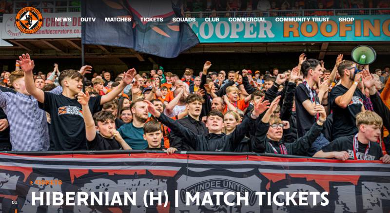
The crest is the anchor of a broader brand system that stretches across everything the club does. From the Tannadice Park stadium signage to the academy branding, the women’s team identity, and the DUTV media channel, the 2022 redesign brought all of these under one consistent set of brand guidelines.
Kit manufacturer Errea uses the crest prominently on home, away, and third kits. Merchandise in the club shop carries the badge on everything from mugs to scarves. And the club’s digital presence, including their website and social channels, uses the logo as the primary visual marker.
The relationship between the crest and the club’s tangerine identity is almost inseparable at this point. You can’t think of one without the other. That’s the sign of a brand that’s been built consistently over decades, even if there were some messy middle years with the DUFC text experiments in the 1970s.
What makes it work is that the core elements have stayed stable. The lion. The circle. The tangerine and black. Everything else has shifted around those constants, which is actually a solid approach to logo design principles in practice.
How Should the Dundee United Logo Be Used?
If you’re looking to use the Dundee United crest, there are a few things to keep in mind.
Official usage rules from the club:
- The badge should always appear in full color when possible. Don’t strip out the tangerine or swap the black for grey unless the club’s brand guidelines specifically allow a monochrome version.
- Don’t stretch, rotate, or distort the crest. It’s circular for a reason, and messing with the aspect ratio breaks the whole thing.
- Maintain clear space around the badge. Don’t cram it next to other logos or text without breathing room.
- The diamond element can be used as a standalone secondary mark, but only in accordance with the 2022 brand guidelines.
Where to get the official logo:
The official Dundee United website (dundeeunitedfc.co.uk) is the primary source for approved brand assets. Vector versions of the crest can also be found on logo archive sites, though always confirm you’re using the current 2022 version rather than an older iteration.
Licensing:
The Dundee United logo is a registered trademark. Using it for commercial purposes without permission from the club is not allowed. Fan-created content and personal use generally falls into a grey area, but anything sold commercially needs proper licensing. When in doubt, reach out to the club’s commercial department.
The 2022 brand regeneration was specifically designed to make the crest more consistent and usable across different contexts. Whether it’s printed on a match ticket at 20mm wide or displayed on a stadium LED board at several meters across, the current design holds up. That wasn’t always the case with earlier versions, which is exactly why the redesign happened.
FAQ on The Dundee United Logo
What does the Dundee United logo look like?
The Dundee United logo is a circular emblem with a black lion rampant centered on a diamond split into tangerine and black sections. “Dundee United” runs along the top arc. “Football Club” sits at the bottom. White fills the space behind the lion.
When was the current Dundee United badge introduced?
The current Dundee United FC badge launched in June 2022. Creative Graffix, a Dundee-based firm, led the redesign. It updated the 1993 crest with cleaner lines, a refined lion, and a modern font while keeping the club’s traditional elements intact.
What do the colors in the Dundee United crest mean?
Tangerine represents energy and the club’s nickname, the Tangerines. Black adds weight and authority.
White provides contrast behind the lion. The tangerine and black combination has defined the club’s visual identity since 1969 when the colors were adopted from a Dallas Tornado kit.
Who designed the Dundee United emblem?
Creative Graffix designed the 2022 version. They’re a family-run business based in Dundee. The firm consulted with fans, stakeholders, and club officials during the process. Earlier versions of the club badge were handled in-house or through informal design efforts.
Why does the Dundee United logo feature a lion rampant?
The lion rampant is a heraldic symbol tied to Scottish tradition. It first appeared on the club crest in 1956.
For Dundee United, it represents bravery and ambition. The lion has been redrawn several times but never removed from the badge design.
How many times has the Dundee United logo changed?
The badge has gone through roughly 10 versions since the club was founded in 1909 as Dundee Hibernian. Major shifts happened in 1956, 1969, 1993, and 2022. The 1970s saw multiple variations using just the “DUFC” initials on kits.
What font is used in the Dundee United crest?
The 2022 crest uses a custom font with a sans-serif base. It has subtle decorative touches inspired by old-century signage.
The club chose this style to balance historical reference with modern readability across Tannadice Park signage, kits, and digital platforms.
Can I download the official Dundee United logo?
The official club website (dundeeunitedfc.co.uk) is the best source for approved assets. Vector files are also available on logo archive sites. Always confirm you’re using the 2022 version, not an older iteration from the Scottish Premiership era before the rebrand.
What makes the Dundee United badge different from other Scottish football club crests?
The tangerine color is unique in Scottish football. No other SPFL club uses it as a primary color.
The internal diamond shape also sets it apart. Most rival clubs like Aberdeen, Celtic, and Rangers use simpler shield or circular formats without that layered centerpiece.
Is the Dundee United logo trademarked?
Yes. The logo is a registered trademark of Dundee United Football Club. Commercial use requires permission from the club. Fan-created content for personal use is generally tolerated, but anything sold for profit needs proper licensing through the club’s commercial department.
Conclusion
The Dundee United logo is more than a football club badge. It’s a century of identity condensed into a circle.
From the Dundee Hibernian days to the 2022 Creative Graffix redesign, every version has carried the club’s values forward. The lion rampant, the tangerine and black scheme, the diamond shape. These aren’t just design choices. They’re what makes United recognizable from Tannadice Park to European competition.
The crest connects the Jim McLean era, the UEFA Cup final against IFK Gothenburg, and two Scottish Cup victories into one visual mark.
It holds up. And for the Arabs, it always will.

Renowned for his expertise in logo design and visual branding, Bogdan has developed a multitude of logos for various clients.
His skills extend to creating posters, vector illustrations, business cards, and brochures. Additionally, Bogdan's UI kits were featured on marketplaces like Visual Hierarchy and UI8.
He also wrote in the past years on sites like Design Your Way, WebDesignerDepot, WPDean, Designmodo, Speckyboy, Slider Revolution, and more.
- Beautiful Fonts Similar to Poppins You Should Try - 22 October 2026
- Website Redesign: How to Improve Your Website without Losing SEO Rankings - 22 October 2026
- The Coda Logo History, Colors, Font, And Meaning - 20 October 2026

Bogdan Sandu is a seasoned designer who has been designing websites since 2008. Renowned for his expertise in logo design and visual branding, Bogdan has developed a multitude of logos for various clients. His skills extend to creating posters, vector illustrations, business cards, and brochures. Additionally, Bogdan's UI kits were featured on marketplaces like Visual Hierarchy and UI8. He also wrote in the past years on sites like Design Your Way, WebDesignerDepot, WPDean, Designmodo, Speckyboy, Slider Revolution, and more.
You Might Also Like


