


The Partick Thistle logo is the official crest of Partick Thistle Football Club, a professional Scottish football team based at Firhill Stadium in Glasgow’s Maryhill district. Founded in 1876, the club has carried a thistle on its badge since 1902, and the current version of the crest was introduced in 2008.
In the broader picture of Scottish football branding, Partick Thistle sits in a tricky spot. They’re not Celtic or Rangers. They don’t have that kind of global profile. But their badge? It punches way above its weight in terms of recognition, partly because of its bold color choices and partly because of the Kingsley mascot situation back in 2015 (more on that later).
The club has gone through at least four distinct badge designs across its history. The current crest features a stylized thistle rendered in red, yellow, and black. It was introduced ahead of the 2008-09 season, replacing a more angular, modernist version that had been in use since 1990.
What Is the Partick Thistle Logo?

The Partick Thistle logo is an emblem-style crest featuring a stylized thistle plant, the club’s name arranged in a semicircular banner, and the team’s traditional red and yellow colors. It was introduced in 2008 and represents Scottish heritage, community identity, and the club’s Maryhill roots.
Design Type: Emblem (combination mark with crest elements). The badge works as a self-contained unit, which is typical of football club crests across Scotland and beyond. If you’re unfamiliar with how a logo actually functions as a brand identifier, Partick Thistle’s crest is a solid example. Everything you need to know about the club is packed into one visual.
Primary Elements: A bold thistle graphic sits at the center of the badge, drawn with solid black outlines. The thistle’s leaves and flower are simplified but still immediately recognizable. Around it, the text “PARTICK THISTLE FOOTBALL CLUB” wraps in a semicircular arrangement. Some versions include a circular border that frames the whole thing.
Official Introduction Date: 2008. The crest launched ahead of the 2008-09 First Division season under manager Ian McCall.
Designer/Agency: The specific designer behind the 2008 crest hasn’t been widely publicized by the club. Some logo archives attribute the vectorization to designers like Frank M. and Anatoliy Agnyotkin, though these may relate to digital reproductions rather than the original badge design itself.
Trademark Status: The Partick Thistle FC crest is a registered trademark of the club. All commercial usage requires permission from the organization.
Color Palette: Red, yellow, black, and white. These have been the club’s official colors since 1936 when Thistle adopted the red-and-yellow kit scheme they still use today. The badge pulls directly from that tradition. The psychological associations behind these colors in sports branding tend toward energy, confidence, and boldness, which honestly fits the Jags’ identity as Glasgow’s “alternative” club.
Usage Context: The badge appears on matchday kits, merchandise, stadium signage at Firhill, official club communications, the SPFL website, and all digital platforms. It’s also used on supporter merchandise, from scarves to pin badges that collectors seem to really go after.
How Has the Partick Thistle Logo Evolved Over Time?

Partick Thistle’s badge has gone through four main versions since the thistle first appeared on a club kit in 1902. The original simple thistle design gave way to a roundel-based badge in 1978, a modernist rectangular version in 1990, and the current emblem introduced in 2008.
Original Thistle Design (1902-1978)
Years Active: 1902-1978
The very first thistle showed up on a Partick Thistle kit around 1902, and again in 1909 when the club settled into Firhill. For the better part of 70 years, the badge was just… a thistle. Simple. Not much else going on.
There was no circular frame. No text wrapped around it. It was a direct representation of the plant itself, and it worked because Scottish football badges didn’t need to be complex back then. Most clubs were running with basic heraldic elements or just initials on their kits.
The colors during this era shifted quite a bit, actually. The club started out in blue, tried orange and black stripes briefly, went through a Villa-inspired phase, and finally landed on the red-and-yellow combination in 1936. So the badge stayed constant while everything else around it kept changing.
Look, it wasn’t flashy. But it established the thistle as the club’s defining visual, and every version since has built on that foundation.
Roundel Badge (1978-1990)
Years Active: 1978-1990
In 1978, the club updated the badge to place the thistle inside a circular frame, or roundel. This was the first time the crest had any real structural design to it beyond just the plant motif.
The roundel added a sense of order and formality. It was still relatively straightforward, but having a defined boundary gave the badge more presence on kits and printed materials. This was also the era when the club’s fortunes on the pitch were declining through the 1980s, so the badge ended up being associated with some tougher years for supporters.
The red, yellow, and black palette was firmly established by this point. No more color experiments.
Modernist Rectangular Badge (1990-2007)
Years Active: 1990-2007
This is the one that people either loved or still miss. In 1990, Partick Thistle introduced a distinctly modernist badge that placed the thistle on a rectangular background. It was angular, clean, and looked nothing like what most Scottish clubs were doing at the time.
The rectangular format was unusual for football. Most clubs across Scotland and England were using shields, circles, or traditional heraldic shapes. Partick went in a completely different direction. The psychology behind rectangular shapes in design typically suggests stability and order, and the badge did carry a certain no-nonsense quality to it.
One design blog noted it as a “distinctive modernist crest” that stood apart from the crowd. It lasted 17 years, making it one of the longer-serving badge versions in the club’s history.
Current Crest (2008-Present)
Years Active: 2008-present
The badge used today arrived in 2008. It brought back some of the rounded elements from the 1978 version but with more detail and a more refined approach to the thistle illustration.
The thistle graphic sits centrally, rendered in a bold, graphic style with solid black lines. The club name arcs across the top in a sans-serif typeface, which keeps things looking clean and modern without losing the traditional feel.
This version has now been in use for over 17 years. It’s outlasted both the roundel and the modernist rectangle. And it’s held up well, partly because it works at small sizes on digital platforms and at larger scales on stadium signage. That kind of flexibility matters more now than it did in the 1990s.
What Do the Design Elements of the Partick Thistle Logo Mean?

Every piece of the Partick Thistle badge carries specific meaning. The thistle represents both Scottish national identity and the club’s name. The red and yellow reflect the kit tradition dating back to 1936. And the overall circular composition ties it all together as a unified club identity.
Why Did Partick Thistle Choose These Specific Colors?
The club’s colors have an interesting backstory. Partick Thistle actually started life in blue. They wore predominantly blue kits from their founding in 1876 through to 1900, with a weird detour into orange and black stripes along the way.
The red-and-yellow scheme only came about in the 1936-37 season, reportedly after the club borrowed kits from another team. They liked the look and stuck with it. That’s nearly 90 years of the same basic color palette now.
Red – Hex: approximately #DA291C, RGB: (218, 41, 28), CMYK: (0, 95, 100, 0). Red communicates energy and passion. In football branding, it’s one of the most common colors for a reason. It grabs attention fast. The way Partick uses red on their badge and kits creates an immediate visual punch that separates them from the green-and-white of Celtic or the blue of Rangers.
Yellow – Hex: approximately #FFD100, RGB: (255, 209, 0), CMYK: (0, 5, 100, 0). Yellow is the dominant kit color for most Thistle home shirts. It’s optimistic and highly visible. The combination of red and yellow together is actually pretty rare in Scottish football, which helps the club stand out. Compare that with how yellow-based logos tend to perform in brand recognition tests, and you can see why it works.
Black – Hex: #000000, RGB: (0, 0, 0), CMYK: (0, 0, 0, 100). Black provides the structural outlines for the thistle illustration and text. It adds contrast and keeps the badge readable at any size.
White – Used as a background and accent color in certain badge applications, giving the other colors breathing room.
What Typography Style Is Used in the Partick Thistle Logo?
The current badge uses a bold, sans-serif font for “PARTICK THISTLE FOOTBALL CLUB” arranged in a curved banner format. It’s all uppercase, tightly tracked, and designed for readability at small sizes.
The choice of sans-serif over serif makes sense here. Football badges need to work on everything from woven patches to mobile screens, and clean typography without decorative strokes holds up better across those applications.
The text curves along the top of the badge, following the circular frame. This is a common approach in football crest design, and it does the job without getting fancy. No custom ligatures, no hand-drawn lettering. Just solid, functional type.
What Are the Hidden Meanings in the Partick Thistle Logo?
The thistle itself is Scotland’s national flower. So there’s an immediate connection to the country’s identity that goes beyond just the club name. It’s a symbol of resilience and toughness in Scottish culture, which maps pretty neatly onto a club that’s survived relegations, financial struggles, and constant life in the shadow of the Old Firm.
Then there’s the Maryhill connection. Partick Thistle hasn’t actually played in Partick since 1908, when they moved to Firhill in Maryhill. The club kept the name anyway, which creates this interesting tension between the badge’s stated identity and its actual geographic reality.
Some redesign concepts have tried to incorporate elements from the Maryhill coat of arms into the badge, but those proposals were considered too busy. The current design keeps things focused on the thistle alone, letting that single symbol carry the weight.
How Does the Partick Thistle Logo Compare to Competitor Logos?

In Scottish football, Partick Thistle’s badge occupies an interesting middle ground between the highly detailed crests of the Old Firm clubs and the simpler designs of smaller Scottish Championship sides.
The Celtic crest, for example, uses a four-leaf clover inside a circular frame with a strong green-and-white color scheme. It’s globally recognized. The Glasgow Rangers badge relies on bold initials and a traditional shield. Both are steeped in history, but also carry the weight of the Old Firm divide.
Partick Thistle’s badge avoids all of that. It’s a non-sectarian club, and the branding reflects that. There are no political or religious symbols in the design. Just a thistle. That’s it.
Compared to other Scottish Championship clubs, Thistle’s badge holds up well. The Dundee United badge is more traditional in its approach. The Hibernian crest in Edinburgh uses a harp motif. And the Heart of Midlothian design centers around its distinctive heart shape.
What really sets Partick apart visually is the red-and-yellow combo. Most Scottish clubs lean heavily on blues, greens, or maroon. The Jags’ palette is immediately identifiable because it doesn’t overlap with anyone else in the league.
What Are the Technical Specifications of the Partick Thistle Logo?
Official Color Codes
Primary Color: Red Hex: #DA291C | RGB: (218, 41, 28) | CMYK: (0, 95, 100, 0)
Primary Color: Yellow Hex: #FFD100 | RGB: (255, 209, 0) | CMYK: (0, 5, 100, 0)
Secondary Color: Black Hex: #000000 | RGB: (0, 0, 0) | CMYK: (0, 0, 0, 100)
Accent Color: White Hex: #FFFFFF | RGB: (255, 255, 255) | CMYK: (0, 0, 0, 0)
Note: These hex values are approximate, based on commonly cited team color databases. The club may use slightly different values for specific print or web applications. For exact Pantone matches, you’d need to check directly with the club’s brand team.
Dimensions and Proportions
The badge is roughly circular in aspect ratio, close to 1:1. Exact minimum size requirements and clear space specs haven’t been published publicly by Partick Thistle the way larger clubs sometimes do in their brand guidelines.
For digital use, the logo is available in vector formats like SVG and EPS, which means it scales cleanly to any size without losing quality. Pixel-based versions in PNG and JPEG are also available through various licensed sources, though the vector files are obviously better for print applications where high DPI matters.
What Cultural Impact Has the Partick Thistle Logo Had?
The Partick Thistle badge itself is well-regarded in football design circles, but it’s the club’s mascot Kingsley that truly broke through into popular culture. Designed by Turner Prize-nominated artist David Shrigley and unveiled in June 2015, Kingsley became a global sensation almost overnight.
Kingsley is a large yellow sun-shaped character with jagged teeth, unsettling eyes, and a sloped unibrow. It trended worldwide on Twitter and was covered by CNN, The Washington Post, Time magazine, and basically every UK outlet you can think of.
The club’s general manager at the time called it the biggest publicity event from a sponsorship launch in Scottish football history. And he wasn’t wrong. A novelist described Kingsley as looking like a cartoon character that had been through some rough experiences, which, well. Look at it and you’ll see what he meant.
Kingsley was part of a sponsorship deal with California-based Kingsford Capital Management, whose founder was a fan of Shrigley’s art. The mascot replaced the previous one, Jaggy MacBee, a more conventional bumblebee character.
The whole episode put Partick Thistle on the international map in a way that no Scottish Championship club normally achieves. The badge benefited indirectly because suddenly millions of people who had never heard of the Jags were looking at the club’s branding for the first time.
How Does the Partick Thistle Logo Fit Into the Overall Brand Identity?
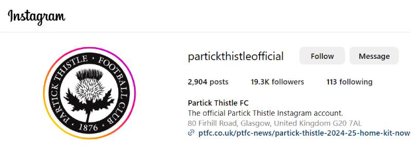
The Partick Thistle badge functions as the anchor point for everything the club puts out visually. The red-and-yellow color scheme from the crest extends to the home kits, stadium branding at Firhill, the club website, social media channels, and all official merchandise.
Partick Thistle markets itself as “The Great Glasgow Alternative” to the Old Firm dominance of Celtic and Rangers. That positioning is reflected in the badge’s straightforward approach. No religious or political symbols. No unnecessary complexity. Just the thistle and the club name.
The club has shown willingness to push boundaries with its broader brand, too. In 2008-09, they became the first Scottish club to use pink as a primary away kit color. In 2019-20, they added a rainbow flag design to their away kit sleeves to support the LGBT community, another first in Scottish football.
But through all of that, the badge stays the same. It’s the constant. That kind of stability matters for a brand style guide approach, even if Partick Thistle doesn’t publicize theirs the way a larger club might.
How Should the Partick Thistle Logo Be Used?
The Partick Thistle FC crest is a protected trademark of the club. Any commercial use of the badge requires written permission from Partick Thistle Football Club.
For supporters creating personal, non-commercial content (fan art, blog posts, social media graphics), the general expectation across Scottish football is that fair use applies as long as you’re not implying official endorsement or selling products.
Official versions of the badge can be found on the club’s website at ptfc.co.uk. Vector files are available through licensed sports branding databases like Brandfetch and Brands of the World, typically in SVG and EPS formats.
If you’re a designer or content creator looking to use the badge in a professional context, your best move is to contact the club directly through their commercial department. Partick Thistle operates its own online shop for licensed merchandise, and any products featuring the crest need to go through proper channels.
The standard rules apply here: don’t stretch, rotate, or alter the colors of the badge. Don’t place it on backgrounds where it becomes unreadable. And definitely don’t slap it on bootleg merchandise. The club takes these things seriously, as they should.
FAQ on The Partick Thistle Logo
What does the Partick Thistle logo look like?
The Partick Thistle FC badge features a stylized thistle plant drawn with bold black outlines, surrounded by the club name in a curved banner. The crest uses red, yellow, black, and white.
It’s an emblem-style design. Circular in shape, clean in execution.
When was the current Partick Thistle crest introduced?
The current crest was introduced in 2008, replacing the modernist rectangular badge that had been used since 1990. It launched ahead of the 2008-09 First Division season under manager Ian McCall at Firhill Stadium.
It’s now been in use for over 17 years.
What do the colors in the Partick Thistle badge mean?
Red and yellow have been the Jags’ official colors since the 1936-37 season. Red signals energy and passion. Yellow brings visibility and optimism.
Black provides structure and outline work. The combination is unique among Scottish football club logos and makes the badge immediately identifiable in the SPFL.
Why is there a thistle in the logo?
The thistle is Scotland’s national flower and a direct reference to the club’s name. It first appeared on a Partick Thistle kit in 1902. Every badge version since has featured one.
The thistle symbol represents resilience in Scottish culture, fitting for a Glasgow club that’s survived over a century of ups and downs.
How many times has the Partick Thistle logo changed?
The club has used four main badge designs. A simple thistle from 1902, a roundel version from 1978, a modernist rectangle from 1990, and the current emblem from 2008.
Each redesign reflected the era’s design trends while keeping the thistle as the focal point.
Who designed the Partick Thistle mascot Kingsley?
Turner Prize-nominated artist David Shrigley designed Kingsley in 2015. The sun-shaped mascot was part of a sponsorship deal with California-based Kingsford Capital Management.
Kingsley trended worldwide on Twitter and got coverage from CNN, Time, and The Washington Post. It put the club on the global map overnight.
What is the difference between the Partick Thistle logo and the Kingsley mascot?
The badge is the club’s official crest, used on kits and all branding since 2008. Kingsley is the matchday mascot, designed separately by David Shrigley.
Kingsley’s face appeared on the Kingsford Capital sponsor logo on Thistle shirts. But it was never part of the actual club crest itself.
Can I download the Partick Thistle logo for personal use?
The badge is available through licensed sources like Brandfetch and Brands of the World in SVG and EPS formats. The club website at ptfc.co.uk also displays the crest.
Commercial use requires permission from Partick Thistle Football Club. Personal, non-commercial fan content generally falls under fair use in Scottish football.
How does the Partick Thistle badge compare to other Scottish club crests?
Most Scottish clubs use blues, greens, or maroon. Partick Thistle’s red-and-yellow palette stands apart in the Scottish Championship and across the SPFL.
The badge is simpler than Celtic’s or Rangers’ crests but holds its own. It avoids political or religious symbols entirely, reflecting the club’s non-sectarian identity in Glasgow.
What font is used in the Partick Thistle logo?
The badge uses a bold, uppercase sans-serif typeface for “PARTICK THISTLE FOOTBALL CLUB.” The text curves along the top of the circular frame with tight letter spacing.
It’s functional and readable at small sizes, which matters for everything from woven kit patches to digital displays on the Maryhill club’s social channels.
Conclusion
The Partick Thistle logo tells the story of a club that’s been around since 1876 and never stopped finding ways to stay relevant. Four badge versions, one consistent symbol. The thistle has carried this Glasgow club through league promotions, relegations, and a mascot that broke the internet.
Red, yellow, and black. That kit identity hasn’t changed since 1936, and the crest pulls directly from it.
From the early days in Partick to Firhill in Maryhill, the badge connects the Jags’ past to their present in the Scottish Championship. It’s honest branding for a non-sectarian club that does things its own way.

Renowned for his expertise in logo design and visual branding, Bogdan has developed a multitude of logos for various clients.
His skills extend to creating posters, vector illustrations, business cards, and brochures. Additionally, Bogdan's UI kits were featured on marketplaces like Visual Hierarchy and UI8.
He also wrote in the past years on sites like Design Your Way, WebDesignerDepot, WPDean, Designmodo, Speckyboy, Slider Revolution, and more.
- Canva vs PowerPoint: Which Is Better for Presentations? - 22 September 2026
- How to Install Fonts on Mac (Step-by-Step Guide) - 20 September 2026
- From Mockup to Code: How AI-Augmented Development Speeds Up the Design Handoff - 19 September 2026

Bogdan Sandu is a seasoned designer who has been designing websites since 2008. Renowned for his expertise in logo design and visual branding, Bogdan has developed a multitude of logos for various clients. His skills extend to creating posters, vector illustrations, business cards, and brochures. Additionally, Bogdan's UI kits were featured on marketplaces like Visual Hierarchy and UI8. He also wrote in the past years on sites like Design Your Way, WebDesignerDepot, WPDean, Designmodo, Speckyboy, Slider Revolution, and more.
You Might Also Like


