


The Ross County logo is one of those football badges that tells you everything about where the club comes from before you even read a word. It sits at the heart of a small Highland club with an outsized story, rooted in Dingwall, Scotland, since 1929.
Ross County FC built its identity around the Caberfeidh, a stag’s head symbol borrowed from the Seaforth Highlanders infantry regiment. That military connection runs deep. Locals from the Ross-shire area served and died with that regiment during the Great War, and the club chose to carry that memory forward on their crest.
The badge has gone through several versions over the decades. Early iterations were simple shields and circles. The stag appeared on shirts starting in 1953, got dropped in 1987 in favor of plain initials, and returned for good in 1991 with the modern crest design still in use today. The current version features a stylized stag’s head on a blue shield with “RCFC 1929” text, marking the founding year.
Within Scottish football branding, it’s a badge that punches above its weight. Dark blue, red, and white give it a distinctive look among the Celtic greens and Aberdeen reds that dominate the league’s visual landscape.
What Is the Ross County Logo?

The Ross County logo is a combination mark featuring a stylized stag’s head (Caberfeidh) set on a blue shield, with “RCFC 1929” displayed in white lettering. Adopted in 1991, it was designed by club branding collaborators. The stag represents Highland heritage, military tribute, and regional pride.
Key Attributes
- Design Type: Combination mark (emblem with text elements)
- Primary Elements: Stag’s head (Caberfeidh), blue shield, “RCFC 1929” lettering, red and white accent details
- Official Introduction Date: 1991 (current version)
- Designer/Agency: Club branding team with input from graphic designers, including work attributed to Victor Fradera for vector adaptations
- Trademark Status: Registered under Ross County Football Club, all usage rights held by the club
- Color Palette: Navy blue (primary), red (secondary), white (accent)
- Usage Context: Match kits, official merchandise, stadium branding at the Global Energy Stadium, digital platforms, marketing materials, and community programs
How Has the Ross County Logo Evolved Over Time?
The Ross County badge has been through roughly four distinct phases since 1929. It started as a basic county shield, grew into a stag-bearing crest, got stripped down to plain initials, then came back stronger as the modern emblem we see today.
Each change tracked a shift in the club’s status and ambitions.
Original Ross County Crest (1929-1952)
- Years Active: 1929-1952
- Design Description: A simple county shield featuring a stag’s head cabossed, drawn from the Ross and Cromarty coat of arms. Minimal detail, no elaborate typography or color work.
- Color Scheme: Basic dark tones matching the club’s early kit colors (claret and blue hoops initially, then blue and white stripes)
- Context: Adopted at the club’s formation when Dingwall Victoria United reformed as Ross County to represent the wider Ross and Cromarty region in the Highland League. The Caberfeidh was chosen to honor the Seaforth Highlanders regiment.
- Cultural Significance: Established the stag as the club’s defining symbol, directly linking football identity to military heritage and Highland community values. It gave the club its lasting nickname: The Staggies.
Stag’s Head Crest on Shirts (1953-1986)
- Years Active: 1953-1986
- Design Description: A more visible stag’s head crest appeared on the team’s navy shirts for the first time. The design was cleaner and more prominent than the original, though still fairly straightforward by modern standards.
- Color Scheme: Navy blue and white, matching the new kit colors introduced in 1953
- Key Changes from Previous: The crest moved from being an occasional, sometimes omitted element to a consistent presence on the shirt. The shift to navy and white as primary kit colors also changed how the badge looked in context.
- Context: This period saw Ross County win the Highland League title for the first time in 1967. The badge was occasionally simplified or left off kits during the 1960s and 1970s but was formally reintroduced in 1982.
- Cultural Significance: Cemented the stag as a recognized part of Scottish Highland football culture. The navy color choice during this era became permanent for the club.
Initials-Only Badge (1987-1990)
- Years Active: 1987-1990
- Design Description: The stag was dropped entirely. A simple set of club initials replaced it. This was a stripped-back, text-only approach to the badge.
- Color Scheme: Navy blue and white
- Key Changes from Previous: Complete removal of the stag imagery. The club went from a figurative emblem to a plain typographic mark.
- Context: This was a relatively quiet period for Ross County on the pitch. The minimalist badge reflected a club not yet thinking about branding in the way modern football demands.
- Cultural Significance: Looking back, this is the least popular version among fans. It stripped away the thing that made Ross County’s identity unique. But it also set the stage for the triumphant return of the stag.
Modern Ross County Crest (1991-Present)
- Years Active: 1991-present
- Design Description: A stylized stag’s head on a blue shield with “RCFC 1929” in white lettering. More refined lines, better proportions, and a design that works across print and digital media.
- Color Scheme: Navy blue, red, white
- Designer: Club branding team
- Key Changes from Previous: Full return of the stag. The “1929” inclusion anchors the club’s founding year into the badge itself. Red accents were introduced alongside the traditional navy and white.
- Context: Adopted the same year Ross County won the Highland League title. The timing was perfect. Within three years, the club joined the Scottish Football League. This badge has seen every major milestone since, from the 2010 Scottish Cup Final to the 2016 League Cup win.
- Cultural Significance: This is THE Ross County badge. It carried the club from Highland League obscurity into the Scottish Premiership. Fans, sponsors, and the broader Scottish football community all recognize it instantly.
What Do the Design Elements of the Ross County Logo Mean?

Every piece of the Ross County badge ties back to something real. The stag is not decorative. It’s a direct reference to the Caberfeidh from the Seaforth Highlanders regiment, connecting the club to the military history of Dingwall and the wider Highlands.
The shield shape and the inclusion of the founding year ground it in tradition.
What Does the Stag Symbolize in the Badge?
The stag’s head, or Caberfeidh, comes from the regimental badge of the Seaforth Highlanders. Many locals from the Dingwall area served with this regiment during World War I.
Red deer stags are also native to the Scottish Highlands, so the symbol works on two levels. It honors fallen soldiers and represents the natural landscape of Ross-shire.
The club’s nickname, “The Staggies,” comes directly from this badge element. Even the club mascot, a stag named Rosco, plays on this connection.
Why Did Ross County Choose These Specific Colors?
- Navy Blue – Hex: #00205B (approximate), RGB: (0, 32, 91) – The primary color. It suggests loyalty, trust, and stability. Navy blue became the club’s main shirt color in 1953 and has stayed ever since. Among brands that use blue, navy specifically communicates tradition and reliability.
- Red – Hex: #C8102E (approximate), RGB: (200, 16, 46) – The secondary color. Red adds energy and draws the eye. It appears as accents in the badge and on the kit. Looking at logos that feature red, you can see how it adds a layer of intensity to any design.
- White – Hex: #FFFFFF, RGB: (255, 255, 255) – Used for text and spacing within the badge. White provides contrast against the navy background and keeps the lettering readable at small sizes.
What Typography Style Is Used in the Ross County Logo?
The badge uses a sans-serif typeface for the “RCFC 1929” text. It’s clean, modern, and built for readability across different sizes.
The font choice keeps things simple. No decorative flourishes or script lettering. Just straightforward characters that hold up on a jersey chest, a website header, or a tiny social media avatar.
This matters more than people think. A lot of older football crests have beautiful lettering that becomes unreadable at small scales.
What Are the Hidden Meanings in the Ross County Logo?
The “1929” isn’t just a date. It’s a statement that this is a club with nearly a century of history, despite only joining the professional ranks in 1994.
The shield shape itself mirrors traditional heraldic design from the Ross and Cromarty coat of arms. And the stag’s posture, a head cabossed (facing forward), follows specific rules in Scottish heraldry that denote alertness and readiness.
Some fans also note that the color combination of dark blue and red mirrors the historic regimental colors of the Seaforth Highlanders, though the club has never confirmed this as intentional.
How Does the Ross County Logo Compare to Competitor Logos?
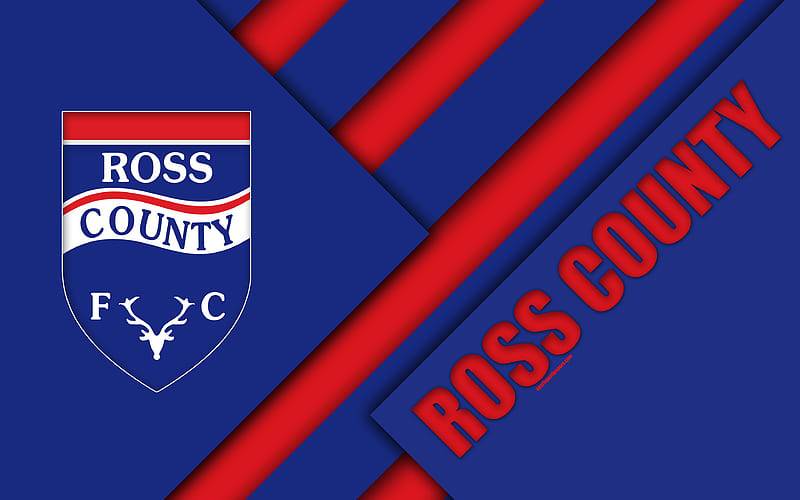
Scottish football badges tend to be heavily heraldic. Shields, lions, castles, thistles. The usual suspects. Ross County goes a different direction with the stag, and that makes it stand out immediately.
Compare it to rivals like Hibernian, who use a harp, or Kilmarnock, who stick with a traditional shield and hand design. The Heart of Midlothian badge leans on its famous maroon heart. Dundee United keeps things geometric and bold.
Ross County’s closest visual neighbor might actually be Partick Thistle, which also uses a distinctive mascot-driven approach, though Partick’s sun design is far more abstract.
The Highland derby rival, Inverness Caledonian Thistle, uses a quite different look with their own regional identity. Where Inverness leans into a more modern, corporate style, Ross County keeps that military-heritage connection front and center. It’s an older kind of identity, honestly. And it works.
What Are the Technical Specifications of the Ross County Logo?
Official Color Codes
- Primary Color: Navy Blue
- Hex: #00205B (approximate)
- RGB: (0, 32, 91)
- CMYK: (100, 85, 5, 36)
- Secondary Color: Red
- Hex: #C8102E (approximate)
- RGB: (200, 16, 46)
- CMYK: (0, 100, 80, 5)
- Accent Color: White
- Hex: #FFFFFF
- RGB: (255, 255, 255)
- CMYK: (0, 0, 0, 0)
Dimensions and Proportions
The Ross County crest follows a roughly vertical shield format, taller than it is wide. The aspect ratio sits close to 2:3, which is common for football badge designs built for jersey placement.
Minimum size for print reproduction typically stays above 20mm in width to keep the stag’s head details legible. On digital platforms, the club often uses a simplified version or the stag alone when space is tight.
Clear space around the badge should be maintained at roughly the width of the “R” in RCFC on all sides. This prevents other design elements from crowding the crest, something you’ll see in the club’s brand guidelines.
What Cultural Impact Has the Ross County Logo Had?

For a town of around 5,000 people, Dingwall punches well above its weight in Scottish football. The Ross County badge is the most recognizable symbol to come out of the area.
When the club beat Celtic 2-0 in the 2010 Scottish Cup semi-final, that stag emblem was suddenly on every front page in Scotland. The same thing happened in 2016 when they lifted the League Cup. For the Staggie Army, the badge became something bigger than football. It became proof that a Highland community could compete at the top.
The crest also keeps the memory of the Seaforth Highlanders alive. That’s not a small thing. Without the football club carrying that Caberfeidh, the regiment’s connection to Dingwall might fade further with each generation.
How Does the Ross County Logo Fit Into the Overall Brand Identity?

The badge is the anchor of everything Ross County does visually. Kit designs, stadium signage at the Global Energy Stadium, social media profiles, community outreach materials. All of it radiates outward from the stag emblem.
The club’s style guide maintains consistency across platforms. Navy blue dominates, with red as a supporting accent. The stag shows up in background patterns on kits (like the deep blue rendition on the back of recent home shirts).
Sponsor logos, kit manufacturer branding, and league insignia all have to work around the badge, not the other way around. That’s how solid logo design is supposed to function. The crest stays central.
How Should the Ross County Logo Be Used?
Official Usage Guidelines
- Do: Use the official crest files provided by the club. Maintain clear space around the badge. Keep it on approved background colors (navy, white, or transparent).
- Don’t: Stretch, distort, recolor, or modify the badge in any way. Don’t place it on busy backgrounds that reduce legibility. Don’t combine it with unofficial text or imagery.
Where to Access Official Logos
The club’s official website (rosscountyfootballclub.co.uk) is the primary source. Vector format versions are available through approved branding channels. Third-party logo sites host versions in EPS, SVG, and PNG formats, but always check with the club for commercial use permissions.
Licensing Information
The Ross County FC badge is the property of Ross County Football Club. Commercial reproduction requires written permission. Fan art and editorial use typically fall under accepted practice within Scottish football, but selling merchandise with the badge without authorization is prohibited.
Trademark Protection
The badge, club name, and “The Staggies” nickname are all protected marks. The Scottish Professional Football League and the club itself enforce these protections. Unauthorized use on commercial products, particularly counterfeit merchandise, is subject to legal action.
FAQ on The Ross County Logo
What does the Ross County FC badge represent?
The Ross County badge features a stag’s head called the Caberfeidh, taken from the Seaforth Highlanders regimental badge. It represents Highland heritage, military sacrifice, and the club’s deep roots in Dingwall, Scotland since 1929.
Why is there a stag on the Ross County emblem?
The stag comes from the insignia of the Seaforth Highlanders infantry regiment. Locals from Ross-shire served with that regiment during World War I.
Red deer stags are also native to the Scottish Highlands. The symbol honors both the soldiers and the landscape.
What are the official Ross County logo colors?
The official club colors are navy blue, red, and white. Navy blue is the primary color on the shield. Red appears as an accent, and white handles the lettering and contrast within the crest design.
When was the current Ross County crest introduced?
The current version was adopted in 1991. It replaced a plain initials-only badge that had been used since 1987.
The timing matched the club’s Highland League title win that same year. Pretty good timing, honestly.
How many times has the Ross County logo changed?
The badge has gone through roughly four versions. The original 1929 county shield, a stag crest from 1953, a text-only initials mark from 1987, and the modern football club crest from 1991 that remains active today.
What font does the Ross County badge use?
The “RCFC 1929” text uses a clean sans-serif typeface. It prioritizes readability across different sizes, from match kits to digital platforms.
No decorative elements. Just clear, functional lettering that works at any scale.
What does “RCFC 1929” mean on the badge?
RCFC stands for Ross County Football Club. The 1929 marks the founding year when Dingwall Victoria United reformed as Ross County to join the Highland Football League and represent the broader Ross and Cromarty region.
Can I use the Ross County logo for personal projects?
Fan art and editorial use are generally acceptable within Scottish football culture. But commercial reproduction needs written permission from the club.
Selling merchandise with the badge without authorization is prohibited. The Scottish Professional Football League enforces these protections.
Where can I download the Ross County FC logo?
The club’s official website is the best source. Third-party sites offer vector and PNG versions, but always confirm licensing for commercial use. The badge is the registered property of Ross County Football Club.
How does the Ross County logo compare to other Scottish Premiership badges?
Most Scottish football emblems lean on shields, lions, and thistles. Ross County stands apart with its stag imagery tied to military history.
It’s a different kind of identity. Less heraldic tradition, more community and regimental connection from the Highlands.
Conclusion
The Ross County logo carries nearly a century of Highland football history in a single badge. Few Scottish club crests pack that much meaning into their design.
From the Caberfeidh stag honoring the Seaforth Highlanders to the navy blue shield marking the 1929 founding, every detail serves a purpose. It’s a badge built on community, not trends.
Whether it’s printed on match day kits at the Global Energy Stadium or displayed across digital platforms, the emblem keeps the Dingwall club’s identity consistent and recognizable across the Scottish Professional Football League.
For The Staggies and their supporters, this crest is more than branding. It’s proof that a small Highland town can leave a lasting mark on Scottish football.

Renowned for his expertise in logo design and visual branding, Bogdan has developed a multitude of logos for various clients.
His skills extend to creating posters, vector illustrations, business cards, and brochures. Additionally, Bogdan's UI kits were featured on marketplaces like Visual Hierarchy and UI8.
He also wrote in the past years on sites like Design Your Way, WebDesignerDepot, WPDean, Designmodo, Speckyboy, Slider Revolution, and more.
- Beautiful Fonts Similar to Poppins You Should Try - 22 October 2026
- Website Redesign: How to Improve Your Website without Losing SEO Rankings - 22 October 2026
- The Coda Logo History, Colors, Font, And Meaning - 20 October 2026

Bogdan Sandu is a seasoned designer who has been designing websites since 2008. Renowned for his expertise in logo design and visual branding, Bogdan has developed a multitude of logos for various clients. His skills extend to creating posters, vector illustrations, business cards, and brochures. Additionally, Bogdan's UI kits were featured on marketplaces like Visual Hierarchy and UI8. He also wrote in the past years on sites like Design Your Way, WebDesignerDepot, WPDean, Designmodo, Speckyboy, Slider Revolution, and more.
You Might Also Like


