


The Kilmarnock logo is one of the most historically layered badges in Scottish football. It belongs to Kilmarnock Football Club, commonly known as Killie, a professional club based in East Ayrshire that competes in the Scottish Premiership. The crest pulls directly from the heraldic traditions of Clan Boyd, whose influence shaped the town of Kilmarnock for centuries.
Few football badges in Scotland carry this much weight. The current version dates back to 1993, but its roots stretch to 1873, when the club first wore a crest on their shirts. Kilmarnock FC, founded in 1869, is the oldest professional football club in Scotland. The badge has gone through at least four major versions across its lifetime.
What Is the Kilmarnock FC Logo?

The Kilmarnock FC logo is a heraldic emblem featuring a football topped with a hand of blessing, flanked by two red squirrels, and bearing the Latin motto “Confidemus.” It was adopted in 1993 after a ruling by the Lord Lyon forced a redesign. The badge draws from the Clan Boyd coat of arms.
Design Type: Heraldic emblem (combination mark with crest elements and text)
Primary Elements: A stylized football acts as the shield. A hand of blessing sits on top of the ball with two fingers raised. Two red squirrels flank the football on either side. A blue and white heraldic wreath sits below the hand. The Latin motto “Confidemus” arches above everything. The club name “Kilmarnock F.C.” appears below.
Official Introduction Date: 1993 (current version). The 1977 kit featured the first modern badge iteration.
Designer/Agency: The original badge redesign was created after the Lord Lyon’s heraldic ruling. A team of sports branding specialists handled the 1993 update.
Trademark Status: The images, logos, and names are proprietary marks of Kilmarnock FC, as stated in the club’s official terms.
Color Palette: Blue (#2F368F), white (#FFFFFF), brown (#BF7537), beige (#E9CCAC), and black (#000000).
Usage Context: Match kits, club merchandise (jerseys, scarves, mugs), digital platforms, matchday programmes, Rugby Park signage, and official communications.
How Has the Kilmarnock FC Logo Evolved Over Time?
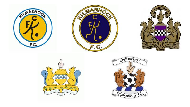
The Kilmarnock badge has moved through four main phases since 1873. It started as a simple hand-on-ball crest, went through a long period with no badge at all, then returned with heraldic versions in the late 20th century. The current design arrived in 1993 after a legal dispute over heraldic rules.
Original Kilmarnock Badge (1873-1887)
Years Active: 1873 to 1887
The first known Kilmarnock crest appeared on the club’s shirt from 1873. It showed a hand with the index and second fingers raised, thumb outstretched, and remaining fingers folded into the palm. This hand sat on a bar over a ball marked “KFC.”
The design was borrowed directly from the Clan Boyd heraldic crest. The Boyds had been the dominant family in Kilmarnock since the 13th century, after Sir Robert Boyd fought at the Battle of Largs.
Blue was the primary color. The earliest known kit from 1879 was an all-blue jersey with white trousers. No formal color codes existed at the time, obviously.
This was the first time any Scottish club identity got tied so directly to local aristocratic heraldry. The hand of blessing represented St. Marnock (or Mo-Ernoc), a sixth-century disciple of St. Columba, from whom the town gets its name.
The Badge-Free Era (1887-1977)
Years Active: 1887 to 1977
Here is something that surprises most people. Kilmarnock played without any badge on their shirts for 90 years. From 1887 onward, the crest disappeared from the kit entirely.
During this stretch, the club went through major changes. They switched from black and white stripes (1887-1890) back to their now-famous blue and white stripes. They won the Scottish Cup in 1920 and 1929. They claimed their only league championship in 1965.
But through all of that, no badge. The team’s identity lived in the blue and white stripes alone.
This wasn’t unusual for Scottish football at the time. Many clubs in the early-to-mid 20th century didn’t put crests on their jerseys. The idea of a logo as a fixed brand asset came later.
The Return of the Badge (1977-1992)
Years Active: 1977 to 1992
In 1977, Kilmarnock reintroduced a badge onto their match shirts. This version pulled from the town crest and incorporated elements of the Boyd family coat of arms more heavily.
The design was more complex than the original 1873 version. It leaned into full heraldic display rather than the simpler hand-on-ball approach.
But there was a problem. The Lord Lyon King of Arms, who regulates heraldic use in Scotland, eventually ruled that the badge was too close to the official town crest. Under ancient Scottish heraldic law, clubs cannot just copy municipal arms without permission.
This ruling forced a complete rethink.
Current Kilmarnock Badge (1993-Present)
Years Active: 1993 to present
The current badge arrived in 1993 as a direct response to the Lord Lyon’s ruling. Instead of copying the town crest, the club created a modernized version that referenced the same source material, the Boyd coat of arms, but in a distinct way.
The football replaced the traditional shield shape. The hand of blessing returned in a cleaner, more stylized form. Two red squirrels were added as supporters, pulled from the Boyd heraldic tradition. The blue and white wreath appeared below the hand. And the motto changed from the Boyd family’s “Confido” (I trust) to “Confidemus” (We trust).
In October 2018, the club unveiled a special 150th anniversary badge to mark the club’s founding in 1869. This temporary version added commemorative elements while keeping the core design intact.
The badge has a bold outline designed specifically so it works in a monochromatic format. That’s a practical detail most people miss.
What Do the Design Elements of the Kilmarnock FC Logo Mean?

Every piece of the Kilmarnock badge traces back to either Clan Boyd heraldry or the history of the town itself. The hand of blessing, the squirrels, the motto, the colors. None of it is decorative filler. Each element connects to a specific historical reference point going back centuries.
Why Did Kilmarnock FC Choose These Specific Colors?
Blue (#2F368F): The primary color. Blue has been part of Kilmarnock’s identity since the earliest known kit in 1879. In terms of color psychology, blue signals loyalty and trust. For Kilmarnock, it ties directly to the traditional match kit, keeping everything consistent across jerseys, merchandise, and branding.
White (#FFFFFF): The secondary color. Combined with blue, it forms the club’s signature striped kit pattern that has been in use, on and off, since 1896. White adds clarity and contrast to the badge, making it readable at small sizes.
Brown (#BF7537): Used for the squirrels and certain crest details. This pulls from the natural coloring of the red squirrels on the Boyd coat of arms. It adds warmth to what would otherwise be a cold blue-and-white design.
Beige (#E9CCAC): An accent color used in the hand and wreath elements. It adds depth without competing with the primary blue.
Black (#000000): Used for outlines and text. The bold black outline was a deliberate choice, making the badge work when printed in single-color formats on kits or documents.
What Typography Style Is Used in the Kilmarnock FC Logo?
The badge uses a font that bridges tradition and readability. “CONFIDEMUS” sits in an arched format above the crest, while “KILMARNOCK F.C.” appears below.
The lettering is clean and slightly stylized. It was selected to work well with the rounded shape of the football crest. Took me a while to find out, but one redesign proposal mentioned the font “Harabara” as a complement to the crest’s curves.
On merchandise and match kits, the text is often dropped entirely, leaving just the crest. That tells you something about how the typography was always considered secondary to the graphic elements.
What Are the Hidden Meanings in the Kilmarnock FC Logo?
The hand of blessing is the biggest one. It represents St. Marnock, the sixth-century saint who gave the town its name. “Kilmarnock” translates roughly from Gaelic as “the church of Marnock.”
The two raised fingers aren’t random. That specific hand position is a traditional Christian blessing gesture, pulled straight from the Boyd family crest. The squirrels, which some fans joke look a bit odd on a football badge, come from Lord Robert Boyd’s coat of arms dating to around 1460. Dean Castle in Kilmarnock still has actual squirrels roaming the grounds today.
The shift from “Confido” to “Confidemus” was a deliberate move. Changing “I trust” to “We trust” made the motto communal rather than individual. It fits a football club better than a family motto.
How Does the Kilmarnock FC Logo Compare to Competitor Logos?

Scottish football badges tend to lean heavily on heraldic tradition. The Kilmarnock crest fits that pattern but stands apart because of its unusual shape psychology. Most Scottish clubs use circular or shield-shaped badges. Kilmarnock uses the football itself as the framing device.
Look at the Celtic logo with its four-leaf clover inside a circle. Or the Glasgow Rangers logo with its traditional shield and intertwined RFC lettering. Both follow more conventional badge formats.
Aberdeen uses a bold, modernized shield. Hibernian leans into their Irish heritage with a harp. Heart of Midlothian keeps their maroon heart front and center.
Kilmarnock’s badge is one of the few in Scottish football that still prominently features animal supporters (the squirrels) from heraldic tradition. Partick Thistle uses the Jags mascot, but that’s a different approach entirely. The Dundee United badge, by comparison, is much more stripped back.
The whole effect is that Kilmarnock’s crest looks more like a coat of arms than a modern sports logo. Depending on your taste, that’s either charming or outdated. Some fans have called it “cartoon-like” over the years. Your mileage may vary.
What Are the Technical Specifications of the Kilmarnock FC Logo?
Official Color Codes
Primary Color: Blue
- Hex: #2F368F
- RGB: (47, 54, 143)
- CMYK: (98, 95, 6, 1)
- Pantone: PMS 2770 CP
Secondary Color: White
- Hex: #FFFFFF
- RGB: (255, 255, 255)
- CMYK: (0, 0, 0, 0)
Accent Color: Brown
- Hex: #BF7537
- RGB: (191, 117, 55)
- CMYK: (21, 59, 91, 6)
- Pantone: PMS 10145 C
Accent Color: Beige
- Hex: #E9CCAC
- RGB: (233, 204, 172)
- CMYK: (8, 19, 32, 0)
- Pantone: PMS 4685 CP
Outline Color: Black
- Hex: #000000
- RGB: (0, 0, 0)
- CMYK: (70, 50, 50, 100)
- Pantone: PMS Process Black C
Dimensions and Proportions
The badge is roughly square in proportion. The official vector graphics version on download sites shows a PNG at 2000×1999 pixels, which confirms the near-1:1 aspect ratio.
The bold black outline was an intentional design decision. It allows the crest to be reproduced in a single-color format without losing its shape or detail. This matters for things like printed match programmes, embossed merchandise, and low-resolution digital applications.
Clear space around the badge should generally match the height of the “CONFIDEMUS” text above the crest. When used on kits, the text elements are typically removed, leaving only the graphic emblem.
What Cultural Impact Has the Kilmarnock FC Logo Had?
The Kilmarnock badge has become a symbol of identity for East Ayrshire that goes beyond football. It ties the club to Clan Boyd, to St. Marnock, and to the town’s history as an industrial center known for textiles and printing.
Robert Burns published his first collection of poems in Kilmarnock in 1786. The town has that kind of cultural weight. The badge, with its heraldic elements and Latin motto, carries some of that same energy for football supporters.
The club mascot “Captain Conker” is a squirrel, named after the crest’s red squirrels and the Boyd coat of arms. Before that, the mascot was “Nutz the Squirrel,” played by longtime fan Ian Downie for 19 years until his passing in 2020. That kind of connection between badge, mascot, and community doesn’t happen by accident.
There have been no major controversies around the badge itself, aside from the 1993 redesign forced by the Lord Lyon. Fans have mixed feelings about the current look. Some love the heraldic depth. Others think it needs a modern refresh. But it remains a source of pride at Rugby Park.
How Does the Kilmarnock FC Logo Fit Into the Overall Brand Identity?

The Kilmarnock badge sits at the center of everything the club does visually. It connects the match kit, the merchandise, the stadium signage at Rugby Park, and the digital presence into one cohesive brand system. The blue and white color palette runs through all of it.
Since the 2008-09 season, the club has manufactured kits under its own sportswear brand called “1869,” referencing the founding year. That’s a smart move. It ties the product directly to the heritage that the badge represents.
The crest appears on everything from jerseys and scarves to mugs and matchday programmes. Its bold outline means it reproduces well across different formats, whether that’s a full-color embroidered patch on a shirt or a single-color stamp on official paperwork.
Yellow serves as the club’s main third color for away kits, though red and purple have appeared in recent seasons. But the badge itself stays consistent. That unity across applications is what holds the whole brand together.
How Should the Kilmarnock FC Logo Be Used?
Official Usage Guidelines: The club’s official terms state that the images, logos, and names on the Kilmarnock FC website are proprietary marks. No license or right is granted to any person for use of the logo, name, or imagery without explicit permission from the club.
Do’s:
- Use the official vector files when available for print or digital reproduction
- Maintain clear space around the badge
- Use the monochromatic version when full color isn’t possible
- Keep the badge proportions intact (do not stretch or distort)
Don’ts:
- Do not alter the colors outside the official palette
- Do not separate individual elements (squirrels, hand, ball) from the full crest
- Do not use the badge to imply official endorsement without club approval
- Do not recreate or redraw the badge from scratch for commercial use
Where to Access Official Logos: The club’s official website at kilmarnockfc.co.uk is the primary source for approved branding assets. Third-party sites offer vector downloads in SVG, AI, EPS, and PDF formats, but these may not always reflect the most current version.
Trademark Protection: Kilmarnock FC reserves the right to remove or restrict any unauthorized use of their logo. The club’s brand is protected under standard trademark provisions, and any commercial use requires direct licensing from the club.
FAQ on The Kilmarnock Logo
What does the Kilmarnock FC badge represent?
The Kilmarnock FC badge represents the club’s ties to Clan Boyd and the town’s patron saint, St. Marnock. It features a hand of blessing, two red squirrels, and the Latin motto “Confidemus.” Every element traces back to Ayrshire heritage.
When was the current Kilmarnock crest introduced?
The current Kilmarnock crest was adopted in 1993. The Lord Lyon ruled the previous badge breached Scottish heraldic law.
A team of sports branding specialists designed the replacement. It kept the hand and football but added squirrels and the “Confidemus” motto from the Boyd coat of arms.
What are the official colors of the Kilmarnock logo?
The official Kilmarnock team colors are blue (#2F368F) and white (#FFFFFF), with brown (#BF7537) and beige (#E9CCAC) accents. Black outlines complete the palette.
Blue and white have been the club’s identity since 1879, matching the traditional kit at Rugby Park.
Why are there squirrels on the Kilmarnock emblem?
The red squirrels come from the Clan Boyd coat of arms. Lord Robert Boyd added them to the family crest around 1460.
Dean Castle in Kilmarnock still has squirrels on the grounds today. The club mascot, Captain Conker, is also a squirrel. It all connects back to the Boyd family’s long influence over the town.
What does “Confidemus” mean on the Kilmarnock badge?
“Confidemus” is Latin for “We trust.” It was adapted from the Boyd family motto “Confido,” meaning “I trust.”
The shift from singular to plural was deliberate. It turned a family motto into a communal statement for the Scottish football club and its supporters.
What is the hand symbol in the Kilmarnock FC logo?
The hand of blessing represents St. Marnock, the sixth-century saint who gave Kilmarnock its name. Two fingers raised, thumb out. It first appeared on the club shirt in 1873.
This same gesture features in the Boyd family heraldic crest, connecting the club to local history stretching back centuries.
Has Kilmarnock FC ever played without a badge?
Yes. From 1887 to 1977, Kilmarnock played without any crest on their shirts. That is 90 years of badge-free football.
During that stretch, the club won a league championship and two Scottish Cups. The blue and white stripes were the only visual identity Killie needed.
Can I download the Kilmarnock logo in vector format?
Several third-party sites offer the Kilmarnock FC logo in SVG, AI, EPS, and PDF formats. The official club website at kilmarnockfc.co.uk is the primary source.
Any commercial use requires permission from the club. The badge is a proprietary mark of Kilmarnock Football Club.
How does the Kilmarnock logo compare to other Scottish Premiership badges?
Most Scottish Premiership club logos use circular or shield shapes. Kilmarnock is different. The football itself acts as the frame, which gives it a look closer to a coat of arms than a typical sports badge.
The squirrel supporters and heraldic wreath set it apart from clubs like Celtic, Rangers, or Aberdeen.
Will the Kilmarnock FC logo be redesigned?
No official redesign has been announced. The club created a special 150th anniversary badge in 2018, but that was temporary.
Fans are split. Some want a modern update. Others want the heraldic elements preserved. Any future changes would likely keep the hand of blessing and squirrels intact while cleaning up the overall look.
Conclusion
The Kilmarnock logo is more than a football club badge. It is a compressed history of East Ayrshire, Clan Boyd, and over 150 years of Scottish football packed into a single crest.
From the hand of blessing to the red squirrels, every detail on the Killie emblem carries specific meaning rooted in heraldic tradition. The blue and white color scheme ties the badge directly to the match kit fans have worn since 1879.
Whether you are collecting Scottish Premiership badges or studying logo design principles, the Kilmarnock FC crest is a strong example of heritage-driven club branding that still holds up at Rugby Park today.

Renowned for his expertise in logo design and visual branding, Bogdan has developed a multitude of logos for various clients.
His skills extend to creating posters, vector illustrations, business cards, and brochures. Additionally, Bogdan's UI kits were featured on marketplaces like Visual Hierarchy and UI8.
He also wrote in the past years on sites like Design Your Way, WebDesignerDepot, WPDean, Designmodo, Speckyboy, Slider Revolution, and more.
- Beautiful Fonts Similar to Poppins You Should Try - 22 October 2026
- Website Redesign: How to Improve Your Website without Losing SEO Rankings - 22 October 2026
- The Coda Logo History, Colors, Font, And Meaning - 20 October 2026

Bogdan Sandu is a seasoned designer who has been designing websites since 2008. Renowned for his expertise in logo design and visual branding, Bogdan has developed a multitude of logos for various clients. His skills extend to creating posters, vector illustrations, business cards, and brochures. Additionally, Bogdan's UI kits were featured on marketplaces like Visual Hierarchy and UI8. He also wrote in the past years on sites like Design Your Way, WebDesignerDepot, WPDean, Designmodo, Speckyboy, Slider Revolution, and more.
You Might Also Like


