Every font size, heading level, and line of body text on your page is a typography element. Get them right, and readers move through content…
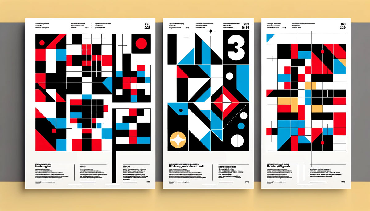
Helvetica is on your phone. The grid layout behind your favorite website started in 1950s Zürich. Whether you realize it or not, Swiss design shapes…
Every layout decision starts with spacing. And spacing starts with margin. Understanding what margin is in design matters whether you’re building a website in CSS,…
You’ve seen the term on every printer box, scanner setting, and Photoshop export dialog. But what is DPI (dots per inch), really? And why does…
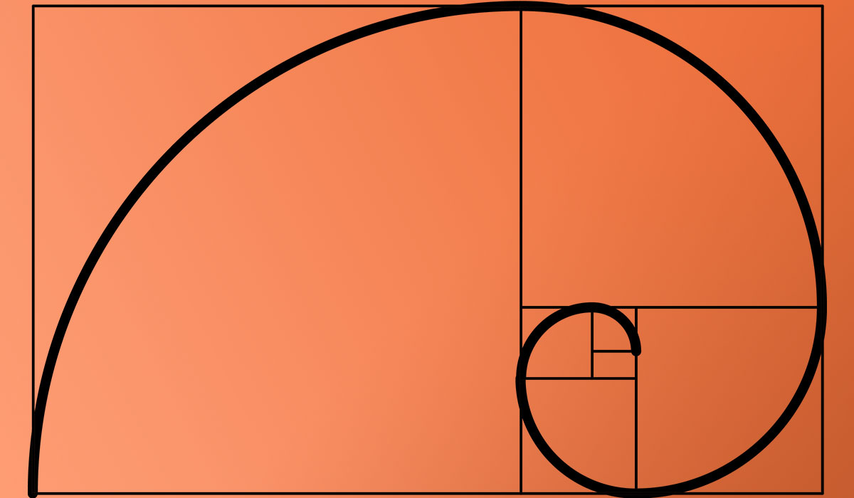
The number 1.618 has shaped buildings, logos, and screen layouts for over two thousand years. The golden ratio in design is a proportional system rooted…
Color choices shape how people respond to everything from a website layout to a gallery wall. But what are monochrome colors, and why do designers…
Every photo you’ve taken on your phone, every image loading on a website right now, almost certainly uses the same file format from 1992. So…
Every color you see on a product label, a brand logo, or a fabric swatch got there through a decision. And more often than not,…
Two colors. Opposite sides of the color wheel. That’s a complementary color scheme at its core, and it’s one of the most powerful tools in…
A reader decides whether to pick up your book in under a second. That decision almost always comes down to the cover. So what is…
Four colors. Two complementary pairs. One of the hardest color harmonies to pull off correctly. So what is a tetradic color scheme, and why do…
Every scroll, every app transition, every animated ad in your Instagram feed. That’s motion graphics at work. But what is motion graphics, exactly, and why…
A single sheet of paper, designed well, can stop someone mid-step on a busy sidewalk. That’s the entire job of poster design, and it’s been…
Three colors, equally spaced on the color wheel, can do more for a design than a dozen random picks. That’s the basic idea behind a…
Color affects up to 90% of a first impression. That single fact explains why getting your color palette right matters more than most people realize.…
A product has about seven seconds on a retail shelf before a shopper moves on. In that window, packaging design does all the talking. So…
People form judgments about a product within 90 seconds of seeing it, and up to 90% of that assessment comes down to color. That’s not…
Users decide whether they trust your website in about 50 milliseconds. That’s faster than a blink. So what is web design, and why does it…
Every product you’ve ever picked off a shelf was designed twice. Once as an idea, and once for the press. Understanding what is print design…
A layout where everything looks the same gives the viewer no reason to keep looking. That’s the problem variety solves. So what is variety in…
Grunge design looks like a mess on purpose. Torn edges, dirty type, ink splatter, scratched surfaces. It’s one of the few graphic design styles that…
Every diagonal line on a protest poster, every oversized sans-serif headline on a magazine cover, every red-and-black composition that makes you stop scrolling. That’s Constructivism…
Every design that feels “right” has one thing in common. The colors, type, spacing, and imagery all work as a single composition rather than a…
Filippo Tommaso Marinetti published a manifesto in 1909 that told artists to burn museums and worship machines. That single document launched one of the most…
Every layout you’ve ever loved had a pulse. Something that pulled your eye from one element to the next without you thinking about it. That’s…
Art Deco shaped the look of an entire era, and graphic designers are still borrowing from it a century later. But what is Art Deco…
Every layout tells your eye where to go. Whether you realize it or not, the path your gaze follows across a page is the result…
Every layout you’ve ever liked probably used framing without you noticing it. So what is framing in graphic design, and why does it quietly control…
Two columns of text that don’t line up. Headings with weird gaps underneath. Spacing that feels random from one section to the next. These are…
Symmetry feels safe. But the most memorable layouts in graphic design break the mirror on purpose. So what is asymmetry in graphic design, and why…