Imagine you’re scrolling through a beautifully designed website, and something just feels right. The typography, the way the fonts interact with each other, captures your attention. That’s the magic of Google font pairings.
In web design, typography choices are crucial. They don’t just convey information; they create an experience. With thousands of fonts available, finding the perfect font combinations can be overwhelming. That’s where Google Fonts come in, offering an extensive library of type pairings to elevate your web design.
This article will unveil the art of Google font pairings, diving deep into practical examples to enhance your typography skills. You’ll discover which font families work harmoniously, learn tips to achieve text readability, and explore the nuances of serif and sans-serif combinations.
By the end, you’ll be equipped to craft visually stunning and readable web pages using the best font pairings. Let’s embark on this typographic journey!
Google Font Pairings Examples
| Font Pairings | Category | Usage | Contrast Level | Popularity |
|---|---|---|---|---|
| Alegreya and Lato | Serif + Sans-serif | Body Text + Headings | Medium | High |
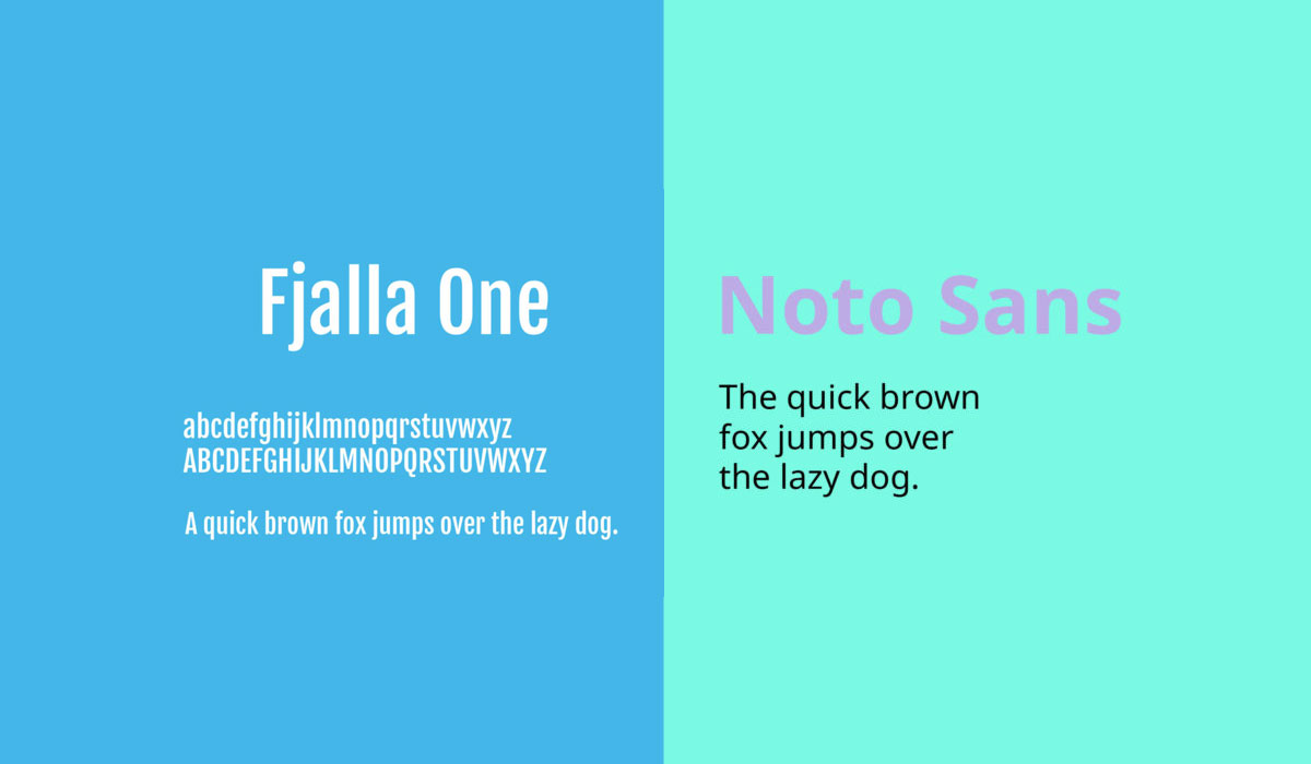
| Fjalla One and Noto Sans | Display + Sans-serif | Headings + Body Text | High | Medium |
| PT Sans and PT Sans Narrow | Sans-serif | Body Text + Condensed Text | Low | High |
| Josefin Sans and Amatic SC | Sans-serif + Handwriting | Headings + Decorative Text | High | Medium |
| Merriweather and Montserrat | Serif + Sans-serif | Body Text + Headings | High | High |
| Oswald and EB Garamond | Sans-serif + Serif | Headings + Body Text | High | Medium |
| Open Sans and Open Sans Condensed | Sans-serif | Body Text + Condensed Text | Low | Very High |
| Raleway and Roboto Slab | Sans-serif + Slab-serif | Headings + Body Text | Medium | High |
| Roboto and Roboto Condensed | Sans-serif | Body Text + Condensed Text | Low | Very High |
| Playfair Display and Source Sans Pro | Serif + Sans-serif | Headings + Body Text | High | High |
| Dancing Script and Josefin Sans | Handwriting + Sans-serif | Decorative Text + Headings | High | Medium |
| Allan and Cardo | Display + Serif | Headings + Body Text | High | Low |
Alegreya and Lato
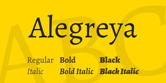
Alegreya and Lato are unique when viewed separately, each having its own character. Together, they create a remarkable font combination. Alegreya is friendly and organic, offering a natural and approachable feel, while Lato, known for its versatility, complements it perfectly. This pairing ensures readability and practicality, ideal for various web designs.
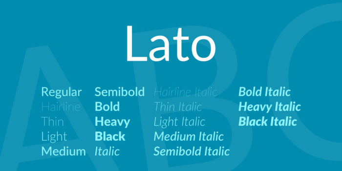
Lato is a highly popular and versatile Google font. Its ease of use and readability make it a favorite for many designers. When paired with Alegreya, the result is a harmonious, readable, and practical combination, perfect for creating natural and engaging content on your website.
Fjalla One and Noto Sans
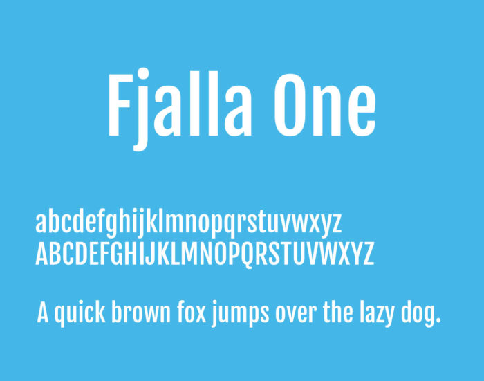
Fjalla One grabs attention with its bold, sans-serif style. Although not the most versatile, it has widespread appeal. Paired with Noto Sans, a highly versatile and harmonious font, this combination is perfect for creating a clear hierarchy in blogs or websites, ensuring legibility and aesthetic appeal.
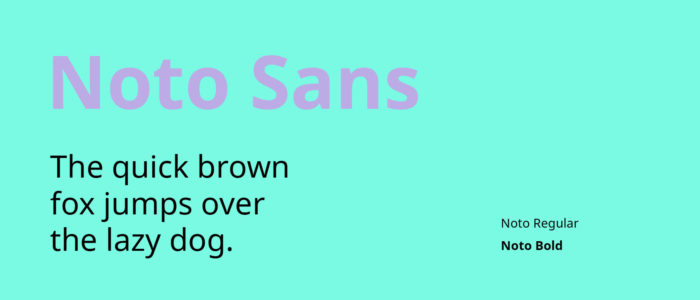
Noto Sans is versatile and aesthetically pleasing, making it an excellent choice for reaching an international audience. This pairing is ideal for websites that benefit from clear headings and subheadings, providing a structured and legible layout that enhances user experience.
PT Sans and PT Sans Narrow
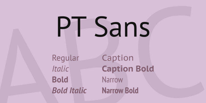
PT Sans and PT Sans Narrow bring old-world charm with a modern touch to your site. These font families add elegance and aesthetic appeal, perfect for technology companies or digital startups. Both fonts are highly legible and versatile, making them suitable for headers and body text alike.
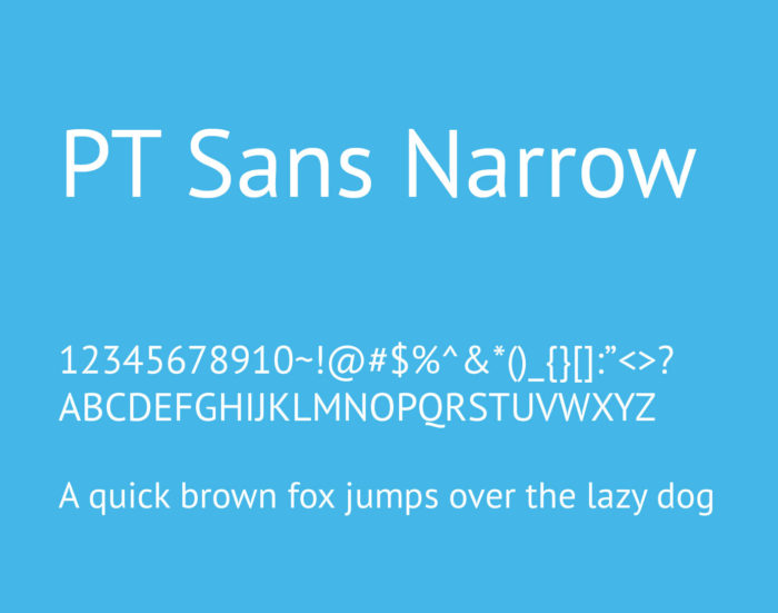
The clean aesthetic of PT Sans and PT Sans Narrow suits technology and software companies. Depending on your branding message, you can alternate between these fonts for body text, ensuring an elegant and cohesive look.
Josefin Sans and Amatic SC
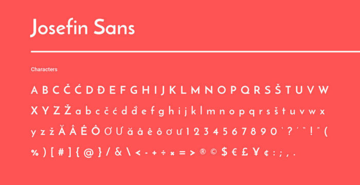
Josefin Sans is vintage and elegant, while Amatic SC brings a playful, hand-drawn touch. This combination is perfect for creative or playful sites, such as those in the entertainment, art, fashion, or design industries. Use Josefin Sans for body text and Amatic SC for headers to add a unique, whimsical feel.
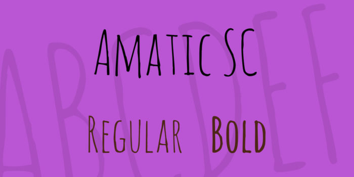
This pairing gives a unique touch to niche blogs or creative websites. Josefin Sans offers readability, while Amatic SC adds a handwritten flair, perfect for headings. It’s an ideal combination for sites targeting a unique and interesting audience.
Merriweather and Montserrat
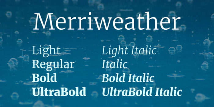
Montserrat is urban and practical, making it a favorite among web designers. Paired with Merriweather, this combination balances classic sophistication and modern flair, suitable for online news sites or publishing agencies. Both fonts can be used interchangeably for headers or body text, offering versatility and readability.
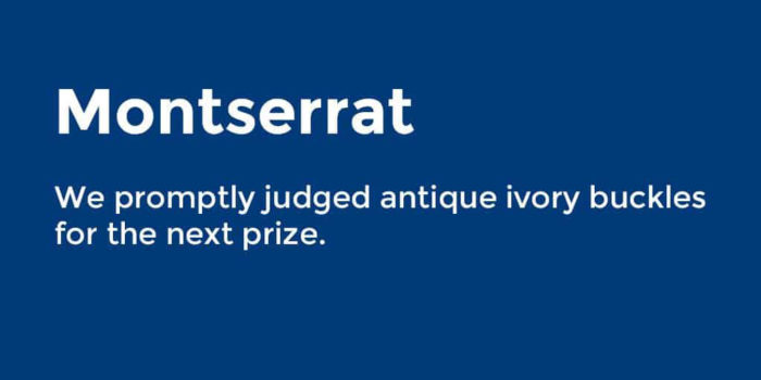
This pairing creates a balance between classic and modern design, making it ideal for business web pages and internet publishing sites. Merriweather and Montserrat offer a versatile and highly legible font combination that enhances your website’s overall aesthetic.
Oswald and EB Garamond
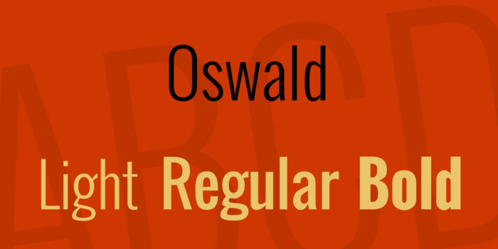
Oswald is a standout header font that also works well for body text, offering versatility and attention-grabbing quality. EB Garamond brings a classic, professional look, perfect for sophisticated or high-end websites like legal firms or fashion boutiques. This pairing exudes quality and professionalism.
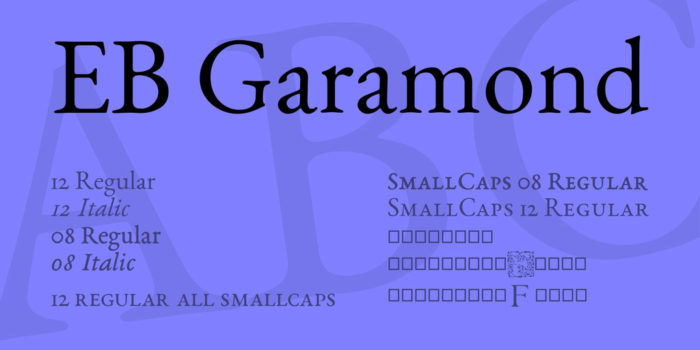
These fonts are suitable for high-end products and professional services, adding a sense of quality and sophistication. Oswald and EB Garamond are perfect for creating a professional and elegant aesthetic on your website.
Open Sans and Open Sans Condensed
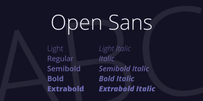
Open Sans and Open Sans Condensed offer versatility and elegance. These Google font pairs are perfect for a wide range of websites, providing simplicity and legibility. This combination is popular for its flexibility and aesthetic appeal, suitable for both headers and body text.
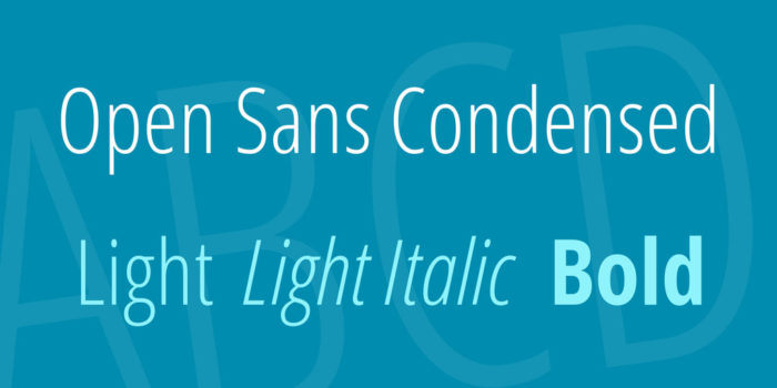
This versatile pairing can be used across various websites, creating a clean and elegant appearance. Open Sans and Open Sans Condensed ensure readability and flexibility, making them a reliable choice for any blog or website.
Raleway and Roboto Slab
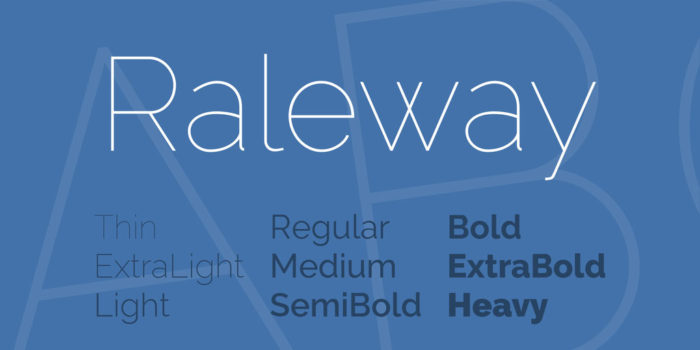
Raleway paired with Roboto Slab creates a striking serif and sans-serif combination. Roboto Slab’s classic style contrasts beautifully with Raleway’s boldness, ideal for sophisticated and clean website designs. This pairing suits e-Commerce sites, particularly those marketing luxury items like jewelry and high fashion.
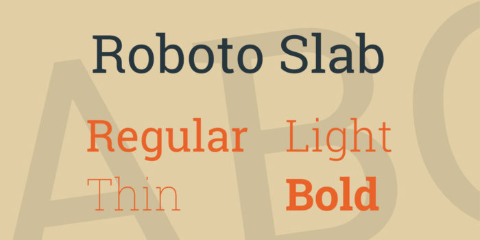
Both fonts can be used interchangeably for headers or body text. By experimenting with font weights and sizes, you can achieve a balanced hierarchy that enhances the professional aesthetic of your site.
Roboto and Roboto Condensed
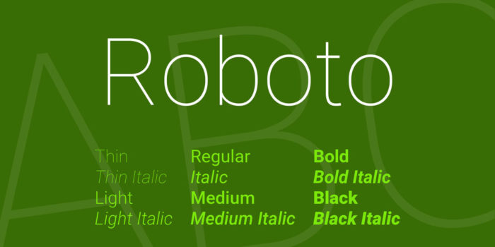
Roboto and Roboto Condensed are known for their versatility. This combination, with its variety of font weights, is perfect for tech companies, startups, and modern businesses. The geometric yet friendly style adds aesthetic appeal and impact to any website.
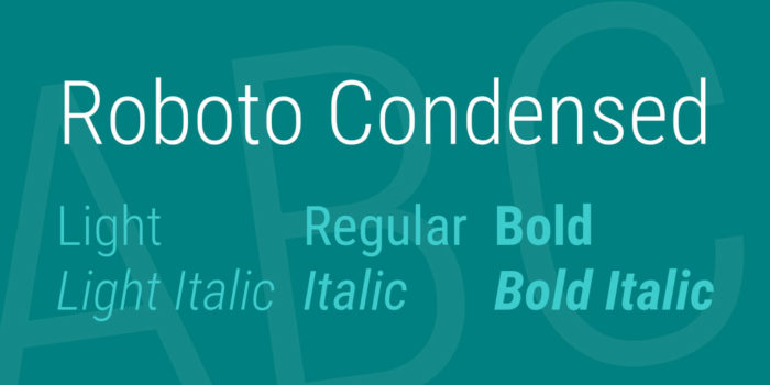
This versatile pairing appeals to a wide audience, making it suitable for tech companies and businesses focused on future development. The modern appeal ensures a striking and impactful website design.
Playfair Display and Source Sans Pro
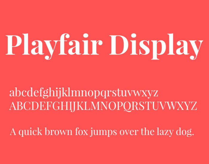
Playfair Display exudes old-world charm with a modern twist, based on calligraphic fonts. Source Sans Pro complements it with a simple, legible elegance, perfect for e-commerce sites. This combination adds a personal and creative touch to product descriptions, enhancing the overall aesthetic.
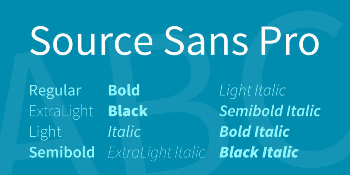
This pairing of modern and classic styles creates an attractive contrast, suitable for luxury brands and products. Playfair Display and Source Sans Pro offer a clean, elegant, and modern look.
Dancing Script & Josefin Sans
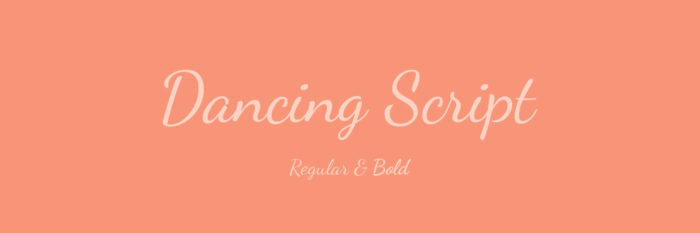
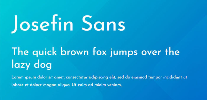
Dancing Script and Josefin Sans create a feminine and elegant combination. Dancing Script, a delicate script font, pairs beautifully with Josefin Sans, adding a soft touch to any website or blog. This pairing is ideal for sites targeting a feminine audience, enhancing the overall visual appeal.
Allan & Cardo
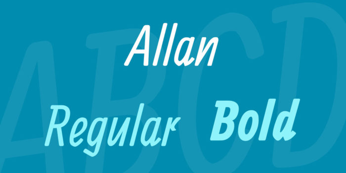
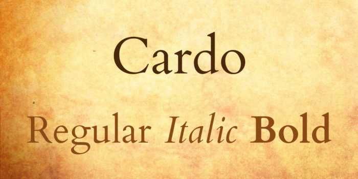
Allan is bold and creative, with an italic appearance, while Cardo offers a classic aesthetic. This combination contrasts time periods in an eye-catching way, perfect for creating a dynamic and engaging website. This pairing is ideal for sites that want to blend modern creativity with timeless elegance.
FAQ on Google font pairings
What are the best Google font pairings for web design?
Choosing Google font pairings can transform your website. One classic duo is Roboto for headings paired with Open Sans for body text. This combination balances modernity and readability, enhancing user experience. Experiment with font combinations from the Google Fonts library to find your perfect match.
How do I choose Google font pairings for readability?
Prioritize text readability by selecting contrasting font styles. A serif font like Merriweather for headlines and a sans-serif font like Lato for body text create a harmonious balance. These type pairings ensure that your content is easy on the eyes and engaging.
How do I integrate Google font pairings in CSS?
Integrating Google Fonts in CSS is straightforward. Use the @import rule or link the font in your HTML, then specify the font family in your CSS. For instance:
body {
font-family: 'Open Sans', sans-serif;
}
h1 {
font-family: 'Roboto', sans-serif;
}
Can I mix serif and sans-serif fonts in Google font pairings?
Absolutely. Mixing serif and sans-serif fonts is a popular strategy. Pairing Playfair Display (serif) with Montserrat (sans-serif) provides a stylish and readable look. This combination leverages the strengths of both font families, enhancing the overall design.
What are the trends in Google font pairings for 2024?
In 2024, modern font pairings focus on minimalism and readability. Popular combinations include Oswald with Lato and Raleway with Merriweather. These typography trends reflect a shift towards clean, easy-to-read designs that enhance user experience and site aesthetics.
How can Google font pairings improve user experience?
Effective Google font pairings improve user experience by ensuring text readability and visual appeal. Well-chosen fonts create a seamless reading flow, reduce eye strain, and make your website more engaging. This attention to typography can lead to longer visitor durations and lower bounce rates.
What are some creative Google font pairings for branding?
For branding, pair Montserrat with Raleway to create a modern, sophisticated look. Alternatively, Playfair Display combined with Source Sans Pro offers a classic, professional appearance. These creative font pairs enhance your brand’s visual identity and communicate your message effectively.
How do I avoid common mistakes in Google font pairings?
Avoid overloading your design with too many fonts. Stick to two or three complementary fonts to maintain visual harmony. Ensure that your chosen font pair aligns with your brand’s tone and is readable across different devices and screen sizes, enhancing overall user experience.
What are some free tools to find Google font pairings?
Explore tools like Google Fonts, FontPair, and Canva’s font combination tool. These resources provide pre-selected font pair suggestions, helping you discover type pairings that work well together. They simplify the process of finding harmonious font combinations for your projects.
How do Google font pairings impact SEO?
Google font pairings can indirectly impact SEO by improving user engagement and reducing bounce rates. Well-chosen fonts enhance text readability and user experience, encouraging visitors to stay longer on your site. This positive interaction signals to search engines that your content is valuable and relevant.
Conclusion
Exploring examples of Google font pairings opens up a world of creative possibilities for your web design projects. By thoughtfully combining Google Fonts, you can craft visually appealing and highly readable content that enhances the user experience. The right font combinations not only improve text readability but also reinforce your brand’s identity.
Remember, effective typography is more than just choosing pretty fonts. It’s about creating a harmonious balance between serif and sans-serif fonts, ensuring responsive typography, and paying attention to details like font weight and CSS font styling. Use tools like Google Fonts and FontPair to discover creative font pairs and elevate your designs.
By mastering Google font pairings, you can create compelling, user-friendly websites that stand out. Whether you’re designing for a sleek modern look or a classic feel, the right fonts make all the difference. Dive into the world of typography trends and transform your web projects today.
If you enjoyed reading this article about these Google font pairings, you should read these as well:
- 117 Free Christmas fonts to use for holiday projects
- Kinetic Typography: Best 47 Videos
- Best free fonts for logos: 72 modern and creative logo fonts
- Retro Fonts: 90 Free Vintage Fonts To Download
- Best Thin Fonts: Free Light Fonts To Download
- The best free fonts to use on your website

Renowned for his expertise in logo design and visual branding, Bogdan has developed a multitude of logos for various clients.
His skills extend to creating posters, vector illustrations, business cards, and brochures. Additionally, Bogdan's UI kits were featured on marketplaces like Visual Hierarchy and UI8.
He also wrote in the past years on sites like Design Your Way, WebDesignerDepot, WPDean, Designmodo, Speckyboy, Slider Revolution, and more.
- Canva vs PowerPoint: Which Is Better for Presentations? - 22 September 2026
- How to Install Fonts on Mac (Step-by-Step Guide) - 20 September 2026
- From Mockup to Code: How AI-Augmented Development Speeds Up the Design Handoff - 19 September 2026

Bogdan Sandu is a seasoned designer who has been designing websites since 2008. Renowned for his expertise in logo design and visual branding, Bogdan has developed a multitude of logos for various clients. His skills extend to creating posters, vector illustrations, business cards, and brochures. Additionally, Bogdan's UI kits were featured on marketplaces like Visual Hierarchy and UI8. He also wrote in the past years on sites like Design Your Way, WebDesignerDepot, WPDean, Designmodo, Speckyboy, Slider Revolution, and more.
You Might Also Like