Your next design project demands typography that looks like it arrived from tomorrow. Finding the best futuristic fonts separates forgettable designs from scroll-stopping visual experiences that command attention.
Futuristic typefaces do more than add sci-fi aesthetics. They communicate innovation, technical precision, and forward-thinking brand personality across digital interfaces, branding materials, and creative projects.
This guide examines 28 carefully selected futuristic fonts spanning geometric sans-serifs, tech-inspired displays, and experimental typefaces. You’ll discover each font’s design characteristics, optimal use cases, technical specifications, and pairing recommendations.
Whether you’re designing game interfaces, movie posters, tech startup logos, or web design projects requiring that space-age edge, you’ll find typography that delivers both impact and functionality.
The Best Futuristic Fonts
| Font Name | Primary Context | Unique Attributes | Best Use Cases |
|---|---|---|---|
| Varino | Modern geometric typeface | Clean lines with variable font technology | UI design, tech branding, web apps |
| Orbitron | Geometric sans-serif | Circular curves, space-age aesthetic | Headers, sci-fi projects, logos |
| Space Mono | Monospace with retro appeal | Fixed-width, excellent readability | Code displays, terminal interfaces, data |
| Audiowide | Wide techno display font | Extended letterforms, bold presence | Posters, titles, music tech branding |
| Michroma | Geometric sans with square caps | Uniform width, architectural precision | Industrial design, tech interfaces |
| Electrolize | Sans-serif with digital aesthetic | Sharp angles, electronic feel | Digital displays, tech documentation |
| Pixelify Sans | Pixel-based retro gaming font | 8-bit inspired, nostalgic design | Gaming interfaces, retro projects |
| Monoton | Decorative display with line work | Horizontal stripes, Art Deco influence | Artistic headers, neon sign effects |
| Raxtor | Bold futuristic sans-serif | Heavy weight, commanding presence | Gaming logos, esports branding |
| Akira Toru | Japanese cyberpunk aesthetic | Angular cuts, anime-inspired design | Cyberpunk themes, Asian-inspired designs |
| Anurati | Wide geometric display typeface | Extreme wide proportions, minimal curves | Movie titles, poster designs, banners |
| Raptor Sans | Aggressive sci-fi typeface | Sharp edges, predatory styling | Action games, aggressive branding |
| Ultra | Bold condensed sans-serif | High contrast, powerful impact | Headlines, impactful statements |
| Elixia | Sleek modern display font | Elegant curves, sophisticated feel | Luxury tech brands, premium products |
| Digitechno | Technical digital typeface | Circuit-inspired, systematic design | Electronics branding, digital products |
| Skensha | Experimental geometric font | Unconventional letterforms, artistic | Experimental design, art projects |
| Nebulica | Cosmic space-themed typeface | Celestial aesthetic, flowing forms | Space themes, astronomy content |
| Brachial | Mechanical industrial typeface | Robust structure, engineering feel | Industrial projects, mech designs |
| Stacker | Layered modular font | Stackable elements, customizable depth | 3D effects, dimensional typography |
| Galaxy | Sci-fi adventure typeface | Star Wars-inspired, classic sci-fi | Space operas, sci-fi films |
| Jedar | Modern tech sans-serif | Clean technology aesthetic | Software interfaces, startups |
| Andoria | Futuristic serif hybrid | Unique serif treatment with tech feel | Editorial futurism, sophisticated tech |
| Cords | Wire-frame inspired design | Linear construction, technical lines | Technical documentation, wireframes |
| Dirtchunk | Grunge futuristic hybrid | Distressed texture, post-apocalyptic | Dystopian themes, edgy designs |
| Space Armada | Military sci-fi typeface | Tactical aesthetic, strong geometry | Military games, tactical interfaces |
| Hermes | Sleek messenger-inspired font | Swift lines, communication-focused | Messaging apps, communication platforms |
| Centauri | Space exploration typeface | Star system aesthetic, astronomical | Space exploration, stellar projects |
| Osiris | Ancient future hybrid design | Egyptian elements with sci-fi fusion | Historical sci-fi, unique blending themes |
Varino
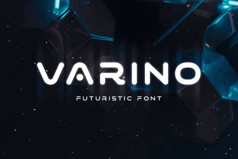
Varino delivers clean tech aesthetics through minimalist letterforms inspired by sci-fi movie titles and modern gadgets. Built for logos and display work where futuristic appeal meets readability.
Design Characteristics
Geometric foundation with rounded edges
The letterforms feature rounded corners that soften the tech-forward design. Each character maintains consistent width ratios across the family.
Unique ligature combinations create dynamic connections between letters. The extended character set supports custom variations through OpenType features.
Weight variations from light to extruded
Five distinct styles provide flexibility:
- Light for subtle applications
- Normal for standard display use
- Bold for maximum impact
- Outline for transparent effects
- Extrude for 3D depth illusion
Best Use Cases
Display typography in tech environments
Works exceptionally well in game interfaces where futuristic aesthetics matter. Movie posters and promotional materials benefit from its sci-fi character.
Logo design applications where clean geometric forms establish brand identity. Packaging projects that need modern tech appeal without sacrificing legibility.
Digital and print versatility
Presentation slides gain visual interest at large sizes. Book covers and magazine layouts use Varino for forward-looking themes. Not recommended for body text due to display-optimized spacing.
Technical Specifications
Available in OTF and TTF formats across all five weights.
Character coverage: Basic Latin, Latin Extended-A, custom ligatures
License: Commercial use allowed (verify specific license terms with foundry)
Supported platforms: Windows, macOS, Linux, iOS, Android
Pairing Recommendations
Combine with clean sans-serif fonts for body text to maintain readability.
Pair Normal weight with geometric sans-serifs like Inter or Roboto. The contrast between Varino’s display characteristics and neutral text fonts creates effective visual hierarchy.
Use Light weight for minimal branding alongside ultra-light supporting typefaces. Bold and Extrude versions need substantial negative space around them.
Accessibility Considerations
Display-only typeface requires minimum 24pt sizing for clarity.
Readability limitations: Extended use causes eye strain. Restrict to headlines, short phrases, and emphasis elements.
Outline and Extrude weights need careful contrast ratio monitoring. Test on various backgrounds to ensure WCAG AA compliance at large sizes.
Light weight struggles on low-resolution screens below 1080p. Digital applications need anti-aliasing enabled for smooth rendering.
Orbitron

Geometric sans-serif built for spaceship exteriors and corporate branding in dystopian futures. Clean lines with aerodynamic shoulders make Orbitron the go-to font for tech companies wanting that space-age look.
Design Characteristics
Pure geometric construction
Square letterforms with calculated roundness at strategic points. Uniform stroke width throughout creates mechanical precision. The design references 1960s space program typography without direct copying.
Capital letters dominate the personality. Lowercase maintains the same geometric rigor with reduced x-height.
Weight range supports versatility
Six weights available: Regular, Medium, Semi-Bold, Bold, Extra-Bold, Black. Each weight maintains identical proportions with only stroke thickness changing.
Variable font technology allows dynamic weight adjustments between fixed points.
Best Use Cases
Technology branding and interfaces
Perfect for software company logos requiring futuristic authority. App interfaces benefit from Orbitron’s screen-optimized geometry at UI scales.
Website headers in tech startups or SaaS platforms. Gaming interfaces where science fiction themes dominate.
Display applications demanding presence
Movie posters portraying space exploration or advanced technology. Corporate presentations in aerospace and robotics sectors. Event signage for tech conferences and product launches.
Technical Specifications
Format: Variable TrueType (TTF), Web formats (WOFF, WOFF2)
Character set: Latin Extended, includes stylistic alternatives and small caps
License: SIL Open Font License 1.1 (free for commercial use)
Google Fonts integration provides easy web implementation. Self-hosting supported with proper attribution.
Pairing Recommendations
Contrast geometric precision with warm serif fonts for editorial balance.
Effective combinations:
- Orbitron Bold + Source Serif Pro for tech journalism
- Orbitron Regular + Open Sans for clean web interfaces
- Orbitron Black + Lora for magazine-style layouts
Understanding how to pair fonts means balancing Orbitron’s mechanical character with more human typefaces.
Accessibility Considerations
Strong legibility at small sizes makes Orbitron versatile for UI text.
Minimum recommended size: 14pt for body text, 18pt for optimal reading. The geometric structure maintains clarity across different display technologies.
WCAG compliance: Achieves AA standards at regular weight with 4.5:1 contrast. Lighter weights need increased sizing or boosted contrast ratios.
Variable weight flexibility helps designers fine-tune for specific accessibility needs without switching typefaces.
Space Mono
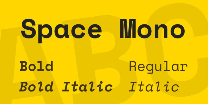
Fixed-width typeface designed specifically for coding environments and monospaced display work. Colophon Foundry created this for Google Design with personality that exceeds typical monospace expectations.
Design Characteristics
Monospaced with character
Every glyph occupies identical horizontal space. This fixed-pitch constraint produces unique letterform solutions.
The lowercase ‘g’ exemplifies Space Mono’s eccentric approach with geometric upper bowl and unexpected descending foot. Nerdy charm comes from intentional awkwardness in character design.
Four-style family
Regular, Italic, Bold, Bold Italic provide comprehensive coverage. Each style maintains strict monospacing while expressing weight and slant variations.
Geometric slab foundation meets grotesque details. The design references 1960s headline typefaces (Microgramma, Eurostile) adapted for digital age.
Best Use Cases
Code editors and technical documentation
Programming environments where monospaced fonts are mandatory. Syntax highlighting gains personality without sacrificing functionality.
Terminal applications and command-line interfaces. Technical documentation where code samples need visual distinction from body text.
Display typography with retro-future edge
Website headers in developer portfolios or tech blogs. Poster design projects requiring space-age nostalgia with legibility.
Data visualizations and dashboards where numbers need alignment. Tabular data presentation in reports and spreadsheets.
Technical Specifications
Format: TrueType (TTF), Web formats available
Character coverage: Latin Extended glyph set supporting Western and Central European languages
OpenType features: Old-style figures, superscript/subscript numerals, fractions, directional arrows, multiple stylistic alternates
License: SIL Open Font License (completely free, including commercial projects)
Available through Google Fonts and Adobe Fonts with no restrictions.
Pairing Recommendations
Combine with proportional sans-serifs for non-code content sections.
Recommended pairings:
- Space Mono + Space Grotesk (sister typeface, complementary design)
- Space Mono + Adobe Garamond for editorial contrast
- Space Mono + TT Norms for clean web layouts
When pairing fonts, use Space Mono for emphasis elements while standard typefaces handle body copy. The monospace texture creates natural distinction.
Accessibility Considerations
Fixed-width design aids dyslexic readers by preventing letter crowding.
Reading considerations: Excellent for short-to-medium text blocks. Extended reading in monospaced fonts causes fatigue faster than proportional types.
Minimum size recommendation: 12pt for code, 16pt for display text. The x-height ratio supports readability at smaller sizes than many monospace alternatives.
Strong character differentiation (0 vs O, 1 vs l) reduces confusion in technical contexts. Passes WCAG AA at regular weight with proper contrast.
Audiowide
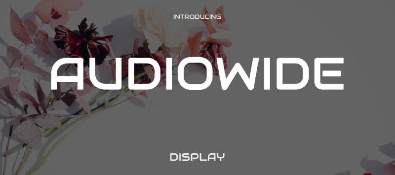
Soft-cornered tubular forms create technology-styled aesthetics with surprising readability. Brian Bonislawsky designed Audiowide as a futuristic alternative to conventional geometric sans-serifs.
Design Characteristics
Rounded tubular letterforms
Stroke terminals feature consistent rounding that suggests sleek manufacturing. The softness contradicts typical hard-edged tech fonts while maintaining modern appeal.
Wide character proportions create bold presence at any size. Letterform geometry nods to Handel Gothic without direct imitation.
Single weight, maximum impact
Only Regular weight available but designed to function like a bold display face. The condensed vertical proportions pack visual power into compact space.
Uppercase letters dominate the design philosophy. Lowercase maintains proportional relationships while expressing the same rounded corners.
Best Use Cases
Branding for tech and entertainment
Logo design in gaming companies or entertainment technology brands. Audiowide’s approachable techno-style bridges consumer and professional markets.
Music production software interfaces where modern aesthetics matter. Audio equipment packaging and promotional materials.
Display headlines demanding attention
Poster design for electronic music events or technology conferences. Website hero sections in startups and digital agencies.
App splash screens and loading interfaces. Product naming and feature callouts in marketing materials.
Technical Specifications
Format: TrueType (TTF), OpenType (OTF), Web formats (WOFF, WOFF2)
Character set: 365 defined characters including Basic Latin, Latin-1 Supplement, Latin Extended-A and B, spacing modifier letters, general punctuation
Language support: 58 languages with Latin-based alphabets
License: SIL Open Font License 1.1 (free commercial use permitted)
Single file simplifies installation across platforms.
Pairing Recommendations
Balance Audiowide’s technological personality with neutral text faces.
Strong combinations:
- Audiowide + Open Sans for clean corporate websites
- Audiowide + Roboto in app interfaces
- Audiowide + Lato for marketing landing pages
The typography principle is contrast. Audiowide handles attention-grabbing elements while conventional fonts maintain comfortable reading.
Accessibility Considerations
Wide letterforms provide strong legibility at distance.
Size recommendations: 18pt minimum for headlines, avoid using below 14pt in any context. The single weight limits flexibility for creating text hierarchies through weight variation.
Rounded corners improve approachability but slightly reduce sharpness at small sizes. Performs best at display scales (24pt and above).
WCAG compliance achievable at recommended sizes with 4.5:1 contrast ratio. Not suitable for extended reading or body text applications.
Michroma
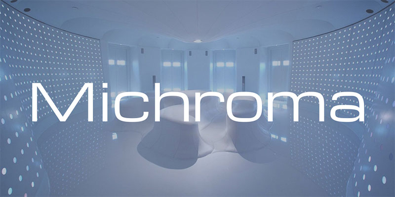
Rounded-square sans-serif channeling 1960s visions of tomorrow. Vernon Adams reworked the Microgramma/Eurostile genre into a single light extended style perfect for space-age branding.
Design Characteristics
Extended letterform proportions
Wide characters with squared-off curves create distinctive horizontal emphasis. Each letter stretches wider than traditional type while maintaining geometric discipline.
Rounded corners at square terminals soften the mechanical appearance. The design captures retro-futuristic optimism popular in mid-century modern aesthetics.
Light weight, bold presence
Only single weight available in light extended style. Despite being classified as light, the extended proportions create strong visual impact.
Uniform stroke width throughout maintains geometric purity. Capital letters drive the typeface personality with lowercase following same principles.
Best Use Cases
Retro-futuristic branding
Perfect for companies wanting 1960s space-age associations. Tech startups seeking vintage-modern balance in brand identity.
Logo design where geometric precision meets nostalgic appeal. Product branding in consumer electronics or lifestyle technology.
Display typography with horizontal emphasis
Website headers where width creates presence without excessive height. Signage projects needing readability at distance with retro character.
Magazine mastheads and editorial display work. Game interfaces requiring science fiction aesthetics without aggressive modernism.
Technical Specifications
Format: TrueType (TTF), Web formats available
Character coverage: Basic Latin with limited extended Latin support
License: SIL Open Font License (freely usable including commercial applications)
Single style limitation: No italic, bold, or other weights available
Available through Google Fonts with easy web implementation.
Pairing Recommendations
Combine Michroma’s extended forms with condensed or normal-width companions.
Effective pairings:
- Michroma + Montserrat for balanced proportions
- Michroma + Roboto Condensed to emphasize Michroma’s width
- Michroma + Source Sans Pro for professional layouts
Use Michroma sparingly for emphasis while standard fonts handle content. The extended width demands generous spacing in layouts.
Accessibility Considerations
Wide letterforms aid legibility but consume significant horizontal space.
Layout implications: Extended proportions create line-length challenges. Short headlines and single-word applications work best.
Minimum size: 18pt for comfortable reading. Light weight requires attention to contrast ratios (WCAG AAA may be difficult without strong background contrast).
Not recommended for extended reading. Display use only where retro-futuristic character enhances the message.
Vertical spacing above letters (inherent in font metrics) may complicate alignment in some design software.
Electrolize
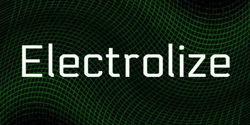
Geometric sans-serif with techno character inspired by Russian commuter train lettering. Valery Zaveryaev created a modular, rectangular structure that scales effectively across digital and print.
Design Characteristics
Straight lines and sharp angles
Constructed from geometric primitives with minimal curves. Angular letterforms create digital, technical appearance without bitmap restrictions.
Uniform x-height and baseline alignment across all characters. The modular approach produces consistent texture in text blocks.
Humanistic proportions within geometric frame
Despite angular construction, character widths follow humanistic ratios. This prevents the mechanical coldness typical of purely geometric faces.
Regular weight only but designed for versatility across sizes. Clean architecture maintains clarity in both screen and print environments.
Best Use Cases
Digital interfaces and software applications
UI text where technical aesthetic reinforces product character. Software documentation needing futuristic personality without sacrificing readability.
Tech blog headlines and digital magazine layouts. Dashboard interfaces in data visualization tools.
Tech branding and corporate identity
Logo design for startups in AI, robotics, or software development. Business card and letterhead for technology consultancies.
Product naming and feature callouts in marketing materials. Conference signage and presentation graphics.
Technical Specifications
Format: TrueType (TTF), Web formats (WOFF, WOFF2)
Character count: 212 defined characters with 166 unique glyphs
Language support: 37 languages including Western and Central European alphabets using Latin script
OpenType features: Standard punctuation, numerals, mathematical operators, currency symbols
License: SIL Open Font License 1.1 (free for personal and commercial use)
No italic or bold variants available in standard distribution.
Pairing Recommendations
Balance geometric precision with organic typefaces.
Successful combinations:
- Electrolize + Merriweather for editorial warmth
- Electrolize + Lato for clean web interfaces
- Electrolize + Crimson Text for sophisticated contrast
Electrolize handles display elements while warmer fonts maintain reading comfort. Apply graphic design principles of hierarchy through typeface contrast.
Accessibility Considerations
Geometric clarity supports legibility across devices.
Screen performance: Straight lines and sharp angles render cleanly on digital displays. Maintains readability down to 12pt in optimal conditions.
Not recommended for extended body text due to geometric uniformity. Best for headlines, labels, and short text passages.
WCAG AA compliance at regular weight with 4.5:1 contrast. The angular character may cause slight fatigue in long reading sessions.
Low-contrast situations require size increases. Test thoroughly on various backgrounds and screen types.
Pixelify Sans

Blocky pixelated typography channeling 1980s computer graphics and arcade games. Stefie Justprince created this retro-gaming display font with multiple weights for versatile nostalgic applications.
Design Characteristics
Grid-based pixel construction
Each letterform built on visible pixel grid mimicking early digital displays. Square blocks create intentional low-resolution aesthetic.
The design celebrates technological limitations as stylistic choices. Characters maintain recognizability despite extreme geometric constraints.
Variable font with four weights
Regular, Medium, Semi-Bold, Bold weights provide hierarchy within pixel aesthetic. Weight changes modify pixel density while preserving grid structure.
Supports both uppercase and lowercase with matching punctuation. Uniform character width creates monospace-adjacent texture.
Best Use Cases
Gaming and retro-themed projects
Video game interfaces needing authentic 8-bit character. Gaming website headers and promotional materials. Esports branding where retro gaming culture matters.
Twitch overlays and streaming graphics. Game jam posters and indie game marketing.
Nostalgic digital design
Website headers for tech nostalgia content. Social media graphics referencing 1980s computer culture. T-shirt designs and merchandise with retro gaming themes.
Music projects in synthwave or chiptune genres. Event branding for retro gaming conventions.
Technical Specifications
Format: Variable TrueType (TTF), Web formats available
Variable axes: Weight adjustment from 400 to 700
Character support: Latin, Cyrillic, and Greek scripts with extended language coverage
License: SIL Open Font License (free including commercial applications)
Four discrete weights plus variable functionality for precise customization.
Pairing Recommendations
Contrast pixelated display with smooth fonts for readability.
Recommended combinations:
- Pixelify Sans + Roboto for modern retro balance
- Pixelify Sans + Inter for clean supporting text
- Pixelify Sans + Fira Sans for tech documentation
Use Pixelify Sans exclusively for display. Pixel aesthetic becomes fatiguing in body text. The font spacing naturally creates rhythm in layouts.
Accessibility Considerations
Pixelated design limits accessibility in certain contexts.
Legibility challenges: Small sizes lose character definition. Minimum 18pt strongly recommended, 24pt+ ideal.
Extended reading causes visual fatigue from grid structure. Reserve for short headlines and emphasis elements.
Screen dependency: High-resolution displays smooth pixels through anti-aliasing, potentially diluting intended effect. Low-resolution screens may make characters merge.
WCAG compliance difficult at regular weight. Bold and Semi-Bold weights improve contrast but still require careful testing.
Not suitable for professional documents or contexts requiring serious tone.
Monoton
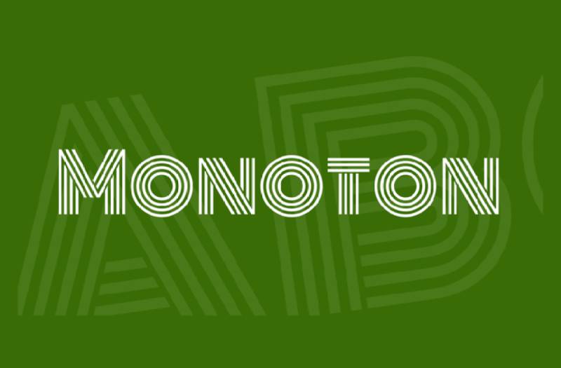
Contemporary metalpress font featuring parallel line construction for striking retro effects. Vernon Adams designed this pure display face inspired by 1930s Art Deco geometry reimagined for digital applications.
Design Characteristics
Multi-line letterforms
Each character constructed from parallel horizontal lines creating dimensional illusion. The stripes produce vibration and visual interest at large sizes.
Geometric foundation with small caps proportions. No lowercase in traditional sense, the typeface works exclusively as display capitals.
Chrome-effect aesthetic
Parallel lines suggest metallic reflections and Art Deco luxury. The design evokes neon signage, disco graphics, and 1970s-80s glam aesthetics.
Extremely wide letterforms demand substantial space. Each character commands attention through bold horizontal emphasis.
Best Use Cases
Event graphics and entertainment design
Nightclub flyers and concert posters where maximum impact matters. Music festival branding in electronic and disco genres.
Album artwork requiring retro glam character. Party invitations and promotional materials for themed events.
Branding demanding attention
Logo design for bars, restaurants, or entertainment venues. Retail signage where bold personality differentiates brands.
T-shirt graphics and merchandise designs. Social media graphics needing thumb-stopping impact.
Technical Specifications
Format: TrueType (TTF), Web formats available
Character set: Basic Latin with limited punctuation
License: SIL Open Font License (freely available for all uses)
Single weight/style: Regular only, no variants
Designed exclusively for large display applications. Small sizes render poorly and lose effect.
Pairing Recommendations
Monoton works best as standalone accent with minimal supporting type.
When pairing required:
- Monoton + Lato for clean supporting text
- Monoton + Montserrat to balance geometric styles
- Monoton + Raleway for modern elegance
Never use Monoton for body text. Single words or short phrases deliver maximum effect. Understanding typographic hierarchy means using Monoton sparingly for focal points.
Accessibility Considerations
Display-only typeface with severe accessibility limitations.
Not suitable for:
- Body text of any length
- Sizes below 48pt
- Text requiring quick reading
- Professional or serious contexts
Visual vibration from parallel lines causes optical fatigue. Reserve for single-word applications or logo-style usage.
WCAG compliance extremely difficult. The decorative nature conflicts with accessibility best practices for text content.
Use Monoton for decorative/aesthetic purposes only. Always provide alternative text for screen readers when used in web contexts.
Raxtor
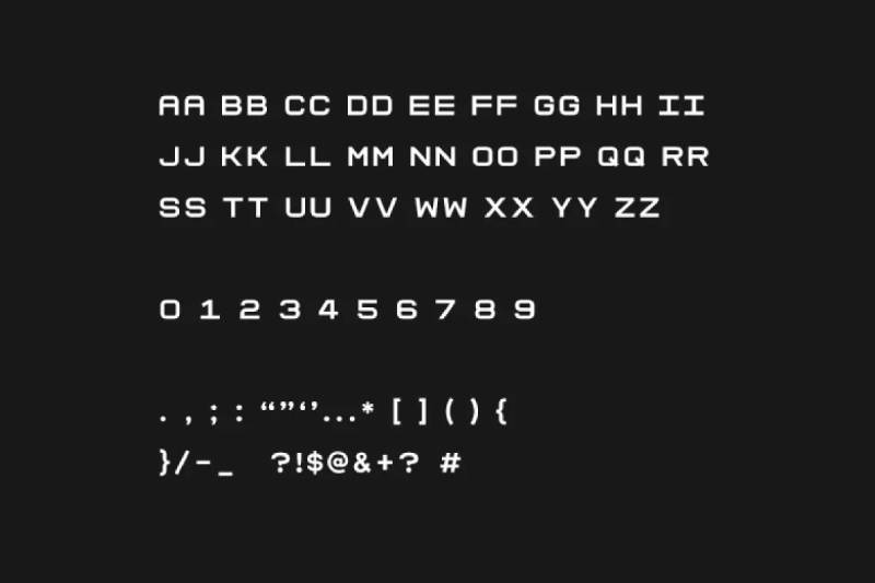
Bold geometric display face engineered for maximum headline impact. Raxtor combines modern construction with robotic personality perfect for tech branding and aggressive marketing.
Design Characteristics
Angular geometric letterforms
Uniform stroke widths create mechanical precision. Sharp edges and straight-line construction produce distinctly digital character.
Each glyph features bold weight by default. Characters maintain wide proportions for strong horizontal presence.
Multiple style variations
Available in Regular, Italic, Outline, Bold, and Bold Italic. Outline version creates dimensional effects through transparent letterforms.
All-caps design focuses attention on display applications. No lowercase variants maintain singular purpose as headline typeface.
Best Use Cases
Technology branding and corporate identity
Logo design for startups in gaming, robotics, or digital services. Company names benefit from Raxtor’s authoritative presence.
Marketing graphics requiring immediate visual impact. Promotional materials where modern aesthetic distinguishes brand personality.
Headlines and display typography
Video game title screens and UI elements. Poster design for tech conferences or product launches. Website hero sections demanding attention.
T-shirt graphics and merchandise designs. Social media content needing scroll-stopping power.
Technical Specifications
Format: TrueType (TTF), OpenType (OTF), Web formats (EOT, SVG, WOFF, WOFF2)
Character set: Uppercase Latin letters, numerals, basic punctuation
Weights: Regular, Bold with Normal, Italic, and Outline styles
License: Commercial licenses available (check with foundry for specific terms)
Desktop and web font packages included in distribution.
Pairing Recommendations
Combine with neutral sans-serifs for supporting content.
Effective pairings:
- Raxtor + Open Sans for balanced web layouts
- Raxtor + Lato in marketing materials
- Raxtor + Helvetica for professional presentations
The geometric boldness needs breathing room. Use Raxtor sparingly for emphasis while cleaner fonts handle information delivery.
Accessibility Considerations
Bold weight provides strong legibility at distance.
Size recommendations: 18pt minimum for optimal recognition. The angular construction performs well on digital displays.
All-caps limitation means no sentence case available. Reserve for short phrases and single words.
Not suitable for body text. Display-only applications where robotic character reinforces message. WCAG compliance achievable with proper contrast ratios at recommended sizes.
Akira Toru
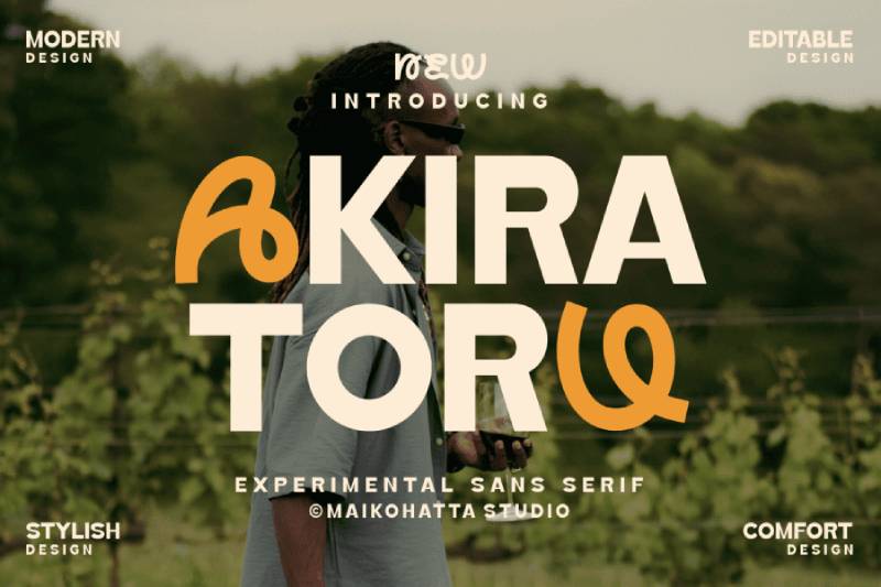
Minimalist sans-serif balancing elegance with contemporary edge. Clean professional appearance suits luxury branding and modern editorial work.
Design Characteristics
Refined geometric proportions
Wide letterforms with subtle weight distribution. The design maintains simplicity without appearing sterile.
Character widths create horizontal emphasis suitable for modern headers. Geometric foundation executed with warmth and approachability.
Single weight flexibility
Regular weight designed for versatility across applications. The balanced stroke width works in both large display and moderate text sizes.
Uppercase and lowercase maintain proportional relationships. Clean terminals without decorative elements.
Best Use Cases
High-end branding applications
Luxury product packaging design where sophistication matters. Fashion industry logos and editorial layouts.
Magazine mastheads requiring contemporary professionalism. Brand identity systems needing flexible display face.
Digital and print headlines
Website headers in lifestyle and design sectors. Product naming where clarity combines with style.
Invitation design for upscale events. Business card typography projecting modern credibility.
Technical Specifications
Format: TrueType (TTF), OpenType (OTF)
Character count: 311 characters supporting Latin scripts
Language support: 218+ languages including extended European alphabets
License: Free for personal use, commercial license required for business applications
Demo version available with limited glyph set.
Pairing Recommendations
Contrast minimalist display with warmer body fonts.
Successful combinations:
- Akira Toru + Georgia for editorial warmth
- Akira Toru + Source Sans Pro for web interfaces
- Akira Toru + Crimson Text for sophisticated layouts
The clean geometry handles attention-grabbing roles. Pair with fonts offering more organic character for balance in multi-level hierarchies.
Accessibility Considerations
Wide letterforms aid legibility across sizes.
Minimum 14pt for comfortable reading. The geometric clarity maintains recognizability at various scales.
Single weight limits hierarchical flexibility through weight variation alone. Size changes and spacing adjustments create necessary contrast.
WCAG AA compliance achievable at regular weight with 4.5:1 contrast ratio. Professional appearance makes it suitable for corporate accessibility requirements.
Anurati
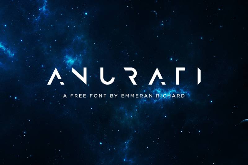
Minimalist futuristic typeface built from geometric primitives. Emmeran Richard created this display face with half-cut letterforms producing distinctive techno character.
Design Characteristics
Sans-serif corners with geometric cuts
Each character features strategic truncations creating unique silhouettes. Half-cut letters distinguish Anurati from conventional geometric faces.
Simple geometric forms build complex visual interest. The minimalist approach prioritizes negative space as design element.
Single style with maximum impact
Regular weight only but designed for bold presence. Uppercase letterforms drive the aesthetic.
Sharp angles and clean lines produce digital-age personality. The modular construction references circuit board layouts and technological precision.
Best Use Cases
Display typography in tech contexts
Game interfaces requiring futuristic character without excessive decoration. Poster design for electronic music events or technology exhibitions.
Movie title sequences in science fiction genre. App splash screens and loading interfaces.
Branding for modern companies
Tech startup logos where innovation messaging matters. Product naming in consumer electronics or digital services.
Event materials for hackathons and developer conferences. T-shirt designs with geometric appeal.
Technical Specifications
Format: OpenType (OTF), TrueType (TTF)
Character set: Basic Latin, limited punctuation and numerals
License: Free for personal use. Commercial applications require Anurati Pro license.
Pro version features: Extended character set, outline variant, improved kerning, 96 glyphs per weight
Single weight in free version with errors and incomplete glyphs.
Pairing Recommendations
Balance geometric minimalism with readable companions.
Recommended pairings:
- Anurati + Roboto for tech documentation
- Anurati + Work Sans for modern web design
- Anurati + Merriweather for editorial contrast
Use Anurati exclusively for display elements. The half-cut letterforms create visual texture that fatigues quickly in extended reading.
Accessibility Considerations
Geometric cuts reduce legibility at small sizes.
Minimum recommendation: 24pt for clear character recognition. Display-only applications where large sizing is standard.
The truncated letterforms may confuse readers unfamiliar with the design. Reserve for contexts where aesthetic impact outweighs immediate comprehension.
Not WCAG compliant for text content. Decorative use only where alternative text provides accessibility.
Raptor Sans
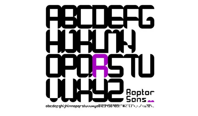
Retro sci-fi typeface channeling 1960s-70s paperback book covers. Panos Voulgaris designed this bold display face for nostalgic futuristic applications.
Design Characteristics
Bold geometric simplicity
Thick strokes create immediate visual impact. Letterforms reference vintage science fiction typography without direct imitation.
Clean construction maintains readability despite heavy weight. Character proportions evoke mid-century book design aesthetics.
Straightforward display focus
Single weight optimized for large-scale applications. The boldness eliminates need for weight variants.
Uppercase and lowercase both available. Retro-futuristic personality emerges from proportion and weight rather than decorative elements.
Best Use Cases
Nostalgic sci-fi projects
Book cover design recreating vintage paperback aesthetic. Movie posters referencing classic science fiction cinema.
Album artwork for synthwave or retro-electronic music genres. Gaming projects with retro-futuristic themes.
Branding with vintage-modern fusion
Logo design for companies wanting approachable tech personality. Podcast artwork in science or technology genres.
Event materials for retro gaming conventions. Merchandise designs with nostalgic appeal.
Technical Specifications
Format: TrueType (TTF)
File size: 16KB (compact distribution)
Character coverage: Basic Latin alphabet, numerals, standard punctuation
License: Free for personal and commercial use
Simple installation across all major operating systems.
Pairing Recommendations
Complement retro boldness with contemporary clarity.
Effective combinations:
- Raptor Sans + Inter for modern balance
- Raptor Sans + PT Sans for approachable professionalism
- Raptor Sans + Libre Baskerville for editorial sophistication
Raptor Sans dominates as display element. Pair with neutral typefaces that don’t compete for attention.
Accessibility Considerations
Bold weight enhances distance legibility.
Minimum 16pt for comfortable reading. The heavy strokes maintain clarity at moderate sizes.
Single weight limits hierarchy creation through weight variation. Size and color changes establish information architecture.
WCAG AA compliance at recommended sizes with proper contrast. Retro aesthetic doesn’t compromise functional legibility.
Ultra
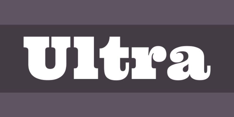
Ultra-bold slab serif font nodding to wood type classics like Clarendon. Strong dramatic letterforms designed for titling with serious yet friendly character.
Design Characteristics
Slab serif construction
Thick rectangular serifs create powerful presence. The design references 19th-century wood type traditions updated for digital applications.
Heavy weight throughout produces immediate visual impact. Stroke thickness dominates character personality.
Dramatic letterform proportions
Wide characters command horizontal space. The boldness makes Ultra impossible to ignore in layouts.
Single weight designed to function as ultra-bold alternative in font pairings. No lighter weights available.
Best Use Cases
High-impact headlines
Magazine covers requiring authoritative presence. Advertising headlines where boldness sells message.
Product packaging for food, beverage, or lifestyle brands. Event posters demanding immediate attention.
Branding applications
Logo design for companies wanting approachable strength. Signage where visibility at distance matters.
Restaurant menus and cafe branding. Retail displays and promotional materials.
Technical Specifications
Format: TrueType (TTF), Web formats available
Character set: Latin Extended supporting Western European languages
License: SIL Open Font License (free including commercial use)
Available through Google Fonts for easy web implementation.
Single weight limits flexibility but ensures consistent ultra-bold application.
Pairing Recommendations
Contrast ultra-bold display with delicate or neutral companions.
Recommended pairings:
- Ultra + Lato Light for maximum weight contrast
- Ultra + Crimson Text for editorial sophistication
- Ultra + Raleway for clean modern balance
Ultra dominates hierarchy. Pair with substantially lighter weights creating clear visual hierarchy through scale and proportion.
Accessibility Considerations
Ultra-bold weight provides exceptional legibility.
Performs well at any size above 12pt. The thick strokes ensure visibility across viewing conditions.
Slab serifs aid character differentiation. Strong baseline creates reading rhythm despite bold weight.
WCAG compliance easily achieved. The serious-yet-friendly character suits professional and casual contexts equally.
Elixia
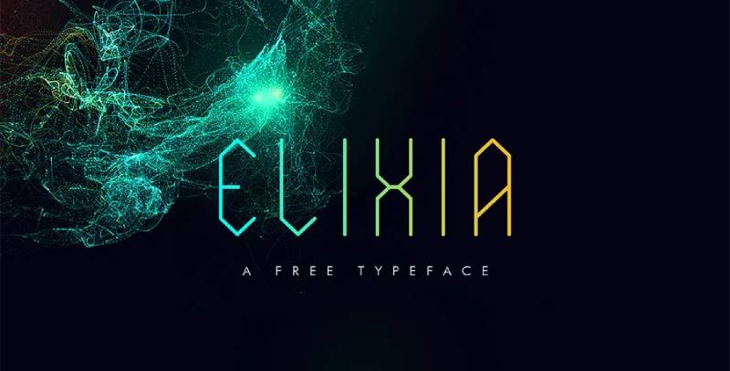
Hexagonal display typeface creating mystical futuristic atmosphere. Built from geometric hexagons with stylistic alternatives for customizable character.
Design Characteristics
Hexagon-based construction
Each letterform constructed from hexagonal modules. The six-sided geometry produces distinctive sci-fi aesthetic.
Uppercase and lowercase variants available. Stylistic alternatives for specific glyphs expand design flexibility.
Archaic-futuristic duality
The design evokes both ancient symbols and future technology. Hexagonal structure suggests mysticism and advanced engineering simultaneously.
Decorative display focus with limited punctuation. Each character demands attention through unconventional construction.
Best Use Cases
Fantasy and sci-fi projects
Book covers blending magical and technological themes. Game interfaces requiring otherworldly character.
Movie titles for mystical science fiction. Album artwork in electronic or experimental music genres.
Decorative display applications
Event branding for fantasy conventions or tech exhibitions. Logo design where memorable uniqueness matters.
Poster design requiring immediate visual distinction. Social media graphics needing thumb-stopping impact.
Technical Specifications
Format: TrueType (TTF), OpenType (OTF)
Character set: Uppercase, lowercase, limited punctuation, stylistic alternates
License: Free for personal use, commercial license required
Hexagonal construction requires larger sizing for clarity.
Pairing Recommendations
Use Elixia as decorative accent only.
Pairing strategy:
- Elixia for single-word emphasis + neutral sans-serif for all other text
- Never use Elixia for body copy or extended headlines
- Limit to logos, single words, or very short phrases
The hexagonal construction creates visual complexity. Pair with simplest possible supporting typefaces.
Accessibility Considerations
Decorative geometry limits legibility.
Minimum size: 36pt for character recognition. Display-only applications where aesthetic trumps immediate readability.
Not suitable for text requiring quick comprehension. Reserve for contexts where users have time to decode letterforms.
WCAG non-compliant for text content. Use as decorative element with alternative text for screen readers.
Digitechno
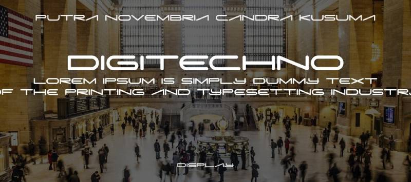
Modern display typeface inspired by digital technology and futuristic aesthetics. Created for logos, UI, and branding requiring forward-looking character.
Design Characteristics
Digital-inspired letterforms
Geometric construction suggesting circuit boards and digital displays. Clean lines with technological personality.
Uppercase and lowercase characters maintain consistent technical aesthetic. The design balances readability with futuristic appeal.
OpenType features
Alternate glyphs provide design variations. Requires programs supporting OpenType features for full functionality.
Multilingual support extends beyond basic Latin. Numbers and punctuation maintain cohesive technological style.
Best Use Cases
Technology branding
Logo design for software companies and tech startups. Product naming in consumer electronics.
UI design for apps and digital platforms. Branding materials for technology conferences.
Display typography
Poster design for tech events and product launches. Website headers in digital industries.
Cover design for technology books and publications. Title sequences for tech-focused video content.
Technical Specifications
Format: TrueType (TTF), OpenType (OTF)
OpenType features: Stylistic alternates, ligatures (require compatible software)
Language support: Multilingual including extended Latin scripts
License: Demo version for personal use, commercial license available
Compatible with Adobe Illustrator, Photoshop, InDesign, CorelDRAW.
Pairing Recommendations
Balance technological display with readable text fonts.
Effective combinations:
- Digitechno + Roboto for tech documentation
- Digitechno + Open Sans for web interfaces
- Digitechno + Noto Sans for app design
Use Digitechno for headers and emphasis. Clean sans-serifs handle body text and navigation elements.
Accessibility Considerations
Geometric clarity supports legibility.
Minimum 16pt for comfortable reading. The digital aesthetic maintains recognizability at moderate sizes.
OpenType features may not display in all contexts. Ensure base character set provides necessary functionality without alternates.
WCAG AA compliance achievable with standard contrast ratios. Professional tech aesthetic doesn’t sacrifice accessibility.
Skensha
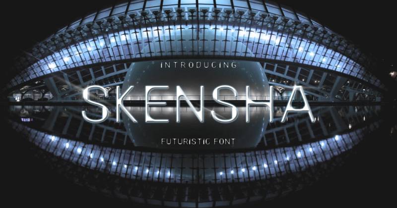
Modern sans-serif with distinctive stroke modulation. Thin strokes thicken at joints creating unique futuristic personality suited to professional applications.
Design Characteristics
Variable stroke weights
Letterforms feature thin main strokes expanding at connection points. The modulation creates visual interest without decorative excess.
Clean geometric foundation with organic weight variation. This combination produces approachable modern aesthetic.
Regular and Bold weights
Two weights provide basic hierarchy options. Bold maintains same stroke modulation at heavier weight.
Uppercase and lowercase with complete numeral set. Professional character set for business applications.
Best Use Cases
Corporate branding
Business card design where modern sophistication matters. Logo design for consulting firms and professional services.
Brand identity systems requiring contemporary edge. Corporate presentation templates.
Professional print materials
Brochure headers and promotional materials. Product packaging in lifestyle and professional sectors.
Magazine layouts and editorial design. Event materials for business conferences.
Technical Specifications
Format: TrueType (TTF), OpenType (OTF)
Weights: Regular, Bold
Character set: A-Z uppercase and lowercase, 0-9 numerals, standard punctuation
License: Commercial and personal use (verify specific license terms)
Standard installation across platforms.
Pairing Recommendations
Combine stroke modulation with uniform alternatives.
Recommended pairings:
- Skensha + Source Sans Pro for professional layouts
- Skensha + Merriweather for editorial contrast
- Skensha + Inter for web interfaces
The variable strokes create textural interest. Pair with fonts lacking similar modulation to avoid visual competition.
Accessibility Considerations
Stroke modulation affects small-size legibility.
Size recommendations: 14pt minimum for body text, 18pt+ for optimal display. Thin strokes may disappear at small sizes or low resolutions.
Bold weight improves accessibility. Use for emphasis and better contrast in challenging viewing conditions.
WCAG compliance requires attention to sizing and contrast. Test thoroughly across devices and display types.
Nebulica
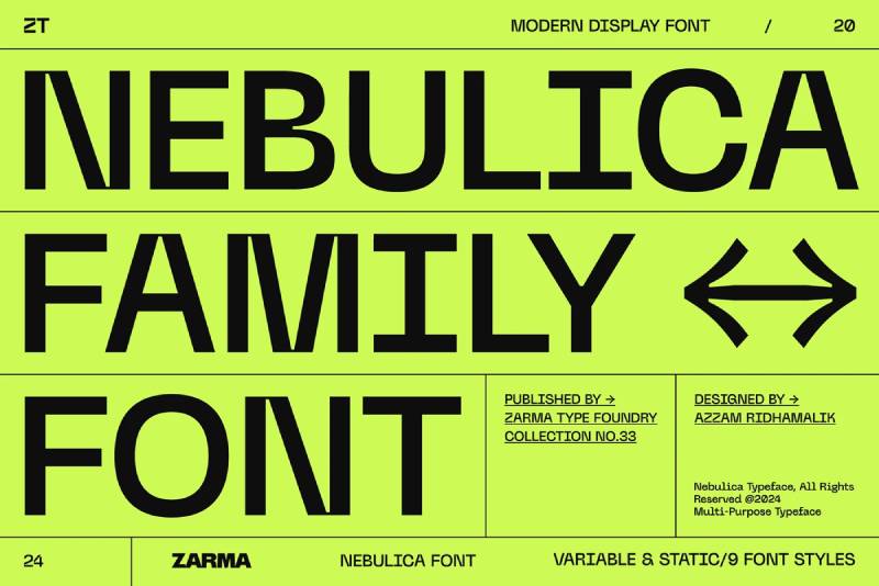
Experimental geometric sans-serif blending monospace elements with urban design influence. Inktraps and slanted stems create contemporary sophisticated aesthetic.
Design Characteristics
Geometric-monospace hybrid
Combines geometric precision with fixed-width spacing influences. The result produces distinctly modern texture.
Inktraps at letter junctions reference editorial design traditions. Slanted stems add dynamic character to otherwise vertical construction.
Variable font technology
Weight axis provides continuous adjustment from light to bold. 435+ glyphs support extensive character requirements.
Multiple stylistic sets expand design possibilities. Arrow symbols and special characters included.
Best Use Cases
Modern digital interfaces
Website design requiring contemporary sophistication. App interfaces balancing personality with functionality.
Dashboard design in data visualization contexts. UI components needing geometric precision.
Contemporary branding
Logo design for startups and creative agencies. Brand identity systems wanting cutting-edge character.
Editorial design in design and technology publications. Packaging for tech-forward consumer products.
Technical Specifications
Format: Variable TrueType (TTF)
Variable axes: Weight (continuous adjustment)
Glyph count: 435+ characters
Language support: 88+ languages including extended Latin, Cyrillic, Greek
OpenType features: Stylistic sets, arrows, symbols, special characters
License: Commercial license available (free demo for personal use)
Pairing Recommendations
Balance experimental geometry with conventional readability.
Effective combinations:
- Nebulica + Georgia for warm contrast
- Nebulica + Roboto for clean tech aesthetic
- Nebulica + Lora for editorial sophistication
Variable weight flexibility creates hierarchy within single typeface. Pair with traditional proportional fonts for body text.
Accessibility Considerations
Inktraps and slanted stems affect legibility.
Minimum 14pt for comfortable reading. Variable weight allows precise tuning for accessibility requirements.
WCAG compliance: Regular and higher weights achieve AA standards with proper contrast. Lighter weights need larger sizing.
Extensive language support aids international accessibility. Test across weight range for optimal legibility in specific contexts.
Brachial
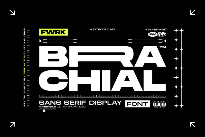
Ultra-wide geometric sans-serif designed to dominate creative spaces. Extreme horizontal proportions create unmissable presence in display applications.
Design Characteristics
Ultra-wide letterforms
Exaggerated horizontal extension creates distinctive silhouettes. Each character commands maximum space.
Geometric construction with consistent stroke weights. The width variation alone generates personality.
Bold geometric personality
Sharp corners and straight edges produce architectural character. No curves or organic elements soften the mechanical precision.
Single weight designed for maximum impact. The ultra-wide proportions eliminate need for weight variants.
Best Use Cases
High-impact display work
Poster design requiring impossible-to-ignore presence. Event branding where boldness communicates energy.
Album covers for electronic or experimental music. Art exhibition materials demanding visual dominance.
Avant-garde branding
Logo design for fashion-forward brands. Creative agency identity systems.
Magazine mastheads in design and culture publications. Architectural firm branding materials.
Technical Specifications
Format: OpenType (OTF), TrueType (TTF)
Character set: Uppercase, lowercase, numerals, punctuation
License: Commercial license required for business use
Ultra-wide spacing requires generous layout space.
Pairing Recommendations
Extreme width demands careful pairing.
Pairing strategy:
- Brachial for single-word emphasis only
- Pair with condensed or normal-width fonts for contrast
- Never use Brachial for more than headline applications
Recommended companions:
- Brachial + Roboto Condensed emphasizes width difference
- Brachial + Source Sans Pro for professional balance
Accessibility Considerations
Ultra-wide design creates layout challenges.
Horizontal space consumption limits practical applications. Best for single-word headlines or very short phrases.
Minimum 24pt for character clarity despite width. The extreme proportions may confuse readers at smaller sizes.
Not suitable for text requiring quick scanning. Decorative display use where impact matters more than immediate comprehension.
Stacker

Layered display typeface designed for dimensional effects. Multiple style variants stack to create depth and visual complexity.
Design Characteristics
Modular layering system
Base styles designed to overlap creating 3D appearance. Regular, outline, shadow, and fill variants combine in various ways.
Each layer maintains identical character proportions. Precise alignment enables clean stacking effects.
Multiple style variations
Regular provides solid foundation. Outline creates transparent frames. Shadow and fill styles add dimension.
Color application to different layers produces multicolor effects. The system encourages experimentation.
Best Use Cases
Dimensional display typography
Poster design where depth creates visual interest. Event branding requiring eye-catching headlines.
Logo design with layered dimensional effects. T-shirt graphics and merchandise designs.
Creative marketing materials
Album artwork benefiting from dimensional typography. Magazine covers demanding standout headers.
Social media graphics needing scroll-stopping power. Packaging design where layered type adds premium perception.
Technical Specifications
Format: TrueType (TTF), OpenType (OTF)
Style variants: Regular, Outline, Shadow, Fill, additional decorative options
Character set: Uppercase focus with complete basic Latin
License: Commercial and personal use licenses available
Layering requires design software supporting multiple text layers.
Pairing Recommendations
Stacker dominates as decorative focal point.
Pairing approach:
- Use Stacker for single word or very short headline
- All other text requires simple sans-serif companion
- Never layer Stacker with another display font
Effective combinations:
- Stacker layers + Open Sans for supporting text
- Stacker layers + Lato for clean layouts
Accessibility Considerations
Layered effects prioritize aesthetics over accessibility.
Not suitable for text content requiring comprehension. Decorative applications only where alternative text provides accessibility.
Layering complexity makes small-size rendering problematic. Minimum 36pt recommended for clear layer definition.
WCAG non-compliant for text content. Use as graphic element with proper alternative text for screen readers.
Galaxy
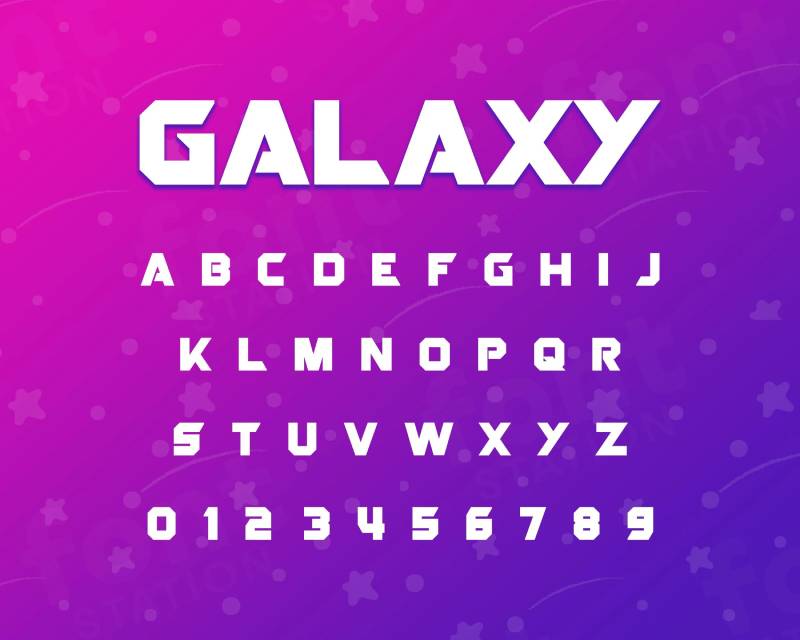
Space-themed display font with cosmic character. Designed for sci-fi projects and futuristic applications requiring astronomical associations.
Design Characteristics
Cosmic-inspired letterforms
Character design references space aesthetics. Letterforms suggest technological advancement and cosmic exploration.
Geometric construction with sci-fi personality. Clean lines maintain readability while communicating futuristic themes.
Display-optimized design
Built for large-scale applications. Character details emerge at headline sizes.
Complete uppercase and lowercase sets. Numerals and punctuation maintain thematic consistency.
Best Use Cases
Space and sci-fi themes
Movie titles and promotional materials. Video game interfaces with space settings.
Book covers in science fiction genre. Poster design for astronomy events or planetarium exhibits.
Technology branding
Startup logos in aerospace or satellite industries. App branding for space-related applications.
Event materials for science and technology conferences. Educational materials about space exploration.
Technical Specifications
Format: TrueType (TTF), OpenType (OTF)
Character coverage: Latin alphabet, numerals, standard punctuation
License: Verify specific licensing terms for intended use
Space-themed aesthetic requires appropriate context for effective communication.
Pairing Recommendations
Ground cosmic display with terrestrial text fonts.
Recommended pairings:
- Galaxy + Roboto for modern tech balance
- Galaxy + Source Sans Pro for professional layouts
- Galaxy + Lato for approachable communication
Galaxy handles thematic display. Neutral sans-serifs provide readable supporting content.
Accessibility Considerations
Thematic design may compromise immediate legibility.
Minimum 18pt for comfortable reading. Cosmic aesthetics work best at display sizes.
Context matters for comprehension. Space themes require appropriate surrounding design to communicate effectively.
WCAG compliance depends on weight and sizing. Test thoroughly in intended application contexts.
Jedar
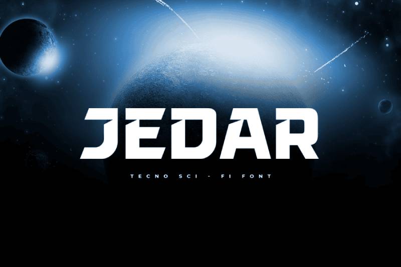
Contemporary geometric display face with sharp angular personality. Modern construction suitable for tech and creative industry applications.
Design Characteristics
Angular geometric construction
Sharp corners and straight edges create technical appearance. Letterforms reference digital precision and manufacturing accuracy.
Consistent stroke weights throughout. The geometric rigor produces mechanical character.
Modern display focus
Designed for headline and branding applications. Character spacing optimized for large-scale use.
Uppercase emphasis with complete lowercase set. Numbers and punctuation maintain angular aesthetic.
Best Use Cases
Modern tech branding
Logo design for software and digital companies. Product naming in technology sectors.
Corporate identity for engineering firms. Startup branding requiring contemporary edge.
Display typography
Website headers in tech industries. App interface titles and section headers.
Poster design for technology conferences. Presentation graphics in corporate contexts.
Technical Specifications
Format: TrueType (TTF), OpenType (OTF)
Character set: Complete Latin alphabet, numerals, punctuation
License: Commercial license available
Angular construction performs well on digital displays.
Pairing Recommendations
Balance angular precision with softer alternatives.
Effective combinations:
- Jedar + Inter for modern web design
- Jedar + Lato for approachable professionalism
- Jedar + Georgia for warm editorial contrast
Angular display paired with humanist text creates effective visual hierarchy.
Accessibility Considerations
Angular construction maintains legibility.
Minimum 16pt for comfortable reading. Sharp edges render clearly on digital screens.
Geometric precision aids character differentiation. WCAG AA compliance achievable with proper contrast ratios.
Professional appearance suits corporate accessibility requirements.
Andoria
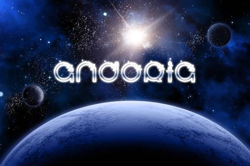
Cosmic sci-fi typeface with cinematic character. Designed for space-themed projects requiring dramatic visual impact.
Design Characteristics
Cinematic space aesthetic
Letterforms evoke blockbuster sci-fi movie titles. Character design balances readability with dramatic flair.
Geometric foundation with cosmic personality. Clean construction allows dramatic presentation treatments.
Display typography focus
Optimized for large-scale headline applications. Character details designed for cinematic impact.
Complete character set maintains thematic consistency. Numbers and symbols follow cosmic design language.
Best Use Cases
Sci-fi entertainment projects
Movie posters and title sequences. Video game branding and UI elements.
Book covers in space opera genre. Streaming content thumbnails and promotional materials.
Space-themed branding
Event branding for science fiction conventions. Planetarium exhibit materials.
Space tourism marketing materials. Aerospace company presentations.
Technical Specifications
Format: TrueType (TTF), OpenType (OTF)
Character coverage: Latin alphabet with complete punctuation
License: Commercial licensing available
Cinematic design requires appropriate context for maximum effectiveness.
Pairing Recommendations
Ground cosmic drama with neutral typography.
Recommended pairings:
- Andoria + Roboto for tech balance
- Andoria + Open Sans for readability
- Andoria + Source Sans Pro for professional support
Andoria dominates as thematic centerpiece. Supporting fonts maintain informational clarity.
Accessibility Considerations
Cinematic styling prioritizes impact over accessibility.
Minimum 20pt for clear recognition. Display applications where dramatic presentation appropriate.
Thematic design requires context for comprehension. Best in environments where space theme is established.
WCAG compliance requires careful sizing and contrast attention.
Cords
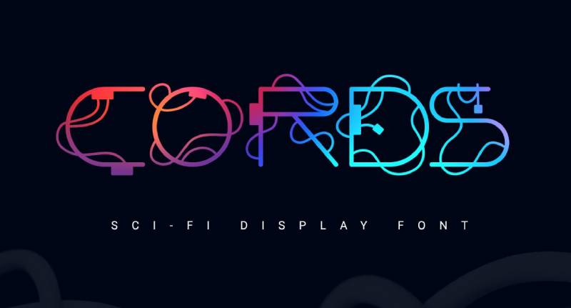
Experimental sans-serif inspired by The Matrix. Letters wrapped in tangled wire patterns creating virtual reality aesthetic.
Design Characteristics
Wire-wrapped letterforms
Each character enclosed in cord-like tangles. The design suggests digital connections and network nodes.
Rounded base letters provide readability foundation. Wire patterns add complexity without destroying legibility.
Color customization potential
Wire elements accept color treatments independently. Multiple color applications create varied effects.
Works on both light and dark backgrounds. The tangled aesthetic maintains visibility across contexts.
Best Use Cases
Cyberpunk and digital themes
Movie posters in cyberpunk genre. Video game branding requiring virtual reality character.
Tech event materials with experimental edge. Album artwork for electronic music.
Innovative branding
Startup logos in cutting-edge tech sectors. Product launches emphasizing network connectivity.
Hackathon materials and developer conference branding. T-shirt designs with digital culture appeal.
Technical Specifications
Format: TrueType (TTF), OpenType (OTF)
Character set: Uppercase, lowercase, numerals, symbols
License: Commercial use requires proper licensing
Wire patterns increase visual complexity requiring larger sizing.
Pairing Recommendations
Cords works best as singular accent element.
Pairing strategy:
- Use Cords for single word or very short phrase
- All supporting text requires simple clean typeface
- Never combine Cords with another decorative font
Effective companions:
- Cords + Roboto for tech clarity
- Cords + Inter for modern balance
Accessibility Considerations
Wire patterns severely limit accessibility.
Minimum size: 30pt for pattern recognition. Display-only applications where immediate comprehension not required.
Not suitable for text content. Decorative use only with alternative text for screen readers.
WCAG non-compliant for text. Use as graphic element in appropriate thematic contexts.
Dirtchunk
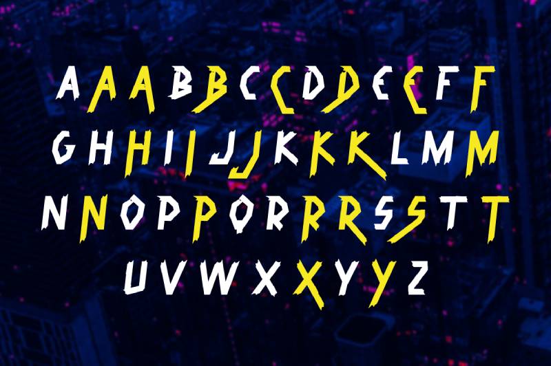
Rebellious urban-tech hybrid combining street style with high-tech elements. Cyberpunk aesthetic perfect for edgy futuristic projects.
Design Characteristics
Urban-tech fusion
Grunge textures meet digital precision. The design suggests both street culture and cyberspace.
Rough edges contrast with geometric structure. This combination produces distinctive rebellious character.
Cyberpunk personality
Character design references dystopian future aesthetics. Letterforms balance chaos with readability.
Bold presence with textured details. The urban edge distinguishes from clean futuristic alternatives.
Best Use Cases
Cyberpunk projects
Book covers in cyberpunk and dystopian genres. Movie posters for gritty sci-fi films.
Video game branding with urban-tech themes. Music artwork for industrial and experimental genres.
Edgy branding
Logo design for alternative brands. Event materials for underground music scenes.
Streetwear graphics and merchandise. Alternative culture publications.
Technical Specifications
Format: TrueType (TTF), OpenType (OTF)
Character set: Complete alphabet with urban-tech styling
License: Commercial licensing available
Textured details require appropriate sizing for clarity.
Pairing Recommendations
Urban chaos needs clean counterbalance.
Recommended pairings:
- Dirtchunk + Roboto for stark contrast
- Dirtchunk + Open Sans for readability
- Dirtchunk + Inter for modern support
Dirtchunk dominates as rebellious accent. Clean fonts prevent visual overload.
Accessibility Considerations
Textured grunge affects legibility.
Minimum 18pt for character recognition. Cyberpunk aesthetic prioritizes impact over accessibility.
Not suitable for body text or critical information. Display applications where attitude matters.
WCAG compliance challenging. Use in contexts where rebellious aesthetic appropriate and expected.
Space Armada
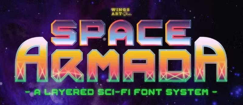
Layered retrofuturistic font family inspired by 1980s sci-fi blockbusters. Nine unique styles designed for stacking to create chrome and dimensional effects.
Design Characteristics
Layered font system
Regular, Bold, Wireframe, three Outline styles, three Fill styles, bonus symbols. Each designed for precise overlay alignment.
Stacking creates metallic chrome effects. Gradient application to layers produces dimensional illusion.
1980s sci-fi aesthetic
References classic sci-fi movie titles. Design evokes video game consoles and early computer technology.
All-caps letterforms with retrofuturistic character. Clean base construction supports elaborate layering effects.
Best Use Cases
Retro sci-fi projects
Movie posters channeling 1980s blockbusters. Video game branding with retro arcade character.
Album artwork for synthwave and retro-electronic music. Event materials for retro gaming conventions.
Nostalgic tech branding
Logo design combining retro and futuristic elements. Product launches targeting nostalgia demographics.
Merchandise graphics with vintage-future appeal. Social media content in retro tech aesthetics.
Technical Specifications
Format: TrueType (TTF), OpenType (OTF)
Family includes: 9 layerable font styles plus bonus symbols
Character set: All-caps Latin alphabet, numerals, punctuation
License: Commercial license available
Layering system requires design software supporting multiple text layers with precise alignment.
Pairing Recommendations
Space Armada layers function as complete decorative system.
Pairing approach:
- Use Space Armada layers for single focal element
- All body text requires simple sans-serif
- Avoid competing display fonts in same layout
Supporting typefaces:
- Space Armada layers + Roboto for clean modern support
- Space Armada layers + Inter for web applications
Accessibility Considerations
Layered effects prioritize aesthetics.
Not suitable for text content. Display applications only where retrofuturistic impact appropriate.
Minimum 36pt for clear layer definition. Complex stacking makes small sizes impractical.
WCAG non-compliant for text. Use as decorative graphic with alternative text provision.
Hermes
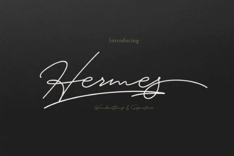
Sleek contemporary sans-serif with subtle futuristic character. Clean professional design suitable for corporate and tech applications.
Design Characteristics
Refined geometric proportions
Balanced letterforms with subtle modern edge. Character design maintains professionalism while suggesting forward thinking.
Consistent stroke weights create even texture. Geometric foundation executed with warmth.
Professional versatility
Multiple weights support hierarchy creation. Regular through Bold provide comprehensive family.
Character spacing optimized for both display and text use. Professional polish suits corporate requirements.
Best Use Cases
Corporate technology branding
Logo design for established tech companies. Corporate identity systems requiring sophistication.
Annual reports and investor materials. Professional presentation templates.
Business communications
Website design for B2B companies. Marketing materials in professional services.
Business card and letterhead design. Corporate event materials.
Technical Specifications
Format: TrueType (TTF), OpenType (OTF)
Weight range: Light, Regular, Medium, Bold
Character coverage: Extended Latin with comprehensive punctuation
License: Commercial licensing available
Professional character set supports business applications.
Pairing Recommendations
Professional display with elegant text companions.
Effective combinations:
- Hermes + Georgia for editorial warmth
- Hermes + Source Sans Pro for modern web
- Hermes + Merriweather for sophisticated layouts
Multiple weights allow single-family typography or pairing with complementary typefaces.
Accessibility Considerations
Professional design prioritizes legibility.
Minimum 12pt for body text. Multiple weights enable accessible hierarchy.
WCAG AA compliance across weight range with proper contrast. Professional aesthetic doesn’t compromise accessibility.
Suitable for corporate accessibility requirements and professional standards.
Centauri
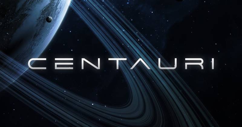
Minimalist wide futuristic sans-serif with space-age character. Clean geometric design perfect for cosmic and technology themes.
Design Characteristics
Extended wide proportions
Characters stretch horizontally creating distinctive space-age presence. Wide letterforms command attention.
Minimalist geometric construction. Clean lines without decorative elements maintain futuristic simplicity.
Alternate character options
Stylistic alternates provide design variations. Multiple character options expand creative flexibility.
Uppercase focus with complete numeral set. Basic punctuation maintains wide aesthetic.
Best Use Cases
Space-themed projects
Planetarium exhibit materials. Space exploration educational content.
Sci-fi book covers and movie posters. Astronomy event branding.
Futuristic branding
Tech startup logos with cosmic associations. Product naming in aerospace sectors.
App branding for space-related applications. Event materials for science conferences.
Technical Specifications
Format: TrueType (TTF), OpenType (OTF)
Character set: Uppercase English letters, alternates, numerals, basic punctuation
Stylistic alternates: Multiple character variations
License: Commercial license required
Wide proportions require generous horizontal space in layouts.
Pairing Recommendations
Wide display needs normal-width companions.
Recommended pairings:
- Centauri + Roboto for proportional contrast
- Centauri + Inter for modern web design
- Centauri + Source Sans Pro for professional applications
Extended width dominates layouts. Pair with condensed or normal-width fonts for balance.
Accessibility Considerations
Wide letterforms aid distance legibility.
Minimum 16pt for comfortable reading. Extended proportions create horizontal space challenges.
Best for short headlines and single words. Extended text creates line-length issues.
WCAG compliance achievable at recommended sizes. Wide spacing aids character recognition.
Osiris
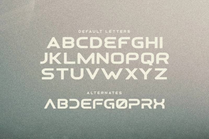
Retrofuturistic decorative sans-serif combining vintage and space aesthetics. Alternate letterforms provide design flexibility for cosmic themes.
Design Characteristics
Retro-future fusion
Design references both vintage sci-fi and contemporary futurism. Character construction balances nostalgia with forward-looking appeal.
Decorative elements add personality without sacrificing legibility. Sans-serif foundation maintains readability.
Alternate letter options
Multiple character variations expand creative possibilities. Stylistic alternates allow customization for specific projects.
Uppercase and lowercase with thematic consistency. Numbers and symbols maintain retrofuturistic character.
Best Use Cases
Vintage sci-fi aesthetics
Book covers recreating classic science fiction appeal. Movie posters with nostalgic future themes.
Album artwork for retro-electronic music. Event materials for vintage sci-fi conventions.
Space-themed branding
Logo design combining cosmic and retro elements. Product branding in space tourism.
Planetarium promotional materials. Astronomy club identity systems.
Technical Specifications
Format: TrueType (TTF), OpenType (OTF)
Stylistic alternates: Multiple character variations per glyph
Character coverage: Complete Latin alphabet, numerals, punctuation
License: Commercial licensing available
Decorative character requires appropriate thematic context.
Pairing Recommendations
Retrofuturistic display with contemporary support.
Effective combinations:
- Osiris + Roboto for modern balance
- Osiris + Inter for clean support
- Osiris + Lato for approachable professionalism
Osiris handles thematic display. Neutral typefaces maintain functionality.
Accessibility Considerations
Decorative styling affects accessibility.
Minimum 18pt for clear recognition. Retrofuturistic aesthetic best at display sizes.
Alternate characters may confuse readers. Maintain consistency within single project.
WCAG compliance requires attention to sizing and contrast. Best in contexts where theme is clearly established.
FAQ on The Best Futuristic Fonts
What are futuristic fonts?
Futuristic fonts are typefaces designed to evoke tomorrow’s aesthetics through geometric shapes, tech-inspired elements, and sci-fi character. They communicate innovation and forward-thinking through clean lines, bold forms, or experimental letterforms perfect for digital displays and branding materials.
Are futuristic fonts free for commercial use?
Many futuristic fonts offer free personal licenses but require commercial licenses for business applications. Google Fonts provides options like Orbitron and Space Mono under SIL Open Font License, allowing unlimited commercial use without fees or attribution requirements.
Which futuristic fonts work best for logos?
Varino, Raxtor, and Orbitron excel in logo design due to geometric precision and strong brand presence. Akira Toru and Michroma suit luxury branding. Choose fonts with multiple weights for flexible brand identity systems across different applications and marketing materials.
Can futuristic fonts be used for body text?
Most futuristic fonts are display typefaces unsuitable for extended reading. Space Mono works for code and technical documentation due to monospaced design. For body text, pair futuristic display fonts with readable sans-serif alternatives maintaining comfortable typography for users.
What makes a font look futuristic?
Geometric construction, angular letterforms, wide spacing, and tech-inspired design create futuristic aesthetics. Elements like chrome effects, neon characteristics, digital precision, minimalist forms, or cyberpunk styling communicate forward-looking personality through typography elements that reference science fiction and technological advancement.
How do I pair futuristic fonts with other typefaces?
Combine futuristic display fonts with neutral sans-serifs for balance. Pair geometric futuristic faces with humanist text fonts creating visual hierarchy. Use futuristic typography for headlines while traditional typefaces handle body content, ensuring readability alongside impact.
Which futuristic fonts support multiple languages?
Nebulica supports 88+ languages including Cyrillic and Greek scripts. Electrolize covers 37 languages with Western and Central European alphabets. Space Mono includes Latin Extended character sets. Check font specifications for multilingual support matching your project requirements before purchasing or downloading.
Are futuristic fonts accessible for users with disabilities?
Many futuristic fonts challenge accessibility due to decorative styling and display-only design. Choose options with strong contrast, clear letterforms, and multiple weights. Orbitron and Space Mono offer better legibility. Always test WCAG compliance and provide alternative text.
What file formats do futuristic fonts use?
Most futuristic fonts distribute in TrueType (TTF) and OpenType (OTF) formats. Web projects use WOFF and WOFF2 formats for browser compatibility. Variable fonts like Nebulica and Pixelify Sans offer dynamic weight adjustment. Ensure compatibility with design software before installation.
Where can I download futuristic fonts?
Google Fonts offers free options including Orbitron, Space Mono, Audiowide, and Electrolize. Adobe Fonts provides commercial licenses through Creative Cloud subscriptions. Premium marketplaces like Creative Market and MyFonts feature extensive futuristic font collections with diverse styles and licensing options.
Conclusion
Selecting the best futuristic fonts transforms ordinary designs into memorable visual experiences that capture attention and communicate innovation. The right typeface choice depends on your specific project needs, whether you’re creating game interfaces, branding materials, or movie posters.
Font licensing deserves careful attention before finalizing selections. Free options like Orbitron and Electrolize work for many projects, while premium fonts offer extended features and commercial flexibility.
Consider pairing strategies when building your typography system. Geometric sans-serifs handle display work while neutral companions maintain readability in supporting content.
Test your chosen fonts across devices and screen sizes. What looks stunning on desktop may fail at mobile scales, especially decorative typefaces with intricate details.
Remember that futuristic aesthetics shouldn’t sacrifice accessibility. Strong contrast ratios, appropriate sizing, and clear letterforms ensure your forward-looking designs remain inclusive and functional for all users.

Renowned for his expertise in logo design and visual branding, Bogdan has developed a multitude of logos for various clients.
His skills extend to creating posters, vector illustrations, business cards, and brochures. Additionally, Bogdan's UI kits were featured on marketplaces like Visual Hierarchy and UI8.
He also wrote in the past years on sites like Design Your Way, WebDesignerDepot, WPDean, Designmodo, Speckyboy, Slider Revolution, and more.
- The Framer Logo History, Colors, Font, And Meaning - 14 October 2026
- 9 Best Motion Graphics Companies for Startups - 14 October 2026
- Best Visual Regression Testing Tools for Web and App Design in 2026 - 13 October 2026

Bogdan Sandu is a seasoned designer who has been designing websites since 2008. Renowned for his expertise in logo design and visual branding, Bogdan has developed a multitude of logos for various clients. His skills extend to creating posters, vector illustrations, business cards, and brochures. Additionally, Bogdan's UI kits were featured on marketplaces like Visual Hierarchy and UI8. He also wrote in the past years on sites like Design Your Way, WebDesignerDepot, WPDean, Designmodo, Speckyboy, Slider Revolution, and more.
You Might Also Like