The Cadillac logo stands as one of the most recognized emblems in automotive history. It represents over 120 years of American luxury car manufacturing.
This crest-based design draws from heraldic traditions, connecting the brand to European aristocracy while firmly establishing its Detroit roots. The current version, introduced in 2021, stripped away the wreath that surrounded the shield for decades.
General Motors has refreshed this emblem roughly 40 times since 1902. Each iteration reflected changing design trends and brand positioning. The logo functions as a visual shorthand for prestige, craftsmanship, and the “Standard of the World” tagline Cadillac has used since 1908.
What Is the Cadillac Logo?
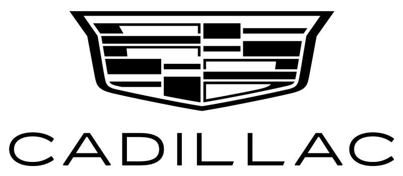
The Cadillac logo is a shield-shaped crest featuring a divided field of colors and a crown element. It was officially redesigned in 2021 by Cadillac’s in-house team. The emblem symbolizes nobility, precision, and the founder Antoine de la Mothe Cadillac’s coat of arms.
Design Type: Emblem (crest-based combination mark)
Primary Elements:
- Shield shape with angular geometric divisions
- Crown motif at the top
- Vertical and horizontal color blocking
- Metallic border framing
Official Introduction Date: The current version launched in January 2021
Designer/Agency: Cadillac Design Team (in-house)
Trademark Status: Registered trademark of General Motors LLC
Color Palette:
- Deep Red (#9B1B30)
- Navy Blue (#00205B)
- Metallic Silver (#C0C0C0)
- Black (#000000)
Usage Context: Vehicle grilles, steering wheels, key fobs, dealership signage, digital platforms, marketing materials, and merchandise
How Has the Cadillac Logo Evolved Over Time?
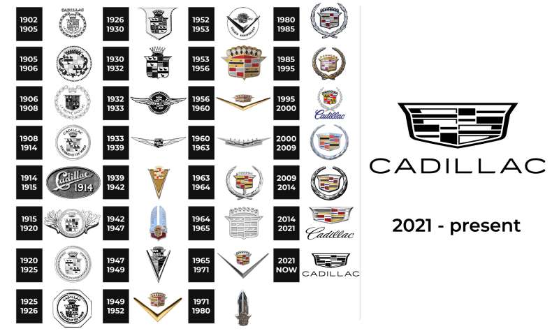
The Cadillac emblem has gone through major transformations since 1902. Early versions featured elaborate wreaths and detailed crests.
Mid-century designs embraced chrome and the tail-fin era aesthetics. Recent updates moved toward minimalist design with cleaner lines and simplified geometry.
Original Cadillac Logo (1902-1905)
Years Active: 1902 to 1905
Design Description: The first Cadillac logo featured a detailed rendering of Antoine de la Mothe Cadillac’s family crest. It included a crown, merlettes (stylized birds), and a quartered shield.
Color Scheme: Black, gold, and touches of red
Designer: Adapted from historical records by company founders Henry Leland and William Murphy
Context: The brand needed instant credibility. Borrowing from French nobility provided that European prestige American buyers associated with quality.
Key Changes from Previous: This was the original. No prior version existed.
Cultural Significance: It established Cadillac’s positioning as a luxury marque from day one.
Wreath Era Logo (1906-1999)
Years Active: 1906 to 1999 (with variations)
Design Description: A laurel wreath encircled the central crest. The wreath symbolized victory and excellence. The shield remained the focal point but gained additional ornamentation.
Color Scheme: Gold, red, blue, white, and black
Designer: Various in-house teams over the decades
Context: The wreath addition came as Cadillac established itself as America’s premier luxury brand. It reinforced the “Standard of the World” positioning.
Key Changes from Previous: Addition of the laurel wreath, more refined crest details, and introduction of the duck motifs (merlettes)
Cultural Significance: This version became the classic Cadillac look that baby boomers remember from their parents’ driveways.
Art and Science Logo (2000-2014)
Years Active: 2000 to 2014
Design Description: Sharp angles replaced curved elements. The wreath became more stylized with angular leaves. The crest took on a faceted, almost crystalline appearance.
Color Scheme: Silver, red, blue, and black with metallic finishes
Designer: Cadillac Design under Wayne Cherry’s leadership
Context: Cadillac launched its “Art and Science” design philosophy. The angular logo matched the sharp body lines of vehicles like the CTS.
Key Changes from Previous: Geometric angular treatment, removal of traditional curves, modernized wreath interpretation
Cultural Significance: It signaled Cadillac’s attempt to attract younger buyers and compete with German luxury brands.
Current Cadillac Logo (2021-Present)
Years Active: 2021 to present
Design Description: The wreath is gone. A clean, monochromatic shield stands alone. The design features simplified color blocking with a three-dimensional metallic appearance.
Color Scheme: Primarily monochrome silver and black, with color versions using traditional red and blue
Designer: Cadillac in-house design team
Context: The redesign coincided with Cadillac’s electric vehicle push. The Lyriq EV was the first vehicle to wear this new badge.
Key Changes from Previous: Complete removal of the wreath, simplified shield geometry, flatter overall appearance suited for digital applications
Cultural Significance: It represents Cadillac’s transition into the electric era while maintaining brand recognition.
What Do the Design Elements of the Cadillac Logo Mean?
The shield shape carries centuries of meaning. It connects to European heraldic traditions where family crests identified noble houses.
The divided fields within the shield represent different aspects of the Cadillac legacy. Each color section tells part of the brand’s story.
Why Did Cadillac Choose These Specific Colors?
The reds and blues in the Cadillac crest come directly from Antoine de la Mothe Cadillac’s family arms. Red symbolizes boldness and passion. Blue represents loyalty and trust.
Understanding color theory helps explain why these particular hues work together so well.
Red:
- Hex: #9B1B30
- Meaning: Passion, power, American heritage
- Psychological impact: Creates excitement and urgency
Blue:
- Hex: #00205B
- Meaning: Trust, stability, premium quality
- Psychological impact: Conveys reliability and depth
Silver/Chrome:
- Hex: #C0C0C0
- Meaning: Modernity, technology, sophistication
- Psychological impact: Suggests precision engineering
The color psychology behind these choices reinforces Cadillac’s luxury positioning. The color palette balances tradition with contemporary appeal.
What Typography Style Is Used in the Cadillac Logo?
When paired with text, Cadillac uses a custom serif font for the brand name. The letterforms feature elegant proportions and refined serifs.
The typography evolved from ornate scripts in early advertisements to the current clean, architectural lettering.
Readability was a key concern. The letters need to work on a tiny key fob and a massive dealership sign.
Recent versions lean toward simpler letterforms that reproduce well in digital environments.
What Are the Hidden Meanings in the Cadillac Logo?
The merlettes (birds without beaks or feet) in historical versions symbolized conquest and bravery. They suggested someone who relied on merit rather than inherited power.
The crown at the crest’s top represents leadership in the luxury segment.
Some see the quartered shield as representing four generations of Cadillac ownership. The designers never confirmed this interpretation.
The 2021 version’s clean lines intentionally echo the angular grilles of current Cadillac vehicles.
How Does the Cadillac Logo Compare to Competitor Logos?
Cadillac’s crest-based approach differs from most luxury competitors. German brands like BMW use circular emblems.
British marques such as Jaguar and Bentley favor animal mascots or winged badges.
Among American luxury brands, the Chrysler logo also uses wings, while Lexus opts for a stylized “L” in an oval.
The shield format puts Cadillac closer to Porsche and Alfa Romeo in design approach.
Cadillac stands out by maintaining heraldic elements that competitors abandoned decades ago. This creates instant differentiation on the road.
What Are the Technical Specifications of the Cadillac Logo?
Official Color Codes:
Primary Red:
Primary Blue:
- Hex: #00205B
- RGB: (0, 32, 91)
- CMYK: (100, 65, 0, 64)
- Pantone: 281 C
Metallic Silver:
- Hex: #C0C0C0
- RGB: (192, 192, 192)
- CMYK: (0, 0, 0, 25)
Dimensions and Proportions:
- Aspect ratio: Approximately 1:1.2 (width to height)
- Minimum size: 0.5 inches for print, 50 pixels for digital
- Clear space: Equal to the width of the crown element on all sides
- The logo should never be stretched, rotated, or altered
What Cultural Impact Has the Cadillac Logo Had?
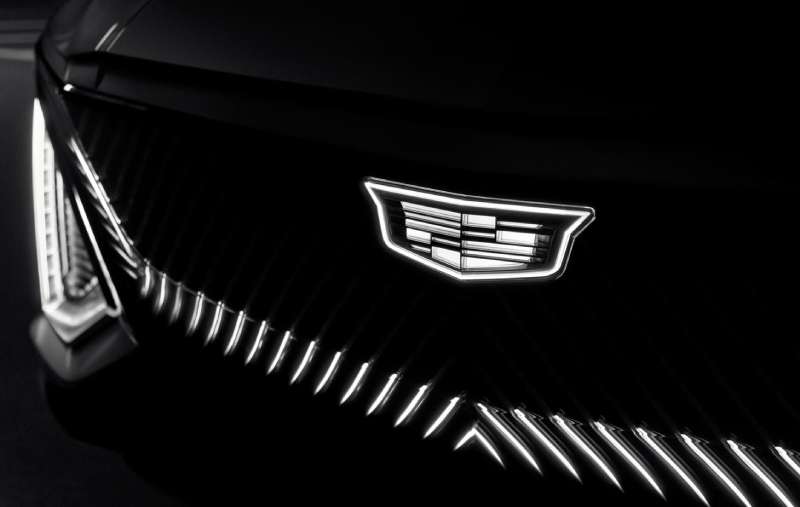
The Cadillac crest became shorthand for American success. Hip-hop artists reference Cadillacs constantly in lyrics.
The brand appeared in countless films as the vehicle of choice for executives, politicians, and celebrities. That wreath and shield meant you had made it.
Elvis Presley famously bought Cadillacs for friends and family. The logo became tied to rock and roll excess.
Today, the simplified emblem signals Cadillac’s push into electric vehicles and a new generation of buyers.
How Does the Cadillac Logo Fit Into the Overall Brand Identity?
The logo anchors every touchpoint of the Cadillac experience. It appears on vehicle grilles, steering wheels, and key fobs.
Dealership architecture echoes the angular lines of the current crest. Marketing materials use the same color codes.
Cadillac’s brand guidelines ensure consistent application across all media. The crest works alongside the wordmark in a defined visual hierarchy.
Digital platforms feature animated versions of the logo for video content. The design scales from billboard to app icon without losing recognition.
How Should the Cadillac Logo Be Used?
Official Usage Guidelines:
Do:
- Use approved logo files from GM media resources
- Maintain required clear space around the emblem
- Apply the logo on backgrounds that provide sufficient contrast
- Use official color values for reproduction
Don’t:
- Alter proportions or stretch the logo
- Add effects like drop shadows or glows
- Place the logo on busy backgrounds that reduce visibility
- Use outdated versions of the emblem
Where to Access Official Logos: GM Media Archive and authorized dealer portals
Licensing Information: The Cadillac logo is a registered trademark of General Motors LLC. Commercial use requires written permission.
Trademark Protection: The crest design, color combination, and Cadillac wordmark are protected under U.S. and international trademark law. Unauthorized use may result in legal action.
FAQ on The Cadillac Logo
What Does the Cadillac Logo Represent?
The Cadillac emblem represents the coat of arms of Antoine de la Mothe Cadillac, the French explorer who founded Detroit in 1701.
The crest symbolizes nobility, craftsmanship, and American luxury. It connects the brand to European heritage while establishing General Motors as a premium automaker.
Who Designed the Original Cadillac Logo?
Henry Leland and William Murphy adapted the design from historical records of the Cadillac family crest in 1902.
The in-house Cadillac Design Team created the current 2021 version. No external agency was involved. They followed core logo design principles while simplifying the classic look.
Why Did Cadillac Remove the Wreath From Its Logo?
Cadillac dropped the laurel wreath in 2021 to modernize the brand identity. The cleaner shield works better on digital platforms and electric vehicles.
It signals a break from the past. The Lyriq EV was first to wear this streamlined badge.
What Colors Are in the Cadillac Logo?
The official colors include deep red, navy blue, metallic silver, and black. These come directly from the original Cadillac family heraldry.
Red represents boldness. Blue conveys trust and stability. The chrome finish adds a modern, technological feel to the automotive insignia.
When Was the Cadillac Logo First Created?
The first Cadillac logo appeared in 1902 when the Cadillac Motor Company launched in Detroit, Michigan.
That original crest featured elaborate details including merlettes and a crown. The logo has evolved roughly 40 times since then.
What Is the Meaning of the Cadillac Crest?
The quartered shield represents different aspects of the founder’s legacy. Merlettes (stylized birds) symbolized bravery and conquest in heraldic tradition.
The crown signifies leadership. Understanding the psychology of shapes explains why the shield format projects authority and protection.
How Many Times Has the Cadillac Logo Changed?
Cadillac has updated its emblem approximately 40 times since 1902. Major redesigns happened in 1906, 2000, 2014, and 2021.
Each logo evolution reflected changing design trends. The brand moved from ornate Victorian details to today’s geometric simplicity.
Is the Cadillac Logo Based on a Real Coat of Arms?
Yes and no. The design references Antoine de la Mothe Cadillac’s family crest, but historians debate its authenticity.
Some records suggest the explorer may have invented noble origins. Regardless, the heraldic design elements gave the brand instant prestige in 1902.
What Font Does Cadillac Use in Its Branding?
Cadillac uses a custom typeface with elegant proportions. The letterforms evolved from ornate scripts to clean, architectural lettering.
Current versions prioritize digital readability. The font spacing ensures the wordmark works at any size.
Why Does Cadillac Use a Shield Shape in Its Logo?
Shields carry centuries of heraldic meaning. They suggest protection, strength, and noble lineage.
The format differentiates Cadillac from competitors using circles or animal mascots. Symmetry in the crest creates visual balance and instant brand recognition on vehicle grilles.
Conclusion
The Cadillac Logo has survived 120 years of automotive history. Few brand symbols carry that kind of weight.
From Antoine de la Mothe Cadillac’s borrowed heraldry to today’s streamlined shield, each version told a story about American luxury and ambition.
The 2021 redesign proves something interesting. You can strip away the wreath, simplify the crest, and still keep instant brand recognition.
Whether on a classic Eldorado or the new Lyriq electric vehicle, that emblem means the same thing it meant in 1902. Premium craftsmanship. Bold design. The Standard of the World.

Renowned for his expertise in logo design and visual branding, Bogdan has developed a multitude of logos for various clients.
His skills extend to creating posters, vector illustrations, business cards, and brochures. Additionally, Bogdan's UI kits were featured on marketplaces like Visual Hierarchy and UI8.
He also wrote in the past years on sites like Design Your Way, WebDesignerDepot, WPDean, Designmodo, Speckyboy, Slider Revolution, and more.
- CMYK to Pantone Converter - 19 July 2026
- Fresh Inter Font Pairing Ideas for Modern Designs - 18 July 2026
- David Bowie Album Covers That Defined an Era - 17 July 2026

Bogdan Sandu is a seasoned designer who has been designing websites since 2008. Renowned for his expertise in logo design and visual branding, Bogdan has developed a multitude of logos for various clients. His skills extend to creating posters, vector illustrations, business cards, and brochures. Additionally, Bogdan's UI kits were featured on marketplaces like Visual Hierarchy and UI8. He also wrote in the past years on sites like Design Your Way, WebDesignerDepot, WPDean, Designmodo, Speckyboy, Slider Revolution, and more.
You Might Also Like