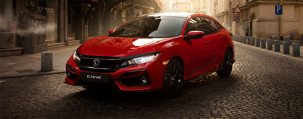
The Honda logo stands as one of the most recognized automotive symbols worldwide. That simple “H” badge has become shorthand for reliability, engineering excellence, and Japanese craftsmanship.
Honda Motor Co., Ltd. introduced their current emblem design in 1981, though the company itself dates back to 1948. The mark sits comfortably among other car logos that have shaped how we identify vehicles on the road.
What makes it work? The logo balances simplicity with distinctiveness. Over seven decades, Honda has refined their visual identity through several iterations, each building on the last while maintaining core recognition factors that consumers trust.
What is the Honda Logo?

The Honda logo features a stylized uppercase “H” enclosed within a trapezoidal shape with rounded corners. Officially standardized in 1981, this emblem represents the company founder Soichiro Honda’s surname while conveying strength and forward motion through its bold, angular design.
Design Specifications
- Design Type: Lettermark/monogram with containing shape
- Primary Elements: Stylized capital “H” with extended vertical strokes, trapezoidal border
- Official Introduction Date: 1981 (current version)
- Designer/Agency: Honda in-house design team
- Trademark Status: Registered trademark in over 150 countries
- Color Palette: Silver/Chrome (primary), Red (#E40521 for accent applications), Black (#000000 for print)
- Usage Context: Vehicle badges, dealership signage, marketing materials, merchandise, digital platforms, motorsport liveries
How Has the Honda Logo Evolved Over Time?
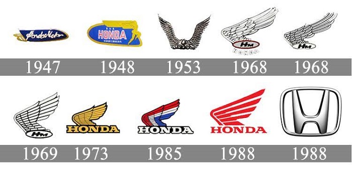
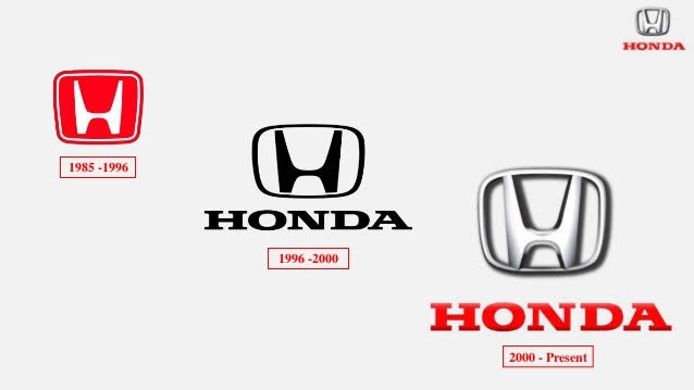
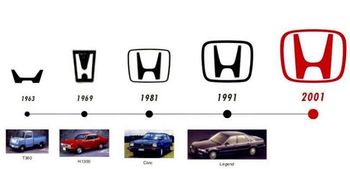
Honda’s visual identity has gone through distinct phases since 1948. The company started with text-based marks before settling on the iconic H emblem.
Each redesign reflected where Honda was headed as a business. From motorcycles to cars to power equipment, the logo adapted.
Original Honda Logo (1948-1958)
- Years Active: 1948-1958
- Design Description: Simple wordmark reading “HONDA” in capital letters, sometimes paired with the full company name “Honda Motor Co., Ltd.”
- Color Scheme: Black text on white, occasionally reversed
- Designer: Soichiro Honda (initial concepts)
- Context: Post-war Japan, company focused primarily on motorized bicycles and small motorcycles
- Key Changes from Previous: First official branding for the company
- Cultural Significance: Represented Japanese industrial rebirth and entrepreneurial spirit
Honda Wings Logo (1958-1969)
- Years Active: 1958-1969
- Design Description: Wing motif flanking the Honda name, symbolizing speed and freedom of movement
- Color Scheme: Red, white, and occasionally gold accents
- Designer: Honda design department
- Context: Expansion into international markets, particularly motorcycle racing
- Key Changes from Previous: Added graphic wing elements, more dynamic appearance
- Cultural Significance: Associated with Honda’s motorsport victories and global ambitions
Transitional H Mark (1969-1981)
- Years Active: 1969-1981
- Design Description: Introduction of the standalone “H” symbol, initially boxier and less refined
- Color Scheme: Chrome/silver for vehicle applications, red for corporate use
- Designer: Honda corporate identity team
- Context: Honda entering automobile market seriously with the Civic (1972) and Accord (1976)
- Key Changes from Previous: Shift from winged wordmark to initial-based symbol
- Cultural Significance: Marked Honda’s transition from motorcycle manufacturer to full automotive company
Modern Honda Logo (1981-Present)
- Years Active: 1981-present
- Design Description: Refined “H” with tapered vertical strokes extending beyond horizontal bar, contained in subtle trapezoidal frame
- Color Scheme: Chrome/silver (3D vehicle badges), red (#E40521), black, white
- Designer: Honda Global Brand Management
- Context: Global standardization as Honda became major international automaker
- Key Changes from Previous: Sleeker proportions, more aerodynamic feeling, refined stroke weights
- Cultural Significance: Became synonymous with Japanese quality and reliability during 1980s-90s automotive boom
What Do the Design Elements of the Honda Logo Mean?
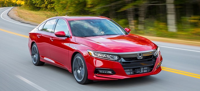
The extended vertical strokes of the H reach upward, suggesting ambition and growth. This wasn’t accidental.
Honda wanted a mark that felt like it was moving forward, even standing still. The wider top creates subtle dynamism.
Why Did Honda Choose These Specific Colors?
Silver dominates Honda’s badge applications. It reads as premium without being flashy.
The chrome finish catches light and suggests precision engineering. Red appears in racing contexts and corporate materials, connecting to Honda’s motorsport heritage.
- Silver/Chrome: Hex varies by application (typically #C0C0C0 to #E8E8E8), symbolizes technology, precision, and premium quality
- Honda Red: #E40521, Pantone 485 C, represents passion, energy, and racing heritage
- Black: #000000, used for contrast and formal applications
- White: #FFFFFF, background color for maximum logo visibility
What Typography Style Is Used in the Honda Logo?
The H itself functions as custom typography. It doesn’t come from any existing font family.
When Honda uses their name spelled out, they employ a proprietary sans-serif font called Honda Sans. Clean, modern, highly legible at any size.
The letterforms avoid unnecessary decoration. Everything serves function first.
What Are the Hidden Meanings in the Honda Logo?
Look closer at that H. The vertical strokes widen as they rise, creating a subtle sense of lift.
Some designers note the shape resembles a person with arms raised in celebration or achievement. Soichiro Honda never confirmed this interpretation, but it fits the company philosophy.
The trapezoidal container echoes the shape of a car grille, tying the badge to its primary application.
How Does the Honda Logo Compare to Competitor Logos?
Japanese automakers often favor letter-based marks. Toyota has their overlapping ovals, Mazda their stylized M, Nissan their circle-contained wordmark.
Honda’s approach sits somewhere between these extremes. More abstract than spelling out the name, less complex than Toyota’s layered symbol.
Against German competitors like BMW’s roundel or Mercedes’ three-pointed star, Honda reads as more approachable. Less heritage-heavy. The Rivian logo and other newer EV brands have pushed even further into geometric minimalism, making Honda’s classic H feel established but not dated.
American brands tend toward bolder, more aggressive styling. Honda maintains restraint. This visual positioning matches the brand’s reputation for practical reliability over flashy performance.
What Are the Technical Specifications of the Honda Logo?
Official Color Codes
Honda Red
Silver (Digital Representation)
- Hex: #C0C0C0
- RGB: (192, 192, 192)
- CMYK: (0, 0, 0, 25)
Black
- Hex: #000000
- RGB: (0, 0, 0)
- CMYK: (0, 0, 0, 100)
Dimensions and Proportions
- Aspect Ratio: Approximately 1:1.15 (width to height)
- Minimum Size Requirements: 10mm height for print, 40 pixels for digital
- Clear Space: Minimum clear space equal to 25% of logo height on all sides
- Official Guidelines: Available through Honda brand portal for authorized partners
What Cultural Impact Has the Honda Logo Had?
That silver H became a status symbol in certain markets. During the 1990s import car scene, Honda badges carried real weight.
The logo appeared on everything from Type R track cars to lawn mowers. This breadth actually strengthened the mark rather than diluting it.
In motorsport, the Honda emblem signals serious engineering. F1 partnerships and MotoGP dominance cemented this perception. The logo transcended transportation to represent Japanese excellence generally.
How Does the Honda Logo Fit Into the Overall Brand Identity?
Honda maintains separate visual systems for different divisions. The H badge unifies them all.
Acura, their luxury line, uses a distinct caliper-shaped A mark. Honda Motorcycle Racing employs wing variants. Power equipment gets the standard H.
This structure follows brand guidelines that allow flexibility while maintaining family resemblance. The H functions as a master brand, with sub-brands extending from it logically.
Color usage, spacing rules, and application standards ensure consistency across thousands of touchpoints globally.
How Should the Honda Logo Be Used?
Official Usage Guidelines
- Do: Maintain minimum clear space, use approved color versions, preserve aspect ratio
- Don’t: Stretch or distort, apply unapproved colors, place on busy backgrounds, modify the design
- Access: Official logos available through Honda’s brand portal for authorized dealers and partners
- Licensing: Requires written permission from Honda Motor Co., Ltd. for commercial use
- Trademark Protection: Aggressively enforced globally, counterfeit badges actively pursued
For aftermarket use, replacement badges should match OEM specifications exactly. Honda provides part numbers for authentic replacement emblems through their dealer network.
FAQ on The Honda Logo
What Does the Honda Logo Mean?
The Honda emblem represents founder Soichiro Honda’s surname. That stylized H symbolizes ambition and forward motion.
The extended vertical strokes suggest upward growth. It’s simple but carries real weight in automotive branding.
Japanese automaker identity distilled into one letter.
Who Designed the Honda Logo?
Honda’s in-house design team created the current badge. No single designer gets credit publicly.
Soichiro Honda himself influenced early branding decisions. The modern H mark evolved through internal corporate identity work during the late 1970s.
Honda Motor Company keeps specific designer names private.
When Was the Current Honda Logo Introduced?
The modern Honda symbol debuted in 1981. That’s when the company standardized their global visual identity.
Earlier versions existed since 1948. The wings logo dominated the 1960s motorcycle era.
This current version has lasted over four decades unchanged.
What Are the Official Honda Logo Colors?
Silver and chrome dominate vehicle badges. Honda red (#E40521) appears in corporate and racing applications.
The color palette stays intentionally restrained. Black and white versions exist for specific print needs.
No gradients or complex color treatments.
Why Does the Honda H Have Extended Vertical Strokes?
Those taller verticals create visual lift. The shape feels like it’s reaching upward.
Some interpret it as a person with raised arms. The psychology of shapes plays into this perception of achievement and aspiration.
Intentional or not, it works.
How Has the Honda Logo Changed Over Time?
Four major phases define Honda logo history. Text-only marks came first (1948-1958).
The wings era followed for motorcycles. Then came early H experiments.
The 1981 refinement locked in today’s design. Each evolution matched company growth stages.
What Font Does Honda Use for Their Name?
Honda Sans is their proprietary typeface. It’s custom-built, not available commercially.
Clean lines and high legibility define it. The x-height makes text readable at small sizes.
No serifs, no decorative elements.
Is the Honda Logo Trademarked?
Yes. Honda holds registered trademarks in over 150 countries. They enforce brand protection aggressively.
Counterfeit badges get pursued legally. The Honda brand mark carries significant commercial value.
Unauthorized use triggers swift legal action from the company.
What’s the Difference Between Honda and Acura Logos?
Acura uses a caliper-shaped A mark. It’s meant to suggest precision measurement.
Honda keeps the H for mainstream vehicles. The visual hierarchy separates luxury from standard lineups clearly.
Different badges, same parent company.
Where Can I Get an Official Honda Replacement Badge?
Honda dealerships stock OEM emblems. Part numbers exist for every vehicle application.
Aftermarket chrome badges vary in quality. For authentic replacement, go through official channels.
The dealer network handles genuine Honda badge orders directly.
Conclusion
The Honda logo proves that effective automotive branding doesn’t require complexity. One letter does the job.
Soichiro Honda built a company on practical engineering. The badge reflects that philosophy perfectly.
From the early wings emblem to today’s chrome H, each version served its moment. The current design has held strong since 1981 because it follows solid logo design principles.
Clean lines. Readable at any size. Instantly recognizable on a Civic, Accord, or motorcycle tank.
That’s what good brand identity looks like. No gimmicks needed.

Renowned for his expertise in logo design and visual branding, Bogdan has developed a multitude of logos for various clients.
His skills extend to creating posters, vector illustrations, business cards, and brochures. Additionally, Bogdan's UI kits were featured on marketplaces like Visual Hierarchy and UI8.
He also wrote in the past years on sites like Design Your Way, WebDesignerDepot, WPDean, Designmodo, Speckyboy, Slider Revolution, and more.
- How to Install Fonts on Mac (Step-by-Step Guide) - 20 September 2026
- From Mockup to Code: How AI-Augmented Development Speeds Up the Design Handoff - 19 September 2026
- The Beehiiv Logo History, Colors, Font, And Meaning - 18 September 2026

Bogdan Sandu is a seasoned designer who has been designing websites since 2008. Renowned for his expertise in logo design and visual branding, Bogdan has developed a multitude of logos for various clients. His skills extend to creating posters, vector illustrations, business cards, and brochures. Additionally, Bogdan's UI kits were featured on marketplaces like Visual Hierarchy and UI8. He also wrote in the past years on sites like Design Your Way, WebDesignerDepot, WPDean, Designmodo, Speckyboy, Slider Revolution, and more.
You Might Also Like