The Barclays Logo History, Colors, Font, and Meaning
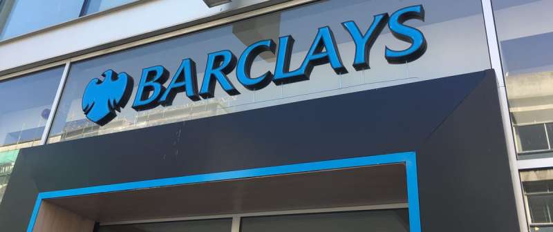
Every touchpoint of a brand holds a narrative. Take a spin around the Barclays logo—it’s not just artistry; it’s an anthology of a legacy, a financial giant’s handshake with the world. It radiates identity. Now, that’s something to unwrap.
Amid these pixels, we’ll dive into the blue emblem’s journey. Consider this a backstage pass to the makings of a symbol that stands tall in the hustle of stock exchanges and the quiet of our wallets.
Imagine this: a blue eagle soaring through centuries, its wings clipped and spread anew, adapting, yet unyielding—a dance of tradition and modernity.
Here’s where you learn the why’s and how’s of its evolution.
Expect revelations on the emblem’s anatomy, the choreography of a rebranding Barclays tale, and a glimpse into the brand guidelines protecting its unique flair.
By the finale, you’ll decode not just a logo, but a beacon of corporate identity in the vast sea of the financial sector. Strap in; let’s decode the saga behind the symbol.
The Meaning Behind the Barclays Logo
The Power of the Eagle
The Barclays logo, in all its simplicity, carries a grand symbol: an eagle. This iconic bird, known for its power and keen vision, is a splendid representation of Barclays’ mission. The eagle exudes a strong sense of leadership and vision, which aligns with Barclays’ position in the banking industry.
Spread Your Wings
Further examining the eagle, we notice its wings spread wide. This open-winged stance is indicative of Barclays’ global reach and acceptance. It’s like the bank is saying, “We’ve got you, no matter where you are.” This powerful image builds a sense of trust and accessibility among Barclays’ customers.
The History of the Barclays Logo
Once Upon a Time in Barclays
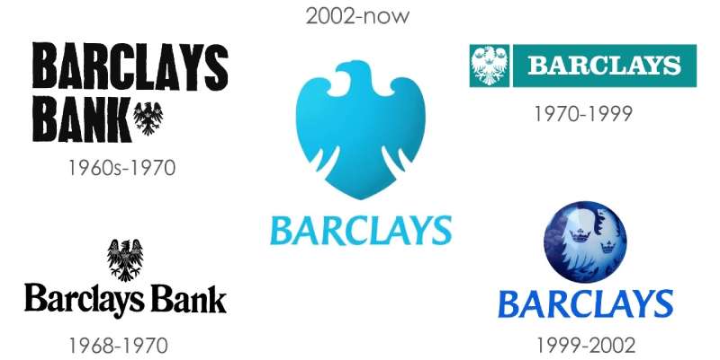
Going back in time, the Barclays logo has evolved while retaining its core symbol – the eagle. The Barclays’ eagle has its roots in the bank’s history, dating back to the 17th century. It’s a symbol that’s endured, symbolizing the bank’s resilience and longevity in the financial industry.
Evolving with Time
As the years rolled on, the Barclays logo adapted to the changing times. The style of the eagle has been refined, and the circle was introduced. The circle not only aesthetically balances the logo, but also adds depth to its symbolic meaning, as discussed earlier.
The Colors of the Barclays Logo
Basking in Barclays Blue
The logo stands out with its distinct blue hue. It’s not just any blue; it’s Barclays Blue. This color signifies trust, loyalty, wisdom, confidence, and intelligence. The choice of blue is strategic, designed to evoke emotions of trust and dependability.
The Font Used in the Barclays Logo
Keeping it Simple
The logo employs a sans-serif typeface. It’s clean, modern, and highly legible, even at smaller sizes. This typeface choice reflects Barclays‘ commitment to clarity and transparency in its communication.
Bold and Balanced
Notice how the letters are bold and evenly spaced. It adds a sense of stability and balance to the logo. Again, these are qualities that a bank like Barclays would want to project to its audience.
The Impact of the Barclays Logo
Brand Recognition
The logo is a powerful branding tool. Its unique design and strategic use of symbol, color, and typography make it instantly recognizable worldwide. The logo helps Barclays stand out in the competitive banking industry and foster brand loyalty among its customers.
Communicating the Brand
The logo effectively communicates the bank’s values and vision. Its design elements work together to tell a story of trust, stability, global reach, and visionary leadership. It’s not just a logo; it’s a visual representation of Barclays’ brand identity.
The Future of the Barclays Logo
Timeless yet Adaptable
While the logo has a timeless quality, its design allows for adaptations to keep up with changing design trends and customer preferences. This flexibility ensures that the logo remains relevant and continues to effectively represent the Barclays brand.
Continuing the Legacy
The logo carries a legacy that’s been built over centuries. As the bank moves forward, the logo will continue to embody Barclays’ commitment to its customers and its vision for the future. The eagle will continue to soar, and the circle of trust will remain unbroken, symbolizing a future where Barclays continues to lead and innovate in the banking industry.
The Adaptability of the Barclays Logo
Digital Friendly
In our increasingly digital world, the Barclays logo holds its own. The simple, bold design scales well, making it easily identifiable on various digital platforms. Whether it’s on an app icon, a website, or a digital ad, the Barclays logo stands out.
Cross-cultural Communication
The logo is a great example of a design that communicates effectively across different cultures. The eagle, the circle, and the color blue are universally recognized symbols that convey positive associations. This makes the Barclays logo a powerful tool for communicating the bank’s brand identity globally.
In conclusion, the Barclays logo is more than just an attractive design. It’s a strategic tool that communicates the bank’s brand identity, fosters brand recognition, and stands the test of time. As Barclays continues its journey, the logo will undoubtedly continue to be a powerful symbol of trust, stability, and visionary leadership.
FAQ on the Barclays Logo
What’s the story behind the Barclays logo?
That eagle? Classic. So, Barclays’ roots go way back, and the spread-eagle crest followed the banking family’s crest. Now, think about this – it’s a nod to both heritage and freedom in finance. A symbol that has morphed with the ages, but boy, does it stand its ground.
How has the Barclays logo evolved over the years?
Like a time traveler, it’s seen different eras. Bold changes, subtle tweaks, each shift reflecting the era’s spirit. The latest revamp? Streamlined, modern, a digital nod, but that iconic eagle still commands respect. It’s proof of how a logo design can adapt yet remain instantly recognizable.
What do the colors in the Barclays logo mean?
Blue is the hero here. Deep, steady, like the ocean – it’s no fluke they chose it. It’s trust, it’s calm, authority. That’s what you want in a financial juggernaut, right? Barclays branding isn’t random; it’s calculated corporate branding at its best.
Who designed the Barclays logo?
This is a tip-o’-the-hat moment to the unsung heroes, the professional designers. Sure, specifics might be cloaked in corporate secrecy, but the talent? That comes from big-league design firms, artists who know visual identity’s power. These creators have etched a mark in banking history.
Is the Barclays logo trademarked?
Absolutely. It’s a tight ship, legally buttoned up. That eagle is prime intellectual property, ensuring nobody pulls a fast one. It’s trademark law 101 – protect your identity like it’s the crown jewels.
Does the Barclays logo have a name?
You bet. It’s not ‘Mister Eagle’ though, let’s keep it classy. Officially, it’s known as the Barclays Spread Eagle. Bold, broad, and befitting a bank that’s got its hands in many pies. They’ve capitalized on a brand identity that resonates globally.
What is the significance of the eagle in the Barclays logo?
Eagles are kings of the skies, right? Barclays snagged that majesty and said, “That’s us.” It symbolizes freedom, control, and perspective – everything a titan in the global banking and financial services sector emanates. It’s about owning the space, soaring sans limits.
How often has the Barclays logo been redesigned?
It’s seen a few facelifts, all calculated. I mean, it’s been around since the 1700s! But, major overhauls? A handful. They tread carefully, balancing tradition and innovation. It’s like reconnecting with old friends, those redesigns, familiar yet fresh.
Are there different versions of the Barclays logo for various services?
Indeed, they tweak it for different Barclays platforms, keeps it context-sharp. The core sticks—our regal eagle—but the dressing? It varies. Premier banking gets a swankier vibe, while retail banking might sport a more demure look. It’s a strategic game of visual branding elements.
What can companies learn from the Barclays logo design strategy?
Straight up—consistency is king. Barclays mastered the art of flexing with the times, not flinching or flip-flopping. Their blueprint? Plant deep roots, but let the leaves dance in the changing winds. Every business should take notes on their game plan for creating a dynamic yet enduring visual identity.
Conclusion
Diving deep into the voyage of the Barclays logo, we’ve spun an intriguing yarn. Twists and turns, steeped in history, yet always darting forward, keen-eyed, to the future. It’s about more than just a logo; it’s a heartbeat, the rhythmic pulse of a global finance player.
To wrap this up, think of that iconic eagle, less a drawing, more a phoenix—always rising, always resonating. It’s not just stitched together by professional designers; it’s woven into the very fabric of trust, quality, and brand recognition we associate with Barclays.
We’ve unboxed the colors, the eagle’s tale, every meticulous redesign. More so, you now know this emblem isn’t just slapped on a building or a webpage; it’s trademarked, fiercely protected, a sentry for a storied banking symbol.
So next time you spot that blue eagle emblem, take a moment. Appreciate its finesse. It’s a legacy etched in time, a visual identity at its paramount—just as it should be.
If you liked this article about the Barclays logo, you should check out this article about the Bank of America logo.
there are also similar articles discussing the Wells Fargo logo, the JP Morgan Chase logo, the UBS logo, and the HSBC logo.
And let’s not forget about articles on the Deutsche Bank logo, the Citigroup logo, the Societe Generale logo, and the ING logo.
- The Epic Games Logo History, Colors, Font, And Meaning - 24 April 2024
- Spread Joy: Happy Color Palettes for Uplifting Designs - 24 April 2024
- The Konami Logo History, Colors, Font, And Meaning - 23 April 2024


