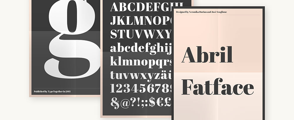
Abril Fatface font pairing separates amateur designs from professional work. This bold display font demands the right partner to shine without overwhelming your layout.
Choosing complementary fonts isn’t guesswork.
The wrong combination creates visual chaos. Readers bounce, conversions drop, and your carefully crafted message gets lost in typographic noise.
This guide covers 18 proven pairing fonts that work with Abril Fatface across different contexts. You’ll learn which sans serif options balance its dramatic serifs, how to establish proper typographic hierarchy, and when to use specific combinations for maximum impact.
Each pairing includes:
- Visual characteristics and weight balance
- Optimal use cases for web and print
- Technical implementation guidelines
- Readability considerations at different sizes
Stop cycling through random font combinations hoping something clicks.
Abril Fatface Font Pairing
| Font Pairing | Use Case Context | Readability Level | Design Classification |
|---|---|---|---|
| Abril Fatface + Poppins | Modern web applications, tech startups, digital product interfaces requiring geometric sans-serif balance | Excellent (9/10) | Contemporary Geometric |
| Abril Fatface + Montserrat | Corporate branding, professional portfolios, urban design projects with strong geometric foundations | Excellent (9/10) | Urban Geometric |
| Abril Fatface + Lato | Editorial content, blog platforms, content-heavy websites requiring humanist warmth with serif elegance | Excellent (9.5/10) | Humanist Editorial |
| Abril Fatface + Raleway | Fashion websites, luxury brand presentations, elegant portfolios emphasizing refinement and sophistication | Good (8/10) | Elegant Minimalist |
| Abril Fatface + Open Sans | Universal web design, accessibility-focused interfaces, government portals requiring maximum legibility | Excellent (9.5/10) | Neutral Humanist |
| Abril Fatface + Nunito Sans | Friendly brand communications, educational platforms, approachable design systems with rounded aesthetics | Excellent (9/10) | Friendly Rounded |
| Abril Fatface + Merriweather Sans | Publishing platforms, long-form journalism, academic publications combining serif tradition with sans clarity | Excellent (9/10) | Traditional Editorial |
| Abril Fatface + Droid Sans | Mobile applications, Android interfaces, screen-optimized reading experiences with technical precision | Very Good (8.5/10) | Screen-Optimized |
| Abril Fatface + Roboto | Material Design systems, Google ecosystem projects, Android-first applications with mechanical structure | Excellent (9/10) | Neo-Grotesque Modern |
| Abril Fatface + Josefin Sans | Creative agencies, artistic portfolios, vintage-modern hybrid designs with geometric Art Deco influence | Good (7.5/10) | Vintage Geometric |
| Abril Fatface + Aktiv Grotesk | Premium brand identity, Swiss design projects, corporate communications requiring refined grotesque precision | Excellent (9/10) | Swiss Grotesque |
| Abril Fatface + Brandon Grotesque | Lifestyle brands, boutique retailers, high-end marketing materials with playful sophistication | Very Good (8.5/10) | Playful Grotesque |
| Abril Fatface + Franklin Gothic URW | Newspaper layouts, editorial magazines, traditional print-inspired web designs with historical gravitas | Very Good (8.5/10) | Classic American |
| Abril Fatface + Anonymous | Tech documentation, developer portfolios, code-adjacent content balancing monospace character with display drama | Good (7/10) | Technical Hybrid |
| Abril Fatface + Abril Display | High-impact editorial design, magazine mastheads, typography-focused branding with dramatic contrast variations | Fair (6/10) | Serif-on-Serif Bold |
| Abril Fatface + FF Spinoza | Cultural institutions, museum websites, philosophical publications requiring sophisticated humanist sans-serif | Very Good (8.5/10) | Refined Humanist |
| Abril Fatface + Proxima Nova | Contemporary web design, SaaS platforms, versatile interfaces requiring professional hybrid sans-serif balance | Excellent (9/10) | Hybrid Contemporary |
| Abril Fatface + Oswald | Sports websites, bold branding, high-impact headlines with condensed grotesque structure for density | Good (7.5/10) | Condensed Gothic |
Poppins
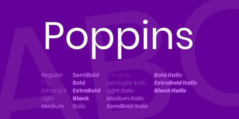
Poppins brings geometric precision to Abril Fatface’s dramatic curves. This modern sans-serif font was designed by the Indian Type Foundry and features rounded letterforms that create exceptional versatility.
The pairing works because Poppins maintains consistent stroke widths while Abril Fatface showcases extreme contrast between thick and thin lines.
Visual Characteristics
High contrast defines this combination. Abril Fatface demands attention with its bold serifs and hairline strokes, while Poppins delivers clean readability through geometric construction.
Weight distribution creates natural visual hierarchy. The display serif dominates headlines, Poppins supports with neutral body text.
Stroke consistency differs dramatically. Poppins maintains uniform thickness across all letterforms, creating stable text blocks that balance Abril Fatface’s high-contrast elegance.
Best Use Cases
Fashion websites benefit from this sophisticated pairing. Headers grab attention while product descriptions stay approachable.
Creative agencies use this combination for portfolio sites and case studies. The modern geometric pairs well with vintage-inspired headlines.
Lifestyle blogs thrive with this duo. Abril Fatface creates memorable article titles, Poppins handles long-form content without fatigue.
Marketing materials work well with varied weights. Poppins offers nine weight options from Thin to Black for flexible typographic hierarchy.
Contextual Attributes
Readability: Poppins excels at small sizes (12-16px) for body text. Abril Fatface requires minimum 24px for optimal legibility, ideally 48px+ for display purposes.
Mood/Tone: This pairing communicates contemporary sophistication with editorial flair. Abril Fatface adds drama and prestige, Poppins softens with friendly approachability.
Technical compatibility: Both fonts are Google Fonts with excellent web performance. Poppins supports Devanagari and Latin scripts. Load times remain minimal with subset selection.
Implementation Example
Use Abril Fatface at 64px for H1 headlines with -0.02em letter spacing.
Set Poppins Regular at 16px for body copy with 1.6 line height. Increase to 18px for improved accessibility.
Apply Poppins SemiBold for H2 subheadings at 28px. This creates stepped hierarchy between display and body text weights.
Maintain 2.5:1 size ratio between Abril Fatface headlines and Poppins body text for optimal scale and proportion.
Montserrat

Montserrat emerged from Buenos Aires street typography and pairs naturally with Abril Fatface through shared geometric influences. Both fonts balance contemporary styling with historical references.
This combination appears across editorial design, branding projects, and digital interfaces where modern professionalism meets elegant display.
Visual Characteristics
Generous letter spacing defines Montserrat’s personality. This creates breathing room that complements Abril Fatface’s dense vertical emphasis.
Similar x-heights maintain baseline consistency. Both fonts align well in mixed compositions without awkward size adjustments.
Geometric construction links these typefaces. Montserrat’s clean forms echo the mathematical precision beneath Abril Fatface’s decorative surface.
The contrast strategy differs between them. Abril Fatface maximizes thick-to-thin variation while Montserrat keeps strokes relatively uniform.
Best Use Cases
Corporate websites benefit from this professional pairing. Montserrat handles navigation and body content while Abril Fatface emphasizes key messages.
Magazine layouts work exceptionally well. The combination references 20th-century editorial design without feeling dated.
Poster design leverages both fonts’ display capabilities. Use Montserrat for secondary information, Abril Fatface for main headlines.
E-commerce platforms appreciate Montserrat’s readability in product descriptions paired with Abril Fatface for promotional banners.
Contextual Attributes
Readability: Montserrat performs well from 14px upward. Open counters and generous spacing support extended reading. Abril Fatface maintains legibility at 36px minimum for headers.
Mood/Tone: The pairing projects urban sophistication with international appeal. Montserrat brings straightforward communication, Abril Fatface adds luxury positioning.
Technical compatibility: Both available through Google Fonts with consistent rendering across browsers. Montserrat includes 18 styles, providing exceptional flexibility for design systems.
Implementation Example
Set Abril Fatface at 56px for main headings with normal tracking.
Use Montserrat Medium at 18px for subheadings, Regular at 15px for body text.
Apply 1.5 line height for Montserrat body copy to maximize readability on screens.
Implement Montserrat Bold for call-to-action buttons at 14px, creating clear interactive elements while maintaining unity across the design.
Lato

Lato’s humanist warmth softens Abril Fatface’s dramatic presence. Designed by Łukasz Dziedzic, this typeface brings Polish sensibility to modern digital typography.
The name means “summer” in Polish, reflecting the font’s approachable character.
Visual Characteristics
Semi-rounded letterforms distinguish Lato from purely geometric alternatives. This subtle curvature creates natural reading rhythm that pairs well with Abril Fatface’s assertive verticals.
Consistent stroke widths throughout Lato provide visual stability. Abril Fatface’s high contrast gains support from this neutrality rather than competing with similar styling.
Strong verticals with subtle curves define both fonts. This shared structural element creates unexpected harmony despite different classification.
The hairline details in Abril Fatface find balance against Lato’s slightly thicker minimum stroke weight.
Best Use Cases
Marketing agencies use this pairing for client presentations and proposals. Lato handles extensive text while Abril Fatface punctuates key messages.
Blog platforms benefit from Lato’s screen readability. The font was specifically optimized for digital environments.
Print materials like brochures and annual reports leverage this combination. Abril Fatface creates memorable section breaks, Lato maintains readability through dense information.
Restaurant menus and hospitality branding work well with this sophisticated yet approachable pairing.
Contextual Attributes
Readability: Lato excels at 14-16px for body text with excellent x-height proportions. Abril Fatface needs 32px minimum for comfortable reading in display contexts.
Mood/Tone: This combination balances warmth with elegance. Lato projects friendly professionalism while Abril Fatface adds aspirational quality.
Technical compatibility: Both fonts render consistently across operating systems. Lato includes 18 styles with extensive language support including Vietnamese and extended Latin.
Implementation Example
Use Abril Fatface at 72px for hero section headlines with -0.01em letter spacing.
Set Lato Regular at 16px for paragraph text with 1.7 line height. Increase to 18px for users over 45.
Apply Lato Bold at 24px for H2 headings, creating clear content hierarchy.
Maintain 3:1 size ratio between display and body text. Use Lato Italic for emphasis within paragraphs rather than bolding, preserving texture and color theory in text blocks.
Raleway
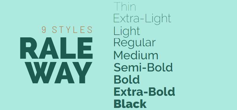
Raleway started as a single thin weight designed by Matt McInerney, later expanded to a nine-weight family. The font’s unique ‘W’ creates instant recognition.
This elegant sans serif font complements Abril Fatface through shared refinement rather than direct contrast.
Visual Characteristics
Thin weights dominate Raleway’s identity. This creates an interesting inversion where Abril Fatface provides weight while the sans serif adds delicacy.
Distinctive terminal shapes give Raleway personality. The font balances geometric construction with humanist touches, creating versatile display options.
Both fonts share elegance as a core attribute. This creates harmonious pairing based on similarity rather than pure contrast.
Wide letter spacing in Raleway’s lighter weights provides visual relief from Abril Fatface’s dense vertical presence.
Best Use Cases
Luxury brands favor this refined combination. Both fonts communicate quality without appearing ostentatious.
Minimalist websites use Raleway throughout with Abril Fatface for strategic focal point headlines.
Wedding invitations and event materials benefit from shared elegance. Raleway Light works for details, Abril Fatface announces main information.
Tech startups with premium positioning use this pairing to balance innovation with sophistication.
Contextual Attributes
Readability: Raleway Regular works at 15px minimum for body text. Thin and ExtraLight weights need 18px+ for comfortable reading. Abril Fatface maintains clarity at 40px+ for headers.
Mood/Tone: This pairing projects refined modernity with confident restraint. Both fonts avoid visual aggression while maintaining strong presence.
Technical compatibility: Available through Google Fonts with 18 total styles. Raleway includes Raleway Dots as a display variant, though standard weights pair better with Abril Fatface.
Implementation Example
Set Abril Fatface at 60px for primary headlines with tight kerning (-0.03em).
Use Raleway Light at 18px for body text with 1.8 line height to compensate for lighter weight.
Apply Raleway SemiBold at 32px for subheadings, creating middle ground between display and body text.
Implement 3.5:1 size ratio between Abril Fatface and Raleway Light to maintain visual hierarchy despite weight differences.
Open Sans

Open Sans was commissioned by Google and designed by Steve Matteson. Optimized for legibility across print, web, and mobile interfaces.
This humanist sans serif ranks among the most widely used web fonts, bringing proven performance to any design system.
Visual Characteristics
Wide apertures define Open Sans’s readability. Large openings in letters like ‘c’ and ‘e’ prevent confusion at small sizes.
Neutral design philosophy makes Open Sans highly adaptable. The font doesn’t impose personality, allowing Abril Fatface to dominate stylistically.
Upright stress and low contrast strokes provide maximum clarity. This conservative approach balances Abril Fatface’s dramatic styling.
Slight humanist warmth prevents sterility while maintaining professional appearance across all weights.
Best Use Cases
Corporate communications rely on this combination for reliability. Open Sans handles body text while Abril Fatface emphasizes brand moments.
Government and educational sites benefit from Open Sans’s accessibility. WCAG compliance comes easier with high-legibility fonts.
Mobile applications use Open Sans throughout with Abril Fatface for onboarding and feature announcements.
Documentation and technical writing pair Open Sans’s clarity with Abril Fatface section headers for wayfinding.
Contextual Attributes
Readability: Open Sans works at 14px for body text with excellent performance down to 12px if necessary. Abril Fatface requires 28px minimum for headers.
Mood/Tone: This pairing balances neutral professionalism with moments of elegance. Open Sans communicates trustworthiness while Abril Fatface adds aspiration.
Technical compatibility: Open Sans includes extensive character sets supporting Greek and Cyrillic. Both fonts load efficiently with Google Fonts CDN.
Implementation Example
Use Abril Fatface at 48px for section headers with standard tracking.
Set Open Sans Regular at 16px for body copy with 1.6 line height. Increase to 18px for better accessibility compliance.
Apply Open Sans SemiBold at 20px for subheadings, maintaining clear information architecture.
Implement responsive sizing that reduces Abril Fatface to 36px on mobile while keeping Open Sans at 16px for consistency.
Nunito Sans
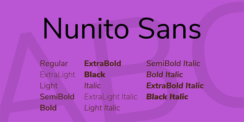
Nunito Sans evolved from the original Nunito, redesigned by Jacques Le Bailly for Vernon Adams’s estate. This sans serif offers 14 styles for comprehensive design systems.
The font balances geometric precision with rounded terminals, creating approachable functionality.
Visual Characteristics
Rounded terminals soften Nunito Sans without compromising readability. This curvature provides gentle contrast to Abril Fatface’s sharp serifs.
Slightly condensed proportions allow efficient text setting. More words fit per line without sacrificing legibility.
Consistent stroke weights throughout the family maintain visual stability. This predictability supports Abril Fatface’s variability.
The geometric foundation creates harmony through shared mathematical construction principles with display serif counterparts.
Best Use Cases
User interface design benefits from Nunito Sans’s compact proportions. The font saves space while Abril Fatface adds brand personality to splash screens.
Educational materials use Nunito Sans for clear instruction text paired with Abril Fatface for chapter headers.
Mobile apps leverage multiple weights for interface hierarchy. Abril Fatface appears sparingly for maximum impact.
SaaS platforms balance functionality with sophistication using this combination throughout dashboards and marketing pages.
Contextual Attributes
Readability: Nunito Sans performs well at 14px with clear distinction between similar characters. Abril Fatface needs 32px minimum for display use.
Mood/Tone: This pairing projects friendly professionalism with contemporary appeal. Nunito Sans brings warmth while Abril Fatface adds aspirational quality.
Technical compatibility: Google Fonts provides both with consistent rendering. Nunito Sans includes extensive Latin coverage with Vietnamese support.
Implementation Example
Set Abril Fatface at 52px for main headlines with -0.02em letter spacing.
Use Nunito Sans Regular at 15px for body text with 1.65 line height.
Apply Nunito Sans SemiBold at 22px for subheadings, creating three-tier hierarchy.
Maintain 3.5:1 size ratio between display and body text. Use Nunito Sans Light for captions at 13px, adding fourth hierarchy level for complex layouts.
Merriweather Sans
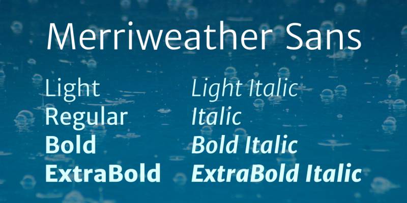
Merriweather Sans extends the Merriweather serif font family with harmonious sans serif companion. Designed by Sorkin Type for optimal screen readability.
The semi-condensed design maintains text density while ensuring comfortable reading at small sizes.
Visual Characteristics
Sturdy construction defines Merriweather Sans. Thick strokes and generous x-height create robust presence that stands up to Abril Fatface’s boldness.
Slightly condensed proportions allow efficient page layout. Text blocks maintain good color without appearing cramped.
Open counters prevent similar letterforms from blurring together. This attention to legibility makes long-form reading comfortable.
The humanist influence adds warmth to geometric skeleton, creating approachable functionality for diverse content types.
Best Use Cases
Publishing platforms pair Merriweather Sans body text with Abril Fatface headlines for editorial impact.
News websites use this combination for article layouts. The fonts reference print journalism while optimizing for digital consumption.
Long-form content benefits from Merriweather Sans’s readability. Blog posts and white papers maintain engagement through comfortable reading experience.
Academic publishing adapts this pairing for journals and conference materials combining scholarly authority with modern presentation.
Contextual Attributes
Readability: Merriweather Sans works at 15px for body text with excellent small-size performance. Abril Fatface maintains clarity at 36px+ for headers.
Mood/Tone: This pairing projects editorial credibility with contemporary execution. Merriweather Sans brings journalistic trustworthiness while Abril Fatface adds design sophistication.
Technical compatibility: Both fonts render consistently across devices. Merriweather Sans includes eight styles from Light to Black with extensive language support.
Implementation Example
Use Abril Fatface at 64px for article titles with tight tracking (-0.02em).
Set Merriweather Sans Regular at 17px for body copy with 1.75 line height for comfortable reading.
Apply Merriweather Sans Bold at 26px for subheadings, creating clear content structure.
Implement pull quotes with Abril Fatface at 32px alongside Merriweather Sans body text to break up long articles while maintaining cohesive typography.
Droid Sans
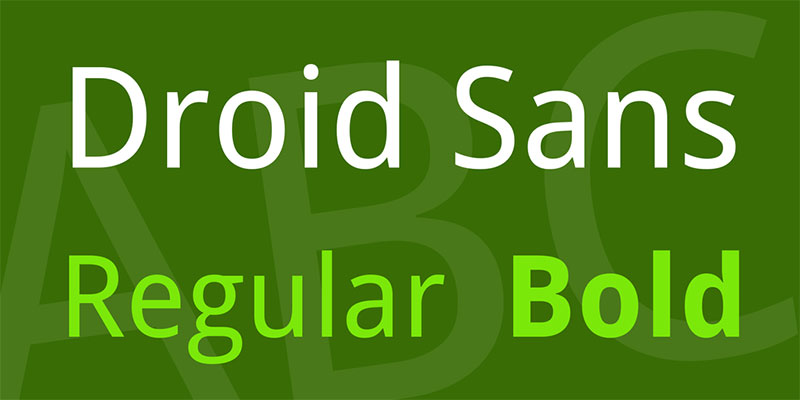
Droid Sans was designed by Steve Matteson for Android’s original interface. The font prioritizes legibility on mobile screens with optimized proportions.
Standard width ratios and neutral design make this sans serif highly functional for digital applications.
Visual Characteristics
Humanist skeleton with subtle warmth distinguishes Droid Sans. The design avoids geometric rigidity while maintaining clean readability.
Neutral appearance allows Abril Fatface to dominate stylistically. Droid Sans supports without competing for attention.
Open apertures and clear distinctions between similar characters prevent confusion. This attention to legibility works well in mobile-first contexts.
The proportions follow traditional measurements rather than condensed or extended variations, creating comfortable reading rhythm.
Best Use Cases
Mobile applications benefit from Droid Sans’s screen optimization. Originally designed for Android, it performs exceptionally on small displays.
App interfaces use Droid Sans for UI elements and body text with Abril Fatface for onboarding and feature highlights.
Responsive websites leverage Droid Sans’s mobile-friendly rendering paired with Abril Fatface desktop headers.
Cross-platform applications appreciate consistent rendering across operating systems, making design implementation predictable.
Contextual Attributes
Readability: Droid Sans works at 14px on mobile devices with clear character differentiation. Abril Fatface needs 40px minimum for mobile headers.
Mood/Tone: This pairing balances functional neutrality with elegant moments. Droid Sans projects reliability while Abril Fatface adds brand personality.
Technical compatibility: Widely supported across devices with predictable rendering. Droid Sans includes basic Latin and extended character sets.
Implementation Example
Set Abril Fatface at 48px for desktop headers, scaling to 32px on mobile viewports.
Use Droid Sans Regular at 16px for body text across all screen sizes.
Apply Droid Sans Bold at 20px for subheadings, maintaining clear hierarchy on constrained displays.
Implement viewport-based scaling that adjusts Abril Fatface size while keeping Droid Sans consistent for predictable mobile reading experience.
Roboto
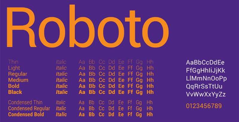
Roboto was created by Christian Robertson for Android as a modern, approachable system font. Geometric skeleton with humanist touches creates friendly mechanical precision.
The font family includes 12 styles covering multiple weights and widths for comprehensive design systems.
Visual Characteristics
Dual nature defines Roboto’s personality. Geometric construction meets humanist warmth through subtle curve adjustments.
Slightly squared curves distinguish Roboto from purely geometric alternatives. This creates mechanical efficiency without coldness.
Open counters and clear letterforms maintain legibility across sizes. Roboto balances space efficiency with reading comfort.
The stroke consistency provides stable foundation that complements Abril Fatface’s dramatic variation without visual conflict.
Best Use Cases
Tech companies use Roboto throughout interfaces with Abril Fatface for marketing materials and landing pages.
Android applications naturally pair these fonts since both originated within Google’s design ecosystem.
Web applications benefit from Roboto’s extensive weight range. Abril Fatface punctuates key moments while Roboto handles functional UI.
Data-heavy interfaces appreciate Roboto’s clarity in tables and forms paired with Abril Fatface section headers for navigation.
Contextual Attributes
Readability: Roboto works at 14px for body text with excellent performance on screens. Abril Fatface maintains clarity at 32px+ for headers.
Mood/Tone: This pairing balances modern functionality with elegant branding. Roboto projects efficiency while Abril Fatface adds aspirational quality.
Technical compatibility: Both fonts load efficiently through Google Fonts. Roboto includes extensive character support with Greek, Cyrillic, and Vietnamese.
Implementation Example
Use Abril Fatface at 56px for hero headlines with standard tracking.
Set Roboto Regular at 16px for body copy with 1.6 line height.
Apply Roboto Medium at 24px for subheadings, leveraging mid-weight for clear hierarchy.
Implement Roboto Condensed at 14px for captions and metadata, maintaining same family while adding variety through width variation.
Josefin Sans
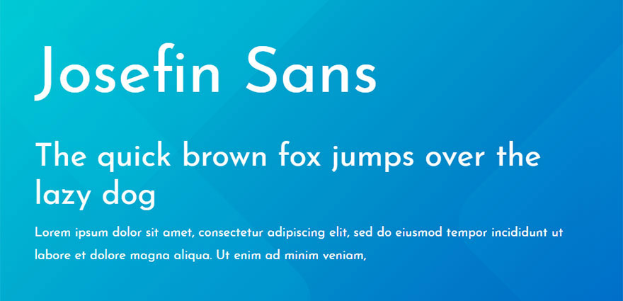
Josefin Sans pushes geometric principles to extremes with halved x-height creating distinctive proportions. Designed by Santiago Orozco as homage to geometric sans serifs.
The font’s unique construction creates memorable identity while maintaining functional legibility.
Visual Characteristics
Dramatically low x-height distinguishes Josefin Sans from conventional alternatives. This creates vintage geometric aesthetic reminiscent of 1920s typography.
Perfect geometric circles and precise angles define construction. The font embraces mathematical purity over optical adjustments.
Extended ascenders and descenders create elegant proportions. This vertical emphasis complements Abril Fatface’s height.
The geometric purity creates interesting tension with Abril Fatface’s organic curves, producing dynamic contrast through stylistic opposition.
Best Use Cases
Vintage-inspired designs benefit from Josefin Sans’s 1920s aesthetic paired with Abril Fatface’s Art Deco influences.
Fashion brands use this combination for editorial layouts and lookbooks. Both fonts reference historical elegance while remaining contemporary.
Art galleries and cultural institutions pair these fonts for exhibition materials. Shared sophistication with distinct personalities.
Boutique businesses leverage this pairing for luxury positioning through refined typography with strong character.
Contextual Attributes
Readability: Josefin Sans works at 16px minimum for body text due to low x-height. Abril Fatface needs 36px+ for display use.
Mood/Tone: This pairing projects artistic sophistication with geometric precision. Josefin Sans brings vintage modernism while Abril Fatface adds contemporary drama.
Technical compatibility: Available through Google Fonts with seven weights. Both fonts maintain distinct personality while sharing elegant refinement.
Implementation Example
Set Abril Fatface at 68px for main headers with -0.01em letter spacing.
Use Josefin Sans Light at 18px for body text with 1.9 line height to compensate for extended line length from low x-height.
Apply Josefin Sans SemiBold at 28px for subheadings, creating stepped hierarchy.
Maintain generous line spacing (minimum 1.8) with Josefin Sans to prevent ascenders and descenders from conflicting across lines in paragraph text.
Aktiv Grotesk
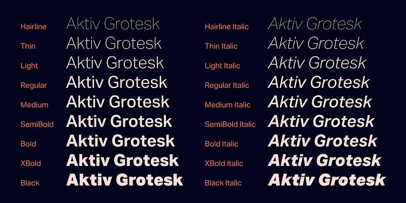
Aktiv Grotesk emerged from dissatisfaction with Helvetica’s ubiquity. Designed by Dalton Maag, this grotesque sans serif balances familiarity with fresh details.
The font references mid-century Swiss design while introducing contemporary refinements.
Visual Characteristics
Grotesque classification means less geometric than neo-grotesque alternatives. Subtle irregularities add character without compromising clarity.
Slightly narrower proportions than Helvetica create space efficiency. This allows more comfortable reading in constrained layouts.
Open apertures and clear terminals maintain legibility. The font avoids excessive neutrality, providing personality without distraction.
The optical adjustments create warmth that pairs well with Abril Fatface’s dramatic personality, each font contributing distinct character.
Best Use Cases
Design studios use Aktiv Grotesk for project documentation paired with Abril Fatface for client presentations.
Corporate identity systems leverage Aktiv Grotesk’s professional appearance with Abril Fatface for brand moments.
Architecture and engineering firms appreciate Swiss-influenced typography. Both fonts reference modernist design principles.
Portfolio websites for creative professionals pair these fonts to demonstrate typographic sophistication and attention to detail.
Contextual Attributes
Readability: Aktiv Grotesk works at 14px for body text with clear character differentiation. Abril Fatface maintains clarity at 38px+ for headers.
Mood/Tone: This pairing projects Swiss precision with editorial flair. Aktiv Grotesk brings modernist rationality while Abril Fatface adds sophisticated drama.
Technical compatibility: Professional font requiring license through Dalton Maag or font services. Performance optimized for both screen and print applications.
Implementation Example
Use Abril Fatface at 62px for section headers with standard tracking.
Set Aktiv Grotesk Regular at 16px for body copy with 1.65 line height.
Apply Aktiv Grotesk Medium at 26px for subheadings, leveraging mid-weight option.
Implement consistent spacing systems using multiples of 8px grid to maintain Swiss-influenced precision throughout layout compositions.
Brandon Grotesque
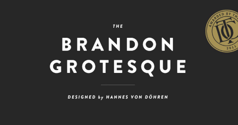
Brandon Grotesque combines geometric construction with friendly warmth. Designed by Hannes von Döhren, this sans serif adds personality while maintaining professionalism.
The font gained popularity for balancing approachability with sophistication across branding applications.
Visual Characteristics
Geometric foundation with humanist touches defines Brandon Grotesque. Perfect circles in ‘o’ and ‘e’ create mathematical precision.
Slightly narrower proportions improve text efficiency. The font saves horizontal space without appearing cramped or condensed.
Rounded terminals add friendliness to geometric skeleton. This warmth prevents sterility while maintaining clean contemporary appearance.
The contrast between geometric precision and organic warmth mirrors relationship between Abril Fatface’s drama and supporting text clarity.
Best Use Cases
Startup branding favors Brandon Grotesque paired with Abril Fatface for pitch decks and marketing sites.
Creative agencies use this combination for client presentations. Both fonts project contemporary sophistication.
Product packaging benefits from Brandon Grotesque’s versatility with Abril Fatface for brand names and hero elements.
Social media graphics leverage this pairing for professional appearance that remains approachable and shareable.
Contextual Attributes
Readability: Brandon Grotesque works at 15px for body text with clear character forms. Abril Fatface needs 34px minimum for display use.
Mood/Tone: This pairing balances geometric precision with human warmth. Brandon Grotesque projects friendly professionalism while Abril Fatface adds luxury positioning.
Technical compatibility: Premium font requiring license through HvD Fonts. High-quality hinting provides excellent screen rendering across browsers.
Implementation Example
Set Abril Fatface at 58px for hero headlines with tight tracking (-0.02em).
Use Brandon Grotesque Regular at 16px for body copy with 1.65 line height.
Apply Brandon Grotesque Medium at 24px for subheadings, creating three-tier hierarchy.
Implement uppercase styling for Brandon Grotesque in UI elements (buttons, labels) at 12px with increased letter spacing (0.05em) for improved legibility.
Franklin Gothic URW
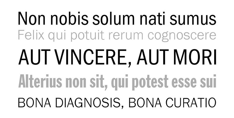
Franklin Gothic dates to 1902, designed by Morris Fuller Benton. The URW revival maintains historical character while adding contemporary functionality.
This grotesque sans serif brings time-tested reliability to modern design applications.
Visual Characteristics
Condensed proportions define Franklin Gothic’s efficiency. Narrow letter widths allow dense text setting without sacrificing legibility.
Strong vertical stress creates authoritative presence. The font projects confidence through bold weights and sturdy construction.
Minimal stroke contrast throughout maintains even color in text blocks. This consistency supports rather than competes with Abril Fatface’s variation.
The historical character adds gravitas that complements Abril Fatface’s vintage-inspired elegance, creating layered sophistication through shared classical references.
Best Use Cases
Museum exhibitions pair Franklin Gothic with Abril Fatface for wall text and interpretive materials. Both fonts reference early 20th-century design.
Newspaper layouts benefit from Franklin Gothic’s compact efficiency paired with Abril Fatface headlines.
Institutional communications use this combination for reports and publications requiring authoritative tone.
Print magazines leverage Franklin Gothic’s text efficiency with Abril Fatface for feature headlines and section breaks.
Contextual Attributes
Readability: Franklin Gothic URW works at 14px for body text despite condensed proportions. Abril Fatface maintains clarity at 40px+ for headers.
Mood/Tone: This pairing projects established authority with sophisticated presentation. Franklin Gothic brings institutional credibility while Abril Fatface adds contemporary elegance.
Technical compatibility: Available through URW Type Foundry with extensive character support. Both fonts perform consistently in print and digital contexts.
Implementation Example
Use Abril Fatface at 64px for article titles with standard tracking.
Set Franklin Gothic URW Book at 15px for body text with 1.7 line height to compensate for condensed width.
Apply Franklin Gothic URW Demi at 22px for subheadings, leveraging mid-weight option.
Implement tighter tracking (-0.01em) on Franklin Gothic for efficient text setting while maintaining comfortable reading experience in longer passages.
Anonymous Pro
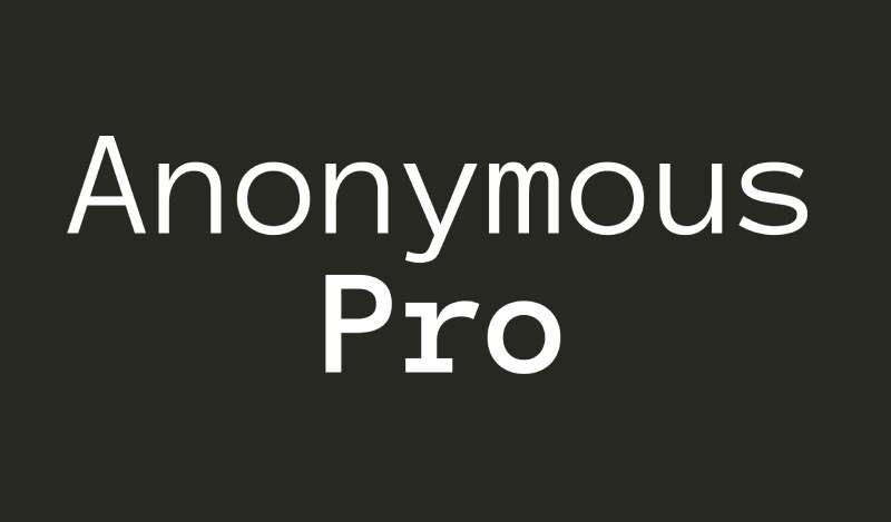
Anonymous Pro originated in 1990s as alternative for Mac screen typography. Later revived and optimized for programming contexts.
The monospaced design creates unique pairing opportunity with Abril Fatface’s proportional elegance.
Visual Characteristics
Fixed-width design means every character occupies identical horizontal space. This creates distinctive rhythm unlike proportional fonts.
Clear character differentiation prevents coding errors. The ‘0’ includes slash, ‘l’ and ‘1’ are clearly distinct.
Slightly boxy construction reflects digital origins. The font embraces functional aesthetic over pure elegance.
The monospace structure creates interesting tension with Abril Fatface’s dramatic proportions, producing unexpected harmony through extreme contrast.
Best Use Cases
Tech documentation pairs Anonymous for code samples with Abril Fatface for section headers.
Developer portfolios use this combination to showcase technical work alongside design sensibility.
Programming tutorials benefit from Anonymous’s coding clarity with Abril Fatface for lesson titles.
Technical blogs leverage this pairing to balance code readability with editorial presentation quality.
Contextual Attributes
Readability: Anonymous Pro works at 14px for code blocks with excellent character distinction. Abril Fatface needs 36px minimum for headers.
Mood/Tone: This pairing balances technical precision with elegant design. Anonymous brings coding authenticity while Abril Fatface adds sophistication.
Technical compatibility: Free font optimized for programming environments. Both fonts maintain distinct character while serving specialized purposes.
Implementation Example
Set Abril Fatface at 54px for article headers with standard tracking.
Use Anonymous Pro Regular at 14px for code blocks with 1.5 line height, standard for programming contexts.
Apply sans-serif font like Roboto at 16px for regular body text, reserving Anonymous Pro exclusively for code.
Implement syntax highlighting within Anonymous Pro code blocks while maintaining consistent background treatment to separate code from surrounding Abril Fatface headlines and body text.
Abril Display
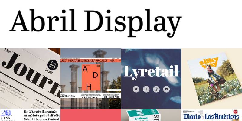
Abril Display extends the Abril family with text-optimized weights. Designed by same team at TypeTogether for editorial applications.
This serif companion shares DNA with Abril Fatface while offering refined proportions for smaller sizes.
Visual Characteristics
Lower contrast than Abril Fatface makes Display variant more suitable for extended reading. Thicker hairlines prevent disappearing at text sizes.
Similar construction principles maintain family resemblance. Both fonts share terminal details and serif shapes.
More moderate proportions improve readability at smaller sizes. The display variant balances character with functionality.
The family relationship creates natural harmony, allowing designers to maintain consistent aesthetic across hierarchy levels from headlines to body text.
Best Use Cases
Editorial design uses Abril Fatface for covers and titles, Abril Display for article text and captions.
Magazine layouts benefit from staying within single family. Visual consistency improves without monotony.
Book design pairs these family members for chapter titles and running text. Shared character maintains coherent identity.
Annual reports use Abril Fatface for section breaks, Abril Display for financial tables and detailed information.
Contextual Attributes
Readability: Abril Display works at 11px for body text with reduced contrast preventing hairline disappearance. Abril Fatface reserved for 32px+ display use.
Mood/Tone: This pairing maintains consistent sophistication across sizes. Both fonts project editorial elegance with shared design language.
Technical compatibility: Both fonts from TypeTogether with matched character sets. Professional licensing required for commercial projects.
Implementation Example
Set Abril Fatface at 68px for main headlines with -0.02em letter spacing.
Use Abril Display Regular at 12px for body copy with 1.75 line height.
Apply Abril Display SemiBold at 18px for subheadings, creating three-tier hierarchy within single family.
Maintain proportional scaling where display text uses larger point sizes at same relative weight, creating smooth transition between Abril variants throughout document.
FF Spinoza
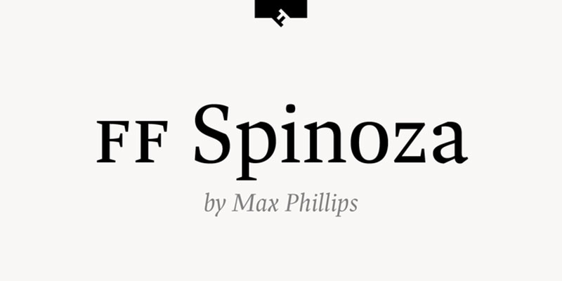
FF Spinoza references Dutch typography traditions through contemporary lens.
The humanist serif brings Old Style character to modern applications.
Visual Characteristics
Old Style proportions create traditional elegance. Diagonal stress and bracketed serifs reference historical printing.
Moderate contrast balances readability with character. The font avoids extreme thin strokes while maintaining serif definition.
Sturdy construction allows use across sizes. FF Spinoza works for both text and display applications.
The humanist character provides sophisticated alternative to geometric sans serifs, creating dialogue between Abril Fatface’s modernity and classical tradition.
Best Use Cases
Publishing houses pair FF Spinoza body text with Abril Fatface display headlines for literary materials.
Cultural institutions use this combination for programs and interpretive materials. Both fonts project cultivation.
Academic publishing benefits from FF Spinoza’s scholarly appearance with Abril Fatface for chapter openings.
High-end editorial leverages this pairing for magazines and journals requiring sophisticated typography throughout.
Contextual Attributes
Readability: FF Spinoza works at 10px for body text with excellent small-size performance. Abril Fatface maintains clarity at 38px+ for headers.
Mood/Tone: This pairing projects intellectual sophistication with artistic sensibility. FF Spinoza brings scholarly authority while Abril Fatface adds contemporary edge.
Technical compatibility: Professional font from FontFont requiring license. High-quality hinting ensures consistent rendering across platforms.
Implementation Example
Set Abril Fatface at 66px for chapter openings with standard tracking.
Use FF Spinoza Regular at 11px for body text with 1.8 line height for comfortable reading.
Apply FF Spinoza Bold at 16px for subheadings, leveraging text-optimized weights.
Implement dropcaps using Abril Fatface at 72px for paragraph openings, creating visual interest while FF Spinoza handles continuous reading text.
Proxima Nova
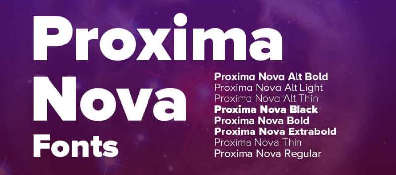
Proxima Nova achieved bestseller status through versatile design balancing geometric and humanist influences. Created by Mark Simonson as complete redesign of Proxima Sans.
The font family includes 48 styles across three widths, providing comprehensive design system.
Visual Characteristics
Hybrid design philosophy combines geometric skeleton with humanist warmth. This creates versatility across applications.
Slightly shorter ascenders improve line spacing efficiency. The font saves vertical space without appearing compressed.
Clear apertures and open counters maintain legibility. Proxima Nova balances character with neutrality.
The professional polish complements Abril Fatface’s dramatic personality, each font contributing strength without competing for attention.
Best Use Cases
Corporate websites use Proxima Nova throughout navigation and body text with Abril Fatface for hero headlines.
Tech companies favor this combination for product interfaces and marketing materials. Both fonts project contemporary professionalism.
Professional services firms use Proxima Nova for accessibility with Abril Fatface for brand differentiation.
SaaS applications leverage Proxima Nova’s comprehensive weight range for UI with Abril Fatface for marketing touchpoints.
Contextual Attributes
Readability: Proxima Nova works at 14px for body text with excellent screen performance. Abril Fatface maintains clarity at 36px+ for headers.
Mood/Tone: This pairing balances approachable functionality with elegant branding. Proxima Nova projects professionalism while Abril Fatface adds sophistication.
Technical compatibility: Premium font requiring license through Mark Simonson Studio. Includes extensive character support with multiple numeral sets.
Implementation Example
Set Abril Fatface at 60px for landing page headlines with -0.01em letter spacing.
Use Proxima Nova Regular at 16px for body copy with 1.6 line height.
Apply Proxima Nova Semibold at 26px for subheadings, leveraging mid-weight for hierarchy.
Implement Proxima Nova Condensed at 14px for dense information areas while maintaining Abril Fatface at standard width for maximum impact in display contexts.
Oswald
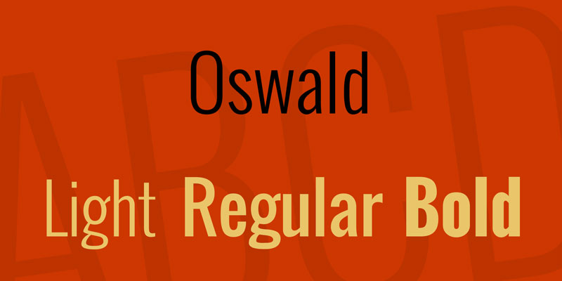
Oswald reimagines ‘Alternate Gothic’ for digital screens. Vernon Adams created this condensed sans serif specifically for web use.
The narrow proportions maximize space efficiency while maintaining legibility across devices.
Visual Characteristics
Strong vertical emphasis creates commanding presence. Condensed width allows dramatic sizing without dominating layout space.
Minimal horizontal emphasis directs eye movement vertically. This creates efficient scanning pattern for headers.
Clean geometric construction maintains clarity despite narrow proportions. The font avoids decorative elements that might blur when condensed.
The condensed structure provides interesting counterpoint to Abril Fatface’s bold presence, both fonts making strong statements through different dimensional approaches.
Best Use Cases
Sports websites use Oswald’s bold impact paired with Abril Fatface for event headlines and promotional banners.
News portals benefit from Oswald’s space efficiency in navigation with Abril Fatface for feature stories.
Poster design leverages both fonts’ display capabilities. Oswald handles secondary information, Abril Fatface dominates main messaging.
Vertical layouts particularly benefit from Oswald’s narrow width, allowing larger point sizes in constrained horizontal space alongside Abril Fatface hero elements.
Contextual Attributes
Readability: Oswald works at 16px minimum for body text despite condensed width. Abril Fatface maintains clarity at 40px+ for headers.
Mood/Tone: This pairing projects bold confidence with sophisticated edge. Oswald brings athletic energy while Abril Fatface adds refined drama.
Technical compatibility: Free through Google Fonts with six weights. Both fonts optimize for screen rendering with clear hinting.
Implementation Example
Set Abril Fatface at 72px for hero headlines with tight tracking (-0.03em).
Use Oswald Regular at 18px for subheadings with standard tracking to compensate for narrow width.
Apply neutral sans serif like Open Sans at 16px for body text, reserving Oswald and Abril Fatface for display purposes.
Implement uppercase styling for Oswald in navigation elements at 14px with increased letter spacing (0.08em), creating strong visual hierarchy alongside Abril Fatface page headers.
FAQ on Abril Fatface Font Pairing
What fonts pair best with Abril Fatface?
Clean sans-serif fonts like Poppins, Montserrat, and Lato work exceptionally well. These provide neutral body text that balances Abril Fatface’s dramatic display characteristics without competing for attention or creating visual clutter.
Can I use Abril Fatface for body text?
No. Abril Fatface is a display font designed exclusively for headlines and large text. Its high contrast and decorative serifs become illegible below 24px, making extended reading uncomfortable and reducing accessibility.
What’s the ideal size for Abril Fatface headers?
Use minimum 32px, ideally 48px or larger for optimal legibility. The font’s hairline strokes disappear at smaller sizes. Desktop headers work best at 56-72px where contrast and details remain visible.
Does Abril Fatface work for logos?
Yes, when your brand requires elegant sophistication. The distinctive serifs create memorable identity for fashion, luxury goods, and creative agencies. Avoid using it for tech startups or corporate brands requiring neutral professionalism.
How do I create hierarchy with Abril Fatface?
Pair it with a versatile sans serif offering multiple weights. Use Abril Fatface for H1 at 64px, sans serif medium weight for H2 at 28px, and regular weight for body at 16px, establishing clear visual hierarchy.
What’s the best color scheme for Abril Fatface?
Black on white maximizes legibility due to high stroke contrast. Dark navy or charcoal work well for softer appearance. Avoid light colors on light backgrounds as hairline strokes disappear, compromising readability and color theory principles.
Is Abril Fatface free to use commercially?
Yes. It’s available through Google Fonts under Open Font License. You can use it freely for personal and commercial projects without licensing fees. Download directly from Google Fonts or Adobe Fonts for implementation.
What letter spacing works with Abril Fatface?
Standard or slightly tightened tracking (-0.01em to -0.02em) works best for headlines. Avoid excessive spacing that disrupts word recognition. Individual kerning adjustments may be needed for specific letter pairs like “AV” or “To”.
Can Abril Fatface work in minimalist designs?
Absolutely. Its bold presence contrasts beautifully with generous white space and clean layouts. Use sparingly as focal point element paired with neutral sans serif, letting the font’s drama punctuate otherwise restrained compositions.
What industries suit Abril Fatface typography?
Fashion, luxury retail, editorial publications, wedding services, and creative agencies benefit most. The font communicates sophistication and artistic sensibility. Avoid for corporate finance, healthcare, or technical industries requiring conservative typography approaches.
Conclusion
Successful Abril Fatface font pairing starts with understanding contrast principles and readability requirements. The combinations covered here span geometric sans serifs, humanist alternatives, and specialized options for specific contexts.
Your choice depends on project goals.
Fashion brands lean toward Poppins or Raleway for contemporary sophistication. Editorial projects benefit from Lato or Merriweather Sans for extended reading comfort. Tech applications work best with Roboto or Open Sans for functional clarity.
Test your selections across devices before finalizing.
What looks balanced on desktop can fail on mobile where font spacing and size constraints shift dramatically. Pay attention to leading adjustments and maintain proper hierarchy through consistent sizing ratios.
The right typeface combination transforms good design into memorable experiences. Start with these proven pairings, then adapt based on your brand voice and audience needs.

Renowned for his expertise in logo design and visual branding, Bogdan has developed a multitude of logos for various clients.
His skills extend to creating posters, vector illustrations, business cards, and brochures. Additionally, Bogdan's UI kits were featured on marketplaces like Visual Hierarchy and UI8.
He also wrote in the past years on sites like Design Your Way, WebDesignerDepot, WPDean, Designmodo, Speckyboy, Slider Revolution, and more.
- The Substack Logo History, Colors, Font, And Meaning - 2 October 2026
- How UX Design Impacts SaaS User Retention and Churn - 1 October 2026
- How to Embed Fonts in PDF for Reliable Printing - 30 September 2026

Bogdan Sandu is a seasoned designer who has been designing websites since 2008. Renowned for his expertise in logo design and visual branding, Bogdan has developed a multitude of logos for various clients. His skills extend to creating posters, vector illustrations, business cards, and brochures. Additionally, Bogdan's UI kits were featured on marketplaces like Visual Hierarchy and UI8. He also wrote in the past years on sites like Design Your Way, WebDesignerDepot, WPDean, Designmodo, Speckyboy, Slider Revolution, and more.
You Might Also Like