


The Together AI logo represents one of the fastest-growing AI infrastructure companies in the open-source space. Founded in June 2022 by Vipul Ved Prakash and co-founders Ce Zhang, Percy Liang, and Chris Re, the company needed a visual identity that could communicate collaboration, technical innovation, and accessibility.
The brand identity positions Together AI among other tech company logos that prioritize clean, modern aesthetics. The logo has remained largely consistent since the company’s founding, though minor refinements have occurred as the brand matured.
What makes this logo work? It balances technical credibility with approachability. Not an easy thing to pull off when you’re selling GPU clusters and inference APIs.
What is the Together AI Logo?
The Together AI logo is a combination mark featuring a stylized globe icon alongside a clean wordmark. Introduced in 2022 when the company launched, the design uses blue and teal tones to communicate trust and innovation. The icon represents interconnected systems and collaborative AI development.
Design Type: Combination mark (icon plus wordmark)
Primary Elements:
- Stylized globe or sphere icon with internal geometric patterns
- Custom sans-serif wordmark spelling “together”
- Horizontal layout as the primary configuration
Official Introduction Date: June 2022
Designer/Agency: Not publicly disclosed
Trademark Status: Together Computer Inc. holds trademark registrations for brand assets
Color Palette: Primary blue (#0A84FF approximate), teal accent tones, white for reverse applications
Usage Context: API documentation, developer platforms, marketing materials, GPU cluster dashboards, research publications, and conference presentations
How Has the Together AI Logo Evolved Over Time?
The Together AI logo has maintained remarkable consistency since the company’s founding in 2022.
Unlike many startups that undergo dramatic visual rebrands, Together AI established strong brand foundations early.
The company’s rapid growth from seed stage to unicorn status in just two years happened without major logo overhauls.
Original Together AI Logo (2022-Present)
Years Active: 2022 to present
Design Description: The original design features a globe-like icon with internal geometric elements suggesting neural networks or distributed computing nodes. The wordmark uses lowercase letters for a friendly, accessible feel.
Color Scheme: Blue gradient tones with teal accents, optimized for dark backgrounds
Designer: Internal team or undisclosed agency
Context: Launched alongside the company’s founding, the logo needed to communicate open-source values while maintaining enterprise credibility. The timing coincided with the generative AI boom of 2022-2023.
Key Features: The icon’s spherical shape suggests global reach and interconnection. Multiple internal elements represent the “together” concept of collaborative AI development.
Cultural Significance: Positioned Together AI as a serious player in the crowded AI infrastructure market, differentiating from both hyperscaler giants and scrappy startups.
What Do the Design Elements of the Together AI Logo Mean?
Every element in the Together AI logo carries meaning tied to the company’s mission.
The globe icon isn’t just decorative. It represents distributed computing across global data centers.
The internal geometric patterns suggest neural network architectures and interconnected systems.
Why Did Together AI Choose These Specific Colors?
Blue dominates tech branding for good reason. It communicates trust, stability, and intelligence.
Together AI’s specific shade leans toward electric blue with teal undertones. This choice separates them from the deeper navy tones used by enterprise software companies.
The hue selection creates a sense of energy and innovation while maintaining professionalism.
Primary Blue:
- Approximate Hex: #0A84FF
- Symbolism: Trust, technology, reliability
- Psychology: Calming yet confident
- Industry fit: Aligns with AI and cloud computing conventions
Teal Accent:
- Used in gradients and secondary applications
- Adds depth without visual clutter
- Creates contrast against dark interface backgrounds
Understanding color theory helps explain why this palette works. Blue-teal combinations create analogous color harmony.
What Typography Style Is Used in the Together AI Logo?
The wordmark uses a custom or modified sans-serif font.
Lowercase letters throughout create approachability. No harsh capitals screaming for attention.
The letterforms feature slightly rounded terminals, softening the technical subject matter.
Generous tracking between characters improves readability at small sizes. This matters when your logo appears in documentation sidebars and API dashboards.
The typeface choice reflects modern tech aesthetics while avoiding the overused geometric sans-serifs that plague the startup world.
What Are the Hidden Meanings in the Together AI Logo?
The globe icon contains subtle references to the company’s technical foundations.
Internal lines and nodes mirror neural network visualizations. If you’ve ever seen a diagram of model architectures, the connection is clear.
The spherical form suggests distributed systems. GPUs spread across data centers, working in concert.
And yeah, the name “Together” gets visual reinforcement through interconnected elements. Not exactly subtle, but effective.
How Does the Together AI Logo Compare to Competitor Logos?
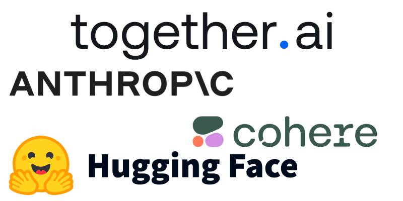
AI infrastructure is crowded. Standing out visually matters more than most founders realize.
The Anthropic logo takes a completely different approach with abstract geometric forms.
Cohere uses warm orange tones to differentiate.
Hugging Face went full mascot mode with their emoji-style character.
Together AI lands somewhere in the middle. More personality than Scale AI, but more professional than playful open-source projects.
The Cerebras logo focuses on hardware computing, while CoreWeave emphasizes cloud infrastructure. Together AI’s visual identity bridges both worlds.
Among AI-focused competitors like Mistral AI and DeepMind, Together AI’s logo holds its own through distinctive color application and icon design.
What Are the Technical Specifications of the Together AI Logo?
Official Color Codes (Approximate):
Primary Blue:
Dark Background:
- Hex: #0D0D0D
- RGB: (13, 13, 13)
- Used for primary brand applications
Dimensions and Proportions:
- Aspect ratio: Approximately 4:1 for horizontal lockup
- Minimum size: Maintain legibility at 100px width minimum
- Clear space: Margin equal to the height of the icon on all sides
File Formats Available:
- PNG for web and digital use
- EPS for print production
- PDF for documentation
- Vector graphics formats ensure scalability
The company maintains strict guidelines against color alteration and partial branding use.
What Cultural Impact Has the Together AI Logo Had?
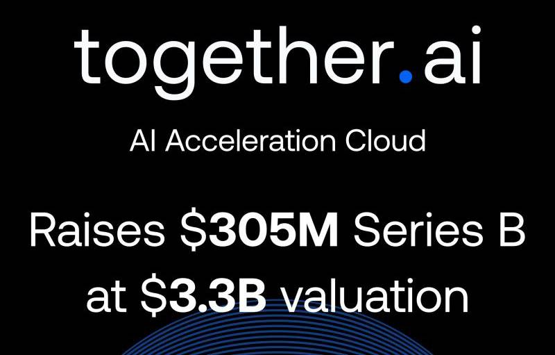
Together AI’s visual identity helped legitimize the open-source AI infrastructure movement.
Before companies like Together AI, open-source AI often looked… well, like open-source projects. GitHub READMEs and academic paper styling.
The polished brand identity signaled that open-source AI could be enterprise-ready.
Their logo appears in major tech publications, conference stages, and research papers. It’s become recognizable in AI developer circles.
How Does the Together AI Logo Fit Into the Overall Brand Identity?

The logo anchors a broader visual system designed for technical audiences.
Dark mode interfaces dominate their platforms. The blue logo pops against black backgrounds in API dashboards and documentation.
Marketing materials extend the color palette with supporting graphics and data visualizations.
The brand’s visual hierarchy places the logo prominently but doesn’t let it overshadow technical content.
Conference booths, swag, and social media maintain consistency. You know it’s Together AI before reading a word.
How Should the Together AI Logo Be Used?
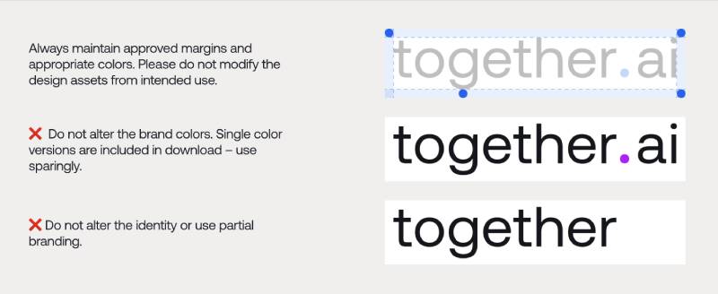
Official Usage Guidelines:
Do:
- Maintain approved margins around the logo
- Use official color versions provided in brand assets
- Apply on dark backgrounds for maximum impact
- Download assets from together.ai/brand
Don’t:
- Alter brand colors
- Use partial branding (icon without wordmark in unauthorized contexts)
- Modify the design proportions
- Apply unauthorized filters or effects
Where to Access Official Logos:
- Primary source: together.ai/brand
- Available formats: PNG, EPS, PDF
- Single-color versions included for specific use cases
Licensing Information:
Together Computer Inc. owns all trademark rights. Press and partner usage requires adherence to published brand guidelines. Unauthorized modifications violate trademark protections.
For detailed usage rules, consult their official brand style guide available through the company’s brand portal.
FAQ on The Together AI Logo
Where Can I Download the Official Together AI Logo?
Visit together.ai/brand for official brand assets. You’ll find PNG logo files, EPS, and PDF formats ready for download.
The company provides high resolution logo versions optimized for both web and print applications.
What File Formats Are Available for the Together AI Logo?
Together AI offers multiple logo file formats. PNG works for digital use. EPS handles print production.
PDF covers documentation needs. For scalable applications, the logo downloads include vector formats that maintain quality at any size.
Does Together AI Have a Transparent Background Logo?
Yes. The transparent background logo comes standard in their brand assets package.
This version works perfectly for dark mode interfaces, marketing materials, and developer documentation where flexible placement matters.
What Are the Official Together AI Brand Colors?
The brand color palette centers on electric blue with teal accents. Primary applications use dark backgrounds.
The specific saturation levels create visual energy while maintaining professional credibility across their AI platform interfaces.
Can I Use the Together AI Logo for My Project?
Check their trademark guidelines first. Together Computer Inc. holds rights to all brand assets.
Press coverage and authorized partnerships can use official graphics. Modifications or unauthorized commercial use violate their logo design principles and trademark protections.
What Does the Together AI Logo Symbol Represent?
The Together AI icon features a globe-like shape with internal geometric patterns. It represents distributed computing and collaborative AI development.
The interconnected elements reflect their open-source mission and GPU infrastructure network spanning global data centers.
Is There a Monochrome Version of the Together AI Logo?
Yes. The monochrome logo versions are included in their downloadable brand assets.
Use these sparingly for specific applications where monochrome colors work better, like single-color print jobs or embroidery.
What Typography Does the Together AI Wordmark Use?
The Together AI wordmark uses a custom font with lowercase letters throughout.
Rounded terminals soften the technical feel. The brand typography maintains readability across their API documentation and marketing materials.
How Has the Together AI Logo Changed Since 2022?
Minimal changes. The machine learning brand identity has stayed consistent since Vipul Ved Prakash founded the company in San Francisco.
This stability helped build recognition as Together AI grew from startup to unicorn status.
What Size Requirements Apply to the Together AI Logo?
Maintain logo clear space equal to the icon height on all sides. Minimum display width sits around 100 pixels.
The horizontal logo layout works as the primary configuration for most generative AI platform applications.
Conclusion
The Together AI logo does what good tech branding should do. It communicates trust, signals innovation, and stays out of the way.
For developers needing official brand assets, the logo download options at together.ai/brand cover every use case. PNG, EPS, PDF, and vector formats are all there.
The wordmark and icon work across dark mode interfaces, API documentation, and marketing materials without losing impact.
As the AI infrastructure company continues scaling its GPU cloud and inference platform, this visual identity will keep representing their open-source foundation model mission effectively.

Renowned for his expertise in logo design and visual branding, Bogdan has developed a multitude of logos for various clients.
His skills extend to creating posters, vector illustrations, business cards, and brochures. Additionally, Bogdan's UI kits were featured on marketplaces like Visual Hierarchy and UI8.
He also wrote in the past years on sites like Design Your Way, WebDesignerDepot, WPDean, Designmodo, Speckyboy, Slider Revolution, and more.
- The Windsurf Logo History, Colors, Font, And Meaning - 10 October 2026
- How to Remove Background From Product Photos (No Photoshop) - 10 October 2026
- How Designers can Build a Stronger Online Creative Identity - 9 October 2026

Bogdan Sandu is a seasoned designer who has been designing websites since 2008. Renowned for his expertise in logo design and visual branding, Bogdan has developed a multitude of logos for various clients. His skills extend to creating posters, vector illustrations, business cards, and brochures. Additionally, Bogdan's UI kits were featured on marketplaces like Visual Hierarchy and UI8. He also wrote in the past years on sites like Design Your Way, WebDesignerDepot, WPDean, Designmodo, Speckyboy, Slider Revolution, and more.
You Might Also Like


