Slab serifs got their name from a Napoleon-era marketing gimmick. They have nothing to do with actual hieroglyphics.
Finding the best Egyptian fonts means sorting through centuries of typographic history, from 19th-century advertising lettering to modern display typefaces. Some pull from ancient Nile-inspired aesthetics. Others lean into that chunky, bold slab serif style that dominated Victorian-era posters.
This guide covers 20 typefaces across the Egyptian font spectrum. You’ll find geometric slab serifs for headlines, Arabic-influenced display fonts for cultural projects, and hieroglyphic-style faces for themed designs.
Each entry includes origin details, distinctive characteristics, and practical pairing recommendations.
The Best Egyptian Fonts
| Font Name | Style Classification | Primary Use Case | Distinctive Attributes |
|---|---|---|---|
| Alfa Slab One | Ultra-bold slab serif | Display headlines, posters | Extreme weight, high impact, Google Fonts available |
| Rokkitt | Contemporary slab serif | Body text, headings | Variable weight, readable at small sizes, web-optimized |
| Sanchez | Rounded slab serif | Editorial content, branding | Soft terminals, humanist proportions, approachable |
| Skandal | Display Egyptian | Branding, packaging | Modern interpretation, geometric structure, bold serifs |
| Bodoni Egyptian Pro | Neoclassical slab serif | Luxury branding, editorial | High contrast stems, elegant proportions, refined details |
| Cleopatra | Decorative Egyptian revival | Thematic design, cultural projects | Ancient motifs, ornamental elements, period authenticity |
| Mionic | Technical slab serif | Tech interfaces, corporate | Monospaced option, clean terminals, digital clarity |
| Akhenaton | Historical revival Egyptian | Museum displays, cultural media | Hieroglyphic influence, historical accuracy, scholarly tone |
| Hieroglike | Pictographic decorative | Themed events, novelty design | Symbol-based characters, ancient Egyptian aesthetics, decorative only |
| Fette Egyptienne | Traditional bold slab serif | Print headlines, vintage design | 19th-century woodtype style, heavy weight, classic proportions |
| Throne Of Egypt | Decorative display Egyptian | Gaming, entertainment media | Fantasy elements, ornate details, thematic immersion |
| Peckham | Geometric slab serif | Modern branding, signage | Sharp angles, contemporary feel, architectural influence |
| Ultra Pro | Heavy weight slab serif | Impact headlines, advertising | Maximum density, compressed spacing, attention-grabbing |
| Revers | Reverse contrast Egyptian | Artistic projects, experimental design | Inverted stress, unconventional structure, visual intrigue |
| Newston | Modular slab serif | Editorial layouts, web typography | Variable weights, extensive family, versatile application |
| Bigboy | Bold display slab serif | Retro branding, casual dining | Friendly curves, approachable weight, vintage Americana |
| Zahra | Elegant Egyptian serif | Fashion, lifestyle branding | Refined serifs, sophisticated proportions, feminine character |
| Sabana | Organic slab serif | Natural brands, artisan products | Hand-drawn quality, warm character, rustic appeal |
| Thoth Legacy | Mythological decorative | Fantasy literature, mystical themes | Symbolic elements, ancient Egyptian deities, esoteric styling |
| Rubaith | Contemporary slab serif | Corporate identity, digital media | Professional appearance, balanced weight, screen-optimized |
Alfa Slab One

A contemporary display font designed by JM Solé and released in 2011 through Google Fonts. This typeface reimagines Robert Thorne’s Six-lines Pica Egyptian from 1821 with extreme black density.
Origin & Design Context
Created as a modern interpretation of 19th-century advertising lettering from the Thorowgood Foundry. The original model inspired a heavier, more aggressive approach suited to contemporary branding needs.
Distinctive Characteristics
- Extreme stem weight with high contrast
- Big, prominent serifs
- Gradual terminals with single serif endings
- Generous x-height for improved legibility
Best Use Cases
Headlines, signage, logotypes, and poster headlines. Works well in branding where a bold statement matters. Too heavy for body text.
Pairing Recommendations
Pair with lightweight sans-serifs like Open Sans or Lato. The weight difference creates strong typographic hierarchy.
Rokkitt

Vernon Adams initiated this geometric slab serif font in 2011. Kalapi Gajjar completed the project in 2017, adding a full set of 9 weights.
Origin & Design Context
Inspired by late 19th and early 20th-century geometric slab serifs. Adams drew from Litho Antique (Inland Type Foundry, 1910) and similar faces from American Type Founders and Monotype Corporation.
Distinctive Characteristics
- Geometric construction with even stroke weight
- Unbracketed slab serifs
- Monolinear appearance
- Updated in 2019 as a variable font
Best Use Cases
Display work and headlines primarily. Can substitute for sans-serifs at text sizes if you need that mechanical warmth. Good for web design headers.
Pairing Recommendations
Works alongside geometric sans-serifs like Montserrat. Or go high-contrast with a delicate serif font for body copy.
Sanchez

Daniel Hernández designed this slab serif typeface for Latinotype in 2011. It was the Chilean foundry’s first display type family.
Origin & Design Context
Draws heavy influence from Rockwell but softens the approach with subtly rounded corners. This creates a friendlier, more approachable personality than its angular predecessors.
Distinctive Characteristics
- Rounded edges on otherwise square serifs
- Consistent x-height across 12 variants
- Range from extra light to black weights
- Distinctive curvy uppercase K
Best Use Cases
Editorial layouts, branding, and headline work. The rounded corners make it suitable for products targeting younger or casual audiences. Regular and italic variants are free.
Pairing Recommendations
Combine with humanist sans-serifs for a warm, readable combination. Works well with Source Sans Pro or Nunito.
Skandal
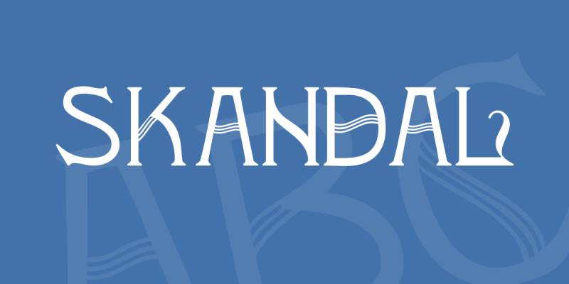
Peter Wiegel created this decorative Art Nouveau typeface in 2020. Licensed under SIL Open Font License with Cyrillic support.
Origin & Design Context
A display face with roots in early 20th-century decorative lettering. The design adds fine line embellishments that give characters a harp-like quality. Wiegel’s interpretation leans vintage while remaining functional.
Distinctive Characteristics
- Sharp, angular strokes
- Decorative fine-line accents on each stem
- Bracket serif structure with wedge elements
- Capitals only design
Best Use Cases
Poster design, album covers, branding for vintage-themed projects. Works best at large sizes where the decorative details remain visible. Not for body text.
Pairing Recommendations
Keep supporting fonts simple. A clean sans-serif prevents visual clutter. Something like Roboto or Inter balances the ornate letterforms.
Bodoni Egyptian Pro

Nick Shinn of Shinntype designed this hybrid typeface, releasing the Pro version in 2010. It originated in 1997 as Bodoni Hairline.
Origin & Design Context
A conceptual deconstruction of the Bodoni archetype. Shinn observed that digital Bauer Bodoni serifs had slab-like qualities similar to Helvetica 25’s stroke weight. The question became: what happens when you strip Bodoni’s high contrast and apply monoline construction?
Distinctive Characteristics
- Monolinear stroke width (except heaviest weights)
- Slab serifs matching stem thickness
- 14 weights from thin to black
- Ball terminals in lowercase options
Best Use Cases
Headlines, editorial design, packaging design, and sophisticated branding. More distinctive than Archer for similar applications.
Pairing Recommendations
Pairs naturally with traditional Bodoni for body text, creating an interesting dialogue between related forms.
Cleopatra
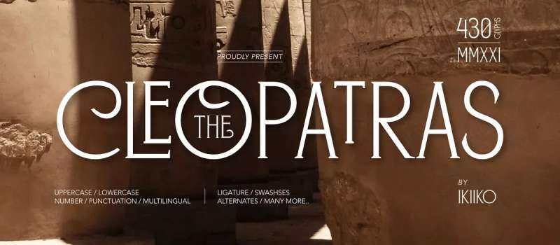
A modern sans-serif font by Alphabet & Type inspired by ancient Egyptian aesthetics. Available in uppercase and lowercase with numerals and punctuation.
Origin & Design Context
Designed to capture Egyptian visual themes while remaining functional for contemporary projects. Named after Egypt’s legendary queen, the font balances historical reference with clean modern lines.
Distinctive Characteristics
- Sans-serif construction with Egyptian stylistic touches
- Clean, geometric letterforms
- Available as TFF and OTF files
- Suitable for both display and short text
Best Use Cases
Logo work, magazine layouts, social media graphics, and brochure design. Works anywhere Egyptian themes need a modern execution.
Pairing Recommendations
Combine with classic serif fonts for contrast. Garamond or Crimson Text add warmth without competing for attention.
Mionic
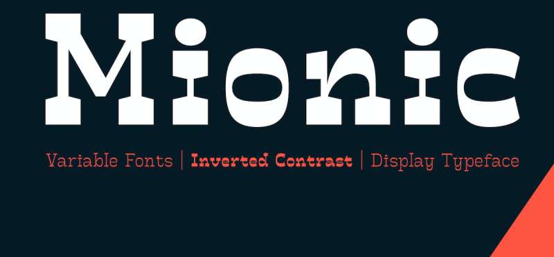
Adam Fathoni Haris and Angga Kristiandri designed this inverted contrast display typeface. Published by Adam Fathony through MyFonts.
Origin & Design Context
Combines antique slab serif structure with contemporary design principles. The variable font system gives designers precise control over weight selection. Think of it as Egyptian lettering meets 21st-century flexibility.
Distinctive Characteristics
- Inverted contrast (horizontal strokes thicker than vertical)
- Variable font with adjustable weight
- Small spurs on stems and terminals mimicking brush entry/exit strokes
- OpenType features including small caps
Best Use Cases
Headlines, signage, logotype design, badge graphics, and print design packaging. Bold weight excels at large sizes. Thinner weights work for longer text passages.
Pairing Recommendations
The unusual contrast means you’ll want neutral companions. Try Helvetica Neue or Work Sans for supporting roles.
Akhenaton
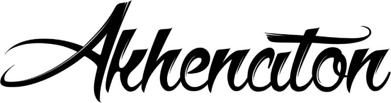
Maellekeita created this Egyptian-inspired font in 2014. Free for personal use with uppercase and lowercase character sets.
Origin & Design Context
Named after the pharaoh Akhenaten, this typeface pulls visual cues from ancient Egyptian writing systems and architecture. Designed for projects needing authentic Nile-era atmosphere without using actual hieroglyphics.
Distinctive Characteristics
- Angular letterforms with Egyptian stylistic influences
- Includes both upper and lowercase
- Decorative display classification
- Clean enough for modern applications
Best Use Cases
Themed event materials, game titles, museum graphics, and entertainment projects requiring Egyptian aesthetics. Book cover design for historical fiction works well.
Pairing Recommendations
Use simple body text fonts that don’t compete. Something like PT Serif or Libre Baskerville provides readability without stylistic conflict.
Hieroglike

A free decorative font created by Andoniaina, featuring outlined hieroglyphic-style characters. Released in 2024 with commercial use permitted.
Origin & Design Context
Designed to provide a modern interpretation of ancient Egyptian hieroglyphic writing. The Malagasy designer created this as a dingbat-style face that bridges ancient symbolism with contemporary design needs.
Distinctive Characteristics
- Outlined letterforms resembling simplified hieroglyphs
- 68 characters in the set
- Display classification with decorative flair
- OTF format with extended language support
Best Use Cases
Themed event graphics, museum materials, educational projects, and Egyptian-themed entertainment. Works for motion graphics titles and game assets where ancient atmosphere matters.
Pairing Recommendations
Keep body text in neutral sans-serifs. The decorative nature demands simplicity elsewhere. Try Source Sans Pro or Noto Sans.
Fette Egyptienne

Typographer Mediengestaltung and Dieter Steffmann created this classic slab serif, first appearing on DaFont in 2006. Over 364,000 downloads speak to its popularity.
Origin & Design Context
A traditional Egyptian-style serif drawing from 19th-century advertising lettering. The “Fette” (German for “bold”) in the name describes its heavy stroke weight. Free for commercial and personal use.
Distinctive Characteristics
- Heavy, bold stroke weight throughout
- Classic bracket serif structure
- 224 defined characters with 220 unique glyphs
- Strong presence at large sizes
Best Use Cases
Headlines, signage, vintage-themed branding, and poster work. The bold weight commands attention in advertising materials.
Pairing Recommendations
Contrast with thin, delicate serifs for body text. Lighter geometric sans-serifs also work. The heavy weight needs breathing room.
Throne Of Egypt

TheCrownIsMine designed this hieroglyphic-inspired font in 2019. Released into public domain with commercial licensing available for 99 cents.
Origin & Design Context
Directly inspired by ancient Egyptian hieroglyphs and artwork. The designer drew from Egyptian visual culture to create letterforms that feel authentically ancient while remaining readable.
Distinctive Characteristics
- Hieroglyphic-inspired letter shapes
- 60-61 characters including variants
- Regular and lowercase versions available
- TTF format with distinct uppercase styling
Best Use Cases
Themed invitations, entertainment graphics, game titles, and cultural event materials. Perfect for projects referencing Cleopatra, Tutankhamun, or pyramid imagery.
Pairing Recommendations
Use simple sans-serifs for supporting text. The ornate letterforms need visual rest around them.
Peckham

Daniel Hernández designed this geometric slab serif for Los Andes in 2018. Named after the birthplace of Vincent Figgins, who first commercialized slab serifs.
Origin & Design Context
A tribute to typographic history. Figgins (born in Peckham, 1766) became the first to include slab serifs in a commercial type catalog. This font honors that legacy while looking contemporary.
Distinctive Characteristics
- 8 weights from Thin to Heavy with italics
- Geometric construction with playful serifs
- 395 glyphs per weight
- Stylistic alternates for A, R, Y, and lowercase a
Best Use Cases
Editorial layouts, branding, headline work. The weight range makes it versatile from delicate to bold applications.
Pairing Recommendations
Works with humanist sans-serifs. The geometric structure pairs naturally with fonts like Proxima Nova or Avenir.
Ultra Pro
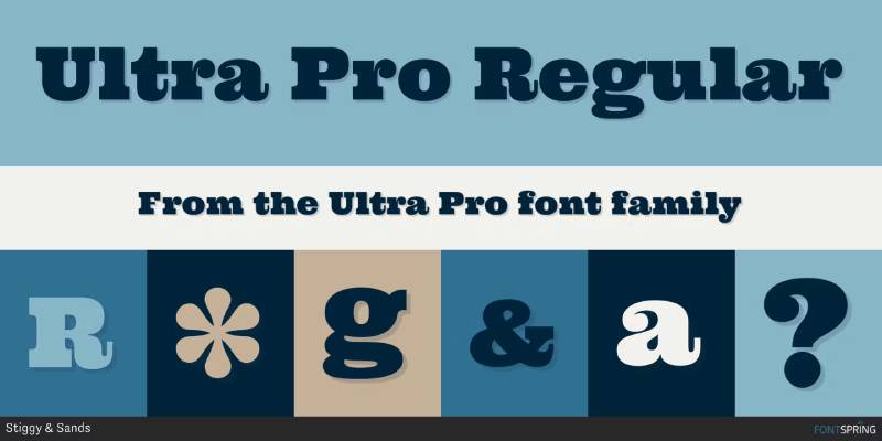
Stiggy & Sands (Brian Bonislawsky and Jim Lyles) designed this ultra bold slab. References Clarendon and Egyptian wood type traditions.
Origin & Design Context
Built for impact. The designers wanted dramatic letterforms that remained serious yet friendly. Draws from 1800s advertising type while adding modern refinements.
Distinctive Characteristics
- Ultra bold weight throughout
- Small caps included
- Full inferior/superior figure sets for fractions
- Tabular, proportional, and oldstyle figures
- Stylistic alternates for caps to small caps conversion
Best Use Cases
Power headlines, magazine covers, signage, and western or steampunk-themed projects. The small caps feature adds typographic flexibility.
Pairing Recommendations
Needs lightweight companions. Try thin sans-serifs or delicate scripts for contrast. The massive weight dominates any layout.
Revers
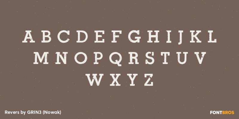
A balanced Egyptian-style slab serif with medium weight. Not too thick, not too thin.
Origin & Design Context
Occupies the middle ground between ultra bold display slabs and lighter text weights. This balance makes it more versatile than extreme designs while maintaining that characteristic slab presence.
Distinctive Characteristics
- Medium stroke weight
- Even distribution across letterforms
- Readable at various sizes
- Sci-fi/western aesthetic potential
Best Use Cases
Film titles, entertainment graphics, and designs requiring Egyptian character without overwhelming boldness. Works for both display and shorter text passages.
Pairing Recommendations
Pairs with both sans-serifs and traditional serifs. The balanced weight allows more flexibility than heavier alternatives.
Newston
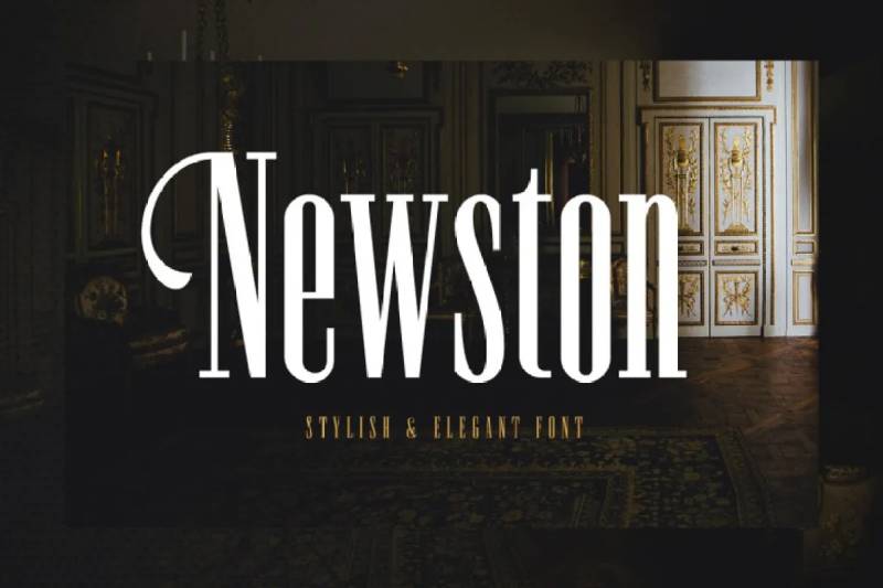
Ahmad Ramzi Fahruddin (Arterfak Project) designed this minimalist serif with Art Deco influences. Available in 4 styles.
Origin & Design Context
Inspired by minimalist and decorative aesthetics. The designer created a font that works across vintage, luxury, and editorial contexts. Tight letter spacing fills space efficiently.
Distinctive Characteristics
- 4 styles: Regular, Italic, Outline, Inline
- Medium stroke contrast
- Condensed spacing
- Stylistic alternates included
Best Use Cases
- Regular: Magazine covers, posters, website headers
- Italic: Foreign language emphasis, motion effects
- Outline: Layered combinations with Regular
- Inline: Logo work with Art Deco styling
Pairing Recommendations
Works with clean sans-serifs for contemporary feel. The inline version stands alone for decorative purposes.
Bigboy
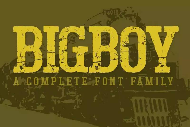
Michael Parson designed this condensed heavy slab based on American Midwest signage. Released through T26 and YouWorkForThem.
Origin & Design Context
Inspired by vintage American road signs and storefront lettering. Parson, a Swiss-based designer, captured that rugged Americana aesthetic with this chunky display face.
Distinctive Characteristics
- Condensed proportions with heavy weight
- 5 evolutive styles (Forties through Eighties)
- Each style progressively more distressed
- Western/rugged personality
Best Use Cases
Americana branding, western themes, vintage advertising recreations. The distressed variants add authentic aged character. Works for fonts for t-shirts with retro themes.
Pairing Recommendations
Pair with clean fonts to contrast the distressed texture. Or lean into the vintage look with complementary aged typefaces.
Zahra

A display face with Arabic styling created by Burntilldead (Eric). Features seamless ligatures for fluid character combinations.
Origin & Design Context
Bridges Arabic calligraphic tradition with Latin letterforms. Designed for projects needing Middle Eastern visual flavor without actual Arabic script. Multilingual support included.
Distinctive Characteristics
- Arabic-inspired stroke patterns
- Seamless ligature system
- Each alternate has unique unicode (PUA encoding)
- OTF, TTF, and WOFF formats
Best Use Cases
Islamic cultural events, Middle Eastern branding, Ramadan promotions, and Egyptian-themed designs. Works for wedding invitations with cultural themes.
Pairing Recommendations
Keep supporting fonts simple. The decorative Arabic styling carries enough visual weight alone.
Sabana
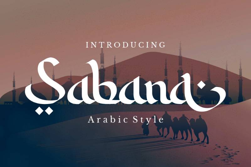
Motokiwo designed this Arabic-style font specifically for Ramadan and Islamic projects. The name evokes Arabian aesthetics.
Origin & Design Context
Created to meet demand for culturally appropriate display fonts during Islamic holidays. The letterforms suggest Arabic calligraphy while remaining Latin-readable.
Distinctive Characteristics
- Islamic character styling
- Decorative script classification
- Suitable for greeting cards and seasonal materials
- OTF and TTF formats
Best Use Cases
Ramadan Kareem cards, Eid materials, Islamic event promotions, and Middle Eastern cultural projects. Also works for restaurant branding and travel graphics.
Pairing Recommendations
Simple serif or sans-serif body fonts. Let Sabana handle the decorative headline work.
Thoth Legacy

Igor Ovsyannykov of HipFonts created this ancient Egyptian-inspired serif. Named after Thoth, the Egyptian god of writing and wisdom.
Origin & Design Context
Designed to evoke Egypt’s storied past through typography. The bold vintage serif structure channels the weight and permanence of stone-carved inscriptions.
Distinctive Characteristics
- Bold vintage serif styling
- Strong character presence
- Hieroglyphic-inspired decorative touches
- Single weight with comprehensive glyph set
Best Use Cases
Museum graphics, historical documentaries, Egyptology publications, and entertainment projects. Works for game titles and film credits needing ancient atmosphere.
Pairing Recommendations
Use lightweight fonts for body text. The bold decorative nature needs contrast. Egyptian-themed projects can pair fonts with geometric sans-serifs.
Rubaith

Slidehack created this handwritten Arabic-style display font. Perfect for Islamic, Arabic, and Middle Eastern cultural applications.
Origin & Design Context
Designed as a faux-Arabic Latin font for designers needing Middle Eastern aesthetics without Arabic script knowledge. The handwritten quality adds warmth and authenticity.
Distinctive Characteristics
- Handwritten stroke quality
- Arabic-inspired letterforms
- Upper and lowercase included
- Numerals and punctuation
- OTF, TTF, WOFF formats
Best Use Cases
Headlines, logos, cultural event materials, and newsletter headers for Middle Eastern communities. Works for Eid and Ramadan promotions.
Pairing Recommendations
Clean, readable body fonts balance the decorative headline treatment. Avoid competing with other stylized typefaces.
FAQ on The Best Egyptian Fonts
What makes a font “Egyptian”?
The term comes from 1800s typography, not ancient Egypt. Egyptian fonts are slab serifs with thick, block-like serifs. The name stuck after Napoleon’s Egyptian campaign made anything Egypt-related fashionable in European design circles.
Are Egyptian fonts the same as hieroglyphic fonts?
No. Egyptian fonts refer to slab serif typefaces with heavy serifs. Hieroglyphic fonts actually replicate ancient Egyptian writing symbols. They serve completely different design purposes, though both connect to Egypt thematically.
Which Egyptian fonts work best for logos?
Bold slab serifs like Alfa Slab One and Bodoni Egyptian Pro work well for logo design. Their strong geometric shapes create memorable brand marks. Condensed weights like Peckham offer versatility for wordmark logos.
Can I use Egyptian fonts for body text?
Most Egyptian fonts work better as display typefaces for headlines. However, lighter weights of fonts like Rokkitt and Sanchez remain readable at smaller sizes. Check the font’s x-height and stroke contrast before committing.
What fonts pair well with Egyptian slab serifs?
Lightweight sans-serifs create strong contrast. Try pairing chunky slabs with Helvetica, Open Sans, or Lato. The weight difference establishes clear visual hierarchy between headlines and body copy.
Are there free Egyptian fonts for commercial use?
Yes. Alfa Slab One, Rokkitt, and Sanchez are available on Google Fonts. Fette Egyptienne and Hieroglike offer free commercial licensing. Always verify the specific license terms before using any font commercially.
What’s the difference between Clarendon and Egyptian fonts?
Clarendons are a subset of slab serifs with bracketed serifs that curve into the main strokes. Pure Egyptian fonts typically have unbracketed, blocky serifs. Clarendons feel slightly softer and more traditional.
Which Egyptian fonts work for Arabic-themed projects?
Zahra, Sabana, and Rubaith offer Arabic-inspired styling with Latin characters. These display fonts capture Middle Eastern aesthetics without requiring actual Arabic script knowledge. Perfect for Ramadan promotions and cultural events.
Do Egyptian fonts work for web design?
Absolutely. Many Egyptian fonts come as web fonts through Google Fonts or Adobe Fonts. Rokkitt and Sanchez perform well on screens. Stick to heavier weights for headlines and ensure adequate line height.
What software supports Egyptian fonts?
Most Egyptian fonts work in Adobe Photoshop, Illustrator, InDesign, and Canva. OTF and TTF formats ensure compatibility across Windows and Mac. Web font versions (WOFF) work in CSS for website typography.
Conclusion
Choosing the best Egyptian fonts depends on your project’s specific needs. Branding work calls for bold typeface families like Alfa Slab One or Bodoni Egyptian Pro. Cultural projects benefit from Arabic-styled options like Zahra and Sabana.
Weight options matter. Thin weights read well in longer text passages. Heavy weights command attention in poster layouts and signage.
Always check font licensing before commercial use. Google Fonts and Adobe Fonts offer reliable free options with clear terms.
The 20 typefaces covered here span decorative hieroglyphic styles to clean geometric slabs. Mix weights, pair strategically with sans-serifs, and let the chunky serifs do what they do best: grab attention.

Renowned for his expertise in logo design and visual branding, Bogdan has developed a multitude of logos for various clients.
His skills extend to creating posters, vector illustrations, business cards, and brochures. Additionally, Bogdan's UI kits were featured on marketplaces like Visual Hierarchy and UI8.
He also wrote in the past years on sites like Design Your Way, WebDesignerDepot, WPDean, Designmodo, Speckyboy, Slider Revolution, and more.
- The Beehiiv Logo History, Colors, Font, And Meaning - 18 September 2026
- Versatile Work Sans Font Pairing for Every Project - 16 September 2026
- Organize Digital Files Like a Pro Before Your Next Client Handoff - 16 September 2026

Bogdan Sandu is a seasoned designer who has been designing websites since 2008. Renowned for his expertise in logo design and visual branding, Bogdan has developed a multitude of logos for various clients. His skills extend to creating posters, vector illustrations, business cards, and brochures. Additionally, Bogdan's UI kits were featured on marketplaces like Visual Hierarchy and UI8. He also wrote in the past years on sites like Design Your Way, WebDesignerDepot, WPDean, Designmodo, Speckyboy, Slider Revolution, and more.
You Might Also Like