The Vodafone logo is one of those marks you’ve probably seen thousands of times without thinking twice about it. A red circle. A white speech…
The PennyMac logo is the official visual mark of PennyMac Financial Services, one of the largest residential mortgage lenders in the United States. It functions…
The Sainsbury’s logo is the primary visual mark of J Sainsbury plc, one of the UK’s largest supermarket chains. It functions as a logo built…
The MV Agusta logo is one of the most recognized emblems in premium motorcycle branding. It combines a heraldic eagle with a bold wordmark, representing…
The Carlsberg logo is one of the most recognized marks in the global beer industry. It’s been around since 1904, and honestly, it hasn’t changed…
The FC Magdeburg logo is the official visual identity of FC Magdeburg, a professional football club based in Magdeburg, Saxony-Anhalt, Germany. The crest combines the…
The Portimonense logo is one of Portuguese football’s most recognizable club crests, representing a team with over a century of history in the Algarve region.…
The Amiens logo is the official badge of Amiens Sporting Club, a French football club founded in 1901 in the city of Amiens, located in…
The Real Betis logo is the official emblem of Real Betis Balompie, a professional football club based in Seville, Spain, competing in La Liga. It…
Two pixels of letter spacing can be the difference between text that reads smoothly and text that drives people away. So what is font spacing,…
The Doctors Without Borders logo is one of the most instantly recognized marks in humanitarian aid. It belongs to Medecins Sans Frontieres (MSF), an international…
The Spin Master logo is one of the most recognized brand marks in the global toy industry. It belongs to Spin Master Ltd., a Canadian…
People process visuals 60,000 times faster than text. That single fact explains why infographic design has become one of the most used formats in content…
Strip the logo from Apple, Coca-Cola, or Nike. The typography alone still tells you exactly which brand you are looking at. Brand typography is that…
The Giant logo is the visual identity of Giant Food Stores, a supermarket chain operating primarily across the Mid-Atlantic United States. It functions as one…
The Husqvarna logo is one of the most recognizable marks in outdoor power equipment and motorsport branding. It combines a crown symbol with bold typography…
The Electronic Arts logo is one of the most recognized marks in the gaming industry. It represents decades of brand evolution for a company that…
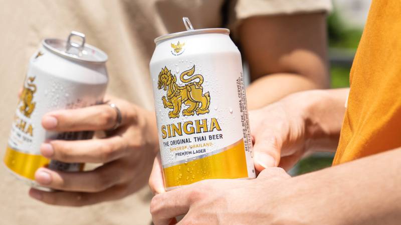
The Singha logo is one of the most recognizable marks in Asian beer branding. It features a golden mythical lion figure rooted in Thai mythology,…
The Boavista logo is one of the most recognizable crests in Portuguese football. It belongs to Boavista Futebol Clube, a club founded on 1 August…
The FC Saarbrücken logo is the official visual identity of 1. FC Saarbrücken, a German football club based in Saarbrücken, the capital of the Saarland…
The Metz logo is one of the most historically layered emblems in French football. It belongs to Football Club de Metz, a professional club based…
The Sevilla logo is the official crest of Sevilla FC, one of Spain’s most decorated football clubs. It functions as a logo that carries the…
The Amnesty International logo is one of those rare marks in the nonprofit world that you recognize before you even read the text next to…
People judge a brand in under half a second. Before they read a single word, the colors, shapes, and letterforms in a logo have already…
The Nexon logo is the corporate mark of Nexon Co., Ltd., one of the biggest online game publishers in the world. Founded in Seoul, South…
Every social media post is a design decision. The colors, the layout, the font size on a five-inch screen. All of it shapes whether someone…
Facebook became Meta. Twitter became X. Dunkin’ Donuts dropped the donuts. The list of companies that rebranded keeps growing, and each one tells a different…
Two fonts sit next to each other on your screen. One feels right. The other looks like a mistake you can’t quite explain. Learning how…
The Tesco logo is one of the most recognized retail identities in the UK, built around a clean blue wordmark that has carried the brand…
The Royal Enfield logo is one of the most recognized emblems in motorcycling. It combines a bold wordmark with a circular crest that carries over…