


The FC Saarbrücken logo is the official visual identity of 1. FC Saarbrücken, a German football club based in Saarbrücken, the capital of the Saarland region. The crest functions as a symbol of club identity, representing the team’s regional roots and competitive history. FC Saarbrücken was founded in 1903, making it one of the older clubs in German football, and the badge has gone through several distinct iterations since then.
The club sits within the broader tradition of German football club branding, where shield-shaped crests with regional color ties are the norm rather than the exception. [Footballs clubs in Germany generally follow this pattern, and FC Saarbrücken is no different.]
What Is the FC Saarbrücken Logo?
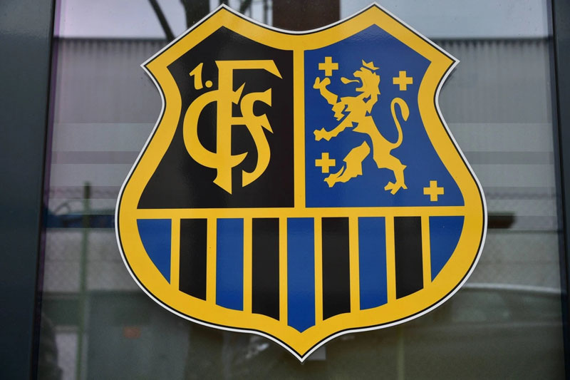
The FC Saarbrücken logo is a shield-shaped emblem featuring the club’s blue and black colors, with the abbreviation “FCS” and founding year prominently displayed. The current version has been in use in its modern form since the early 2000s, refined over decades of incremental updates rather than a single dramatic overhaul.
- Design Type: Emblem / shield crest (combination mark with typography and graphic elements)
- Primary Elements: Shield shape, “FCS” lettering, blue and black color split, club founding year (1903)
- Official Introduction Date: Current modern iteration refined circa 2000s; original crest dates to mid-20th century
- Designer/Agency: Not publicly attributed to a specific designer or agency
- Trademark Status: Registered trademark of 1. FC Saarbrücken e.V.
- Color Palette: Royal Blue (#003DA5 approx.), Black (#000000), White (#FFFFFF)
- Usage Context: Match kits, official merchandise, digital platforms, stadium signage, club marketing materials
How Has the FC Saarbrücken Logo Evolved Over Time?
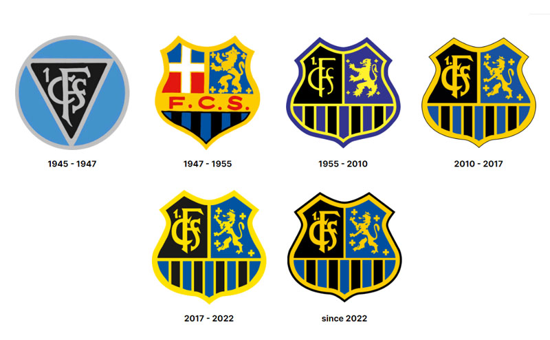
The FC Saarbrücken badge has gone through gradual changes since the club’s founding in 1903, moving from early simple designs to the more structured shield emblem used today. No single redesign was radical. Each version built on the previous one.
Original FC Saarbrücken Logo (1903-1940s)
- Years Active: 1903 to approximately late 1940s
- Design Description: Early badge with basic circular or shield form, minimal graphic detail
- Color Scheme: Blue and white, consistent with early club colors
- Designer: Unknown
- Context: Founded in 1903, the club needed a basic identity mark for kits and official documents
- Key Changes from Previous: N/A – first version
- Cultural Significance: Established the blue color association that would define the club for over a century
Mid-Century FC Saarbrücken Logo (1950s-1970s)
- Years Active: Approximately 1950s through 1970s
- Design Description: More structured shield shape introduced, with clearer typography and club abbreviation
- Color Scheme: Blue and black, reflecting the club’s established identity
- Designer: Unknown
- Context: Post-war reorganization of German football and the Saarland’s political reintegration into West Germany in 1957 influenced a more defined regional identity in the badge
- Key Changes from Previous: Cleaner shield geometry, stronger typography weight
- Cultural Significance: The Saarland’s reintegration into Germany gave the club (and its crest) a renewed sense of regional identity
Modern FC Saarbrücken Logo (1980s-Present)
- Years Active: 1980s to present, with refinements continuing into the 2000s
- Design Description: Refined shield emblem with bold “FCS” lettering, blue and black halved background, white detailing, and founding year 1903
- Color Scheme: Royal blue, black, white
- Designer: Not publicly documented
- Context: Modernization of the visual identity to work across digital and print formats
- Key Changes from Previous: Cleaner lines, more consistent proportions, better scalability for digital use
- Cultural Significance: Represents the club’s identity during its most turbulent period – multiple league changes, financial difficulties, and eventual return to the 3. Liga
What Do the Design Elements of the FC Saarbrücken Logo Mean?
The shield shape signals competitive tradition and regional pride. The blue and black split is the most recognizable element, directly tied to the club’s official colors since at least the mid-20th century.
The “FCS” abbreviation keeps the mark compact and readable at small sizes. The founding year, 1903, grounds the badge in history without needing words to say it.
Every element in the crest is functional. Nothing is decorative for its own sake.
Why Did FC Saarbrücken Choose These Specific Colors?
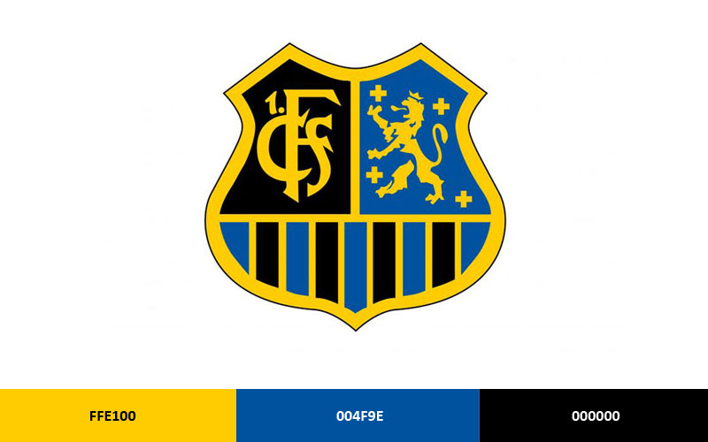
- Royal Blue
- Hex: Approximately #003DA5
- Symbolic Meaning: Loyalty, stability, regional identity
- Psychological Impact: Blue is widely associated with trust and reliability – fitting for a club with over 120 years of history
- Brand Connection: Blue is common among German football clubs but FC Saarbrücken’s specific shade distinguishes it from neighbors
- Black
- Hex: #000000
- Symbolic Meaning: Strength and seriousness
- Psychological Impact: Adds visual weight and authority to the badge
- Brand Connection: The blue-black combination is a deliberate contrast pair – similar to how blue in logos generally signals professionalism when paired with darker tones
- White
- Hex: #FFFFFF
- Symbolic Meaning: Clarity, clean presentation
- Psychological Impact: Provides contrast and makes the typography legible at small sizes
- Brand Connection: Standard in football crest design for separating color blocks and text elements
What Typography Style Is Used in the FC Saarbrücken Logo?
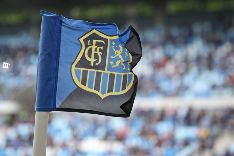
The “FCS” lettering uses a bold, condensed sans-serif style. It’s built for legibility at distance, which matters on kits and stadium boards.
The font is not publicly identified as a licensed commercial typeface. It reads as a custom or heavily modified letterform.
Earlier versions used slightly different letterform weights. The current version is more uniform and works better across digital formats. Understanding how typography functions in logo design helps explain why the “FCS” mark has stayed stable – it’s already doing its job cleanly.
What Are the Hidden Meanings in the FC Saarbrücken Logo?
There are no publicly documented subliminal elements in the FC Saarbrücken crest. The design is straightforward rather than symbolic in the way some club badges are.
The shield shape itself carries implicit meaning – it references protection, territory, and competition. That’s not accidental in European football badge tradition.
The 1903 founding year functions as a quiet credibility marker. It says the club has been here a long time without needing to argue the point.
How Does the FC Saarbrücken Logo Compare to Competitor Logos?
FC Saarbrücken’s badge sits within the standard German football crest tradition – shield-shaped, color-split, abbreviation-forward. It’s not trying to stand out from that tradition. It belongs to it.
Compared to nearby clubs, the blue and black combination is fairly distinctive. FC Kaiserslautern uses red and white. SC Freiburg works in red and black. Saarbrücken’s blue-black pairing gives it a clear visual separation from its regional competitors.
Clubs like MSV Duisburg and VfL Bochum also use blue as a primary color, but their badge structures differ enough that confusion is unlikely. The “FCS” abbreviation is specific enough that it functions almost as a standalone identifier.
Compared to top-tier club rebrands – think Borussia Dortmund or Bayer Leverkusen – FC Saarbrücken’s crest is more conservative. There’s no geometric abstraction, no mascot element, no attempt at a modern minimal aesthetic. It reads as a traditional badge, which is exactly what the club’s fanbase tends to prefer.
What Are the Technical Specifications of the FC Saarbrücken Logo?
Official Color Codes (approximate – not publicly confirmed by the club):
- Primary Color: Royal Blue – Hex: #003DA5, RGB: (0, 61, 165), CMYK: (100, 63, 0, 35), Pantone: approx. PMS 286 C
- Secondary Color: Black – Hex: #000000, RGB: (0, 0, 0), CMYK: (0, 0, 0, 100), Pantone: Process Black C
- Accent Color: White – Hex: #FFFFFF, RGB: (255, 255, 255), CMYK: (0, 0, 0, 0)
Dimensions and Proportions:
- Aspect Ratio: Approximately 4:5 (portrait-oriented shield)
- Minimum Size Requirements: Not publicly documented; standard practice for football crests is no smaller than 20px height for digital use
- Clear Space: Typically equal to the height of the “FCS” lettering on all sides
- File Formats: Official versions available as vector graphics (SVG, EPS) for print; PNG with transparency for digital use. Avoid bitmap formats for anything requiring scaling. For screen use, JPEG versions exist but are not recommended where background transparency is needed. Print applications should maintain minimum DPI of 300 for sharp output.
What Cultural Impact Has the FC Saarbrücken Logo Had?
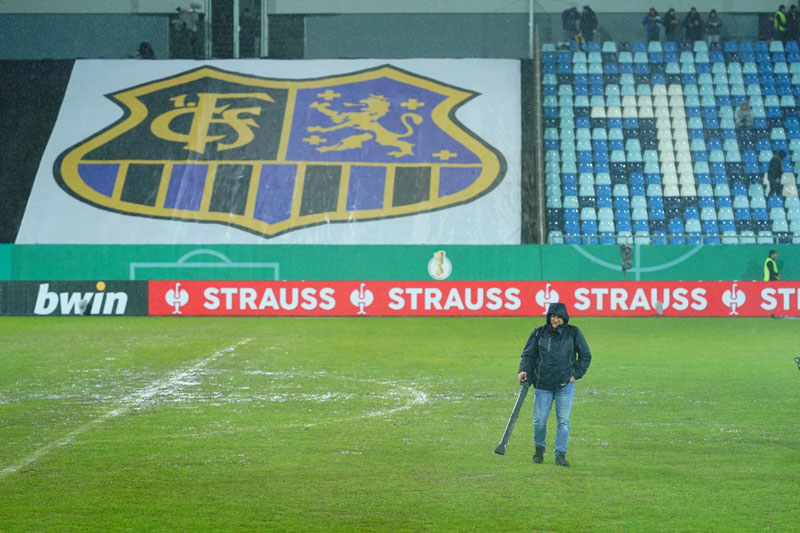
FC Saarbrücken’s badge carries weight specific to Saarland. The region has a complicated history – it was briefly a semi-independent protectorate after World War II before voting to rejoin West Germany in 1957. The club’s badge, and the blue-black identity behind it, became a consistent anchor during that political instability.
When FC Saarbrücken made a remarkable run to the DFB-Pokal semi-finals in 2020 as a fourth-division club, the crest suddenly got a lot more national visibility. That kind of moment does something for a badge. Fans who had never heard of the club suddenly recognized it.
The logo also carries meaning locally that outsiders don’t always see. It’s on scarves, pub walls, and tattoos across Saarbrücken. That kind of embedding in daily life is what separates a club crest from just a sports logo.
How Does the FC Saarbrücken Logo Fit Into the Overall Brand Identity?
The logo is the anchor of FC Saarbrücken’s visual identity, but it doesn’t operate alone. It connects to the club’s kit colors, stadium presentation, merchandise design, and official communications – all of which use the same blue-black palette.
The crest functions as the primary brand mark across all touchpoints. Typography in club communications tends to echo the bold, condensed style of the badge lettering. The color palette stays consistent across home and away kit variations, even when away kits shift to white or grey as a base.
The club doesn’t appear to have a formal published brand guidelines document available publicly. In practice, the badge’s visual rules are applied consistently enough across official materials that informal standards clearly exist.
Related entities in the brand network include the Ludwigspark Stadium (home ground), the DFB (governing body), the 3. Liga (current competitive context), and Saarland itself as a geographic and cultural reference point. All of these feed into what the logo represents beyond just football.
How Should the FC Saarbrücken Logo Be Used?
Do’s:
- Use the official vector version for all print and large-format applications
- Maintain clear space around the badge at all times
- Use on approved background colors (white, black, or the club’s official blue)
- Source official files directly from the club’s press or media department
Don’ts:
- Do not stretch, distort, or rotate the badge
- Do not recolor the logo or apply effects like drop shadows or gradients not present in the official version
- Do not use the crest on unofficial merchandise without a licensing agreement
- Do not reproduce the logo for commercial purposes without written permission from 1. FC Saarbrücken e.V.
Where to Access Official Logos: Media and press assets are typically available through the club’s official website press section. Third-party sports media databases also carry official versions for editorial use.
Licensing and Trademark: The FC Saarbrücken badge is a registered trademark. Any commercial use requires explicit authorization from the club. Unauthorized use on merchandise, apps, or marketing materials is an infringement. Editorial and journalistic use generally falls under standard press permissions, but commercial use is a separate matter entirely.
FAQ on the FC Saarbrücken Logo
What does the FC Saarbrücken logo look like?
It’s a shield-shaped crest split into blue and black sections. The FCS abbreviation sits prominently in the center, with the founding year 1903 included.
White lettering and outlines provide contrast against the dark background.
What colors are used in the FC Saarbrücken badge?
The official club colors are royal blue and black. White is used as a secondary detail color for typography and border elements.
The blue-black combination has been tied to the club’s identity for decades and remains unchanged in the current version.
When was the current FC Saarbrücken crest introduced?
The modern version of the crest was refined during the 2000s. It built on earlier shield designs rather than replacing them entirely.
The core structure, including the shield shape and FCS lettering, has been consistent since at least the 1980s.
What is the meaning behind the FC Saarbrücken logo design?
The shield reflects the club’s competitive tradition and regional identity in Saarland. The 1903 founding year signals long-standing history without needing explanation.
Blue represents loyalty and stability. Black adds visual authority to the overall crest symbol.
Who designed the FC Saarbrücken football badge?
No specific designer or agency has been publicly credited for the FC Saarbrücken club emblem.
Like many German football crests, the badge evolved gradually through internal club decisions rather than through a single commissioned redesign.
How many times has the FC Saarbrücken logo changed?
The crest has gone through at least three distinct phases: an early simple badge from 1903, a mid-century version with a clearer shield structure, and the refined modern emblem.
Changes were incremental. No version was a radical departure from the previous one.
What font is used in the FC Saarbrücken logo?
The FCS lettering uses a bold, condensed sans-serif style. It has not been publicly identified as a standard commercial typeface.
It reads as a custom or heavily modified letterform built for legibility on kits and signage.
Where can I download the official FC Saarbrücken logo?
Official high-resolution assets are available through the club’s official press and media section. Sports media databases also carry editorial versions.
For commercial use, direct authorization from 1. FC Saarbrücken e.V. is required. Unofficial downloads from third-party sites carry licensing risk.
How does the FC Saarbrücken crest compare to other German football club logos?
It follows the standard German football badge format: shield shape, color split, club abbreviation. Nothing unusual structurally.
The blue-black pairing separates it visually from regional clubs like FC Köln or Hamburger SV, which use different color combinations entirely.
Is the FC Saarbrücken logo trademarked?
Yes. The FC Saarbrücken club crest is a registered trademark of 1. FC Saarbrücken e.V.
Unauthorized commercial use on merchandise, digital products, or marketing materials is an infringement. Editorial and press use generally falls within standard permissions.
Conclusion
The FC Saarbrücken logo is more than a football badge. It’s a direct expression of Saarland identity, club heritage, and over a century of competitive history packed into a shield crest.
The blue-black color split, the FCS abbreviation, and the 1903 founding year work together as a tight visual system. Each element earns its place.
Within German football club branding, the Saarbrücken emblem holds its own without chasing trends. It stays rooted in the core principles that make sports visual identity last.
That consistency is the whole point. A club symbol that keeps changing stops meaning anything.

Renowned for his expertise in logo design and visual branding, Bogdan has developed a multitude of logos for various clients.
His skills extend to creating posters, vector illustrations, business cards, and brochures. Additionally, Bogdan's UI kits were featured on marketplaces like Visual Hierarchy and UI8.
He also wrote in the past years on sites like Design Your Way, WebDesignerDepot, WPDean, Designmodo, Speckyboy, Slider Revolution, and more.
- The Webflow Logo History, Colors, Font, And Meaning - 10 September 2026
- Your Highest-Paying Design Project Might Be Your Least Profitable One… Without You Noticing - 10 September 2026
- Free Browser 3D Tools for Designers Who Refuse to Install Anything - 9 September 2026

Bogdan Sandu is a seasoned designer who has been designing websites since 2008. Renowned for his expertise in logo design and visual branding, Bogdan has developed a multitude of logos for various clients. His skills extend to creating posters, vector illustrations, business cards, and brochures. Additionally, Bogdan's UI kits were featured on marketplaces like Visual Hierarchy and UI8. He also wrote in the past years on sites like Design Your Way, WebDesignerDepot, WPDean, Designmodo, Speckyboy, Slider Revolution, and more.
You Might Also Like


