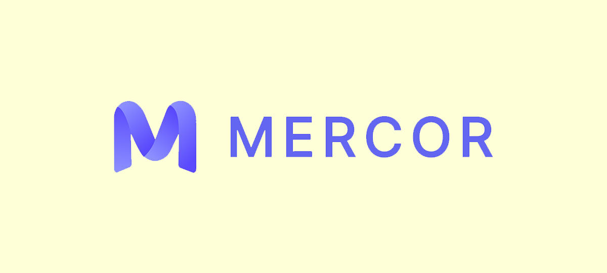
The Mercor logo represents one of the fastest-growing AI hiring startups in Silicon Valley. Founded in 2023, this San Francisco-based company built its visual identity around clean, modern design principles that reflect its tech-forward mission.
Three college dropouts, Brendan Foody, Adarsh Hiremath, and Surya Midha, created the brand from scratch. The company reached a $10 billion valuation by late 2025.
Mercor has maintained a consistent visual identity since launch. The logo appears across their platform, marketing materials, and corporate communications. It serves major clients including OpenAI and Anthropic.
What is the Mercor Logo?
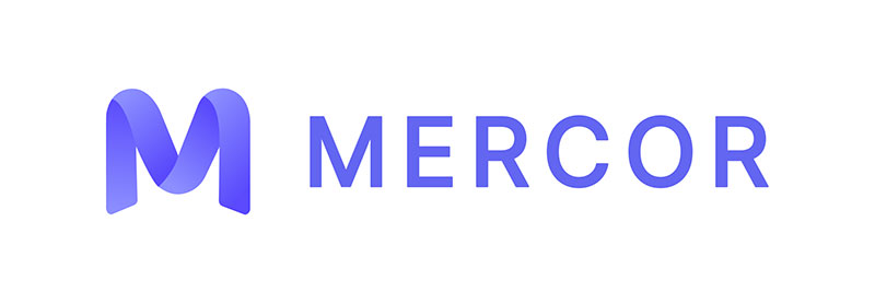
The Mercor logo is a clean wordmark featuring the company name in a modern sans-serif typeface. Introduced in 2023 alongside the company’s founding, the design reflects the startup’s focus on AI-driven hiring solutions. The mark communicates professionalism and technological sophistication through its minimalist approach.
Design Attributes
- Design Type: Wordmark (text-based logo)
- Primary Elements: Company name rendered in custom typography
- Official Introduction Date: 2023
- Designer/Agency: Created internally during company founding
- Trademark Status: Protected as company intellectual property
- Color Palette: Dark navy/black primary with light backgrounds
- Usage Context: Website, mobile app, marketing materials, investor presentations, corporate communications
How Has the Mercor Logo Evolved Over Time?
Mercor’s visual identity has remained largely consistent since its 2023 founding.
The company launched with its current wordmark and has made only minor refinements.
This stability reflects a deliberate branding strategy common among tech startups that want to build recognition quickly.
Original Mercor Logo (2023-Present)
- Years Active: 2023 to present
- Design Description: Clean wordmark with modern sans-serif typography
- Color Scheme: Dark navy or black on white, with occasional reversed versions
- Designer: Internal team
- Context: Launched when the company was founded by three Thiel Fellows
- Key Changes from Previous: N/A (original design)
- Cultural Significance: Represents the new wave of AI-native hiring platforms challenging traditional recruitment
What Do the Design Elements of the Mercor Logo Mean?

The Mercor wordmark prioritizes readability and professionalism above decorative elements.
Its clean lines suggest efficiency. The lack of ornamental graphics reflects the company’s data-driven approach to matching talent with opportunities.
Simple design choices here weren’t accidental. They mirror how the platform itself works, by cutting through noise to find signal.
Why Did Mercor Choose These Specific Colors?
The primary dark color, typically a deep navy or black, projects authority and trustworthiness.
These tones work well in the recruitment space where credibility matters. Understanding color psychology explains why so many tech company logos lean toward similar palettes.
Dark logos against light backgrounds also read well across digital and print applications. Think about how blue logos and black logos dominate the enterprise software space.
What Typography Style Is Used in the Mercor Logo?
Mercor uses a geometric sans-serif font that feels contemporary without being trendy.
The letterforms are balanced and evenly weighted. Good tracking between characters keeps it legible at small sizes.
This typographic choice aligns with current minimalist design trends in tech branding.
What Are the Hidden Meanings in the Mercor Logo?
The name “Mercor” itself carries meaning. It derives from Latin roots related to trade and commerce.
There’s no hidden symbol or Easter egg in the mark. Sometimes the absence of complexity is the message.
The straightforward approach suggests transparency, a value the company emphasizes in its AI-driven hiring process.
How Does the Mercor Logo Compare to Competitor Logos?
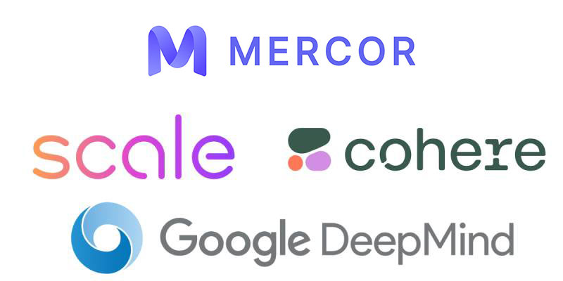
Mercor sits comfortably within the visual language of modern AI startups.
Compare it to the Anthropic logo or the Scale AI logo. You’ll notice similar restraint.
These companies avoid flashy graphics. They let their product speak louder than their branding.
The DeepMind logo and Cohere logo follow comparable patterns. Clean type, minimal fuss, maximum professionalism.
What Are the Technical Specifications of the Mercor Logo?
Official Color Codes
- Primary Color: Dark Navy/Black
- Hex: Approximately #1A1A2E or similar dark tone
- RGB: (26, 26, 46) approximate
- CMYK: Rich black mix for print applications
- Secondary Color: White
- Hex: #FFFFFF
- RGB: (255, 255, 255)
Dimensions and Proportions
- Aspect Ratio: Horizontal wordmark optimized for header placement
- Minimum Size Requirements: Legible at standard favicon sizes
- Clear Space Specifications: Adequate margin around wordmark for visual breathing room
- Official Usage Guidelines: Maintain consistent application across web and print
What Cultural Impact Has the Mercor Logo Had?

Mercor’s brand has become synonymous with AI-powered hiring innovation.
The three founders, all under 23 when they hit billionaire status, turned their wordmark into a symbol of Gen Z entrepreneurship.
Media coverage frequently features the logo alongside stories about disrupting traditional recruitment.
It represents a shift in how companies think about talent acquisition in the AI era.
How Does the Mercor Logo Fit Into the Overall Brand Identity?

The logo anchors a broader visual system that emphasizes clarity and functionality.
Website design, app interfaces, and marketing all follow the same clean, minimal approach.
Good brand guidelines keep everything consistent across touchpoints. The wordmark works whether you’re viewing it on a phone screen or a conference banner.
Mercor’s identity supports its positioning as a serious player in enterprise AI solutions.
How Should the Mercor Logo Be Used?
Usage Guidelines
- Do: Maintain minimum clear space around the wordmark
- Do: Use approved color variations (dark on light, light on dark)
- Do: Scale proportionally to preserve legibility
- Don’t: Stretch, rotate, or distort the logo
- Don’t: Add effects like drop shadows or gradients
- Don’t: Place on busy backgrounds that reduce contrast
Where to Access Official Assets
Brand assets are typically available through Mercor’s corporate communications team. The company logo appears in vector graphics format (SVG) and raster formats (PNG) for different applications.
Trademark Protection
The Mercor name and logo are protected intellectual property. Unauthorized use, especially for commercial purposes, is prohibited without explicit permission from the company.
FAQ on The Mercor Logo
What type of logo does Mercor use?
Mercor uses a wordmark design for its official logo. The company name appears in clean, modern typography without additional symbols or icons.
This approach follows core logo design principles favored by tech startups. Simple. Direct. Professional.
Where can I download the official Mercor logo?
Official Mercor logo assets are available through brand aggregator platforms and the company’s press resources.
Look for SVG and PNG formats. Always use authorized sources to ensure you’re getting the correct version for your project.
What colors are in the Mercor logo?
The Mercor brand identity relies on dark navy or black paired with white. This color palette projects trust and professionalism.
The combination works across digital and print. High contrast ensures readability at any size.
Is there a transparent background version of the Mercor logo?
Yes. The Mercor logo PNG with transparent background exists for flexible placement on various backgrounds.
This version is standard for web applications, presentations, and marketing materials where background colors vary.
Who designed the Mercor logo?
The Mercor visual identity was created internally when founders Brendan Foody, Adarsh Hiremath, and Surya Midha launched the company in 2023.
No external agency has been publicly credited. The design reflects the founders’ preference for simplicity.
What font does the Mercor logo use?
Mercor uses a geometric sans-serif typeface with clean lines. The typography elements emphasize readability and modern aesthetics.
Proper kerning between letters keeps the wordmark balanced and professional.
Can I use the Mercor logo for my project?
Unauthorized use of the Mercor company logo is restricted. The trademark protects against misuse in commercial applications.
Contact their communications team for licensing inquiries. Following a proper brand style guide matters here.
What file formats is the Mercor logo available in?
The Mercor logo SVG format works best for scalable applications. PNG files suit web and digital use.
Vector formats preserve quality at any size. Raster formats like JPEG work for basic digital needs.
How does the Mercor logo compare to other AI company logos?
Mercor’s wordmark fits the clean aesthetic common among AI hiring platforms. Similar brands like those behind the Hugging Face logo favor approachable designs.
The recruitment technology sector tends toward understated corporate identity.
Has the Mercor logo changed since the company was founded?
No major redesigns have occurred. The Mercor brand identity has stayed consistent since the 2023 launch.
Stability builds recognition. For a startup scaling rapidly, maintaining visual consistency across their press kit and media assets makes sense.
Conclusion
The Mercor logo reflects everything the AI hiring platform stands for. Clean execution. No unnecessary elements. Pure function.
Its wordmark design demonstrates how effective simplicity can be when building a startup brand. The dark color scheme and modern typeface create strong visual hierarchy.
Smart use of white space keeps the mark readable across all applications.
For a company valued at $10 billion, the logo does exactly what a good logo should. It gets out of the way and lets the product speak.

Renowned for his expertise in logo design and visual branding, Bogdan has developed a multitude of logos for various clients.
His skills extend to creating posters, vector illustrations, business cards, and brochures. Additionally, Bogdan's UI kits were featured on marketplaces like Visual Hierarchy and UI8.
He also wrote in the past years on sites like Design Your Way, WebDesignerDepot, WPDean, Designmodo, Speckyboy, Slider Revolution, and more.
- The Windsurf Logo History, Colors, Font, And Meaning - 10 October 2026
- How to Remove Background From Product Photos (No Photoshop) - 10 October 2026
- How Designers can Build a Stronger Online Creative Identity - 9 October 2026

Bogdan Sandu is a seasoned designer who has been designing websites since 2008. Renowned for his expertise in logo design and visual branding, Bogdan has developed a multitude of logos for various clients. His skills extend to creating posters, vector illustrations, business cards, and brochures. Additionally, Bogdan's UI kits were featured on marketplaces like Visual Hierarchy and UI8. He also wrote in the past years on sites like Design Your Way, WebDesignerDepot, WPDean, Designmodo, Speckyboy, Slider Revolution, and more.
You Might Also Like