The Vercel logo represents one of the most recognizable marks in modern frontend development. It’s a simple black triangle pointing upward. Nothing fancy. Just geometry doing its job.
This mark sits comfortably among other tech company logos that have embraced minimalist design principles. Vercel introduced it in 2020 when the company rebranded from Zeit.
The current version has remained unchanged since that rebrand. Designer credit goes to the internal Vercel team working alongside external consultants. The company itself launched in 2015 under its original name, and this triangle mark represents only the second major logo in its history.
What Is the Vercel Logo?

The Vercel logo is an abstract geometric mark featuring an equilateral triangle pointing upward. Introduced in April 2020 during the company’s rebrand from Zeit, it was designed by Vercel’s internal team. The triangle symbolizes deployment, progress, and the “delta” concept of change in development.
Design Classification
- Design Type: Abstract geometric icon with separate wordmark
- Primary Elements: Solid equilateral triangle, custom sans-serif wordmark
- Official Introduction Date: April 21, 2020
- Designer/Agency: Vercel internal design team
- Trademark Status: Registered trademark in the United States
- Color Palette: Primary black (#000000), white (#FFFFFF) for reversed applications
- Usage Context: Platform interface, documentation, marketing materials, developer tools, merchandise
How Has the Vercel Logo Evolved Over Time?

The Vercel brand has only seen one major logo transition. The original Zeit logo used a distinctive geometric “Z” mark.
When the company rebranded to Vercel in 2020, everything changed. The triangle replaced the Z completely.
This wasn’t a gradual evolution. It was a clean break from the past identity.
Original Zeit Logo (2015-2020)
- Years Active: 2015-2020
- Design Description: Angular geometric “Z” letterform constructed from triangular shapes
- Color Scheme: Black primary with white reversed versions
- Designer: Zeit founding team
- Context: Launched alongside the original company founding, representing the German word for “time”
- Cultural Significance: Became associated with the early JAMstack and serverless deployment movement
Current Vercel Logo (2020-Present)
- Years Active: 2020-present
- Design Description: Simple upward-pointing equilateral triangle
- Color Scheme: Pure black (#000000) on light backgrounds, white (#FFFFFF) on dark
- Designer: Vercel design team
- Context: Introduced during Series A funding announcement and complete company rebrand
- Key Changes from Previous: Moved from letterform to abstract symbol, dropped any reference to previous name
- Cultural Significance: Represents the company’s maturation from startup tool to enterprise platform
What Do the Design Elements of the Vercel Logo Mean?
The upward triangle carries multiple meanings. It suggests deployment (pushing code up to production). It references the mathematical delta symbol for change.
The shape also implies progress and forward momentum. Simple geometry, layered meaning.
Why Did Vercel Choose These Specific Colors?
Vercel uses a strict monochrome color palette. Black and white only. No gradients, no secondary colors.
This choice reflects developer culture. Code editors, terminals, documentation. All primarily monochromatic environments.
The psychological impact is clarity and professionalism. Black logos communicate authority and sophistication.
- Primary Black: #000000 (pure black, maximum contrast, developer-friendly)
- Primary White: #FFFFFF (used for dark mode applications, maintains visibility)
What Typography Style Is Used in the Vercel Logo?
The Vercel wordmark uses a custom geometric sans-serif font. Clean lines. Even stroke weights throughout.
The letterforms feel technical without being cold. Readable at small sizes, distinctive at large ones.
Vercel’s typography has remained consistent since the 2020 rebrand. No tweaks or refinements to the wordmark.
What Are the Hidden Meanings in the Vercel Logo?
The triangle doubles as a play button rotated 90 degrees. Deploy and go. Ship it.
Some see the Greek delta symbol. In math and programming, delta means change. Fitting for a deployment platform.
The upward direction suggests growth and scalability. Your projects pointing toward success. Maybe a bit on the nose, but it works.
How Does the Vercel Logo Compare to Competitor Logos?

Vercel sits in a crowded space of developer tools and cloud platforms. Most competitors use either wordmarks or abstract symbols.
The Cloudflare logo uses a stylized cloud. Netlify has a geometric teal shape. AWS goes with the smile arrow.
Vercel’s triangle stands out through pure simplicity. While others add complexity, Vercel stripped everything away.
Among AI and developer tool companies, the Anthropic logo takes a similarly minimal approach. The Stripe logo also uses clean geometry, though with more refined letterforms.
What Are the Technical Specifications of the Vercel Logo?
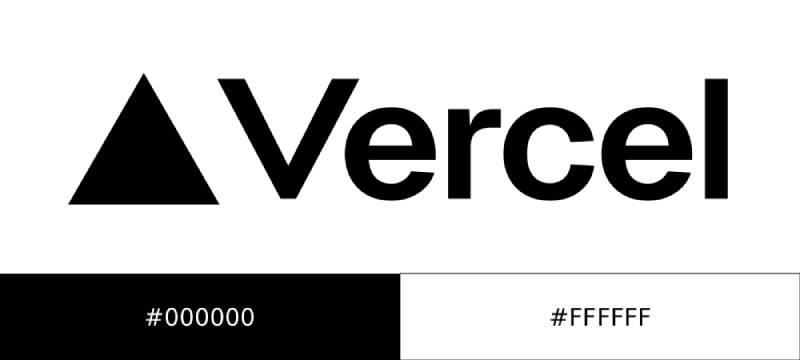
Official Color Codes
- Primary Black
- Hex: #000000
- RGB: (0, 0, 0)
- CMYK: (0, 0, 0, 100)
- Primary White
- Hex: #FFFFFF
- RGB: (255, 255, 255)
- CMYK: (0, 0, 0, 0)
Dimensions and Proportions
- Aspect Ratio: The triangle icon is equilateral (1:1 bounding box)
- Minimum Size: 16px for digital applications
- Clear Space: Minimum padding equal to half the triangle height on all sides
- File Formats: Available as vector graphics (SVG) and raster formats (PNG)
What Cultural Impact Has the Vercel Logo Had?
The Vercel triangle has become shorthand for modern frontend development. Developers recognize it instantly.
It shows up on laptop stickers at conferences. In GitHub readmes. On personal portfolio sites.
The logo helped establish a visual language for the “deploy anywhere” generation of web development. Simple, fast, no friction.
How Does the Vercel Logo Fit Into the Overall Brand Identity?

Vercel built an entire design system around the triangle. The shape appears in UI elements, loading animations, and marketing graphics.
Their brand guidelines maintain strict consistency. Black, white, and the triangle. That’s mostly it.
The logo connects directly to their product philosophy. Fast deployments. Clean interfaces. No unnecessary complexity. The visual identity mirrors the developer experience.
How Should the Vercel Logo Be Used?

Official Usage Guidelines
- Do: Use official logo files from Vercel’s brand resources page
- Do: Maintain minimum clear space around the mark
- Do: Use black on light backgrounds, white on dark backgrounds
- Don’t: Rotate, stretch, or distort the triangle
- Don’t: Add effects like shadows, gradients, or outlines
- Don’t: Change the official colors
Where to Access Official Logos
Vercel provides brand assets through their official website. The press kit includes SVG and PNG versions in multiple configurations.
Licensing and Trademark Information
The Vercel name and triangle logo are registered trademarks. Usage requires compliance with their brand guidelines. Commercial use in ways that imply partnership or endorsement needs written permission.
FAQ on The Vercel Logo
What Does the Vercel Logo Look Like?
The Vercel logo is a solid black triangle pointing upward. That’s it. No gradients, no effects.
The Vercel icon uses pure geometric form. It pairs with a custom wordmark for full brand applications.
Both elements work independently or together depending on context.
What Does the Vercel Triangle Symbol Mean?
The triangle represents deployment and forward progress. Think of code shipping upward to production servers.
It also references the delta symbol from mathematics. Delta means change, which fits a deployment platform perfectly.
Simple shape. Layered meaning.
When Did Vercel Change Its Logo From Zeit?
Vercel rebranded from Zeit in April 2020. The geometric “Z” mark disappeared completely.
The new Vercel triangle arrived alongside Series A funding announcements. Guillermo Rauch led the company through this transition.
Everything changed at once. Name, logo, visual identity.
What Are the Official Vercel Logo Colors?
Vercel uses only black (#000000) and white (#FFFFFF). No secondary colors exist in the official palette.
The monochrome logo works in dark mode and light mode applications. This approach reflects developer tool aesthetics and terminal environments.
Where Can I Download the Vercel Logo?
Official Vercel brand assets are available through their website’s press kit section. You’ll find SVG logo downloads and PNG logo files there.
The brand kit includes various configurations. Icon only, wordmark only, and combination versions.
Can I Use the Vercel Logo on My Website?
Yes, with restrictions. The Vercel trademark allows usage that follows their guidelines.
You can show the “Powered by Vercel” badge on deployed projects. Don’t imply official partnership without permission.
Check their usage terms for commercial applications.
What Font Does Vercel Use in Its Wordmark?
Vercel uses a custom geometric typeface for its wordmark. Clean lines with consistent stroke weights throughout.
The Vercel logotype prioritizes readability at small sizes. It works well in documentation, dashboards, and marketing materials.
Who Designed the Vercel Logo?
The Vercel internal design team created the current logo. They worked alongside external consultants during the 2020 rebrand.
No single designer receives public credit. The Vercel visual identity emerged as a team effort in San Francisco.
Why Did Vercel Choose a Triangle for Its Logo?
Triangles suggest stability and upward momentum. The shape connects to psychology of shapes principles used in logo design principles.
It’s also a play button rotated 90 degrees. Deploy and go. The geometric logo design communicates action.
What File Formats Is the Vercel Logo Available In?
The Vercel press kit includes SVG files for scalable applications. PNG files come in multiple resolutions.
SVG works best for web design implementations. The vector format scales infinitely without quality loss. Transparent backgrounds come standard.
Conclusion
The Vercel logo proves that effective branding doesn’t require complexity. A single triangle communicates everything the frontend platform stands for.
Deployment. Progress. Change.
Since the 2020 rebrand from Zeit, this mark has become synonymous with modern web development. Developers worldwide recognize the Vercel symbol instantly, whether on GitHub repos or conference stickers.
The contrast between the simple geometric form and the sophisticated technology it represents creates lasting impact. Good use of white space around the mark strengthens its visual hierarchy.
Sometimes the best brand identity is the simplest one.

Renowned for his expertise in logo design and visual branding, Bogdan has developed a multitude of logos for various clients.
His skills extend to creating posters, vector illustrations, business cards, and brochures. Additionally, Bogdan's UI kits were featured on marketplaces like Visual Hierarchy and UI8.
He also wrote in the past years on sites like Design Your Way, WebDesignerDepot, WPDean, Designmodo, Speckyboy, Slider Revolution, and more.
- Death Note Font Generator - 26 October 2026
- Versatile Georgia Font Pairing for Timeless Layouts - 24 October 2026
- How to Turn Inconsistent UI into One Design System (Without a Full Redesign) - 24 October 2026

Bogdan Sandu is a seasoned designer who has been designing websites since 2008. Renowned for his expertise in logo design and visual branding, Bogdan has developed a multitude of logos for various clients. His skills extend to creating posters, vector illustrations, business cards, and brochures. Additionally, Bogdan's UI kits were featured on marketplaces like Visual Hierarchy and UI8. He also wrote in the past years on sites like Design Your Way, WebDesignerDepot, WPDean, Designmodo, Speckyboy, Slider Revolution, and more.
You Might Also Like