


The IFK Varnamo logo is a classic Swedish football emblem that carries over a century of tradition from the Smaland province. It belongs to IFK Varnamo, a professional club founded on October 31, 1912, in the town of Varnamo, Sweden. The badge follows the standard visual language of the Idrottsforeningen Kamraterna (IFK) movement, built around a white shield, blue horizontal stripe, laurel wreath, and the trademark four-pointed comrade star. While the club has gone through different periods in Swedish football (from local amateur leagues to the Allsvenskan top tier), the core design of the emblem has stayed remarkably consistent. It is one of those badges where the identity was established early and the club simply never felt the need to throw it all away and start over.
The IFK system itself dates back to 1895, so these visual elements predate the club by nearly two decades. That context matters. You are not looking at some recently cooked-up branding exercise. This is a logo tied to a broader Scandinavian sports tradition that links clubs across Sweden and Finland through shared symbols and colors.
What Is the IFK Varnamo Logo?
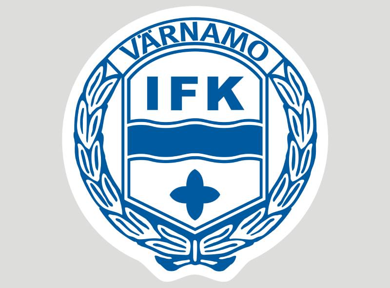
The IFK Varnamo logo is an emblem-style badge featuring a white shield with a blue horizontal stripe across its center, the letters “IFK” displayed prominently, a surrounding laurel wreath with the inscription “Varnamo” at the top, and a four-pointed comrade star. The current version follows design conventions established by the IFK movement in the late 1800s. The badge uses blue and white as its official colors.
Here is a closer look at the specific attributes:
- Design Type: Emblem (shield-based crest with wreath surround)
- Primary Elements: White shield, blue horizontal stripe, “IFK” lettering, laurel wreath, four-pointed star, “Varnamo” text inscription
- Official Introduction: The club was founded in 1912, and the badge design draws from IFK visual standards dating to 1895
- Designer/Agency: No specific designer credited. The design follows the centralized IFK association template adapted for local use
- Trademark Status: The four-pointed star and IFK visual identity are protected trademarks managed by the central IFK organization
- Color Palette: Blue and white (the traditional colors shared across all IFK member clubs)
- Usage Context: Matchday kits, club merchandise, official communications, Finnvedsvallen stadium branding, digital platforms, and the ifkvarnamo.se website
How Has the IFK Varnamo Logo Evolved Over Time?
The IFK Varnamo badge has not gone through dramatic overhauls like some bigger European clubs tend to do every decade or so.
The basic structure, a shield with wreath and star, has been there from the beginning. Changes over the years have been more about refinement than reinvention.
Most adjustments involved small tweaks to proportions, line weights, or how the lettering sits within the shield. The club never abandoned its IFK roots or tried to go in a completely different direction.
Original IFK Varnamo Badge (1912 – Mid-20th Century)
- Years Active: 1912 through roughly the 1950s
- Design Description: A straightforward white shield with a blue horizontal band, the “IFK” abbreviation in the center, and a basic laurel wreath border. The four-pointed comrade star appeared at the top of the shield. Early versions were simpler in execution, hand-drawn for match programs and local materials
- Color Scheme: Blue and white
- Designer: Unknown. Based on the IFK association template
- Context: The club was founded at Karl Wetterholm’s barbershop in Varnamo by local enthusiasts including Ragnar Selander (first president). It operated as an amateur outfit playing in local Smaland competitions. The badge reflected that modest, community-driven origin
- Cultural Significance: Connected the small-town club to the larger nationwide IFK network, giving it an instant sense of belonging to something bigger
Modernized IFK Varnamo Badge (Mid-20th Century – 2000s)
- Years Active: Approximately 1950s through early 2000s
- Design Description: Cleaner lines and more standardized proportions. The laurel wreath became more defined, and the lettering got sharper. The blue stripe and “IFK” text stayed central
- Color Scheme: Blue and white, more consistent application
- Key Changes from Previous: Better print quality and more uniform reproduction across materials. The shapes became tighter as printing and production technology improved
- Context: The club moved through various tiers of Swedish football during this period. Having a cleaner badge helped with official league documentation and growing merchandise needs
Current IFK Varnamo Badge (2000s – Present)
- Years Active: Early 2000s to present
- Design Description: The current version is a polished, digital-ready emblem. White shield, bold blue horizontal stripe, “IFK” in strong lettering, “Varnamo” inscribed at the top of the laurel wreath, and the four-pointed star sitting prominently. Everything is optimized for screen display, kit printing, and vector graphics reproduction
- Color Scheme: Blue and white
- Key Changes from Previous: Sharper detailing, better suited for digital use (website, social media, broadcast graphics). Available in SVG format for scalability
- Context: This version coincides with the club’s rise through Swedish football, including promotion to the Superettan in 2012 (their centenary year) and eventually reaching the Allsvenskan
- Cultural Significance: The badge became visible on a national stage as IFK Varnamo played top-flight Swedish football. For a town of roughly 20,000 people, that badge showing up on Allsvenskan broadcasts was a big deal
What Do the Design Elements of the IFK Varnamo Logo Mean?
Every piece of the IFK Varnamo badge carries a specific purpose. The white shield at the center represents purity and unity within the club.
The blue horizontal stripe adds movement and ties the design to the IFK color tradition. And the laurel wreath framing everything signals achievement and competitive spirit.
None of these choices are random. They trace directly back to the IFK movement’s founding principles from 1895.
Why Did IFK Varnamo Choose These Specific Colors?
The color palette was not really a choice IFK Varnamo made independently. Blue and white are the standard colors for all IFK member clubs, established by the central organization.
According to the IFK society master writing in Kamraten magazine back in 1899, the colors symbolize innocence and loyalty. That is the official line, and it has stuck for over 125 years.
Blue:
- Hex: Approximately #003DA5 (exact shade varies slightly across reproductions)
- Symbolism: Trust, stability, loyalty
- Connection: Shared across the IFK network as a unifying color. From a color psychology standpoint, blue communicates reliability, which fits a community-owned club built on member contributions rather than corporate investment
White:
- Hex: #FFFFFF
- Symbolism: Purity, clarity, simplicity
- Connection: Provides the clean background for the shield and creates strong contrast against the blue elements. The white also carries through to the home kit, which has traditionally featured a white shirt with blue detailing
Clubs that use different colors (like IFK Malmo with yellow and white) actually needed special permission from the central IFK organization to deviate. IFK Varnamo stuck with the standard.
What Typography Style Is Used in the IFK Varnamo Logo?
The typography in the badge is custom to the emblem. The “IFK” lettering uses a bold, slightly condensed style that fills the shield space efficiently.
It is not a commercially available font. The letters were drawn specifically for the badge format, which is common across IFK clubs.
The “Varnamo” inscription at the top of the wreath uses a smaller, more traditional lettering style. Readability at small sizes was clearly considered, since this badge appears on everything from shirt patches to tiny website favicons.
Look, I have seen clubs try to get too clever with their badge typography elements, cramming in decorative scripts that fall apart at small sizes. IFK Varnamo avoids that trap entirely.
What Are the Hidden Meanings in the IFK Varnamo Logo?
The four-pointed comrade star is probably the most interesting element. Each point of the star represents one of the four IFK principles: persistence, skill, power, and friendship.
That star is not just decorative. It is the symbol of the entire IFK movement, used since the 1890s, and it connects IFK Varnamo to over 160 other member clubs.
The laurel wreath pulls from classical imagery of victory and achievement. And the shield shape itself, with its characteristic rounded top featuring two curved parts between three peaks, is an IFK-specific design element you will find across most member club badges.
There is no single hidden “Easter egg” in the way some modern logo design principles might encourage. The meaning is all right there on the surface, and that is kind of the point.
How Does the IFK Varnamo Logo Compare to Competitor Logos?

Within Swedish football, IFK Varnamo’s badge sits in a particular visual category. It shares DNA with other IFK clubs like IFK Goteborg and IFK Norrkoping, which all use variations of the shield, stripe, and star format.
But it is distinctly simpler than IFK Goteborg’s crest (which incorporates the Gothenburg coat of arms with a lion and three crowns). IFK Varnamo’s badge does not try to cram in civic heraldry. It keeps things straightforward.
Compared to non-IFK Swedish clubs like Malmo FF or Hammarby IF, the IFK Varnamo logo reads as more classical and restrained. BK Hacken‘s badge, for example, feels more modern and aggressive in comparison.
The takeaway? IFK Varnamo’s badge does not try to compete on flash. It competes on heritage. And for a club from a small Smaland town, that is probably the right call.
What Are the Technical Specifications of the IFK Varnamo Logo?
Official Color Codes
Primary Color – Blue:
Secondary Color – White:
- Hex: #FFFFFF
- RGB: (255, 255, 255)
- CMYK: (0, 0, 0, 0)
Dimensions and Proportions
The badge follows a roughly vertical orientation. The shield sits taller than it is wide, with the laurel wreath extending slightly beyond the shield edges on both sides.
For digital use, the logo is distributed in SVG format, which means it scales to any size without losing quality. That matters when you need the same badge to look right on a stadium scoreboard and on a mobile app icon.
The DPI for print applications should be at least 300 to maintain sharp detail on the laurel wreath and star, which have fine elements that get muddy at lower resolutions.
Minimum clear space around the badge should equal roughly the width of the four-pointed star, keeping surrounding text and other graphics from crowding the emblem.
What Cultural Impact Has the IFK Varnamo Logo Had?
For Varnamo, a town of about 20,000 people in the Smaland region, this badge carries real weight. It represented the community on a national stage when IFK Varnamo reached the Allsvenskan.
The club celebrated its centenary in 2012 with a promotion to the Superettan, which put the badge in front of a wider audience for the first time.
Then reaching the top flight meant the emblem appeared on national broadcasts, on Allsvenskan merchandise, and in UEFA documentation. For a small-town club nicknamed “Talangfabriken” (Talent Factory), the badge became something locals genuinely rallied around.
Jonas Thern, probably the most famous player to come through the club, captained Sweden to a third-place finish at the 1994 FIFA World Cup. That connection gave the badge a bit of extra shine on the international stage, even if indirectly.
How Does the IFK Varnamo Logo Fit Into the Overall Brand Identity?

The badge is the anchor of IFK Varnamo’s entire visual system. The blue and white colors from the emblem carry through to the home kit (white shirt, blue detailing, blue socks), the Finnvedsvallen stadium branding, official communications, and the club website.
IFK Varnamo operates as a member-owned association with around 1,100 members. That community structure means the badge needs to feel like it belongs to everyone, not just a corporate entity. And it does. The brand guidelines stay rooted in that shared IFK identity rather than chasing trends.
The four-pointed star links IFK Varnamo to the broader network of IFK clubs. So the badge works on two levels: it says “this is our local club” and “this club is part of something much bigger across Scandinavia.” That dual identity is baked right into the design.
Recent Puma-manufactured kits have kept the badge placement and proportions consistent, which shows the club takes its brand style guide seriously even as kit suppliers change.
How Should the IFK Varnamo Logo Be Used?
Official usage guidelines:
- Always use the badge on a clean, uncluttered background to maintain visual hierarchy
- Do not alter the colors, proportions, or arrangement of elements within the emblem
- The four-pointed star and IFK branding are protected trademarks managed by the central IFK organization, so unauthorized commercial use is restricted
- For digital applications, use the SVG version to maintain crispness across screen sizes
- For print, use high-resolution files at 300 DPI minimum
- Do not place the badge over busy photographic backgrounds where the white shield and fine laurel details might get lost
Where to access official logos:
The official club website at ifkvarnamo.se is the primary source for authorized logo files. Media and broadcast partners receive assets directly from the club’s communications team.
Licensing:
The IFK Varnamo badge, like all IFK club emblems, falls under the intellectual property protection of both the local club and the central IFK organization. Merchandise producers and sponsors need licensing agreements before reproducing the badge commercially.
Trademark protection:
The four-pointed comrade star is a trademark of Idrottsforeningen Kamraterna. Individual clubs use it under the umbrella of the IFK movement, but independent parties cannot use the star or the IFK visual framework without authorization.
FAQ on The IFK Varnamo Logo
What does the IFK Varnamo logo look like?
The IFK Varnamo logo features a white shield with a bold blue horizontal stripe through its center. The letters “IFK” sit inside the shield. A laurel wreath frames the badge, and a four-pointed comrade star appears at the top.
What do the colors in the IFK Varnamo badge mean?
Blue and white are the official club colors across all IFK associations in Sweden. Blue stands for loyalty and trust.
White represents purity and clarity. These meanings were established by the IFK society master in 1899 and have not changed since.
When was the IFK Varnamo club crest first introduced?
The badge appeared when the club was founded on October 31, 1912, in Varnamo, Smaland. It followed the standard emphasis and visual format already set by the IFK movement dating back to 1895.
What is the four-pointed star on the IFK Varnamo emblem?
That star is the comrade star, the symbol of the entire Idrottsforeningen Kamraterna network. Its four points represent persistence, skill, power, and friendship.
Every IFK member club across Sweden and Finland shares this symbol.
Can I download the IFK Varnamo logo in vector format?
Yes. The official club emblem is available in SVG format, which uses mathematical paths instead of pixels to stay sharp at any size. Several logo databases also carry the badge in AI and EPS formats for professional design work.
Has the IFK Varnamo logo changed over the years?
Not dramatically. The core elements, the shield, blue stripe, laurel wreath, and star, have stayed consistent since 1912.
Updates have focused on cleaner lines and better digital reproduction. The football club identity was never fully redesigned.
How does the IFK Varnamo badge compare to other Swedish football club logos?
It shares the IFK template with clubs like IFK Norrkoping and IFK Goteborg. But IFK Varnamo’s version is simpler.
No civic heraldry, no complex illustrations. Compared to Kalmar FF or Degerfors IF, the badge leans more classical in its approach to balance and structure.
What font is used in the IFK Varnamo logo?
The “IFK” lettering is custom, not a commercially available typeface. It was drawn specifically for the badge format.
Bold and slightly condensed, the letters fill the shield space without crowding. The “Varnamo” inscription uses a smaller, more traditional style that stays readable at small sizes.
What does the laurel wreath on the IFK Varnamo crest represent?
The laurel wreath surrounding the shield pulls from classical shape symbolism, representing victory and achievement. It is a common feature across Swedish football club badges, especially within the IFK system.
Where can I find the official IFK Varnamo logo for media use?
The club’s official website at ifkvarnamo.se is the primary source. Media partners receive authorized assets directly from the club.
Unauthorized commercial reproduction is restricted. The IFK trademark, including the four-pointed star, is managed by the central IFK organization.
Conclusion
The IFK Varnamo logo is more than a football badge. It is a direct link to the IFK movement that started in 1895 and shaped Swedish sports culture for over a century.
Every element, from the white shield and blue stripe to the laurel wreath and comrade star, carries specific meaning rooted in the Allsvenskan club’s community-driven history.
For a small-town team from Smaland playing at Finnvedsvallen, this emblem punches above its weight. It connects local supporters to a nationwide network of shared graphic design principles and tradition.
The badge did not need constant redesigns to stay relevant. Its strength comes from consistency, clear alignment with club values, and a minimalist design approach that holds up across print and digital formats.

Renowned for his expertise in logo design and visual branding, Bogdan has developed a multitude of logos for various clients.
His skills extend to creating posters, vector illustrations, business cards, and brochures. Additionally, Bogdan's UI kits were featured on marketplaces like Visual Hierarchy and UI8.
He also wrote in the past years on sites like Design Your Way, WebDesignerDepot, WPDean, Designmodo, Speckyboy, Slider Revolution, and more.
- Beautiful Fonts Similar to Poppins You Should Try - 22 October 2026
- Website Redesign: How to Improve Your Website without Losing SEO Rankings - 22 October 2026
- The Coda Logo History, Colors, Font, And Meaning - 20 October 2026

Bogdan Sandu is a seasoned designer who has been designing websites since 2008. Renowned for his expertise in logo design and visual branding, Bogdan has developed a multitude of logos for various clients. His skills extend to creating posters, vector illustrations, business cards, and brochures. Additionally, Bogdan's UI kits were featured on marketplaces like Visual Hierarchy and UI8. He also wrote in the past years on sites like Design Your Way, WebDesignerDepot, WPDean, Designmodo, Speckyboy, Slider Revolution, and more.
You Might Also Like


